Dashboards have become indispensable tools for turning raw data into business intelligence, but not all dashboards are created equal. A truly actionable dashboard doesn’t just display metrics; it also provides actionable insights, it tells a story, highlights what matters most, and helps users make fast, informed decisions.
At XeoMatrix, we help organizations unlock the full potential of their data, including building dashboards that are clear, focused, and results-oriented. Whether you’re building dashboards for sales, HR, finance, or customer data, these 10 best practices will help you design business intelligence dashboards that users trust and act on.
What Is a Business Intelligence Dashboard?
A business intelligence (BI) dashboard is a data visualization tool that consolidates and displays key performance indicators (KPIs), metrics, and other relevant data points in a single, interactive interface. BI dashboards are designed to help users—whether executives, analysts, or team leads—quickly understand complex data and make informed decisions. Instead of sifting through spreadsheets or disconnected reports, users can gain real-time insights at a glance. These dashboards are typically customizable and can pull from multiple data sources to give a comprehensive view of business operations.
Popular BI platforms like Tableau make it possible to create highly interactive, visually compelling dashboards that are both scalable and easy to maintain, helping organizations monitor performance, identify trends, and act on insights faster. In modern organizations, well-designed BI dashboards are critical for aligning teams, tracking progress toward goals, and fostering a culture of data-driven decision-making.
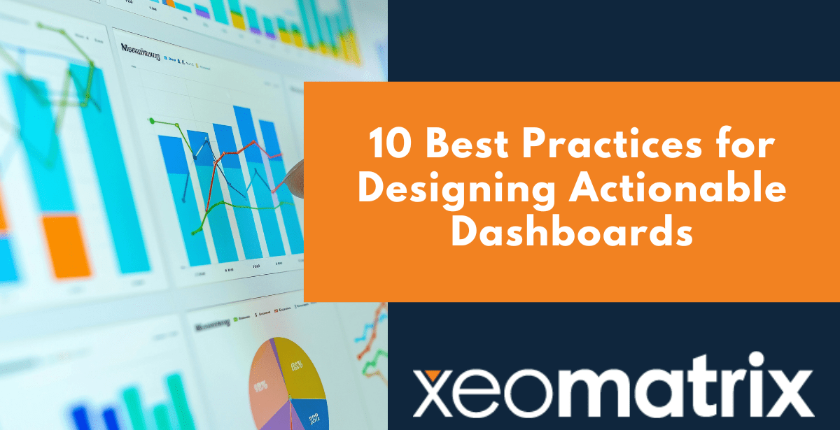
10 Best Practices for Designing Actionable Dashboards
1. Start with Purpose and Audience
The best dashboards start with a clear mission. Who’s going to use it, and what decisions do they need to make? A sales manager, a marketing director, and a CEO will each care about different numbers, at different levels of detail.
Before you sketch a single chart, talk to stakeholders about what “success” looks like for them. If you know their goals, daily responsibilities, and how they interpret data, you can design a dashboard that fits seamlessly into their decision-making process instead of adding noise.
Pro Tip: Ask, “If you had this dashboard open every morning, what would you want it to tell you?” Build from there.
2. Follow the 3-Second Rule
A user should be able to glance at your dashboard and understand its core message in three seconds or less. That means the most critical KPIs belong in the top-left corner, the spot our eyes naturally land first, arranged so the story flows logically.
Cramming too much on the screen or scattering key numbers in unexpected places forces people to hunt for insight, and that slows decisions.
Pro Tip: Map your layout to the “F-pattern” of reading: top-left for the most important numbers, then across and down for supporting details.
3. Use a Clear Visual Hierarchy
Not all data is equally important, so don’t present it as if it is. Use size, spacing, and placement to make the primary story impossible to miss. Bigger, bolder visuals should carry the headline insight; smaller, subtler visuals can handle supporting facts.
Grouping related metrics together also helps the brain process information faster and prevents “visual whiplash” from jumping around the screen.
Pro Tip: Imagine your user reading the dashboard like a story: big headline, supporting paragraphs, then footnotes.
4. Match Visuals to the Data
Every chart type has a job. Bar charts are great for side-by-side comparisons, line charts shine for trends over time, and scatter plots are ideal for spotting relationships. Pick the wrong one, and you risk confusing or misleading your audience.
Pie charts, for example, can work for showing simple proportions, but with more than a few slices, they’re hard to read and easy to misinterpret.
Pro Tip: If a chart doesn’t directly answer a question your audience cares about, it doesn’t belong.
5. Keep It Simple and Focused
A dashboard overloaded with metrics is like a meeting with no agenda, and nobody leaves knowing what to do next. Stick to the essentials that directly support your dashboard’s purpose. Too much data turns into static, making it harder for the important points to stand out.
Clarity beats complexity every time.
Pro Tip: Apply Edward Tufte’s “data-ink ratio”: strip away anything that doesn’t add value to the message.
6. Add Context and Comparisons
A number without context is just trivia. Is “$1.2M revenue” good? Compared to last month, last year, or your target? Context turns numbers into insight.
Use benchmarks, historical trends, and visual indicators like progress bars or arrows to signal whether performance is up, down, or on track. This helps users act with confidence instead of guessing.
Pro Tip: Whenever you show a metric, ask yourself: “Compared to what?” Then answer that question in the design.
7. Design for Interactivity
Static dashboards are snapshots; interactive dashboards are living tools. Filters, drill-downs, and tooltips let users explore data from different angles without cluttering the main view.
By showing the big picture first and letting people dig deeper as needed, you keep the layout clean while still delivering depth. This not only boosts engagement but also helps users self-serve their own answers.
Pro Tip: Use progressive disclosure—surface the summary, but let curious users peel back the layers.
8. Use Color with Intention
Color is one of the most powerful storytelling devices in data visualization, when used thoughtfully. Red can signal loss, green growth, and muted neutrals provide balance and contrast. A well-chosen palette draws the eye where it needs to go, making patterns and outliers easier to spot in seconds.
Go overboard, and you risk overwhelming the viewer with visual noise. Too many bright or saturated colors compete for attention and bury your main point. And remember: not everyone sees color the same way. For someone with color blindness, reds and greens may appear almost identical, so use patterns, labels, or contrast adjustments to keep your message clear.
Pro Tip: Limit yourself to 2–3 core colors, give each a clear meaning, and always pair them with labels or icons.
9. Optimize for Speed and Responsiveness
A dashboard that takes forever to load is a dashboard that people stop using. Speed is part of the user experience, and it matters just as much as design.
Reduce heavy visual elements, utilize caching where possible, and test across devices to ensure the layout works consistently, from desktop monitors to phone screens. Responsive, fast dashboards get opened more often, which means your data actually drives action.
Pro Tip: Use skeleton loaders or spinners to reassure users that their data is on the way.
10. Test, Iterate, and Refine
Your dashboard shouldn’t be frozen in time. As business needs evolve, so should your design. Watch how people interact with it, gather feedback, and make changes based on real-world use.
Small tweaks like rearranging a chart, adding a comparison metric, or simplifying a layout can have a big impact on usability. Ongoing iteration keeps your dashboard relevant and keeps users engaged.
Pro Tip: Schedule periodic review sessions to ensure your dashboard stays aligned with user goals.
Ready to Build Dashboards That Drive Action?
At XeoMatrix, we build solutions that empower teams to make smarter, faster decisions.
Whether you’re starting from scratch, improving legacy reports, or scaling enterprise analytics with Tableau, our data experts can help you create actionable dashboards that align with your goals and resonate with your users. Let’s work together to turn your data into a competitive advantage. Contact us today to get started.