Human Resources leaders are expected to deliver actionable insights with powerful reports. An HR Analytics Dashboard is an essential tool for tracking performance, identifying trends, and aligning talent strategies with organizational goals. HR analytics tools empower teams to visualize data clearly, making it easier to manage people and measure what matters.
In this post, we highlight five compelling HR dashboard examples built in Tableau. Each dashboard showcases how effective human resources analytics can support teams in transforming raw data into insights that drive real impact. Whether you’re an HR executive, analyst, or business leader, these dashboards illustrate the power of data-driven human resources reporting.
Tableau HR Dashboard 1: HR Executive Dashboard
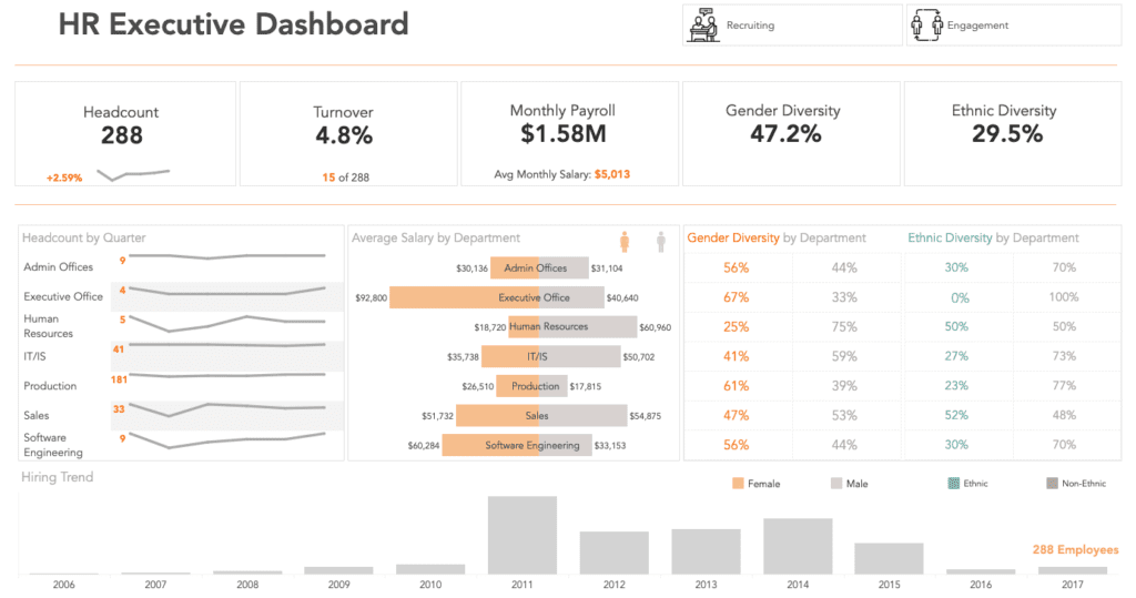
The HR Executive Dashboard provides a high-level overview of core HR metrics, including headcount, turnover, monthly payroll, and average salary. It also offers a detailed view into gender and ethnic diversity, both company-wide and broken down by department. The dashboard includes quarterly headcount trends and visualizations of hiring patterns over a period of time.
This HR metrics dashboard works well because it balances strategic and operational insights in a single view. HR leaders can quickly assess overall workforce composition, diversity initiatives, and payroll impact across teams. Its department-level breakdown helps identify disparities or opportunities for improvement, making it a valuable tool for executives and DEI stakeholders focused on meaningful HR data analytics.
View the HR Executive Dashboard to explore headcount, turnover, payroll, and diversity insights.
Tableau HR Dashboard 2: HR Analytics Summary
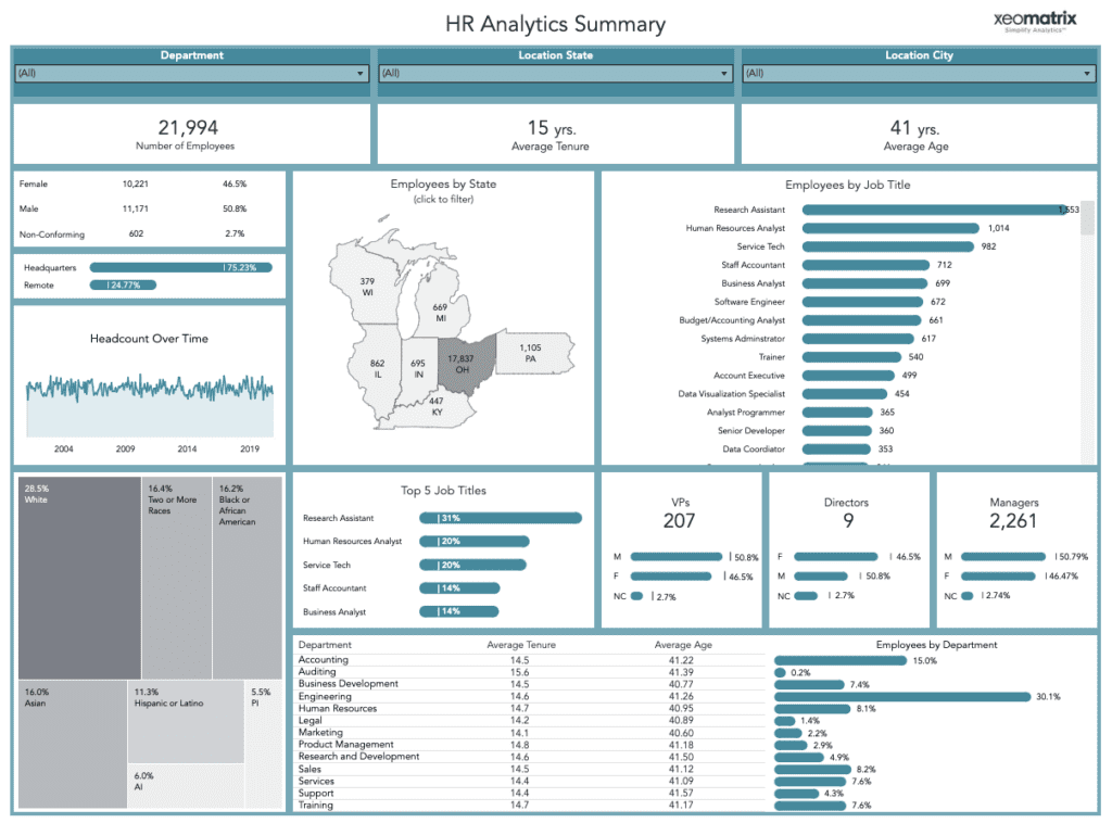
The HR Analytics Summary dashboard offers a comprehensive snapshot of a company’s employee base, broken down by gender, race, job title, location, and department. Key metrics include number of employees, average age, and tenure. It also highlights the top job titles, gender identity distribution (including non-conforming employees), and departmental comparisons of age and tenure.
This dashboard excels at surfacing detailed demographic and organizational trends that inform HR analytics strategies. Aggregating and filtering data across various dimensions allows teams to monitor workforce aging, track diversity, and support more inclusive hiring practices. This Tableau dashboard is one of the most effective HR dashboard examples for building equitable workplaces.
Tableau HR Dashboard 3: Human Resources Dashboard
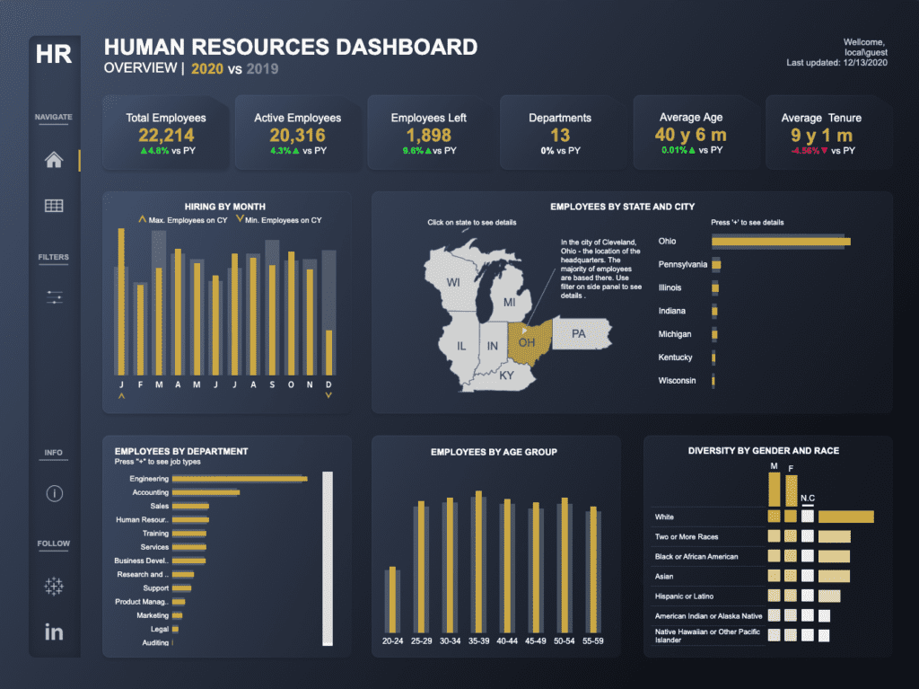
This interactive human resources dashboard spans two decades of workforce data, displaying employee distribution by state, department, job type, gender, race, and age group. Users can drill down into geographic regions or departments to analyze workforce diversity and tenure. Additional metrics like average age, monthly hiring trends, and separation rates round out the long-term view.
This dashboard’s emphasis on historical human resources analytics makes it valuable, helping organizations track long-term changes in employee demographics and department growth. This dashboard is handy for companies with regional offices or enterprise-wide initiatives that rely on scalable, actionable HR analytics tools.
Tableau HR Dashboard 4: Modern HR Overview
The Modern HR Overview dashboard combines a clean interface with deep insights into HR metrics such as headcount, labor turnover, absence rates, new hires, and performance scores. It also includes employee engagement, inclusion, and wellbeing scores—making it a well-rounded report for monitoring organizational health.
This dashboard is highly effective for human resources reporting because it prioritizes people-first metrics alongside traditional KPIs. Its visual layout makes comparisons across departments easy, and its focus on engagement and inclusion adds a valuable qualitative dimension to HR decision-making. This is a strong HR metrics dashboard for companies that prioritize employee experience.
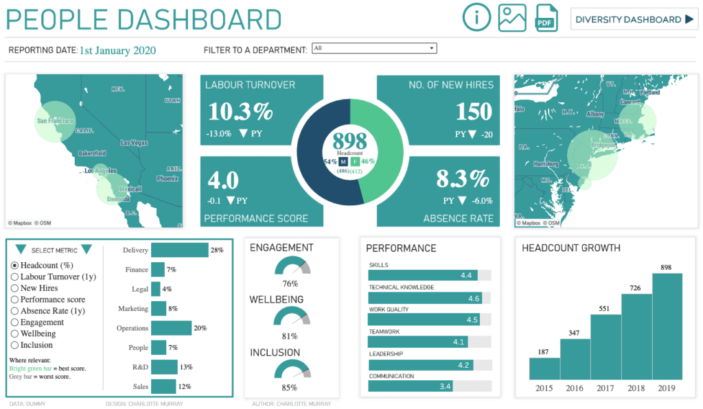
Tableau HR Dashboard 5: HR Dashboard – Modern UI
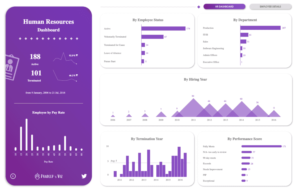
The HR Dashboard – Modern UI features a visually appealing interface that tracks employee status, pay rate distributions, termination reasons, performance scores, and departmental headcounts. Spanning data from a decade, it categorizes employees by performance rating and employment status, giving a well-rounded view of talent lifecycle metrics.
This dashboard works well for HR data analytics because it integrates compensation, performance, and turnover data in a single interactive view. HR professionals can explore how performance correlates with pay, identify at-risk employees, and analyze trends in voluntary and involuntary terminations. This is one of the most actionable HR dashboard examples for performance management.
Transform Your HR Strategy with Tableau and XeoMatrix
Harnessing the power of Tableau for HR analytics empowers organizations to turn workforce data into a strategic advantage. The HR dashboard examples showcased here reveal how smart design, meaningful metrics, and real-time interactivity elevate human resources reporting from a compliance activity into a strategic function.
At XeoMatrix, we help organizations modernize their data infrastructure and implement powerful HR analytics tools tailored to your people strategy. Whether you need to track inclusion goals, improve retention, or explore new HR metrics examples, our team can help you design impactful HR dashboards that deliver results.
About XeoMatrix
XeoMatrix is a trusted leader in data and analytics consulting, helping businesses transform complex data into actionable insights. Our proven methodologies ensure a streamlined approach to data visualization, reporting, and business intelligence, allowing companies to focus on analyzing trends, making informed decisions, and maximizing ROI. Learn more about our comprehensive BI and data warehousing solutions—reach out to us today!