The Data-Driven Community Meetup holds monthly webinars on business analytics and big data. Webinars are held on the second Wednesday of the month at noon (12:00 PM) Central Time via Zoom Webinars and will cover topics related to enterprise data management. Our goal with each webinar is to provide meaningful insights and actionable takeaways to simplify analytics so you can make better decisions.
We cover topics such as data strategy, data management, data warehousing, BI modernization, embedded analytics, and cloud migration and strategy. Learn how to build reporting solutions that drive your business demand based on your needs.
About the Topic
In this session, we explored how accessibility best practices can transform your dashboards into tools that truly serve everyone.
Guest speaker Roshni Gohil from MIT guided us through the principles of universal design, sharing how to apply them in data visualization to improve usability and access.
What was covered:
- Core principles of universal design and why they matter
- Accessibility best practices for dashboard layout, color, interaction, and more
- Key features to implement for better usability and inclusivity
This article includes a recording, transcript, and written overview of the presentation on Accessibility Matters: Universal Design Means Data for All (On-Demand Webinar).
Accessibility Matters: Universal Design Means Data for All Presentation Video
Accessibility Matters: Universal Design Means Data for All Summarized Presentation
In this session, Roshni Gohil explored how principles of universal design can make Tableau dashboards more inclusive, usable, and effective for everyone. Drawing on her experience with temporary impairment after a wrist fracture, she illustrated how everyday examples, such as door levers and curb cuts, highlight the value of designing for all users from the outset, not just for exceptions. This framework set the stage for applying similar thinking to data visualization.
The session introduced the audience to pre-attentive attributes, including color, size, shape, boldness, and position. It demonstrated how they create the “pop-out effect” that helps users quickly identify key insights. Thoughtful use of these features, paired with attention to color contrast and accessibility standards such as WCAG, ensures dashboards remain clear and distinguishable across different devices, lighting conditions, and for users with vision deficiencies.
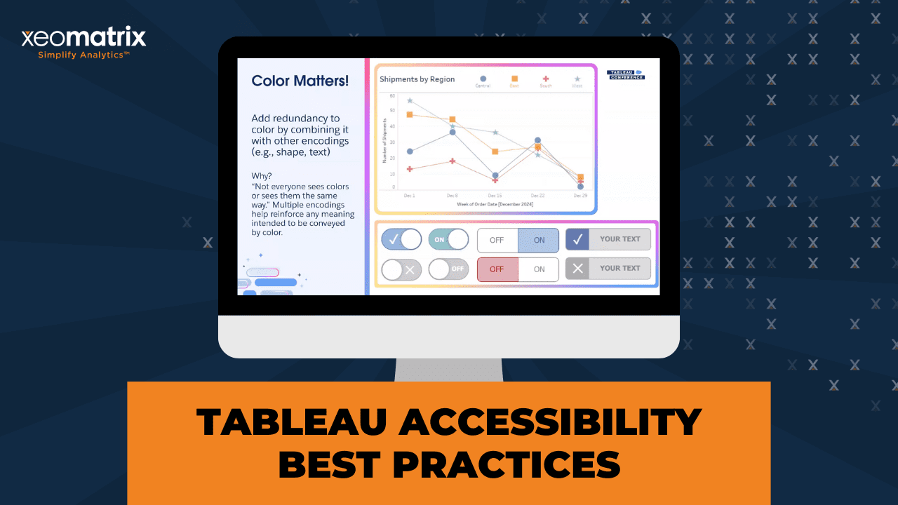
Beyond color, it’s essential to use multiple encoding methods, reinforcing information with shape, size, or text, so that meaning isn’t lost for users who perceive color differently. The role of hierarchy, layout, and consistent typography in guiding attention, alongside practical tools such as custom palettes, themes, and contrast checkers, that operationalize accessibility within teams.
Additionally, it is essential to perform usability testing with real users, as even small groups can uncover significant accessibility barriers. By combining design best practices with empathy and advocacy, developers can build dashboards that are not only functional but also accessible and welcoming to all.
Session Outline
- Universal Design in Practice
- Pre-attentive Attributes and Visualization
- The Challenge of Color and Contrast
- Reinforcing Information Beyond Color
- Size, Layout, and Hierarchy
- Words, Icons, and Alt Text
- Barriers and Workarounds in Tableau
- Usability Testing and Advocacy
- Conclusion
Universal Design in Practice
The seven principles of universal design are equitable use, flexibility, simplicity, perceptibility, error tolerance, low physical effort, and appropriate size and space. Some examples are:
- Door levers (usable by children, people with arthritis, or someone carrying groceries).
- Curb cuts (essential for wheelchairs, but also helpful for parents with strollers, delivery drivers, and cyclists).
- The “curb cut effect”, showing how accessibility features often become mainstream conveniences.
Accessibility often requires a “yes and” approach, such as providing both stairs and ramps, to address diverse user needs.
Pre-attentive Attributes and Visualization
To transition into Tableau practices, Roshni led exercises where participants counted numbers in grids, showing how certain features stand out:
- Color highlights differences (e.g., sevens in a distinct hue).
- Size makes elements easier to see.
- Boldness, shape, position, and grouping all contribute to what Colin Ware calls the pop-out effect.
Effective use of pre-attentive attributes enables users to discern meaning in data quickly. Attributes must be chosen based on their expressiveness and effectiveness in conveying the intended message.
The Challenge of Color and Contrast
Roshni described issues she encountered with color perception on multiple screens and in poorly lit conference rooms. Contrast, not just hue, ensures accessibility, especially for people with color vision deficiencies.
Some WCAG guidelines related to color and contrast:
- Normal text requires a contrast ratio of 4.5:1.
- Large text and non-text elements require 3:1.
You can test colors with tools like Coblis (color blindness simulator) and WebAIM’s color contrast checker. For example, people with color blindness can’t distinguish red and blue dots on a chart, so it’s important to test color contrasts.
Roshni shared how her team developed accessible Tableau style guides, stored accessible palettes in TPS files, and used tools like Alex Vlieghe’s Color Manager.
When brand colors don’t meet accessibility standards, offering alternative palettes gives users flexibility.
Reinforcing Information Beyond Color
Color should not be the only way to convey meaning. In addition you can work with:
- Adding shapes to line charts when colors blur.
- Designing toggles with both color and labels to remove ambiguity.
- Using consistent encodings across dashboards.
This approach, called reinforcement or multiple encoding, ensures information is perceivable by all users.
Size, Layout, and Hierarchy
Size also plays a critical role in accessibility:
- The squint test helps check visual hierarchy and readability of dashboards.
- Following WCAG guidance, interactive elements like buttons should be at least 24×24 pixels, with 44×44 pixels recommended for touch devices.
- Tableau’s default navigation buttons meet these standards, but show-hide buttons are too small and should be enlarged for usability.
Consistent use of font hierarchies (dashboard titles, worksheet titles, and text) and promoted Tableau’s custom themes feature and external theme generators for enforcing visual consistency.
Words, Icons, and Alt Text
It’s important to have clear icons, labels, and text alternatives:
- Usability testing revealed that icons alone often confused users (e.g., filter buttons misinterpreted as app settings). Combining icons with words made functions clear.
- Adding tooltips to buttons provided clarity for sighted users and was accessible via screen readers.
- Providing alt text for images and views in Tableau ensured low-vision users could understand purpose and context without visual cues.
We also have the resource of Tableau’s Data Guide, which allows developers to include dashboard or view descriptions and resource links, serving as an additional accessible layer.
Barriers and Workarounds in Tableau
While Tableau has made strides, it still has limitations, such as inaccessible tooltips on views. Developers should provide access to information through View Data as a fallback, ensuring that all users can access underlying content.
Usability Testing and Advocacy
It’s essential to conduct usability testing with actual users, rather than relying solely on colleagues or developers. Testing with even three to five representative users can uncover major accessibility barriers.
Beyond technical design, you should advocate for accessibility in your organization:
- Talk about colorblindness, button sizes, and descriptions when presenting dashboards.
- Join or start user groups like the Accessibility TUG.
- Share personal experiences with disability to build empathy and awareness.
Conclusion
Key takeaways:
- Design with pre-attentive attributes to make data pop.
- Use contrast checkers, simulators, and testing methods to validate design choices.
- Operationalize accessibility with style guides, palettes, and themes.
- Remember that words matter—in both dashboard labels and advocacy.
- Always test with real users, not just for function but for usability and accessibility.
Transcript
>> ROSHNI GOHIL: Welcome to Accessibility Matters: Universal Design Means Data for All. My name is Roshni Gohil, and I’d like to thank you all for coming to my talk today. This talk was inspired by the DataFam, by all of you guys, and some of the folks I’ve met through the Higher Ed tag and some of the other tags that Artelia talked about. I really hope that this talk inspires you to bring universal design and accessibility into your Tableau development process. I’m going to introduce you to universal design through my own experiences with a temporary impairment. I’ll share what pre-attentive attributes are and what the pop-out effect is, and what they tell us about universal design for visualization. We’ll also walk through a bunch of ways to use color, size, and text to build universally usable and accessible dashboards in Tableau. What is universal design? Let me tell you about it through my recent adventures in the fractured wrist department, and I will let you know from the get-go, it’s a little long story, but bear with me. As Sully mentioned, I work at MIT, the Massachusetts Institute of Technology.
I recently moved to the fundraising arm of the MIT Sloan School of Management. Until a couple of months ago, I worked at MITIMCo, the MIT investment management company, a.k.a. the endowment. MITIMCo’s mission is to earn outstanding long-term investment returns for the Institute so that students can get great educations and have access to opportunities, and so that faculty and researchers can continue to make discoveries to better understand our world and solve the world’s problems. One of our goals at MITIMCo is to cultivate an innovation ecosystem in Kendall Square, Cambridge, the home of MIT.
At the same time, we also want to engage and foster the larger community that MIT is part of, the residents of Cambridge, the students, faculty, and staff of MIT, and their friends and families, and anyone else who might work in the city or just visit the city. One of the ways that we do that is through our real estate department, whose data and processes I supported as an analyst. Not only do we build buildings, bringing biotech, tough tech, and other companies and their people to the area, and yes, those are actual LEGO models of some of the buildings we’ve built.
Our team actually helped build out the mosaic background behind that, which is the Charles River, which I can actually see right through my window, which is amazing. Anyway, we not only build these buildings and bring the companies in, but we also bring in retail and community spaces that help make Kendall Square come alive and be a place where people actually want to gather. Last summer, for example, we hosted a pop-up roller rink in what was once a parking lot. You can see the cars parked. You can see the lines of the parking lot there.
Yes, it was a roller rink, a full-fledged outdoor roller rink. We called it Rollerama at Kendall Common. A local artist, Massiel Grullón, helped design this amazing swirl design, dare I call it a swanky-sanky. She engaged her other artist friends to help make it happen. We had live music, free skate rentals, learn-to-skate events, all the things that you need for an amazing time. All of it was for free and open to the public. Of course, there were food and beverage concessions, and we got to raise some money for local nonprofits in Cambridge. As MITIMCo employees, we got to test-drive the Rollerama at a friend’s and family event the day before it officially opened.
Of course, I rolled right over. That day, we took Rollerama for a test glide. We made sure that the liability waivers worked. We checked out the free skate rentals. We celebrated the work that our colleagues had done to get the space rolling. As far as skating went, that first day went pretty well. I was a little shaky on my brand-new skates, but I didn’t fall, and I considered that a win. On the next day, the first official day of business, Friday afternoon, our summer interns convinced me and some other folks to go skating again. They really had to twist my arm.
I was still a little shaky on my skates, but going in basic loops was really no problem, and we were all having a blast. Then I lost my balance. My glasses fell off my head, and I fell, and I used my hand to catch my fall. I had a little bit of a scrape on my palm, but the glasses and I came out of that first fall relatively unscathed. No big deal. I got right back up and continued to skate. Then, a little while later, I fell again. Again, I used my hand to catch my fall. This time, the glasses stayed on, which is good, but everything did not feel okay. I had to coast on out of there and hang up my skates. My office, Dino Cyrus stole them.
I thought maybe I just sprained my wrist. A little rest, no knitting, a little ice, a little compression and stabilizing with a wrist brace, a little elevation, RICE. Everything would be fine in a couple of days, right? It was and it wasn’t. A few days rolled by, and the initial hurt and swelling was gone. In its place was a different kind of hurt. I was having trouble with little things like turning the handles on sink faucets and the doorknob on my front door. It hurt when I tried to squeeze water out of the sponge after washing dishes, and stirring anything, just forget about it.
I should also mention that the hurt wrist was my left one, and I am a lefty. A trip to MIT medical, some X-rays, and I learned that I had fractured my wrist. It was a tiny little fracture of the radius, tiny little bone shards, bone pebbles, I call them, because I watch too much Flintstones. Though there was no surgery, I was stuck in a wrist brace for basically the rest of the summer. I was medically cleared to do just about everything, but I had to wear a wrist brace all the time. I learned a couple of things from this experience. First, listen to Mariah.
I don’t know how many of you guys remember the 1995 music video for Fantasy, the one with ODB saying he and Mariah go back like babies with pacifiers. What is Mariah wearing while she rollerblades around the amusement park? Wrist guards, knee pads, and I wouldn’t be surprised if there were elbow pads under the hoodie. My orthopedist did say that I could continue to skate, provided I wear wrist guards. I now have wrist guards and knee pads, and elbow pads. They’re in the cabinet right next to me. He also told me that if I fall again, whether it’s because of wheels or not, that instead of putting my hand out to catch myself, I should tuck and roll.
Consider this a lesson for you all as well. Tuck and roll. Do not put your hands out to catch yourself. Another thing that I learned is that door levers reign supreme. All of those faucets and doorknobs that hurt to turn, they looked like this. I had to go grip the knob and then turn my wrist. I’m a lefty, so my go-to hand for gripping and turning those faucets and doorknobs was my left hand, the one that was attached to the fractured wrist. Fortunately, all the interior doors at my house have levers. Why? Levers are just easier to deal with when you’re carrying laundry or groceries or just moving things from one room to another.
They simply require a press. No gripping, no turning. In fact, they don’t even require hands. There’s one door at MITIMCo that I used to usually open while carrying a mug of tea in one hand and a laptop in the other. Whichever elbow was closest to the door, that’s the elbow that would just press down on the lever, and I’d get right in. While I was wearing the wrist brace, I could just lean my brace forearm on the lever and voila, the door opened. While my wrist fracture healed, I had a partial temporary impairment, a disability with a lowercase d.
Last summer, I just did not have the same range of motion, the same abilities as uninjured, clumsy, but still relatively able-bodied me. That experience made me realize some of the examples of universal design that are all around me. Door levers are a great example. Yes, they’re required in many buildings by ADA or the Americans with Disabilities Act, but they are universally usable regardless of ability and don’t require any need for adaptation or specialized design. They promote equitable use. Anyone can use them with or without a disability.
Kids with tiny hands have an easier time with levers and doorknobs, as do those with arthritis or other disabilities, gripping with their hands or turning their wrists. They’re flexible. You can use them with your right hand or left hand. You can use any method to open them: your hand, your forearm, your elbow, your knee, your laptop, the bottom of a mug of tea. They’re simple and they’re intuitive to use. It’s easy to perceive them and understand how they’re supposed to function. They’re easy to operate and they require very little physical effort.
They’re usually big enough and at the right level for most people attempting to use a door to use them. These seven universal design principles were developed by a working group of architects, product designers, engineers, and environmental design researchers led by Ronald Mace at the North Carolina State University. They can be used to evaluate existing designs, to guide the design process, and to educate both designers and consumers about what makes products and environments more usable. Though I may not call out these principles, we are going to see them in action throughout the rest of this talk.
Curb cuts are another familiar example of design intended to provide access to users with disabilities, but that can be usable by all. Let’s look at these two curb cuts. The slope makes it easier to go up and down. There’s no steps involved. With a curb cut, people and dinosaurs in a wheelchair or using a motorized mobility device, or even a walker, are provided a safe way to get to street level so they can cross the street.
Riding my bike and walking around Cambridge, I’ve seen lots of instances where curb cuts were actually helpful for those without visible mobility issues, like the 40-year-old on a scooter followed by a lady pushing a stroller, or the delivery driver with a heavily loaded hand truck trying to make a drop off, or the couple walking their teeny tiny dog that could barely reach the top of the curb, but could easily walk up the curb cut, or the person with a foldable shopping cart going on a grocery run, or all those times that I actually had to walk my bike across street crossings because I was walking with friends.
Who uses curb cuts anyway? The curb cut effect, this phenomenon where a much larger population benefits from the positive externalities of something that is designed to help individuals with disabilities, is something that we see all over our lives. Who uses speech-to-text to send text messages, or text-to-speech to hear messages via Bluetooth in their car? How many folks turn on closed captioning on their TVs? All of this technology was designed to improve accessibilities for those with disabilities, but it has a much broader usage. Many of these innovations were designed for disability first.
Universal design goes a step further and posits that our goal isn’t to design for the exception, for the disability, for the other. Rather, we should design more inclusively with an eye to remove barriers to use for everyone from the outset. Build to address a larger range of abilities rather than to solve for a specific disability. The challenge, though, is that sometimes the universal design isn’t going to work for everyone. Ron Mace’s original name for this movement was actually called barrier-free design. In other words, sometimes accessible design shouldn’t be a this instead, but rather it should be a yes and.
Here we have the stairs and the ramp. The stairs are generally quicker, while the ramp, it provides access, but it is the slow and long way to get into the building. Again, getting into the building, having access is better than not having access at all. I actually spy a second set of stairs here, and we’ll come back to it later in the talk. How does this all apply to a Tableau? I told you, we’re going to take the slow and long way. We’re taking the ramp to get there. First, let’s count our steps. Some of you might’ve seen a demo like this before, and I’m adapting it from where I first saw it in one of Colin Ware’s books, Information Visualization: Perception for Design.
This is audience participation time. I hope you guys have access to the chat. I want you to tell me how many 8s you see within the rainbow frame here. Feel free to just throw an answer in the chat. [unintelligible 00:11:31]. Okay. Heather. Heather’s got eight. Yes, the answer is eight. It probably took a lot of scanning through the rows and columns to count all the eights. The message here, it can be hard to find a data point in a sea of sameness. How many 6s in the frame here? Yes, there are indeed five. Every 6 here is a darker shade or color intensity than the non-sixes.
How many 7s? Ah, I see some new faces answering the chat. Yes, the answer is three. It was probably very easy because the sevens are a completely different color. The different color or hue makes the data pop. In other words, color matters. How many fives?
>> [PAUSE 00:12:21]
>> ROSHNI: All right. I’m seeing some threes, but it took a little while to get there. Because in order to get there, you had to scan the entire thing. Again, you got color, but here the rainbow of colors was not helpful. How many 3s do you see here? Yes, I got some quick eights. Here, the data point that we’re looking for is bigger than all the others. Increasing the relative size of something can make it easier to see. In other words, size matters. How many 0s here? I got some nines and that’s right. These 0s were easier to see because they had some added weight to them. Making a number bolder makes it pop.
How many 9s? Yes, the answer is 11. This is the most so far, but even though it might’ve taken a while to count them because there were so many, they were probably the easiest to see. Why? Because we’ve compounded some of the features that we’ve already seen. The nines are bigger, they’re bolder, and they’re in technical. Shape is another feature that can make a mark pop. It can be combined with color or other attributes. When shape and color mean two different things, that interplay could have unintended consequences. Here, if you’re looking for the fours, you may have gotten thrown off a little bit by the non-orange circles.
An object’s position with respect to others can make it more salient, like these 2s that are offset from the other marks, so can enclosures like this and grouping like this. All of these features that we’ve seen are called pre-attentive attributes, and they contribute to what Colin Ware calls the pop-out effect. When they’re used thoughtfully, a combination of pre-attentive attributes will make certain marks or annotations more salient than others. They’ll help things stand out or pop out. Visualization research has demonstrated that certain features are more effective than others at conveying information.
Some of them have more of a pop-out effect, and some are more expressive. They’re better suited to express a specific type of data attribute. If you wanted to use color to show quantity, for example, you wouldn’t use random colors like the categorical colors that I’ve highlighted here. Instead, you’d use a gradient of the same hue like on the left. You’d want to let these ideas of expressiveness and effectiveness color your approach, as it were, as you go to apply pre-attentive attributes in your work. Speaking of colors and speaking of work, when I visit my mom’s house in Texas, she’s in the Houston area, though, not Austin, but when I visit my mom’s house, this is what my remote work setup looks like.
There’s a laptop on the bottom left plugged into a larger monitor above it, and a portable monitor on the right. All of these screens are supposed to show the exact same orange desktop background. They clearly do not. Cindy Lopper, there is no true color shining through here. That’s even apparent when you look at a dashboard on the setup. Here’s Andy Kriebel’s visual vocabulary, the deviation tab, and I do love me a diverging stacked bar chart. What on Earth is happening here? The orange bars disagree– Oops. The orange bars disagree and strongly disagree are distinguishable from everything else on all of the charts.
The dark blue and the strongly agree is also pretty solid, but the gray neutral and the light blue agree are only easily distinguishable on the external monitor, the one at the top. On the laptop, they’re a little hard to tell apart, and on the portable monitor on the bottom right, not even going to try. Are my eyes playing tricks on me? No, because I experienced a similar effect in most of the conference rooms at MITIMCo, and basically, almost every conference room I’ve ever been in that has more than one monitor. Here’s one of the larger MITIMCo conference rooms that happens to be in the corner of the building, which means that there’s lots of windows.
There’s a projector on the ceiling that projects onto a screen in front of one bay of windows. On the wall across from the other bay is a monitor, and clearly drawn in here is where my laptop was sitting in the slides that follow. It was directly in front of and centered under the monitor. Under ideal conditions, the shades on the windows are pulled down, the lights are off, and all three screens show enough contrast between the colors. Here’s a zoom in on that diverging stack bar. Again, the colors look slightly different on each screen. I perceive them slightly differently, but the contrast is clear.
There are five distinct shades, dark and light, orange and blue, and a gray in the middle. I’ve been in that room for meetings well over 100 times. Of all of those meetings, how many times do you think those shades were drawn and the lights were off? The answer, zero. Usually, the shades are up at least partially, if not fully. On an overcast or cloudy day, this is what happens. The projector is washed out, and the distinction between gray and light blue is a little harder to see. If it’s even partially sunny, just forget it. That projector is toast, and my laptop monitor, surprisingly, wasn’t much better.
Only the external monitor, the one that was on the wall, seemed to show the colors as distinct from each other. If we turn on the lights, the projector, again, still a lost cause. My laptop is a little bit better, but only when the light blue bar is long enough. On that bottom bar where the light blue is super short, I have to zoom way in on my laptop to see where it meets the gray. Going back to the monitor, again, it’s pretty clear, but depending on where you’re sitting, the monitor might have a glare from the lights. All of these pictures were taken from straight on. If I was viewing in from an angle, the contrast would have been harder to see.
All of us experience these temporary blips in our vision, like when we walk out of a building in a full light and have to increase the brightness on our phone screens. These temporary situational vision deficiencies are not the only ones that humans experience. You’ve probably all heard of colorblindness, which is usually a permanent, often genetic color vision deficiency where a person has decreased or no ability to discriminate between certain colors. I’ve used Coblis, the colorblindness simulator, here to show what that diverging bar chart looks like under different types of colorblindness.
Variations of red-green colorblindness, the first full row of images simulated here, are most common. What matters here is not the actual color that’s shown, but rather something I mentioned a few times earlier, the amount of contrast between the colors. What exactly is the right amount of contrast to make colors in your Vizs universally or almost universally distinguishable? The folks at the World Wide Web Consortium, or W3C, housed at MIT, have developed standards called the Web Content Accessibility Guidelines, or WCAG. These guidelines say that an accessible website must be perceivable, operable, understandable, and robust.
What are Tableau dashboards but fancy webpages? What do the WCAG standards say about the perceivability of color? For normal text, let’s just call it under 18 point. The contrast ratio between a text color and its background should be at least 4.5 to 1. As the text gets larger, the contrast ratio can get smaller, 3 to 1. Just like that zoom effect that we saw on the bottom bar earlier, as the bar got bigger, it was easier to see the contrast. Same thing happening here. Then, for non-text elements, and in this case, the actual bars in that diverging bar chart, it should be 3 to 1.
How do you calculate that? I have no idea. Instead, I use a color contrast checker like this one from WebAIM. This excerpt from a chart is one of the inspirations for this presentation. When sharing the content at a MITIMCo staff meeting, the presenter was talking about the red dots, but joked they couldn’t actually figure out which dots were red versus blue because they have color blindness or some level of color vision deficiency. Running the colors through a contrast checker demonstrates that they really are hard to distinguish. The contrast just is not there. It’s a 1.34 to 1 ratio, not even that 3 to 1, that minimum that we need.
When I worked at MIT Central Fundraising Department, which is before MITIMCo, which is before my current job, I was tasked with building out a style guide for Tableau. One of the elements in that style guide was determining what colors to use to highlight content in tooltips. We tested MIT colors, cardinal red, and a variety of grays, along with Tableau’s default blue and orange, because I’m lazy. We tried them all against both a white background and a black background. What did we learn from the color contrast test? The easiest, and again, easiest because I’m lazy, option that passed was Tableau blue against a white background.
We tried it. You know what else is blue on the web? Links. Sure enough, we saw users trying to click the blue text in these tooltips to open up a link. This was a bit of a facepalm moment for me. I was so stuck on those color contrast ratios and using the easiest, a.k.a. no custom color palettes version, that I completely missed something so clearly obvious. Forget color vision deficiency, I had tunnel vision deficiency, but I’m bummed. Anyway, the other colors that did pass included MIT red.
Though it required adding that color to our color palettes, which we’re going to do it anyway, let’s just be honest about that, it was clear from both color contrast ratio checking and usability testing that using MIT red for our text highlights against a white background was the right choice. I’ll add one other thing that we did is we ran those colors through the Coblis color blindness simulator as well, and then used a color picker to grab the simulated colors, and then ran those simulated colors through a color contrast checker.
This two-step process, while very time-consuming, it ensured that not only did we have high enough color contrast for users with normal vision, but also for most users with color vision deficiencies, which was a cool thing. If you’ve gone through an exercise like that, again, time-consuming, you want to ensure that the colors that you’re using are not just a one-and-done thing. You want to make them usable. Tableau lets you store custom color palettes in a preferences at TPS file in your Tableau repository.
You can then share that file with others in your organization or at the– Because since you guys are consultants at the organization that you’re supporting, and then they can all be sure that they’re using the same accessible color palettes. Creating that TPS file does require knowing some XML. If you don’t want to mess with the XML, there’s this really cool tool by Alex Vlieghe from the New Zealand TUG. This color manager for Tableau tool helps you generate and update your preferences at TPS file by simple dragging and dropping. There’s some copying and pasting and a little bit of clicking, and it is a huge time saver.
If you really need to stick to your color brand palette that doesn’t offer sufficient contrast, you can provide those that need a higher contrast or colorblind friendly palette an option through a simple user-operated color palette, which this is the ramp that we can build in addition to the stairs. Andy Kriebel put together this super short video on it. It’s three steps. You create a Boolean parameter, you add it to the mark shelf and switch it to color, and then you assign a colorblind friendly palette to it. So far, we’ve looked purely at color, but what if we mix it up with other attributes?
Let’s look at this line chart at the top. The blue and green lines start to look the same to me when they get close to each other. It’s really hard for me to distinguish between them. If you look to the bottom chart, I’ve added a shape to each line to make it easier to differentiate central versus west. Even if the blue and green blend, it’s really hard to confuse a circle with a star if it’s big enough. Remember that blue and red dot example that inspired this presentation? Replacing those red dots with red stars would have made that low contrast issue not an issue, because again, it’s hard to confuse a star with a circle.
Here’s some toggles. Most in the wild, I see the type that is on the left, not just in Tableau workbooks, but all over the web. It’s just a toggle switch with a difference in color to presumably show on versus off. Every single time I look at a toggle like this, I need to think through it, like, “Wait, is this on or off by default?” Then I need to click it a few times to figure that out. You know what really helps? Adding a shape or words to differentiate the check means it’s on. Great. Oh, it says it’s off, wonderful. Completely unambiguous and clear.
These two examples demonstrate a WCAG principle around the use of color, that it shouldn’t be the only way that you convey a particular piece of information. Not everyone sees colors. As we saw earlier, not everyone sees colors the same way. Heck, the same person may not even see color the same way depending on lighting conditions, the device that they’re using, or other situational elements, like how sunny it is outside, or it’s just cloudy. Adding context through shape, size, text, whatever it is, to reinforce what you’re trying to convey through color, we call this reinforcement double or multiple encoding, has the potential to help all of your users.
When combining color or shape, you do want to be careful. Here, we’ve applied color and shape to show different attributes of the data. That multiplies the number of options a person has to keep track of, and can make a chart even more confusing. Just don’t mix your encodings. Finally, one more thing. Be consistent. If you’re using a color to highlight a type of ’80s leg accessory, do it consistently. Don’t use orange to highlight slouch socks and red for leg warmers in one chart and then switch it around the next chart. Just don’t do it. With that, we’re done with color, and let’s [unintelligible 00:24:57] on over the size.
Folks, I’m going to get real here. Size really does matter for your Tableau dashboards. This is a very important page in the Tableau documentation. I don’t want you to actually read it, but what I do want you to do is look at the screen and squint. Scrunch your eyes up really small and stare at the screen. What do you see? What stands out? All right. You can stop squinting. Does it look a little like this? What we just did was a squint test. The squint test is a design trick that helps you get an idea of how elements on your screen are grouped and understand the visual hierarchy on the page.
The big things, the headers, are what’s emphasized. Everything that got a little blurry, not so much. Here’s the Tableau User Groups or Tableau homepage, usergroups@tableau.com. I’m a TUG ambassador, so I’d be remiss if I didn’t tell you to go join a user group or multiple. There’s one for everyone. If there isn’t, you can start one. Colin Smith and Emily Kuhn, for example, started the Accessibility TUG a couple years ago because there was a need. If you want to learn more about TUGs, just go to usergroups@tableau.com or feel free to DM me on the Tableau community flag.
Anyway, back to our regular scheduled program. Let’s try the squint test again. Ready, set, squint. Okay. You can stop squinting. It probably looks a little like this. Again, big letters, all big and bold. The surprise here is that this image probably also popped. Images can be a great tool, but they can also steal attention, especially when they are so big. Here, it’s effective. In a Viz, it really depends. On a Viz, there may be additional accessibility concerns you should be aware of. Speaking of a Viz, let’s try the squint test on the Deviation tab of Andy Kriebel’s Visual Vocabulary. Go ahead and squint.
All right. Here’s what that probably looked like. Again, we’ve got headers. Let’s talk about headers. WCAG has a couple of guidelines on headings. Basically, that you should have them and that it should help you describe a topic or purpose or organize content. Seems simple enough, so how do you make that happen? First, we used typography to set up a visual hierarchy. The Big Book of Dashboards says that you should use three levels of font types and sizes, top level, mid level, and low level, to help your users see how the Viz is organized and to help them understand the relative importance of and relationship between the elements of the dashboard.
How does the three-level font hierarchy apply to the Deviation dashboard we looked at earlier? Deviation, the dashboard title is the top-level font. Individual chart or view titles are the mid-level font. Basically, everything else is low-level. How does that translate to Tableau settings? Let’s look at the workbook settings, which you can go to via the format menu and then workbook. Deviation, your top-level font should be tied to your dashboard titles font. Chart titles, your mid-level font should be tied to your worksheet titles, and everything else, your low-level font should be tied to worksheets.
Let’s say you found a combination of fonts that you like and that tests well with users, and that you want to reuse and maybe share with others on your team to build a consistent usable template. In 2025.1, Tableau introduced a new custom themes feature. You set your settings via the format menu and workbook, and then you export that custom theme from that same format menu. That generates a JSON file, which you can edit if you’d like. When you want to use that new custom theme, you import it again from the format menu. What if you want to make edits, but you also want to do a little bit more graphically?
That’s where the custom theme generator developed by LaDataViz, aka Tristan Guillevin and Jessica Bautista, comes into play. This free tool allows you to generate new custom themes as well as import and tweak an existing one. If being able to set all your Viz styles easily isn’t enough, I want to make one more plug for an accessibility feature that is really easy to overlook, but that can be key to helping low or no-vision users see the visual hierarchy in your Viz. WCAG recommends that the structure of a document, the relationship between parts of a dashboard, be programmatically determined or available in text.
What does that mean? Simply put, use the built-in dashboard and view titles instead of using text boxes that are creating dummy sheets for dynamic titles. Why is that important? Screen readers. A screen reader is an assistive technology that literally reads what’s on the screen out loud for users with low or no vision. Usually use a keyboard to navigate using tab, enter, and arrow keys to access different parts of the page, or in our case of a dashboard. When a screen reader sees a standalone text box or a dummy no-content view used for a dynamic title, it reads the title department. That’s it.
It’s not very useful to the user. Compare it to what happens when you use the worksheet title. Then the screen reader reads the title department, and it also sees that it is structurally related to the chart, and it goes on to read the chart for the consumer, so data visualization, bar chart of blah, blah, blah. The structural elements in Tableau convey information, structure, and relationships as recommended by WCAG. Take a look at these two charts. Would you believe me if I said the only difference between them is the size of the shape? If I were to tell you that there’s a tooltip on the red mark at the top, which Viz would you want to use to find out what’s in that tooltip?
My guess is you’re probably going to pick the one on the left. Why? Because it’s bigger, and you can see the shape more clearly, and you’d be able to hover over it more successfully. How many of you prefer to use a Bluetooth mouse instead of a trackpad or the touchpad that’s built into your laptop? I’m going to guess a fair number of folks because every time I have asked this, the answer is like, “Oh, don’t make me use the trackpad.” If I told you your mouse battery died and you don’t have a spare, you have to use the trackpad or the touchpad, it’s probably going to be a little annoying for you because you just don’t have the same motor control that you do with an external mouse.
Marks, buttons, and controls like filters are all interactive elements that you need to be able to point to, hover over, or click on. If the interactive element is too small for you to use effectively, if the target of your interaction is too small, that’s a problem. Fortunately, marks tend to have a bit of an extra halo around them. The specific scenario isn’t as bad as it seems. Buttons and controls, on the other hand, completely different story. Fortunately, WCAG has some guidelines around things that need to be pointed to. They say the target size should be a minimum of 24 by 24 pixels.
The enhanced guideline, which makes websites more usable on touch devices like your phone or a tablet, that’s 44 by 44 pixels. Just real quick pop quiz, and feel free to put the answer in the chat. How much larger is the enhanced button than the minimum? Anyone want to do some math? That math is taking a long time. 3.36 times larger is the answer. For folks who have difficulty moving the mouse or using a touch device, that extra little space of the enhanced standard it’s a very welcome change compared to the tiny, tiny 24 by 24 pixel button.
The good news is that by default, navigation buttons in Tableau they are 52 pixels high, which is great. Show-hide buttons, though, are that tiny 24 by 24 pixel size, which can be a little harder to use on a touch device. For those buttons or any custom buttons that you use, like the ones you might create by using shapes on a view, you should aim for 44 by 44 pixels. That will make the button big enough to be usable on more devices and by more users. That’s beginning to sound a lot like universal design. That’s enough on size. Let’s learn to use our words.
First, let’s talk about icons. One of my favorite features when it was first introduced was that show-hide button on layout containers. The ability to let the user show or hide extra, but still helpful information, so that I could make better use of the screen real estate I had, game-changer. Then, when I worked in fundraising, we tried to implement it on a dashboard that just had a lot of filters that most people weren’t going to use much. We use a simple funnel icon, similar to what you see in Excel, to show, “Hey, here’s the filters.” We really thought that that would be enough, but during usability testing of this dashboard, we found out that it was not.
Users didn’t seem to get what the icon meant. We went the complete opposite way, and we changed tracks. We went to an all-words option, but again, users missed it, or they didn’t know what filters meant in this context. We came away thinking that we weren’t using the correct words for our users. We changed tracks completely again and went to this wrench and sprocket design with the words show settings, words, and an icon. Surely they won’t miss it. They didn’t miss it, but they definitely thought it wasn’t for them. The gear made them think it was more like iPhone setting, so Tableau app settings, not the filters they would use for the dashboard that they were using.
In those discussions, though, we did discover that filters was the right word. We finally settled on this version with both the filter answer icon, similar to again, what you see in Excel, and it has the word show filters or hide filters. In testing, people finally got it. The icon was familiar enough, and the words were clear enough, hallelujah. We learned that using an icon alone presented an issue with understanding. What the heck does that icon mean? What happens if I click here? The small amount of text that you have room for on a neat little button, it may not be enough context for a user to know with certainty what will happen if they click on the button.
That’s where providing a text alternative for a button is key to improving usability and accessibility. Do I have to say the words? Yes, Brian Adams, you do. The good news is that buttons in Tableau have tooltips. When you go to edit a show-hide button, for example, you have this option to update the tooltip. When you hover, Show Buildings appears. The accessibility win here is that tooltips on buttons are screen reader accessible. That additional context that you’re providing for sighted users is also usable by low or no-vision users. These tooltips are a universal design win because you’re adding this extra context that just happens to help all of your users navigate.
When I started looking at this University Space Used Analysis workbook from the Tableau Exchange to find examples for this presentation, I was thoroughly confused by this little orange mouse pointer icon that I’ve highlighted on the right here. It’s on here three different times, but somehow, somehow I thought it was a show-hide button. When clicking on it did nothing, I opened up the workbook to investigate, and I learned it was actually an image. There are no words here, no words, none. I was a little slow to notice that there was also a gray cross-tab version of that same icon that appeared twice on the dashboard.
I’m relatively tech-savvy. I’m relatively aware of what goes on on the internet and with technology. It took me far too long to realize that the orange version meant that the chart it accompanied was interactive. The gray version meant the chart was not interactive. I was a little annoyed. I figured it out, but I was annoyed. Now imagine if all you could see was that the thing was an image. You had no idea what the image was. You had no idea why it was there, and you couldn’t distinguish the difference between the orange version and the gray version.
That’s what happens when you use a screen reader on an image in Tableau. That is, unless you add Alt Text. When you add alt text to an item, you can provide users that use screen readers information about what’s in the image. Is it purely decorative, or does it serve a purpose? Adding a description of the image, if applicable, and more importantly, the purpose it serves, provides key information to users who cannot see the image or cannot see it well. In fact, alt text goes beyond images in Tableau. You can now add alt text to views. If you right-click on a worksheet on a dashboard or go to the worksheet menu, you’ll see this accessibility option.
Tableau generates alt text for you, similar to the automatic caption that you may already be familiar with. As with captions, you can edit the alt text to make it more useful and informative. The extra bonus here is that alt text on the worksheet is screen reader accessible out of the box. With captions, you have to make that caption be visible on the dashboard in order for a screen reader to make use of it. That can feel like all that text is cluttering up the Viz. With alt text, the description is hidden. It’s hidden from sighted users, reducing potential clutter on the dashboard.
Oh, wait, wait, you say alt text is hidden from users not using a screen reader? Yes, that’s right, Cyrus. Sometimes things aren’t built for everyone, and that’s okay. Yes. Yes, LEGO Cyrus. I am supposed to be talking about universal design and building for everyone. Phew, thank goodness Flex has my back. There’s this additional feature that can be used alongside alt text that is usable without a screen reader, the Data Guide. Sorry, this is my new dino. My team at MITIMCo got her for me. Her name is Melizmata. She has an iHeartData tattoo on her.
Please note that Melizmata’s name does not rhyme with data or data, however you say it, but she is sassy and I can guarantee you she has some opinions on how to say data. All right. Sorry, tangent. Let’s come back from that. [laughs] In Tableau Server and Tableau Cloud, there’s a button in the top right that looks like a signpost. It is the Data Guide. If you click on it and you have a Viz selected, the top portion includes details about the Viz, including a description and any optional links to resources like videos or Wikipages or your company’s knowledge base, or document repository.
If you don’t have a Viz selected, it shows a description of the dashboard as a whole. Again, all of this text in the links, all of it is customizable. How do you get to it? In Desktop, that same little signpost lets you edit the Data Guide, updating the description and resource links for both the dashboard or the Viz. On the Viz Data Guide, you also have an additional way to access the alt text for the Viz. If you wanted to make the alt text and the Viz description identical, easy way to do that right there. We’ve seen a case where accessible design means extra steps, but what about these extra steps that I pointed out in the barrier-free environment sketch a while ago?
Those steps are a way for more able-bodied people to get to another level of the building, but they aren’t for those with some mobility issues. Unfortunately, Tableau has some of that too, but it is changing and it is improving. One of my favorite features in Tableau is tooltips. They let you add extra information, and with Viz and tooltips, you can put that information into easy-to-digest chart. The problem is that tooltips on views are not accessible. What do we do? Ideally, everything that we build is accessible by keyboard navigation and compatible with assistive technology like screen readers.
Ideally, we make sure the ramp is available and structurally sound. As noted in the Tableau docs on accessibility that are pictured here, all of the dashboard items that are in pink on the left and all of the features pictured on the right provide solid accessible structure for low or no-vision users. If the ramp can’t get somewhere, we do need to bring the content to the ramp. One of the simplest ways to do that is via view data. It’s not the best way to serve up data, but if the choice is between providing access to extra information versus not providing it at all, I’d rather provide everyone the data.
Making sure your end users can view data and download full data, and that anything that is contained within the tooltips or invisible tooltips is available via view data, that makes the data Rollerama open to everyone. Man, that was a very fast loop around the roller rink of universal design and accessibility. I hope you can take a few things away from this talk. First, remember the pop-out effect and how pre-attentive attributes contribute to building more universally usable design. Event techniques like the squint test and user research techniques like usability testing, along with tools like color contrast checkers and colorblindness simulators, can help you refine your design choices.
Once you’ve got something that works, operationalize it by using custom color palettes and custom themes, and tools like Alex Vlieghe’s color manager for Tableau and LaDataViz’s custom theme generator can simplify that process greatly. Second, words matter. Data Viz is about more than just the data. You need to provide pathways for sighted users and those with vision deficiencies, for users with motor issues, and those without. All users need to be able to get to the data and also understand the data and its context. The other side of words is advocacy.
Usability and accessibility can be easily overlooked when you’re building Tableau dashboards, so just stop it. Mention colorblindness, mention descriptions, mention button sizes, and all the other things that I talked about when you’re sharing a new dashboard design. Join the Accessibility TUG. We’ve got a meeting next month. Don’t remember the date, but go check out usergroups@tableau.com and look it up. Then, finally, share your own stories of disability. We’re in fact going to hear one of our new Accessibility TUG co-leads’ stories, her own experience with a disability.
Finally, test, test, and test again. Don’t just make sure that clicking this button makes that happen or that clicking a bar filters another chart. That’s user acceptance testing or UAT. That’s necessary, but it is not sufficient. Also, test your dashboards with your actual users to make sure that the dashboards help them meet their goals. Don’t make assumptions about what your users know or what they can see and are seeing or what they can easily interact with. Instead, test with them to confirm whether you’ve built something that’s both usable and accessible in your dashboard.
Universal design and accessible design, they go hand in hand. Sometimes one shakes into a cool little slip like this, or the other rattles around a bit, but often they simply rock and roll in sync. Thank you, everyone. I really appreciate you taking the time today. If you have questions, now’s the time.
>> SPEAKER 1: Thank you so much, Roshni. Wow. So much packed into such a short period of time. Thank you so much. Team, what kind of questions do we have for her today? Feel free to come off mute or put it into chat. We’ve got the chat open. I don’t think I’ve ever heard so clearly which devices within Tableau are accessible by a reader and which ones are not.
>> ROSHNI: One thing I want to point out there, like not all screen readers are built equally, just like everything else.
>> SPEAKER 1: That’s a good point.
>> ROSHNI: There’s a lot of depends. A lot of folks will be like, “I tried it with Windows Narrator.” In fact, that was my own experience. They’re like, “I tried it with Windows Narrator, and it was crap. It didn’t work. Nothing was accessible, blah, blah, blah.” Windows Narrator for most people who have low vision, that’s not going to be their tool of choice. There are free tools out there, like NVDA, I believe, is one of them. There’s paid tools, ZoomText, JAWS, a handful of others. They all have slightly different feature sets.
If you know that you are building for someone with lower no vision and you know that they use this tool or that tool, it’s not a bad idea to go and actually sit down with them or sit down with an accessibility person at the organization and say, “Okay, I want to test out this dashboard. Help me test it out.” Again, it’s one of those really easy ways. You take the time to sit and meet with someone, but it’s an easy way to both learn for yourself, but also learn from them about what their challenges are with using a dashboard and how you can make their life a little bit easier.
Every time I’ve done usability testing, whether it was for something that had an accidental accessibility to it or not, it was just a really great way to just build rapport and make your users understand that you actually do care about what they can do with the dashboard. It’s not just like I’m checking a box and getting this dashboard out so you have something, but I’m actually building something that you can use that can help you reach your goals.
>> SPEAKER 1: That’s really good. I’m actually really disappointed that tooltips are not accessible. Have you heard if that’s on the roadmap for them to change anything about that?
>> ROSHNI: It is. It is. I’ve heard over and over again that it’s coming. With every iteration of Tableau or every release that goes out, there’s usually something– It might be something small, but there’s usually something accessibility related. The accessibility team is really open to hearing feedback and being like, “Oh, this is something that’s really important to me or my community for this reason or that reason.” They are definitely working on it. Like anything else, there are so many features that push out with every Tableau release that it’s not always possible to fully test-
>> SPEAKER 1: Sure.
>> ROSHNI: -and get something working out the door. Again, they are great partners on trying to make Tableau as accessible as it can be.
>> SPEAKER 1: That’s great. That’s great. Then, can you say anything more about the user acceptance testing that you did when you were testing the– That was really interesting to see the series that you went through on settings versus filtering.
>> ROSHNI: Yes. Let me go back to the– I have way more built-out slides for this-
>> SPEAKER 1: I’m sure.
>> ROSHNI: -that did not make the cut here. Actually, we didn’t go in here thinking that we were really going to be spending a lot of time testing this little icon thing. We actually went in thinking, “This is super straightforward. Yes, it’s a new feature, but it’s super straightforward.” What we really wanted to test was all of the stuff that was in the menu that was hidden. The way we do usability testing, usability testing is something that is done for the web and for mobile devices, and even for products like a coffee maker. Are the buttons in the right places? Are the buttons well labeled?
>> SPEAKER 1: Sure.
>> ROSHNI: How easy is the coffee maker to use? What you do is you put a scenario in front of someone, a task that they would normally do, like, “Oh, I want to go–” This is fundraising. “I want to see who all of my prospects are in this region.” You know, as the developer, that region is hidden as a filter somewhere in the show-hide panel. The user does not know that. Your goal is to understand, “Okay, we’ve put this in the show-hide panel. Will they find it?” Then, there might be more subtasks after that, like, “Okay, you want to find your users in the Northeast who you haven’t talked to in a while.”
There may be more filters, or there may be more interaction that they have to do with whatever else is on the dashboard. Your task there is just to ask that question and sit and observe and see what happens. With this, we were testing iteratively. We tried one thing where we were testing one part of this dashboard, whatever it was, let’s say, feature set one. We tested feature set one. We learned some things about what was in the feature set, but we also learned a lot about that filter button. Then we tried part two with a different group. It was one of those things where I think we weren’t really– This goes back like six years or something ridiculous like that.
We weren’t really sure how they would take this piece or that piece or whatnot. We tried a handful of users. That’s all you need for usability testing, three to five users tops, because they will uncover the biggest issues that are going to trip up the larger set of your users, as long as they are representative users. If you’re just going to– You do usability testing on your own team, your own team, who are not going to be the actual end users or even remotely the end users, that’s a waste of your time. If you are able to pick three or three to five people from your actual end user base and have them come spend 15 minutes testing a feature, again, you will learn so much.
Then you can take those findings, fix the issues, add whatever other thing you’re doing in your new iteration, and then test again. That’s how we did this. I think this was four rounds of testing, all for one dashboard.
>> SPEAKER 1: Oh, my goodness. Wow. That’s amazing.
>> ROSHNI: It was time-consuming, but again, like I mentioned earlier, part of our goal with usability testing is to learn about our users and make sure that they understand that we actually do care about them. All part of the strategy was, okay, yes, we’re testing something. That’s what we’re saying is the real reason we’re doing this, but really the real reason is to build that rapport so that we have a really good relationship and can work well with these teams that we are supporting.
>> SPEAKER 1: Yes, that’s great. Really great. From our audience, anybody have questions about what we’ve discussed here today? Examples that you might like to share or show. Would love to hear from you guys. Lauren, have you had much experience with making accessibility features into the dashboards that you’ve been creating?
>> LAUREN: Yes. No, I have more recently, especially– I’m trying to think of the tools that I’ve used. I’ve learned about more tools. I’m excited to start using those and incorporating those in my future presentations on stuff.
>> ROSHNI: Excellent. I’m glad that you have some takeaways from today.
>> LAUREN: Yes, thank you.
>> SPEAKER 1: All right. Unless anybody else has anything else to add, ask. We’d love that you guys carved out some time during the midpoint of the week to spend with us. Mostly, thank you from the bottom of my heart. You’re awesome. Such a rock star in the Tableau community. Just really appreciate you curating this content for us to consider and digest and challenge our– To take it to the next level on making sure that the Tableau data accessible for all is actually true. Remember that was one of their initial [unintelligible 00:50:19].
>> ROSHNI: [crosstalk] That’s actually where I got the title from. I was like, “Yes, university design for all.”
>> SPEAKER 1: Yes, for all.
>> ROSHNI: I really appreciate you guys having me here. If you ever have any questions, feel free to reach out to me again on the Tableau community Slack. Just look up my name. I’m probably the only Roshni Gohil on there. I’m always happy to answer questions.
>> SPEAKER 1: Awesome.
>> ROSHNI: I hope to see some of you guys at the next Accessibility TUG, which again is sometime in September. I should have the date ready, but I don’t. [laughs]
>> SPEAKER 1: You are correct. I know we’ve mentioned this before, but I’m going to keep saying it because there is such a vibrant Tableau community that is available, and they’ve consolidated access to all the different forums and resources, ambassadors, visionaries, folks who are just avid users and into the Tableau community Slack channel. We’ll make sure that that– Thank you. The user groups. Those are two really amazing resources with people who are living and breathing this day in, day out, and would be glad to jump in and have conversations about all of it together with you. Please know that that is a really good resource. You want to describe what you’re sharing there?
>> ROSHNI: Yes. This is the user groups page. There’s information about upcoming events. If you’ve heard of Tableau Next, there’s actually a virtual hackathon that’s in place, and there’s more information there, along with that had some basically office hours and training sessions.
>> SPEAKER 1: If you scroll for just a second, do you see that banner? Y’all see that one with the state of Texas on it? If you happen to be local, if you scroll down just a tiny bit, tomorrow we are hosting the– Not we as the XeoMatrix, but XeoMatrix is a sponsor of it, but the Austin Tableau User Group is hosting the Iron Viz Champion, who is a local guy. He works at Apple-
>> ROSHNI: Bo McCready?
>> SPEAKER 1: -here in Austin. Yes. We’re going to be doing that tomorrow.
>> ROSHNI: Bo is one of the nicest guys in Data Viz. I’ve met him a handful of times.
>> SPEAKER 1: Yes, he is. So true.
>> ROSHNI: He’s like, oh, my God, such a sweetheart. While we’re here, I’m going to plug the higher education Tableau User Group. Then, under-
>> SPEAKER 1: Awesome.
>> ROSHNI: -belonging is where the Accessibility Tableau User Group lives.
>> SPEAKER 1: Great. Good. I’ve never seen this page before. This is awesome. [laughs]
>> ROSHNI: There’s so many user groups out there. A lot of them are virtual. Regardless of where you are, you can usually attend at least one a day on weekdays, if not more, but they’re a really great resource. Go check them out.
>> SPEAKER 1: Everything from construction to sports management, sports analytics, to video game, consumer analytics, there really is just something for everybody out there. I’m seeing a lot of credit unions. If not, you should start one. [laughs]
>> ROSHNI: You can start one. There is a starter group, and every quarter, they go through the applications, and there’s a whole lot of support behind user groups as well.
>> SPEAKER 1: Yes. So true. All right, my friend. We’re at the top of the hour.
>> ROSHNI: [crosstalk] Thank you, everyone.
>> SPEAKER 1: Thank you so much for your time. Thank you, Lauren. Thank you, team, and thank you, folks, for joining in. We’ll be sending the recording out on the emails that were registered. We’ll look forward to seeing you all next month.
>> [00:53:40] [END OF AUDIO]