The Data-Driven Community Meetup holds monthly webinars on business analytics and big data. Webinars are held on the second Wednesday of the month at noon (12:00 PM) central time via Zoom Webinars and will cover topics related to enterprise data management. Our goal with each webinar is to provide meaningful insights and actionable takeaways to simplify analytics so you can make better decisions.
We cover topics such as data strategy, data management, data warehousing, BI modernization, embedded analytics, and cloud migration and strategy. Learn how to build reporting solutions that drive your business demand based on your needs.
About the Topic
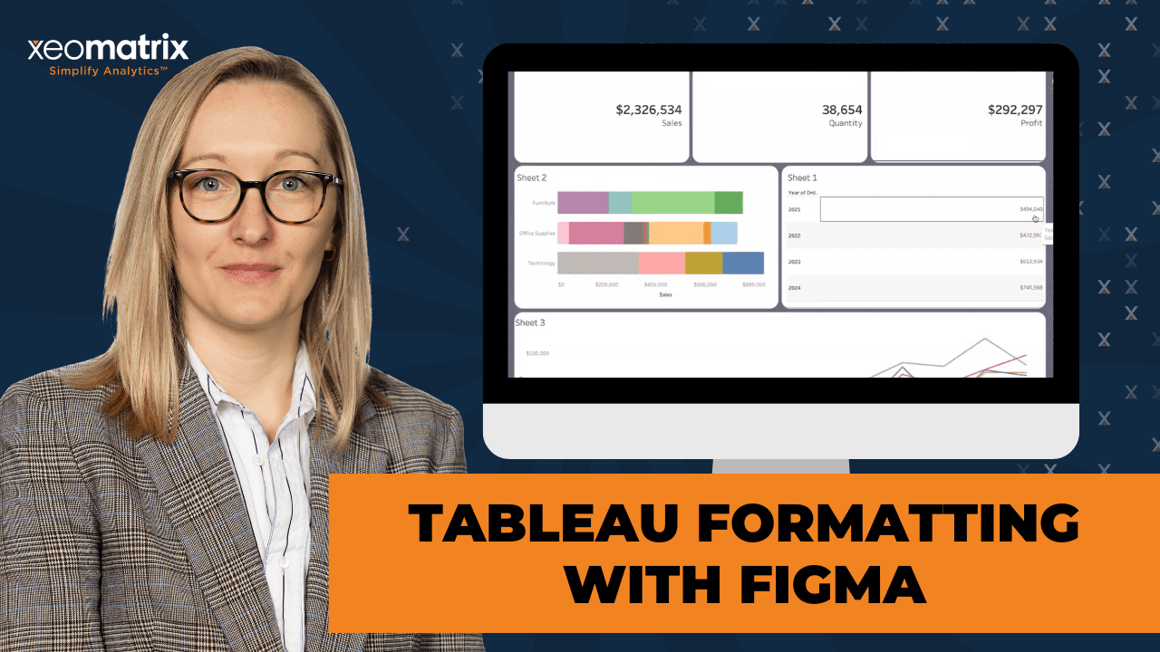
In this webinar, we explored how to enhance the visual appeal of your dashboards using custom Figma backgrounds and layout best practices. Learn how to create sleek, professional designs that not only look great but also improve usability and engagement.
We walked you through practical techniques for integrating Figma with Tableau, optimizing layout structures, and ensuring your dashboards are both functional and visually compelling.
This article includes a recording, transcript, and written overview of the presentation on Advanced Tableau Formatting with Figma (On-Demand Webinar).
Tableau Formatting with Figma Presentation Video
Tableau Formatting with Figma Summarized Presentation
In this session, we explore advanced formatting in Tableau using Figma for layout prototyping. While Figma is typically a graphic design tool, it provides templates, UI kits, and wireframes that are highly useful for Tableau users to build polished dashboards.
Lauren showcased her collection of reusable Figma templates, emphasizing the value of saving and repurposing designs across projects for consistency and efficiency.
Session Outline
- Building a Layout in Figma
- Figma Techniques Demonstrated
- Exporting from Figma to Tableau
- Integrating Figma Layouts in Tableau
- Building Visuals in Tableau
- Advanced Layout Tips in Tableau
Building a Layout in Figma
The core of the session focused on constructing a sample dashboard layout in Figma:
- Basic Structure: Starting with a simple rectangle as the base, the presenter added containers to mimic Tableau dashboard sections.
- KPI Cards: Several duplicated KPI blocks were created at the top of the layout.
- Chart & Table Areas: Space was allocated for a bar chart and a table, with careful attention to spacing and grouping.
Figma Techniques Demonstrated
A variety of useful Figma formatting tricks were shared:
- Grouping & Alignment: Elements were grouped using hotkeys (e.g.,
Control+G/Command+G), and spacing was adjusted using Figma’s alignment tools. - Auto Layout: The auto layout feature helped enforce consistent padding and alignment. Special attention was given to allowing space for titles, filters, and navigation bars.
- Corner Radius & Colors: Rounded corners (radius of 20) were applied in bulk to dashboard elements. The presenter selected colors from Figma’s built-in palette and noted that custom hex values could also be used.
- Canvas Sizing: Dashboard dimensions were discussed, with 1300×1000 pixels suggested as a default for compatibility with Tableau Cloud and general monitors. The presenter emphasized planning dashboard height/width based on how users will consume it (e.g., web, PDF, PowerPoint).
Exporting from Figma to Tableau
Once the Figma layout was complete:
- The frame was named (e.g., “demo background”) to aid organization and ease of export.
- The layout was exported as a PNG and brought into Tableau as a background image.
- A key tip was to group all design elements before export to ensure nothing was left out or misplaced.
Integrating Figma Layouts in Tableau
In Tableau:
- A new dashboard was sized to match the Figma layout (1300×1000).
- The background image was added using the Image object and set to centered without additional padding.
- The presenter recommended floating the image and layering other objects above it.
Building Visuals in Tableau
To demonstrate the full workflow, several visuals were created and layered over the Figma background:
- Bar Chart: Sales by Category colored by Subcategory.
- Line Chart: Sales over time, switching from quarters to months.
- KPI Cards: KPIs for Sales, Quantity, and Profit were created using Measure Names/Values, with special formatting for size, alignment, and text hierarchy.
- The default number formatting was updated for fields like Sales and Profit using “Default Properties” to ensure consistency across all sheets.
Advanced Layout Tips in Tableau
The session closed with advanced dashboard layout best practices:
- Controlled Floating: Initial layout was built using floating objects, then transitioned into containers to allow flexibility and easier management.
- Container Nesting: Horizontal and vertical containers were nested to match the Figma layout. A “grandparent container” was created for global dashboard resizing.
- Background Transparency: Default white sheet backgrounds were removed using the formatting pane to allow the Figma design to shine through.
Transcript
>> Today we’re going to talk about some more advanced formatting in Tableau through using Figma. If you guys aren’t familiar with Figma, I can just bring that up. So [silence] Figma is a graphic design tool, but they have a lot of really cool resources like UI kits and wireframes that can help you enhance your dashboards. There’s a lot of these on Tableau Public that use Figma or background tools like Figma. Basically, we’re just going to create a sample layout. Then I’ll show you how to put it in Tableau and make everything work in real life. [silence] Over here, I just downloaded the Figma desktop app. Here are some of my templates that I’ve used on other projects for clients. Sorry, just letting people in. It’s hard being the host and presenter. I like to keep all of these templates together, because it helps me when I go to a new project, I can look at my old templates, and it helps me be organized. It’s really hard to start from scratch sometimes. It’s nice to have something visually there that can help start that whole design process.
Now, to get something like one of these templates, Figma has a weird– I wouldn’t say it’s a steep learning curve, but it’s definitely different. Once you start creating these, I’d say it’s pretty easy. I’ve made a lot of these, and these aren’t even all the ones I’ve made. Over here, I have some sample charts, so we can see what it’ll look like with charts with dummy data. If we start here, we’ll draw just a rectangle. That’s usually how I start out. Then I’ll start making more containers. These will basically be like our containers in Tableau. I’ll just bring that to the front. We’ll want to change the color.
In this case, maybe we do a few KPIs at the top. You can just use the hotkeys to copy and paste those objects, and they’ll come up over here as well. Let’s say we have a couple KPIs, few KPIs. Then generally, I’m sure this is looking pretty familiar for a lot of you. Let’s say I want a couple other sections. We could have this one be like a bar chart or something, maybe a table. Then below it, maybe we have a longer section. Right now, all of these look crazy because they’re not evenly spaced, but it’s actually really easy to get everything to be evenly spaced.
First, I’ll start grouping these. To do that, you’ll hit Control+Command if you’re on Mac or Shift, just depending on where you are. When you’re in the pane like this, you want to hit Shift. We’ll group these objects. That’s just Control+G, Command+G. Then over here, you can adjust the spacings. If I tell it I want everything to be 18, maybe even– let’s do 20. Now that’s 20. Now if we group the group with this other section that we made, and Shift, Control+G, now we have those groups, so we can keep adjusting the spacing. This isn’t the only way to do it. This is just how I normally do it.
Figma also has auto layout, which I’ll get to in the next part after I group these together. I just realized that was 18. That isn’t quite fitting, so I just dragged it, and it’ll have those Xs. It almost feels like PowerPoint sometimes, like a more polished PowerPoint. You can keep track of your groups over here as well. You can have nested groups. Like here, for example, we have a nested group, technically. If I do Command on the side, and then group those together. Now we have everything grouped together, all of our elements. If we just adjust that spacing, things are starting to come together.
The next trick I like to use, so if you have a title section above, this can make it a lot easier, just make sure everything is spaced and padded consistently. I have this group, if I group it again, so I just right click, group it again. Then right click on that new group that we made, and we’ll add an auto layout. We’ll make sure that we’re selecting this frame that we made that has the auto layout. I’m just going to make it so that it’s the exact same height and width as our background container. Then you come over here. I usually just tell it to be in the center, but that doesn’t matter as much.
Then we can really get into the padding. If you hit the individual padding, we can make it so that everything– let’s say we want everything to be 20, except for on the top where we’re going to have our title, I usually make that 90 and leave some room for filters and what– navigation or anything else you might want up there. Make sure all those sides are 20. Now this still isn’t fitting exactly. To do that, we select the group that’s under that frame and we go to the dimensions, and we’ll do fill container and fill container. Now everything is fitting within our frame.
We can adjust the padding more if we want to. This would just adjust those spaces within it. It’s like adding additional padding. Sometimes when you adjust the height and width, that spacing within another group will need to be adjusted again. It’s just always good to check for consistency. We can take this back to 10. It didn’t do very much anyway. The other part of this is that we need to think about how big we want this to be in Tableau. Usually my dashboards are 1,300 by 1,000, but I’ve also made a lot that are, depending on how– if you want to export to a PDF, the width will be narrower and then the height might be longer. If you want a PowerPoint, then it would be wider and shorter.
It really just depends on how you plan for the users, your end users to consume and share the dashboard. A general rule for me is I just do 1,300 by 1,000. We have all this laid out. This is way too big. One important thing to call out for Figma is that this width and height are almost one for one in Tableau. We don’t want a dashboard that’s quite this wide. That would be a lot of scrolling for most people unless you have a huge monitor. They modify this to be 1,300, let’s say, and then 1,000. Oh, but see, we only did that for the frame, and that was 100.
We need to group and this is good to keep in mind, and it’s not a big deal because it’s really easy to group everything together here, but we need to group our rectangle with our rectangle background. If we group this together and then we tell this container to be the same size, and it did make our frame smaller, but that’s okay. Can we adjust that here? Just making sure that those things walk into place. Awesome. We got that laid out. Some of the other nice things like what I’ve done over on some of these is adding a drop shadow or rounded corners.
To do that, you select the individual rectangles in this case and you go to corner radius. We can adjust the individual corners or we can just adjust all of them. I think in this case, it’s just easier to adjust all of them. The next one, we’ll just keep doing that. If you don’t feel like going through all of these individually, then if you select them using Shift– Oh, too many clicks. Sometimes this is easier on the navigation pane. Select these rectangles, this rectangle, and all of these. Now I’m going to tell it corner radius, give me about 20. Voila. Now all of them are formatted with the same corner radius and you didn’t have to go through that step and type in that 20 for every single object, which is nice.
Next. We can really pick any color. It’s nice, Figma has a lot of these libraries. You can upload a custom palette or put in a hex code. Or you can just use one of their out-of-the-box colors. That might be a little too purple. There we go. I just feel like you don’t see purple enough. Can make the background purple. Now we have our background image that we want to use. Over here we can rename it. You don’t have to do this. It’s just it can be easier if you have a lot of– because you can see I have a lot of these on the side. It’ll be easier to find. You can search for it, it’ll come right up if you have a lot of these templates that you’re making.
Then when you export so that you can use it in Tableau, it’s also easier to find just on your desktop. Let’s call this demo background. We have our demo background. If we want to try out any of these different charts that I have over here, we can adjust these. Bring him to the front. Oh, and you know with the auto layout, it doesn’t always like when you do that. Let’s just send that back.
>>
>> Oh, actually, this is good. It’s always going to think that you’re bringing in something to add to that auto layout and it’s going to try to make room and it’s going to get funky. If you just lock it, then you don’t have to worry about it. I know I just took that chart out of the frame. Let’s put him back where he needs to be. We’re going to select that whole group with the frame. There we go. See, and now you can start laying it out before you go through the time and effort of building things out in Tableau.
It can be helpful sometimes when you’re not sure exactly how you want to visualize, and maybe you’re waiting on the data and you’re trying to trying to plan, in the meantime, how you want things to be visualized, then this can be a good way to do that. Then you end up saving yourself time later. Now if we take this guy, let’s say we want a table. Maybe we put the table down here. It doesn’t have to be perfect since it’s just a mock up. Put our sample bars. Maybe one of these KPI cards.
>>
>> Now this is really coming together. Now that we have a plan in place, we have our background made, we can actually just go back to our demo layout. Since I named it, I’ll just search for it up here. We can select it. We can unlock it. Actually, that’s something for me to learn too. Actually, if it’s locked, you can still export it. I don’t normally lock it. We’re all learning something new now. If we just export that, and it’s fine as a PNG. We can save it to the desktop. You can also do a preview. It’s not taking these charts with it because we had it locked and these aren’t actually a part of the group. When you’re exporting, you need to make sure that you’re selecting all of the contents and not just a part of them.
If I go in here and let’s say I just select this group under the frame and we go to export and then preview, we lose that background because we’re only selecting a part of it. Now I’m going to try to take some questions before I take this into Tableau. Let’s see. Someone asked about the recording. Yes, we’ll send out the recording. It’s always available on our meetup page. We’ll make sure that you get a copy of the recording after today. We’ll send out an email.
I see that Evelyn asked, “Why did you choose that sizing?” I’ve just found that 1,300 by 1,000 usually fits the best in cloud or really just on general monitors. Also with the padding, I think that using 20 seems to be like a good, even amount where there’s enough buffer without too much buffer to where you have blank space. I did make these charts in Tableau and then I exported them as just SVG, which is good to know. When you export as an SVG and then you pull it into Figma, you can actually go into the individual elements and change them. Whereas if it was a PNG or a JPEG, you wouldn’t be able to do that. It would just be one flat image.
Oh, and then for the standard dashboard size. It could be any size. That’s just the one that I feel like fits the best on my monitor, and just on cloud, it seems to look the best. It’s really a personal choice and like depends on how many objects you have. If you have a lot of charts, then you’re probably going to need some more room. I say always go for more vertical scrolling, some more height than width, because if you’re on a Chromebook or like a standard Dell laptop, you don’t have a lot of real estate in terms of like the width of your screen, so it can get difficult when you’re trying to keep organized and you have to keep scrolling up and down, and left to right.
Oh, the SVG. These are just from Tableau. I built these out and then I exported them as SVGs. If you go into your dashboard– actually, let’s, since we’re talking about that. It’s just dummy data from Excel, whereas here I’ll use Superstore. Up here, if we– where is it? I’m always losing it. Oh there we go. I actually had something here. Let’s just put a date out there, then make a dashboard. Here’s the table. This basically just exactly what I did. I just changed the size sometimes depending. Now we go to dashboard, export image. This is where you can choose it to be that scalable vector type.
If I save that, I go back into Figma. Then I say to insert an image. You can see all my other ones that I was inserting. We can take this dashboard SVG and it’ll just pop right in. That was a good question, because if you guys want to do this yourselves and have maybe different types of charts or tables, maybe use some of your own data to test out different metrics that you want to visualize, then this can be really helpful. If we go back to Tableau, and before we build anything out, which I know seems backwards, but we’re going to start, instead of with a sheet, with a dashboard.
We’re going to go into size and we can resize this to be the 1,300, 5,000. Then from objects, we’ll do image. We can choose from a demo background, open. We don’t need to fit the image because it’s already to scale, but we can center it. Sometimes if you want to add additional padding, it can get wonky, so selecting to center it is a good idea. Now our Figma background is in Tableau. It’s just using that image, we’ll tile it so that it’s always in the very background, or it’s sent all the way to the back. I usually remove the padding just because I think it looks odd to have that frame around it.
There’s a hidden layout container padding, fun fact, by default, so we’ll remove that as well. To get to that parent container, that layout container this image is in, when this gray bar is at the top when you’re selecting a sheet or an object, if you double click it, it’ll select the container that it’s in if it’s in a container. If you double click that, it’ll keep going through all of the containers and sub-containers, because containers definitely can be easily lost within each other and everything.
You can always use the item hierarchy. I think this is something that is really underutilized in Tableau a lot of times, especially with formatting. It’s nice to have where you can select things from over here or you can double click from where you normally would, or you can hit the drop down and select the container. There’s always multiple ways to do things in Tableau. You got options, which is nice.
Now that we have our background in here, we’ll build out a couple sheets. In this case, let’s do sales. We could use the ones that I used for those SVGs, but I think using Superstore, since everyone has Superstore, might be a little easier of an exercise to go through that you can recreate on your own. Let’s do some bars. We have our sales on columns category. Maybe we color it by subcategory. We can leave our legend, that’s fine for now. I won’t get too into worksheet formatting. Here’s one of the visuals to put in there.
Now when we drag this in, and I just made this mistake, we don’t want it to be tiled – that’s always the default – we want it to be floating, which I’m usually very against floating. I like to call this a controlled float. What we’re going to do is we’re going to lay everything out just floating for now. Then once we have things looking the way that we want, everything oriented the way we want, we’re going to put everything into containers and then eventually have it be nested in one massive container that will be floating.
That way if you change the size of your dashboard, you’re only having to adjust one object, which is that massive great grandparent container, instead of having to go into every individual item. Which I know I always used floating when I started in Tableau. I can’t tell you the amount of hours I spent just trying to reposition every object after I just made one small change to the size.
We have this sheet. Maybe we’ll bring in that table as well. Just going to make that entire view so it fills out the space a little better. We can go back into that table, just add any value. Actually let’s put our table– no, we can put it up here. We could even do the line chart down here instead if, let’s say you have a really long X axis, it’s better to have all that width to fit everything in. We can do our order date down to the day. Do our sales. We have crazy lines. Maybe make this a little bit easier to read. Let’s do based on quarter. Then we can see some year over year with that quarter by dropping in the year of order date onto color.
Entire view. That’s not super interesting Maybe we change this to month. There we go. We’ll go back to our dashboard. It is floating this time. That’s good. Progress. You can’t make everything floating by default. That is a good question That was my last selection, was floating. If that was the last selection you made, it’ll stay floating, but if I made a new dashboard, oh, that’ll stay floating too. It’s little things that you don’t think about when you’re developing all the time. That’s cool. That’s good to know. As long as that’s the last selection you made in the current workbook, then it’ll always default to whatever you made. When you create a new workbook, it’s going to default as tiled.
A lot of good questions today, guys. We have this floating. Let’s make a couple KPIs. Trying to think of some good– oh, this is like a trick for KPIs actually. I’ll bring out the measure values. I know it looks insane, but then if we put measure names on filters and we edit that, we’ll say none. For now, I just want sales. Then we can go in here. Actually, if we bring measure names onto text as well, so there’s our KPI with the sales. I usually like to bump this up. We’ll move that from the text and label. Just move those around. I like to make the value itself bold, or just have a little more weight, and make it really big.
Then the name of the metric for measure value, I just make it a little bit smaller. That way you have a visual hierarchy. It’s still giving you that information but what you really care about is the actual sales value in this case. This isn’t formatted, so you could format like you normally would from the measure value pill, or from the sales pill. If I want this to change everywhere all at once and not have to go into every sheet, that can get really tedious with reformatting it every time. If you select it from the fields list, then you go to default properties and then number format, now we have currency custom just for the case of sales.
Let’s say I don’t need to see that much detail, so maybe we do one decimal place and then have it by the thousands. This will change it everywhere. I know here it’s showing as a really crazy number, because it needs to be in the millions, but over here it makes sense. In this case the default isn’t the best one to use if you want to have dynamic, either it be in the thousands or the millions. If we go back to our KPI, let’s say actually I want the sales default number format to just be regular with no decimals. The trick though with these KPIs is if you’re making a bunch of them and they’re all just going to be different measure values, it’s actually a lot easier–
Before I do that, let me get all of my formatting done before I duplicate. I’m trying to decide If I want it– yes, I think that’s fine with the right alignment. That makes more sense for currency anyway, in most numbers. Now if we duplicate, our formatting is the same. Where the magic happens is you go up to edit filter on the measure names, we unselect sales and we select quantity. Now you don’t have to go through and reformat individually, or lay it out again and again with a new metric.
Another way to do this would be you bring in the fields over the existing fields and it’ll adopt that formatting. Then if you don’t have dynamic text to accompany it for the label, you’d have to go into the text on label and then change that every time. This just ensures that you won’t have to do that every time. We had three of those, so let’s just make three. We have quantity. We could do the profit. Profit also needs that default number format. We’ll make it that currency as well. We go back to our dashboard. We can bring those KPIs in.
>>
>> We have a general idea of how we want things laid out. As you can see here, because this, by default, which is another one I wish we could turn off or on without having to change it manually, but the sheets always have a white background. If we go to format, the paint can, on sheet. We’ll change that to none. You can either resize it or add more padding so that it doesn’t overflow, but sometimes with the rounded corners, if you want to make the most use of the overall space, it’s just better to remove that that color on the sheet. Do none. That’s none. We’ll just click on all of them.
It is nice if you already have the formatting pane open and you’re doing something basic like the worksheet background color. Then you can just go to every sheet on your dashboard and you don’t have to select the format again. The little things, they add up to save a lot of time. Now we have our sheets all in there. We’re going to start getting into containers. Since we have this, and this will make containers actually easier because we visually can see I need a container for this row, this row, and this one’s fine. I really just need two containers to start that will be horizontal.
Fun fact about containers, I don’t know how fun it actually is, but if you bring out a horizontal and say we drop that floating sheet in– oh, and by the way, to do that, you hit Shift, you select the tab at the top if it’s floating and you want it to be tiled in a new floating container, and you just drag it and drop it in. Even though you dragged in a horizontal container from the objects list, they can always change if you only have one element in there. If it’s not already established that this is a horizontal container when you add in another object or worksheet, like here, it’s not going to let me make that a vertical container. Since there’s only two, I can tell this, oh, actually I want this to be vertical, and it’ll change it.
Don’t worry if you bring in a horizontal container and you think, oh no, I needed a vertical, because it’s easy to switch without having to drag in another object. In this case, we do want it to be horizontal, so we’ll keep adding those sheets in. Just get those oriented. We want these to be distributed evenly. We’ll do that for our second row. You don’t have to make them fit right now. Sometimes it helps to see how it’s all laid out. As you’re dragging in more containers to have it nested, it’s actually easier to have a little more room to move things around.
Now we want a vertical container. The tricky thing with containers when you’re nesting them, I found this to be really useful, I always float it first and then I’ll tile it if I don’t have a Figma background. Then if you’re trying to put, let’s say this container, within the new container, it can get difficult, depending on the sizing of it, to add in another container. Especially if you have multiple nested horizontal containers, then it’s like, oh, which container did I put it in? Just to save yourself that headache of trying to search.
Now we actually do want tiled. We’re going to drop a blank in there. This will separate it and will prevent the potential for that container to get absorbed. If I go ahead and make that distribute evenly, then I can keep dropping in these new containers and eventually just this sheet. Now we have our parent container. We can see this floated. Everything’s looking good. I know some of these aren’t actually the same vertical distribution. We can fix these heights so that they make a little more sense and they work with the padding that’s in the background.
We have one more container, and I know we’re almost up on time. We bring out another container. This one is where I want to put my title. I’ll just call it demo. Make that a little bigger. I’ll make it white because it’s going to go in that darker purple background. Now we can select parent container, put in our grandparent container. These are not necessarily the technical terms. It just helps me. You don’t have to call it a grandparent container.
Now we have just one container to adjust. If, say, you adjust the Figma background to be longer so that the dashboard can be longer. If you want to add in more subsections, then it’s a lot easier to manipulate than each individual element. I won’t get too into the fixed heights here, because actually the easiest way to make sure this is exactly the same size as if it were just tiled as it normally would be, we’re going to make this grandparent container 1,300, so the exact dimensions of the dashboard, by 1,000. Then we’ll have it start at 1, 1 For the X and Y.
You can also have it start at 0, 0. I guess technically that’s better. Just sometimes I want to add initial padding almost, or I want it to be more centered or something. Then you can make it a different X and Y. Actually, it is better to do the 0, 0 because then you know for sure it is exactly the dimensions of the dashboard as it would be if it was traditionally tiled. Since we know the dimensions of the different sections, or not– we know the heights of the different sections from when we were creating this background, for our padding and the frame, like the buffer, we want our title to actually be 90.
Then we want this one, and for the sake of time, instead of going back and looking, I’ll just eyeball it. Oh no, that was bigger. Maybe 150. Let’s see what that looks like. You can keep playing with it, or alternatively, you can just drag it. That’s good there. Same for these. You can play with the inner padding. A major difference between inner padding and outer padding is that with outer padding– it’s mostly the difference is when you have, let’s say, borders or backgrounds, the inner padding is not going to impact the border or the background, whereas the outer padding will. The inner padding won’t, and the outer padding will.
Also, if you change it from 4 to 0 and you have it at a fixed size, it’s going to impact that fixed size. Just some things to note about padding. We can make everything, inner padding of 10, The standard is always 4 for outer padding, just to clean up, especially since we have the rounded edges, which can get tricky with the sizing. Now everything’s starting to fit nicely. I know we only have a few minutes left, so if you guys have any other questions, feel free to throw them at me. I know this is a lot, but it can be a really useful tool, especially when you want to create more polished dashboards.
>> All right. I don’t think we have any other questions then. We’ll make sure that the recording goes out. Oh, we did get a question. Can you show how to go from vertical to horizontal? Yes. Here’s the vertical container. We don’t have anything in it right now. I’ll just put some blanks in there. If we drag a blank in, and then let’s say we drag another one in. It’s on tiled. Even though this is floating, technically we’re tiling it within a floating object. That’s the difference there. All you have to do is start dragging it around and you’ll see where it’s highlighting.
If you want it to be horizontal instead of vertical, you just drop that new object in. It’ll probably be easier to see if I redo that background. As long as you only have two objects in that container, you can keep switching them out. Oh, never mind. I want it to be vertical. That’s fine, but if we had another object in there, this one isn’t going to let you change it back to being horizontal, because we have more than two. Thank you, guys. Great questions. I hope you got a lot out of this. Like I said, the recording will be out there. Hope everyone has a good day.