The Data-Driven Community Meetup holds monthly webinars on business analytics and big data. Webinars are held on the second Wednesday of the month at noon (12:00 PM) Central Time via Zoom Webinars and will cover topics related to enterprise data management. Our goal with each webinar is to provide meaningful insights and actionable takeaways to simplify analytics so you can make better decisions.
We cover topics such as data strategy, data management, data warehousing, BI modernization, embedded analytics, and cloud migration and strategy. Learn how to build reporting solutions that drive your business demand based on your needs.
About the Topic
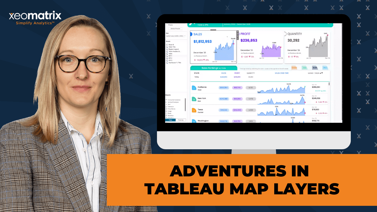
In this session, Lauren Cristaldi, Lead Consultant at XeoMatrix, demonstrated how to go beyond traditional mapping and transform map layers into powerful tools for visual storytelling.
Learn how to use map layers in creative ways to build tables, donut charts, KPIs, and more, all within Tableau. Whether you’re aiming to enhance dashboards with new visual elements or streamline your design process, this session provides you with practical techniques that you can apply immediately.
As a bonus, you can find a companion dashboard on Tableau Public, allowing you to revisit the examples and continue exploring after the webinar.
This article includes a recording, transcript, and written overview of the presentation on Adventures in Tableau Map Layers (On-Demand Webinar) (On-Demand Webinar).
Adventures in Tableau Map Layers (On-Demand Webinar) Presentation Video
Adventures in Tableau Map Layers (On-Demand Webinar) Summarized Presentation
The presentation explored how Map Layers can be leveraged to design high-performing dashboards, streamline layout control, and enhance visual storytelling—all without relying on traditional workarounds like dummy measures or multiple worksheets.
Lauren began by sharing her career journey and how the limited tools she used early in her career taught her to think resourcefully about design. This creativity now translates into her innovative use of Tableau features. She explained how Map Layers allow users to combine multiple visual components—such as KPIs, time series charts, and shapes—on a single sheet, significantly improving performance and reducing complexity. Using her publicly available workbook, she showed how to recreate these elements with precision through coordinate mapping and MakePoint calculations.
Throughout the demonstration, Lauren emphasized the importance of precision, organization, and reusability. She showcased how she uses Map Layers for both analytical and creative dashboards, such as a TV guide that tracks streaming shows. The session also covered advanced formatting techniques, layering for custom charts like donuts and KPIs, and practical strategies for managing fields, folders, and data densification.
By the end, attendees walked away with a clear understanding of how Map Layers can revolutionize Tableau design. Lauren’s approach illustrated that with thoughtful structure and creative experimentation, it’s possible to build dashboards that are both visually engaging and technically efficient—pushing Tableau beyond traditional boundaries.
Session Outline
- Understanding Map Layers and Performance Benefits
- Plotting with Map Layers: Coordinates and Precision
- From KPIs to Dynamic Tables
- Formatting and Labeling Techniques
- Real-World Applications: TV Guide Dashboard
- Creating Donut Charts with Map Layers
- Troubleshooting and Best Practices
Understanding Map Layers and Performance Benefits
For this session, Lauren used the Adventures in Map Layers workbook, which uses Tableau’s Superstore dataset. Each KPI card on the dashboard was built using Map Layers, allowing her to combine multiple visual elements into a single sheet rather than using many separate worksheets. Reducing the number of sheets significantly improves workbook performance, since fewer sheets need to load simultaneously.
Users can copy and paste fields and sheets between workbooks, making it easy to replicate Map Layer-based dashboards with their own data. This approach minimizes redundant rebuilding and helps maintain structure.
Plotting with Map Layers: Coordinates and Precision
A foundational concept Lauren shared was converting latitude and longitude into X and Y coordinates to precisely place visual elements. By setting the background map to “None,” Tableau reveals numeric axes, which can be adjusted to fine-tune element spacing.
Lauren used graph paper early in her design process to manually sketch dashboards, determining the minimum and maximum values for each coordinate to maintain alignment. This meticulous planning enabled her to utilize Map Layers as a spatial layout tool, plotting every KPI and chart with precision, rather than relying on dummy measures or evenly distributed containers.
A simple MakePoint calculation to define the position of elements (e.g., setting KPI Position 0 to coordinates 0.35 and -7). This method provides full control over spacing, size, and layout relationships, avoiding the rigidity of dummy variables and improving maintainability.
From KPIs to Dynamic Tables
Going into a more complex example: using Map Layers to build a time series table within a single sheet.
By defining X and Y coordinates for each data point, Lauren showed how to create dynamic in-row time series charts using MakePoint and layering marks such as areas, lines, and shapes on top of each other. Each mark card could represent a different visual component, such as an area chart for trends and a line or shape to emphasize movement or status.
She also organized her calculated fields into folders (e.g., “Map Layer Table” or “Map Layer Columns”) to manage multiple related calculations, improving workbook clarity.
Formatting and Labeling Techniques
Lauren demonstrated how to create flexible text alignment within Map Layers. Instead of using a standard text mark, she layered a transparent circle with a label attached to it. This workaround gave her better control over text positioning—allowing labels to appear precisely beside a shape or icon rather than being confined to a default alignment. Adjusting the circle’s opacity to zero left only the text visible, producing a clean, professional appearance.
This approach feels more native and stable than “hacky” dummy-measure techniques, making it less likely to break with Tableau updates and easier to replicate.
Real-World Applications: TV Guide Dashboard
To illustrate Map Layers in action, Lauren shared a personal project: a TV Guide dashboard she built to track streaming shows across platforms. She applied her Map Layer techniques to map out show schedules, streaming services, and next-airing dates—demonstrating that these skills extend far beyond traditional geographic mapping.
Lauren used data densification (filling in missing date values) to create complete, continuous timelines. This technique, originally inspired by Andy Kriebel, involves maintaining a reference table containing every date from 2015 to 2050 and joining it to the dataset to fill gaps in data visualization—essential for accurate calendar and progress bar visualizations.
Creating Donut Charts with Map Layers
The session concluded with a deep dive into building donut charts using Map Layers instead of dual axes. Lauren explained how layering identical points (e.g., at 0,0) enables perfect centering and alignment between two pie charts—one for the outer ring and another for the center. This eliminates the common misalignment issues from traditional methods.
She added measures to create sales-based pies and used region on color to create segment differentiation. Lauren and Celia discussed when donut charts are appropriate—ideally when visualizing five or fewer categories for readability—and how combining total values at the center with percentage labels on the outside enhances interpretability. For larger or more complex datasets, Lauren recommended supporting tables or legends for clarity.
Troubleshooting and Best Practices
Several practical tips:
- Always set the background map to “None” when working with coordinate-based layouts.
- Rename mark layers for better organization.
- Avoid excessive containers—Map Layers offer greater flexibility and performance.
- Use default properties for dimensions (like shapes or colors) to save setup time.
- Be cautious with auto-sizing; fixed axes offer more predictable results.
- Leverage Map Layers for elegant, single-sheet dashboards that combine multiple visual types.
Transcript
>> CELIA FRYAR: Today, we’re going to talk about Adventures in Map Layers. We are so grateful that you’re spending a little time with us and are part of our data-driven community. Today’s agenda is we’ll talk a little bit about our format of our meeting, but we’re going to feature Lauren Cristaldi, our lead analytics consultant. She is by far next level with design and creative implementation of bringing the very best out of what Tableau has to offer. She’s prepared a full workbook that is also available on Tableau Public, right, Lauren?
>> LAUREN CRISTALDI: Yes, on my profile.
>> CELIA: All right, on her profile, Adventures in Map Layers. If you’re interested in recreating these things in your environment, I’d encourage you to look that up and then also just maybe pursue conversations with her because she’s really got so much to offer to our community. Just a couple of reminders. This is a webinar meeting virtual format. We have made it so that only those who are hosts are sharing their screens, but at the end, when we’re having our Q&A, if there’s something we can help you share your screen. That’s been that’s reserved for a host, so we’ll have to work on that on a special case basis. We definitely have the Q&A for in chat open all the time.
We very much welcome your input and your questions, and conversations along the way about whether or not you’ve tried these various techniques or not. There will be a follow-up email that will give you a link to the recording as well as a feedback survey. Always welcome anything you guys want to know about or you would like for us to use in future meeting formats, that’s a great place to give us that and have that conversation with us as well. Lauren, do you want to do a little intro?
We don’t usually do this, but I’d love it if you tell them a little bit about your background and tell them how you got your start in data, because I feel like some of the restrictions of the resources you had to work with just compels you in a direction of creativity that has really paid large benefits as you’ve developed your career.
>> LAUREN: That’s very accurate. I started out working for the state of South Carolina and for all my other state employees. You know that you’re limited to what your agency or department even will pay for. We only had Microsoft Office. I didn’t have access to design tools like I do now, which is why I’d love to be even more creative because I have access to all these cool new tools and everything that’s out there. I started out just doing everything in PowerPoint, even making custom icons. I’m sure all of us have used PowerPoint and struggled with PowerPoint. It taught me a lot of patience, also.
I think that’s why I’m good at containers and Tableau, because I have all that patience. You have to have patience for containers. Yes, it’s been really fun. I love looking back at like some of the early stuff I built because it’s so different from where I am now. It’s cool to see that sort of progress roadmap, like where I started and where I am and how much the tool itself has evolved. I never would have imagined that we could use Map Layers, for example, to build a table for KKS.
>> CELIA: KKS, all right. Awesome. My role here today is to facilitate and make sure things get communicated inside of chat. I’m seeing that there’s folks even starting to say hello. I’m really glad. If you guys don’t mind telling us where you’re dialing in from today in chat, that’d be great just to kick it off. Even Lauren and I are in two different states. I’m in Austin, Texas. Lauren, you’re in South Carolina, right?
>> LAUREN: Yes, I’m in Charleston.
>> CELIA: Charleston, yes.
>> LAUREN: I’m on James Island for anyone that knows Charleston.
>> CELIA: Awesome. We got somebody dialing in from Houston. Very good. Breckenridge, Colorado. Okay, Jacob, we may all need to be a little bit jealous. You guys have the leaves changing colors up there. I’ve had some friends sending me pictures. Awesome. Atlanta. Good. Awesome. Very good. Anybody else care to share? That’d be awesome. We’ll dive into layers for the win. Lauren, I’m going to invite you to share your screen, and we will get the party started.
>> LAUREN: I’m going to turn my camera off while I’m screen sharing because I have a tendency, even with my new glasses, to be very close to the screen.
>> CELIA: That makes sense.
>> LAUREN: I don’t want you to stare at my forehead. Today, I want to walk through my technique for like a couple of different ways to use Map Layers. This is the main workbook that’s on my Tableau Public. You can download it. You can download any of my workbooks and then copy and paste. I’ll also show you how to copy and paste into a new workbook if you want to use it with your data. This one is just using Superstore, and a lot of the calculations are just Makepoint. They’re not actually tied to the data itself. It’s really easy just to copy and paste it and then use it with your own data. There we go.
Here’s my downloaded workbook. If we go in here, you can see each of these KPI cards are just one sheet. Which I know it’s crazy. I think that whole dashboard, it has very few sheets for the number of visuals.
>> CELIA: That’s a real game changer with Map Layers, isn’t it?
>> LAUREN: Yes, absolutely, because the more sheets you have, the less performant your workbook is. There’s a lot of other factors to performance as well, but that’s one of the major ones is if you have a lot of sheets, then Tableau is trying to load all of that at once and then add in filters and everything else. It can make everything really slow. With setting this up, we start over here. We’re adding in layers. I made it so that it was a little easier when you’re creating a new workbook. Let me actually show you. I also started making this, and this is also using Map Layers.
My husband and I, I don’t know if anyone else has this very first world problem, but we have a lot of different streaming services, and we’re watching a lot of different shows, but we always forget, “Oh, what’s on tonight?” I wanted to make a TV guide, basically, dashboard to see, “Oh, okay, there’s new episodes for this show, and then tomorrow we have this show, and where to watch them.” It’s mostly Hulu. If I wanted to create, let’s say, this KPI, over in this new workbook, then I can just come to this one. Let’s say you have your own workbook open, as well as this one downloaded. For that table, you would bring over these, but let’s focus on the KPI first. I’m getting ahead of myself.
I have all of these positions. Then I made it so it’s using this metric field for this area chart. That just makes it a little easier so that you can change just three different values instead of a whole bunch. Let’s start by copying these. I did that fast. If you want to select multiple fields, just in case, there’s some people that don’t know this trick, you select one of them, and then shift and select the one at the bottom of that continuous string of fields. Then you copy, and go over to your other workbook, select that drop-down caret, and paste. Now you have all of those fields from this other workbook available.
You can also copy whole sheets. Sometimes that’s easier if you don’t want to have to recreate all of this. If I just copy KPI1, you right-click on the sheet tab, and then I can paste it over here. Now it’s brought in that entire sheet for this workbook. Then I can come up here and replace references. A lot of things are broken just because I don’t have everything from Superstore in this sample TV guide data that I put together. If you go through and you replace references, then you can remove some fields that just don’t apply, depending on the data that you’re using.
I think for this exercise, though, I just wanted to show that option if you don’t want to recreate all of these layers. In our case, we can just use these fields that I made. Then you can keep track of these Map Layers, what order we’re putting them in.
>> CELIA: You may have already said this, and I just may have missed it. Did you show what the calculation is that’s underneath KPI position zero, for example?
>> LAUREN: Oh, yes. No, not yet.
>> CELIA: Okay, good.
>> LAUREN: Let me show those. Most of these, and we can start out with the ones that don’t rely on other metrics. Most of these are just going to be points that you’re making. If I bring– actually, I can show it on here because it makes a little more sense. If I go to show header on latitude and longitude, and you get this by going up to map and making sure that the background maps is set to none. Otherwise, it won’t give you that option to show the header. Now, we’ve converted geographic latitude, longitude to– it’s still geographic technically, but we’re plotting it on an X and Y, and we’re converting those into decimals.
When I first started playing with Map Layers, I actually got some graph paper, and I started wireframing dashboards, just trying to figure out, what are the minimax of the axes to lay things out a certain way and have the spacing be more dynamic or precise, just to give me an idea of the first KPI position here. This is our first one, and if you select any points, it’ll take you to the marks card that’s controlling it, which is also really nice. This is that KPI position zero, and I have it set to 0.35 and negative seven.
>> CELIA: I feel like this is really foundational right here, because I think that I’ve seen a lot of people tell me to make a make 0.0011, but not really shown how it literally applies against an X, Y coordinate axis behind it. That’s very helpful, Lauren. Thank you.
>> LAUREN: Great. I noticed that too, actually. A lot of the videos I’d watched, they would say, “Oh, make this,” or they have a workbook that’s downloaded, but there’s all those little things in the background, like I couldn’t figure out why isn’t it showing me the X and Y. Why are they able to show that header, or it shows that they have it fixed on some level, but they didn’t really go through it. Then I figured out just by I don’t know, patience and brute force, almost, that you have to go through this hidden option.
I never knew about the none–
>> CELIA: I don’t even know that that was there a while back. I think that’s got to be relatively new, because we used to have the first three, and then the next four came, and our next three came, and that’s really cool.
>> LAUREN: I knew about the background images, so I’ve used that. I have some radar charts on my Tableau Public, and I used a background image for that, but I think you’re right, that might be a new–
>> CELIA: Not necessarily this year, but newish with Map Layers, because that’s a game changer to have these coordinates up, and it’d be so clear that that’s where we’re placing it on the axis or a grid.
>> LAUREN: Yes, exactly.
>> CELIA: It’s good.
>> LAUREN: Depending on the point, because this could be anything. You can set it up to where you want it to start here. It’s really just so you can keep track of exact spacing, because in order to do this without Map Layers, you’d have to use the dummy measures. When we have men zero, men zero, men zero, men zero, you have a set amount of space that you can use, and they’re all distributed evenly, whereas this, I can say, “I want this to have this much room compared to this that has this much room.” It’s a lot more flexible. Then I can tell that I want 0.05 spacing between the very top and the point that’s showing first.
>> CELIA: That’s great.
>> LAUREN: To make sure that our scale doesn’t get all crazy, if we did automatic, things are really spaced out, and depending on what your lowest value to your highest values are for that X and Y, it can get wonky, especially when you go back into the dashboard. Of course, I say that, and this doesn’t actually look that bad.
>> CELIA: I resigned just nicely there. That was going to be a question, and I was going to ask anyhow about how does the autosizing sort out?
>> LAUREN: For the most part– like this one, the autosizing isn’t great. Let’s see, does this–
>> CELIA: I can appreciate that it gets too tiny at some point, because you did say the font size on some of those things, right?
>> LAUREN: Yes, exactly, especially with creating this area, and we’re telling it exact points, so it’s not readjusting a map would zoom in and out. We left the map background on there, so let’s go back a couple–
>> [PAUSE 00:17:29]
>> LAUREN: If I converted this back to being on the map, we can see that the sizing gets–
>> CELIA: Really tricky, huh?
>> LAUREN: Yes, exactly. We’d have to readjust all of those, and it still doesn’t necessarily fit everything, depending on the font size you’re using. This works a little better with donuts. Celia, I know we were talking about that earlier. We might segue to the donut in a minute here. Try and think of what else would be good to call out, because I know this is a lot of information. I think the best way to learn this and how I went about it, you don’t have to go out and buy graph paper, but I’m kind of intense. [chuckles]
I think if you download this and then try to bring these calculations into your own workbook, and then just follow along with the order of these, I brought these out in the order from bottom to top, because as we bring them out, let’s say I start over here in this other workbook. Depending on the last one you drag in, that’s going to be at the top, and you can always resort these. I can move it up or down, but I just find it easier if I’m recreating the same thing. I’ve actually used this on other projects where I’ve just reused what I’ve made here.
It helps with the order, because I like as you’re reading it from– and this matters more on the table, but from left to right, top to bottom. Having those in that same positioning can be helpful. You can also rename all of these cards. Like here, I have it saying trend month labels, so you can rename it here, so it’s not just KPI position three. I think overall, a lot easier to navigate even then when you have dummy measures up there. [silence]
>> CELIA: This feels like it’s working within the structure of what they recommended or provided for us as opposed to the dummy measures. I’m always nervous that that’s going to be into a hack that some feature release overrides or doesn’t treat the same way.
>> LAUREN: Oh, exactly, yes. Any questions just before I–
>> CELIA: Has anybody tried to use Map Layers for a KPI card or cards before? Anybody? Is this something you guys might try to do? If you want to add a reaction to your window, you can react, or you can chat on this. Very good. See you, John. Cool.
>> LAUREN: Oh, awesome.
>> CELIA: Good, great. I definitely feel like this is a feature-rich space that they intended for us to use, and so way better than using what she was describing as the dummy variables. It’s more elegant, more performant, leaves you with less bulk in your workbooks because otherwise, each one of these little chunks would be a separated worksheet that we’d be trying to combine into a container.
>> LAUREN: Yes, exactly.
>> CELIA: Thank you so much.
>> LAUREN: Even though I love containers, they don’t always love me, so I’m happy to avoid using them. I know this would have to be a nested container where we have maybe just the sales title, the value, all of this.
>> CELIA: I feel like containers are way better for distributing evenly, but beyond that, it just gets to be really precision work otherwise, because within your KPI card, you’ve got these nicely pointed spaces for things, but they’re not technically distributed evenly, right?
>> LAUREN: Right, exactly. Yes, because these are all working with each other to know exactly where to plot. I have a lot of control to where I place things.
>> CELIA: That’s great.
>> LAUREN: Awesome. Let’s see. With the table, and I have it made already in another version of my TV guide, but let’s go through, because this one is a little bit trickier. If we copy all these map layer columns, I’m going to paste it in my other workbook. We see column five is angry, because we need the time series X and Y. I think it’s a little easier to process, because I have a lot going on in this workbook, but what’s happening with this time series, because this was the coolest thing that I found. I gave credit to the original. Ellen Blackburn.
I have it linked on my Tableau Public, too. I took a slightly different approach than her. She didn’t have the KPI cards, but she gave me the starting point that I needed to figure out how to do this time series, which I think is so cool to have that in row. If we take the X and Y, and because I don’t have those same fields, in my case, order date is going to be air date. I wanted to make sure to show this just so that everyone has an idea of what they might need to change.
Up here, most of these are just the make points, very simple, so you don’t need to worry about changing anything for your data going from the Superstore data. For column five, in this case, that’s where we need this X and Y calc, so we have it fixed. In my case, I want to do it on the show name. Then, using air date, let’s count the number of episodes. We’ll do that up here too.
>> [PAUSE 00:26:19]
>> LAUREN: Oh, and I’m sure some people have noticed, I like to organize my fields list by the folder. Especially when you’re making all these calculations, because we have different ones for either the KPIs or the columns. Maybe for the donut, you have something different. The gauges are a good example too, that I have also on my profile using Map Layers. When you have all of that in the same workbook, it’s hard to keep track of which one should I be using for this certain chart. I like to create a folder just for specific chart specific calculations. It’s like here, I’ll call this Map Layer Table.
I think over in my other workbook, I had Map Layer Columns, but just any way to differentiate and group all of those calculated fields together. I can drag those other ones in. If we’re going from the bottom up to the top, we’re using the 6.5. You’ll notice that I don’t ever use the text type. I’ll get into that. It’s actually a weirdly valuable difference. Let’s keep bringing these in, though. There’s six.
>> [PAUSE 00:28:39]
>> LAUREN: Then some of these are actually using the same– we’re layering them. This allows you to layer them on top of each other as well, which is a technique used for the donut. These are the same point, but we’re layering different chart types on top of it. We can have that area and then a line that highlights the top of the area, and these different shapes to indicate the variances, if it’s trending up or down.
>> [PAUSE 00:29:21]
>> LAUREN: I think that’s the last one of column five. This will be our area, our line, and our shape. Then the next ones are just the different metrics. Like here, we’re tracking sales or quantity, sales, and profit, I think.
>> [PAUSE 00:30:06]
>> LAUREN: To get these pills, I’m using a custom shape that I made in Figma, but it should inherit from this workbook since they’re all packaged. If you want to use that same custom shape, you can bring the sheet in or work from this workbook that you’ve downloaded.
>> [PAUSE 00:30:45]
>> LAUREN: I’m just changing these to match. I quickly bring these in just so we can start adding more detail.
>> [PAUSE 00:31:30]
>> LAUREN: Now I have everything in the same order that I do over here, left to right, top to bottom. For the first one, and it’s off just because this one is using this custom shape, and I wanted it to be almost like a thumbnail, just denoting that rank and then which region it’s in. That doesn’t really apply for my shows. Before I do that, let’s show the header here, show the header here. If you show those headers, we can make sure that we’re using the same scale. You have 0.01, 1.18, and these values, they just depend on that spacing that you want. They can really be anything, or you can keep them at automatic.
The actual values aren’t required. They’re just aesthetically what I went with. We’ll go to our background maps, set that to none, and just start seeing it for individual shows. I’ll bring in that show name. As a bonus, we can have an image URL that I pulled all these from IMDb. We don’t really need the show name to have the header, because right now we have one of these layers or marks cards. We’re going to put that information in, and then we can format it. We have a little more dynamic formatting. We’re just going to fit the width.
This should be 0.01. Now I can’t remember what the other one was. 1.18.
>> [PAUSE 00:34:15]
>> LAUREN: Then at the bottom here, we’re going to do the same thing, the X-axis. I compare it against this one. It’s negative 7.45-
>> [PAUSE 00:34:47]
>> LAUREN: -and 2.7. [silence] Now this is starting to take shape. I don’t need these headers anymore. If you right-click– sorry, I went through that really fast. If you right-click on the axis, you can unselect the show header, or you can come back up to longitude or latitude, and you can check it or uncheck it from there as well. Of course, I’ve done this so many times, and I always forget that longitude is the X and latitude is the Y, even though it’s columns and rows, so I should know, but sometimes you get too it and then it’s just easy to forget those little details.
>> CELIA: I don’t know about you, but that always feels backwards to me. Is that just me?
>> LAUREN: Yes, because I feel like it’s really backwards too. I’m glad I’m not the only one. That actually makes me feel better.
>> CELIA: Yes, because I describe that a lot, especially when people are new to Tableau, about the columns and rows representing X and Y. Invariably, I have to be careful not to be too specific about which is which, because I invariably try to say it wrong, because it doesn’t align with my math background.
>> LAUREN: No, agreed, because it’s like, I don’t know why, because I guess it does make sense, but then it doesn’t at the same time. [silence] Oh, we’re going to go through this first one, so this column one, which again, you can select any of these points, and they’ll take you to the appropriate marks card to edit.
For this first one, I want to highlight, based on the show, where I can watch it. I’m going to set the streaming platform on shape, which, if you have a dimension, you can go to default properties, and you can set the shape here before you bring it in. That way, every time you bring it into a new sheet, those shapes are already set up there. That’s what it will default to, which is nice. It saves a lot of time so that you don’t have to constantly be remapping those, or in case you load another shape into a palette, and then you reload the shapes, and now all of your– it doesn’t always happen, but sometimes it can get mixed up, and it’ll choose the wrong ones.
This prevents a lot of that from happening. I adjusted the size a bit, and you can continue increasing or decreasing. Now, if I go to this next column, I want to show the show name. Let’s say this is text. The formatting gets kind of tricky. It’s finding the point in the same place, and I can tell it write a line, but it doesn’t go where I actually want it to go because now it’s trying to write a line, but it’s still getting cut off. If I do the circle and then have it as the label, now I have it middle right. If it’s multiple, so let’s say I have show name, and then I wrote the show name, everything is right-aligned here, but I really want it to be to the right of this point, but left-aligned.
If it was set to text, we couldn’t do that, but since we have it on the label for that circle, it gives you a lot more flexibility in how you’re formatting those strings. Which I don’t know if anyone else thinks that that’s as cool as I do, but it really satisfies my OCD. [chuckles]
>> CELIA: No, that is really cool. Well done.
>> LAUREN: It’s all about the-
>> CELIA: It’s so tiny.
>> LAUREN: -little wins, right?
>> CELIA: Yes, they add up.
>> LAUREN: Oh, and then once I’ve made that label, or you can do it before it as well. I just changed the opacity on the circle to be zero. Then the label still shows up, but the circle goes away.
>> [PAUSE 00:40:33]
>> LAUREN: Then we can keep adding. I think on the next one, just for the sake of time, I’ll go to my other one where I have it finished. I want to make sure we cover the donut and touch on this calendar. This is what it ends up looking like. Where I have those same points, I just did a little more formatting. I have it using a calculation to find when the next episode is airing, depending on the current month. Up here, I have a tracker, which these points I don’t have included in what I have on Tableau Public, mostly because I’m still trying to iron them out. I got it to work for something else, but the data was formatted in a very specific way.
I’m trying to see how I can make it more flexible. Sorry. Try to turn those off. This is technically a progress bar. if you have a percentage of days, it uses the date. If you’re doing a scale that’s not based on the date, we need to add some data densification. With that, I’d have to get into what I used for the gauge chart. Keep checking my Tableau Public, and I should have a solution for that later. I was really happy with this progress bar.
>> CELIA: I saw that in a couple of things you’ve done recently. I think that’s fantastic. The fact that it not only shows what has occurred, but what is remaining, and the math behind that, is really nice. Just to follow up on what you just said about data densification, does that have to do with we often are working with data sets where there’s an occurrence of a transaction, so it’s like, those are the dates that are present, and we need to fill in all the dates in between? Is that something along those lines?
>> LAUREN: Yes, exactly. I can show it. I have a table that I made. In Excel, it’s one column for this one. It just says date, and then has every date down to the day level, from 2015 through 2050. I just drag it down. No, that’s how I made it. Excel populated all of the future dates. Then I have the relationship, so that it’s set where in the flow of these relationships. This one, all of the possible dates are first. Then I have that noodle, where I’m defining the relationship as the date equals whatever date field is in my data.
This will bring back all of the– it’s not going to restrict it at all, just because every date exists. It’s filling in those gaps to where maybe the shows that I have it’s only a handful of dates. If I go back here, you can see there’s a lot of gray. If I didn’t do that, all of these dates, they wouldn’t show up at all. Then our map, or the calendar, would look really funky. This is actually a method I found from Andy Creeble. I made some changes with the progress bar and then with the different custom shapes behind it. If you guys haven’t seen that, it’s really cool. He has a workbook on Tableau Public, and he also has a YouTube video on it.
I had a solution without Map Layers for this calendar view before, but it was not dynamic. It was hard to maintain.
>> CELIA: He just did a master class on this just recently. You can set it wide, or you can tell it to go long. It’s a game-changer on that stuff.
>> LAUREN: Yes, especially with being able to size it how you want and everything lays out correctly. I know we only have 10 minutes left. I’m trying to think which workbook would be the best. Let’s do this one. Let’s try the donut.
>> CELIA: Yes, please.
[laughter]
>> CELIA: Your donut maker point is zero to zero, yes?
>> LAUREN: Yes. With the donut, it can be anything. You can have it zero, zero, one, one, some crazy funky 1.35 or something. It only matters that it’s exactly the same so that it’s centered. Then also, you’re just layering that same point. You only have to make one of those. I brought that into the view. Then if I add another layer, now they’re both in there. With this one, we want it to be a pie and then another pie. I’ve just found that when they’re both pies, it’s easier to make sure that they’re exactly center with each other. That’s what I used to do with the traditional donut method with the dual axis. I kept that same practice.
With the Map Layers, it really doesn’t matter, but it doesn’t hurt to have both of them. As long as you don’t have anything on color or angle, then it doesn’t change anything. For this first one, let’s make that really big. We might have to adjust once we get it on the dashboard, but we’ll double-check that. I’m just going to turn all the background layers off.
>> CELIA: You do it through there, or is there any difference if you do that last option on the right click right there, the map options? Do we need to check those off as well or not?
>> LAUREN: Yes, you can check those off here. What’s weird, though, is that it makes you do it again on the dashboard. I don’t know why it does that.
>> CELIA: It doesn’t stick. You just unchecked them off of the map background layers over there on the left margin, yes?
>> LAUREN: Yes.
>> CELIA: On your panel that you’ve put down? Background layers, got it, okay.
>> LAUREN: In this case, we don’t want to turn off the background map. That takes away the automatic sizing or the dynamic.
>> CELIA: That’s probably my problem, by the way, that I was talking to you about. That’s probably exactly it.
>> LAUREN: I was thinking about that because sometimes I will turn it off, but then I also come back in here and I address the size, if I want it to be very specific. If you just want to be able to throw it into a dashboard, and maybe it’ll change size after you’ve added in things.
>> CELIA: Correct.
>> LAUREN: We’ll test this out, too. If I throw in– I’m just going to use sales. We want sales on the angle just like a regular pie. The color, let’s just do the region.
>> CELIA: You did a pie on both of them, not a circle on the top?
>> LAUREN: Yes. With the Map Layers method, that doesn’t matter as much. It’s just like a holdover from when I was using the old method because I noticed sometimes– it wasn’t every time, but sometimes if I had a circle on top of a pie, even though it was mean zero, mean zero, the circle would be slightly off center compared to–
>> CELIA: Okay, interesting.
>> LAUREN: It was weird because especially, it didn’t do it every time.
>> CELIA: Yes, it shouldn’t do it.
>> LAUREN: That made it even more annoying just being consistently inconsistent.
>> CELIA: As a pie without segments on an assignment on the angles, it will give you a single color option.
>> LAUREN: Right, exactly. Then I can go in here, have it set.
>> CELIA: Very nice.
>> LAUREN: Then if I wanted just all sales–
>> CELIA: That’s your KPI on that?
>> LAUREN: Yes, there’s our total, and then we have all the regional breakdowns.
>> CELIA: I like to put percent of total labels on the outside of a donut like that.
>> LAUREN: In this, it should be easier. Let’s see.
>> CELIA: If you just move it over onto the label. There you go. Isn’t that nice? You have the raw number in the middle, and then you have percent of tables on the sides.
>> LAUREN: I do like that. Sometimes I’ll do a side table, and I’ll have the numbers to work as a legend.
>> CELIA: That’s really good because to be fair, the whole problem with pie charts and any circle format like that, it’s not a precision instrument. If we’re doing a big picture, aha, great. If we’re trying to get real numbers out of it, we need a table or supporting resource. It’s really smart, Lauren.
>> LAUREN: Thank you. That was a lot of trial and error.
>> CELIA: Yes, I see that.
>> LAUREN: If you have I think it’s five or less categories, so slices, then you should use a donut or a pie, but if it’s any more than that– if I was using subcategory on this, it would look insane. How are you going to get any real insights from that? I think my favorite use of the donut is actually just tracking one percentage. If you’re looking at sales for just central compared to for everywhere, then we would just have this blue slice.
>> CELIA: That’s way better.
>> LAUREN: Then break them down that way.
>> CELIA: You have something that’s an overwhelming minority or majority, like you’re showing the contrast between a couple of components, I feel like that’s definitely more aligned with best practice.
>> LAUREN: Yes, exactly. You can get better insights from that because I think we all fall into the trap of just data overload. Analysis paralysis.
>> CELIA: That’s so much better, because the dummy variables did not give good sizing.
>> LAUREN: This one is still a little bit limited, but for the most part, it’ll figure out what to do. Definitely better than the dummy variables.
>> CELIA: Is there any impact on using the color legend to highlight certain elements? I know you just deleted it, but have you had any success with that, where you can with the pencil and the shape? Yes, you can. Good. It’s interesting. I’ve noticed even if you turn off on the last sheet where you were, if you disallow Zoom, where the desk is supposed to not keep the back in the source sheet, how you can go to the map layer and turn off some of the-
>> LAUREN: Oh, disable.
>> CELIA: Yes, disable selection. It doesn’t do the slicing, but you can still get to it through the color legend.
>> LAUREN: Oh, yes, I guess so.
>> CELIA: It somehow doesn’t listen.
>> LAUREN: Oh, yes, because now I can’t select slices.
>> CELIA: Yes, you can. Go for the side. [laughs] It’s interesting to watch this product mature, right?
>> LAUREN: Oh, yes, because sometimes Tableau is so smart, but it has its moments where you’re like, “You just did this really complicated thing. Why can’t you do something simple?”
>> CELIA: We have a couple minutes left. Do we have any questions from the team that’s been hanging out with us here? I’m going to get those over to Lauren. Watch in chat. If not, I just want to thank you guys for your patience. I did put the link to her example workbook from Tableau Public into the chat. I’d encourage you to see what you’re able to recreate from what she’s described and shown today. Map Layers are way more efficient, going to perform better in your workbooks. It’s more in line with the development that’s happening with the product overall. It’s a really good thing to try to learn how to adapt into and implement. Just wish you guys all the best success with that.
Let us know if we can help you out. Lauren, thank you for all your preparation and for leading the charge today. I really appreciate it. We’ll be back next month with more fun, you guys. We’ll keep you posted on email. We’ll be watching for that link on email and also the survey to give us some feedback. If you’ve got a suggestion for a topic you’d like for us to cover, please let us know. Thank you so much. You guys have a good rest of your week.
>> LAUREN: Thank you.
>> CELIA: Thanks, Lauren. Bye, everybody.
>> LAUREN: Bye.
>> [00:57:06] [END OF AUDIO]