The Data-Driven Community Meetup holds monthly webinars on business analytics and big data. Webinars are held on the second Wednesday of the month at noon (12:00 PM) Central Time via Zoom Webinars and will cover topics related to enterprise data management. Our goal with each webinar is to provide meaningful insights and actionable takeaways to simplify analytics so you can make better decisions.
We cover topics such as data strategy, data management, data warehousing, BI modernization, embedded analytics, and cloud migration and strategy. Learn how to build reporting solutions that drive your business demand based on your needs.
About the Topic
In this session, Lauren Cristaldi, Lead Consultant at XeoMatrix, showcased the most impactful techniques to help you work smarter, design cleaner dashboards, and uncover insights more efficiently in Tableau.
This article includes a recording, transcript, and written overview of the presentation on Best of Tableau Tips & Tricks (On-Demand Webinar).
Best of Tableau Tips & Tricks Presentation Video
Best of Tableau Tips & Tricks Summarized Presentation
The Best of Tableau Tips & Tricks session was packed with practical ideas to make working in Tableau faster, easier, and more fun. Lauren showed how a few small changes, like setting default properties or organizing fields into folders, can save hours of work and keep projects running smoothly.
Lauren walked through clever ways to simplify formatting, scale numbers dynamically, and even bring dashboards to life with custom images. Along the way, she shared personal stories and answered audience questions, making the tips feel approachable and easy to try right away.
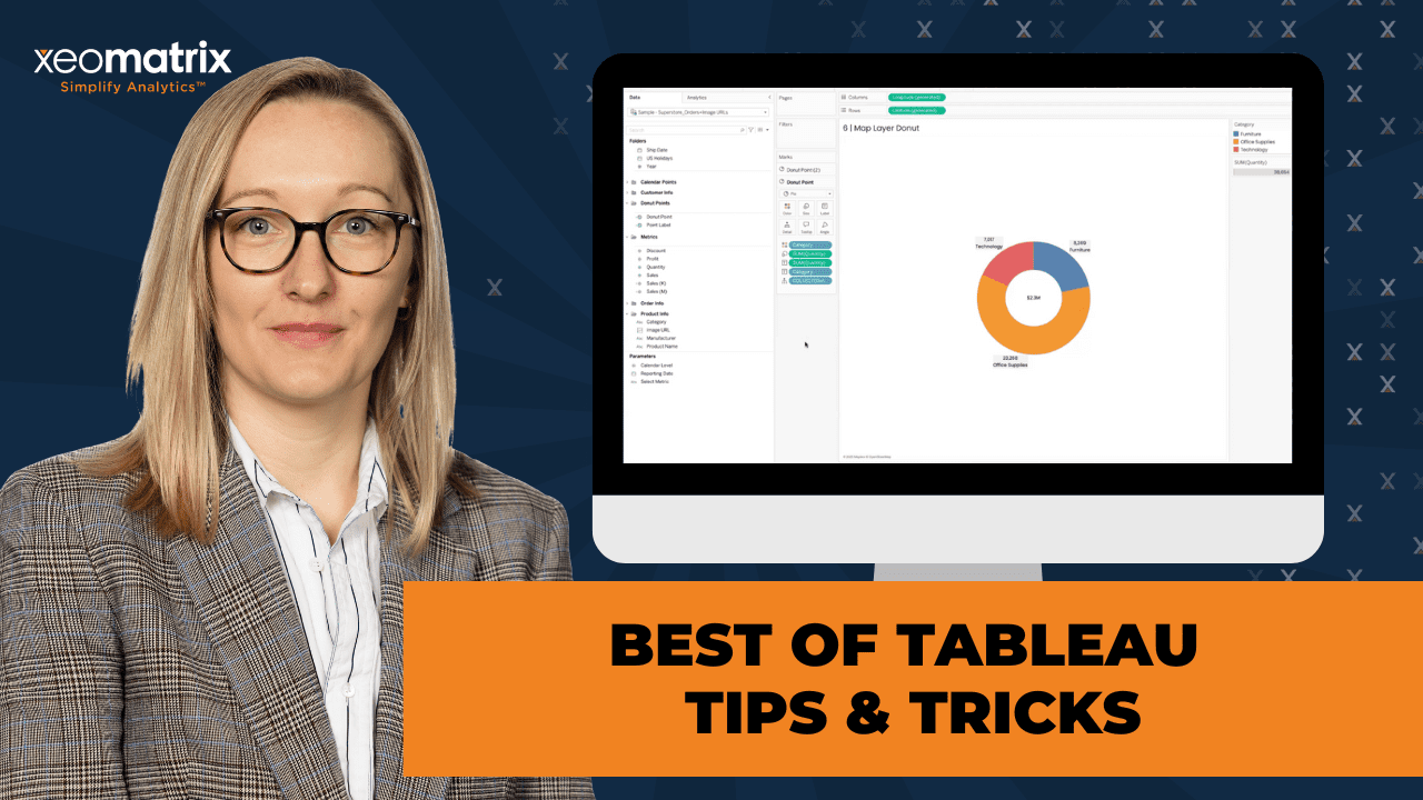
Some of the biggest “aha” moments came from her creative visualization tricks, like building donut charts with map layers or using sets to boost performance and cut down on clunky calculations. These examples showed how Tableau’s flexibility can help you solve problems in smarter, more efficient ways.
By the end of the session, everyone walked away with a collection of time-saving tricks and fresh ideas for making dashboards both more polished and more effective. It was a reminder that the best tips are often simple ones, you just have to know where to look.
Session Outline
- Setting Default Properties and Custom Themes
- Conditional Formatting with Colors
- Organizing with Folders and Field Lists
- Dynamic Number Formatting
- Using Custom Image URLs
- Sets for Easier Filtering and Performance
- Creating Donut Charts with Map Layers
- Sorting with INDEX for True Top N Result
- Key Takeaways
Setting Default Properties and Custom Themes
Default properties are a “one-and-done” solution. Once configured, default settings, such as number formats and colors, are applied automatically throughout the workbook, eliminating the need for repetitive manual formatting. This small detail saves enormous time, especially under tight deadlines.
While fonts themselves can’t be set as defaults, Tableau’s newer feature of custom themes fills that gap. For example, Lauren consistently formats her workbooks, using the font Poppins across worksheets, tooltips, and adjusting font sizes. These specifications can then be exported as a JSON file, which stores details like color palettes, font weights, and sizing. Although the options are somewhat limited, they are sufficient for maintaining visual consistency across projects. This blend of default properties and themes makes dashboards both polished and efficient.
Conditional Formatting with Colors
Color defaults is another overlooked but powerful trick. Instead of writing calculated fields, users can configure a diverging color scale, such as setting negative values to red and positive values to green, by defining the range as -1 to 1. This enables the automatic highlighting of values, such as profit, without the need for additional formulas.
There’s also the option to use separate legends for measures. With this feature, one measure can have its own color rules (e.g., profit colored by positive/negative values), while another measure on the same view remains unaffected. This option is not widely known, making it a particularly valuable piece of advice. Lauren tied this back to her “one-sheet philosophy,” where multiple insights are layered efficiently in a single sheet, an approach made easier with separate legends and map layers.
Organizing with Folders and Field Lists
Moving into data organization, it’s essential to use folders and field lists for maintaining clarity. By default, Tableau groups fields by data source tables, which can quickly become cluttered. Instead, it’s recommended to group fields into custom folders for specific projects, calculations, or chart types.
The process: from the field list near the search bar, switch to “Group by Folder,” then right-click a field to add it to a folder or create a new one. This method keeps calculations for particular clients or dashboards organized, which saves time when revisiting projects months later.
Can fields exist in multiple folders? They can’t, though, duplicating a calculated field (with a minor change like adding a space to the name) provides a workaround. This is more of a “hack” than a best practice, but it can be useful.
Folder assignments disappear when replacing or reconnecting data sources. To avoid this frustration, you can create folders at the workbook level, ensuring they persist even if the published data source changes.
Dynamic Number Formatting
Instead of displaying long, inconsistent numbers, calculations can be built to automatically show values in thousands (K) or millions (M), depending on their size. You can create a calculated field, “Sales K,” for example, that switches formatting rules based on whether sales are under or over a million.
This approach is particularly effective for KPIs on dashboards, where space is limited. It keeps numbers compact without losing meaning, while tooltips can still display the precise full value for accuracy. This not only improves clarity but also enhances user experience by tailoring values to their natural scale.
Using Custom Image URLs
You can also embed custom image URLs into Tableau. This requires the image links to be present in the dataset and hosted in a shared cloud repository, such as Cloudinary. With hosted images, fields like product subcategories or employee profiles can be directly linked to relevant visuals.
Images work best at 200×200 or 300×400 pixels, with 400 pixels being the upper limit.
The usefulness of this method can be seen in employee trackers or sales performance dashboards, where images such as headshots can make the dashboards feel more integrated into a portal’s UI.
Sets for Easier Filtering and Performance
Sets are a more efficient way to filter and segment data. Instead of repeatedly building long filters or calculated fields, sets allow users to define a group once, such as specific ship modes or account codes, and reuse it across worksheets and calculations.
The performance advantages of sets: calculations on string fields are expensive, but using sets (or numeric parameters in place of strings) allows Tableau to process faster. For example, creating a parameter with values 1, 2, and 3 and aliasing them as “Sales,” “Orders,” and “Profit” is quicker than comparing string labels.
There are also practical applications, such as using sets to isolate Hawaii and Alaska from U.S. maps. By placing them in separate views, dashboards avoid distorted scaling while maintaining interactive filtering. Sets make these kinds of adjustments easier to maintain, as they can be updated in one place rather than across multiple calculations.
Aliasing Fields at the Worksheet Level
A small but powerful tip for renaming fields locally: by double-clicking on a pill in the rows shelf and typing // followed by a custom name, users can rename the field just for that worksheet without changing the original field name.
This allows dashboards to present user-friendly labels while keeping the backend fields consistent. It’s particularly helpful when the same field needs different contextual labels across multiple visualizations.
Creating Donut Charts with Map Layers
Donut charts were another highlight of the session. Lauren explained her map layer technique, which avoids the messy sizing issues of older donut methods. By using a calculated field with MAKEPOINT, she layered two pie charts, one serving as the outer ring, the other as the inner hole.
You can set up these layers, hide latitude and longitude axes, and arrange the mark cards so the top layer sits correctly over the bottom. Once sized appropriately, users can add categories, quantities, or sales to angles and labels. You can limit the number of values to five or fewer, to avoid clutter and misinterpretation.
The technique also allows for a KPI in the donut’s center, making it a powerful tool for compact and interactive dashboard design. Resizing donuts within dashboards was significantly easier with this method compared to earlier approaches.
Sorting with INDEX for True Top N Result
Sorting across multiple dimensions is one of Tableau’s frequent challenges. Traditional sorts often fail when nested dimensions are involved, leading to misleading rankings.
The solution is to create an INDEX() calculated field, set it as discrete, and place it as the first pill in the view. Then, by editing the table calculation, users can sort by their desired measure (such as sales) and return a clean ranking.
This method ensures accuracy, particularly when applying Top N filters. Unlike traditional sorting, which can be disrupted by other filters, INDEX() is always computed last, preserving the true top results. You can filter for the top five sales results, showing how it remained stable even when new filters were applied.
Key Takeaways
- Default Properties & Themes: Save time with defaults and JSON-based custom themes for consistent styling.
- Color Formatting: Apply diverging colors and use separate legends to highlight measures.
- Folders: Organize fields into custom folders for clarity and efficiency.
- Dynamic Formatting: Automatically scale numbers to thousands or millions for KPIs.
- Custom Images: Use hosted URLs to embed visuals directly into dashboards.
- Sets: Simplify filters, boost performance, and manage calculations more efficiently.
- Aliasing: Rename fields at the worksheet level for clarity without altering the dataset.
- Donut Charts: Use map layers for clean, flexible donut chart design with KPIs in the center.
- INDEX Sorting: Ensure accurate Top N results with INDEX() instead of traditional sorting.
Read the Transcript
>> CELIA: If you’ve used default properties, if you would just give me some sort of reaction in the chat channel, that would be fantastic. This is one of my favorites as well. I’m a huge fan. Yes, big time. I get that.
>> LAUREN: It’s like one of those little things that you don’t really think about. You’re like, “Oh, that’s easy,” but it ends up saving you so much time that you don’t realize.
>> CELIA: So much time. It’s a one-and-done. Absolutely. John, I see you as well. Vivian’s asking if you can do this for fonts. Setting default properties for fonts.
>> LAUREN: That’s a good question. You can’t set it for fonts, but if you have 2025.2, or did it come out in 1? There’s custom themes. Let’s say– where was it? I’ve made a few of these. You can either import a custom theme or you can create one. If you went through and formatted everything specifically in the workbook, like right now I have it set to Poppins, and I could alter these other ones as well, like for the worksheets, tooltips, and the font size and whatnot.
>> CELIA: Awesome.
>> LAUREN: You can go up to format and export custom theme, and it’s going to create a JSON, and it’s just going to have that theme. Whatever formatting specifications, it’s a little limited, but for the most part it carries through, especially with different color palettes, font weights, sizing, and types.
>> CELIA: Awesome. I don’t know if you’re seeing chat, but she’s saying cool, and thanks, by the way, Lauren.
>> LAUREN: Oh, awesome.
>> CELIA: Yes. Thank you, Vivian. Great question.
>> LAUREN: Yes, I should have added that in there, too.
>> CELIA: Well, [laughs] there’s so much. [laughs]
>> LAUREN: Yes, and it’s funny, like you don’t even realize, but it’s a trick because you’re just trying to– especially if you’re on a deadline, [laughs] you’re just trying to get stuff done. Awesome. That’s for the default properties of the number format. I also find that color is really useful. Let’s say I wanted conditional formatting, and just to show if there’s any negatives. Sales isn’t a great example, but for profit, if I go to color, and I’m just going to make this custom diverging. If it’s negative, I want it to be red. If it’s positive, I want it to be green. All you need to say is negative one and one, and then we’ll change the step size to two.
>> CELIA: That’s good.
>> LAUREN: Instead of doing a calculated field, which this would work for that as well, this already has it defaulted. Now we’ll bring out profit. You’ll click on measure values on the marks card, and we want to set these to the color. Use separate legends. Here, profit is green. It already has that set up, whereas I didn’t set it up for sales, so it’s not showing anything. If I change that to text, measure values on text, it’ll color the number. That’s awesome.
>> CELIA: That’s awesome.
>> LAUREN: The value.
>> CELIA: I’m not sure that that use separate legends is also well known. I find that that’s less known. That’s great to show that as well. Thank you.
>> LAUREN: Has anyone tried that out? [silence] I found it a while ago, and it blew my mind. [chuckles]
>> CELIA: Oh, you mean with the custom color is what you’re talking about?
>> LAUREN: Yes, the color and then doing the separate legends for the measures. It really vibes with my one sheet philosophy. If I can fit everything into one sheet. [laughs] Thankfully, map layers has made that a lot easier than it used to be.
>> CELIA: Yes, to be sure. [laughs] Awesome. I hope you have your chat channel open. You’re getting lots of feedback.
>> LAUREN: Oh, yes, actually, I don’t. Cool.
>> CELIA: Awesome.
>> LAUREN: All right, so the next one is using folders and fields list. A lot of times, the default is to have everything set up as group by data source table. You can see my different sheets or tables. As you’re creating a lot of calculations or you have a bunch of tables, and maybe some of them are similar, like you have things joined on a certain date, well, you really only need one of those date fields. It’s good to just go through for data hygiene, clean everything up.
I found that navigating folders is a lot easier because you can customize it. I have where I’m using my calendar points or specific graphs that have particular fields that I’ve created for them. It can be a mess. You can search for things, but sometimes it’s better just to have everything grouped together. It’s saved me a lot of time. Just as I’m revisiting projects, especially, like if someone asks for updates, and I’m like, “Oh, I don’t remember [chuckles] this client anymore.” I can go through these folders and be like, “Oh, that’s where that calculation is.”
>> CELIA: Just to reiterate, how did you create those folders, those custom folders? How did you get that started?
>> LAUREN: If you go to the fields list near the search bar, there’s that little caret. You select that and then do group by folder instead of the group by data source table.
>> CELIA: Then, your custom folders, how do you add those?
>> LAUREN: To create the folders, you would right-click on one of the fields. It can be a dimension or measure calculated field. Then you can either add it to another folder, remove folder. If it isn’t already foldered, so let’s say I remove this from the folder. You go back, and now I can create a new folder, and it’ll put it in there.
>> CELIA: Got it.
>> LAUREN: It’s all alphabetically sorted.
>> CELIA: There’s a question in chat about needing to have a unique column name under each folder name. I assume that means that you wouldn’t– The question by the question is you’re placing things only in one folder, not in multiple places, correct?
>> LAUREN: Right. Yes. You can only have it– You can make a calculated field and just replicate that same field and put it in a different folder. It would have to be named slightly different. Which I also have a trick for that. It can get confusing, so I don’t necessarily recommend it. Let’s say you need a calculated field also called date, but it won’t let you because there’s already a field called date. If you add a space, [unintelligible 00:08:55]
>> CELIA: Is that a trick or is that a hack? I’m just asking for a friend over here. [laughs]
>> LAUREN: Maybe a little of both. A little column A and column B.
>> CELIA: That’s great. In chat, David has said something about being careful not to lose all the folder assignments and replacing data sources. Is that connecting to anything you’ve experienced?
>> LAUREN: Yes, that happens a lot. It’s really, really annoying. It’s like, I don’t know why it can’t– I’m just reconnecting or replacing references. I don’t know why it can’t remember. That’s where I usually make these on the workbook level. Because that way, if you’re connecting to a published data source and you make changes to that published data source, you won’t lose all the folders. If you need the folders across multiple workbooks, then you should do it in the data source.
A lot of times, if you’re making certain charts or calculated fields that only pertain to one report, it’s just easier to make that in the workbook. Then you can always go back to that workbook and take out those calculations if you need them for other projects. [silence] Oh, and with that trick with the space, I usually use that when I want, let’s say, we have sales that we brought out and on the legend or on the axis, I want it to be in the format of millions instead of the full value. I would just duplicate sales as a calculated field, name the same way, do that space, and then have the default formatting of that version of sales not be the full.
>> CELIA: Got it.
[silence]
>> LAUREN: Which, actually, that’s another– [silence] Let’s say you want a shorter version of the sales value, but sometimes it’s in millions, sometimes it’s in thousands, depending on the order of the customer. You can actually make dynamic calculations where sales will format according, like will default to the format that it fits. I’ve used this a lot. We’re going to say if the sum of sales is less than one million.
>> [PAUSE 00:12:00]
>> LAUREN: I’ll call this sales K, just so we don’t lose track of it.
>> CELIA: Yes, that makes sense, yes. Then you can give it its own default properties.
>> LAUREN: Yes, exactly. Then the million, if it’s greater than or equal to. [silence] Now, if I add this to the marks card on text. We’ll remove profit. We’ll change those default properties. We want the display units to be in the thousands for this one, and millions for this one. Since this is a million, or over a million, it knows to use that 2.3 instead of in the K. Then we could just clean up our tooltips. We would remove that. You put these right next to each other, so it doesn’t give a weird space in the tooltip.
>> CELIA: Oh, interesting.
>> LAUREN: If we bring out– let’s do order date. See, now they’re in the thousands.
[silence]
>> CELIA: That’s great. That gets it curated and ready for someone, especially if you’ve got folks on the cloud environment that don’t have a lot of– Well, it would just get things staged very nicely for folks, wouldn’t it?
>> LAUREN: Oh, yes. It’s good for KPIs.
>> CELIA: Oh, yes.
>> LAUREN: If you just wanted that value, if you wanted it to change, because maybe you have a lot of KPIs or not a lot of real estate on your dashboard, it shortens that number, and then you have more room for other stuff. [laughs]
>> CELIA: Right on. Just curious about a group that’s here, has anybody ever done such a thing where they have the different levels of aggregations staged, pre-staged in their data set, or in the data pane?
>> [PAUSE 00:15:08]
>> LAUREN: Oh, awesome.
>> CELIA: Cool. Good to know. Good to hear. Go ahead, Lauren.
>> LAUREN: The other part is that I like to add the normal sales value that I’ve– with the full value into the tooltip. Let’s say, user, you have it shortened here, but I still want to see down to the tenth or hundredth of a cent or something. Then you can hover over, and if you adjust the formatting on the other one, it’ll let you do that.
>> CELIA: Cool.
[silence]
>> LAUREN: Awesome.
>> CELIA: All right. Oh, I love this one.
>> LAUREN: This is my favorite. When I did Iron Viz last year, I spent a lot of time trying to figure out– because it was when it just came out. There wasn’t really anything out there about, well, what size is– like, what are the min and max sizing dimensions that you can use to make these actually show up. I added in a few, that don’t work because the sizing is a little off. I found that it’s, like, 300 by 400 works, or 200 by 200. You just can’t go over 400 pixels.
I like to add the custom image URLs. The thing with those is that you need– there are a few things that you need. We need these URLs to exist in the dataset, and they need to connect to something in our raw data. This is the orders table from Superstore. Mm-hmm. I took the whole list of subcategories, and I have that as another tab.
If we look at here, here’s my dataset that orders, and then I have another tab in Excel, and this could be another table in your database where it’s just all of those subcategories, and then the image URL.
>> CELIA: Right, and did you get these images from Google somewhere, just as examples?
>> LAUREN: Yes, some random ones.
>> CELIA: Yes, no, no, that makes sense. I think there’s a question in chat about that. Then also, what if the URL is dynamic? I’m not even sure what you mean by that, Susan. If it’s where you could put a variable in the URL to select the certain item?
>> LAUREN: The image URL is a little different.
>> CELIA: Oh, it’s updated by source. Got it.
>> LAUREN: Yes, you have to have it– because you can do that with the URL actions, where you put in subcategory or something, and it can go and grab it. This one, if it’s in the dataset, you need to have it in a shared, a cloud environment, so like a repository to host all of these. I use Cloudinary because it’s free. I’ve been using it a lot. Oh, and you can see some of my Lego ones.
[laughter]
>> LAUREN: It has to be hosted in a central cloud repository. Here are all my images. If I wanted to upload another one, and I was just doing the image search, let’s say– [silence] I’d upload this donut. Then I go to edit. We can resize and crop. That donut looks pretty good.
>> CELIA: It looks really good. [laughs]
>> LAUREN: I already have these templates saved. This image URL, image or template, and then it already has some of those dimensions that I mentioned. After you apply– Oh, sorry.
>> CELIA: No, please go ahead. I have a question when you’re done.
>> LAUREN: Okay. After you apply the template, you just go up here, copy the URL, and you would paste it or upload it wherever you’re connecting to those image URLs. With the image URLs, I also like to use these when I’m showing maybe a profile, like someone’s profile photo. If you’re doing some kind of employee tracker or performance or sales performance for that regional manager, especially if you’re embedding in a portal, then it makes it feel more like it’s better integrated with a portal UI and UX. I don’t know if anyone remembers Clippy from Microsoft Office [chuckles] a million years ago, but I thought that was funny.
>> [PAUSE 00:20:54]
>> LAUREN: Has anyone used the image URLs or run into any issues or have questions about them?
[silence]
>> CELIA: I shared Cloudinary in the prior chat, and then also we had the image sizes that you were recommending.
>> LAUREN: Oh, great.
>> CELIA: Thank you for that.
>> LAUREN: I’m always happy to share those kind of resources because it took me a while to find all that. [silence] Cool, okay. I’ll get into sets. Celia, I know you’ve probably run into this a lot, with your trainings, where you’re showing sets or parameters, and then people ask, “What is a set?” [laughs]
>> CELIA: [laughs] I actually just this week revised how I teach sets. [laughs] Let me put this back in the chat. You recommended 200 by 200 or 300 by 400. There was two sets that you said in terms of dimensions for the URL image size.
>> LAUREN: Oh, yes. You can do 200 by 200 if it’s smaller. If you need something that’s a little bigger, maybe it’s higher resolution, I would do 300 by 400 or 300 by 300. It’s not an exact science; it’s just within that realm, [chuckles] usually works.
>> CELIA: Then you have found that Cloudinary works well for a free posting site, yes?
>> LAUREN: Yes, and it allows you to make those adjustments to the sizing. If you want look up photos, then it’ll let you upload like that.
>> CELIA: I find, when I’ve been using custom shapes, the tools to change the size of an image are some of those things that just, being a former programmer, those resources are always really super helpful to hear about. That was never my world.
>> LAUREN: I used to use PowerPoint, but that doesn’t really work at all.
>> CELIA: I tried to use 3D art and such like that. Okay, cool. Yeah, so tell us about this, using sets for easier filtering.
>> LAUREN: With sets, let’s say you have all of these filters, and for some reason, it wasn’t working earlier, but let’s see. I was just doing this yesterday. I have all of these filters. There’s my category. They don’t necessarily have to be in context. I just have them like that right now. I might remove those. If you bring out order ID, and then filter, because that’s our unique identifier, and let’s say like, oh, this really works with, like I use it a lot in accounting data, because let’s say we have a group of account codes that belong to a certain category of, or cost category, you’d have to recreate that every time, or put it in your calculated field, and then it ends up being a really long calculated field. If I just wanted the ones out of here, which it’s not working right now, but.
Let’s say I just want the ship mode. We can create a set. I just want that same day. Because you can create sets from over here too, if you select, like let’s say category, create a set. If you already have a filter applied, and let’s say it’s something really long, it kind of took more time to pick out from the list, depending on the field that you’re filtering. This way, you can just make that selection once, and then you can apply it to future worksheets. Or if you need it in a calculation, so you don’t want to apply the filters on the worksheet, you just want them to be applied within the calculation.
You can create a calculated field. Let’s say if, in this case, ship mode is in the ship mode set, then sales. In this case, this was the same day set. Now, if I remove, I’m just going to remove that same day. It’s showing only the values where the ship mode was.
>> CELIA: Interesting. That pulls out and segments it that way. Like measure isolation of sorts, yes?
>> LAUREN: Yes, exactly.
>> CELIA: That’s cool.
>> LAUREN: Then you can use that in several calculations. That way you don’t have to– let’s say you had like five or more items that you were selecting from that filter, and you wanted to do the same thing here, but you’d have to go through and say, ship mode equals this, else if, or, and, something like that, baking in that specific logic. Then your calculation ends up being a lot clunkier, impacts performance overall, especially if you’re making a lot of those, and especially if it’s a string field, because that’s the hardest for Tableau to compute.
It’s just, it makes things more efficient, and it’s easier to maintain, because if I wanted to change those items in the ship mode set, let’s say I wanted to add in another one or something, I would just have to change that in one place, instead of having to go through potentially multiple calculations and then change the text. Or maybe in the dataset, that string value changes, or something gets messed up, and an extra space is added.
Then these calculations would break, because you’re saying ship mode equals same day, but now same day is lowercase or something. It’s also easier to maintain.
>> CELIA: Say those comments you made about performance again, because I feel like that’s one of those, the larger the dataset, the more important that becomes.
>> LAUREN: Oh, absolutely. With a couple of the best tricks for performance, like using sets when you’re using the if-then logic, if it’s a string field, especially, that’s the hardest to compute. It’s like when you’re using parameters, for example, and let’s say you have a list, and it’s not like an enormous list from one of your fields, but if you want dynamic measure selections, you select from the parameter, and you want to see sales or profit, or number of orders.
Instead of doing orders, sales, profit, you would do one, two, three, and then you can alias them as sales, orders, profit, but it’ll make everything faster because it’s just having to read a float or integer value instead of having to read a whole string. Just like that number of characters, it’s easier for Tableau to read it on the back end, so everything appears on the front end faster.
>> CELIA: Awesome. Just for our crew that’s here, do you use sets much? Have you guys found ways to implement them? We’ve got a chat post, a question up there.
>> [PAUSE 00:30:52]
>> CELIA: The end function, yes. That’s also a good one, isn’t it? Yes. Awesome.
>> LAUREN: Oh, yes, that’s one of those hidden functions that don’t get used a lot because they’re really unique to sets.
>> CELIA: Or in a list is also, I’ve used it with that in the calculated fields. I feel like that’s a SQL standard, [laughs] to be fair.
>> LAUREN: It’s funny, I used that the other day, but I remember using it when I did more SQL, but I didn’t even realize you could do that in Tableau. [laughs] I was like, “Oh, cool, that’s a lot faster than saying, this equals this, this equals this.” Essentially you’re just creating a set in a calculated field without creating a set here when you do that. Oh, and sets are also handy if you’re making, like, let’s say we have a map.
>> [PAUSE 00:32:19]
>> LAUREN: We’re adding customer info. Let’s bring out postal code in the state.
>> [PAUSE 00:32:46]
>> LAUREN: Oh, and this data set doesn’t have Alaska and Hawaii. Kind of surprised. This is something that’s useful for when you have filter actions on the dashboard, and let’s say you want to be able to select a state, but you have another map view, and you realize, oh, it cleared out my state filter. Say I wanted to exclude Hawaii and Alaska, because I want those to be two other sheets that are just Hawaii and Alaska, just so that you get– because a lot of times this map, it’ll get crazy, because Alaska is like half of the US. The sizing gets all weird. If you want to just split those out, it can work a lot better, and then you get a better view or zoomed view of the continental US.
When you select Oregon or Washington or one of the other states, it’ll clear that filter that you have on those views that are just Alaska or Hawaii. With sets, we can make a state set. If we go back to our customers, we create a set. If I just want this one to be Florida, it’ll just be Florida, because I don’t have just from the state field. It won’t default to that whole US view.
>> CELIA: Oh.
>> LAUREN: Yes. Oh, I know we only have 15 minutes, so I’ll try to go through these other ones a little faster. This is a good one. Let’s say you have– Just trying to think of– Okay, we’ll add an order ID. I don’t want to rename this field, but I want the column where this field is being displayed in this particular worksheet to be called something differently or named something differently. If you double-click on the rose shelf, or the pill on the rose shelf, and then you do slash, slash, and I’m just going to call this order, and then do shift, enter, and enter again, and now it’s changed how that field is being aliased almost, but it’s not really an alias, because it’s only in this worksheet, but that way the label, you can customize it more.
>> [PAUSE 00:36:41]
>> CELIA: This one I’ve been waiting for, for sure. I’m super done with you and donuts the other way.
>> LAUREN: I know, I’m still waiting for it to be in the show me. That’s fine.
>> CELIA: Yes.
>> LAUREN: I’ve been asking for it for eight years. It’s okay. That’s okay. Tableau gave us the map, so I think that’s even better. To make the donut, you need to create a calculated field where we have a make point, so that’s a spatial calc, and you just put 1100. As long as they’re the same, it’ll make sure that it’s in the center of the view. Then we’ll bring that out like you would another geo field. We change this to a pie, and then we bring out the same donut point again, and I make both of these a pie, because you don’t have to put any angles or other colors in there when you’re trying to make the center of the donut. Sometimes the axis can get weird when it’s a circle over a pie, so it’s just easier to make sure that it’s consistent.
Now if I go up to map and the background maps, I just select none, because we really don’t need those. Entire view. We can hide the latitude and longitude, X and Y. Then we’ll adjust the size. The order of these different marks cards for the map layers are important, because the one on the top is actually going to sit on top of the other donut. Otherwise, it’ll get hidden behind it.
Let’s make the bottom layer a little bit bigger. Can’t really tell right now, because it’s the same color. If we go to our product info, we can add in, let’s do the subcategory. Oh, that breaks my rule, though. My rule is no more than five values should be showing.
>> CELIA: Yes, good. You and I were about to have a big debate right here, just saying.
>> LAUREN: Oh, yes, no, no.
>> CELIA: [laughs]
>> LAUREN: I would not.
[laughter]
>> CELIA: I’m just kidding.
>> LAUREN: Trying to practice what I preach. Oh, that’s right, we need angle. Now if we do– let’s just do our sales. [silence] Bring that to angle.
>> [PAUSE 00:40:00]
>> LAUREN: Oh, and you know what, I told you wrong. Let’s do that as light.
>> [PAUSE 00:40:17]
>> CELIA: You still have good control to put a KPI in the center. Yes?
>> LAUREN: Yes. If we want to see like all of sales and the spur will bring in those, the K and M. Now we have the KPI in the center. [silence] The angle, I think maybe it– oh, that’s what was going on. Sorry. Put the sum of sales on size, not angle. I was making some other map layer charts earlier.
>> [PAUSE 00:41:19]
>> LAUREN: It looks like, oh, these are very similar.
>> CELIA: Yes, the numbers are pretty similar.
>> LAUREN: We can try. Oh, that looks well done.
>> CELIA: There you go.
>> LAUREN: Using quantity for this data set made it look a little better.
>> CELIA: Shows a little bit more difference between the three components. That’s good.
>> LAUREN: Yes. You can go in and add the quantity on the label like you normally would. Then let’s add category too. Now, if I create a dashboard, and this is the best part of the donut. I just have to– there it is.
[silence]
>> CELIA: The resizing on this is what I’ve heard is better. Is that correct?
>> LAUREN: Yes. This is a lot better with the resizing.
>> CELIA: Did you do entire view on the worksheet? You did, right? I think you did.
>> LAUREN: When we’re doing the map, it doesn’t have the entire view?
>> CELIA: Oh, you didn’t have to. Yes. Okay. Interesting. Okay. Yes, that makes sense because we’re a map. We’re not doing the other. Great. Well, the sizing on the dashboard is so much more appropriate. That’s something we can all start with, I think. That’s good.
>> LAUREN: Oh, yes, with the pie. Then you have to make multiple donuts. You’re trying to make sure that the sizing is the same as the other six donuts that you made. Then you added another one. You have to resize all of them because you realize, oh no, [chuckles] none of these donuts are going to fit. This makes the whole process a lot easier.
>> CELIA: Awesome. Thank you.
[silence]
>> LAUREN: There are a few of these. I know we don’t have a lot of time left. Next month we’re going to do adventures and map layers, so that donut map layer solution was like a taste of that. I’ll go through calendars and my one-sheet KPIs. I actually have this on my Tableau Public right now if you want to download. I have a table and KPIs that are– the table is all one sheet with different measure types, kind of like this, or marks types. Then this KPI is all one sheet.
>> CELIA: That’s great.
>> LAUREN: We’ll definitely go through– I’m excited to go through those next month, especially since the dashboard is already ready. [chuckles]
>> CELIA: [laughs] I think that this one is super valuable, by the way, if you’re picking a few for the last minutes here.
>> LAUREN: I really like using this one. With index, let’s say you have. I’m going to put region and some other dimension segment. All right, so I have three. Let’s just say you have more than one or two dimensions on the rows. If you try to sort just region, the traditional way, you’re also going to have to do a nested sort to sort relative within that region, or segment, or whatever your dimensions might be. It can be really annoying and trying to figure out all of those filtering.
What I do is I create calculated field called index. It’s just index, that function. We’re going to make this discrete. Drag it out to be the first pill on the rose. Then we go– Well, first, let me bring in measure, let’s bring in sales. Now, if we go to edit table calculation, specific dimensions, have all of those selected. We can do custom, and let’s say I want it to be the sum of sales descending.
Now I get an accurate view of who truly has the most sales based on these criteria. It looks like the East consumer standard class ship mode has the most sales. That was a lot faster than trying to do all the nested sorting. This is also great for if you want to do a top 5 or top 10 because we can come up here after we’ve already applied that edit table calculation. We just filter. I tell it I’m going to do top five. Then, okay.
>> CELIA: Got it. Well, good.
>> LAUREN: Yes, now you have that top five. If you apply other filters, it’s not going to impact that top five because the– This is always calculated last so you’re always truly getting a top five of whatever other filters, or subset of data that you’re trying to create. Otherwise, the traditional top where you’re just doing it from the dimension, if you don’t apply new filters or existing filters to context, then those won’t– Those will be applied after this one potentially, and then you’re not getting a true top 10. That’s why sometimes you get five rows when you know there are more than five.
>> CELIA: Awesome. Thank you. I’m pleased to hear that you’re planning toward the map layers for our October session, that’s going to be brilliant and super timely. Thank you so much. Thank you guys for hanging in there with us today and for your joining in in the chat to discuss what you’ve been trying and giving us feedback as we go along.
Again, unbelievable interruption, so sorry, don’t even know what to say except for thank you for hanging tight. Definitely not a reflection on how these meetings will go, and just appreciate you guys. Yes, sorting is hard. Yes, it is. Thank you. Thank you, everyone. Thank you, Lauren, and we hope to see you again next month. All right, and we will send an edited video out after we’re done with that, with the email as a follow up. Thank you so much, y’all.
>> LAUREN: Yes. Thank you.
>> CELIA: All right.
>> LAUREN: Bye.
>> [00:49:57] [END OF AUDIO]