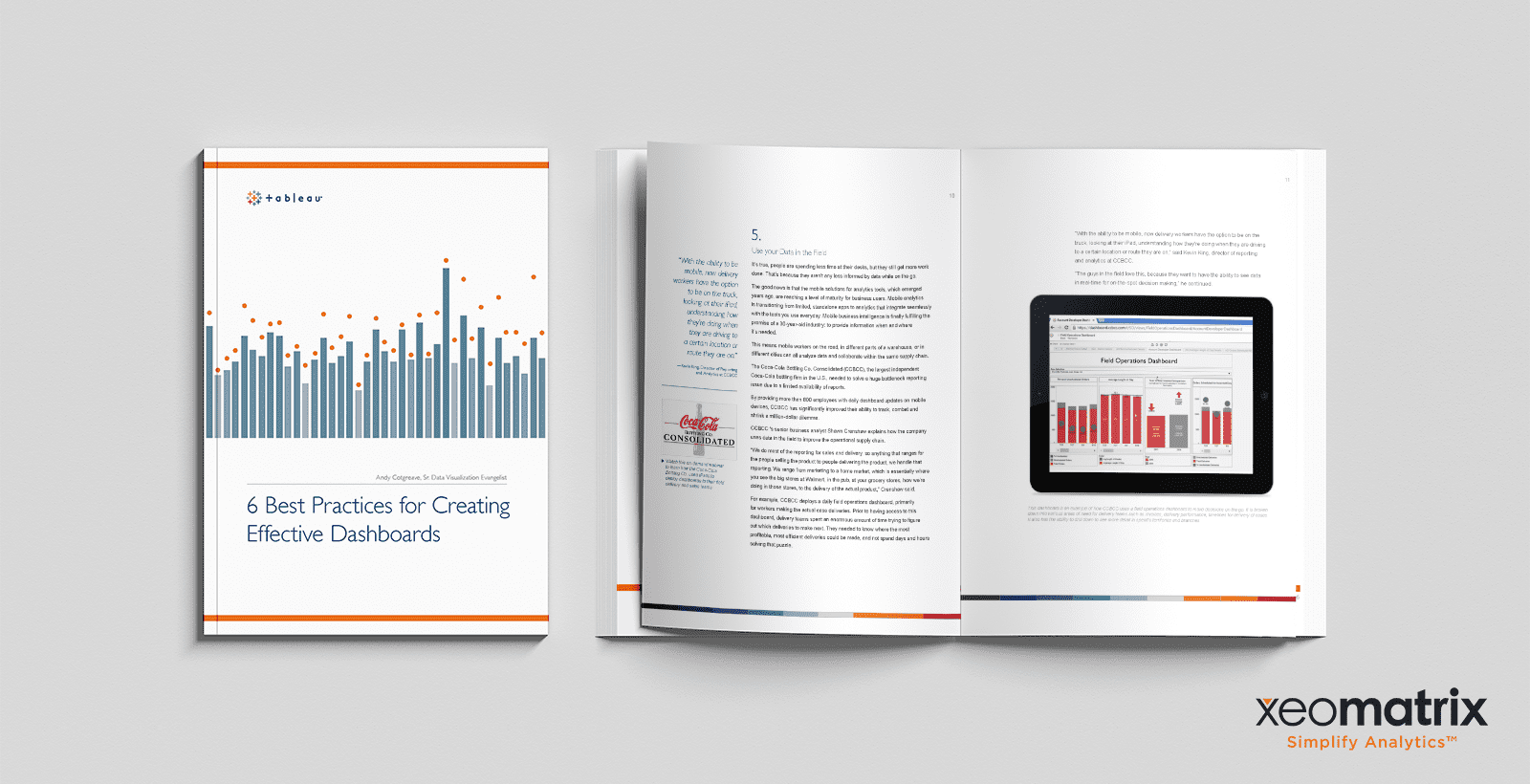
This whitepaper, written by Andy Cotgreave, is a roundup of the top 6 practices you have to keep in your toolbox to create effective dashboards using the data visualization tool Tableau.
About the Whitepaper
Tableau Dashboards help you boost analytics and filter data into actionable insights, however, they are often underutilized.
Having a properly planned Tableau Dashboard can align your company’s efforts to make well-informed decisions, track performance outcomes, and ultimately increase ROI. To make this happen, you have to create a dashboard that works for your company’s goals to ensure top efficiency and accuracy.
In order to make the most out of your data to see the complete picture and make better business decisions, you’ll have to build dashboards that will display what’s happening across multiple sets of data, correlate patterns across an array of metrics, and ultimately provide a proper summary and in-depth visualization of performance.
This begs the question, how do you build Tableau dashboards that will help you make better business decisions and increase ROI? How do you build dashboards that align with your company goals? To create Tableau dashboards that allow you to achieve this, start by following the six best practices on this whitepaper.
As a Tableau Gold Partner, we believe in learning how to create custom Tableau Dashboards that ensure top efficiency with your data. Dashboards should provide rich, intuitive visualizations that allow users to identify key data points, and use that knowledge to make informed decisions.
Fill out the form below to download the whitepaper to learn the best practices you have to keep in mind to create dashboards that align with your company goals. If you have any questions or are ready to get started doing more with your data, contact us and a member of our team will help you become the data hero at your organization.
