The Data-Driven Community Meetup holds monthly webinars on business analytics and big data. Webinars are held on the second Wednesday of the month at noon (12:00 PM) Central Time via Zoom Webinars and will cover topics related to enterprise data management. Our goal with each webinar is to provide meaningful insights and actionable takeaways to simplify analytics so you can make better decisions.
We cover topics such as data strategy, data management, data warehousing, BI modernization, embedded analytics, and cloud migration and strategy. Learn how to build reporting solutions that drive your business demand based on your needs.
About the Topic
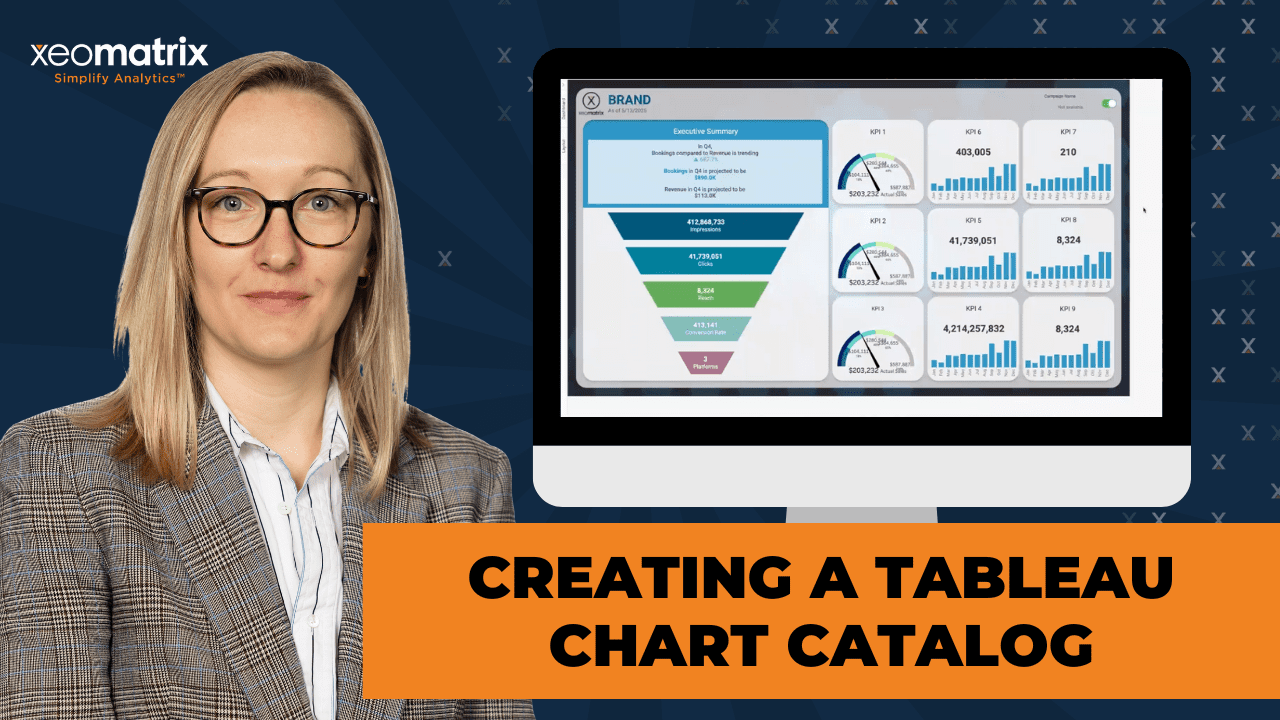
Speed up your dashboard development process with a custom chart catalog! In this article, we show you how to create your own library of reusable Tableau views, chart types, and dashboard layout templates.
This article explores how organizing your go-to visualizations can save time, ensure consistency, and streamline collaboration across teams. Whether you’re working solo or as part of a larger BI team, this session will provide practical strategies to build a flexible, time-saving resource you’ll turn to again and again.
This article includes a recording, transcript, and written overview of the presentation on Creating a Tableau Chart Catalog (On-Demand Webinar).
Creating a Tableau Chart Catalog Presentation Video
Creating a Tableau Chart Catalog Summarized Presentation
In this session, Lauren Cristaldi, Lead Consultant at XeoMatrix, shares how to build a reusable Tableau chart catalog to streamline dashboard development. She demonstrates templates for advanced visualizations—including donuts, waterfalls, funnels, KPIs, and gauges—while offering practical tips on using map layers, parameter actions, Measure Names/Values, and Figma design assets to create polished, efficient dashboards.
Session Outline
- Why Create a Chart Catalog?
- Donut Charts with Map Layers
- Waterfall Charts with Interactive Features
- Smart Text and Dynamic Labeling
- Figma Integration for Custom Design
- Streamlining KPI Panels with Measure Names and Values
- Funnel Chart Using Custom Shapes
- Gauge Charts Built with Map Layers and Geometry
Why Create a Chart Catalog?
While Tableau makes many basic charts easy to create, more complex charts like waterfalls, donuts, funnels, and gauges often require custom calculations and formatting. Building these from scratch each time can be time-consuming and repetitive. By designing a catalog of publishable templates, Lauren aimed to eliminate that repetition and help others accelerate dashboard development. Each template includes the chart and a layout-ready dashboard, so developers can plug in their data and go. This catalog’s adaptability allows users to swap data sources, adjust layouts, and repurpose components without manually rebuilding everything.
Donut Charts with Map Layers
The live demo begins with a walkthrough of her donut chart templates. Rather than using Tableau’s traditional dual-axis technique, which often results in resizing issues, Lauren employed map layers and the MAKEPOINT function to center and stack visual layers. This method ensures that the chart resizes automatically to fit the space without clipping, which is especially useful when multiple donut charts are displayed side-by-side.
Donut charts are most effective when comparing two parts of a whole, such as quarterly performance toward an annual target. It’s recommended to add a text table and custom color-coded legend for charts with more segments to improve readability. These donut charts are simple to update and don’t require constant adjustments when layouts change.
Waterfall Charts with Interactive Features
The dynamic waterfall chart template uses parameter actions to allow users to switch between different metrics, such as sales and profit. It includes clickable elements that highlight a selected quarter and update the accompanying smart text. Reference bands, created from Tableau’s Analytics pane, help visually emphasize the highlighted value.
Lauren provided insight into performance considerations, explaining that parameter fields should use integers when possible for efficiency. She also structured her templates using folders in Tableau to make it easier to replace data sources and identify which fields power each chart.
The template includes prebuilt calculations for running sums and dynamic sizes, all designed for reuse across different datasets and use cases.
Smart Text and Dynamic Labeling
Smart labels could respond to user selections and highlight key insights using calculated fields and text symbols. For example, Lauren used caret icons to mark selected quarters and formatted text to display only when certain conditions were met. She also demonstrated techniques for formatting numerical values—displaying thousands, millions, or billions dynamically depending on the value’s size. This improves legibility and ensures that smaller values still appear meaningful.
Colored text formatting was used to call attention to negative trends, and Lauren explained how all of this could be configured directly in the Marks card using calculated fields and label settings.
Figma Integration for Custom Design
To further enhance the look and usability of her dashboards, Lauren used Figma to design custom backgrounds, containers, and toggle buttons. These assets were exported as SVG images and added to Tableau dashboards as floating elements. Lauren explained how to create a Figma frame that matches the dimensions of the dashboard (such as 1400×900), design the visual layout, group assets, and export them for use in Tableau.
Using SVGs instead of PNGs when creating toggle buttons is recommended, as SVGs render more clearly in Tableau, especially when publishing.
The result is a polished dashboard that feels more like a professional application interface, with consistent visual styling and custom interactive elements like show/hide buttons.
Streamlining KPI Panels with Measure Names and Values
Another time-saving tip is how to build reusable KPI panels using Measure Names and Measure Values. Instead of duplicating charts and reapplying formatting each time a new KPI is added, developers can use a single sheet that swaps metrics through a filter. Formatting is preserved by setting default number formats at the field level, meaning that currency, percentage, or decimal settings carry over automatically. This technique dramatically reduces the time spent reformatting charts when switching from profit to sales, or from one dataset to another. This approach ensures tooltip consistency and keeps the dashboard design clean and efficient.
Funnel Chart Using Custom Shapes
Lauren also walked through a funnel chart template she created using custom pyramid shapes designed in Figma. Funnel charts are often challenging to build natively in Tableau, and this approach uses static images and Measure Names to organize key metrics in a top-down structure. While the shapes are not scaled to data values, they are arranged logically to reflect process stages (e.g., impressions to clicks to conversions). Each funnel segment is tied to a metric through a Measure Names filter, and users can easily swap out metrics or update the colors to match their data. The custom shapes are stored in Lauren’s Tableau repository.
Gauge Charts Built with Map Layers and Geometry
Lauren shared her popular gauge chart template. She developed these using map layers and a scaffolded model dataset rather than relying on floating images or hard-coded arcs. The technique uses basic geometry and level-of-detail scaffolding to draw the gauges, which can then be animated using Tableau’s Pages feature. This allows viewers to step through different time periods and watch the gauges animate, which is both visually engaging and informative. The calculations and model data needed to support the gauges are designed to make the charts adaptable across datasets.
Transcript
>> STUART TINSLEY: We do this every month. Tell your colleagues, tell your friends who are interested in Tableau topics that they can come be a part of this community. Easy sign up, middle of the month, every month at noon Central. Today, we’ll have Lauren speaking. She is our lead consultant at XeoMatrix. Her topic today is going to be how to create a chart template catalog. Lauren, do you want to take a second and talk about what that will entail today?
>> LAUREN CRISTALDI: Yes, so I’ve created this catalog, and I know you’ve probably seen some on Tableau Public if you’ve looked there. Kevin Flerlage has one where he’s linked all the different great charts that exist on Tableau Public. Mine’s a little different, though, because I’ve actually created templates so you can publish to cloud and make a new workbook from there, or basically you don’t have to start from scratch every time, especially for those complicated charts like waterfalls or funnels or donuts, anything like that that’s not out of the box, just to save you some time.
>> STUART: That’s awesome.
>> LAUREN: To make development easier.
>> STUART: Well, that’s great. You’ll also notice that, if anyone has noticed, we have updated our profile pictures here. We actually had company photos taken recently. I’m happy that they’ve made it to the slides. Just a reminder, we’ve given the ability for everyone to come off of mute in these sessions. If you’re not asking a question, if you could stay muted, that’d be helpful for Lauren, but we want to encourage participation.
If you do have questions, you can either use the chat window, Celia on our team will be monitoring that, or you can come off of mute, and we can talk about a question you have, and we can talk about it live. At the end, we’ll have a Q&A, provided that there’s time. Just a quick intro for Lauren, right? She has become wildly popular in the Tableau community. Is this correct? Eight years of experience, Lauren, in Tableau and data?
>> LAUREN: Yes. Wow, I guess it is eight years.
>> STUART: Yes?
>> LAUREN: Yes.
>> STUART: I think we updated that last time.
>> LAUREN: I keep saying seven– because I just don’t, yes.
>> STUART: Yes, mine’s actually 11 years in Tableau at this point, but let’s get into it. I don’t like to spend time on slides. We are here for the live demo. Lauren, I will give you the floor. Again, if you have questions in the chat window, you can come off of mute. We’re so excited that you’re here. Thank you for joining. Lauren, I’ll kick it to you.
>> LAUREN: Yes, sounds good, thank you.
>> STUART: Cool.
>> LAUREN: I wanted to start by showing what inspired all of this. From Kevin Flerlage, like I had mentioned earlier, he made this chart catalog, so you can select any of these, and it’ll take you to a workbook you can download if you want to try to reverse engineer any of these. It can be nice for inspiration, like if you have a lot of data, and you’re not sure exactly how you want it to be represented or visualized, this might give you some good inspiration for that. [silence]
What I’ve created, and I will publish this on our Tableau Public later this week, but just some of the ones that I’ve been using a lot lately that are more complicated, and they’re not just ready out of the box in Tableau. It’s like waterfall, donuts, and funnels, and gauges. I think if you’ve been on these sessions over the last few months, you’ve probably seen me use a lot of gauges because I’m obsessed with gauge charts.
If we go, this is just the story, so you can kind of flip through these different dashboards. Our first dashboard and the template includes how the dashboard is laid out as well as how the chart is laid out, but if you wanted to make a new dashboard have a different background or layout, then you can still use this as a guide to bring these sheets in. We would just need to unhide the sheet. It also uses this one. [silence] Then we can make a new dashboard and drop these in.
Yes, just trying to make it as easy as possible to keep developing, because I know I make a lot of dashboards every week, and it can be nice to have something already made. The other thing I like to do is within my data, I’ll make these folders so it’s a little bit easier if I’m switching from like Sample Superstore to actual client data, then I’ll replace references, and I can see, okay, so these calculations are being used here, or which ones are being used for the waterfall, and then I’ll change what I need to, that’s relevant to the new dataset.
[silence]
Any questions? That’s pretty straightforward.
>> STUART: I’ve not seen any questions yet. Let me see. No, we’re good.
>> LAUREN: Nice. Okay, the next one, these are donuts. I’m actually going to go through how I made these. I can do that with the waterfall as well, but the donut is a good place to start because we’re all used to donuts. Usually, the rule of thumb is you need– I prefer doing donuts when it’s just two parts of a whole. You’re trying to track progress of something. We’re saying like, “Here’s the sales for the quarter versus the year,” and then for the whole year would be gray, and the quarter would be a different color.
It’s just a lot easier to read, but when we do have a lot of different categories or slices to the pie of the donut, I like to put a text table next to it and then use a custom legend to kind of color code. Sometimes it can just be easier to read that way instead of having labels on each of these outside of the percentages. It’s just a donut tip, and you’ll notice I’m not using a dual axis. I was really excited to use map layers for this, and it’s pretty easy to recreate.
I just created a pie point, which is essentially you use the function Make Point and then just say 1, 1 for your X and Y axis, and that way you’re able to plot these layers, and I can actually bring that out. You just drag that pie point into the view, and then you drag it again and add that as a layer. Now we’ll change both of these pies. [silence] We can resize them.
>> [PAUSE 00:08:03]
>> LAUREN: For this one, we can use the terms. This is just Google Ads public data that I’m using. [silence] Now, after I’ve got all my layers added, we can actually remove the longitude and latitude. Entire view, just to give us more room, and right now this is a little too big. It’s getting cut off, but we can always adjust it.
>> [PAUSE 00:08:49]
>> LAUREN: Now we have all of these different slices, but we need it to be sized accordingly. I’ll just use score for the size, and the center of the donut, I usually put what we’re dividing by, so the actual total, which can be a nice visual for a KPI if you don’t want just a traditional KPI card. The other cool thing about these is that they’ll automatically resize, so your donut won’t start getting cut off, whereas if you’ve made the dual axis, like the traditional way of making a donut in Tableau, you have to go back and adjust them every time because, depending on how much real estate you have on the dashboard, it can start getting cut off, and it’s really annoying.
>> STUART: That’s happening, Lauren.
>> LAUREN: Yes, and then when you have 10 donuts and they’re all different sheets and you have to try to resize every single one and make sure they’re actually the same size, it gets really annoying. [silence] Yes, any questions about donuts?
>> STUART: I don’t see any questions. No, that’s good.
>> LAUREN: Nice. [silence] In that case, let’s go back to our waterfall. Now you notice that if you select, and I just do in the Tooltip for those quarters, you can click to highlight, which is a feature I really like because if you just want to focus on a certain quarter, over here, it’ll give you. This is some smart text I just used different calculations to create. If you select one of the quarters, it’ll highlight and update this smart text, and this button will change the measure that you’re focused on.
If we want to see profit for these different quarters in the waterfall versus the sales, we can change those dynamically. If you wanted to add more measures to select, you can do that, too. They’re just using parameter actions and then a list from a parameter and a calculated field that’s telling it basically what to do based on your selection. [silence] It’s the main part of the waterfall, and this one is fairly simple. We’re just going to use a Gantt bar.
We have this metric select, and this is that calculated field that’s making the parameter action work. [silence] The button is only changing it to sales or profit. I just had a profit ratio when I was testing it out, but yes, those are our two main ones. [silence] If we look at the dynamic, oh, the main waterfall, and we can use my folder. If we go into Max Waterfall Line, it’s nothing too crazy. The cohort is a parameter that’s just the different quarters.
You could change that if you didn’t want to map it over quarters, if you wanted it over different categories, that are in your data, or months or years, then you can change that from the parameter. I’ll just open that up real quick. Yes, so these are the different values, but we could change those to something else as well. Just a performance tip, when you’re using parameters in calculations, if you’re using a parameter in general, it’s always better to do an integer type and then change the display as, unless you have a really long list that’s coming from a field, and then I totally understand just adding values from a field.
When you have quarters or months, it’s really better to use the integers because they’re more performant. [silence] We have our max determined, now our min. This will be our metric selector again, so sales or profit. If you just want it to be one of those, you could just throw in some of sales or some of profit, just as long as this is aggregated into that running sum. Then we have our dates, which are equal to our cohort, but again, if you want your cohort to be a category, then it would just be your max category equals the cohort.
[silence]
These are technically table calculations. If we do Edit Table Calculation, just select all, and then I don’t have anything else selected. We just want to make sure that that running sum is being calculated across the quarters or whatever your cohort might be, and then also the highlighter, and the highlighter is cool because if we edit, this is just a reference band that we can get from the analytics. Let me back up a step. From your fields list, if you hit the Analytics tab, then we can add in these reference lines or bands.
I think average lines are most commonly used, but you can get really creative with the reference lines and the reference bands. I’ve used reference lines for formatting tables a lot, actually, which I know sounds weird, but it works. Yes, that’s for our highlight, and you’ll notice this highlight band, it’s using that minimum and the maximum of the waterfall line, so those calculations that we’re already using, and then it’s determining basically how wide or tall that band is.
The other important part of the Gantt, we need a size. In this case, fall size is our other main calculation, and it’s just the negative of that sales or profit in the metric selector. [silence] We’re forcing it to dynamically be taller or shorter based on what the actual value is. Then, if you want to get really creative with your Tooltips, this is actually just another sheet that I added in, and to do that, you just insert, and then it’ll give you a list of all these sheets, which, wow, there’s a lot of sheets. [silence]
Another thing I like to do is when, let’s say, you want your values that are being labeled, especially with currency, you want it to be in the thousands or millions, or billions. Then I use two different or three different calculations if I want to show those dynamically for the label. Because if we had everything set to millions, then that 113,000 would look not as meaningful because it’s harder to read.
To do that, we just make a calculation for both thousands, millions, and then we do the same thing for billions or hundreds, and we’re just telling it if this value here is less than a million, then we’re going to show it. Otherwise, don’t show it. When it is over a million, it’s going to default to the next calculation and not show up in the label, and this one is just greater than or equal to a million.
>> [PAUSE 00:18:08]
>> LAUREN: I feel like I went through that kind of fast. Any questions about waterfalls?
>> STUART: I don’t see any questions, but we’ll give people a second.
>> LAUREN: Yes.
[silence]
>> STUART: All right, I think we’re good.
>> LAUREN: Nice. [silence] In that case, I’m just going to run through my Smartsheet. This is similar to that Tooltip I showed, which is another sheet, but this is impacted by that highlighter and the common filters from our waterfall, and I know it looks like a lot because it kind of is with dynamic text, but it can be pretty cool to use this just if you want a summary of the insights that you’re looking for, especially for executives if they just want to look at this quickly.
Maybe they don’t want to try to navigate the waterfall necessarily. They just want these key metrics in this kind of easily ingestible format. We go back to our dynamic labels or smart text, and these are all really simple. It’s just saying, it’s giving a condition of, in this case, if the quarter equals the cohort, so that highlighted quarter, then show this, and this is actually highlighting our quarter itself.
On this sheet, that’s how I’m getting this caret when you’re selecting it, and then the rest of them don’t have it. With that, I use– and I’ll put a link in the workbook, but I go to these cool symbols, like free icons as text website, so you can find all these crazy icons, like the circles as text and everything, and sometimes that’s easier to put in when you have smart text or smart labels that you want deltas in there, or you just want to highlight it in a certain way or have those bullet points.
>> [PAUSE 00:20:46]
>> LAUREN: The other smart text really just works the same way as our other dynamic labels. [silence] When you put it all together on the Marks Card, it looks like this. We can color the text by saying when it’s negative, it’s going to be red, and we just do that right from the edit label from the Marks Card.
>> [PAUSE 00:21:27]
>> LAUREN: It’s all these little things that they take a long time to test and put this all together. I’ve done it, too, but I’ve definitely underestimated how much time it takes to format something properly. Definitely love using templates like this chart catalog in order to save just a lot of time in the long run. [silence] Another thing I want to touch on would be these KPIs. Here’s a time series, like just a line over as part of the KPI here. Now, say we have, I don’t know, 10 of these. It’s really annoying to try to duplicate the sheet.
You right-click on that. If I wanted to make another one, I duplicate it. I don’t want this to be profit. I want it to be quantity or something like that. Well, usually you’d have to drag quantity in, you’d have to reformat unless you have the default format set up already, but it can just take a lot of time to replace everything and hide all the lines again in the background. By using Measure Names and Measure Values, you can quickly recreate your KPIs by just going into this Measure Names filter. You edit. We can change that to quantity, and now everything is formatted the same way, even our Tooltip, but we have quantity instead of profit.
>> STUART: Lauren, there was a question that came in. How did you get the rounded dashed lines on the insights? Rounded dashed lines.
>> LAUREN: Oh.
>> STUART: Oh, yes, that.
>> LAUREN: This one? Oh, that’s an image, a custom image I made in Figma, and I just have it floating over the insights section to kind of frame it.
>> STUART: That’s not native Tableau right there. All right, so Figma. Someone asked how to use Figma. Do you want to explain, maybe what Figma is and how it might relate to Tableau?
>> LAUREN: Yes. Actually, last month, and I think that video is on our YouTube channel, I went through how to create different Figma templates and then put them into Tableau, basically. Yes, Figma is a really great tool. It’s really powerful for design. Even this background I created in Figma, so all these rounded backgrounds for the different sections.
>> STUART: Yes, someone asked if you can download. It’s a web application that you could have. They have a free version, and they have paid versions, and then when you make a template, or in this case, Lauren built an image, right? That can be exported and brought into Tableau from there.
>> LAUREN: Yes, exactly. Actually, I can pause for a second. Let me, and I won’t get too into the weeds.
>> [PAUSE 00:25:32]
>> LAUREN: This is what Figma looks like, and I actually have a free license, and they have all these really cool UI kits. If you wanted some custom shapes or buttons, I love the toggle for when you’re showing or hiding really anything, but especially filters, instead of that filter icon that you’d normally see, or the hamburger menu. It just feels cleaner. Yes, you can add these in here. [silence] Then, if we’re creating, let’s say, a background for our dashboard, you just make sure that this is the same dimensions as your dashboard’s going to be.
Recently, I’ve been doing a lot of 1,400 by 900 or 1,000, not by 100. I’ll just do 900, and then I use this as a base, so that initial rectangle. Then I could start building little KPI boxes or something. I go in here, make them rounded, change the color. We can add a little drop shadow to give it more of an application feel, [silence] and then we can just duplicate those objects several times if you want everything to kind of be the same.
>> STUART: Lauren, somebody asked about exporting of this to Tableau. How do you do that?
>> LAUREN: Yes, for that, we just want to make sure everything that we want visible is grouped together. I just do Command or Control G, and then once you have all of that selected, you can go down to Export, and then Preview. It’ll show you what you’re exporting, and we would export Group 1. That’s going to export it as an image. Now, if we go back over into Tableau, we’ll create a new dashboard. We’re just going to tile that image we generated. [silence]
I usually fit and center it, and then, okay, and right now, it looks kind of wonky because we don’t have it set to the same dimensions. It doesn’t have enough room. I think that was 1,400 by 900. Then we’d remove all the padding as well because we really want this to truly be the whole background. Just make that 0, and there’s some hidden padding that Tableau defaults to. You notice when you put something into a tiled container, it’s the first thing you drop in into a new dashboard, it’s going to have this blue box around it, and that’s the layout container or this tiled, which you can see in the item hierarchy from the layout tab. I don’t know why it’s 8, but I just change it to 0, and then everything fits.
>> STUART: That’s cool. Yes, David, hopefully that was helpful. Are you paid for Figma, or do you have a free version still?
>> LAUREN: I still have the free version, and I’m able. I’ve made some.
>> STUART: You’ve gotten pretty far. Yes. Good, okay, cool, yes. Free version.
>> LAUREN: I think the paid version, so the free, you don’t get as many projects allotted to you, like for team collaboration. I think you only get two. If you’re planning on having multiple files with multiple team members or different teams, then you should have the paid.
>> STUART: That could be pretty applicable, yes. If you’ve got a team and you want to share, “Hey, I’ve already got a template for that,” that could be money well spent on the paid version, I guess.
>> LAUREN: Yes, exactly.
>> STUART: That’s cool.
>> LAUREN: We should be Figma partners.
>> STUART: Yes, you would think we have a partnership with Figma. We don’t, we don’t at all. Yes, that’s our little pitch on that.
[silence]
>> LAUREN: Let’s see. We’re talking about those KPIs. The same thing with the Measure Names and Measure Values to save you some time and the pain of formatting or reformatting, the same thing applies to just those numbers as well. If you wanted to add more KPIs or change the measurement or the measure being used, we would just duplicate, edit the filter on the Measure Names, and then we could select something different, and now all the formatting stays.
The other part of this that’s good to know and will save you a lot of time, if you try to format from the Measure Values pill, that number that, say, you want it to be a currency or a percentage or something, then every time we add a new measure or we make any kind of duplicates of this and then change the measure that we’re using, you’re going to have to go back in here and reformat it. Instead, if you look up the field that you’re going to be changing it to, that measure value, select that pill or that field.
Then go to Default Properties, Number Format, and in this case, we can say we’ll just add the two decimal places so we can see it change everywhere. Now this has changed here, and it’s changed everywhere else as well. Well, everywhere that we’re using quantity. [silence] Yes, like in these Tooltips, but if we were to change that back to– [silence] or let’s change it to profit. Now we don’t have those two decimals, but the profit also doesn’t have the default formatting.
We’ll select Profit, Default Properties, Number Format, and then Currency Custom, and now we have that profit value. Every time we bring in profit, it’ll be a currency instead of just a number. [silence] Yes, don’t sleep on how much time Measure Values and Measure Names can save you.
>> [PAUSE 00:34:00]
>> STUART: I think we had a question come in. “Lauren, what happened to the buttons in the exported image?” I’m not sure if I understood that question.
>> LAUREN: These buttons?
>> STUART: I think so. I think from Figma. I don’t know if we want to pop back. We can maybe cover that later.
>> LAUREN: Oh, what happened? Oh, I see. I see what you mean. Yes, so these toggles, I didn’t add them to that group, so they’re not being included. Since we want to use these as images in the Hide/Show, we go over here. I’m using it right here, and this is technically a Hide/Show button. To do that, when you have a container or another object, and this one already has the Hide/Show of that toggle, but let’s say I want to Hide/Show just this one or something.
You select that object or container, and then you look for Add Show/Hide button. Oh, I was saying that backwards, but yes. Then we’ll edit the button, and this is where you’d choose an image that you have downloaded. In this case, over here. I have that ToggleOn and ToggleOff saved already as images. We’d go into Figma, and we would just export these two images.
I prefer, if you’re not going to put them in your shapes folder or add them as custom shapes in the workbook, because in that case, they have to be PNGs, if you’re going to add them just as buttons, like navigation buttons, or the Show/Hide buttons, the SVGs render a lot better than PNGs do. It’ll just look a lot crisper if you publish or when you’re sharing it. It’s just a small tip. Yes, that’s how you would export those separate from your actual dashboard background, just so they have the interactivity.
>> [PAUSE 00:36:57]
>> LAUREN: I can move on to the funnel. You guys are ready.
>> STUART: Yes, I think we are.
>> LAUREN: Sweet. This is another layout. If you have a lot of KPIs that you’re tracking, maybe you want to throw in a pipeline or a funnel. This is actually using custom shapes. [silence] I used Figma again for this. I created a pyramid, and then I cut it apart, basically, so that we’d have all of these line up relative to each other. In this case, I have these different metrics. They’re not adjusting for the size. It’s more of a way to organize these different KPIs because we’re saying the impressions are the most important, and then clicks, and then further down, they feed into the result here, even though the scale is different. [silence]
I think this is the cleanest way. I’ve seen a lot of different methods for funnels. They can get kind of involved, and then it’s not as easy to replace with different data or to change out the data you’re using. With this, because we have the custom shapes and we’re using Measure Values and Measure Names again, you would just swap it out and then adjust which Measure Values are being used for each of these, or Measure Names are being used for each of these.
>> [PAUSE 00:39:07]
>> LAUREN: I’m trying to think if it would be– yes, I’ll just– Let’s see. I think Superstore has enough measures for us. For example, if you wanted to take this and plug in your own data, you’d go into here, you’d say Replace data source just for this worksheet, in this case. We’re going to swap it out with the sample Superstore from that dummy marketing data that I was using. Yes, that’s the current one. [silence] Now it’s freaking out because it can’t find these fields that it was using, but that’s easy to handle, too. If we just come in, let’s see. We want to change a bunch of these out. We use sales instead, [silence] and then maybe we do quantity.
>> [PAUSE 00:40:31]
>> LAUREN: Actually, in this case, because we’re not needing to replace it everywhere, we’ll just edit the Measure Names filter. [silence] We’ll say none because it’ll clear out all those red ones, and let’s just pick. There are five of these. We can do quantity, sales, profit, discount. We just need one more. [silence] Let’s do the count of orders, and then okay, so that’s all good. Remove that filter. It did get rid of my funnel, but because I still have it in here, I just saved it in a folder within my custom shapes, within my Tableau repository folder, and you just go down this list.
I want the first one to be that one, and you just go and order here. [silence] We could change the colors if we wanted, or we could change the order of these and then change how those funnel shapes are assigned, but it’s really pretty easy just to swap that out, change those Measure Names, and then reassign the funnel shapes, and those shapes are available if you download this workbook once we have it published. [silence] Any questions? [silence] Cool.
>> STUART: I don’t think we have any questions now. We’re good.
>> LAUREN: Nice, okay. Yes, I was worried that I was going too fast because I had too much coffee earlier, but I’m glad I’m not. [silence] For the last one, I love gauges. I’m actually going to be presenting at the Austin TUG tomorrow and talking about these gauges. [silence] I came up with this for a client that wanted gauges. There’s not really a clean way to do gauges without having to use images and floating stuff.
You have to use parameters, and I just couldn’t find the best solution to exactly how I wanted to use them, but I came up with this with the map layers, some light eighth-grade geometry, but I have all of those calculations here so you don’t have to recreate the wheel, but you just plug in your own data. Actually, on our Tableau Public page, from one of our previous sessions from this webinar series, I have one about mapping.
The map layers I highlighted that you can use them for stuff other than mapping, and I have the dummy or the model data that I used to create these gauges to connect to your regular data available there, so you could download it. The other model is just a level point and value. It’s assigning, it’s telling your data how to draw this, basically. You do a scaffold, and it assigns a fixed 1 through 400 values so that you can draw these points from the 0 to, in this case, 241,000. [silence]
These are all adjustable, and we can use different filters. In this case, I’m using pages, if we go here.
>> [PAUSE 00:45:32]
>> LAUREN: It’s not showing. [silence] Well, we can do it from here as well, but if you want a cool animation, the gauge will actually move when we use that Quarter and Year on pages. In a normal– Oh, sorry, go ahead.
>> STUART: No, that’s awesome. That’s really cool.
>> LAUREN: Yes, I feel we never get to use animations, and I’ve had a lot of clients be like, “What are pages?” I’m like, “Oh, you don’t really need to worry about them. You probably won’t use them,” but I wish we could use them more.
>> STUART: Yes, that’s awesome.
>> [PAUSE 00:46:27]
>> LAUREN: Yes, just with the other sheets, you can unhide, add it to a new dashboard, or you can swap these out for different ones that you’ve built or modified and use the same template.
>> STUART: That’s great. Lauren, now we have 10 minutes left. Is there anything else you wanted to cover?
>> LAUREN: No, I think I’m good. Anyone that has any questions, or I can clarify anything? [crosstalk]
>> STUART: If you’re ready to come off of mute or ask it in the chat window, we can take time for questions. [silence] Okay, any questions? Where is the link to the dashboard? Is that on Public, Lauren?
>> LAUREN: Yes, I’m going to publish this later this week.
>> STUART: Cool.
>> LAUREN: I’m going to make some little edits and tweaks, and some notes.
>> STUART: Yes, that sounds great. Okay, that seemed to be the only question. People want to get to this dashboard and work with it.
>> LAUREN: Awesome.
>> STUART: All right. Lauren, thank you, as always. Yes, Vivian, our YouTube channel, we’ve got everything recorded. This session will go there, and then any previous recordings that are there. Lauren, we’ll see you next month. Do we have an idea of the next topic, or does that need to be thought out?
>> LAUREN: Oh, next month, we are going to get into Viz Extensions-
>> STUART: Oh, cool.
>> LAUREN: -and how to use those and kind of highlight Infotopics, which is our favorite extensions.
>> STUART: Yes, that’ll be really awesome. For those that are not familiar with extensions, a couple of years ago, Tableau started opening up the platform where you can integrate extensions. There’s a company called Infotopics that has some really wonderful extensions. They have things like SuperTables, which will give you an Excel-like experience in Tableau, or they have ShowMeMore, Lauren, I think it is, lots of visualizations you can customize with.
>> LAUREN: Yes.
>> STUART: All kinds of extensions that we’ll dig into on that one. Cool, all right, Lauren, thank you for your time. Thanks to the group. We’ll see you next month.
>> [00:49:22] [END OF AUDIO]