About the Topic
This session covered multiple use cases for Tableau’s Dynamic Zone Visibility functionality, including sheet swapping, showing and hiding legends and filters, and drill-down data exploration.
Presentation Video
Summarized Presentation
In the session “Get in the Zone: Dynamic Zoning in Tableau,” Jared delved into the transformative power of Dynamic Zone Visibility (DZV) in Tableau, showcasing its potential to revolutionize data visualization and interaction within dashboards.
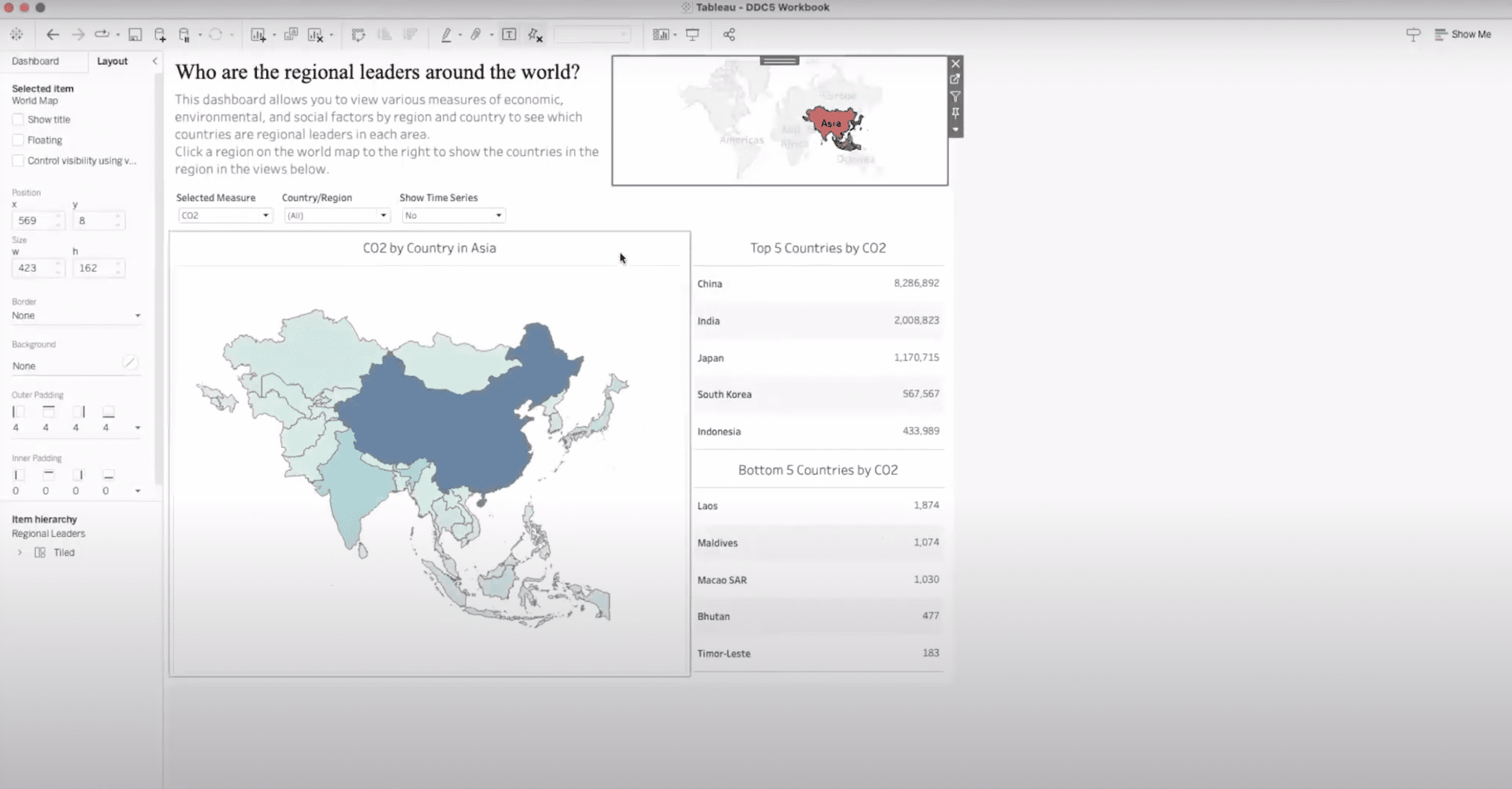
Jared started the session with a foundational overview of DZV, utilizing a specially created demo dashboard that leveraged the world indicators data source. This departure from traditional datasets underscored the flexibility of DZV in enhancing user engagement and analytical depth. Through interactive examples, Jared illustrated how DZV allows for dynamic content display—such as region-specific data and time series analysis—triggered by user actions, thereby facilitating a richer, more engaging data exploration experience.
The session progressed to unpack the complexities behind implementing DZV, with Jared meticulously explaining the backend setup. This included the integration of sets, Boolean calculations, and parameter actions to achieve a seamless and dynamic user interaction. Such detailed walkthroughs provided attendees with the necessary knowledge to replicate these techniques in their dashboards.
Building on this foundation, Jared provided a step-by-step guide on constructing a dynamic dashboard from scratch, emphasizing the strategic use of containers, sets, and actions to manipulate dashboard elements dynamically. This hands-on approach not only demonstrated the practical application of DZV but also highlighted its utility in simplifying complex data interactions without sacrificing dashboard real estate.
Diving deeper into advanced techniques, Jared explored conditional visibility and parameter-driven content display, showcasing the adaptability of DZV in managing various data visualization needs. This segment underscored DZV’s role in enhancing dashboard aesthetics and user experience by enabling dynamic content adjustments based on user interactions.
One of the session’s highlights was the exploration of practical applications and visual design, where Jared shared a compelling use case involving the dynamic display of call center employee rankings. This example vividly illustrated how DZV could be used to automatically adjust content presentation, optimizing readability and visual appeal.
Throughout the session, Jared emphasized the importance of community resources, collaboration, and continuous learning in mastering DZV and other Tableau features. By providing a comprehensive overview, practical demonstrations, and insightful discussions, the session equipped attendees with the knowledge and inspiration to leverage DZV in their Tableau dashboards, pushing the boundaries of data visualization and interaction.
Session Outline
- Introduction to Dynamic Zoning
- Implementing Dynamic Zone Visibility for Enhanced User Interaction
- Advanced Applications and Backend Setup
- Simplifying Complex Data Interaction with Dynamic Zoning
- Building a Dynamic Dashboard from Scratch
- Dynamic Zoning Advanced Techniques
- Practical Applications and Visual Design
Introduction to Dynamic Zoning
In the session “Get in the Zone: Dynamic Zoning in Tableau,” Jared introduced the concept and practical applications of Dynamic Zone Visibility (DZV) in Tableau through the creation of a demo dashboard. Utilizing the world indicators data source available in Tableau Desktop, the dashboard was designed to explore various economic, environmental, and social measures across different countries and regions. This approach marked a departure from the commonly used superstore data set, offering a fresh perspective on data visualization and interaction.
Implementing Dynamic Zone Visibility for Enhanced User Interaction
The dashboard showcased how Dynamic Zone Visibility could significantly enhance user interaction by allowing for dynamic content display based on user actions, such as selecting a region on a world map. This functionality enabled the dashboard to reveal specific measures for the Americas, such as the top and bottom five countries, based on a selected measure, all through a single click. Moreover, DZV was utilized to display a time series at the bottom of the dashboard based on a true/false parameter, offering insights into trends over time for the selected countries.
Advanced Applications and Backend Setup
Further exploring the capabilities of DZV, Jared demonstrated how it could be used for more complex interactions, such as selecting individual countries for a detailed comparison, facilitated by set actions and Boolean conditions in the backend. This level of customization provided a deeper analytical view without cluttering the dashboard with excessive information.
The setup process for these dynamic interactions was explained in detail, including the creation of navigation maps, the use of parameters for controlling visibility, and the integration of parameter actions for interactive elements like region selection and time series display. Jared emphasized the importance of constant values in triggering DZV through fixed level of detail calculations, ensuring reliable and consistent dashboard performance.
Simplifying Complex Data Interaction with Dynamic Zoning
Jared provided an insightful exploration into using Dynamic Zone Visibility (DZV) to create highly interactive and flexible dashboards. Through hands-on examples, he demonstrated the power of DZV in transforming user experiences, emphasizing its utility in simplifying complex data interactions and enhancing dashboard aesthetics.
Building a Dynamic Dashboard from Scratch
Jared illustrated the process of constructing a dynamic dashboard using the Tableau Superstore dataset. The example focused on dynamically displaying sales information across categories, subcategories, and geographical regions. Jared skillfully integrated sets and Boolean calculations to manipulate dashboard elements, showcasing the seamless transition between different data views based on user selections. This practical demonstration underscored DZV’s versatility in managing and presenting data in a concise and user-friendly manner.
Dynamic Zoning Advanced Techniques
Jared introduced more sophisticated techniques, including conditional visibility and parameter-driven content display. These advanced applications highlighted the capability of DZV to accommodate various data exploration needs without overloading the dashboard with information.
Practical Applications and Visual Design
Jared shared a particularly compelling use case involving the dynamic display of call center employee rankings based on varying data sizes. This example highlighted DZV’s role in enhancing the visual appeal of dashboards by automatically adjusting content presentation to fit available space, thereby eliminating visual clutter and improving readability.
Transcript
>> STUART TINSLEY: We’ve done so many sessions that are all on our YouTube page, and tell your friends, tell co-workers, tell anyone in the Tableau community that this is out there for people. So you always go back and look at the sessions on YouTube.
Today’s agenda. We’ll talk about just upcoming events, the meeting format for today. Our featured speakers are primarily Jared Schulman. He’s been with XeoMatrix a number of years. He’s an incredible Tableau expert who has led a number of these sessions, and we’re going to talk today about Zone Visibility, which is a newish feature in Tableau that Jared will dive into and provide a number of examples of how you could use it in Tableau.
Like any sessions that we have, we’ll always have Q&A. We’ve made these meetings open. So if you have questions as we go, please feel free to come off of mute. Or you can leverage the chat windows, and I’ll chime in and ask Jared a question. Or you can wait till the end and you can ask the questions there.
This is a webinar meeting, so if you could just please observe that customary Zoom etiquette. So if you’re not asking a question, just stay on mute so we have a crisp recording for YouTube, and again, we’ll have Q&A at the end, and we’ll always send the recording out, and you can go to YouTube and find all those sessions that we’ve recorded in the past.
All right. Jared, do you want to give an intro on yourself? I feel like I always do an intro, but it’s always great for people to hear from you and your experience and your background. That could be helpful.
>> JARED SCHULMAN: Yes, yes, sure thing. My name is Jared Schulman. I’m one of our Tableau leads here at XeoMatrix. I’ve been in the Tableau ecosystem for eight years now, mostly Tableau Desktop, but probably like six years of Tableau Prep as well.
I came into data analytics out of the higher education industry. So if we have any public sector folks on the call, you’re my people, good to see you, and I kind of moved from strictly Higher Ed over into sports and entertainment, working in college athletics, and then back onto the business side of Higher Ed, and throughout that whole time, did a lot of sort of consultative building of data shops, and ended up parlaying that into working here at XeoMatrix, helping all sorts of companies build out data shops, get into the Tableau ecosystem, have success in the product, and it’s been a great run. It’s been a great place to be, and getting to do these data-driven communities is a really fun way to kind of build on that and help bring Tableau to more people.
>> STUART: Cool. Thank you, Jared.
For anyone who doesn’t know me, I’m Stuart Tinsley. I’ve been in Tableau for close to 10 years now. I need to update the slide. Used to work at Tableau. I lead our sales group for XeoMatrix, but I’ve done consulting work, and have done a few sessions on our community too. But I’m really excited to turn it over to Jared because he is far better in the product than I. So let’s get into the demo.
Jared, do you want to take a second and just talk about what you’ll be covering with Zone Visibility? Or maybe what Zone Visibility is, and what you can use it for might be a good starting point.
>> JARED: Yes, yes, totally. So Dynamic Zone Visibility was a new feature that got released, I want to say, in 2022.3, so it’s still fairly new in the Tableau world, and it’s a feature that lets you show or hide dashboard elements based on some kind of Boolean criteria or parameter.
So what that means, practically speaking, is if you’ve ever done sheet swapping in the past where you had to set up a parameter or a calculation that would filter out all of the data in a view based on some criteria, and then another view with a slightly different data setup that was unfiltered when the other one was filtered, just to get those views to sort of swap with each other on a dashboard, Dynamic Zone Visibility makes that, like, 50% easier. So there’s still a little bit of setup, but it not only lets you do sheet swapping easier, it lets you expand that to more than just sheets.
So Dynamic Zone Visibility lets you show and hide whole containers on dashboards. You can show and hide legends, filters, navigation menus. So there’s really no limit to what you can show and hide with Dynamic Zone Visibility, whereas sheet swapping in the past was a lot clunkier and limited to just the actual sheets on the dashboard.
[crosstalk ]
We’re going to go through about three different ways to use and set up Dynamic Zone Visibility, and we’ll talk to some of the different use cases for it as well.
>> STUART: Sweet. Let’s get into it. Live demo time. I’ll stop sharing.
Like I said earlier, if anyone has questions as we go, you can come off mute, ask a question, or use a chat window. I’ll keep monitoring that.
Jared, I’ll pass you the ball here.
>> JARED: Nice one. Well, cool. This is going to be our demo dashboard for today. It’s always fun building these out. You know, we schedule these data-driven community meetups, and then we have to kind of scramble and go, “OK, well, what can we build for this? How can we show this? And what can we pull together?” This is the first one that I’ve done where I kind of said, “I’m bored of superstore data. Let’s see what else Tableau has.”
So this is using the world indicators data source that comes with Tableau Desktop. If you go and connect to a new data source in Tableau Desktop, you actually have the option of just pulling up this data, and, yes, I wanted to take a look around that data set, see what was in there, and it’s a bunch of different economic, environmental, social measures across various countries, and years, and regions. So I figured let’s build out a dashboard that lets us explore through this data, and get a feel for what’s out there.
So this dashboard starts off with just our title card, and then this little navigation map up in the top right, and it says we can click on a region in the world map to show the countries in the region in the views below. So if we do that and we click on the Americas, this is going to use Dynamic Zone Visibility to pick up on the fact that we’ve clicked that, and it’s going to show us the Americas, and then the top five countries for this measure, and the bottom five countries for this measure down here at the bottom, and that Dynamic Zone Visibility showed this whole filter bar. It showed this whole container that has multiple sheets within it, all within, like, one click, which is way easier than sheet swapping.
Now we can come around here and just kind of click around, see what our different measures are. We could filter country if we wanted to. There’s also this show time series, and this is just a true/false parameter that was supposed to be aliased as “yes” and “no” instead of “true” and “no.” But I guess I didn’t click that to check it. So if we click this over to “true,” now we’re going to use Dynamic Zone Visibility to pick up on this parameter value and show this time series at the bottom, that lets us see what that trend is like over time for whichever country that we’re hovering over up here. So that is also using Dynamic Zone Visibility there.
There’s one more way that we can use Dynamic Zone Visibility that’s a little bit trickier. Right now, we’ve got top five and bottom five countries selected here. But if we wanted to get a closer look at a few individual countries, what we’ve done on the backend, and I’ll show how this is all set up after this, is we’ve set up a set in the data and a set action on the dashboard that lets us highlight a few of the countries, and when we do that, that’s sending a signal back to the Dynamic Zone Visibility Booleans, which says we have multiple countries selected now. So we want to get rid of the top five and bottom five, and just show that zoomed-in look at those few countries that we’ve selected, so we can kind of get the exact values for the countries that we want to look at in that set, and then if we click off of that, it’s going to go away. We don’t have any countries selected now. So we get our top five and bottom five back.
All of this is on one dashboard. All of it is controlled by about three or four different Booleans for Dynamic Zone Visibility.
That was my favorite one to be able to use that set action. That was a fun one.
>> STUART: Yes, we got to see that. We got to see how you set that out.
>> JARED: [chuckles] Yes, yes. So let me back out of presentation mode, and we can talk through how this is done. So to start up at the top, this map for navigation, this is built off of a couple of filters and then the Dynamic Zone Visibility. There’s actually one more Dynamic Zone Visibility feature going on here. We can combine multiple criteria.
In this case, Oceania only has 13 countries in it on this map, and so instead of showing the top five and bottom five, I said, well, let’s just show all 13 for Oceania because it’s a pretty short list. So this is looking at which region is selected as well to pull out the full list instead of the top and bottom five.
Anyway, to go back, this “show and hide” here on this container is using this region Dynamic Zone Visibility field that we created, and if we come in here, all that is saying is it’s looking at this region parameter and checking to see if it’s none. So this is working in conjunction with a parameter action on the dashboard. If we come back to the dashboard and look at our dashboard actions, the region parameter is being set by this parameter one. So this is a parameter action on the region map… Actually, on the world map. We don’t need it on these. Those we’ll just add in later.
So on the world map for the source sheet, we’ve got the region parameter being targeted based on the region field. So anytime we click on the world map, it’s going to set the region parameter according to the region field on this map. So that means that when we go in and we click on Americas, it’s going to change that to Americas. When we click on Africa, it’s going to switch it to Africa, Europe, etc.
When we opened the workbook, the value for that was set to none. So I can come over here to my sheet, change that to none, and we come back to this view that’s just our title card in our map, and as soon as our end user goes in and clicks on one of those, now it’s going to show us the sheets below, and that’s based on that region DZV that’s telling us that there is a region selected in the map.
Does that make sense?
Then moving forward.
>> STUART: Makes sense to me. Yes.
>> JARED: OK, cool. Cool. Yes. If there are any questions that come up, let us know. Happy to dive into this a little bit more.
It’s kind of like riding a bike, where the first couple times you set up Dynamic Zone Visibility, you’re, like, “OK, I don’t quite understand how this is all working, but it’s working and that’s cool,” and then you just kind of get used to it.
A much more simple example is this show time series. So this is just a parameter that is set to either “yes” or “no,” and that is controlling this sheet down here. So we called this parameter “time series.” And it’s just saying if the time series is not no or yes. So if it’s yes, then it’s going to show it. If it’s no, it’s going to hide that.
So this is something that, to take a small tangent, if you have a parameter that’s being used to control the time period visible on your dashboard, you may have that parameter set with options for year-to-date, month-to-date, rolling 12 months, and you might have a custom option. So this is a situation where you can use Dynamic Zone Visibility to say, if that is custom, if you want that custom date range for that date parameter, then you can show two parameters for the start date and end date that you want to use for that custom date, and if it’s not set to the custom date, it’ll hide those, and that’s less confusing for your end users. That way, they don’t see those two dates and wonder why it’s not showing anything different when they’re actually set to year-to-date.
Does that make sense?
>> STUART: Yes.
>> JARED: It looks like we have a question: “Repeat for parameter mapping.”
So if I’m understanding the question correctly, the parameter that’s being used on the map, it’s set by the region field. So this map has the region field over here on text, on detail, on color, and so our parameter action up here in the dashboard actions is using the region field from the world map as a source, and so that’s the source field, and that’s the value that’s being put into the region parameter. So when that region parameter is equal to anything other than “none,” whether it’s equal to Americas, Africa, Middle East, Asia, it’s going to show these views here, because we’re telling it that when that condition is “true,” when it’s not equal to “none,” that’s when we want to show that visibility of this container.
Awesome. OK, cool.
Stuart, does that make sense on that sort of date filter use case as well? Because I know that’s something that we run into a lot, where we have clients who want to show a defined time period or custom, and there never used to be a way to hide those custom dates.
>> STUART: Yes. That’s a really good one.
>> JARED: Right on. Yes, I know it’s come in handy for us a lot. Hopefully, that lights up a light bulb for somebody, and they go, “Oh, yes, I could totally use that for something on mine.”
The same thing is true for legends. If you want to show or hide legends, you can put a parameter on your dashboard to just say “show legends.” And if they hit “yes,” then it’s going to show it. Especially if you have a view with just a ton of marks in it that has 20 or 30 different colors, you don’t want to have it on your dashboard all the time. It’s going to be a pain to scroll through. It’s really difficult to read. So you can hide that with Dynamic Zone Visibility, and just tuck it off to the side to where you can show it with a parameter, and you can set that parameter up as a radio button too, so it’s just kind of click on or off. That’s a really nice way to do those things that you just want to show or not show. So, yes, a couple of different options for that.
The one that is built for Oceania, I’m trying to remember exactly how we did this. So this is using the Oceania field. This is one that gets a little bit tricky. Because if you’ll see, this is looking at, is the region parameter Oceania? But also, the country set cannot be greater than one, while with make a little bit more sense when we go into that country set. But what I want you to notice here is these curly brackets that are showing this is a fixed level of detail calc.
One of the criteria for Dynamic Zone Visibility is the field that you use to trigger it has to be a constant value. What that means is it can’t change based on what’s in your view. So if we were using sum of sales, this would depends on what else is in the view. Is it sum of sales by region? Sum of sales by category? But if we were to use the fixed maximum sum of sales, with no particular level of detail, just for the whole data set, that’s never going to change.
So what we have to do here is take the fixed maximum or minimum or what have you of the true/false region parameter equals Oceania, and the true/false of not country set is greater than one. So that part’s a little bit tricky. The only thing to really remember from that is if you have a field that you’re trying to use for Dynamic Zone Visibility, and it’s not showing up when you’re over in your dashboard, and you have this control visibility using value, if you don’t see the field that you’re trying to use there, go back and double-check and just see, “Do I need to make this a fixed level of detail calculation? And is the value going to be constant?”
So parameters, like the show time series, those are always going to be constant, because you can’t affect a parameter value through any other filter or calculation. But if you’re using a calculated field, like a calculated Boolean, you just need to make sure that it’s going to be a constant unchanging value based on what you have in your dashboard.
Does that make sense? That one’s tricky.
>> STUART: That is a bit tricky, yes.
Jared, not to put you on the spot. But I wonder if it’d be helpful for people who have never done Zone Visibility to do one from scratch, like, do an example, and I’m thinking we could pick even in superstore, like, category, subcategory, and map something out. Would that be feasible?
>> JARED: Yes. Yes, we could do something like that.
>> STUART: Something at random here, just to show. Because I think when I was learning Zone Visibility, it was helpful to go through all the steps, right? And there are a couple, just to see, and then having seen that, I think these examples are like, wow, what you could do with them. But, yes, maybe we connect up to superstore. We grab whatever you think is best, like sales and subcategories and categories, and show a practical example of that data.
>> JARED: Yes. So let’s dive into that. So let’s take category and subcategory, and we’ll grab sales. Why not? Let’s do this set based example for this, because this will probably be the most complicated example we can give, and then we can show a more simple one if that’s too much.
So we’ve got our category, we’ve got our subcategory, and we’ve got our sum of sales. So let’s go by region. Yes, all right. This is going to look a little bit ugly because we’re doing it on the fly, but this will be fun. So we’ve got that, we’ve got that, and then we grab state as well. We’ll pull out category and subcategory, a region, or state. May actually put these in a horizontal container.
There’s only so far I can go with winging it, Stuart. I just have to have things organized somehow.
>> STUART: We certainly preach containers. So [laughter] good that we practice what we preach.
>> JARED: Yes [laughs]. Yes, got to keep things organized.
>> STUART: Yes. All right, so you have three sheets here. You’ve got one sheet breaking up categories, subcategory, sales,then a sheet for region based off of sales, and then you’ve got a state level view of sales.
>> JARED: Exactly. So I’ve got category, I’ve got region, and I’ve got state. So what I want to do from here is create a set based off of the subcategory, and all I’m going to do here is just create the set and leave it as it is. So I’m not going to make any changes to this, and that just kind of creates a bucket that we can put subcategories into, and we’ll go ahead and create an action to put the subcategories in that bucket.
So we’re going to change set values. We’re going to use sheet 10, which is our categories, targeting the subcategory set. We’ll run it on select, which means that when we click it, it’s going to add it. It’s going to assign values to the set, and if we clear the selection, we want it to remove all the values from the set. So all that does is change the values in the set based on the subcategories that we select.
What I want to do now is create a couple of Boolean calculations. So this is going to be subcategory is greater than one. So in my subcategory set, if this is “true,” if it’s part of the subcategory set, then give me the subcategory, And I’m not even going to put it “yes” or “no.” I’m just going to do end. So this is saying, “If a subcategory is a member of the subcategory set, tell me what that subcategory is.”
I want to get a distinct count of this, but then I know this also has to be a constant value to work in Dynamic Zone Visibility. So I’m just going to pop curly brackets on it to make that a fixed distinct count.
Then I also want the inverse of this. So let’s duplicate this, and we’re going to say this is less than or equal to one. Let’s see if this will work with this outside. Let me do the same here and make sure this is greater than one.
So I’m wondering if this “greater than one” being outside of our fixed calc is going to be enough to make it unusable. Yes, I think it is. OK, so we just have to move that inside the fixed calc. So if that is less than or equal to one, moving that inside the bracket is going to keep that at the fixed level overall, and not consider anything outside of it. If I come back to my dashboard, now I’ve got the option to use those.
So let’s take subcategory is less than or equal to one on state, and we’re going put the greater than or equal to one on subcategory. So immediately, that goes away because we have zero subcategories in our set. Now, if we highlight a couple of these subcategories, we can see that region map pop up. Now, what would be helpful to do from there is if we actually set the set on filters so that we saw what we were highlighting.
This is also a situation where we’re applying multiple different techniques here. So we can see that as we select more subcategories, our view is changing. So we have multiple selected, and that is letting us see, by region, what the sales breakdown is. But if we click on a single one, we actually get the view by state for that single subcategory.
Now, is that the perfect use case for this? Maybe not, but this kind of shows how a lot of these things that we’ve been covering over the past six months all come together. We’re using the containers for dashboarding. We’re using sets. We’re using actions. Now we’re using this Dynamic Zone Visibility. So this lets us really add a lot of interactivity without sacrificing space on our dashboard, if that makes sense.
>> STUART: I think that’s the biggest key. Where in the past, you might’ve had to do sheet swapping, like you mentioned earlier, or have an entirely different dashboard, now, as I see it, Zone Visibility gives more options to stay within one view and look at things much differently.
>> JARED: Yes. You could get to the point where you just say, “Hey, I want to see the region view as soon as one of these is selected, and then if I click on a region, I want to see the states.”
>> STUART: True.
>> JARED: So you can build in that, like, native drill down to your dashboards. There’s just so much functionality that can come out of Dynamic Zone Visibility.
Question in the chat about the control visibility using box. This is always going to be on that layout tab whenever you have something selected on your dashboard.
So if you’re over here in the dashboard view and you come over to layout, as long as you have something selected, that’ll pop up, and it doesn’t matter. Like, if we go back to the other dashboard, if that’s a filter, a parameter, a sheet, or like a whole container, you can select it and control that visibility. Go for text boxes, anything you want to do on your dashboard.
>> STUART: OK. All right, Jared, can we do an even simpler one, then? That was, as you mentioned, like, harder to get to. What about a basic example, maybe where it’s doing some kind of sheet swap? Like, replacing subcategory with category or something like that? Just a more simple one. Would that be possible to show?
>> JARED: Yes. Yes, we could do that. Let me think through what that would look like.
>> STUART: Maybe you’ve got a view of sales broken down by category, and then the option to flip to a different breakdown, like subcategory or some other element?
>> JARED: Yes. Yes. So let me just chop up what we already have here. So if we’ve got our sales by category and subcategory, we’ll take category, we’ll take subcategory, and we get rid of this. This is going to be our subcategory.
So in this instance, if we just wanted the option to flip back and forth, we can create a parameter by, and then set this to either category or subcategory, which gives us this parameter now that has those two values, and all we need to do is create a couple of Boolean fields. So category selected is going to be view by equals category [inaudible], and because this is based on a parameter, it should be constant. It won’t change based on anything in the workbook. So we should be able to use this to control Dynamic Zone Visibility.
I’m going to eat my words if it comes back and says that we need to make tab fixed.
Now, when I go to create another one like this, especially if it’s just one or the other, you can come in here and say, like, view by equals subcategory. That’s probably the more future-proof way to do it in case you add more options. More often than not, I just say it’s not equal to category, because I know there’s only one other option and that’s fewer clicks.
So if we do that and we come back over here, here we can say for the subcategory, we want to control that visibility when subcategory is selected, and for category, we want to control that visibility when category is selected, and if we expose that parameter that we for view by, then we can switch this back and forth, and it’s going to swap in that whole sheet.
>> STUART: Yes, and you could have another sheet that was by region or by a state, and we could have many different views, right?
>> JARED: Yes. So if we had something… I think 11 was… Yes. So this is regions, this is states. If we throw state on map… [inaudible]. That’s funky. So if we do this and we duplicate it as a bar chart. You could do the same sort of thing with view by, if we did like map versus bar.
>> STUART: Yes. I love this example.
>> JARED: So this way, depending on how your end users want to see the data, you can switch between types of these too. So if we had down here in our, like, bottom left… Let’s see. [inaudible]. So just clear that, and hen we need to set up our… Oh, we already have view map or bar. I’m just going to come in here and duplicate one of these booleans.
It can be this simple, where we just say, “Hey, we want to give people the option to view a visualization either on a map, or as a bar.”
>> STUART: Or as a grid. A lot of people want numbers, right? They just want it to be visual and numbers, right?
>> JARED: Yes. Yes, this is obviously an ugly dashboard, but we could switch between showing map, showing the bar… There we go. Really wanted to get that over there.
>> STUART: Yes. So you could call that parameter chart types or, you know, different views, view by bar, view by map, right?
>> JARED: Yes.
>> STUART: You could get very creative with this, format it nicely, and have it just display the data in different ways, right?
So just to summarize, the example you just went through here, the first was traditionally done with sheet swapping, right? Where we looked at category and then we’re able to flip it to subcategory view, right? Swap the sheet.
Then in the second example, you could use Zone Visibility just to switch the view, how Tableau is displaying the data. Is that accurate?
>> JARED: Yes.
>> STUART: Yes, that’s cool.
We had a question that came in.
>> SPEAKER 1: Yes. What I’m trying to ask is if we created a parameter, we added values, right? I mean, my question is how it maps the sheet, like, which to display, which not to display. So it maps the sheet name with the values that we added in parameter?
>> JARED: It’s not so much that it maps the sheet names to the values. It’s based on what you set in the control visibility using. So in this case, we have it set to the “view bar,” which is a Boolean calculation that just asks, is the view map or bar set to bar?
So it’s not automatic. You still have to kind of set it and say, “All right, the parameter has values of map or bar, so I need to know when it’s bar, and I’m going to create this calculation that does that.” And now that we have a calculation that knows when it’s bar, we can come to our sheet that has the bar, and control the visibility based on that parameter that’s looking for bar. So it’s all kind of manual, not really an automatic process.
>> SPEAKER 1: Yes, yes, I think I missed it.
>> JARED: Stuart, what we went through here is really like the building blocks of everything that we did over here that has some of, like, the cleaner formatting, with the multiple views all set together where you can look at these different… This is like the same thing as the view map or bar. It’s do we have multiple countries selected? And if we do, show me those countries. If we don’t have multiple selected, then just show me the top and bottom five, and it’s all based on the same logic. It’s all just true-and-false calculations.
>> STUART: That’s really cool. All right, now we’re coming up on 10, 15 minutes here. Does anyone have questions? Any questions that people have?
Well, you’ve had some really good ones, so feel free to ask any more.
>> STUART: Jared, I’ll ask a question. When this feature came out, where did you go to get, I guess, more help, more information on how it could be used, Zone Visibility?
>> JARED: Yes. I’ll give you two answers. So one, typically, whenever there’s a new feature out, there’s going to be something from Tableau that’s released that gives some more information about it. Somebody’s going to be posting in the community forums or news on YouTube about, “Hey, here’s this new feature. Here’s how it works.” But honestly, we’ve got such a good team here that, typically, by the time something new comes out, there’s somebody on the team who’s, like, “Hey, I found this really cool thing. Let me show everybody. Here’s how it works.”
So I get a lot of the news on new features that way, just from our other consultants here.
>> STUART: Yes, that’s a good point. That’s a good point.
We’ve got a little bit of time.
I feel like you went through some really good examples that were more kind of fundamental, those last ones. Have you seen any other use cases that have come up in different projects that people could be thinking about?
>> JARED: Yes. I’ll give you one that I really like. This was I think back in ‘22 when this first came out. I was working with one of our colleagues on a project, where depending on what was on the sheet and what filters were selected, it was, like, ranking call-center employees by number of calls. Sometimes it would be 50 employees, and sometimes it would be five.
So what we found out was that the KPI box that had that ranking in it could hold about seven rows of data, and instead of trying to just use something like a “fit width”… So this might be an example here. Like, we did “fit width.” It doesn’t really fill up the whole box. It looks a little bit weird. So it’s nice to have this fit the entire view. But if this didn’t always show five, if this could show, like, 50, it would get all scrunched up and totally unreadable.
So what we did was we created a calculation, something like this one that looks for multiple countries selected, and we said, if based on all the criteria – and we put all that into the fixed level of detailed calculation – if the number of call center employees in this view is going to be less than or equal to seven, then use this view, and it was a view that was to fit the entire view of that KPI box.
>> STUART: Yes.
>> JARED: And then if it’s going to be greater than seven, we had it fit width so that you could get a vertical scrolling bar, and it was a really little thing on the dashboard that just added so much to the visual appeal of the dashboard, because you never had this white space underneath. It either filled up the whole thing because it was stretching, or it was enough that you were going to have a vertical scroll bar, and it’s those little touches for formatting that really take visual design on dashboards to the next level, and just makes it look cleaner for clients or end users.
>> STUART: That’s a really awesome example. Yes, I can see where you might have data that pulls back so many records, that if you fit entire view, you can’t see a thing. You can’t read a thing.
>> JARED: Yes.
>> STUART: And if you have a different view for that where it goes to scroll, that’s way better. But then auto fits it when there are less records pulled back.
>> JARED: Exactly.
>> STUART: That’s really cool. Yes. That’s a really good example. Wow. Yes.
>> JARED: Yes. It’s one of those like weird edge cases, use cases for Dynamic Zone Visibility, but we’re really kind of in the deep end of Tableau right now. So if you’re watching this webinar and you’re, like, “Wow, this seems kind of complicated, this seems kind of tough,” that’s OK, it is. This is definitely not like Tableau 101 stuff. But when you can find the use cases for it and deploy it, it’s a really cool feature.