Tableau creates crosstab groups in order to help us quickly understand data. However, these groupings are not usually the best way to present visual data to an end-user. In this article, we will teach you how to remove grouping from crosstabs in Tableau.
What Are Crosstabs in Tableau?
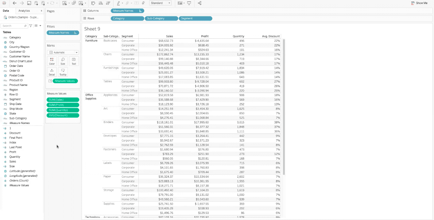
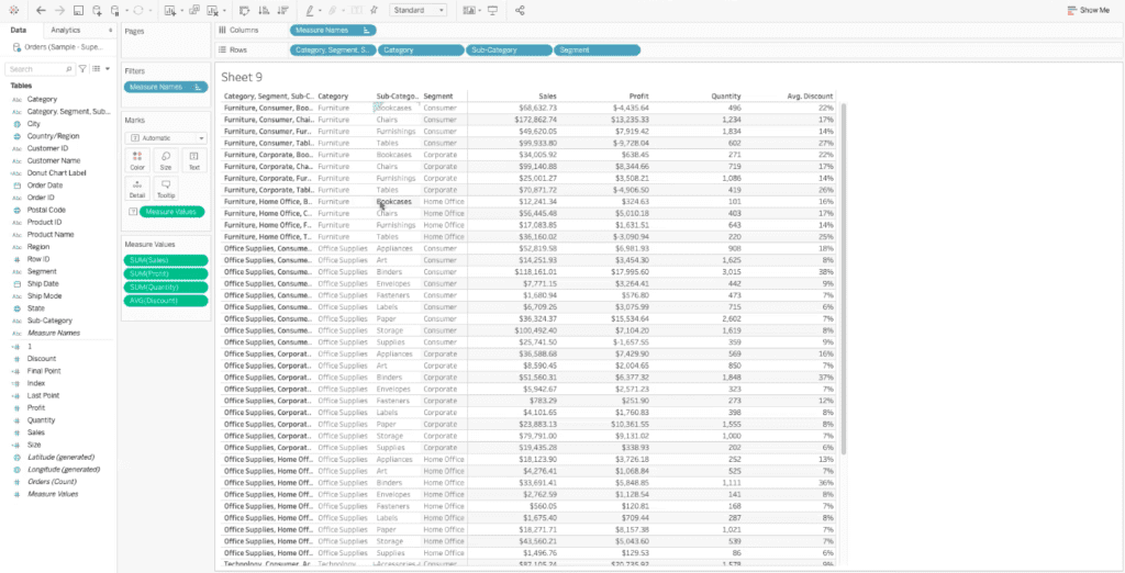
A crosstabular view in Tableau shows detailed data comparisons and relationships between multiple data fields. The example worksheet below is a crosstabular view that allows us to compare and understand the relationships between a variety of dimension categories and measure values.
This crosstab is helpful for understanding how the overall sales, profit, quantity, and average discount break out between our categories, sub-categories, and segments.
Why Should I Remove Grouping from Crosstabs In Tableau?
If you are coming from a program with a more tabular view, like Excel, you won’t typically find as much grouping as you may find in a crosstabular view dashboard within Tableau.
In programs like Excel, individual rows will typically just run across the screen, rather than being grouped together under a category like “furniture” as they are in our crosstabular view example.
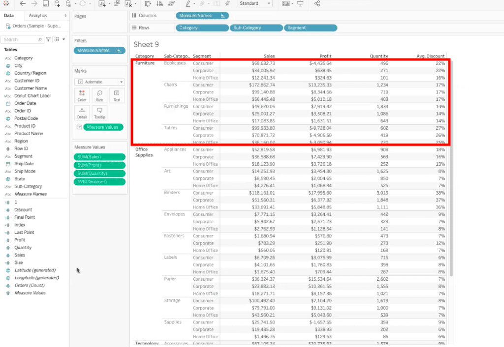
Tableau automatically groups these crosstabs to ensure that we understand the relationship between rows and the categories that they belong to.
However, when our end-users are more familiar with data visualizations like those in Excel, it is best to remove grouping from crosstabs in Tableau, so that they can understand the data more easily.
How Do I Remove Grouping from Crosstabs In Tableau?
Before we start to remove grouping from crosstabs in Tableau, we need to understand the level of granularity that we’re looking at in the dashboard.
In our crosstabular dashboard example, we are looking at data at the category, sub-category, and segment level.
Once we understand the level of detail that we are seeing, we can begin to create individual records for them. To create these individual records, we can go to our data fields menu, and multi-select the detail levels by holding down the control key and then selecting each field.
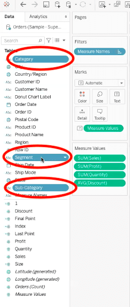
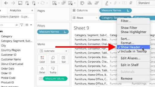
Once all three data fields are highlighted, we need to right-click on one of them. For our example, we will be right-clicking on the segment data field.
In the pop-up menu that appears, hover over the “create” option, and then select “combined field” in the sub-menu.
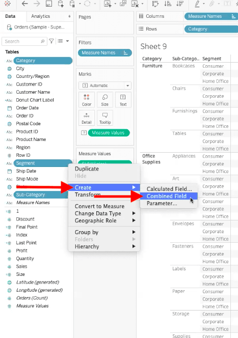
Essentially, a combined field will concatenate all three data fields together so that they are one field. Every individual category, sub-category, and segment combination will have its own value.
Once you have created the combined field, Tableau will create it and store it in the dimensions data field menu.
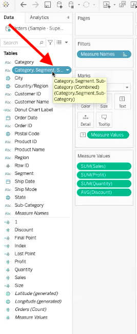
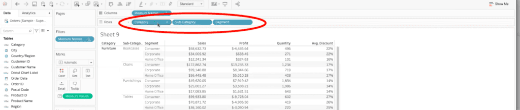
Now we want to drag our newly created combined field dimension into the rows bar, to the left of all the existing data fields in that bar.
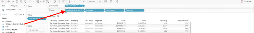
This will create a row straight across the view for every individual combination of categories, sub-categories, and segments. Each row is now unique in the eyes of Tableau.
The last step before presenting this data to an end-user is to remove the field that is being used to create the view, because it’s not useful for them to see it. To remove this field, go to the combined field dimension in the rows bar, right-click on it, and deselect “show header” in the pop-up menu.
This field has now been removed from the view in your Tableau dashboard. Tableau will still keep this field in the context of the visualization, it is just being removed from the overall view so that Tableau will create rows straight across the dashboard, without grouping.
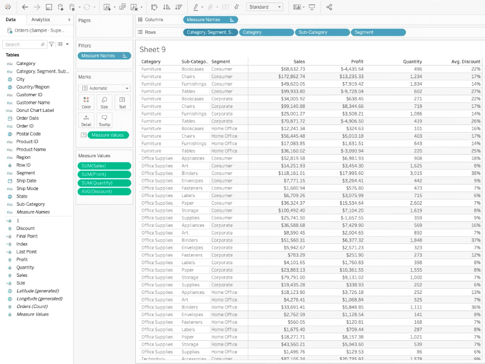
Now we have a more traditional crosstabular view that will be more recognizable for end-users.
If you are in need of a crosstabular view dashboard in Tableau, but aren’t sure where to start, XeoMatrix can get you started on the right path. Whether you need Tableau training to build a dashboard yourself, or you’d like XeoMatrix to build one for you, there are plenty of options available. Contact us today to get started on your project.