
Tableau dashboards often hit a familiar ceiling: there’s only so much space on the screen, yet stakeholders want to explore the data from multiple angles. Dynamic Zone Visibility in Tableau offers a way to reuse dashboard space instead of piling on more worksheets, which can quickly lead to cluttered layouts, cramped views, and overwhelmed users.
Dynamic Zone Visibility offers a smarter way forward. Instead of forcing every chart to live on the dashboard at the same time, you can reuse a single “window” and swap views based on user interaction. The result is a dashboard that stays clean and focused while still giving users access to rich, multi-view analysis.
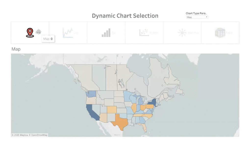
In this Tableau Tips & Tricks tutorial, you’ll learn how to combine parameters, parameter actions, and Dynamic Zone Visibility to build an interactive chart selector that lets users toggle between views like maps, line charts, bar charts, scatter plots, heatmaps, and tables, all within the same dashboard space.
Why Dynamic Zone Visibility is Worth Learning
Dynamic Zone Visibility is especially useful when you’re publishing to environments like Tableau Public or building dashboards for executives who value simplicity and clarity. Rather than asking users to scroll, navigate tabs, or interpret crowded layouts, you give them a single focal point that adapts to their choices.
This approach helps you:
- Maximize limited dashboard real estate without sacrificing analytical depth
- Keep layouts visually clean and intentional
- Guide users toward focused exploration instead of overwhelming them with options
- Create interactive experiences that feel intuitive, not complicated
It’s a powerful technique for anyone designing dashboards meant to support both quick insights and deeper analysis.
Tutorial Video
Show/Hide Transcript
[00:00:00] In this recording, we’re gonna go through the steps required to do Dynamic Zone Visibility so that you can reuse the same space on a dashboard using something clever like these little icons to switch out the chart that is being shown. First things first, we’re gonna build some charts. Now, in the dashboard that I’m sharing, you’re gonna also see that I have provided two tabs in the back that are giving a summary of the steps required, and so you can use this for reference for later.
So let’s get building those four sheets.
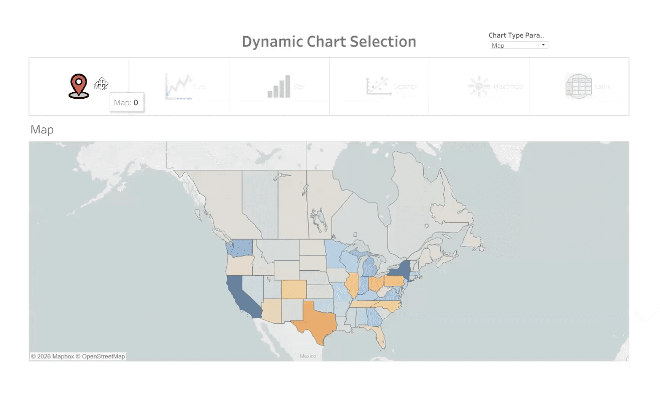
Map’s gonna be first. We’re gonna speed this up a little bit so that it can happen quickly for us. We’re gonna do a Map of Profitability by State and Province. Next, we’re gonna build a Line Chart. We’re gonna be looking at Years, Months of Order Date, and looking at Sales.[00:01:00]
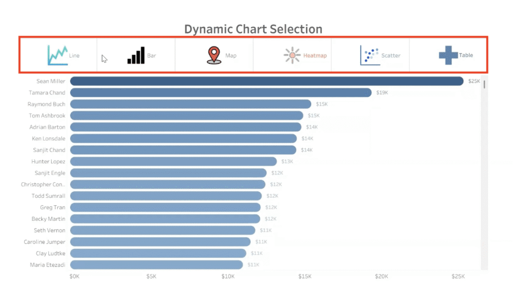
Bar Chart is next. We’re gonna be looking at all the Customers, ranking them by their Sales, providing a little interest with the continuous application of color to give us that nice sequential presentation, matching the Mark Type so we get some nice attractive labels.
Next, we have a scatter chart. We’re gonna contrast Sales and Profits divided up by the Customer, switch out the Rows Axis and Columns to change the orientation of the Axis, put Profit margin on the color, give a little bit of definition, increase the size, and we have our scatter. We want it to change the entire view so it fits into our dashboard nicely.
Heat Map is next. This [00:02:00] Heat Map, we’re gonna be contrasting the Months by the Days of the Week. We’ll go to the entire view and we’ll bring Profit onto those squares to give us that indication of peaks and valleys with our Profit.
Next, we’re gonna do a Cross Tab Table. Looking at the Subcategories, lemme look at the Performance, Quarterly Performance Over the Years. So we have a good reference table here.
I’m gonna Hide those, those Field Row Labels. Go ahead and do a little bit of cleanup on the Formatting, including giving it some Row Banding to make it a little easier to read.
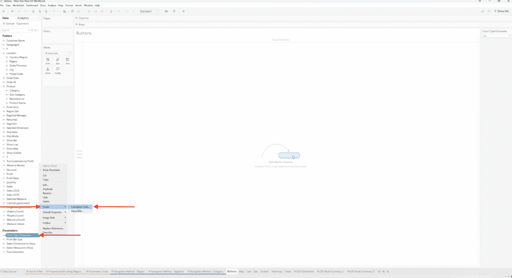
I’m gonna create the Parameter first, and this is what’s gonna be [00:03:00] the controller for us to select our Users to select which Chart they wanna see. I’m gonna make it a String Data Type, give it a List, fill in the List with the names of my Charts, and Save that and show the Parameter Control so the device is there and available for use.
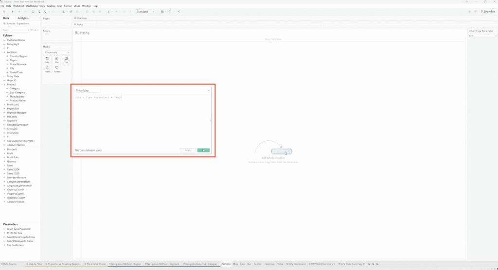
Next, I need to create a Calculated Field for each of the different Charts where it’s gonna be just a statement of when the Chart Type Parameter contains a certain Label. We need one of those for each of our Charts. So there was Map, now this is Line.
Next on deck, it’s gonna be Bar Charts. Check in to see when the Parameter contains the word that is the Keyword for that item. A shortcut would be to right click on the Chart Type Parameter name and use “Create” and “Calculated Field.” That’s your little, little [00:04:00] faster way to get into the dialogue. Do a Heat Map.
We have one to go.
Just double checking that we have all, all six and we do.
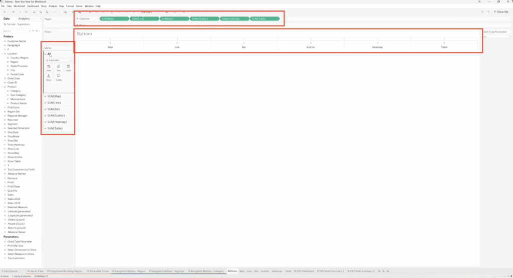
So, now we’re ready to move on to making our Buttons which are gonna be essentially Dummy Variables where we do a double slash, which is like comment code, hit “Return” control insert to get to the next level, and then we put a zero. So I’m, I’m doing a control, click Copy on each of these and then giving ’em a new name so that I have one for each of the Charts.
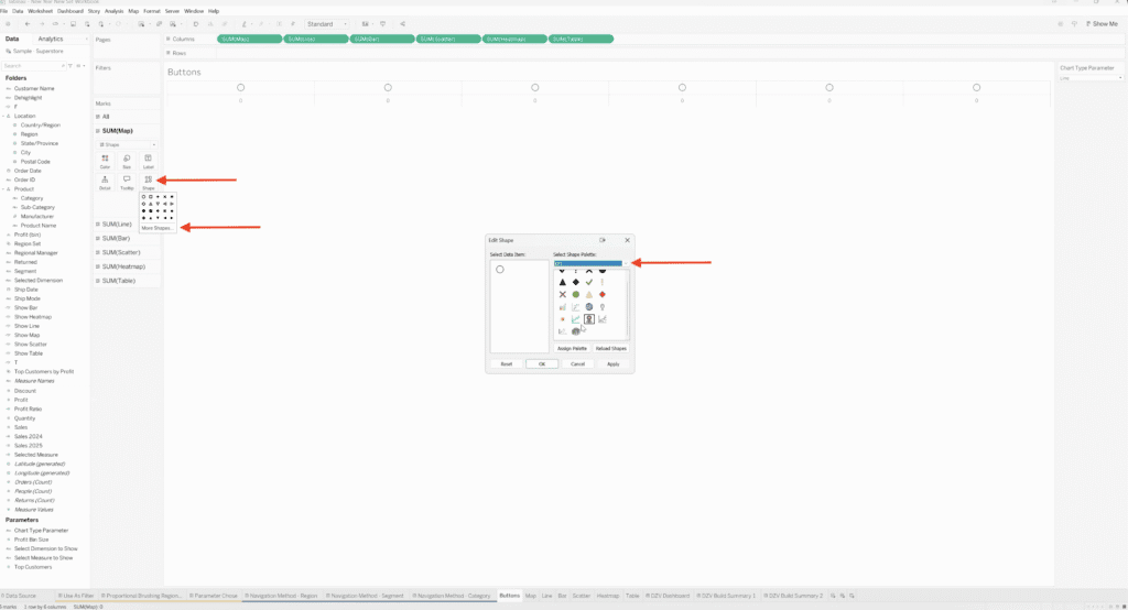
Alright. You’ll see that they’re appearing on my Worksheet. Each one of them has a separated Marks Card and change the Mark Type to Shape, [00:05:00] and then I can go through them and then make a Custom Assignment of the Shape that’s being used for each one of the Demi Variable. So, for Map, have a clever little Map Symbol.
Keep in mind that you can load Custom Shapes into the Shape Directory. SVGs and JPEGs work very well in addition to the ones that are pre-stored there as you download desktop.
Onto assigning Scatter Plots, I found a couple of cute ones.
For Heat Map, I never found a new one that I was really thrilled with, so I am gonna end up using the, the Sunshine because, you know, Heat Map. Right? So that’s a, you could do something that is logical or something that is clever. Hopefully both.
Okay. So now we need to bring measure names onto the labels so we have that [00:06:00] connection for the titling of each of these objects with what’s gonna show up in our Parameter Selection as well. I unchecked your header, doing a little cleanup here with our zero lines, our grid lines.
Now, we’re gonna control, select all of these and move them to the, or not move, we’re gonna make a Copy and put it into the Data Pane so that they are also stored Variables there.
All right, so over to the Dashboard.
I’m using Containers for… One for the Buttons and a separate one for the Worksheets. I move the Chart Type Parameter to the Header just so that I can keep an eye on it, use it more like an Audit here. Have it into… have my Buttons fit the Entire View, and I’m gonna layer into this lower Container all of the Worksheets that are gonna be referenced in the lower section. So going over to make that assignment, you can see that the Container contains all of ’em. I’m verifying that. [00:07:00] Sometimes they tend to wanna slip out, so you wanna make sure that they all are contained by that Container.
And then, go in one by one and assign your Boolean value of “Show Line,” “Show Map” to the corresponding Chart. And as you select ones that are not what is currently being selected by your Chart Type Parameter, they should disappear.
Okay, so only the one that is currently the corresponding value for the Chart Top Parameter should show up, but you can Audit it, make sure that we’re in good shape by changing the Parameter that’s on screen. We presently don’t have that connection made to the Buttons, but that’s coming next.
You wanna check each step as you go.
So next we wanna make those Connections to the Icons that we’ve selected to be Buttons. And you wanna go to the Dashboard Actions, look at the on this sheet and change Parameter Value using what is being selected on the Worksheet that’s called Buttons. So do you select the [00:08:00] others ’cause we wanna have that be our originating controller. We’re gonna use the Target Parameter of Chart Type Parameter. And we’re gonna use in the Source Field Measure Names and that’s gonna take it back to that connection that we made on all the Labels for each of the individual Shapes, specialty Shapes we assigned back on that Worksheet.
Now I’m gonna call this Parameter action to update the Chart Selection.
So, okay, and, okay. And we will all test it. Go into presentation mode, and there you have it. As it make the different choices, click on the different shapes, the corresponding chart will be selected.
Step-by-Step Guide to text
1. Build your chart worksheets (the views you’ll swap)
Create the set of worksheets you want to toggle between (in this tutorial we use: Map, Line, Bar, Scatter, Heatmap, Table).
Example starting point (what the finished experience looks like):
2. Create the Chart Type parameter
- Create a Parameter (String).
- Set Allowable values to List.
- Add one list value per chart (ex: Line, Map, Bar, Scatter, Heatmap, Table).
- Show the parameter control (helpful for testing as you build).

3. Create a “Show [Chart]” calculated field for each chart
For each chart, create a calculated field that checks whether the parameter contains the chart name. The pattern is a statement of when the Chart Type Parameter contains a certain label… one of those for each of our charts.
You’ll end up with six fields:
- Show Map
- Show Line
- Show Bar
- Show Scatter
- Show Heatmap
- Show Table
You can speed this up by right-clicking the parameter and using Create → Calculated Field.
Here’s what it looks like once those “Show …” fields exist:
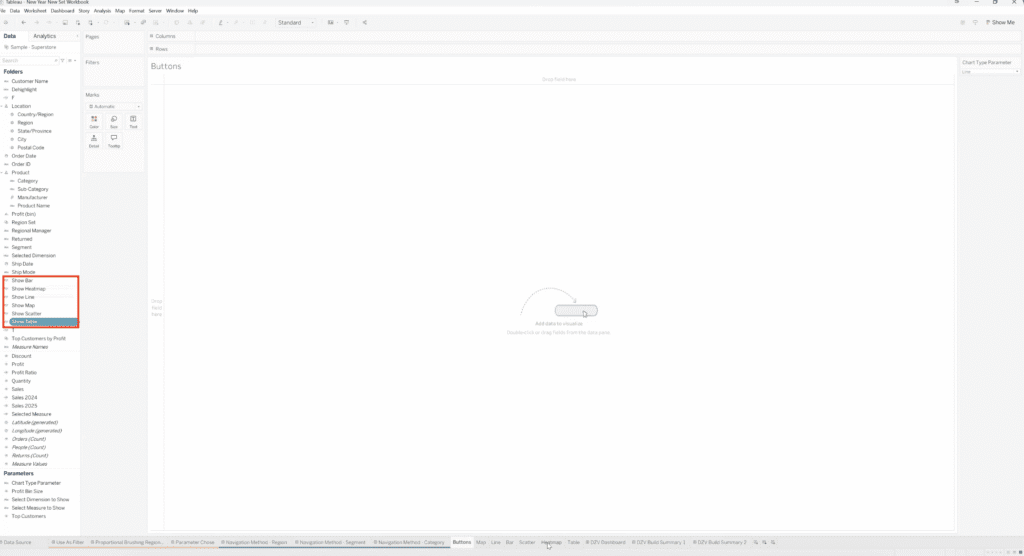
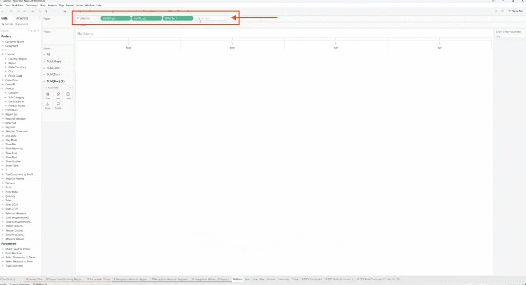
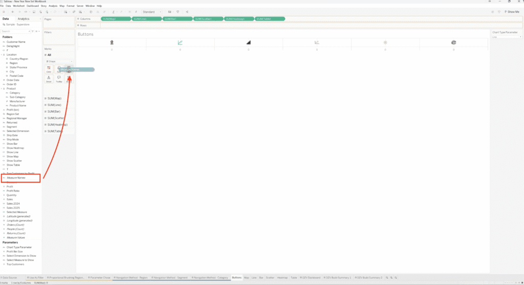
4. Build the Buttons worksheet (your icon chart selector)
This is where the “icons as buttons” are created.
Create dummy “button” measures (one per chart)
Here we use dummy variables with this idea:
- Type
//(comment-style) - New line
- Put
0 - Copy/rename until you have one for each chart
These dummy fields are then used to create separate marks cards and place icons across the view.
It should look like this:
Change mark type to Shape + assign icons
- On the Buttons sheet, make sure each dummy measure has its own Marks card.
- Change the Mark Type to Shape.
- Assign a different icon to each chart.
You can load custom icons into Tableau’s Shapes directory, and SVGs and JPEGs work well.
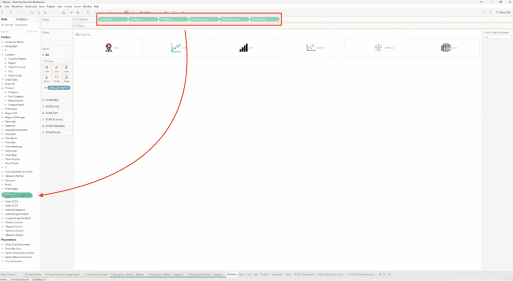
Add labels using Measure Names
To make the buttons drive your parameter action, you can use Measure Names on Label so the click has a clean value to pass into the parameter.
Copy button fields into the Data Pane
Copy the created button fields into the Data Pane so they’re stored as fields.
5. Build the dashboard layout with containers
The dashboard structure:
- One container for the Buttons
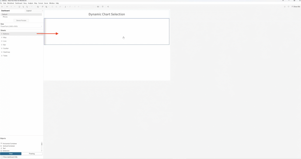
- A separate container below for the Worksheets (your “dashboard window”)
You can also temporarily move the Chart Type parameter onto the dashboard header as an “audit” while building.
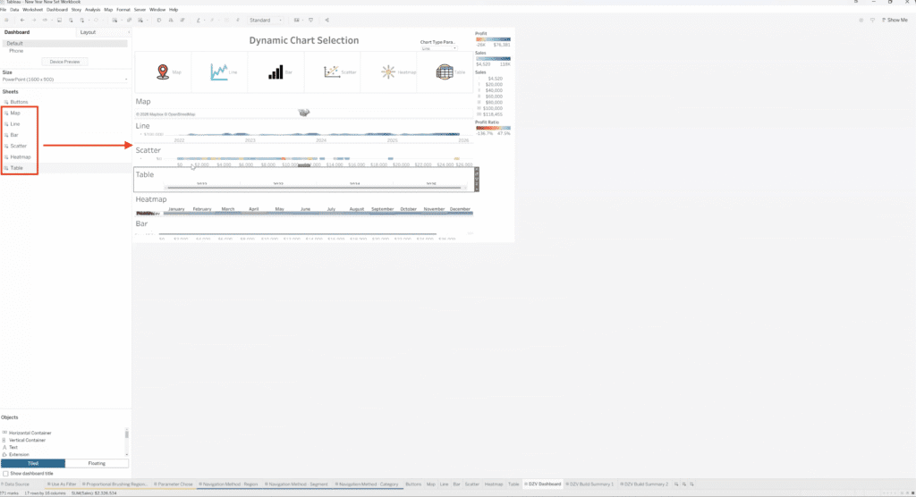
Important: when you add all the chart sheets into the lower container, verify they’re truly inside the container (the sheets can “slip out”).
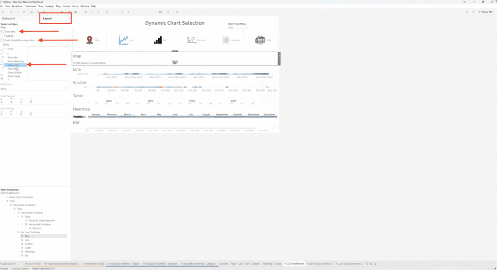
6. Turn on Dynamic Zone Visibility for each chart sheet
This is the core of Dynamic Zone Visibility:
- Click a chart sheet on the dashboard.
- In the Layout pane, check Control visibility using value.
- Set the controlling field to the matching boolean:
- Line sheet → Show Line
- Map sheet → Show Map
As you assign these, any sheet that doesn’t match the current parameter selection should disappear.
Test as you go by changing the parameter selection (while the parameter control is still visible on the dashboard). For example, below we chose the Chart Type Parameter Table and we are only seeing Table.

7. Add a Parameter Action so icon clicks update the Chart Type parameter
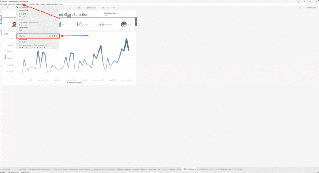
Now connect the Buttons sheet to the parameter:
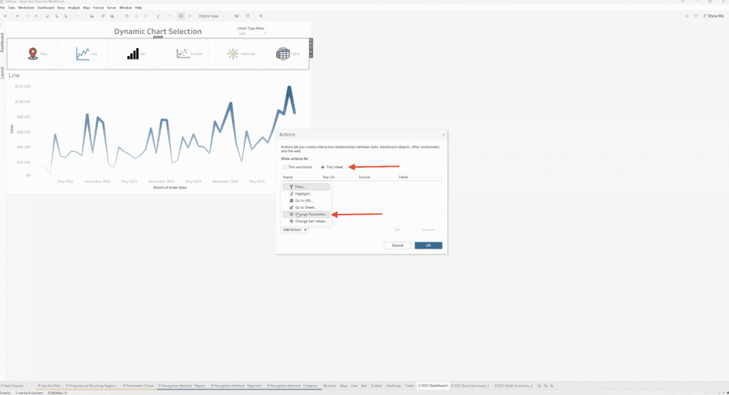
- Go to Dashboard → Actions…
- Add a Change Parameter action.
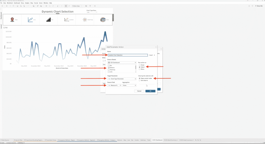
- Set:
- Source sheet: Buttons
- Run action on: Select
- Target parameter: Chart Type Parameter
- Source field: Measure Names (this is why labeling the buttons matters)
- Name it something like “Update Chart Selection.”
8. Test the final interaction
Go into presentation mode and click each icon—the dashboard should swap the view in the same “window” area.
How the Pattern Works (At a High Level)
At a conceptual level, this pattern relies on three core ideas working together:
First, a parameter is used to store the user’s current chart selection. Instead of filtering data, the parameter simply tracks which view the user wants to see.
Next, each worksheet on the dashboard is paired with a small boolean calculation that determines whether it should be visible. When the parameter matches that chart’s name, the calculation returns true; otherwise, it returns false.
Finally, Dynamic Zone Visibility ties those calculations directly to the dashboard layout. All the charts live inside the same container, but only the one that matches the current parameter value is shown. A parameter action, triggered by clicking an icon or button, updates the parameter and instantly swaps the view.
From the user’s perspective, it feels like a seamless chart switcher. Behind the scenes, Tableau is simply showing and hiding sheets based on logic you control.
Want Help Designing Cleaner, More Interactive Tableau Dashboards?
At XeoMatrix, we help teams move beyond static dashboards and build analytics experiences that actually support decision-making. Whether you’re refining an existing dashboard or designing a new one from scratch, our team can help you apply advanced Tableau techniques, like Dynamic Zone Visibility, in a way that fits your data, your users, and your goals. Get in touch with XeoMatrix to talk about your Tableau strategy.
