The Data-Driven Community Meetup holds monthly webinars on business analytics and big data. Webinars are held on the second Wednesday of the month at noon (12:00 PM) central time via Zoom Webinars and will cover topics related to enterprise data management. Our goal with each webinar is to provide meaningful insights and actionable takeaways to simplify analytics so you can make better decisions.
The topics we cover include data strategy, data management, data warehousing, BI modernization, embedded analytics, and cloud migration and strategy. Learn how to build reporting solutions that drive your business demand based on your needs.
About the Topic
Stuart Tinsley, Client Success Manager, and Jared Schulman, Lead Consultant at XeoMatrix, recently held a meetup titled “Mastering Tableau Parameters,” where Jared showed how to harness the power of Tableau parameters to create interactive and insightful dashboards.
This article includes a recording, transcript, and written overview of the Mastering Tableau Parameters presentation.
Presentation Video
Summarized Presentation
In a recent session, Jared provided an in-depth overview of advanced functionalities in Tableau, focusing on the versatility and power of Tableau parameters. He discussed Metric Swapping, a technique that allows users to switch between different data metrics in a single view dynamically. This feature enhances the interactive nature of dashboards, enabling users to explore various aspects of the data without the need for multiple charts.
Next, Jared delved into Dimension Swapping, which, similar to Metric Swapping, allows for the interchange of dimensions in visualizations. This capability is particularly useful for comparative analysis and creating flexible, user-driven reports.
Custom Dates was another key topic. Jared demonstrated how to create custom date ranges, enabling more nuanced time-based analysis. This functionality is critical for businesses that operate on non-standard financial calendars or need to analyze seasonal trends.
Jared then covered Ranking, illustrating how Tableau can rank data points based on various criteria. This feature is essential for identifying top performers, trends, or outliers within a dataset.
Dynamic Thresholding was another important aspect of the session. Jared explained how to set up dynamic thresholds in visualizations, which adjust automatically based on the data or user-defined criteria. This is particularly useful for monitoring performance against targets or benchmarks.
He also explained YTD (Year-to-Date), QTD (Quarter-to-Date), and MTD (Month-to-Date) calculations, which are essential for periodic reporting and trend analysis. These calculations help in understanding performance over specific time frames, providing insights into short-term and long-term trends.
Finally, Jared discussed Parameter Actions with Zoning, a relatively new feature in Tableau that allows for more interactive and responsive dashboards. This technique enables users to interact with data at a more granular level, enhancing the overall user experience and providing deeper insights.
Overall, Jared’s session was a comprehensive exploration of Tableau’s capabilities, particularly focusing on parameters and their role in enhancing data visualization and analysis. These advanced techniques, when applied effectively, can significantly improve the quality of insights derived from data and the interactivity of Tableau dashboards.
The session concluded with a Q&A session.
Presentation Outline
The session follows this outline.
Mastering Parameters in Tableau
- Metric Swapping
- Dimension Swapping
- Custom Dates
- Ranking
- Dynamic Thresholding
- YTD/QTD/MTD
- Parameter Actions with Zoning
Metric Swapping in Tableau
Jared began by explaining the use of parameters to dynamically swap between different metrics in a visualization. He demonstrated how to start with a subcategory on the rows shelf and then create a parameter named “metric” to interchange between sales, profits, total quantity, and other measures. Jared suggested using integers (like 1, 2, 3, 4) for easy reference to different metrics such as sales, profit, quantity, and profit ratio, thereby simplifying the calculation process.
Jared then showed how to create a calculated field called “metric calc” using a case calculation. This calculated field would change according to the metric selected, enabling dynamic updates in the visualization. He also highlighted a new feature in Tableau Desktop where the axis label updates dynamically based on the selected metric, improving clarity for end users.
Dimension Swapping in Tableau
Jared replicated the process used for metrics, creating a new parameter for dimensions. By setting up a calculated field named “dimension calc” with a case statement, he enabled switching between different dimensions like subcategory, state province, and manufacturer. This approach allows the creation of various view combinations on a single sheet, significantly enhancing dashboard flexibility.
Custom Dates in Tableau
Jared then addressed flexibility around dates. He illustrated how to let users pick their own start and end dates using date parameters. A calculated field named “date filter” was created to apply these date ranges as filters, enabling users to view data within specific time frames.
Ranking in Tableau
Jared discussed dynamic ranking using a parameter called “top-end.” This integer parameter allows users to dynamically set the number of top items (like states or manufacturers) they wish to view. By using a top filter in combination with the “top-end” parameter, users can adjust the visualization to display the top 5, 10, or 15 items as per their preference.
Filtering Dimensions in Tableau
Jared highlighted a useful keyboard shortcut for quickly filtering dimensions. On a Mac, you can use Command + Click and Drag to copy a dimension from the rows shelf directly to filters, avoiding the need to search through numerous fields. For PC users, the same can be achieved with Control + Click and Drag.
Dynamic Thresholding in Tableau
Jared explored dynamic data representation through calculated fields. He created a “profit ratio” field by dividing the sum of profits by the sum of sales and multiplying by 100 to express it as a percentage. This field helps in visualizing the profit ratio across different dimensions.
Jared introduced the concept of dynamic thresholding using parameters. He created a parameter for setting a profit margin goal and a calculated field to highlight data points exceeding this goal. This technique dynamically visualizes which data points, like manufacturers in the given example, exceed a specified profit margin. T
The demonstration used sales data, but this approach could be applied to various types of data, like survey responses or student retention rates.
Setting Default Values in Tableau
Stuart and Jared discussed setting default values for parameters, a crucial step before publishing to Tableau Server or Cloud. Jared explained that the default value set in Tableau Desktop will be the initial value end users see. This feature is particularly useful for setting initial benchmarks or targets in a visualization.
Date Selection in Tableau: YTD/QTD/MTD
The session also covered using parameters for date selection, offering users a range of options from year-to-date, quarter-to-date, month-to-date, to custom date ranges. Jared demonstrated how to set up a parameter named “date selector” with a list of integers corresponding to these date ranges. He further enhanced this functionality by creating a dynamic end date that updates to the current day every time the workbook is opened, ensuring the data is always up-to-date.
Category Filters in Tableau
Jared demonstrated a simple view showing sales by category, with categories like furniture, office supplies, and technology. He then duplicated this view to include subcategories, adding more detail to the visualization. To make the dashboard interactive, Jared created a category parameter as a string, allowing all values. He then set up a category filter based on this parameter and applied it to the second sheet to show data relevant to the chosen category.
Dynamic Zone Visibility in Tableau
The next step involved creating a Boolean field for Dynamic Zone Visibility. This field ensures that the category doesn’t show “none” unless it’s explicitly set to that value. Jared then set up a dashboard action to change the category parameter based on user selection, making the dashboard respond dynamically to user interactions. This setup allowed for a streamlined view where detailed data would only be displayed when a user clicks on a specific category, thereby not overwhelming the dashboard with information.
Jared highlighted the Dynamic Zone Visibility feature, a recent addition to Tableau, which provides a more efficient way of managing visibility in dashboards compared to traditional sheet swapping methods. By using a Boolean field, the visibility of sheets can be controlled, revealing detailed information only when necessary.
Read the Full Transcript
>> STUART TINSLEY: All right, everyone, let’s get going here. Welcome to our Data-Driven Community.
If you’re new to these events, we host a Data-Driven event once a month, middle of the month at noon, Central Time, so we’ll have one more session in December. We’ll finish out the year, and we’ll start doing, obviously, more sessions into next year.
Here’s the meetup link, just encourage you to share this with other colleagues or other people you know that are interested in Tableau, interested in data. We’d love to build this community as we go forward.
So here’s a quick agenda for today. I’ll do, as always, a meeting format and an update of upcoming events. I’ll introduce our key and featured speaker today, and then we’ll get into our presentation, which will be on “Mastering Tableau Parameters.” and as always, we’ll have a Q&A discussion.
This is actually a little bit different format from last time. You’ll probably notice that you’re able to come off mute, so if you have questions throughout, we definitely encourage you. You can come off mute and ask a question. You can save those, if you want, for the Q&A. Or please feel free to use the chat window if you have questions throughout. I’ll be managing that, and if it’s something that Jared can answer on the fly, we’ll do so, but a little bit different format, so if you could stay off mute during the session, but a little different. Here, we want to make this more interactive.
This is a webinar, Zoom format, so please observe customary webinar etiquette. I mentioned you could use the chat window. You can also come off mute and ask your questions. We’ll obviously be holding a Q&A after the presentation, so any and all questions could be answered or followed up on, and then a link of the recording will be sent out following today’s session, and if you ever want to go back and look at all of the sessions, we do have those posted on our XeoMatrix channel on YouTube. Just type in “XeoMatrix,” and you’ll find all of these Data-Driven Community sessions, as well as other content that we’re putting out there on the web.
Our last event is going to be in December. It’s hard to believe we’re almost into 2024. We’re going to finish up the year with a session that is on “Advanced Dashboarding.” So we’re going to talk to you about how you can level up your Tableau dashboards using actions, using Dynamic Zone Visibility, using custom logos, and there’ll be many more topics that we’ll cover, so that’ll be a really good session to join. That’ll be on the 13th of December at noon, Central. That’ll be it for the year, and we’ll see you in 2024. We’ll have a whole list of new content coming out then, so we’ll have one more session.
Our featured speaker today is Jared Schulman. Jared’s a lead consultant with XeoMatrix. He has over eight years… I think you’re approaching nine years, Jared, of Tableau experience?
>> JARED SCHULMAN: Yes. Yes, 2024 will be nine years.
>> STUART: Yes. I think we had on here that you love Tableau calculations. You also love parameters, so this will be a really fun session for you to cover.
For those of you who don’t know me, I’m Stuart Tinsley, Director of Sales and Client Success. I used to work at Tableau in the past. I’ve been in the product about nine years as well at this point, so excited to be your MC as always, and really excited for Jared’s presentation today.
Give me one second. I’m going to admit a few more people.
All right. Our session today is “Mastering Tableau Parameters.” What we’re going to cover today, Jared’s going to go through a live demo of these topics. He’s going to talk about how you can use Tableau
to do metric swapping, dimension swapping, how you can do custom dates, how you can get a more robust and flexible ranking out of Tableau using parameters. He’ll talk about dynamic thresholding. He’ll talk about how to use and incorporate year-to-date and quarter-to-date and month-to-date. We actually talked about those in our previous session, those calculations, but how to actually take that to the next level with parameters.
Then, Jared, I believe your final topic you’ll cover is “Parameter Actions Using Zoning,” if that looks right?
>> JARED: Yes. Yes, we’ll cover “Parameter Actions using [inaudible] Dynamic Zone Visibility.”
And I think that’ll dovetail really well into next month’s session as well, so a little teaser.
>> STUART: Awesome. OK, that’s great, and then we’ll end with a Q&A session.
Again, if you want to come off of mute and ask a question live, if you want to use the chat window, we’ll monitor both, so we’ve made this more interactive, and please feel free if you have a question live. Jared, is that OK if we come off mute and they ask a question? Or do you want to hold till the Q&A?
>> JARED: Yes, just throw them out. We’ll roll with it. That’ll be fun.
>> STUART: OK. All right. Fantastic. All right. Jared, I will kick it over to you for the live demo. I’m going to stop sharing and we’ll get into it.
>> JARED: Awesome. All right, good morning and good afternoon, everyone. I am coming to you live here from the West Branch location of Austin Public Library. We help out Tableau with a state and local government training every six weeks, and today just happened to overlap with our Data-Driven Community Meetup, so please give me a little grace. I’m on one monitor instead of two, with none of my external mouse and keyboard, so this is going to be an adventure for all of us.
Like Stuart mentioned, we’re going to go through a handful of different ways to use parameters today, metric and dimension swaps, parameters for custom dates, filtering by top-end, and a few others, so we’ll go ahead and dive in and we’ll start out with how to use parameters to swap between metrics.
If we start with a subcategory on our rows shelf, and we want to see sales and we want to see profits, maybe we want to see the total quantity, we can start to drag these measures out, but if we wanted to be able to see one at a time and have the option to pick between them, we can create a parameter and a measure for that, so we can call this one “metric.”
Now, when it comes to parameters, we can use a string and say that this is going to be sales, and this is going to be profit, but if you’re using enough parameters, I actually find it easier to use an integer and just create a list, where one, two, three, and four are going to be sales in dollars, profit in dollars. We’ll do quantity, which is just a number, and then profit ratio, which is a percentage.
Now, instead of having to remember exactly what string values we put in, and, “Oh, is this capitalized?” “Does this have a space?” We just have one, two, three, and four, and that’s going to make our calculations easier once we get into that, so now that we have that parameter, we can create a calculated field off of it, and this is going to be our metric calc. Make this really simple with a case calculation.
So we’re going to say when metric is one, then we have our sum of sales. When two, then sum of profit. When three, then sum of quantity, and the reason that we’re using sums for all of that
is because profit ratio is going to be an aggregated field, so this is going to be our sum of profit divided by sum of sales, and then we can end that, so that is all ready to go.
If we bring this metric calc out and we get rid of these… Let’s actually drag this up under columns, so now when we show this metric parameter, we can choose between sales, profit, quantity, and profit ratio.
One of the newer features in Tableau Desktop now is you can actually, instead of having this axis
say “metric calc,” we can also use the parameter to label the axis, so now when we change that from profit ratio to quantity, to profit, to sales, it’s updating the title on our axis as well, which helps a lot when your end users are looking at charts and they want to know, “What metric am I looking at?” Well, this axis is sales, or profit, or quantity, and that’ll update dynamically as you go, which is a really neat feature. That wasn’t available about six months ago, so that lets us swap different metrics.
If we want to do the same thing with dimensions, I’m actually just going to duplicate this and delete that version, so this one is going to be “Dimension Swaps.” Let’s go ahead and create a new parameter for dimensions, and we’ll do the same thing. I’m going to use a list of integers, where one, two, and three are subcategory, state province, and then manufacturer, and it’ll be the same situation. We’re going to create a calculated field off of that called dimension calc, and it’s going to be another case statement, so when one, then subcategory; when two, then state province; and when three, then manufacturer. We end that.
Now, if we bring out this dimension calc instead of our subcategory field, and we show that dimension parameter, we can switch between subcategory, state province, and manufacturer, so automatically, now we have about 12 different possible view combinations, four metrics, and three dimensions that we can view all in one sheet, so where this could have been 12 different charts before, now we’ve made this a single sheet that we can put on a dashboard, and we can give our end users the ability to view this data by the dimensions and metrics that they want to see.
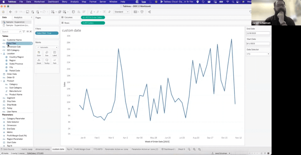
This is great for dimensions. It’s great for measures. What if we want to give our end users some flexibility around dates as well? So if we have our order date, let’s say that we want to see the week of order date, and we want to see sales, so this is going to show us all of our data, and we could filter this if we wanted. We could even give our end users the option to filter on a relative date and see,
“OK, starting at this date, ending at this date by days, weeks, months.” But if we want to just give them total carte blanche, total creative control, let’s use parameters to do that.
So we’re going to let them go ahead and pick their own start date. This is going to be a date parameter, and we’re going to let them pick their own end date, and I’m just going to duplicate the start date and call this one end date, and once we do that… Let’s go ahead and show those, and we’re going to create a calculated field.
I’m really creative when it comes to names, so I’m going to call this one “date filter.” Took me a really long time to come up with that one, but I get a lot of mileage out of it, and the calculation for our date filter is going to say the order date is greater than or equal to our start date, and we can tell that this is the parameter because it’s purple, and our order date is less than or equal to our end date, and that’s going to give us this Boolean filter field that we can drop on our filter shelf and keep only “true.”
Now if we put this on our dashboard, our end users can say, “I want to see everything from 11/8/22 for the start date to 11/8/23 for the end date.” and there’s our last year. Or if they want to say,
“I want to see everything year-to-date, we can go from… Or keep swapping these two, so this is going to be 11/8/23, and we’ll call this 1/1/23, and now, all of a sudden, we’re seeing just this year.
We can do the same thing if we go to 11/1. Well, this is by week. We can do this by day, and this is just the last seven days, 11/1 to 11/8.
So this gives your end users a lot of flexibility. It lets them pick any two dates, and they’ll just see all of the data within those two dates using that date filter, and we’ll circle back later and talk about adding a little bit more functionality to that as well, but just with that alone, they get a good amount of flexibility in how they can control what dates they’re seeing in the view.
Let’s switch back over to talking about dimensions, and how to show that dynamically in a view. If we bring out our dimension calc and we bring out… Let’s bring out our metric calc. You know, we’ve got them both built, so why not use them? And let’s show our metric parameter and our dimension parameter, and what if we just want to see the top 10 states when we have this showing state, and we just want to see the top 10 subcategories when we have it shown by subcategory? We can do that with a top-end filter, but if we want to have that dynamic, we can use a parameter for that as well, and so we’re going to call this parameter “top-end.”
It’s going to be an integer. We’re going to allow all values, and we’ll set the default value, this current value, to 10, just to start there. We can show this.
If we bring our dimension calc over to filters and we use a top filter, we can filter top 10 by metric calc
or we can use the top-end parameter to set that value, and if we do that, now we see our top 10, and if we change this to five, now it’s top five. Now we can do top 15.
So any number that the end user inputs, they can see what that top value is, and this will also change if we switch to state province. Now we’re seeing the top 15 by state province. We can do the same by manufacturer. We can do the same by quantity, so this adds another element of user interactivity and more flexibility to the view for your end users, where now they’re not just controlling the metric and the dimension in the view, but they’re also controlling the view that they actually see.
We might not care about some of these bottom manufacturers that only have 140 products sold.
We might only care about these top 10 or so, and we can set the view to just show those.
>> STUART: I thought of something. You did a quick kind of Tableau trick that I wanted to make sure we called out. When you filtered the dimension calc, you used a keyboard trick to have it from rows, and make a copy of it to put in filters. Am I right?
>> JARED: You’re absolutely right, yes.
>> STUART: OK, so what is that? Explain that for people on the call.
>> JARED: Yes, so if we take this off, there are two ways that we can put dimension calc on filters. We can come over here and find it, and this doesn’t have a lot of fields in it, so it’s not that hard to find, but if you have about 200 different fields in your data source, it might be quicker to grab it from the rows shelf than to find it over here.
On a Mac, I’m holding down “command” and then click and drag, and instead of pulling it off of the rows shelf, it’s copying it, and that way, I don’t have to come over here and find it. I can just copy it from the rows shelf over.
I think on a PC, it’s “control…” I’m trying to remember. Do you know offhand, STUART?
>> STUART: Yes, I was thinking the same thing.
Someone on the call might know.
>> SPEAKER: I can confirm it is. I have a PC.
>> STUART: “Control”?
>> JARED: Awesome.
>> SPEAKER: Yes.
>> JARED: Yes. It’s been a while since I’ve worked in Tableau directly on a PC, and even controlling a PC virtual machine from the Mac keyboard, it ends up still being “command.” So that’s perfect.
On a PC, you’re going to hold “control” and then click and drag, and if you’re on a Mac, it’s going to be the “command” key.
And instead of having to drag it out from the left, that will duplicate a field.
We can do the same thing if we wanted to dual-axis metric calc. We can “command-click-drag” or “control-click-drag,” and then have a second version of metric calc just by duplicating that.
>> STUART: That’s super cool. We should maybe have a session on Tableau shortcut keys and tips and tricks on that stuff at some point.
>> JARED: Oh, yes.
>> STUART: You gave me an idea. No, thanks for covering that. That’s perfect.
>> JARED: [chuckles] Yes, absolutely. That’s a really good thing to stop and discuss for a second, so there’s a lot of those little time-saving hacks. Perfect.
So this is going to let us see our top end, but if we’re working with tabular data, let’s say that we have the dimension calc, and then we’re looking at sales and profits.., and let’s go ahead and create a calculated field for that profit ratio that we used earlier, so this is going to be a sum of profits divided by a sum of sales, and because it’s going to be a percentage, I’m going to multiply this by 100, and I’ll explain why in a moment. That gives us our profit ratio.
That is that one in the middle. Cool, and just see… I’m going to take a detour here. I just want to see if I can… Ah, yes, it’s going to make that higher than I want.
All right, I want to throw a percentage on there, but it’s going to be wonky formatting, so for now, we’ll ignore that. We’ll cover formatting on the next session.
Now that we have the profit ratio, though, we can create a parameter, so whichever dimension calc we have, if we wanted to see a profit margin goal and highlight everyone who’s above that, we can leave this as a float. Maybe we set this to 25% to start with, and we’ll show that. I’m actually just going to put a percentage in here so that the end user knows that’s what units we’re in, and I’m going to create a new calculated field for profit margin highlights.
In this case, I want the profit ratio to be greater than or equal to the profit margin goal percentage, so this is going to give me another true/false field, and if I drag this over to color, all of a sudden I’m seeing some oranges pop out. An orange is telling me that this is true that the profit ratio is greater than the goal, and we can change this.
So if we want to see how many of these manufacturers are hitting above the goal, if we increase the goal to 30%, some of them drop off.
If we want to see how many are making 50% profit or more, maybe none of them, so maybe we don’t want to raise the goal to 50%. To 45%, there’s a group up here, really high profit manufacturers, who are hitting over 45% profit on each of these.
The reason that I multiplied profit ratio by 100 was just to get it in this numerical format. The alternative is to divide this number by 100 and use this as a percentage. It just looks a little bit cleaner for the purposes of this demo to have it in whole numbers, so we figured we’d roll with that.
This is another really slick interactivity trick where you can start to see where that cutoff is, if you set a goal. How many of the different manufacturers or whatever you’re trying to measure are hitting above a particular goal.
>> STUART: Jared, I have a thought here and also a question. This is a great sales example, dealing with profit or dealing with any sort of sales, but not everyone’s data is that, right? So just to encourage you to use your imagination on how you could set really any sort of target, any sort of goal, any sort of threshold where this could be applicable. Now, this is obviously sales data, so this could be used in many different ways.
Jared, the question that I just thought of and had is, where did you, in the parameter, set the default? I’m guessing you’d edit the parameter and you would set it at the current value? Or where would it be set to where the end user would see it as a default and they can make a selection?
>> JARED: Yes. When I create the parameter, I set this default value to 25. That’s just whatever current value it is, so as long as we’re here in Tableau Desktop, we can edit this and it’s going to continue to update that current value, and then whatever that value is when we publish the workbook to Tableau Server, Tableau Cloud, that’s the value that will show up for the end users when they first go in and look at it.
>> STUART: Got it, so something you want to think about, I suppose, before you publish is, “What’s a good default value to start with?” Right?
>> JARED: Yes, so you were talking about other use cases for this sort of thresholding. I mean, if you’re working with survey data and you want to see a response rate across cohorts, maybe your response rate goal is 20%, you could set that response rate parameter at 20, and then see which of those cohorts of users or customers is above 20%.
You’d do the same thing for retention rates, which would be another big one. I came into consulting out of higher education, so student retention is big for higher ed. Or like season ticket holder, retention, things like that, so there’s a lot of different things that you can use this for in getting some of that thresholding.
>> STUART: Right, and it also seems like maybe if you have 549 marks on the view, like, bottom-left corner shows us that, so that’s a fair amount of data, and you might have even more of that, so this parameter and formula behind the scenes is great at calling attention to whatever threshold has been set, with a lot of data in your view, right?
>> JARED: Yes, and we can combine all of these, too, where if we wanted to, again, bring this dimension calc over and use that top-end filter, you know, we switch this to the top of top end, then we can start to… Now, granted this is the top end by metric, so, yes, there’s going to be some changes based on what we’re showing, but yes, we can always combine these two, kind of like we did on some of the earlier views, and just give a ton of flexibility to the end users in what we’re seeing.
>> STUART: Yes, that’s cool.
>> JARED: Right on. All right. I told you that we’d be coming back to the idea of working with dates, and we used a custom start and end date for this date view, and one of the things that we do a lot with clients is we’ll build in some more extensive default functionality, and what that usually means is some version of year-to-date, quarter-to-date, and month-to-date, along with the custom functionality.
Sometimes we’ll do a rolling 90 days or a rolling six months as well, and we can do that with another parameter, so we might call this date “selector,” and we’ll do the same thing again using a list of integers, and this one, let’s say we have, what, four? So this might be a year-to-date, quarter-to-date, month-to-date, and then custom date, and in order to use this date selector for some of those presets, we can edit this date filter to say, based on the date selector, when it’s one, this is going to be year-to-date, so our order date is less than or equal to our end date, because we never really want to get past our end date. This will happen a lot.
If you’re looking at things like renewals, sometimes you might have some pre-schedule, sometimes you have scheduled payments, and if your end date is going to be today, you probably want to have this stop at the end date, so you want to make sure the order date is less than the end date, and it’s in the same year. That’s our year-to-date.
Quarter-to-date, we’re going to use a date trunk to the quarter level. Order date, make sure that equals the date trunk at the quarter level of our end date, and we still want to make sure that our order date is less than or equal to our end date.
This is going to start looking really familiar. Three is month-to-date, so we’re going to say that the date trunk of month level of order date is equal to the date trunk at the month level of end date, and we want to make sure that our order date is less than or equal to our end date, and that just leaves us with the custom, which we already have, so we want to say that order date is greater than or equal to start date and less than or equal to end date, and we’ll close out that calc.
So once we update this, we’re going to see our view shift, and now we’ve got all the way from January 1st to November 8th, and this is by day. We can switch this back to week, just clean it up a little bit, so that’s our year-to-date view.
If we look at quarter-to-date, it’s going to go back to October 1st. Month-to-date is going to give us
just that November 1st to November 8th view, and if we look at custom, then we can come back here and we can mess with our start and end dates again.
Now, in addition to giving your end users the flexibility of the custom date, you also give them some frequently used presets, whether that’s year-to-date, quarter-to-date, and you can always anchor these to today instead of that end date.
Here we’re using end date instead of the today function, but if you want to have the flexibility of both, what you can do is you can create a field called today, and then in your end date, we edit this and go to value. When workbook opens, we can set it to automatically update. When the end user comes into the workbook, the end date is always going to be today.
If we want to default that custom date to the beginning of the year, then we can date trunk to the year level, “today.” and because date trunk is going to make it a date time, we’ll go ahead and swap that to date, and that will match the data type of start date, and then we can default that to beginning of year.
Now, whenever a user comes into this workbook, they have the year-to-date, they have the quarter-to-date, they have the month-to-date, and they have custom, and custom will always go from the beginning of the current year to “today” by default. That’ll update every time someone opens up the workbook, and then they have the opportunity to change it to whatever they like from there.
So just an absolute crazy amount of flexibility. Between this and the metric and the dimension parameters, you’re almost giving your end user their own data exploration window, where they can come in and they can explore the data by a number of different fields, any combination of dates that they want. It gives them just a ton of options for pulling insights out of that data, slicing in a bunch of different ways.
>> STUART: That is really cool, Jared, and just for folks on the call, if you joined late, we’re definitely recording the session. If you’re like me, I’ll go back, even if I was here from the beginning, and look at the recording, just to get the logic, just to get the clicks down, so this is definitely recorded, but that’s a really neat example right there.
Full circle, on the custom date, back into month-to-date. Yes, that’s awesome.
>> JARED: Yes, just crazy amount of flexibility. Definitely feel free to review that. Let us know if you have questions about any of this afterwards. We’re happy to circle back and go into more detail.
It looks like we have plenty of time to cover the last piece, which is great, because the last thing that I want to talk about is a really cool functionality.
A lot of Tableau users won’t get into parameter actions and dashboard actions right off the bat, but if you can start leveraging these, it opens up some really cool opportunities for interactivity with your end users.
For this parameter action, I’m going to start with a view that shows just sales by category, and it’s going to be that simple. We’re going to have three boxes; one for furniture, office supplies, and technology, and I’m going to duplicate this and I’m going to swap category for subcategory, bring that down to rows, and then I’m going to bring in my profit…
Did I break it? I’m frozen. There we go.
So we’ve got sales, we’ve got profits. I’ll bring out profit ratio, and I’ll bring out quantity as well. Just a more detailed view of the subcategories in the data, and if I want to make this really slick and interactive, this is going to be an incredibly ugly dashboard, because I’m just going to whip a few things out real quick, but I can bring out my category view and I’m going to make that large. I’m going to format this like it’s a KPI. Let me make that, like, 16. Keep this centered. Great. Maybe I can edit the height on this to about 250. Awesome.
Now I’ve got these three KPIs up top, and if I bring in my list of subcategories, and fit that to the entire view as well, so this is great. I can see my categories, I can see my subcategories, but it takes up the entire dashboard, and maybe I don’t want to show all of this data right off the bat. Maybe I just want to have the user click on a particular category and then show the data for that category.
So there’s a few things that we’re going to do to make that happen. First thing that we’re going to do is we’re going to create the parameter that drives this. This is going to be our category parameter. It’s going to be a string. We’re going to allow all values, and then I’m going to create a category filter, and this is going to say that our category equals our category parameter, and I’m going to apply that to my second sheet. I’m going to exclude all “false,” which will only show me “true.” Come back over here.
Last thing that I’m going to do, I can get my zoom bar out of the way because I’m going to create a Boolean field that I can use for Dynamic Zone Visibility, and so this is going to be “Dynamic Zone Visibility category.” and we want it to say that the category parameter is not equal to “none.”
Our category isn’t going to show “none” unless we set the value to “none.” and I’m going to come up into the dashboard actions menu and create a change parameter action that uses the parameter actions with zone sheet as a source. We’re going to target the category parameter to change, and use category as a source field. This means now when we click on this sheet, it’s going to take whatever category we click on and set the category parameter to that value, and if we clear the selection, we want to set the value to “none.”
This is all going to come together in a second here. It’s a lot of setup, but once you get it going, it’s pretty slick.
If you haven’t seen Dynamic Zone Visibility before, I think it’s come out within the past year or a year and a half, and it’s a better way of doing sheet swapping or show/hide than having to use filters to filter out all the data on a view and then hide the title. It’s this control visibility using value box, and if you have a Boolean field in your view, you can go ahead and click on that field and that’s going to control whether or not we can see this sheet, and I’ll bring out that parameter just so we can see how this is working.
So our category parameter right now, we haven’t changed the value, but the action that we set in dashboard actions will let us click on one of these, and now, all of a sudden, our category parameter is showing “furniture.” and if we unclick that, now the value is “none,” and it completely hides that sheet, so when the end user comes in, they’ll see a very simple breakdown by category, and if they click on one of those categories, now we’re seeing all of the office supplies subcategory, and if we click on “technology,” we see the technology subcategories, and if we unclick it, it hides it.
So this lets you store a lot of extra detail in your views without having to have it all on the dashboard all the time.
You can use a parameter action to change the value of a parameter, and then use that Dynamic Zone Visibility on your other sheet to control what is in the view at any given time, and let your end users click around and get that detailed data behind what they’re seeing.
I realized that was a lot of setup to get there. [chuckles] We created multiple calculated fields
plus the parameter and the parameter action, so feel free to go back to the recording and check that out again, or let us know if you have questions about it, but this is a really cool one. This Dynamic Zone Visibility is a feature that we’ve loved using with clients ever since it came out.
>> STUART: That’s really cool. That is really cool.
>> JARED: Yes. That’s kind of like the big showstopper for parameters.
>> STUART: Yes, yes, the finale.
>> JARED: Yes, yes. There’s a lot of things that we can do with parameter actions and Dynamic Zone Visibility.
We’ve got one client who we built a drill-down map for, where if you click on a particular state, it drills down to a separate map using Dynamic Zone Visibility. It has that state broken out by regions, and then if you click one of the regions, it drills down and breaks it out by submarkets. Then if you click a submarket, it goes down to a fourth sheet that breaks everything out as codes, and we use parameter actions to allow them to drill back up as well, like you would on a webpage with, like, a breadcrumb link trail, so there’s a ton of things you can do with them.
>> STUART: That’s really cool. That’s really cool. Should we pivot to Q&A, Jared? Do you have any more examples you want to cover?
>> JARED: I think that was it on my notes. Yes, happy to take any questions. I know parameters are a funky feature. There’s a lot of ways you can take them, so I’m happy to answer any questions that folks have.
>> STUART: Yes. One came in from Anthony, and, Anthony, you might need to clarify this a little bit, but you asked: “Would you use a parameter to show just the results of the person who is looking at it?”
>> JARED: Ooh. OK, that’s a really good question, sort of, yes, so what you’re asking about could be a good use case for row-level security, which can be done on the data source side, but I think we can also do that using parameters.
>> STUART: Yes, I could.
>> JARED: Yes, if we allow all values for a user on a string value. Value and workbook opens, so if we do that.., so if we had a user table that had me in it, and let’s see.., so we have username, which should be me. Yes, so that’s going to show my email address, and then if we take… Can we plug that in here? Yes.
So we can use this parameter to default to the user’s name when they log in; and that way, whoever opens it up, that’s going to be their email address, and then this would be like a user filter, and we could say that our user field or our user parameter is equal to an email field in a second data source that we had, and we could apply that kind of row-level security here in the workbook too, so that would be an option, absolutely.
We can do the same thing if we had, like, a region table, and I had certain regions assigned to me, then maybe we would use the region or the user email from regions, so there’s some use cases.
>> STUART: Yes. I never thought of it like that, because most of the time, Anthony, clients, if you want row-level security, meaning the user signs in, they only see the data that they should see.
We’ve typically seen, like, a client would have an entitlements table or a security table that gets joined back to your base, like data model, and you do a similar formula, right, Jared?
>> JARED: Yes, we would do [inaudible], like here in the data source.
>> STUART: Right.
>> JARED: And we would just say, like, username equals whatever that entitlements table is.
>> STUART: Yes.
>> JARED: And we might say [crosstalk ], and then we could use the Tableau Cloud user groups, [inaudible] like is member of admin users, and then we would be running that row-level security on the data source side, which is going to be more performant. You’re going to be bringing in less data that way versus doing it in the workbook.
>> STUART: Yes, good question. That’s really good. Anyone else have questions? Feel free to come off mute, or use the chat window. Any other questions people have about parameters?
No questions. I could think of a few as we’re waiting.
Jared, you’ve been in consulting a long time, and worked in Tableau before consulting. You’ve met with a lot of clients that have requirements, so you’ve been in a situation where you get requirements from a customer or from a company you work for. When do you decide to use a parameter? Is there an example where you said, “Based on that requirement, I’m going to use a parameter for that”?
>> JARED: Yes, absolutely. I’ll tell you a big one right off the bat. If we have two data sources and we want to filter based on region in both data sources at once, instead of blending on region to do something like that, we can create a region parameter and then create a calculated field in both data sources that says the region equals the region parameter, and because the parameter exists at the workbook level and not at the data source level, we can use a single parameter to control filters in both data sources without having to blend them, which is a huge boost for performance.
>> STUART: Yes, that’s a good one.
>> JARED: That’s one of the biggest times that we’ll use a parameter to sort of mask the fact that we have multiple data sources. There are some drawbacks. It’s only going to be single-select, like, we can’t select central and east, but it provides a good solution for having to blend instead.
>> STUART: Yes. I feel like the month-to-date, year-to-date, and custom comes up a lot, where, like, a user of the business has the… Let’s call it the relative date option in Tableau just doesn’t offer the flexibility they want. Or they just want in year-to-date, they want it in quarter-to-date, month-to-date, but they also want that option to pick a timeframe, so they’re almost getting the best of both worlds. They’re getting the relative date and the slider that Tableau offers, a range of dates, and one with that example.
>> JARED: Yes, yes, and the nice thing about having this anchored by the end date instead of anchored by “today” is that relative date filter on order date, this is always going to be anchored to “today” unless we set a specific anchor, but this never updates. Whereas we can look at year-to-date based off of a month ago, and so we can look at what that data looked like historically. We can look at quarter-to-date based on an end date of, like, 9/8, and now, all of a sudden, we’re looking at the last quarter through 9/8. Whereas if we used the date filter on order date.., and let’s just look at it.
If we swap this out and we do a relative date for, you know, last one quarter, well, this is always going to go through, and we have future data in here too, so this is going to show us everything. This isn’t even giving us quarter-to-date, so it’s a lot more flexible.
If we do look at quarter-to-date, now we can only look at this quarter. We can’t go back and look at the previous quarter.
>> STUART: Right. Yes, that’s a good one.
Any other questions from the group?
Thumbs up if you found this helpful today, if you’re using parameters. These are great, great examples, Jared.
>> SPEAKER 2: Yes, that’s good. Thank you.
>> STUART: Yes.
>> JARED: Awesome. Thanks.
[crosstalk ]
>> SPEAKER: On the example you’re showing, you did a start date and end date instead of a date range. Why or how would you have used a date range that would have been different?
>> JARED: With the date filter, we can use a date range. Here’s my order date filter, and here we can get, like, that date slider, which is kind of similar to the start and end date, and that would be perfectly usable if you just wanted that functionality. You could do that instead of start and end date, if all you wanted was the custom.
However, if you want to build in those presets for year-to-date, quarter-to-date, rolling six months, or if you’re trying to filter dates in multiple data sources, like we were talking about before, the parameters are going to be the way to go.
Unless I’m wrong about this and they’ve updated it, there’s not a way to create, like, a slider parameter that takes a start and end date by default. It’s always going to be one value, so we create two of them, one for the start date and one for the end date.
>> SPEAKER: OK, so it’s more of an aspect of Tableau. I don’t want to say liability, but it’s an aspect of Tableau that if you need that fixed start and fixed end, as opposed to being able to recognize the start and end date within the range of dates?
>> JARED: Yes. You can also set these date parameters to default to the start and end dates in the data, so we used today and start of year as our defaults, but if we wanted to, we could write a fixed calc to take the max order date or our end date, and then we could find our beginning of year and change that to a fixed minimum of order date in the data.
Now, when the users go and open up this workbook, these parameters for custom are going to start at the earliest and latest date in the data, so it will show everything by default on custom, and then they can limit it from there, so that’s kind of one way to approximate this functionality and pair it with this preset date filters.
It’s a really good question, though.
>> STUART: It seems like to master parameters, like in your experience, Jared, knowing Tableau formulas, Tableau calculations has been really helpful, and then you’re just figuring out the functionality from there in a parameter.
>> JARED: Yes. Parameters at a high level are really just a way to insert some fixed value into a calculation, and then the question is, well, what fixed values do you want to put in and how do you want to use them? So that fixed value might be a particular date or date range. It might be a dimension that you want to sort on or filter by, or a type of date that you want to look at, but parameters can be about as flexible as you want them to be, and it helps to have a good grasp of calcs so that you can think through, “Well, if I had a parameter that gave me this value, how would I use that in this calculation to create a Boolean filter and make this interactive or to select a particular value from a field?”
>> STUART: Yes, I find it helpful, too. When you have a lot of calculations, and let’s say you’re using them for parameters, in that search bar in your data page, Jared, you can search for a funnel icon to the right, and it would let you search for only the calculations in that workbook.
>> JARED: Yes.
>> STUART: I didn’t notice that for a long time, and then the product, right? That could be helpful for troubleshooting. You can also put those formulas into folders, right? You could have just for more organization in a workbook, right?
>> JARED: Yes.
>> STUART: Yes, group by folder, so that might help if you have lots of formulas that cleans it up. It makes it a bit more organized in your Tableau workbook, so yes. [crosstalk ]
>> JARED: I know a lot of people, too, who will name their parameters as, like, p.dimension.
Particularly, where you have the same name, you can name a parameter p.dimension and a calculation c.dimension, so a lot of folks will do that. Instead of dimension calc, they’ll just do “C.”, and when you start to do that, these will all join together alphabetically and make it easier to find your calcs too.
>> STUART: Yes, good tip. Well, cool. We’re coming up on time. Any last questions from the group?
Hopefully this was helpful. I definitely learned some things, as always, from Jared, but any last minute questions?
OK. If you joined later, or just in general want the recording, that will be sent out. We’ll also have it on our YouTube channel, XeoMatrix.
We look forward to the last session in December, “Advanced Dashboarding.” I think we’ll touch on more zone visibility there, too, Jared, right? [crosstalk ]
>> JARED: The parameters will dovetail really well into that.
>> STUART: Right. Yes, and so many examples. For folks that weren’t able to join the calculation session, we go much deeper into the logic of year-to-date, month-to-date, that type of syntax.
So check those out. We’ll see you in December, and reach out if you have any questions or feedback. We’d love to hear it.
We’ll see you next month.