The Data-Driven Community Meetup holds monthly webinars on business analytics and big data. Webinars are held on the second Wednesday of the month at noon (12:00 PM) Central Time via Zoom Webinars and will cover topics related to enterprise data management. Our goal with each webinar is to provide meaningful insights and actionable takeaways to simplify analytics so you can make better decisions.
We cover topics such as data strategy, data management, data warehousing, BI modernization, embedded analytics, and cloud migration and strategy. Learn how to build reporting solutions that drive your business demand based on your needs.
About the Topic
In this session, Celia explored how to design Tableau dashboards that do more with less, maximizing available space while unlocking deeper, more flexible analysis for your stakeholders. You’ll learn how interactive filtering helps reveal meaningful intersections in your data, how parameters can empower users to dynamically choose what dimensions and metrics matter most, and how set actions enable proportional brushing to highlight the contribution of specific members in context.
Celia also covered dynamic zone visibility, showing how a single dashboard “window” can be reused to display different charts based on user selections—keeping layouts clean while dramatically expanding analytical depth. Together, these techniques create dashboards that are simple, intuitive, and uncluttered on the surface, yet rich with insight just beneath—helping your audience quickly focus on what matters most and uncover insights that might otherwise remain hidden.
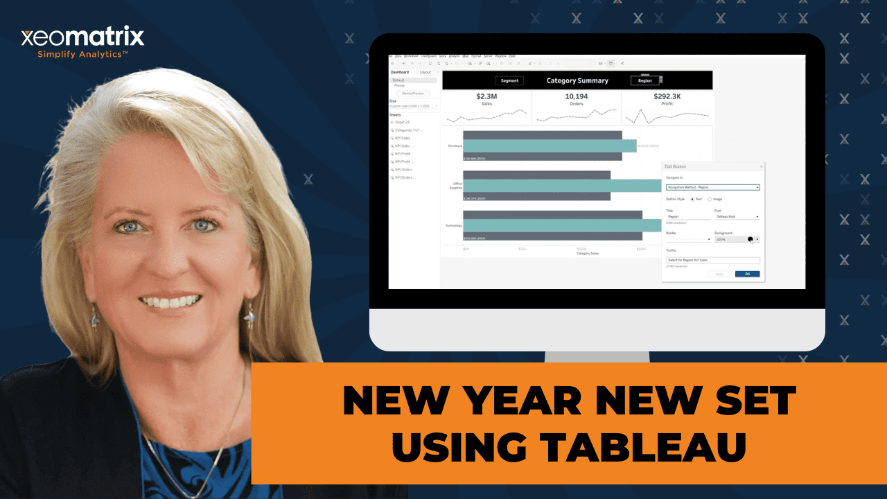
This article includes a recording, transcript, and written overview of the presentation on New Year New Set (On-Demand Webinar).
New Year New Set (On-Demand Webinar) Presentation Video
Links Mentioned
- Dynamic Zone Visibility Tableau Tutorial on YouTube
- Celia’s Managing Dashboard Space on Tableau Public
New Year New Set Summarized Presentation
In New Year New Set, Celia Fryar (XeoMatrix) shows how to build Tableau dashboards that do more with less, using limited space to give stakeholders deeper, more flexible ways to explore data. She walks through practical patterns using set actions (including proportional brushing), parameter actions for switchable views, navigation/show-hide techniques, and a step-by-step approach to dynamic zone visibility so one “window” on a dashboard can display multiple charts based on user selection. The session includes real-world build tips, UX considerations to keep interactions intuitive, and Q&A troubleshooting around Tableau containers and common authoring pain points.
Session Outline
- The recurring theme: “Make the most of the space we have”
- Technique 1: Parameter actions for “switchable” views (dimension + measure flexibility)
- Technique 2: Proportional brushing with set actions (show contribution to the whole)
- Technique 3: Navigation buttons + show/hide for “dashboard switching” that feels seamless
- Technique 4: Dynamic Zone Visibility (DZV) for reusing one “window” for multiple charts
Session Summary: New Year New Set
The recurring theme: “Make the most of the space we have”
We are used to a familiar tension in dashboarding: stakeholders want more, but adding more often leads to chart junk, cramped visuals, and fewer “aha” moments. Tableau’s real strength is interactive visual querying, but that only works when people have enough space and the right interactions to explore patterns and outliers on their own.
You would want to start from the basics, making sure worksheets are properly set up with “use as filter” and thoughtful dashboard actions, then progressively move into more advanced techniques that let a single dashboard do multiple jobs without looking overloaded.
Technique 1: Parameter actions for “switchable” views (dimension + measure flexibility)
One of the first “space-saving” strategies demonstrated was a dashboard pattern in which users can switch the dimension and measure they’re viewing while reusing the same chart area.
You can use Tableau’s dimension/measure split: anchor a dashboard on a stable structure (like regions), while allowing users to dynamically swap in different breakdowns (dimension choices) and metrics (measure choices) through parameters. She emphasized that parameters are essentially a device, a UI control, and they don’t do anything meaningful until you pair them with logic (typically a calculated field) that uses the parameter selection to change what the viz displays.
Key implementation notes:
- Two-part setup: create the parameter with a list of options, then tie it back to the worksheet with a calculated field (often a CASE or IF/THEN).
- Labeling matters: if field names are cryptic (jargon/acronyms), you can keep “machine-friendly” values feeding your formulas, but display “human-friendly” labels in the parameter UI so stakeholders feel invited into the analysis instead of intimidated by internal naming.
Technique 2: Proportional brushing with set actions (show contribution to the whole)
Proportional brushing is a technique that helps users see how selected items contribute to the total.
In this example:
- A set of “buttons” that were actually circles with labels (a worksheet used as a control surface)
- A sales by region view and a sales by category view
- A percent-of-total quick table calculation to make contribution obvious as users clicked selections
A key takeaway here was the difference between sets and parameters:
- Set actions can contain more than one member, so users can select multiple items (e.g., East + South) and see combined contribution—unless you explicitly restrict to single select.
“De-highlight” polish: preventing Tableau’s default dimming behavior
We also spent time on a small-but-important UX improvement: preventing Tableau from de-highlighting other marks when a single selection is made (which can distract from the story you’re trying to tell with proportional brushing). Creating a de-highlight field that forces Tableau to remain in an “All” state, keeping everything visible and readable while still highlighting the selection.
Technique 3: Navigation buttons + show/hide for “dashboard switching” that feels seamless
There’s also a simpler, very practical approach: creating the appearance of switching views by using:
- Multiple dashboards
- A consistent “frame” (duplicating a base layout so it feels like one continuous experience)
- Navigation buttons (text or images, with tooltips) to move between dashboards smoothly
Navigation is a “low-hanging fruit” that can dramatically improve usability, especially when paired with the consistent placement of filters and menus, so users can relax into a predictable structure.
You can also use show/hide containers as a way to tuck away supporting detail (like a “there’s more here” breakout), noting she wasn’t originally a fan until she found better ways to apply it as an intentional UI affordance.
Technique 4: Dynamic Zone Visibility (DZV) for reusing one “window” for multiple charts
The final (and most advanced) section covered dynamic zone visibility, which is a layered technique that relies on multiple components working together, often including:
- A chart-type parameter
- Parameter actions to update it via buttons/icons
- Boolean calculated fields (one per view) like “show line,” “show bar,” etc.
- A container in the dashboard where multiple sheets are stacked, each controlled by its boolean visibility rule
The core build sequence:
- Create the parameter that stores the chart type selection (the “switch”)
- Create boolean calcs that evaluate the parameter (e.g., parameter equals “line” → TRUE/FALSE)
- Load all target views into a single container
- In the Layout pane, set each sheet to “Control visibility” based on its boolean field
- Add a parameter action so selecting a button/icon changes the parameter value (she highlighted that using Measure Names can be especially useful here as part of making the switching work smoothly)
Celia’s workbook includes a documented checklist and that she recorded a sped-up walkthrough video showing the full build (since doing every step live would take too long).
Building “buttons” with dummy variables and shapes
To create icon-style buttons, Celia described building dummy fields (including a technique of inserting a “comment” line and then a zero on the next line) so she could place shapes, assign icons, and position labels—then saving those elements into the data pane as reusable assets.
Transcript
>> CELIA FRYAR: Let me advance the slide, and I’ll do a little introduction. All right. Thank you for joining us for our data-driven community event. We do these once a month, usually on the second Wednesday of the month. Then we have some tips and tricks that we normally share. It’s usually myself and one of my favorite colleagues, Lauren Cristaldi, who is tied up right now. That’s why it’s just me. There you go. In any case, I’m the training engagement lead for XeoMatrix. To be fair, I’ve been doing training for around the idea of data analysis, data science for at least the last decade of my career, walking alongside people who’ve been trying to get to market. Tableau has figured largely into that because it’s in the suite of tools we have to use as analysts. It’s some sort of spreadsheet, some sort of database. Then a finishing touch. Often, the finishing touch of choice is Tableau if you get to choose. I also am a part-time instructor, adjunct professor at University of San Francisco.
I have really enjoyed that, seeing what the– Because I mostly have walked alongside of adults that were pivoting or lifting the lid on what they could do with their careers. That’s been a real honor to get to be part of people’s lives like that. Also, the last three years have worked with folks that are either retooling with a new degree or just coming up through the academic ranks. It’s given me just a little bit broader scope on what people are doing, how they’re getting to market, what they’re equipped with, and what they’re not equipped with. I also have had a close and personal encounter with the impact of COVID from a different point of view here.
In any case, the goal of today is to talk about how do you make the most of the space we have with dashboards? Let me see what other slides we’ve got here. We obviously are in a webinar. Although it’s a regular Zoom room, we have the ability to share and show if we want to. I definitely try always to keep the chat log open so that as we go through things, if you’ve got questions, be happy to take them on as we go. Really prefer to be more interactive than just a one-way presentation, but whatever fits into today’s schedule will be fine.
There will be a recording of the webinar released later on the XeoMatrix website. Then I think that’s about it. I also have a workbook I prepared to talk through today that I’ve already posted on my Tableau public profile. I also left it available to be downloaded. If you find some techniques that you think might help you, you probably can mimic it out of there. I’ve done my best to also try to leave notes behind in that one, especially the more complex one. I went ahead and put some instructions on how to mimic it and recreate it. Then also it’ll be just fine if you guys ever need– If you do need to do it and you get stuck, just reach out, because I’d be happy to help you out.
All right. Normally, this is me and Lauren Cristaldi. She’s a remarkably talented analytics consultant, visual analyst. Some of us that approach data analytics from a logic side of the house, that would definitely be me. I started off as a database developer, took a tour through being a network systems engineer and managing some network systems engineers, and then did a department, stepped into management in a way that I realized middle management is never going to be a satisfying role for me. I love doing, and I love helping people that are doing. I really prefer the hands-on life. Then that was the result revealing for me.
Then also back to Lauren, though, she comes at it from the creative side of the house. She’s got that eye for things that look great together and can create some remarkably good things. She’s got a beautiful Tableau public profile if you get a chance to look her up. She’s tied up with a client today, so she’s not going to be joining us. All right, so maximizing your space using sets, parameters, and dynamic zone visibility. Set actions, parameter actions, and dynamic zone visibility, and all the components that go with that are the main core things I prepared to talk to you guys about.
I just want to give a quick shout-out to Wecom Fiber team. It was largely because of something that they requested that I do in December that I even had the materials ready, set go for this. Devin, I see you. It’s good to see you here, sir. We do ask for requests, and there’s a survey that goes out on email from our president, Chris Monahon. We are purposing this spring to tick off things off of the list that have been requested. Please, when you get the survey from this session, and there’s a request of what would you like to see, please tell us because that’s what we’ll do. With that, let me pause my screen and switch over to this workbook that I want to share with you guys, and we will dive in.
All right. Again, I do have chat here, so if you’ve got questions or thoughts about it, please let me know. All right. I’m going to do my best to keep an eye on who’s coming into the room as well, and all that. All right. The theme song repeatedly here is going to be how to make the most of the space we have, because there’s such a conversation that has taken various levels of fury about chart junk and crowding.
One of the biggest things I hear from people who are coming from other graph and chart environments, including Salesforce, is that there’s just so much little tiny spaces that are being used to convey those insights, and it’s difficult to have those ahas and just the clarity of being able to see in the visual interactive query that was actually the part of Tableau’s original intellectual property, Polaris, is what the patent’s around. It’s that interactive ability to see things and have those ahas that happen when we have the space and all to see things that aren’t pre-built. That takes us to the first thing that I’m going to just show you.
Of course, this is not meant to be a fancy anything, except for the idea here is when we have things set up correctly inside of a Tableau dashboard, we should be able to have, and my map is not releasing, most of the time it’ll zoom in here, but in any case, being able to see exactly like, why is California doing so well? Well, then our customers are mostly having profitable things happen here.
Then, if I’m trying to look at my outliers, seeing where is this customer making those purchases that are successful, this one down here, where I’ve got some real negative profit problems with this fake data that we’re using here. To be able to do that independent inquiry is largely dependent on being able to set the filters right, and then having good success with what dashboard actions you put into place or don’t put into place. By default, we have the ability to, in this dashboard, in these elements to just use as filter. That would be the low-hanging fruit to come in here and make sure that all of our worksheets have the use as filter done.
That’s going to trigger for us the default on this particular sheet. These default filters. That’s just the beginning of the story because on each one of these, we could do more with it should there be a call for that. That’s what a lot of these other ones that I’m going to show you today are going to be doing is doing more with that. Moving on here, then my next choice here would be what I would like to call a– I’ve seen this on quite a few production dashboards lately, where we have the ability to choose between the dimension we want to show and maybe the measure we want to show.
This also has to fit in your data scheme. We happen to have in this data set, this is Superstore that I’m using as an example today. This one has the four big regions that are selling regions. This is a unified story around sales of some sort. Underneath these four regions, there happens to be three categories or types that I can select between. There’s a different story that emerges with each one of those selections. I can choose, each one of them falls within a category, each one has a segment that they sell to, each one has a shipping mode, the choices that were made.
Then, along with that, of the metrics that are collected, we have sales, and we have profits, we have quantities ordered, and we have total items. The data story that’s possible for me to take a look at here, I can make some different choices and reuse this same space by what I’m doing and what I’m choosing both on the dimension side, which is those Tableau– Tableau is big on dimension and measures. Categorical values and then things that we are literally measured values. Having a dashboard where you can anchor it on something that is a key component and makes sense, but then being able to switch out those segments.
I have one customer that just wrapped up a training round with, where they had a frame across the top of their dashboard, that’s their main production dashboard, where they had several dimension layers that they were choosing from as filters. Then, several metrics that they were choosing on the other side. Just know that it is possible, and this is a parameter action that’s happening here. Let’s take a quick peek behind the scenes on that because on this particular dashboard, it’s just a single worksheet that has two different parameters, but these parameters are designed to give that flexibility.
There’s two parts to this. The first part is to create a parameter that is based on the dimension, or it’s going to have this list. Anything that’s giving a list, and we have the value side is what’s going to connect to the background of the formula that’s going to make it show the right thing. Then this side is what’s going to display in this device. Parameters essentially are us creating a device to share and show things, and then it’s tied back into the worksheet with a secondary element, commonly and usually a calculated field. Sometimes it can be tied into the filtering dialogue as well, which is a relatively new thing.
The partnership between these two makes it possible. We’ve got this one that is presenting the labels for the dimension, and then this other one that is the same flavor parameter, but it’s just a list of items here. One of the things that can be super helpful for you to make it a little bit simpler to use– Thank you, David. Is that better? If you have field names that are cryptic, jargon, acronyms, or whatever, you can leave these over here so they feed into your formulas on the receiving side a little simpler, and go ahead and make your labels that you’re sharing and showing to your user more human-friendly. That’s always a challenge.
Coming at this from a coding background, I’m very keenly aware of how the things that I might see inside of a coding environment are not necessarily going to be clear and easily digestible by my stakeholders. Knowing that whatever you put on this name right here, to go ahead and label it so it’s an invitation for someone to jump in and be a part of this, is going to save you some time in the long run. This is the parameter device, but in and of itself, keep in mind, it only provides me what’s on the screen here. It doesn’t do the rest of the story. The rest of the story is being able to have a calculated field that’s going to be that switching. The small box, the dialog box. Okay, great, yes. I see that.
All right. Then we create the parameter. We have to tie it to the worksheet with something. In this case, the selected dimension is going to be this field right here, and I’m going to do a quick look at the inside of that one, and either it’s hiding or it’s not popped up yet, probably on another of my screens. All right. Let’s look at the other one then. This is going to be a calculated field, and it’s probably piled up behind here. Let’s see where I got it. Oh, no, it’s just not showing, but anyhow, this is going to be more of a case statement, or if-then-else, it’s going to be selecting through there. I literally don’t know what happened to it. This should be in the background, in any case.
All right. That’s the complement to make it so that it’s switching these out, so let me go back to– That is super weird. I’m not sure why that didn’t show. We’re going to keep moving for the sake of time and to honor everybody being here. All right. The parameter to show would be our level two. First filtering, level two is going to be over here. Then another way for us to maximize the space and the conversation that could be had here is what is called proportional brushing. It’s to show the proportion that is represented by whatever it is we select. Let me describe what I have here.
This is actually a worksheet that I just am using for buttons. I have a parameter up here at the top in the margin that I’m using only for audit. In production, I would take this away, but it was just for audit. Then I have two worksheets up and on this dashboard. The first one is my sales by region, and the second one is the sales by category. Then my goal here was to be able to share and show what is the proportion that is represented by each of these four regions.
If I click on central, I’m clicking on the button, which is actually just a circle with a label on it, but it could be all kinds of clever stuff. This is a worksheet that has this item on here, and then as I select these different ones, you’ll notice a couple of things that have been done here. One is that I’m using a quick table calculation to do a percent of total table across for this worksheet down here so that I can see the percent of each one of their contribution to the big picture.
I did this on a less complex method without the dashboard actions to share and show the advantage that quick table calculations can be for percent of total in a class I was teaching yesterday. It is just a really useful conversation. Now, notice the impact of having both the dollar volume up here at the top, so I see that west has contributed this much money, but then here’s the breakout, and down here, though, it’s given by percentages.
Maybe that’s the best way to do it, maybe not. The idea to show the contribution to the whole of this member or this component, whatever, it could be a product component, it could be a Salesforce possibility. This one is the Salesforce of the western team. What did the western team do here? Let’s see. I have a question or comment. Okay. Yes, thank you. I appreciate that. That’s helpful. Let me show you the other thing I want to point out, which is just as a finishing touch that I recently learned from Andy Kriebel. I’ve been a part of his mentorship group this year. Super fun.
Notice how that when I select this, I’m actually overcoming some of the default behavior from Tableau to keep it from deselecting the other elements. That’s one of those things that leaves you– It’s understandable, but it’s also a little frustrating because it’s like, wow, that diminishes what’s being shared and shown and shared here. Now, notice I deselected everything, so now none of it is highlighted.
I’m going to go back to this worksheet for just a minute to show you that, because while it’s a small thing, it’s a polished thing to keep things from being distracted. Interestingly enough, I was at a seminar with some people in Dallas that work in education and have a lot of Tableau going on in the beginning of September. This idea also came up there, so that’s part of the reason I’m emphasizing it.
I would like to be able to select these without the others being de-highlighted. It’s cool that the Tableau’s default behavior is to bring attention to the thing you’ve selected. However, if you’re in a circumstance like this for proportional brushing, we want to be able to also have everything remain. What we can do is I have a field here that I created called de-highlight. There’s two key ways to do this. I have a different method implemented in dynamic zone visibility, I’ll show you at the end.
This one right here, my pop-ups are not finding. Well, this actually just contains the word “All.” I’m not sure what’s happening to my pop-ups, so that’s a mystery for another time, I guess. We’re going to look at the worksheet action is where I’ve implemented this one. Looking at what is happening on this sheet, because inside of this, I’ve created a highlight. Now, keep in mind with these actions, lots of different kinds of dashboard or worksheet actions you can use, and this one is a highlight type that I’ve selected. Instead of selecting it again, I’m going to just edit this one so you can see the content.
You decide where the source sheet is, what’s the target sheet. I just wanted to run on this one sheet because I just didn’t want the other circles to go away when I was selecting the one. I’m telling it on selected fields, and then de-highlight, and in the content, if you can see it, there’s the word “All,” in quotation marks, because you know how when it selects, I don’t know if you’ve ever used in a title or something where you get to see the outcome of a filter. When you don’t have anything selected, it is saying, “All.”
Essentially, what I’m doing here is I’m saying, “Always have everything on.” I’m overcoming the de-highlight mistake. Everything is, we’re going to stay in the state of all because of the way I constructed that little loop right there. All right. Then, beyond that, we have the set action, which is on the main menu for today, and that is that I’m using these buttons off of this worksheet of region buttons, which are not buttons, they’re circles. Then, I’m changing the content of this region set, which initially I left empty, and I’m having it assign the value to the set and then remove the value from the set when the selection is clearing based on a click, a select.
That’s the mode of action that’s making the proportional brushing working. Then I just have to have that set being represented on these other worksheets. You see I’ve got my color just in and out of region set right there. Then same thing for this last one here. I’m going to go to sheet here, and you can see, I did also do the de-highlight thing here just for safety, but it’s really the place that’s most important is on that first worksheet.
In and out of the set, and then I’ve used my quick table calculation here to give my percent of total, which is really nice and not super– This is not the most simple thing I’ve ever done, but it’s by no means the hardest because I’m just moving things in and out of a set. Then I’m having it reflect here until I’m confident that it’s good to go. Then I would dismiss this, but that’s my audit trail in the beginning is when I’m testing these things out to make sure that my set content is upgrading.
I don’t know if you guys ever heard this, but one of the key advantages of a set action versus a parameter action, sets can have more than one element. If I want to select both east and west, I should be able to do that here in my buttons unless I’ve– Oh, you know what? I think I put single select only on my worksheet action, so let’s take a look at that. On this sheet, and then update the set, and maybe not. Well, you should be able to put more than one item in a set action unless you’ve selected single select only, which is, of course, an option in any case. Am I just not doing this right on my selection? There we go.
Now I have east and south selected, my two bars below, and then the over, the tally of both selected in below. I don’t know what your use case might be. Just curious in– I’ve got my participants list up. If you’ve used proportional brushing before, can you give me a reaction to your Zoom window? It’ll show up on my list. Just curious if anybody’s ever tried that before. Okay, John. Yes, David. Cool. All right. Yes, and Keylon. Awesome. Well, it seems like it’s a nice way to show the contribution of a portion.
My next method that I wanted to share and show is the idea of using navigation to give the appearance of switching in and out. This actually is going to be dependent on a little bit of pre-planning and pre-thought on it because what I literally have here is three different dashboards, but what I did was because I was aiming at this from the beginning, I made sure that some of my framing was the same by just duplicating my base frame. That gives more of the appearance of it being the same territory, visual real estate, if you will, that we’re using.
What I did here was I have definitely three different dashboards, and I have them switching using navigation buttons, which I’ve become a huge fan of because it’s just a really just very smooth way to provide the appearance of reusing space, a smooth user interface, a light gun to a menu with even tooltips on what it is it’s going to do if you select it. The buttons can be symbols, or they can be text. Just a quick thumbs up on the screen, if you’ve used buttons before for navigation on a dashboard, if you would give me a thumbs up. I’d just be curious to know if anybody has done it before. Okay, a couple. Right, cool.
I feel like those are low-hanging fruit, [unintelligible 00:23:52] so if you edit those buttons, you get a chance to choose for text or for image. Keep in mind that when you have Tableau Desktop on your system, it comes loaded with that shape file for a different purpose. You can pick things out of there. There’s three styles of arrows. You know how lots of times navigation, we’re used to seeing arrows point us back or return, especially for returning to the main, so you can pick those images up out of there without having to ever download anything.
If you choose something off the internet, just a PNG or a JPEG easily loads in and works for an image that can be navigation for you. I’ve seen a lot of clever things, honestly. I’m doing something here with my text fields where I’m just putting the word onto a menu, and then I’m putting a little bit of a light border to help it stand up off the black, make the background match, and then a little tooltip. Here’s where you select the dashboard.
It’s going to give you a dashboard list of what you could add. Could do the directions to, so navigation, super low-hanging fruit on being able to give people choices of what to do. Now, one of the little items that I also included in this particular one was a show and hide. To be perfectly honest, I was not a fan of show and hide when it first was released until I had a little bit different vision for what could be.
This one is about the different regions Salesforce. Well, what if I wanted to have a breakout of that. If I have my share and show, and this one is that– This is fake data and all that, but in any case, it’s a breakout of who the people are behind that. Then I have a chance to have an icon for drawing attention in, and then also having some sort of landmark item that shares and shows that, “Hey, there’s more here.” Then, if you hover on it, there’s also a tooltip option that I didn’t complete. You have a chance to do both.
All right. That’s a little bit of an option here on what to do to reuse the space, make it low-hanging fruit, not overly complex, just something that will help extend your reach and make it straightforward and easy for people to get relaxed into a framework. Over and over, I’ve heard from both the receivers and the authors of dashboarding. If you decide on a standardized frame that people can relax into and know that, dependably, here’s where I’m going to go for my filters, here’s where I’m going to go for my menu, here’s where– That will ease the consumption and engagement that you’ll have luck with.
All right. The final one in my example dashboard here, and I’m sorry that the font is small here, but I don’t think I can expand this one right here in full screen mode. In any case, this is one that’s called dynamic zone visibility. It is leveraging several layers of techniques, both boolean fields, parameter actions, and several things. Then, also within the layout tab is the key part where we get this one put together and assembled. Then I’ve used a different overcoming Tableau’s default behavior of selecting, deselecting to make it so that I can choose my cute icons. These are just images I pulled from various places, except for out of the weather shape file on Tableau. I like the sunshine.
In any case, but these sort of things make it so that I didn’t want them to diminish. In fact, I have a recording to share with you guys of this being constructed, and because I’m going to point out the components, but it would take way too much time to do all the individual components. I recorded it, and it’s just a few minutes long because I speeded it up a little bit and give you a chance to see the behind the scenes of all the components.
That also in this same workbook, again on my Tableau public profile, you’re welcome to download it and use it. Let’s just use a superstore for it. This tells you a checklist of how to get all the components done, including the final step, that is the way to get it to not diminish or de-highlight. I want it to stay steady as we select the buttons because we’re making it appear as it’s more. This dashboard, if I was to unhide all these sheets, you’ll see it’s actually quite a few sheets. First of all, I had to build that– This was actually my last thing to build. The first things I did was I built the individual charts and you would do something more complex. I’m sure something more relevant to your data, your business, et cetera.
I’ve got my charts in place of what I wanted to put in that, and put it in reuse in that same space. The next thing I did was I created some dummy variables. These are literally just you tap into here, and I’ve detailed this right here. In each of these, I’m creating essentially a dummy variable so that I have a placeholder there on the line. I’m putting slash slash, which is comic code. Then I’m putting the label of what I want that to be, and then putting on the next line inside a Tableau Zero. If you’ve not seen that before, I can just quickly do one more here.
We double-tap into the column shelf or the row shelf, you put a double-double, and then I’m going to put new item. Then I’m going to hit control enter to get to the next line, and I’m putting a zero. Now, as I do that, you’re going to see that I have a new item here. I have my show header has now been turned back on. This is how I got rid of these was, I got rid of the show header part of this right there. I could make it go away again. That’s where that little piece comes in. Then I would give this a title and give it a shape that would be assigned to it to get it to be new.
Now, I also then took the rest of these and brought them in over here into my data pane. I stored them as data elements, anything that you– You can do this even with quick table calculations, you know how it creates a pill, and it’s got the fancy calculation behind it. You can drag that into your data pane and use it then as a reusable asset without having to go through the dialogue. If you have something like that, you really like it and enjoy. This is just a way to make each of these here and notice they each have their own marks card. Then I went into the shape files and made independent assignments for each one of them, so that this one has more shapes.
Then I made a directory. We have a directory by default, pretty sure it’s by default, this KPIs. Then over time, I’ve just added to mine. I have some other little icons to choose from when I want to do something like this. You come through each one of these. You create the dummy variable, you get the spot on the chart that you can work with. Then you make a mark type change from automatic to shape. Then you’re going to make the independent assignments to each one of them. Then also I brought the– I did it from the top though. I brought measure names onto labels, marks card, and that got each one of these to be here.
Then, as I recall, I also moved them out to the side. All right, because I wanted it to be to the right. This is optional. Most people that I’ve seen build this sort of thing do not put the labels out visible, but I thought it was helpful, especially since some of mine don’t necessarily correlate precisely. In any case, whatever you can do to make it smooth user experience. You have a lot of fun with this if you want to now. That is my buttons. The next big step here is in how I loaded it into the dashboard. All right. As I go to the layout tab, you’ll see that I have hidden the parameter that is switching with any of this stuff.
In any case, with each one of these worksheets, I needed to create something that would say, “Show line, show bar, show whatever.” There’s no magic in the labeling of that, but let’s go back to a worksheet for just a minute where you can see that as well. You’ll see that there’s a boolean statement in here for each one of those. It’s just the clarity of labeling is for me then– This is a problem with the pop-ups. All right, so inside of it is a boolean statement that just says, ‘If the chart type parameter content equals line.” If my label here has been mapped, if the chart type parameter selection, and here’s the parameter over here. You can see the list that’s been inputted there.
I also could show you inside of here. Let me open this up, but I’ll be more clear. All right. I entered in the labels for each of these, and then I made sure I was consistent in the way that they were labeled inside those boolean statements, which is just, you see it’s a true false element over here. Inside of there, I just made sure that it said, “Chart type parameter, referencing the parameter.” In purple, you guys know, being a teacher, I’m always emphasizing that, and then equal, and then line. I have that just as a confirmation. I’m making a boolean statement there to tie into.
Then back to the dashboard, we make those, we open up a container here. That’s an essential part of this, by the way. We’re loading them all, all the visits that you want to switch in and out in a container. Then you go to your layout tab, and for that container, you drag in all of them. In the little video recorded that I’ll share and show in a minute, they all like, I’m lining them all up in this vertical container. Then for each one, I come in and I say, “Control the visibility value so that when show line is true, that it shows this.” Then, as you make those settings, they’ll all disappear except for whatever your current setting for your parameter is.
Let me see if I can just bring the parameter back on screen here. Yes, I can. Let me float it so it’s not eating up space. Get rid of this extra space, okay. If it was something else over here, the window would change because of the control visibility that’s been assigned to this. There’s a sequence here. Lots of little parts, thus me having documented all of these steps. The final component is to make sure that the dashboard actions support all this. On this dashboard, we have a parameter action. Remember, we got all these different types of actions.
We’re going to use a change parameter content, and that’s where we’re going to tell it to use the buttons. Use my worksheet that I’ve identified as buttons, and whenever selected there, then update this parameter choice. Then this is where one of the few uses of measure names becomes super helpful here because we put– It’s available as a choice here because of what’s already been done in the worksheet. Based on the name of the measure that was selected, then it’s going to make the switch. This is a really smooth implementation here. You just need to make sure it’s select and keeping the current value and then we have this.
We have that one as making these main– This is the main story here of how this happens is we have a parameter that is containing the chart type parameters and the switching that it provides us opportunity to do. Then we’re tying into boolean statements that are calculated field. Normally, we have a parameter, and then we have something that ties it back to the Viz. This is going to be our boolean statements in this case, one per Viz. Then we come in here, we layer them into a single container. Then, as we layer them, we tie them into these boolean statements of show bar, show line.
Then we come into the dashboard action, we tie it all together with updating the content of our parameter based on this selection here. Whatever’s being selected on the buttons worksheet is going to change the content. We’re using measure names to make it complete because we’ve got multiples there. We are pointing to one, but we’re pointing to multiples that are referenced and to individual elements beyond that. That’s a little bit of a diversion from what we normally do with parameters. That finishes how the dynamic zone visibility will work for you.
Now, the final step here that I’m using to overcome the deselection, which may be more of a nitpick, it’s really not core to it working or not working, but I’m going to show it to you as a finishing touch. That is the fact that I’ve used a series of function– I’ve used a pairing of a true and a false to set up an impossible circumstance so that it will always show the values.
I’ll show you the elements here, which my T and F represent. On the buttons worksheet, I’ve told it when selecting to show all values and using these selected fields of true and false to always make it show the values. I don’t want it to deselect my icons because they’re supposed to be being buttons and to do their job, they need to not get deselected. Back over in that particular worksheet, I put my false on here.
Now, this is a calculated field that since my pop-ups are not popping up, you’re not going to be able to see it, but it literally looks like this, where I’ve created a calculated field, and now the pop-up is gone. I have something wrong with my display. In any case, so my calculated fields are probably gathering up on some other virtual display somewhere. It just literally will say true. My T that was representing the function of true, my F is representing the function of that. Then back over in my dashboard action, then I drag the true, the false one onto detail. It’s a member, and it’s present. Tableau will see that.
Then back over here in my dashboard action, looking at the actions here on the sheet, it knows that I’ve said that when the buttons from that button worksheet, I want you to continue to show all values when there’s a selection because when false is present with true and by creating that impossible circumstance, it never does anything other than show all values. That took a while for me to get my mind wrapped around. In fact, I had a conversation even two weeks ago with my mentor who is Andy Kriebel. He’s had office hours and I was like, “Help me understand this one more time,” because I knew that explaining it was going to be challenging if I didn’t have my own mind around it.
All right. Let me see what questions we might have. I just want to invite you to, if you’re interested in trying to mimic these, I would recommend that you download the workbook. Let’s see. I have a question about, can you speak to recommendations on how to navigate layout issues? We have this on [unintelligible 00:40:13] you want to add new objects in the same container. Okay. Oh, interesting. Well, so you’re saying if we had another worksheet we wanted to add it in, David, that sometimes it gives you a hard time on being able to add an additional element. Is that what you’re saying? I can’t say that I personally– The thing I have trouble with is, maybe this is what you mean.
The containers, once I load them, sometimes when I try to do different or more, or even when I’m trying to load, especially since I was trying to put, what is this, six of these guys in here, I had to reload it a couple of times to get it to sit all together. Is that what you mean? Where it’ll leak out into other– They won’t necessarily be all in the same container.
It’s not the container thing, is it? Okay. All right. Well, I’m a little bit intimidated to try it live in front of everybody, but that’s what I’m tempted to do here. Have you navigated some sort of boundary in terms of like, after X number of items, it goes wonky? No? Come on off mute, just say what your experience with this has been?
>> DAVID: It’s just some abnormally and hassling behavior. You have your container there with your DZV objects in it. If you wanted to add something else into that container while the DZV is enabled for all of those objects in that container, I often find it won’t let you. It just gives you the circle with the line across it and says, “You can’t drop this here,” even though you would normally be able to drop it. It highlights that it’s going to drop it in that container. The only way to drop anything into that container is to disable all of the DZV on those objects, then drop it in there, then re-enable the DZV on all those objects. You can try it right now.
Just try putting like another object, I don’t know. I can’t tell you I’ve tested it extensively, like it’s for every type of object, but if you try to drop a text object into that container or maybe another worksheet, another sheet into that container that already has the DZV objects in it, it won’t let you.
>> CELIA FRYAR: Yes, I think I’m at a disadvantage because I can’t get my create calculated fields to show. Let me see if I can just pause my share for just a minute, see if I can figure out where my pop-ups are going, because you know how when I’m doing a create calculated field, if I can’t do a create calculated field, I can’t do another one of these true false statements.
>> DAVID: You don’t have to, just try to drag another object into that container on your layout.
>> CELIA FRYAR: Oh, I see what you mean.
>> DAVID: Just grab any other sheet that you have in your workbook that’s not already in that dashboard.
>> CELIA FRYAR: Not in that one.
>> DAVID: Try to drop it in that container that contains your DZV objects.
>> CELIA FRYAR: What’s my volunteer going to be? Let’s undo one of these guys.
>> DAVID: Take the [unintelligible 00:43:23] block.
>> CELIA FRYAR: Yes, that’s a good call. All right. This dashboard, let’s bring in, yes, this one would be easy enough. The dashboard, the profit map. Now I’m going to need my true false thing to be able to do.
>> DAVID: No, you don’t have to even set it up for DZV itself. I don’t think what you just dropped is in the same container, though, is it? It’s usually DZV objects.
>> CELIA FRYAR: I may not be, let’s see.
>> DAVID: Look at your layout, item hierarchy. [crosstalk]
>> CELIA FRYAR: Actually, it is. It actually is, though. See, look, I just opened up the container. I may have gotten lucky, to be fair, because I’ve had a mixture of experiences with this. Oh my goodness, I need to clean this up. [laughs] Yes, it’s okay, but one of my thing is it’s only because you’re watching it, and it was intimidating by you being here.
>> DAVID: I’ll try to narrow it down and connect with you offline and see if we can figure it out together.
>> CELIA FRYAR: Yes, that’s good.
>> DAVID: It’s a real hassle.
>> CELIA FRYAR: Well, that’s really good. Lena is suggesting it’s a sizing issue sometimes.
>> DAVID: Yes, that’s the normal containerization issue that people have with the sizing and not being able to drop it where they want to drop it. This is specific about dynamics and visibility.
>> CELIA FRYAR: Once I got them all in a container, it fought me to try to not get them all in the same container. That is very, very true. That one I got lucky on, to be fair, because I was anticipating you to demo your, whatever you found there. If you find a pattern or a circumstance, I’d be really happy to hear about that, because that’s– I wonder if there’s a bug there, something, that’s what comes instantly to mind for me.
>> DAVID: I’ll connect with you offline.
>> CELIA FRYAR: That’d be great. Just for context, dynamics and visibility is not brand new, but as things have been progressing, they’re packing lots in here as we go. Let me back up for a minute. This last year, since May, I’ve been involved in the Tableau next beta, and then also been watching what’s happening with the release cycles for Tableau Pulse, which they’re on a bi-weekly release cycle right now.
I’ve been really pleasantly surprised that they’re really responsive to bugs most of the time. If you can get your arms around something that is frustrating or a blocker or whatever, I would just really encourage you to do your best to articulate that back to them, and then also with the betas, well, the feedback we were given was being received by engineers that would write us back and say stuff. I don’t know. I guess my personal opinion is this is not a new product. We’re here since 2003, and the fact that they’re still responsive on some of that is really encouraging to me. Maybe I’m a little bit of a cynic as well. Can I offer another– Yes, please go ahead, David. Absolutely, sir.
>> DAVID: The hack you showed about the labeling of pills using the comment hack where you put a comment in line, move the calculation to the next line, and it renames the pill. That was a great hack. In fact, I had presented it to my users group. I was all for it. I thought it was awesome until one day I realized the limitation on it.
>> CELIA FRYAR: What is the limitation? It actually creates a reference to the pill name that then will show up when you’re checking things like dependencies, or you try to delete a calculation. It’ll say, “You can’t delete this calculation because this pill exists,” and it doesn’t exist because that name doesn’t exist because it’s not a real pill. It actually causes a lot of problems in terms of maintainability of dashboards that probably aren’t worth it. It’s just better to create a [crosstalk] truly named field, a field that’s truly named that way as opposed to using the inline comment hack.
>> CELIA FRYAR: Sure. This was one of those anti-credible things I learned this last fall. I think that may be why he had us save them off to be actual pills in the data pane. All of these I copied and pasted, and they’re actually over here now. That may be what he was not saying to us, but then trying to help us avoid. Because I don’t disagree. They had to be uniquely named as well. They couldn’t be just overlaps to something else.
>> DAVID: Just create real pills with real names rather than use that comment hack because it’s going to bite you and dump you.
>> CELIA FRYAR: I used that to get it started, but then I most certainly am pulling them over and saving them. I don’t know that I knew about the caution that you’re sharing, which I totally appreciate. I think that making it more of a real asset in the workbook, even though it’s not part of the data source. That’s good call out. Thank you. I appreciate that.
>> DAVID: Yes, I actually have a video I recorded for my users group after I realized the problem to demonstrate the issue.
>> CELIA FRYAR: That’s fair.
>> DAVID: Caution them as to why not to do it anymore. I actually have that recorded. I can share it with you sometime, probably.
>> CELIA FRYAR: That’d be great. Just to recap here, what we’re talking about is the double tap in here, the double slash of new item, and then control enter and a zero. Seems like there’s a number of old school hacks, if you want to call them that, min, average, zero, those things where we’re creating dummy variables to receive stuff that we’re overcoming our wishlist regarding Tableau development. In any case, but if I was going to– What we’re going to say is, if we’re really going to do this, it needs to be a unique thing here. Then this needs to get saved off into our data list so that it’s not just a dummy variable sitting in this one worksheet. Is that fair, David, would you say?
>> DAVID: Yes, and now that I’m seeing what you’ve done there, it may not be the same hack that I’m thinking of. The hack I’m thinking of is where you have a pill up there, and you want to, let’s say, you just have a simple table, drag a couple fields over, new sheet, country, region. I’ll show you the hack I’m talking about, you’ll tell me whether it’s the same.
>> CELIA FRYAR: If you want to share your screen, I’m also cool with that. You have something you want to share and show?
>> DAVID: Yes, I can do that.
>> CELIA FRYAR: Let me make sure that I can–
>> DAVID: If you allow it, yes.
>> CELIA FRYAR: Yes, let’s see if it’s allowed. We had to turn that off at one point because we had some–
>> DAVID: I remember. [laughs]
>> CELIA FRYAR: I will never forget.
>> DAVID: I have told that story so many times.
>> CELIA FRYAR: I know. Anyway, can you share? Are you attempting?
>> DAVID: Let me crank up Tableau Desktop.
>> CELIA FRYAR: Got you.
>> DAVID: I’ll share.
>> CELIA FRYAR: All right. For anyone of you that joined in late, I just want to mention that this particular workbook is on my Tableau public profile. Eventually, we’ll have this recording on the XeoMatrix YouTube channel. Then I also recorded just a speedy version of just doing the dynamic zone visibility. There are three tabs in the back of the workbook that you can grab off of Tableau public that have instructions and images about what you want to have set up. Then one way or the other, I’ll get that link out there as well so that we have some fast motion ways to check it out and build it.
>> DAVID: I’m going to drop a couple of things in.
>> CELIA FRYAR: Sure.
>> DAVID: This is the hack I was referring to. Maybe not the same thing that you were showing. The hack is if you have a field here, if you want to change what it says up here at the top category, the hack is to double click into here, do two slashes, if you can– Can you all see my screen big enough?
>> CELIA FRYAR: We can. Yes, I’m seeing it, yes.
>> DAVID: What did I just do? Nevermind. Let me back up a second. I want to change what it says here at the top of this table. I’m going to double-click into the category field. I’m going to put two slashes and call it David category. Then I’m going to hit Alt Enter.
>> CELIA FRYAR: Are you trying to rename what it says for category?
>> DAVID: Yes.
>> CELIA FRYAR: Got you.
>> DAVID: Let me do that again. David. I got to remember the–
>> CELIA FRYAR: Somehow I know this complaining about your parentheses around the second one of category. Do you have it spelled, category? Yes, it’s spelled right.
>> DAVID: It doesn’t matter what the spelling is. Let me see here, is it Shift Enter? Yes. Now you can see in my pill, I have two lines. I have a comment line, and then I have the actual pill name.
>> CELIA FRYAR: Yes, you do.
>> DAVID: I inserted the comment in line, and this is the hack. This will actually change what says category on that column to David category spelled incorrectly when I hit Enter. See how it changes it?
>> CELIA FRYAR: Oh, I see, yes. I’ve seen that before, yes.
>> DAVID: This hack looks great on the surface, but it actually starts referencing a pill called David category misspelled. You’ll see it in references. If you’re doing this with calculated fields, you go to delete a calculated field, it’ll say you can’t delete it because this field exists where it doesn’t really exist. You’ve maybe gotten rid of it already. It causes all kinds of circular problems with dependencies, what’s listed as a dependency, what’s keeping you from deleting a pill, or deleting a calculation.
On the surface, the example I just showed you, no problem. As you do this in more complex workbooks where you’re maybe using the field here in a calculation or something like that, it actually gets confused. Tableau gets confused.
>> CELIA FRYAR: It sounds to me like it’s getting stuck in the metadata somewhere where it’s not getting cleaned out when you delete it as well.
>> DAVID: Exactly.
>> CELIA FRYAR: I think a lot of us have used this labeling technique to overcome fields that are just either improperly labeled or are labeled in a way that’s not helpful. When we’re trying to recharacterize it for people who are coming in behind us. That’s good. It’s good to know.
>> DAVID: This particular hack that you don’t want to do in my recommendation, even though it looks great on the surface, because otherwise, how do you rename this? You can’t.
>> CELIA FRYAR: You can’t, yes.
>> DAVID: You have to create a new field over here and use that new field pill, which is actually now what I recommend. It seems silly to create a new field-
>> CELIA FRYAR: No, I understand.
>> DAVID: -just get a different name. It’s the more solid way to do it.
>> CELIA FRYAR: Especially if you’re working with a, say, published data source, it’ll let you edit and modify a copy, but it won’t let you touch the original. Yes, that’s a place where you are stuck for sure. That’s really helpful. Thank you for that.
>> DAVID: Sure, no problem.
>> CELIA FRYAR: All right, folks. I just learned Keylon was kind enough to let me know that my dash, my thing up on Tableau public is not downloadable. I will fix that, because my intention was to put it up there and have it downloadable. I just want to tell you, thank you guys for your time today, for hanging out with us. David, thank you for jumping in and sharing and showing. Top notch, man. Extra props. Good to see everybody. The recording will be available in a period of time, hopefully not too long.
Then I will make sure that, maybe with the follow-up email, that– I think they send a follow-up email to all of you, because I did prepare and I had expected it to be ready today. A quick walkthrough where it speeds up. It’s short enough to not be too long for our appetites these days of how to do the dynamics on visibility with all the little bells and whistles that I did. Well, hope to see you guys next month. Thank you so much. Appreciate y’all very much. Take care. Thank you, everyone.
>> SPEAKER 3: Thank you.
>> CELIA FRYAR: Thank you.
>> [00:56:27] [END OF AUDIO]