The Data-Driven Community Meetup holds monthly webinars on business analytics and big data. Webinars are held on the second Wednesday of the month at noon (12:00 PM) central time via Zoom Webinars and will cover topics related to enterprise data management. Our goal with each webinar is to provide meaningful insights and actionable takeaways to simplify analytics so you can make better decisions.
The topics we cover include data strategy, data management, data warehousing, BI modernization, embedded analytics, and cloud migration and strategy. Learn how to build reporting solutions that drive your business demand based on your needs.
About the Topic
Stuart Tinsley, Client Success Manager, and Jared Schulman, Lead Consultant at XeoMatrix, recently held a meetup titled “Tableau Advanced Dashboarding,” where Jared showed how to harness the power of Tableau dashboards to transform your data visualization experience.
This article includes a recording, transcript, and written overview of the Tableau Advanced Dashboarding presentation.
Presentation Video
Summarized Presentation
The presentation on “Tableau Advanced Dashboarding” delves into sophisticated techniques for enhancing the design and functionality of dashboards in Tableau. It begins by exploring the use of containers, distinguishing between tiled and floating types. Tiled containers offer ease of placement and a seamless design flow while floating containers provide greater design flexibility and precision. The presentation emphasizes the importance of horizontal and vertical containers in creating a cohesive and professional look, as well as the ability to adjust container properties for optimal design and layout.
A significant portion of the presentation is dedicated to Filter Actions in Tableau, which adds a dynamic element to dashboards by allowing users to interact with various components and observe real-time changes in data. The step-by-step guide to setting up Filter Actions includes identifying source and target sheets, configuring actions, and customizing filters for targeted results. These actions not only enhance the aesthetic appeal of the dashboards but also make complex data sets more accessible and comprehensible to users.
Another key feature discussed is Dynamic Zone Visibility, which operates on Boolean logic to show or hide elements based on specific conditions, thus preventing dashboard overcrowding and maintaining a clean design. Alongside this, the presentation covers the use of Show/Hide and Info Buttons. Show/Hide buttons are crucial for managing space, especially in filter-heavy dashboards, while Info Buttons provide additional context and guidance, improving the user experience for complex dashboards or first-time viewers.
The presentation also touches on the use of padding and backgrounds in Tableau, illustrating how adjusting outer and inner padding can create visual separation and alignment, enhancing the overall aesthetic of the dashboard. Lastly, it discusses Navigation Buttons, which provide an intuitive alternative to text tabs for switching between different dashboards, highlighting their ease of setup and use.
Presentation Outline
The session follows this outline.
Tableau Advanced Dashboarding
- Containers
- Filter Actions
- Dynamic Zone Visibility
- Show/Hide Buttons
- Info Buttons
- Padding and Backgrounds
- Navigation Buttons
Containers in Tableau
Tableau offers numerous features to enhance the design and functionality of dashboards. One such feature is the use of containers. Jared delved into the intricacies of using containers to organize dashboard elements effectively.
Tiled vs. Floating Containers
Tiled containers are essential for easy placement of objects. They snap elements into place, ensuring a seamless design flow. However, they come with limitations in precision and design flexibility. On the other hand, floating containers offer more control and can be placed anywhere on the dashboard, allowing for more creative designs.
Enhancing Design with Horizontal and Vertical Containers
The use of horizontal and vertical containers is a game-changer in dashboard design. These containers allow for a more cohesive and polished look. By neatly organizing elements like filters and Key Performance Indicator (KPI) boxes, they bring a structured and professional appearance to the dashboard. Jared demonstrated how these containers could be used to align elements symmetrically, thereby improving the overall aesthetic appeal.
Adjusting Container Properties
Tableau allows you to adjust container properties. This includes modifying the size and distribution of elements within the containers. A notable feature is the ‘distribute contents evenly’ option, which ensures that elements within a container are uniformly sized. This feature is particularly beneficial for maintaining consistency and uniformity in the dashboard’s layout.
Container-Based Designs vs. Traditional Tiled Layouts
This comparison emphasized the benefits of using containers, such as enhanced control over the layout, cleaner design, and the ability to group related elements effectively. These advantages contribute significantly to the visual appeal and functionality of the dashboard.
Filter Actions in Tableau
Filter Actions stand out as they bring a dynamic element to dashboards, allowing users to interact with various components and observe the changes in data in real time.
Bringing Data to Life with Filter Actions
Jared illustrated the functionality of Filter Actions using practical examples, such as selecting categories like ‘Technology’, ‘Office Supplies’, or ‘Furniture’. This action dynamically altered the information displayed in the Key Performance Indicators (KPIs) and line graphs, providing a tangible understanding of how Filter Actions enable users to delve deeper into specific data subsets.
Setting Up Filter Actions in Tableau: A Step-by-Step Guide
Step 1: Identify the Source and Target Sheets
The first step involves determining the ‘source sheet’ and ‘target sheet(s)’. The source sheet is where the Filter Action will originate, and the target sheets are the ones that will be affected by this action. For example, if you have a sheet with various product categories and another with sales data, the product categories sheet would be your source, and the sales data sheet would be your target.
Step 2: Accessing Dashboard Actions
Once your sheets are prepared, go to the dashboard that contains these sheets. In the dashboard view, navigate to the menu bar and select ‘Dashboard’, followed by ‘Actions’. This opens a new window where you can manage all the actions associated with your dashboard.
Step 3: Adding a New Filter Action
In the Actions window, click on the ‘Add Action’ button and choose ‘Filter’. This action will create a new Filter Action. You’ll be prompted to configure the specifics of this action in the subsequent steps.
Step 4: Configuring the Filter Action
In the configuration window, you’ll need to:
- Name your action: Choose a descriptive name for your action for easy identification.
- Select the source sheet: Choose the sheet from which the action will be triggered.
- Choose the target sheet(s): Select the sheet(s) that will be affected by the action. You can select multiple sheets if needed.
- Define the action’s trigger: Decide how the action will be triggered—on select, hover, or menu.
Step 5: Customizing the Filter Action
Here, you can further customize the action:
- Clearing the selection: Decide what happens when the selection is cleared. Options include showing all values or keeping the current filter.
- Selecting fields to filter: Choose specific fields to be filtered. This allows for more targeted actions rather than filtering all data fields.
Step 6: Testing and Adjusting
After setting up the action, it’s crucial to test it to ensure it works as expected. Navigate through your dashboard, activate the Filter Action, and observe the changes in the target sheets. If the action doesn’t work as intended, revisit the configuration settings and adjust as needed.
Step 7: Saving and Sharing
Once satisfied with the setup and functionality of the Filter Action, save your dashboard. If you’re sharing this dashboard with others, ensure that the Filter Actions work in the shared environment, as interactions might differ based on user permissions and data access.
Impact on User Experience
Filter Actions significantly augment the interactivity of a dashboard, making data exploration both engaging and functional. This enhancement is not merely aesthetic but also crucial for making complex data sets accessible and comprehensible to end-users.
For example, you can select a specific time frame (like a quarter or a month) on a line graph and observe corresponding changes across the dashboard.
Dynamic Zone Visibility in Tableau
Dynamic Zone Visibility in Tableau is a feature that greatly enhances the interactivity and functionality of dashboards.
Boolean Fields in Actions
The Dynamic Zone Visibility feature operates on Boolean (true/false) logic. This functionality allows dashboard elements to be shown or hidden based on certain conditions. Such dynamism not only enriches the interactivity of the dashboard but also significantly improves the user experience.
Leveraging Parameters for Control
A key aspect of Dynamic Zone Visibility is the use of parameters. Jared demonstrated this with a practical example: a parameter that controls the visibility of subcategories. This parameter, toggled between ‘yes’ and ‘no’, dynamically alters the dashboard’s display, either revealing or concealing specific sections based on the user’s selection.
The Benefits of Dynamic Zone Visibility in Tableau: Clean and Concise Dashboards
By preventing the overcrowding of data, this feature allows for a more streamlined design, where additional information can be accessed as needed, maintaining a clean aesthetic.
Flexibility and Broad Applications of Dynamic Zone Visibility
Dynamic Zone visibility can be applicable to both individual sheets and entire objects or containers within a dashboard. This versatility opens up possibilities for more complex and interactive designs, where entire sections can be responsive to user interactions.
Show/Hide Buttons in Tableau
Show/Hide buttons allow you to effectively use space in your Tableau Dashboards.
The Role of Buttons in Dashboard Design
Buttons are very important, particularly in conjunction with containers. You can replace a usual filter bar with a filter button. This button, when clicked, reveals or conceals the filters bar, offering a quick and efficient way to manage dashboard elements.
Real Estate Management
One of the primary benefits of using Show/Hide buttons is the conservation of screen real estate. This is especially pertinent in dashboards cluttered with numerous filters. Jared shared examples of clients with extensive filter bars, including one with a complex propensity scoring model managed by 35 different parameters. In such cases, displaying all elements simultaneously can overwhelm the dashboard, making Show/Hide buttons a practical solution.
Setting up with Show/Hide Buttons
The process involves selecting an object or a container and adding a Show/Hide button from the options menu. This button, which initially appears as a small ‘X’, can be customized and positioned as desired.
Users can choose between text and image buttons, tailoring them to fit the dashboard’s aesthetic. For instance, Jared used a filter icon from PowerPoint’s library for his demonstration. Text options like ‘hide KPIs’ or ‘show KPIs’ can also be used, enhancing user interaction and understanding.
Info Buttons in Tableau
Info Buttons, often symbolized by a light bulb icon, are small yet powerful tools that add essential context to Tableau dashboards.
Info Buttons serve a simple but vital role: they provide additional information about the dashboard. When users hover over these icons, they can access insights into the dashboard’s purpose, the data it presents, and how to navigate or interpret it. This feature is particularly useful in dashboards that require extra context or guidance.
Info Buttons significantly enhance the user experience. They offer a discreet yet effective means of providing guidance, making dashboards more user-friendly, especially for first-time viewers or complex data sets. This tool bridges the gap between data presentation and comprehension.
Setting up Info Buttons in Tableau
The process is not immediately intuitive, but once learned, it is remarkably simple. The key components are a separate sheet with a shape mark and a piece of dummy text.
Creating an Info Button
The creation process involves:
- Starting a New Sheet: Begin by creating a new sheet in Tableau.
- Adding Dummy Text: Place a piece of dummy text in the detail section. This text will later appear in the tooltip.
- Setting the Shape Mark: Change the mark type to a shape. In the case of the light bulb icon, this can be found under ‘more shapes’ in the bug tracking category.
- Customization Options: Tableau allows for the addition of custom shapes to its library. This means you can personalize the Info Button with specific icons, like a stylized ‘i’ for information or any other symbol that fits the dashboard’s theme.
Tooltips for Contextual Information
The crux of the Info Button is the tooltip feature. By embedding the necessary information in the tooltip, users can simply hover over the icon to receive helpful insights. This method ensures that the dashboard remains uncluttered while still providing easy access to important contextual information.
Padding and Backgrounds in Tableau
Padding: A Tool for Visual Separation and Alignment
Tableau offers two types of padding:
- Outer Padding: Adjusts the space around the outside of an object on the dashboard. It can be set uniformly for all sides or adjusted individually for each side.
- Inner Padding: Similar to outer padding, but affects the space inside the object or container.
The practical application of padding was demonstrated with an example. Jared showed how removing padding between two visualizations (viz) could make them appear as a single, cohesive chart. This technique is particularly useful when you want to ‘stitch’ together separate sheets or visualizations to create a unified look.
Navigation Buttons in Tableau
While Tableau Cloud or Tableau Server naturally provides text tabs for navigating between different dashboards, some end users prefer more intuitive in-dashboard navigation. This is where Navigation Buttons come into play, offering a user-friendly alternative to the standard text tabs.
Creating a Dashboard Menu with Navigation Buttons
Jared showcased a sales dashboard that had been enhanced with Navigation Buttons, serving as a menu down the side. This menu included buttons for sales, profit, orders, and returns. While these buttons were text-based in the demonstration, Jared noted that images could also be used for a more customized look.
Intuitive and Easy Navigation in Tableau
The setup allows users to switch quickly and easily between dashboards like sales, profit, and orders. This functionality is not only convenient but also enables users to see clearly which dashboard they are currently viewing.
Simple Navigation Setup
One of the most striking aspects of Navigation Buttons is their simplicity in setup. The setup involves using the same four buttons across each sheet, with minor edits to the color and border of the button corresponding to the active dashboard. For example, on the sales dashboard, the sales button would have a highlighted appearance, while the other buttons would have a more subdued look.
The clever use of color and borders on these buttons makes it seem like Tableau intuitively knows which dashboard is currently being viewed. However, this effect is achieved through simple adjustments made during the dashboard-building process. The result is an intuitive menu bar that effortlessly guides users through different sections of the workbook.
Read the Transcript
>> Stuart: Jared I think we’re probably good to get rolling here.
>> JARED: Right. Party time.
>> Stuart: Awesome. OK. Well, thanks everyone for joining. We are really excited to bring advanced dashboarding technique to you today on this lovely Wednesday here. Let me go to the next slide. As you all know, once a month in the middle of the month, we have this meetup where we talk about various tableau topics and discussion points. Continue to tell your network about this meetup, we want this to grow. We want to keep offering sessions in the next year.
So in general, thank you for the attendance and participating in these sessions with us. Just a quick overview of our agenda today. You’re going to hear from Jared again. He’s our lead consultant at XeoMatrix, he’s going to be talking about advanced dashboarding. He’s got some really good examples that he’s going to cover that can take your dashboards to the next level. So we will be talking all things dash boarding today.
Just always a reminder that we are in a Zoom meeting, a virtual meeting format. We have done things a little bit differently the last session in this session in that if you would like to come off of mute and ask a question, particularly as Jared’s going through these examples, you’re more than welcome to do that. Otherwise you could use the chat window as well. And if you could stay muted if you don’t have any questions, but we want to make this more engaging, more interactive as we do more of these sessions.
So, yes, feel free to come off of mute. And we can certainly do that at the Q&A in the end. So this is our last event for the year, which is kind of crazy. We’re almost in 2024. Our next session, guys, will be TBD.
We’re going to come up with a new list of data -driven events for next year. So more information that come out there, we’re targeting January 17th, which is a Wednesday, I believe, for that next event. So you’ll have more information coming out, but we’re going to see you in 2024. This will be the last session that we have for the year, which is crazy that we’re at that point. But thank you again for going along on this journey with us as we bring new data topics to you every month. We really look forward to seeing you next year and tell your colleagues and friends, and we’d love to grow this even more.
We’re going to hear from Jared today. Again, Jared’s our lead consultant at XeoMatrix. He’s got over eight years of experience in the product. We have a bullet point that he loves calculations. He loves dashboarding, he loves parameters. He likes the product as a whole, I would say. He’s very passionate about Tableau. I’ve been with XeoMatrix for five years and used to work at Tableau and have around nine years actually of experience in the product.
So I’ll be helping out, kind of be your MC today as usual. And we’ll have a really good demo to show you here today. Today’s topic is on advanced dashboarding. So here’s what you’re going to be able to take away. And again, these sessions are recorded.
OK, we’re going to look at these topic areas today. Jared’s going to talk about containers, how to use them appropriately, why they’re important, how they can really level up your design of your Tableau dashboards. He’ll touch on the importance of filter actions. He’ll touch on dynamic zone visibility, which I believe we touched on Jared in the last session as well, we’re coming back to that. Because this is a great feature to be thinking about in the product.
We’ll talk about show hide buttons where that can be useful. We’ll talk about info buttons, talk about padding, what that can do for your dashboards to polish them up. And then we’ll wrap up with navigation buttons. So these are all topic areas that will help you take your dashboards to the next level.
If you have questions throughout, don’t hesitate to come off mute. We can take questions on the fly, or feel free to use the chat window. I can address those as they come in. And if you want to wait to the Q and A at the end, you’re more than welcome to do that too. So we’re trying to make this more interactive. So yes, let’s get rolling. Jared, I’m going to pass it to you for the live demo. I’m going to stop sharing here. OK.
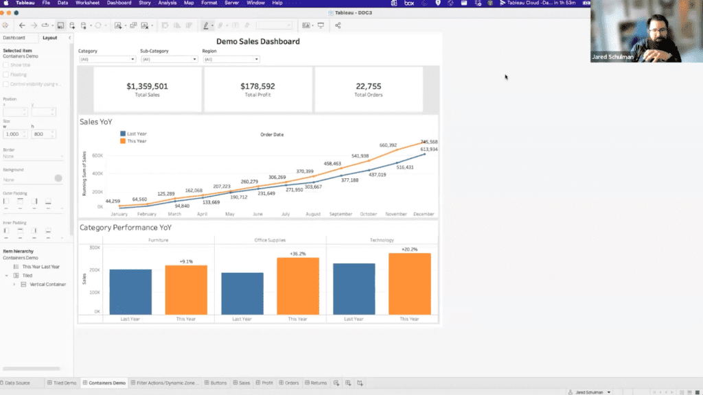
>> JARED: Sweet. So, Stuart, we talked about this idea of kind of leveling up dashboard design. And what does that look like? What does it take to do that? So where I wanted to start today is a really simple dashboard. We’ve got some filters, some KPIs, a couple of vizes. This is really similar to what we see when we get brought into engagements with clients a lot of times. It’s a clean dashboard. It’s very clear what’s going on with it. There are just a few small things that we could do to kind of improve this and just tweak it a little bit.
So when you have a dashboard like this to start with, when we talk about containers, the default for a Tableau dashboard, when you start dragging out sheets or objects, is they’re going to fall into a tiled container. And the tiled container lets you put something pretty much anywhere you want which is nice. It’s really easy to just click and drag objects or sheets around your dashboard, but it has some limitations as well.
So if we start looking at this dashboard, we can pick out a few things that aren’t the best visual design. With these filter boxes, they’re separated, they’ve got this padding in between them and we could remove that, be a little bit tedious. That’s something we might want to address. When we move down to our KPI boxes, they’re not quite even. So we can adjust these a little bit and try and get them a little bit closer to even. Maybe eyeball that. We can actually use the layout pane as well to get an idea of this. So if I click on this sheet, it’s going to tell me this is 310 pixels wide. This one’s 348 and this one’s 326.
So visually, they look pretty close, but they’re actually not that even. And if we want to get these closer to the same size, we’ve got to click and drag and double check. It’s just a very tedious process to try and get these more even when they’re just in the tiled container on the dashboard. Same thing is true for these two sheets here. They look roughly the same size. This one’s 294 pixels. This one’s 298. I mean, that’s close enough for a lot of work, but I think we can get that a little bit closer as well.
So if we look at this on the item hierarchy, we can see that tiled container. I might have snuck a horizontal in here. That was my mistake. That shouldn’t be on the tiled demo. So we have everything inside this tiled container. If we move over to the version of this dashboard that uses containers, it starts to look just a little bit cleaner. You know, we don’t have as much separation between everything.
Things start to look a little bit more cohesive. And I want to go through how this is built. And then like step by step, this is how we would do something like this and here’s why we would do this. So just by clicking around on this dashboard, we can start to see if I double click here, these objects are now all in a horizontal container. So on the tile demo, we’ve got this like padding in between the objects, those like gray lines, it looks very brick like.
On this demo, we have a background color on the container that all of those are in. So it just makes them all white all the way across. And it makes it look like those go together. That’s like one object. This is our filters bar. as opposed to these are the three filters that we have at the top of our sheet.
And then similarly for the KPI boxes, these are all inside of a horizontal container. And because they’re in a horizontal container, back over here, we have to click and drag to try and get these to be the same size. And what we don’t have here on the tiled container that we do in the horizontal is in the horizontal, we can edit it and fix the width of the object. So we can say I want this to be exactly 300 pixels. And the KPI box next to it, I want that one to be exactly 300 pixels and so on.
So now these are all exactly 300 pixels wide. And we don’t have to click and drag to try and get them to be close enough that you can’t really tell that they’re not the same when you look at it. We can just make them the same by just dropping down this menu and going to edit width and we can set that to whatever width we want. And I added in a couple of blanks on either side. Just to kind of make that KPI bar look a little bit separate from the rest of the sheet, just to draw the eye a little bit to it. And those are also in that same horizontal container.
And then down below, these two objects are within a vertical container. And what we’ve done here is we’ve used this distribute contents evenly object or not object but option. And what this does is it takes everything in this container, which is these two sheets, and it just automatically makes them the same size.
So if we were to make this container larger, it’s going to keep that same size. And now we’ve got 304 high, 303 high. That’s as close as you can get with an odd number. and that’s where we end up. So that distribute contents evenly is another way that we can just really quickly make similar things a similar size so that instead of having to click and drag and try and like mess around with the heights, we can just set it to distribute them evenly from jump.
So that’s within a vertical container. That vertical container exists within a larger vertical container. So if we wanted to build this from scratch, this is how I typically start all of my dashboard builds. I’m going to come over on the dashboard side and I’m just going to drop a vertical container into that pile and I’m going to build everything that I build from the top down.
So I would take a text object and I’d drop a title in. And if you have a logo that you want to use either for an internal or external facing dashboard, you can drop in a horizontal container at the top and put your logo and then the title in there. The one thing that I’ll mention on containers is, if you ever put an empty container into an empty container, it becomes pretty much impossible to get an object to drop into the first one. So if you ever have something like that, I’d recommend dropping in a blank.
And you can just kind of use that blank to block and space things within the container. So here I’ve got now my title and the blank, and I could bring in a horizontal container and drop it right underneath that title. And with that horizontal container, I’m going to bring over my filters. And the thing with containers too is like, you can tell by what is shaded dark gray, where that object is going to land. The same way that you can in the tile, you can in like a horizontal or vertical.
So here in this horizontal, I’m looking for it to be dark gray on the right side of that. You can throw it on the left too, but I’m going left to right. So I’m going to hit this on the right side. This is going to put it just over the top of the container that I’m in, which I don’t want. This is going to put it inside that container. We get the blue outline, which tells us that it’s going to go in the container. And the dark gray shading tells us what side of the container it’s going on.
>> Stuart: This is by the way, the most frustrating element of containers guys.
>> JARED: Oh yes.
>> Stuart: Is getting it in the container. So that is a really good point to harp on Jared. Is like, it could be out of the container or you got to make sure it’s in there to get the features that you, or the outcome you want. So good to call that out. And it’s really tough too, if you have a really skinny container, like if I make this really narrow, I guess it’s making it easier for me this time, but there are times when it’ll be really tough to get it to actually land in the container when it’s that narrow. So you can always just make this bigger, drop in your other object. I’m going to bring this blank in as well because I like using blanks for spacing. And then we can make that more narrow again.
So I’ve got all of those filters in there now. And like we did on the demo as it stood when we started, we can come over into layout and change the background color for that horizontal container to white and it’s just going to fill in all that empty space. Just for the sake of time, I’ll also point out, you can move entire containers with objects in them. So I’m just going to grab this whole horizontal that has our KPIs in it and bring that over into, how are we doing this outside of our vertical? This is always great when something goes wrong on a demo. So this is like two verticals. That’s so weird. OK, so for some reason our container duplicated, this is a separate one now. That’s very strange.
OK, there we go that was weird I’m so glad we’re recording this so we can’t edit that out. We’ll bring this over as well and it’s doing the same thing. All right. And then we’ll bring our two sheets in although those did exist in their own vertical container. So now if we come back over here, this one’s 297 this one’s 295. If we bring out a vertical container and drop those two sheets in there, we can set those to distribute contents evenly again like they were and that will just barely change that by a pixel.
>> Stuart: And Jared, it’s very worth calling out like you can distribute contents evenly in two ways. You can double -click that tab that Jared was doing and so that highlights the sheets in the container. It might be more than two it could be 10. Or you can select the drop -down menu for one of those sheets. I believe Jared and do select In this case it’s a vertical container. Once you do that, it grabs the sheets in the container then you can fit them even more. So a couple ways to get there. Just wanted to call it out.
>> JARED: Yes, so if we clicked on this KPI, we click this drop down and select the horizontal container and from the horizontal container, we can also select the vertical container. So you can go all the way up to the tiled container that contains everything as well. So yes.
>> Stuart: I did not know that, that’s good.
>> JARED: Yes, especially if you’re running KPIs that are actually three sheets stacked on top of each other so you have three verticals that are inside of a horizontal. That’s inside of a vertical. You can get a maze of containers, and it can be helpful to just be able to trace that up the train. Particularly, if you’re trying to get pixel perfect formatting, there are two ways to get pixel perfect formatting. Either you use containers, and you edit the widths and heights, and you distribute contents evenly, or you float every single object on your dashboard, and you can never change anything without editing the whole thing, which is a nightmare. So that would be the alternative; to use all floating objects.
If you float, you can actually set the x, y position and the width and height of everything, so that you can place it exactly just like you’re mapping it out on a piece of poster board. But then if you ever want to add in another sheet you have to edit the width and height and the xy of every other sheet on the dashboard to make room for it. So we recommend containers for what’s hopefully obvious reasons at this point over floating. Stuart am I missing anything on containers? I’m trying to think.
>> Stuart: No, I think just generally for anyone on the call, it’s not used containers. It is, like Jared mentioned, an effective way to get a good fit between your sheets, like an actual great fit. There’s just formatting benefits that come with it. It looks cleaner. So it really is a great option for solid dashboards, either horizontal or vertical containers. So that’s like the biggest takeaway. It’ll really level up your dashboard.
>> JARED: And I guess the other thing is containers also enables some of the other functionality that we’re going to get into later. So dynamic zone visibility and show hide buttons, you can leverage containers for those to really make those features more useful as well. And I’ll circle back to that when we get to those items. So if we take our new dashboard now, it’s just a little bit more clean, a little bit more polished, everything’s looking a little bit more put together. Let’s talk filter actions and dynamic zone visibility.
So we talked about dynamic zone visibility in the last session that we did on parameters and dynamic zone visibility leverages a Boolean true false field to either show or hide content based on when that is true or false. And the easiest way to do that is just with a parameter or using a parameter to control a value that’s going to be true or false. And I have a parameter up here to show subcategories. That’s default to no, but if we flip it to yes, it’s going to create this subcategory breakdown pop up just right over the top of my category performance.
Dashboard best practices, is it best to go from subcategory to category from top down? No, but this was a quick demo that we threw together. This is driven just by this parameter, and it’s a Boolean parameter, true false. So to recap from what we talked through last time, when we highlight this subcategory breakdown sheet on the layout tab, we get this control visibility using value option. And because the show subcategories field is a Boolean parameter, it’s going to have a value of true or false.
We can use that true or false to control when this sheet is shown. So we can set that to no, and we just see our sales year over year. When we set it to yes, this subcategory breakdown is just floating on top. So when it’s on no, it’s invisible. When it’s on yes, it’s visible. And it’s just straight there over the top hidden when we don’t want to see it. And instead of using a true false parameter, we could use a parameter action, which I think is what we covered in the last call, to say if we click on technology, then we want that parameter to equal technology. And if the parameter equals anything other than none, it’s going to be true and that’s what we’ll use to control the visibility on this object.
So that’s something that I think that recordings up on YouTube, if you want to get more into parameter actions and how to use those to control dynamic zone visibility, I’d highly recommend that because it’s a really cool functionality. And circling back to what we were just talking about, we can use this dynamic zone visibility to control the visibility of the sheet, but we can also use it for entire objects, like entire containers. So this wouldn’t be a good use case for this, but we can do the same thing.
Use this show subcategories to show and hide the whole horizontal container that controls our KPIs and it just disappears when it’s on no. So if we didn’t have those in a container, we would have to set that individually for all of the five different objects, the three KPIs and two blanks in that container, it’d be way more tedious. But because we’re using a horizontal container, we can control the visibility at the container level, which makes sheet swapping, drill downs all way easier than they were in Tableau like a year ago.
>> Stuart: Jared, there was a good question that came in from Kim. She was asking, is the subcategory Viz its own sheet that’s being laid on top, or is it just adding a dimension to the existing bit?
>> JARED: That’s a great question. Yes, so to cover that, the subcategory breakdown is its own sheet. And so this sheet exists on its own. And the sheet is technically on this dashboard, even when it’s not shown. So dynamic zone visibility is just making it invisible. We can see what’s behind it. But that sheet is technically still on the dashboard, even when it’s not visible. Does that help?
>> Stuart: Yes, in many ways, it seems like this new functionality, dynamic zone visibility, maybe in the past, you would have too many views, and it would get cluttered and you might think about having another dashboard, but now zone visibility can just make things invisible and hide them until you need them, so you can almost have one dashboard that encompasses that. Is that fair to say Jared, I guess?
>> JARED: Yes, yes, it’s like having pockets. If you ever had like a jacket without pockets, and then you get pockets, now you can put more stuff in your pockets. It’s great.
>> Stuart: That was on the fly. You haven’t thought about that. That was good.
>> JARED: Yes, this just gives us like a little pocket that we can keep this extra Vis in. And then we can tell our end users, hey, if you want to see some category breakdown, I got that in my back pocket. And we can just show it right there. So it lets you pack a little bit more visual punch in the same space, the same way that a Vis in tool tips does. This just gives you another option to show more data in the same space.
So moving on just a little bit to filter actions. This is another really nice interactivity ad for your dashboards. There’s a couple of different ways to set up filter actions to where we want to let our end users click on something and change the data that’s on the dashboard. The easiest way to do it is to click on this use as filter button. And if we click on that, it’s going to create a filter action automatically to where now if we click on technology, we’re going to see our KPIs and our line graph change to just reflect technology data.
We can do the same for office supplies and furniture and all that data is going to change, which is really slick. I mean, it lets your end users drill down just a little bit and see that next level analysis. If we wanted to do the same thing for like the sales year over year so that we could drill into just like one month or one quarter of data and we don’t want to use this, we can also set it up manually.
So if we come up to the dashboard menu and come into actions, we’re going to see the automated ones that were like already created and we clicked on other sheets. And we can add an action. So we’ll add a filter action. There’s also a bunch of other actions that there’s probably a ton of great tech notes online on Tableau forums about. We don’t have time to get into today. So we’re going to create a filter action. And this is just going to be our sales year over year action. And the source sheet is going to be the sheet that starts the action. What do we want to click on to affect the rest of the sheets? And that’s going to be our sales year over year, which I believe is Vis one.
So this is what we want to interact with and the target sheets are, what do we want to affect with that interaction? So we want to pick basically everything except the source sheet in this case. We’re going to leave the filter on all fields. This is all the same data source. The fields are all the same. So we don’t need to get into this too much.
The other thing we’re going to change is we’re going to select run action on select instead of menu. If you do hover, anytime you hover over data, it’s going to run that action, which can be pretty taxing on the processing power of Tableau Cloud or your machine, and maybe a little bit confusing for your end users.
Menu will let you click and in the tool tip, there will be a little link to run that action. And select just is a middle option where when you click on something or highlight it, it’s going to run that action. And then what do you want it to do when you unclick that? Do you want it to keep the filter, blank out everything or show everything? And we’ll just pick show all values.
So by default, when you click the users filter, it defaults to run on select and show all values and filter all fields. And you can always check that too if you come back over here to whichever filter you’re generating. And we can see what that looks like. So the other one is running from Viz 2 on all the sheets. It’s going to show all values and run action on select.
So now that we have that set up for the sales year over year, now if we just want to look at December, we can highlight December this year and last year, and it’s going to change all that data. If we want to look at just Q4, we can select October through December and it’s going to change all that. If we just want to see the last month, we can just single select click and obviously that’s only this year or we’re going to see just this year’s numbers. And the same will also affect the subcategory breakdown that we had because it’s its own sheet on the dashboard.
So those filter actions can give just a really nice extra tool for your end users to do some of that drill down within the dashboard, get some more information. We can start looking at, OK, office supplies and just the last quarter, boom. And they can do that all from the same dashboard. Yes, there’s some fun stuff that you can do with these. Stuart, go ahead.
>> Stuart: Yes, I don’t think I might say this seems very sort of basic, but important to it. And users like, a lot of times we will label in the header of the sheet, click to filter. Just to give them some sort of indication that like, A, there are actually action on this report. So it’s something you want to consider because they might not know that they can filter. So just thought I’d mentioned that.
>> JARED: Yes, so we can do it as simple as that, just like smaller text next to the title, click a category to filter views above. And then boom, now they know. So some of it may just be end user training and getting them used to looking for something like that. But you can also include some of that info text. Say, highlight, prompts to filter other views. Boom. And now they just know, oh, OK, so if I come in and I highlight a few months, it’s going to filter everything else.
>> Stuart: Yes.
>> JARED: Yes, that’s a good call out, Stuart. I like that a lot. All right. We’re tracking pretty good on time. I figured we’d spend a lot of the first time on containers and filters and dynamics zone visibility. So let’s talk buttons. Buttons is the other place that the containers are going to play a big role. So on this sheet, it’s a little bit different from the one that we had in that we no longer have our filters bar up at the top. And that’s because we’ve hidden it behind this filter button. And this button just lets us show and hide that real quick and easy. There’s a few reasons that you might want to do this. It’s nice for real estate, especially if you have eight, ten filters on your filter bar.
I have clients with filter bars that are two rows. We have one client who’s running a propensity scoring model dynamically in Tableau desktop. And we have a control panel button that lets them flip down 35 different parameters that they can use to edit that propensity scoring model. And you don’t want to see that on the dashboard all the time, because 35 parameters, a five by seven grid, takes up most of the time. of the dashboard. So instead we have it hidden behind a button where when they click that button it’s just a floating container that will pop in.
And the setup for this is really easy. If you have an object or a container and you go into this drop down, there’s a little option for add a show hide button. And it’s going to come up like this. It’s like a little X. You can click and drag it wherever you want. And then if you edit that button, it’s going to let you choose what you want it to look like when it’s shown and hidden. You can choose either a text or an image button.
So in this case, I just chose just a filter icon that I got from PowerPoint’s icon library. And went ahead and made that the image for when it’s shown and hidden. You can also do text. So when the item is shown, we can say hide KPIs and when it’s hidden we might want to say, show KPIs. And then if we do that, we make that a little bit bigger. Now we’ve got a little button that we can say, all right, I want to click on that and hide the KPIs, and now I want to show them.
So it’s super straightforward, but it again just gives you options to put a few more views on your dashboard or some things that might not be necessary to see all of the time. But people might want to see, this is great for filter bars, for data dictionaries, glossaries, things like that. It’s really useful for all of that. Also, if you have folks who want to screenshot dashboards and throw them into PowerPoint or something like that, maybe you don’t want to show the whole filters bar. So you can hide the filters bar and get a cleaner view for screenshotting and presentations, things like that.
So that’s another really easy one. You can do it on objects. So there’s an add show hide button for just this sheet. You can do it for just this legend or for entire containers like we were talking about before. So if we wanted to show and hide the filters bar and we didn’t have these in a container, then again, we would need to have a separate button for each of the four filters or the three filters in the parameter. And it would just be tedious. So really, really drawing home the importance of those containers.
The other thing that we have on this dashboard is that little light bulb icon. And the light bulb icon is something that we do sometimes when dashboards need a little bit of extra context. We’ll add an info button. And if you hover over that, it’s just going to give you a little bit of extra information. about what’s going on with this dashboard, what’s the purpose, how do you use it? And the setup for this is really straightforward too.
It’s not super intuitive, but once you know how it’s done, it’s like a magician revealing his secrets because it’s so easy. So all this is, is a separate sheet with a shape mark and just a dummy piece of text on detail with a tooltip that has that text in it. And that’s all it takes.
So you just come into a new sheet, you put like info on detail in quotes, that’s all this is. And then you change the mark type to shape and this shape is here under more shapes in the bug tracking category. It’s a little light bulb. You can also add your own custom shapes within your Tableau library. So I’m sure there’s some good knowledge -based articles on that. It’s something that, we’ve done a few times before and if you have like a like a special icon that you want to use or you want a little eye in a circle for info, you can use custom shapes or things like that and just get a little button that you can hover over and get a little bit of extra information on your dashboard.
>> Stuart: We have questions flooding in, do we want to take a few or wait till Q &A. What do you think?
>> JARED: No, we can take them with some time.
>> Stuart: OK. All right. Well, Danik had a good question I wanted to revisit first and that is, she says when selecting just a month or a quarter, how does the viewer know or remember which one they choose, would you need a dynamic title?
>> JARED: Oh, so dynamic titles are a bit tricky. We can chat about that though. So remembering which ones you picked, if I select this quarter, it’s going to give me just this little highlight around them like those button or those dots are a little bit bold almost. So that’s one way to remember it. I do want to see what this will do if we try and add the months into the title Because I think it’ll default to like all months. So if I do month of order date and year of order date, I just want to see what this will look like. So all 2022 and 2023 and then if I select these because it’s not filtering this view. OK. So this is where the dynamic titles with the field values just doesn’t quite work the way that I’d like it to for things like this. I’m trying to think if we’re getting into some hacks now, but if we do this and let’s see. So if we do that and we were to bring this out and then make this like, I just want to see if we could sort of chop off the bottom of it and just leave the title and then put them in this title which should be affected by that filter action.
So even if we took this out, these are the sorts of questions that I love getting because it’s like, oh, yes, how would we do that? So there now we have a very hacky dynamic title that says we’re showing October, November, and December 22 and 23. And if we unselect that, hopefully it won’t break in say all the months. Yes, it just says all. OK. So that lets you, I don’t know that I would necessarily recommend doing it this way because we’re loading an entire separate visualization just to get that title in there. But at minimum, it’s a duct tape and bubblegum solution for it. That was a fun one.
>> Stuart: Awesome. Another question that came in, let me see. Amber, did you have a question that how did you get the last year, this year, legend to be horizontal? Yes, you recall where that was?
>> JARED: So horizontal meaning like to get it?
>> Stuart: Oh, yes, yes. So it’s not going across probably.
>> JARED: Yes, so there’s like a couple of ways to adjust legends. If you just kind of mess with the size of the legend object, you can get it to reorient itself. But you can also edit that in the arrange items menu. So we can change this from auto-arrange to single row and it’s going to move that up to this orientation.
>> Stuart: Yes. Was that the answer to your question Bridget? Was that what you were looking for? Arrange items. Awesome. OK. Cool. Let’s continue on Jared and then there’s a couple other good questions we’ll come back to in the Q&A. But we’ll let you wrap on the demo side.
>> JARED: Awesome. All right. Cool. I’m going to ignore the fact that I just wiped pot sauce in my eye from my tacos on there.
>> Stuart: We’ll cut it out in post; it’s OK.
>> JARED: So we talked buttons. The next thing I want to talk about is padding and backgrounds. So we talked a little bit about in that switch from tiled to containers, just adding these blank objects in the KPIs bar just to give it a little bit of spacing and separate it visually a little bit from the rest of the dashboard. Using blank objects is one way to do that, but we can also change the padding on objects. And that’s in the layout menu here, this outer padding and inner padding. So outer padding is going to adjust the amount of space that’s around the outside of the object itself on the dashboard and you can set that equally for all sides or uncheck this box or click this little lock icon and you can set it for just one side.
So you can do that for outer padding or inner padding is going to basically be the same thing, but for the inside. So we notice here we don’t have the gray around it now we have the white. Because this is still the same sheet, we’re just adding padding to the inside of the sheet as opposed to the outside of the sheet. And that can be useful in a couple of different places. We talked about being able to take a container and set the background as white.
And that can be handy, but if we had something like this category performance year over year view and we wanted to add, now granted we could also just add a grand total. But if we wanted to have a separate sheet for the grand total and bring that in over here, we might put that in a horizontal container. I switch back to tile here and then maybe bring in that grand total. Hide that title this won’t line up perfectly.
So we can hide this and that’s fine. Maybe I’ll actually show that title again just it’ll line up a little bit better and we’ll just call this grand total. But we have this space in between that’s not really great. If we wanted this to look like it was all a single visualization, what we can do is we can come into the padding, unlock this and take off the right padding from the left viz and then take off the left padding from the right viz, and now there’s no space in between them.
So if you have two different sheets or two different tables or two different vizes that you want to kind of pseudo stitch together and make them look like they’re one chart, you can do that by taking away the padding in between them. And so it’s two separate sheets, but now it kind of looks like one. You do the same thing vertically.
So these don’t really line up great with the titles being different sizes. So I could hide both of these titles and then bring in a text box and call this category performance, which I think is what our views were called. I’ll make that size 16, make this white. Now this is a situation where this is in a vertical object that we set to distribute contents evenly. So notice as soon as I bring that title in, now it’s the same size as my two vizes.
And this is a situation where, OK, we’re going to take this and put a second vertical container inside of this first one, so that what’s inside of the vertical container is actually one sheet and one vertical container and now those two objects are distributed evenly. That might be making things more complicated than it needs to be. If that’s confusing, let me tell you, we can explain that a little more.
But in this bottom now, I’ve got my two sheets in the horizontal, and I’ve got my title above it. And if I want to just make that title look like it’s a title for both of these sheets, I’ll do that same thing again. I’ll come in here, my horizontal container doesn’t have any padding, but the sheets inside do.
So I’m going to take off the top padding from the sheets underneath. I’m going to take off the bottom padding from the title above it, and now it’s all stitched together. It looks like one view, it’s actually three separate objects. So padding can be really useful for getting the formatting just how you want it and being able to arrange things just how you want them on the dashboard.
The other thing that I want to at least mention is custom backgrounds. And Stuart, I don’t have a demo for this because it takes time to set up, but I know on our Tableau public page, we’ve got a demo dashboard that you built that has a custom background with the KPI boxes with the nice rounded corners and the shadows. So maybe towards the end, we can hop over to that and just show that to see, like I think that’s up in the map. Like you can use background images or background maps, you can add those to your dashboard.
So you can put in like a background image and display that. So instead of having these square KPI boxes, we could use a nice rounded shape that Tableau doesn’t support natively. Really great for infographics or graphic design type stuff. You can put in nice fancy swoopy arrows between things and images that you like if you have a different mascot or something that you want to put up in the corner of your dashboard. Yes, yes, this can be really flexible.
We also used those for when we built like a spider chart and I don’t know if we have it. I don’t think we have a demo of that, but we basically built a custom background. There’s like a 12 sided spider web to rank different points on. That was a fun one. So background images can be pretty powerful if you can get into the hang of those, if you have some way to design those.
And the last thing that I want to talk through is navigation buttons. And this is something that, let’s see if I can go into presentation mode. So if you’re in Tableau Cloud or Tableau Server and you have a workbook with multiple dashboards, a lot of times you’ll have those little text tabs across the top that let users click back and forth between different sheets, different dashboards in that workbook.
And those are great. Most people find them just fine, but if you have end users who prefer in dashboard navigation, you can do that with navigation buttons. So if we come to our sales dashboard, all I’ve done is created different versions of this for sales, profit, orders, and returns and added nav buttons down the side, like a little menu. And now you can use images for these instead of text, but for now at least, we’ve got our sales button, profit, orders, and returns.
And this is set up in a way to where when I click on one of these, it’s going to flip me over to my profit dashboard or my orders dashboard. And this lets me navigate really quickly and easily back and forth from those dashboards. And it lets the user see easily which dashboard they’re on right inside the current dashboard.
And this was something that a couple of our other consultants used on a project and I loved it. And I was like, you’ve got to show me how you did that. That is so slick. It turns out like so many things in Tableau, it’s so easy to set up. So I’ll go out of presentation mode. All that this is, the only thing that this is, is the same four buttons and on each sheet, we’re just editing the color of the button for the sheet that we’re on. So the buttons are set up all the same way. The only difference is I added a border and a lighter background to the sales button on the sales sheet and on the profit sheet that sales button has the darker color and no border, but the profit button is a lighter color with a border on it.
So it feels like it should be way more complicated to set up this intuitive menu bar where Tableau knows what sheet you’re on and is going to color the bar, but it’s not. You just set it up while you’re building sheets. And then if we go back into presentation mode, you end up with this really easy nav system that lets you switch back and forth between sheets on your dashboard and user knows where they’re at. So I was like blown away by that. I was like, that is the coolest. simple solution I’ve ever seen in dashboard navigation. I think that was the last thing that I wanted to cover. I wanted to end with that and we can hit some questions. Stuart, if you want to demo that custom background dash.
>> Stuart: Yes, Jared I have a question here, like just for clarification, like I understand, I think it makes sense like the navigation. Did you build out a dashboard for sales and then build out a dashboard for profit and then for orders and then returns?
>> JARED: Yes, so this is a really bad example in that this is something that we could easily achieve with parameters instead.
>> Stuart: That’s what I was thinking. Yes, OK, that’s where my mind was going. It’s like you could have used, I guess zone visibility and parameters in that.
>> JARED: Totally. If you imagine if you had something like sales, marketing, HR, finance, where it’s totally different viz, you know, we didn’t have time to build out and we don’t have that data in the Superstore data set. But yes, if you imagine, I know there are clients that’ll have a master workbook for some core sort of annual reporting or some sort of board level reporting where they just have high level dashboards for a bunch of different departments or functional areas.
You could build something like this out and using the navigation button object, which is down here in the objects menu. So this is just in a vertical container on the side of my sheet. So you just come in here and you set which sheet you want it to navigate to so we could have this take us back to the containers demo. And we call this containers. I want to make sure that’s set right. So yes, and then it’s spelled wrong, but if I click on that, it’s because the containers.
>> Stuart: Yes. Yes, it opens up ideas for if you have this requirement where you need a landing page for people to jump to reports. I guess you could use it in that way, right, Jared? You could have basically a dashboard that’s all buttons that then take a user to where they want to go and sort of a landing page setting.
>> JARED: Yes, I think we were on sales. So if we were using that as our landing page, which again, bad example, we could just put a nav button on wherever we’re going and say back to home.
>> Stuart: Right, great for back button. You could do an icon that sends you back. Yes, that’s a really good point.
>> JARED: Yes, it gives you some really nice, we’ll do that for detail sheets too, to like drill down to detail, go back to home, things like that. So nav buttons can be a fun one too.
>> Stuart: Awesome, yes, there’s a question that came in. I want to address from Kim and then we can take some more. Let me read this out. So Kim says I have a dashboard that has multiple date filters that each only apply to one sheet on the dashboard. Is there a way to create an overarching filter? Maybe using dashboard actions to create a date filter that could be displayed and used to control all of the date filters on the dash. All of the date filters are from the same data source, but looking at different date yield.
>> JARED: OK. Yes, so I like this one. This would be a really good one too. I’m trying to remember if we talked about this in our parameters community webinar because that’s my first thought here is if we have something like order date and ship date and we want to look at anything that was ordered or shipped within a certain date range, we can’t filter on both at once because what was ordered in that date range isn’t necessarily what shipped in that date range. What was shipped wasn’t necessarily ordered.
But what we could do is create date parameters and there’s a couple of ways that we could use date parameters, but the easiest would just be we put in a start date and an end date and then we expose that as the filter when we say we want it to be between December 1 and December 13 and when we come in here assuming that we had those parameters, just call this date filter and then we would say the order date is greater than or equal to our start date parameter and the order date is less than or equal to start date parameter.
I’m going to wrap that in parentheses so that’s one Boolean function or and then I’m going to take that same thing and just put in the shift date there as opposed to the order date.
And so what this is going to say now, and I want this to be end date, I appreciate all of you who are screaming at your screen for me to catch that. That became through loud and clear. So now what we have here is we’re saying we want the order date to be greater than or equal to the start date and less than or equal to the end date, or the shift date is greater than or equal to start date and less than or equal to end date. So this is going to filter both dates with a pair of parameters as opposed to a filter.
Beyond that, I think it would be tough to use something like dashboard actions to control two different fields at once. Because I’m trying to think there are set actions. But if we used a set action on order date, it would change a set for just the order dates. If we used parameter actions, it’s only going to be single value because parameters can’t be multi -select. So we couldn’t get multiple dates in a single parameter. I think the best bet for something like that is going to be either using parameters like this or maybe if you had like a date dim field.
>> Stuart: Yes, I was thinking that too.
>> JARED: Yes, that you could like join out both tables too. That might be getting a little too complicated. That’s a challenging one for sure, but I think parameters are probably going to be the best way to go there.
>> Stuart: Yes, I would agree. Awesome. So we have a question come in Jared. OK, so let’s get from Pascal. Let’s say you have two sheets in a dashboard, a map and a bar chart as an example. The filter actions are happening for both sheets. The filter actions are enabled. Now if you click on the map, the bar chart should update accordingly. I can clear the filter by clicking on the map again, however I want to clear the filter by clicking on the bar chart. It’s not clear the selection. How can we make this happen? Generally the question.
>> JARED: I don’t think that’s doable. And the reason is in this case, this action is being driven by this sheet and so we can kind of see this if we go up to our actions menu. And we look at this, the source sheet. Maybe we could do this if we set the source sheet to viz one or viz two. My hunch is that it’s still going to go based off of the selection. So, and this is probably a bad example because we don’t have the same fields here. Let me try just duplicating this real quick.
>> Stuart: We have a lot of good tangents here. No, this is a great questions and you’re the best person for the job Jared. I figured this out.
>> JARED: So yes, I think what’s going to happen is if we set the action from either of these sheets and we should be able to see now that it’s like set on viz two or viz one or viz one six. So it’s going to filter this sheet as well, but because we’re not selected on sheet viz one six, which is this one, clicking on this one is not going to unselect the selection that we have here. So I don’t think Tableau is going to support driving a viz action from a selection on one sheet and clearing it from another one.
>> Stuart: Yes, we can, we can do some digging. Maybe go on a fun one to kind of see if it’s possible. We’ll get back to you. Let’s go.
>> JARED: It’s going to keep me up at night. I’m sure.
>> Stuart: Yes, yes. Jared’s going to stay up tonight working on that. Awesome. Guys, we’re right at time. Uh, this has been really good. Really great questions. Thank you for all the questions. Thanks for being here. We had 43 participants and probably the highest we’ve had on these calls. So we look forward to next year. If people can hang on, I can quickly show that custom background you talked about Jared. Happy to.
>> JARED: Yes, you got that pulled up?
>> Stuart: Yes. Well, the recording out for this call on our YouTube channel and it’ll be emailed out. So keep in mind, you can go to all of the session recordings on our YouTube, XeoMatrix on YouTube. We track where they’re all there and these get sent out. And reach out to us, if you have any questions that are really burning need help with. Yes, I’ll show that real quick. And then again, we’ll have more information coming out on the sessions next year. It’ll likely be on the 17th of January.
So TBD on that session, email us if you have ideas for topics that you’d like for us to cover, we’re starting to get those topics together. I’ll quickly show the custom background information for those interested.
So this is our Tableau public page. And the one that Jared was referencing was this KPI scorecard dashboard. Very simple type of analysis, just KPIs with comparisons like looking back a prior year and then some spark lines, but what’s unique I would say is that I built this in PowerPoint and I’m not good at PowerPoint by the way, they got to get help. But I just built these boxes and we’ll make a caveat that this is tedious to do.
It requires more work, but it can look great. And I’ve floated these objects on. And using the layout tab that Jared showed, I was able to get the right sort of fit and the right width and height and x -axis and y -axis coordinates.
But it’s tedious. And if you go this route, whether it’s PowerPoint or Figma, it’s another great option. You’ve got to think through your design ahead of time. And that’s the mistake I made. I kept coming back and going, ah, I want to do this now and I’d have to redo everything. So you really want to kind of prototype it before. What’s the term in development, Jared, when you prototype or you wireframe it? Kind of wireframe something? That would be my advice.
There’s another example we have. This was using Figma. It’s the same type of thing, just almost like these boxes that pop out and kind of have a shadow. And then this was floated in. I’m not actually sure, Jared. If you bring in a Figma Tableau or PowerPoint, can you use containers? I don’t think you can.
>> JARED: You can float containers.
>> Stuart: You can float containers.
>> JARED: You can put them in containers and then float the four across the top and horizontal, the four down the side in a vertical.
>> Stuart: That’s a really good point. Yes. And then to your point in the demo, I just have some buttons here. I think this one is just show hide. I could have done zone visibility, but it wasn’t out yet. It wasn’t released. And so that just pops that out and then we’ve got filters that drop down and just different icons. I think I captured all of these from Google. Just Google images, save them to my local machine and then if you want a PDF download, you can get that PDF. So hopefully that’s some good ideas. Again, it’s more tedious to do stuff like this, but it can have a really cool look and feel if you have the time and bandwidth to do it. That is all I had. That’s on our XeoMatrix webpage.
Awesome. OK. Guys, that’s everything. I’ve got to jump to a call. We will see you in January. Happy holidays, everyone. And really appreciate you joining these calls. They’ve been really fun for us. So we’re going to do it next year. Tell your friends, tell your colleagues, we’d love to have more people join and let us know if we can help you with anything. OK. Awesome. Jared, thank you as well. That’s been fantastic. And you’ve done the last three, so appreciate your time.
>> JARED: Yes, maybe I’ll take a break for the rest of the month.
>> Stuart: Yes.
>> JARED: This is great. I appreciate all the questions and the interactivity from the community. This has been phenomenal.
>> Stuart: Yes. Enjoy time with your families over the holidays. We’re going to stay safe and we’ll see you next year. OK. Bye, everyone.
>> JARED: Yes. See you.