The Data-Driven Community Meetup holds monthly webinars on business analytics and big data. Webinars are held on the second Wednesday of the month at noon (12:00 PM) Central Time via Zoom Webinars and will cover topics related to enterprise data management. Our goal with each webinar is to provide meaningful insights and actionable takeaways to simplify analytics so you can make better decisions.
We cover topics such as data strategy, data management, data warehousing, BI modernization, embedded analytics, and cloud migration and strategy. Learn how to build reporting solutions that drive your business demand based on your needs.
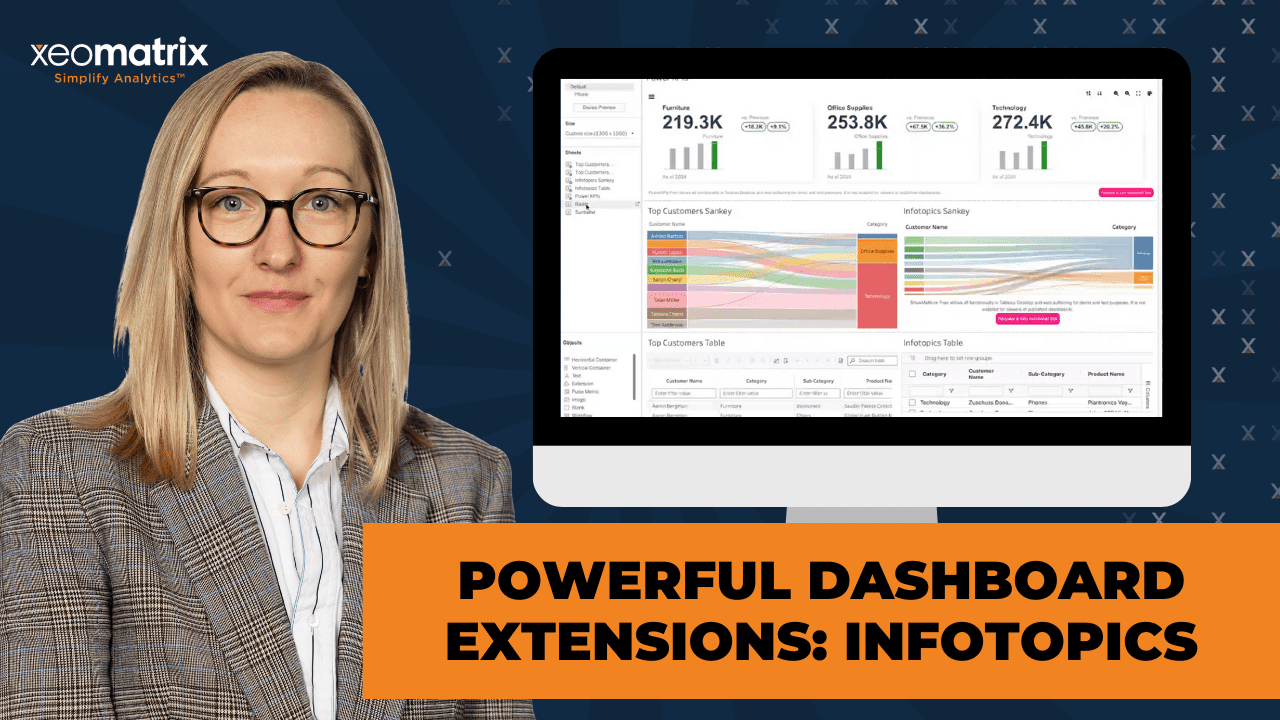
About the Topic
In this meetup, Lauren will explore powerful dashboard extensions that can take your Tableau dashboards to the next level. We’ll also explore how to enhance interactivity and functionality using Tableau dashboard extensions, with a special spotlight on some of our favorite tools from InfoTopics.
Discover how these extensions can help streamline workflows, improve user experience, and unlock new visualization capabilities that go beyond native Tableau features. Whether you’re looking to improve data filtering, export options, write-back capabilities, or navigation, you’ll walk away with actionable ideas to make your dashboards more dynamic and impactful.
What You’ll Learn:
- How to integrate and use Tableau dashboard extensions
- Key features and use cases for InfoTopics extensions
- Practical examples and demos to inspire your own dashboards
This article includes a recording, transcript, and written overview of the presentation on Powerful Dashboard Extensions: InfoTopics Spotlight (On-Demand Webinar).
Creating a Tableau Chart Catalog Presentation Video
Creating a Tableau Chart Catalog Summarized Presentation
This session focuses on enhancing Tableau dashboards with third-party Viz Extensions, specifically highlighting the powerful capabilities of InfoTopics. Designed for analysts and dashboard developers, the session walks through how to elevate data visualizations without relying on complex calculations or manual workarounds.
Lauren begins by introducing Viz Extensions and explains how they simplify the process of building advanced chart types in Tableau. She showcases how InfoTopics offers an extensive library of visual tools that go beyond what Tableau provides out of the box, with a mix of free and paid options available. Users can download demo workbooks from the InfoTopics website to explore the functionality firsthand.
Throughout the session, Lauren demonstrates how to integrate extensions into a Tableau workbook using the Superstore dataset. She compares Tableau’s native extensions with InfoTopics alternatives, highlighting improvements in formatting, interactivity, and export capabilities. Featured extensions include Sankey diagrams, PowerKPIs, SuperTables, Radar charts, and Sunburst visuals—all configured live with minimal setup time.
In addition to showcasing extensions, Lauren shares practical dashboard design strategies, including tips for using containers effectively to create clean, organized layouts. Her insights are especially valuable for users who want to save development time while improving the aesthetics and functionality of their dashboards.
Session Outline
- Introduction to Viz Extensions
- Highlighted Extensions from InfoTopics
- Building with Extensions in Practice
- Tips for Dashboard Design & Containers
- Key Takeaways
Introduction to Viz Extensions
Viz Extensions were introduced in a recent Tableau version and have the potential to simplify the creation of advanced chart types. Unlike Tableau’s built-in capabilities that often require complex calculations and data scaffolding, Viz Extensions—especially those by InfoTopics—enable users to easily integrate sophisticated visual elements into their dashboards.
Users can explore and test InfoTopics extensions via their website, where demo workbooks are available for download. While some extensions are free for demo use, full access typically requires a paid license.
Highlighted Extensions from InfoTopics
Sankey Diagram
The InfoTopics Sankey extension is a visually rich and customizable alternative to Tableau’s native version. While Tableau offers a free Sankey extension, it has limited formatting options and does not support PDF or PowerPoint export—often rendering blank in those contexts. By contrast, InfoTopics’ Sankey offers:
- Dynamic highlighting and interactive flow visibility: Users can hover to highlight specific paths and quickly see relationships between categories, such as customer names and product segments.
- Branded color support and styling: The extension allows teams to align the Sankey’s visual appearance with corporate branding.
- Improved real estate handling: The Sankey can zoom in on KPIs without needing dynamic zone visibility or extra calculations, which saves time and dashboard space.
This Sankey dramatically improves storytelling with flow-based data.
PowerKPIs
The PowerKPIs extension allows users to create highly stylized KPI cards with minimal effort. In “five seconds,” you can build fully functional KPI views that:
- Automatically calculate deltas: The extension calculates changes over time, such as year-over-year or month-over-month performance, without the need for custom calculations.
- Support multiple display formats: Users can choose between a traditional grid layout or a tree layout that visualizes the relationships between categories and subcategories.
- Work seamlessly with dashboard actions: The KPIs respond to user interactions, enabling dynamic filtering and drill-downs.
- Save significant development time: Typically, such KPI cards would require building multiple sheets, using containers, formatting everything manually, and distributing components evenly. PowerKPIs reduce this complex task to a few clicks.
While there is a free version available, the full functionality is unlocked through a paid license. Even so, the visual appeal and ease of use make it one of the most compelling extensions in the InfoTopics suite.
SuperTables
The SuperTables extension adds robust table functionality that outperforms Tableau’s built-in table extension. Several features that set it apart:
- Column-level filtering and search: Users can filter by exact match or partial string (e.g., “contains” or “starts with”) directly within each column.
- Excel-style interactivity: The table mimics familiar Excel behavior, including clean row formatting and support for single-row exports.
- Conditional formatting: Users can highlight cells based on values, such as negative profit margins, without writing calculations. This level of formatting typically requires heavy logic in Tableau.
- Anonymization support: Ideal for external sharing, the extension allows users to anonymize data values to protect privacy or comply with regulations.
- Cleaner exports: Because of its single-row structure and formatting controls, exporting the data is more reliable and professional-looking.
While Tableau has a native version of SuperTables, it lacks the polish, formatting flexibility, and user control available in the InfoTopics version.
Radial (Radar) Charts
Radar charts are “hard” to build manually in Tableau due to their data structure requirements and formatting complexity. However, the InfoTopics extension makes it straightforward:
- Minimal configuration required: Users simply choose their dimensions and measures, and the extension renders a radar chart.
- Better visual polish: The output looks clean and professional, especially when compared to manually built radar charts.
- Effective for survey or scoring data: Radar charts are ideal when visualizing how different categories or individuals score across multiple attributes.
Despite the simplicity, Lauren noted that getting clean data for a radar chart is still key—but the extension makes formatting much more approachable.
Sunburst Chart
The Sunburst extension has the ability to turn complex category structures into engaging visuals:
- Multi-layered insights: Users can drill down into hierarchical data like category → subcategory → product type by simply clicking on a section of the chart.
- Saves time compared to layered donut hacks: Lauren humorously compared manually created donuts (using map layers) to “Krispy Kreme” and the Sunburst to a “Cronut,” emphasizing the advanced and polished nature of the extension.
- Dynamic interactivity: Selecting a top-level category filters the view to show only its subcategories, conserving dashboard space while deepening insights.
- Enhanced formatting control: The extension allows label formatting (e.g., switching to thousands) and prevents long debugging sessions typical in manual builds.
The sunburst could be sorted more easily when combining fields like category and subcategory—a task that’s error-prone without extensions.
Relationship Diagrams
Relationship diagrams have real business applications:
- Visualize customer-distributor-manufacturer relationships
- Map supply chains or sales routes
- Connect images, icons, or data entities dynamically
The diagrams allow users to show how elements are interrelated, using lines and images to represent associations. Even if not part of day-to-day analytics, these visuals add a powerful storytelling tool for certain use cases.
Building with Extensions in Practice
In the second half of the session, Lauren Cristaldi shifted from exploration to hands-on demonstration, walking participants through the process of incorporating extensions into a real Tableau workbook. Using the Superstore dataset, she showcased how to find, install, configure, and compare different Viz Extensions—both from Tableau and InfoTopics—directly within Tableau Desktop.
Installing and Using Viz Extensions
Lauren began by showing how to access extensions through Tableau’s Marks card under the “Viz Extensions” pane. Once the user selects this option, a library of available extensions becomes visible, including offerings from InfoTopics, Tableau, LaDataViz, Actinvision, and more.
She explained that after an extension is added to a workbook once, it remains accessible within that workbook, saving time when building multiple visualizations.
Exploring Tableau’s Native Extensions
Lauren first demonstrated Tableau’s built-in Sankey and table extensions. Although free, she highlighted some key limitations:
- Export limitations: Tableau’s Sankey extension does not export correctly to PDF or PowerPoint; users will see a blank space instead of the visualization. This could be a dealbreaker for executive reporting or static slide decks.
- Limited customization: While basic interactivity and styling exist, Tableau’s version doesn’t offer the flexibility or polish of third-party options.
- Filtering setup: The default table extension allows users to add columns like customer name, category, sub-category, sales, and profit. Basic interactivity like filtering and sorting works well, but customization is minimal.
Still, she acknowledged that Tableau’s extensions can be valuable for users who are budget-conscious or need simple enhancements.
Comparing Tableau vs. InfoTopics Extensions
To show the difference in power and usability, Lauren recreated the same Sankey and table visualizations using InfoTopics extensions.
Key observations:
- More intuitive configuration panels: The InfoTopics interface clearly labels dimensions, measures, and details, making it easier to set up.
- Rich formatting options: She was super impressed by how many ways users could adjust visuals—sorting, labeling, hiding legends, resizing links, and customizing color schemes, all through the built-in UI.
- Better filtering and usability: InfoTopics tables allow for deeper customization, including anonymization (ideal for external reports), adjusting column widths, and applying conditional formatting without writing calculations.
- Cleaner, more flexible exports: Unlike Tableau’s built-in Sankey, the InfoTopics version supports more robust exporting capabilities (depending on the license type), making it more production-ready.
Creating High-Impact Visuals Quickly
Lauren illustrated how extensions streamline development. For example, building out a set of PowerKPIs using Superstore data took mere seconds:
- She added measure values (e.g., sales) and a date dimension (e.g., order date), and the extension auto-calculated KPIs with time-based comparisons.
- Without any manual work, the extension handled layout, formatting, delta calculations (like change vs. previous year or month), and visual consistency across cards.
She emphasized how this process usually involves creating multiple sheets, managing containers, applying padding, and dealing with layout issues manually—an effort that is largely eliminated using extensions.
Advanced Chart Types Made Easy
Lauren also experimented with Radar and Sunburst charts:
- Radar charts, usually difficult to construct due to specific data formatting needs and complex calculations, were generated in seconds using InfoTopics. She applied this to category-level sales data to highlight customer behavior differences.
- Sunburst charts showcased hierarchical data in an elegant, space-saving layout. Lauren appreciated the ability to drill down interactively, seeing only relevant subcategories when a top-level category was selected.
She highlighted how hard it is to replicate these visuals using standard Tableau techniques—like donut charts made with map layers or nested calculations—and praised the extension’s ability to cut through the complexity.
Layout Tips and Dashboard Construction
As the final step, Lauren compiled all her extension-based sheets into a dashboard, discussing both extension behavior and Tableau layout best practices:
- Dashboard sizing: She shared that her go-to custom size is 1300×1000 pixels, but also recommended 1600×900 for PowerPoint export. Ultimately, the dashboard size should reflect how viewers will consume the dashboard (web, PDF, PowerPoint, etc.).
- Containers best practices:
Lauren gave a mini masterclass on using containers, a topic she’s often asked about:- Start with floating containers and insert blank objects to control layout.
- Use the “distribute contents evenly” setting to ensure uniform size distribution.
- Use visual cues (blue highlights = containers, gray = individual objects) and the layout tab’s hierarchy to keep track of nested elements.
- She acknowledged that even experienced users get tripped up by container behavior but encouraged practice and a methodical approach.
Lauren’s pro tip: If nested containers are hard to manage, float them first to make adding objects easier, then tile them once layout is complete.
Tips for Dashboard Design & Containers
In addition to exploring extensions, Lauren shares her dashboard design philosophy, especially when working with containers:
- Start with floating containers and blank objects to control layout
- Use “distribute evenly” settings to ensure aligned elements
- Differentiate between objects and containers using blue (containers) vs. gray (objects) highlights in Tableau
- Reference the layout panel to troubleshoot nested structures
- Emphasize clean aesthetics and polished design with consistent sizing
Key Takeaways
- InfoTopics extensions greatly enhance Tableau dashboards with visual diversity and simplified configuration.
- Compared to Tableau-native options, InfoTopics offers superior formatting, customization, and interactivity.
- PowerKPIs, Sankeys, and SuperTables are standout tools with wide application.
- Thoughtful use of containers and layout design improves dashboard clarity and user experience.
- While free versions exist, premium features and export options usually require licensing.
Transcript
>> CELIA FRYAR: All right. Our awesome Lauren Cristaldi is going to be presenting today regarding InfoTopics. Excuse me. My name is Celia Fryar. I’m a new team member to the XeoMatrix team, stepping in for Stuart today, and just wanted to welcome you all. Thank you for coming and taking some time out of your busy day to join us for some insights from Lauren. Without further ado, I’m going to pass the baton to you, Lauren, and invite you to share with the rest of the team. Thank you.
>> LAUREN CRISTALDI: Thank you, Celia. Thanks, guys, for joining today. We’re going to get into some Viz Extensions. It was released in one of the versions last year. It was the big thing, in case you missed it. Basically, it allows you to create really complicated chart types that aren’t necessarily out of the box for Tableau. They’re usually created by third parties. InfoTopic is one of the main ones that we recommend. Let’s get into it. If you check out the InfoTopics website– you can just google InfoTopics– you can read about everything they have to offer. They have a lot of different extensions available. Some of their pricing is there. They do have free versions. They’re just more limited and more for demos. For questions about pricing or anything, you can contact them from this page. The really cool thing, though, if you want to try now, you can create an account, and they actually have all these different workbooks that they’ve already created with their extensions to see how they look in practice. Honestly, a lot of these inspired me to up my design game.
We check out the first one. Here’s a Sankey, which you can make all of these through different hacks, math, and calculations. I created a bunch of gauges. I think I’ve talked about that before, if you’ve been on previous sessions. I was pretty proud of myself because it was a lot of math. It’s not as easy as just bringing in an extension. You have to have the template and make sure to have those data scaffolds and everything. It’s not as complicated as some other solutions, but it’s still more of a lift than just adding an extension to your view, and then you’re good to go.
I know Sankeys are really popular. Tableau actually has a Viz Extension through Tableau that is free. That’s Sankey. It’s limited on the formatting, whereas here, you can have this dynamic highlight. You can see how everything flows. You can update those colors so that they’re on brand. I think another cool part of this– We all, I’m sure, have come across the struggle that is limited real estate on a dashboard, especially when you’re exporting or you want to put this into a slide deck or something.
We only have so much room to show everything, so I really like this feature where you can zoom in to these KPIs, because otherwise, we’d have to do a lot of dynamic zone and different calculations to make that possible. It would not be as quick as this. I really like how they visualized the percentages as well. That’s cool. [silence] I don’t know if this– Oh, no, it’s not an extension. They do have donut extensions out there available. I’ve been asking Tableau to give me an out-of-the-box donut for a while, but now with map layers, it’s a little easier. The dual access isn’t too bad.
Another cool one, being able to map out these PowerKPIs. Here’s our profit ratio. What’s the relationship with the other KPIs? Then it breaks it down that way. That’s a really cool way to visualize and drill down. I think these are probably the most popular, the PowerKPIs.
>> [PAUSE 00:05:40]
This is another one of my favorite ones that I found. We have our radial bar, the PowerKPIs, again. These are just really useful, because really, they can fit into any dashboard.
>> [PAUSE 00:06:12]
We’ll actually try to use this with Superstore in a minute. I just wanted to go through as an intro. We could see some of the really cool extensions that they offer. Oh, it looks like you can’t explore. Oh. Recently, I tried to make this without an extension or something similar. It is a lot of math and very complicated. [laughs] It’s really nice.
>> [PAUSE 00:07:08]
I think this one also has their SuperTables. In here, you can actually start filtering within the column. Tableau has its own version of this as well. It’s just not as polished or capable as this is. You can’t do as much custom formatting on the Tableau out-of-the-box extension from Tableau.
>> [PAUSE 00:07:59]
This last one, for my fellow Lord of the Rings fans. These are really cool because they have the images and how they’re related to the other images, characters, or places.
>> [PAUSE 00:08:43]
Unless you’re running a business that is about Lord of the Rings, [laughs] you could also use this to show relationships with customers and distributors, or manufacturers, different routes. There are definitely business applications to this.
>> [PAUSE 00:09:21]
All right. I’ll just pause here. Any questions, or did you guys want to see anything? If you sign up, you can download these workbooks as well and play with them. [silence] Cool. Okay. In that case, let’s see this more in practice as we’re building them out. When you’re in Tableau Desktop or on the web, you can create a new sheet. I’m just connected to Superstore. You go into the Marks card– I went through that fast– you add an extension under the Viz Extensions, and here’s the entire library. Not just InfoTopics, but LaDataViz, and I think Actinvision has a few.
Let’s start with the Tableau Sankey. We open this up. One thing to call out with extensions, depending on who you’re getting the extension from, when you try to export to PDF or put this in a slide deck, I know the Tableau one doesn’t let you do that. It’s just going to look blank in your dashboard when you export it. It’s one of the drawbacks. I think they might be working on it, but that is to be determined. I think InfoTopics lets you. If you pay for a different license type, it will let you do that. I would check on their pricing page about that, or if you decide to contact them. I just wanted to call that out because I ran into that recently. It was disappointing.
If you want to host this on the web in Tableau Cloud and share it with other users on your site, then it works fine. For the Sankey, if we brought out a customer– Might be too many customers. Let’s just do the top 10. [silence] There are top 10 customers of all time. Here we can see within the top 10, we have furniture, office supplies, and technology. This is how they’re all interacting with those. We can adjust the size of the link.
Our number one customer is actually Sean Miller, because his square is larger, or rectangle. It’s mostly going to technology. He’s spending the most money in technology. It’s cool you can see how these different dimensions relate to one another. Whereas you could see the numbers, but I think this is more impactful. It’s just like, in one glance, you can tell, “Oh, Sean Miller is spending the most money. He’s spending the most money on products under technology or in technology.” Now we have our top customers.
>> [PAUSE 00:14:05]
If we wanted to look up another one, I would say let’s do another Tableau one. Now we’ll bring in customer name. We drop all of our measures and dimensions in here. We can have more detail than what is in the Sankey. We can still have customer and category. We will add in the subcategory. Different products. I’ll drop in sales and profit. [silence] Up here, it lets you adjust the settings. You want to show those filters, like what we saw in the InfoTopics one. This is cool because you can eliminate the null values without having to put that in the filters, which is one of these options.
I think this data is pretty clean. What you type into the filter either contains an exact match or starts with, which is cool. The Excel download is nice too. Because this defaults to a single row per line, that’s going to make that Excel export a lot cleaner. [silence] We can adjust the widths of our columns.
>> [PAUSE 00:16:53]
I like that you can adjust the profit within this range, too. [silence] We can also format this. That was the settings. [silence] Oh, there we go. They moved it around. This is where we go in and change how we have things formatted. It allows for conditional formatting, which is really cool. Usually, that’s calculation. Let’s highlight things that are negative, our profit that’s negative versus our profit that’s positive.
>> [PAUSE 00:18:30]
Now this will call out the products that have negative profit.
>> [PAUSE 00:18:50]
That’ll be our top customers table. Those are the two that Tableau offers. Let’s see how they compare to InfoTopics.
>> [PAUSE 00:19:29]
Here’s the InfoTopics. If we just want to do the same thing as our other Sankey. [silence] Customer name. We’ll filter it again just so that we get the top. [silence] Sales is our measure. [silence] I also like how they have this labeled. It makes a little more sense. These are our dimensions, our measures in any detail.
>> [PAUSE 00:20:51]
They have a lot more options in terms of formatting and sorting. We just want to sort everything high to low.
>> [PAUSE 00:21:23]
I’m actually super impressed with all the formatting options.
>> [PAUSE 00:21:44]
I feel like I could just spend the whole time going through all these formatting options.
>> [PAUSE 00:22:36]
I feel like we don’t really need the legend since we have customers’ names here, which is a nice option. [silence] This will be our InfoTopics Sankey. [silence] Let’s see how different their table is.
>> [PAUSE 00:23:33]
Let’s see if our last table will bring in that customer name similar to our other one.
>> [PAUSE 00:24:09]
Yes. Just like with the Sankey so many more options.
>> [PAUSE 00:24:39]
Including anonymizing the data, which is great if you’re wanting to share outside of your group or externally. Let’s try one of their–
>> [PAUSE 00:25:19]
Yes, that’s really cool. It gives us a total down here.
>> [PAUSE 00:25:55]
Also, if you want to create multiple, once you’ve, in the same workbook, loaded one Viz Extension, it’ll be available here. You don’t have to search for it every time.
>> [PAUSE 00:26:36]
Since the PowerKPIs are the most popular, let’s pull in some of these as well. [silence] We look at sales.
>> [PAUSE 00:27:09]
Let’s do order date. [silence] That was so fast. I’ve made a lot of these, but it would still take me– I’d have to make a few different sheets, put it on a dashboard, have fun with containers, apply all the formatting, make sure everything is padded, sized, and distributed evenly. It could take a lot of time, potentially, depending on how many cards. That took seconds.
>> [PAUSE 00:28:08]
Checking out the other. It works with the dashboard actions, which is nice. Not all of them do. This is where we could either have a grid, which is your traditional KPIs, or this tree layout. [silence] It looks like they give really good instructions.
>> [PAUSE 00:29:10]
I wonder if we just add– That might be too many. [laughs]
>> [PAUSE 00:29:42]
Maybe we just want our subcategory. If we throw that in there.
>> [PAUSE 00:30:14]
It looks like this data isn’t the best for this use case.
>> [PAUSE 00:30:32]
For these high-level KPIs, if you just want to see totals for the different categories or anything that gets rolled up, this is really nice and easy.
>> [PAUSE 00:31:15]
Oh, sunbursts are cool.
>> [PAUSE 00:31:32]
Radars are hard. You really need the data to be in a certain format. Let’s see if it works. [silence] Let’s try the different categories-
>> [PAUSE 00:32:03]
-and do this based on sales.
>> [PAUSE 00:32:30]
Here we can see it drawing different customer behavior. If we were to filter to one–
>> [PAUSE 00:33:06]
That’s pretty cool. Usually, you have to make sure your data is in very specific format, and then it requires additional calculations. I’d say usually I use radars if I have some kind of survey data or scoring. They definitely don’t look as clean as this. [silence] Just so we can compare, on the dashboard– We already have that. Oh, we have to use all and then the top.
>> [PAUSE 00:34:16]
Let’s do one more, then we can add these to the dashboard. Create a dashboard.
>> [PAUSE 00:34:58]
Let’s try this sunburst.
>> [PAUSE 00:35:21]
We do sales.
>> [PAUSE 00:35:39]
Now you’re going from a Krispy Kreme doughnut, just glazed, to one of those super fancy, a Cronut or something. [laughs]
>> CELIA: I’m totally loving that analogy right there, by the way.
>> LAUREN: Thank you. Can you tell I haven’t had lunch yet?
[laughter]
>> CELIA: This is so much nicer than what it was. I have tried to do this recently and it has been a mess within the last year.
>> LAUREN: It’s really difficult to get them to all sort correctly. Because of map layers, I started making donuts with map layers. Then, to get this sunburst, if you add another layer on there, you combine category and subcategory and sort based on that combined field, it actually works.
>> CELIA: That’s really nice.
>> LAUREN: It’s not as easy as this.
>> CELIA: No. No doubt.
>> [PAUSE 00:37:09]
>> LAUREN: Let’s call this our sunburst. [silence] Let’s see how much it’ll let us pick the labels.
>> [PAUSE 00:37:38]
In here, we can make it thousands.
>> [PAUSE 00:38:08]
It makes the formatting a lot easier, too. I’ve definitely spent way too long trying to figure out where that one line that I was trying to get rid of existed before.
>> CELIA: It’s tough stuff freehand, though, to be fair.
>> LAUREN: Yes. [silence] Let’s see how this is going to look in a dashboard. [silence] This is the size that I use a lot. I’ve gotten that question before, what the best fixed size or custom size is. I use 13 by 1,000 a lot, or 16 by 900 is your standard PowerPoint size, so it just depends on where viewers are going to access it. If you’re exporting it to PowerPoint or PDF, or you’re just viewing it on the web, it’s all dependent on the end interviewer, really, how they’re consuming it. I’m just trying to think. Let’s see. We’re going to compare our Sankeys. Let’s put those in a container.
>> [PAUSE 00:40:06]
Also, compare our tables.
>> [PAUSE 00:40:36]
As a trick with containers, if you find that when you put a container within a new container but it gets lost, happens a lot, still happens to me sometimes, if you just put something blank, a blank object in there while you’re trying to get everything laid out, then it won’t get absorbed by that other container, especially if you do distribute evenly then you’ll be able to find that divider line easier. We can bring this other container in, and they’ll stack evenly. Nothing to do with this extension, it’s just to talk about containers, because I feel like, Celia, you and I were talking about that. There’s not a lot out there.
>> CELIA: No, there’s not. Most stuff that’s out there is a 10-cent helpfulness, but not super clear.
>> LAUREN: Yes, exactly.
>> [PAUSE 00:41:53]
Let’s put that there.
>> [PAUSE 00:42:10]
I can’t get over how much I like these PowerKPIs.
>> CELIA: Remind me, the PowerKPIs, that was the InfoTopics ones?
>> LAUREN: Yes. The only Tableau ones, they are Sankey and then the table. Then InfoTopics has just a crazy range of different visualizations chart types.
>> CELIA: The PowerKPIs, are they free to use, are they for fee?
>> LAUREN: They are technically free. I’d say most of Viz Extensions, even if you select that option where you just want to view free ones, you’ll get a limited version of it. The Tableau one, this is free. To unlock everything else, you need to pay a fee.
>> CELIA: Those KPIs are top notch.
>> LAUREN: I really like that there are so many options, and then that drill down like we had over here, because I feel like traditionally you’d have this in a grid. You lose those relationships.
>> CELIA: Yes.
>> [PAUSE 00:44:18]
>> LAUREN: I didn’t realize that it had this action. I haven’t used their sunburst too much. [laughter] That’s really cool too because, if you don’t have enough space, you select furniture, now you can just see the subcategories within that category.
>> CELIA: Yes, it’s beautiful.
>> [PAUSE 00:45:11]
>> LAUREN: Are there any questions?
>> CELIA: I don’t see any in the chat. Y’all feel free to ask any questions you have in the chat. I looked away for just a second when you were doing the PowerKPIs. Do you mind just running back through how those got configured one more time? I missed something.
>> LAUREN: Yes, no problem. Because I used them before, I don’t have to look them up again.
>> CELIA: Makes sense, right?
>> LAUREN: We bring out a dimension. The measure names are going to be our different cards, so category, measure values. We’ll add a date in there. I just did order date, so it can create that over time.
>> CELIA: That’s beautiful. Wow.
>> LAUREN: It took like five seconds.
>> CELIA: Right? Compared to [crosstalk]– I know, right? It’s usually a heavy lift to make that artful.
>> LAUREN: Right.
>> CELIA: Yes, it’s beautiful.
>> LAUREN: It calculates versus previous, which is nice. In this case, it’s on year, but we could change this to month. That’s several calculations right there.
>> [PAUSE 00:47:26]
>> CELIA: I’ve got some compliments in the channel. You also want to tell them where they’re going to be able to find the recording of this session, please?
>> LAUREN: Oh, yes. We post these on our YouTube channel, XeoMatrix on YouTube. You can view all of the previous recordings there as well.
>> CELIA: Very nice.
>> LAUREN: Make sure to check out the InfoTopics website. Sign up. You can download all these demo workbooks. This is a brilliant way of showing what you can do.
>> CELIA: Totally agree.
>> LAUREN: I know we have about 10 minutes left, so if you guys have any other questions, even if it’s not related to Viz Extensions, maybe just containers or something. [laughs]
>> [PAUSE 00:49:00]
>> CELIA: It seems like, Lauren, you have a strategy in how you start your containers. Do you want to speak about that for just a moment, because I do think that’s how people struggle to get started?
>> LAUREN: Yes. Let me create a new dashboard. I like to start my containers by floating the pieces– I’ll have one giant container, which is the grandparent or great-grandparent sometimes, then I’ll have a smaller container that I’ll put in. Let’s just put in a blank object. I always start, float a container, put in a blank object untiled within that container. Now we can see that object in there. Set to distribute contents evenly, just so as we put more objects in there, it’ll distribute evenly.
If it turns out you want things to be a fixed size within it, you don’t want it to be distributed evenly, you can always adjust that later. This just makes it easier as you’re putting more objects or worksheets within that container. Then, if this is for the whole dashboard, I will make another container. I’ll put it within this one. Another note or call out. I found that floating them at first, and then eventually you’ll tile them, but when you float them at first, even when it’s smaller, you can still get objects in there a little easier. I don’t know why, but just one of the mysteries of containers.
Also, when you double click on something within a container, you’ll notice that this highlight around it is blue instead of gray. If you have an object or a worksheet, excuse me, then it’s going to be a gray outline in this tab at the top, but if you’re actually selecting a container, it’s going to be blue.
>> CELIA: That right there was super helpful for me, by the way, the blue versus gray. I’ve been using Tableau for so many years, I’m almost reluctant to admit it, but I did not realize that. Thank you for showing me that not too long ago. That was super helpful.
>> LAUREN: Honestly, I hadn’t realized it until a year ago or a couple years ago.
>> CELIA: They wanted to change it.
>> EVELYN: [crosstalk] I know, but I want to hear it again.
>> CELIA: [laughs]
>> LAUREN: When you have an object within a container and say, “Oh, I want to select the container that this object is in or worksheet,” you can tell what you’re selecting, either– Actually, there’s another way. You can go to the item hierarchy and the layout, and you can see this blank object within the vertical container. Then the horizontal container is also within that vertical.
>> EVELYN: Sometimes I have a hard time getting the right menu, depending on what I’m selecting. Is there a way to get around that, or is there– I’m a Tableau baby. [laughs]
>> LAUREN: Oh, yes. I’d say if you’re just wanting to see if you’re selecting a worksheet or object versus a container, then the outline and the tab at the top are going to be gray for objects and worksheets. If you double-click on that tab at the top, then it’ll be blue for any containers.
>> EVELYN: Thank you for [Inaudible 00:53:34]
>> CELIA: Evelyn, I don’t disagree. Sometimes it’s hard to grab the edges, especially if you’ve got a dashboard that’s full and you’ve already filled it out, made it go edge to edge. You’re in good company; it’s giving you a little hard time there.
>> EVELYN: Thank you for telling me that.
>> LAUREN: When I first started making dashboards, I floated everything. I just don’t know even how I did that before because I–
[laughter]
>> EVELYN: That’s what-
>> CELIA: Same.
>> EVELYN: -I’m doing right now.
>> LAUREN: That’s how you have to start, though. It’s easier just to float it when you’re first starting out because you can like, “Oh, I have control over this, the sizing, the positioning,” but once you have more objects in there, you’ll start to notice, “Oh–” This one, let’s do– [silence] This is still within a container. Let’s just bring out some of the other sheets. You can try to get these to be similar sizes, but it’s really hard.
The more objects or worksheets you have on the dashboard, the more difficult it gets to try size everything the same. Whereas if I put these new worksheets not in a container into this container, I have it set to distribute evenly already. I only have to size this one thing, and it’s all distributed evenly. Things are matching up. It offers a more polished end result. I’m a big supporter of containers, so I’m always happy to share what I’ve learned over the years, how to best use them.
>> CELIA: That’s great. You definitely mastered them. You also have such an eye for clean aesthetics on the dashboard, so it’s good.
>> LAUREN: Yes, thank you.
>> CELIA: Any other questions, folks, before we wrap up today?
>> EVELYN: I came really late. Is this recorded? Will I be able to find it somewhere?
>> CELIA: Yes. We posted on the XeoMatrix YouTube channel, for sure.
>> EVELYN: Thank you.
>> CELIA: You bet. Glad you’re able to join us whenever you can break away.
>> LAUREN: Yes, thank you.
>> CELIA: All right. Lauren, I think we’re almost top of the hour. Thank you so much for sharing out of the wealth of your experience and knowledge. It’s always a joy to get to watch you and to learn from you. Thank you for that.
>> LAUREN: Yes, thank you.