
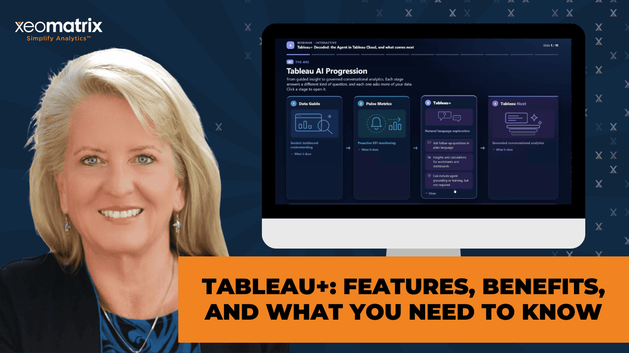
As generative and agentic AI capabilities expand within familiar Tableau workflows, you can ask questions more naturally, uncover insights faster, and reduce the friction between curiosity and understanding. Making the most of that starts with knowing what is available, what each experience can do, and how it fits into the data work you already do. The most important AI story here is not the arrival of a new product platform, but how much more the Tableau you have today, can accomplish.
Tableau Cloud already brings information closer to people. Data Guide surfaces contributing factors and outliers, and subscriptions and alerts push what matters without anyone reopening a dashboard. Tableau Pulse goes further with governed metrics, forecasts, goals, and delivery into Slack, Teams or email, so a KPI can follow the person who depends on it.
From Tableau Cloud+, the Tableau Agent offer depth of support across Tableau Cloud. You can build a viz or write a calculation by describing it, and more recently, you can ask questions of a published dashboard rather than only picking from suggested prompts. Tableau Next takes semantics to a deeper level. Instead of layering conversation on top of a workbook, it grounds the whole experience in a semantic model: definitions, relationships, business rules, calculated fields, and metrics that carry their own sentiment.
None of this reduces the value of analysts, governed dashboards, or careful visualization design. Instead, it makes them more important. A dependable, decision-ready answer requires well-structured data, meaningful field names, documented business logic, and someone validating the numbers.
The session walks through where each capability fits, and what you can do now to get ready for more conversational analytics.
Watch Tableau+: Decoded
>> CELIA FRYAR: We have recently upgraded our welcome slides. I just want to point that out. I feel like everybody I’ve had a chance to work with in the last decade, especially the last few years, you’re a data hero. Thank you for being here and being on the journey with us. I want to share a couple of other announcements about things that are going to happen with us and things I’m a part of and our XeoMatrix is a part of is we have Matthew Miller, who is VP of product.
If you watched or went to Tableau Conference ’26, he is the one who would have been on stage leading the Devs on-stage session. They handed it off to his team. He is a master storyteller and a great communicator. I’m very excited for him to come and talk at the Austin TUG on his birthday, September 10th, which is great. Oh, and I didn’t get the date on that. There we go. Later in September, we’re going to have Michael McCuster talk on the San Francisco TUG meeting.
He is going to be the most effective person I’ve bumped into in the DataFam at making dynamic zone visibility and those map layer, mark layers, chart layers, whatever we’re calling it this week, that type of charting simple and approachable. He did a masterful job with that at the Austin TUG in about June timeframe, early July, actually July 9th. We’re having him do it again for San Francisco. Also in December for DDC, we’re going to host Kirk Munroe, who is a Tableau visionary. He also authored a book on data modeling in Tableau.
He is one of the leading folks I’ve been watching in the beta channels and the early release channels, jumping in with composable data sources. He’s probably the best-informed person that I’m aware of anyway in the United States and North America for composable data sources and being able to articulate it well and then explain what the benefits should be to us should we implement it correctly. Today, we’re going to jump into talking about Tableau Agent and some of those newer things that have happened in the Tableau Cloud and then also in Tableau Next.
Basically, we’re moving into where we have more semantics that are happening with an agent involved as opposed to us always being dependent on the person, the analyst running the show. As you’ve already guessed, we’re going to do chatting and chat. I have a colleague here with me today. Lauren is not with me. Haley, this is your heads-up. I’m going to ask you to introduce yourself in just a moment. She also works with me as at XeoMatrix. I’m really delighted to have her alongside of us today. She’s going to help me with chat as well.
Lauren and I generally are responsible for the DDC. Like I said, Haley has kindly joined me today to be my Lauren today. Haley, would you kindly introduce yourself, please, to the team, and then I’ll do the same?
>> HALEY WEIGELT: Yes, of course. My name is Haley Weigelt. I apologize in advance that I’m not on camera. I am really happy to join Celia today on this call. Feel free to put anything in the chat. I’m here to answer questions or support where needed. I joined Xeo about three months ago, so new to Xeo, but I’ve been working in Tableau for about three years now. It’s crazy to see all the things Tableau can do, really. Before I joined Xeo, I was working in Tableau, but just was using it to what I knew it could do and what I had seen online.
Now, after joining the team and working alongside Lauren and everybody else, it’s been amazing to see how they can push it to its limits. Then, even also being able to join the user groups and everything, I’ve already learned so many things just within the last three months. Always encourage everybody to join when they can. You’re alongside great people and mentors that want to help and grow you. That’s it. Thanks for letting me introduce myself, Celia.
>> CELIA: Thanks for being here, my friend. All right. You guys, many of you know me. I’m Celia Fryar. I’m a Tableau academic ambassador. I have been with Xeo about 15, 16 months now, but I’ve been involved in Tableau since about 2011, first as a consumer and then as an author and then as a teacher. I’ve been training people to use Tableau since 2016. Really seen it grow up a lot, change in so many ways. I’m an adjunct professor at University of San Francisco, and I’ve been in data my whole career. I really think it’s a great place to be.
You have to like rate of change, though. You have to be okay with that to be in this industry for sure. It’s just a fantastic place to be if you like helping people. This is going to be our main topic for today is, I’m calling it Tableau+ Decoded. I feel like it needed that. This was definitely requested by our attendees. I have a couple of resources I’m going to share and show and a little bit of a conversation.
Then you probably can see I have some things queued up in this browser from Tableau Cloud and then some things queued up in the background for Tableau Next in a different browser because it was giving me the business about logging in in the same browser. Let’s start with the overarching, like, what is the AI tooling inside of Tableau? I just want to point to this arc that is happening.
I’m just interested to see how we have a– we do have a progression of increasing sophistication and intentional tooling and then the depth of how much agentic support is being flushed out just weekly as we come along these months and weeks that we’re in right here. That’s the part I want to also draw attention to because that has been something that’s on the rise and changing very much. Haley, if you’ll open the participants list on Zoom, I think that you may be able to see since I made you coach, you may be able to see the waiting room. If you’d help me keep an eye on that, that would be super helpful.
>> HALEY: Okay, will do.
>> CELIA: Thank you. All right. For any of you that have worked with me, you know that I’m a fan of Data Guide. Over in Cloud, we have a couple of things that are low-hanging fruit on push analytics and push notifications. That’s the words I actually was hunting for there. Anything we can do to send those key performance indicators, the information that’s essential to my job to a user so that they’re not having to be spending the time to get to logging in and all that within the boundaries of good security and permissions.
I feel like Data Guide and then also our watch menu here of subscriptions and alerts, that is something that if you’ve not covered with your users, I feel like that’s an important part to start with because it can be scheduled. They can be modified. Them being on Tableau Cloud, they are managed by all the proper securities, both for the data sources as well as for the roles that people play. Data Guide is a fantastic place to begin because it is great. My experience with it is, it is very good for contributing factors and for outliers.
Inside of a visualization, if I were to come in here and select a person like Tamara, she’s known and super sore for her being ahead of this list, so as I select her, first of all, if PulseMetrics is enabled on my Cloud side, Data Guide is going to point to PulseMetrics that would be in line with whatever I’ve just selected. Like I said, it’s very effective for outliers, so I wouldn’t select a great group of things, but I might group select a few things. There’s going to be something on your chart that you’re going to see.
It’s recommending that I check out these sort of things first and maybe go on over to Tableau Pulse, which is that whole other app I’ve done. Earlier this summer, we talked about that, and I’ve spent a lot of time building implementation guides and recommendations for that. If anybody has not seen that and wants to get the notes from me on that, please just either e-mail me or DM me, and I’ll send you what I have. I was thinking more along the lines of equipping people than I was making a serious presentation on it, so I have it way more technical than it is marketing-oriented.
Anyway, PulseMetrics is huge. Just a side note on what we’re going to talk about in a minute. Here, Data Guide, down here, we’ve got it trying to help us get to the point where we’re going to see those underlying factors or any uniqueness about that person that’s made that thing you’ve selected be notable or what made it an NLR. PulseMetrics being the next step in that AI tooling, and by AI, I mean anything from a data science model to predictive analytics, so it could be regression analysis or classification in the background, the math that’s being run, or it may be that Einstein is in the background.
For those of you that have been around Tableau a while, you may remember Ask Data, Explain Data. Some of that stuff was late teens, mid-teens. Then Einstein came on the scene, and Einstein was really very exciting. We were all very thrilled about that. Salesforce also bought Tableau right along that time. They decided to bring Einstein into a different format. It became heavily applied over in the Salesforce side. It also then became tucked away behind another license, so some of the things that you will hear people say about this type of interactivity was available.
There’s some things that will be noted here about in version 2025.1, a lot of things that were possible. Well, if you had the Einstein license. I have been aware of how the majority of us have not had conversational analytics or that sort of agentic support until just this year, where it’s starting to happen. PulseMetrics is fantastic. They’re being run by a team where they’re on a biweekly release cycle. I’ve had the pleasure to be able to be more closely aligned with them. If you’ve not seen Pulse, this year would be the right year to reevaluate it.
Since about February, they have been releasing very meaningful increments in the kinds of features and offering. They were the first one of the product family, besides Tableau Next, to have a specific, identified generative AI engine behind them. This summer, the enhanced Q&A, which, if you don’t have the license for, you can get a 60-day free trial on your Cloud site. Hopefully you guys can’t hear the guys that are making noise in the background. I’m sorry. Of course, that’s how this is. They are mowing outside.
Anyhow, PulseMetrics has ChatGPT 5.2 standing in the background to support that enhanced Q&A. Like I said, there’s a 60-day free trial on your Cloud site if you wish to execute that this summer. That’s something that they started late June and has been a way to try to make it more accessible for people, and people have a chance to see it. PulseMetrics now, in case you haven’t checked them out in a while, they can be embedded in dashboards. They can be filtered alongside of your other slicing and dicing that you do just so that they’re reactive to dimensional filters or not.
You can choose either way on that. I have some demos of both. Then there’s an assortment of additional features including forecasting goals and inclusion in Teams. It’s already been in Slack. It goes on and on. Again, if you want to hear a deeper dive on PulseMetrics, hit me up, and I’ve got some resources for you, but it is like that next step in the tooling toward agentic-supported analytics. The next one that has been released a little later than what happened with Pulse is Tableau+. We have a couple of different formats in how Tableau+ is being marketed, and that’s on another slide.
Essentially, what I mean by Tableau+ is when you have more agentic support on your Cloud site than what we’ve had in the past. Now, the earliest releases of this, where we just had– let’s see if I have that right here. Earlier, before just what we have right now, which is in beta, it’s also available, the newer component is, instead of just asking it for dashboard insights and descriptions, it’s also got a Q&A opportunity where instead of having a templated question pop up as a recommended question you can ask, you can actually ask something for real.
Like this question I asked here, I was thinking about this chart here where I’ve got customer sales. You’ll notice I don’t have regular sales here. I’ve got median sales and I’ve got some ranges showing. My point here was to say I can ask a question other than what’s right here on this dashboard, and it’d be responsive and be correct. One of the things that I think is really helpful about the way that the agent has been implemented right now is as it’s analyzing, you have the opportunity to actually read what its plan is, what it’s traveling through.
I don’t know if that’s long-term going to be exactly like that or not, or if it’ll be more like it is right now in Next, but the fact that you get to see what it thought through, I think that that’s huge for two reasons. We all need to learn what parts of Tableau Cloud are helping to inform the agent. Any of you that have used generative AI, you know that we spend a lot of time talking about making our prompts really strong and great prompt engineering, all that. It also needs to be able to read the data and understand what it is.
As a trainer, I can tell you a lot of times what we call things is not at all going to be clear to a third party, much less a genetic third party, about what the content in that field is. I have a few comments to make about that. Beyond that, I also wanted to just expose to you what it is that the developer has recently said to me about– I have a chart that I just received a few days ago from the developer on what is exposed to this agent and what it can see. We don’t have a true semantic model over here that’s more deep and rich.
By that, my definition has become what we have in Next. Let me not get stuck here too long because I’m going to come back to this again. Tableau Next is, my words meaning that, is where we have not only a great visualization that does all the dashboard, parameterization, interactivity, but where we have that agent sitting on the side. It doing what it did early was a couple of canned things of insights and descriptions, which are useful but also very prescriptive as opposed to me getting to ask what I was needing to see.
Then this agent being included behind it being so much more of a nice upgrade. We’re going to talk in a minute about what it can see and what it can’t see. Then we have Tableau Next. A lot of my summer has been invested again in Next. It’s built on a broader semantic model and grounded in definitions, business rules. There’s a place for you to connect the dots between the business logic, the jargon that is used. This is a potentially,– especially as the product matures, because keep in mind, it’s been in market since late June of last year, so what? 13, 14 months.
As it matures and gets more robust, you’ll find that this is from the ground up meant to be a more conversational analytics from the ground up, as opposed to being added after it being on market for 20 years. As a result, long-term, this is going to be a much more smooth user experience. We’re still back to the same thing of what can the agent see? How does it make its decisions and how does it answer your questions? Then separate but connected to that is how do we coach the users so that they ask questions that can’t be answered?
Fundamentally, that starts with what are the bounding boxes on the data that we have and then what can we do in the middle piece here to make sure that the block and tackle that we can do is done, and that is our labels. How are they labeled? Does it make any sense compared to the content? Then descriptions of all sorts. I also have some things that I’ve built personally with my Maya Claude to speed up that whole process of loading all that stuff into Tableau Next. Because even though they’ve added an Einstein piece in there to help generate things quickly, it’s still a lot, to be fair.
We’re all following Data 360 as the home base for where the data is stored. I have some examples and also some images I can show you as well, as I have a couple of slides pulled up. What is actually in it? If you were to go and ask a salesperson or a marketing person, these are the two classifications they basically would tell you about. I’ve also observed a little bit of drift in how they’re using the words. The key thing is whether or not Tableau Next is included or not included. That would be the distinction.
This chart came from a more current– current, I mean, the difference between July 31st and this week is a current chart to say what exactly is included in what. Let me just leave this for you guys to see later. The main point is whether or not we have Tableau+ with agent is in both of the Plus offerings. The agent and the desk in that interactive piece inside of the visualizations as well as the dashboards, prep and some of that that’s down here as well. That’s where we’re going to get into the additional feature sets that can be incredibly valuable.
For better or worse, our culture is, their expectations are rising in the ability to have that conversation. Then I feel compelled to also just throw in my note about as people get excited to do those one-off answers, we got to be sure that we emphasize context because the dashboards are fantastic for providing the context of where decisions need to be made and be well balanced and be more wise and discerning. Even though we’re very all very excited, lots of folks are at the command line who never previously would have considered being at the command line.
We’re still going to need that context and the broader picture to make a wise decision. That being said, let’s keep going. What can the agent actually see? I’m talking about in Tableau Cloud. Keep in mind, we don’t have a true semantic model there, but we do have some opportunities to convey what the data means. That would start with whenever you’re loading it or when you’re renaming things, you use words that make sense. They’re more connected to the practical. Away from the IT part of it and into more how it’s going to be used.
Then the field name is visible. First of all, hidden fields are not visible at all to the agent. That’s not really that big a surprise. The field name is available. What they’re going to call a “field description” is actually where you go to “default properties”; you open up the comments, and you write something there, or you have something like DBT or your agent using a REST API, you can auto-load those guys in there as well. Having a description that goes beyond just the label will add depth and potential understanding, anyhow, for your agent that is going to be in there.
The fact that it’s a dimension or a measure, it’s going to be informative to it in a way that is really actually very useful to an agent as opposed to a regular business reader, I would imagine. It’s going to read the type of aggregation that’s being used. It’s also going to see the data type. That should be helpful. Then it’s also going to see the aggregation level. We have the aggregation that may be a default aggregation, and we have the aggregation that is being used in the visualization or inside that dashboard. Those things are visible to the agent.
Now, what’s not visible? Keep in mind, this is new, fresh, may change. That has to be said because, for example, fiscal year start when this list first went up. That was very much on fire. People were talking about this big time. I would imagine this will be moved off this list pretty quick. In any case, right now, it doesn’t see the fiscal year start. Something about its reach of what it sees. Again, I would expect that to change. Interestingly enough, it doesn’t see geographic roles. It is able to see comments down inside of default properties, but not the geographic roles.
I’m made of questions over here. Anyway, this is the current state of things as of– this is August 19th. Know that this is a project that is in motion and in beta right now as well. Since we don’t have a classic full data definition, data dictionary embedded into Tableau Cloud, other than what we have for configuration purposes, this is what we’re going to use to help convey the content meaning and connect the dots so that the agent is not trying to– you want it to not come back with either “unable to answer” or it extrapolating, which leads to the next piece here.
When you are authoring, there are different agentic support elements that you get than when you are consuming and you have the dashboard open in front of you. What I showed you a moment ago was this dashboard Q&A right here, and that’s really brand new. It’s so much better than what was before in that I can ask my question as opposed to being prompted that these are a few questions it can’t answer. Even though that was cool, this is more what we’re expecting, and it’s very helpful.
Now, it does have to line up with what’s possible in the data, and your users who are doing this, in as much as possible, they need to use words that are going to connect to the data tables. Having those data labels connect to the practical side of that is where you can meet them in the middle. That’s going to be a big win. Now, people have been fairly happy with the dashboard insights and overviews that are generated because it’s like whatever is on screen is going to give you some additional context insights.
Also, not just structural insights, but like details and calculations and something similar– if you’ve seen PulseMetrics give those summary insights, it’s akin to that kind of thing that you would have on screen then. Now, this over here is the list that is technically possible since 2025.1. I would offer that a big chunk of these are because if you had an Einstein license. Now, up until this summer, what we had in Cloud that was agentic but not empowered by the new Tableau agent that’s been implemented this summer, it was basically a couple of things.
It was build a viz, help me with creating a calculated field and then some canned-ish type questions. Unless you were in an environment where you could select one of the agent force agents to stand behind it and train it, which was a complex project that I don’t know that I knew of any Tableau customers doing. I did have a Salesforce engineer teaching me that at one point. I hit skip on that because I knew this was coming and figured this would be better, and indeed it really is going to be better.
In any case, just know that some of these things here are improvements that have to do with Einstein, and they are becoming more mainstream because of what’s happening with the new introduction of the Tableau agent that is the stronger resource behind the scenes in Tableau Cloud. We don’t have any support, and I don’t think you’d want it to. It’s not doing modeling joins or relationships. That’s something that’s important to see. Some of the formatting for visualizations, if you haven’t built a viz, they’re kind of basic. That’s to get you started.
Assortment of things that cannot do yet. I don’t know that we’d want it to do, just to be fair. Some of those things are about what we would choose in our style and our corporate ID and the way we do it, and so that would be really difficult for an agent to do. A couple of examples of how that semantic model and the definitions behind the scene can really make a difference. This is a dataset that was meant for training. It was built around construction scenario, and it was modeled after two customers I’ve had a lot of time in the trenches with.
It was so interesting, as I got into it, the diversion between what I intended and what it was giving me. Then I was using Claude to evaluate the gap between the way the agent was answering me and the question I was asking, and then I had informed fully about Claude the data content. It had full view of all the tables and what all was there. To mimic my customer’s environment, I had gone ahead and made it a really big, complex kind of situation, not volume-wise, but I had 25 tables, for example.
It just was really tricky as a human person to keep track of all the places that had references to cost and the dates and such. It felt like it was a fair assessment of trying to estimate what is it going to take to take natural, real-world data and then inform an agent and meet in the middle on what words are going to be used by my stakeholders and then how do I inform the agent. A question that was just as simple as “What are the total costs of projects expected to finish in this year, 2026?”
As it got to total, it gave me some crazy numbers that were not in it at all because it was using just the total versus summed in the beginning. That was the problem. Then cost, I had three different cost features in there, so which one to use without knowing the label on the data table. That became part of my business rules, was which one for the agent to use. Then projects. Often, whether we mean to or not, we use these nouns that are not necessarily exactly what’s on the tables. The mapping of that is important, and expected to finish.
Even though that seems pretty straightforward, was apparently not. This is another place where does that mean it starts in this year or starts and finishes in this year or complete only ends in this year, and which of the ending dates, so expected, actual, what date field are we using? If it’s expected to finish in this year, is it in the recent actual? That’s going to just give me up until this moment, but not the things that are forecasted. There’s some complexities. Do we use multiple dates for that?
Anyway, this one small sentence translates into several different specific and separate questions that need to be accounted for in that gap between what’s in the data table and how an agent is going to answer a simple Q&A question. The distance between what it initially said, because literally the one on the left is what I got out of my first iteration of running it, and, at the end of things, what I have on the right is the correct answer.
Now, one of the reasons why I would allow it to give me a bunch of round answers in the first place is because I’m always looking for that threshold about how much work do you need me to put in to get to a level of completeness or thoroughness to where it’s an accuracy level that will be trustworthy? There’s a couple different components of how we can equip our agents, and some of them can end up creating drag in their execution. I’ll say more about that in just a moment.
Tableau Next is where we have the more fulsome model, and we have a chance to really equip it to do well. Generally speaking, we have different sections that are sitting in on the model, and every field and every table has an opportunity for a description up to 255 characters. It doesn’t have to be just a highlight kind of thing. One of the methods I’ve adopted is to have a spreadsheet where I’ll use either a SQL query or some other gathering source put into a table.
Maybe if there’s an API name, I’ll put that and then put the field name, and then you can put if it’s a dimension or measure, if you can get a little sample, like, what is the range or what is the median. Give it an idea of just a random. If you’ve run any Python, the .info, .describe, some of those things that just generate characteristics for us at the drop of a hat without any effort on our behalf, that kind of stuff can go a long way on just getting that into a format where your description can incorporate an example or give more flavor for the actual content of the column.
All of our metrics inside of Tableau Next also have the ability to have a description, as well as they also have what is up or down, good or bad, and then a few more questions that I’ve never even had the need to use. Then also we have filters with sentiment. We have calculated fields with descriptions. Then relationships give us our cardinality to keep things from fanning out. Just even as I read that list, you hear how many places you might have to go and add information. Finding ways to leverage it and make it enough and then also speed up the process using automation is, I think, essential.
That’s one of the other things that my summer has been invested in that I’d be happy to share with you all. The next step in Tableau Next is we have under a menu that’s called “optimize model,” and it’s our optimized AI. It’s not an optimizing the model, but it’s under this AI optimization menu. There we go. We have some feedback on the model health with things that it’ll identify if there’s similar meanings in the labels that you have, if you have missing relationships, any orphan tables, especially if you’ve got a big environment, and missing descriptions.
It’ll bubble up anything that doesn’t have a missing description and give you another dialogue where you can have a chance to directly intervene with that instead of having to go through the table list and all that. Then we have this other section here called Business Preferences. This is where you would put your business rules. It’s not at all meant to be the right spot for anything that’s algorithmic, so no calculations. Anything you can express via a calculated field or a metric, it should go there for a number of reasons.
Business preferences, you need to think of like if you’re handing someone a task, you want them to do a task, and you’re handing them an envelope of information that you want them to read before they do the task. That’s what the business preferences are going to be. Any executions that you ask it to do, any questions, it’s going to reread its business preferences first. You really want it to be that core, just as much as possible distilled down into a few really important things.
One of them is it’s totally fine for one of them, and in all of mine, you’ll find a listing of only use the data you have. Do not extrapolate and don’t make anything up or something to that effect. I have found some phrases that work really well. I’ve also found some ways to put a flag on a certain spot so that I know it’s executing, I know it’s there, just to build my own confidence that this is working. That’s a really powerful part where we can enforce that logic and give it an idea about the jargon that my business users and my stakeholders are going to use and expect there to be some understanding of.
That’s business preferences. They’ve really increased the volume of what’s possible there, but I would recommend that you keep it as slim as possible because of it being that envelope that it has to read. Now, it’s very, very fast, of course, but it is something that needs to be read as it’s doing its executions. They have a checklist for analytic agent readiness, and then we have a whole other section that’s called calibration. This is a place where it’s a separate set of screens where you can ask a question. It will give you its answer.
You can rank the response as either accurate, inaccurate. If you tell it it’s inaccurate, you’re going to have a dialogue with it right there, and it’s going to respond with maybe making a recommendation that you have a added calculated field or add a metric. Now, one thing I’ve definitely seen be true is if you have any way to line up questions to governed metrics, that is a fantastic way to get consistency and truthful responses. I’m using the word truthful, but that’s not actually what I mean. Accurate and timely responses from the agent back out to your users.
In the last iteration I stood up this summer, I created a table that was like my pre-aggregated values for the entire data system. I had a pre-staged, pre-aggregated, in addition to a number of KPIs inside of a metric, so one each. There’s ways to queue it up to where it’s really going to give good performance and not have to guess at things, and that’s some of the ways we could do it. You could end up very easily,– like my 25 tables and even like the last dataset I was responsible for, I had 10 tables. If you have 5 to 30 fields per table, that’s a lot of editing. That’s a lot of time.
Buildings, either extracting out of Snowflake, out of your bigger database, something that you can then like put into an intermediate form to feed into as opposed to copy and paste or handcraft or any of that stuff. You want to find a way to put yourself in an orchestrator role instead of a data cleaning, grind-it-out role. This is one of the ways I’ve been doing that, and that is I go ahead and spend a few minutes to document the metadata. I have experimented mostly with putting it into a spreadsheet that’s not meant to be a long-term governing structure, but you definitely could keep it that way if you wanted to.
My presumption is that those metadata elements exist other places first. Many of you have spent a tremendous amount of time setting up the different layers of bronze to gold medallion layers in your database environment. Leveraging that I think is the right play. That becomes where your big investment has been. We’re informing Tableau Next instead of having to start from scratch. That’s the goal, and that, I think, is the right mental strategy. We got to have something where we can either go grab that with a DBT or something and then push it in as opposed to having to handcraft it and type it in.
For my experiments this summer, I did make a pit stop into a spreadsheet, but I’m actually on the hunt for scripting that, so that may be something I can share with you guys later. In the meantime, I did have it pause into a spreadsheet, and then I wrote some skills to get it to– in view of what we need the agent to be able to do, not be ridiculous about it, but go ahead and use more of that 255-word space that I have allocations for, and tell them the definition, give an example. If there’s anything complex about it or unique about it, say that as well.
Then I had it implant that into, or upload and deploy it into my model. It was just a beautiful thing to see it clicking, click of a button, and have it all there. I also decided to hide the noise. Now, for any of you that have loaded data tables into Tableau Next, you know that it comes in through data streams, and then you bring it over to Next because the data for Tableau Next lives on data 360. There’s two choices that have to be made as it’s coming in.
If you are manually loading them, but you also, by the way, cannot manually load them, I’ve learned that, the manual load has you select from one of three categories and also identify the primary key. The reason identifying the primary key right there is a game changer because if you don’t identify it right there, it will add another field called UUID that’s much like a row ID label, and it will cause you to be stuck with many-to-many as your defaults on your cardinality over in Tableau Next modeling.
Now, it doesn’t mean it’s going to explode the tables quite like that, but not being able to be definitive about cardinality of one-to-many, many-to-one, that stuff was very bothersome to me. I learned that if you go ahead and identify the primary keys in Tableau Next in Data Cloud as you’re bringing it in, that problem goes away. All this being said, hide the noise. The reason I’m saying this here is because there are some system fields that get added as it comes into Tableau to Data 360. Some of my tables, it’s four or five fields.
For a Tableau user doing visualizations, that to me creates noise. Unless there’s a field that’s helping provide support for into a row number or something that’s helping it provide uniqueness within the table, that’s also one of those things I decided to hide. I also had my cardinality spelled out in the spreadsheet. Easy. Let Cloud do that. It was very dependably done over and over through the summer months. I have zero problems with it.
Then, after I get the data up and running and I hear the questions that my users are trying to ask and get answers to, I will run some of those in the background with Cloud and making sure that the numbers that we have in the table are actually getting reconciled to the output. Whether or not you do this through the calibration tool inside of Next or you do it outside of that, it just needs to happen. Then you’ll learn from that what it is that the agent is understanding, where the misses are, and you’ll be able to provide that support in the semantic model for that.
Validation still lives and is more important than ever because of the ripple effect that it’s going to have. That brings us all the way back to the top of the list of like what is it that we do to set this all in motion in a way that’s going to really be successful? Governance has gone from being something that it’s okay for it to live in someone’s head to where it really can’t. It really needs to be expressed and agreed on. Having those trusted definitions across the departments will be another place.
Seeing the names in the room, I know that several of you probably have already spent a lot of time working on that. Then getting people to adopt it. We have a collection of tools now to create engagement and adoption and push notifications, helping it be where people live, taking a Tableau Next dashboard. If they’re in Salesforce a lot, embedding that dashboard in the workflow over in Salesforce is incredibly simple to do. Whatever that is, making it so people don’t have lots of different logins and moving around to get to the information. Have it come to them if at all possible.
Slack, Teams, email, whatever is appropriate for the safety and the privacy. Then making sure that you’ve got some good governance over who’s making the edits to the descriptions as well. PulseMetrics is probably the clearest. Recently I’ve been amused that it is a Cloud app, PulseMetrics. Similar look and feel exists in Next. The way that you have the ability to author in PulseMetrics, but there’s a very discreet amount of people who can create and edit those definitions.
Then lots of people can follow and lots of people can make small filtering changes to where they have their own customized look and feel. It’s a very a tight fit on who can actually change those definitions of what’s being calculated. Then trying to get the demos of what is going to be seen and making sure that it’s trustworthy, that’s where we really get a lot of gains or losses one way or the other quickly. This was something that came up over and over at Tableau Conference of trying to build agentic smartness and intelligence without that context.
Context still is key. You’ve heard this phrase, I’m sure, over and over.That’s a dashboard. From my mind, it’s a dashboard, everything in this use case. Context is going to be those descriptions, the jargon, the business rules, the expression of what does this actually mean? What does this actually contain and how should it be used? A few things to just kind of quickly go through here in terms of look and feel. We did talk about this with either Data Guide. This is going to be in our PulseMetrics.
We have the ability to embed PulseMetrics in dashboards, again, bringing more strength to what’s possible here for uniform approaches. Then this is a question that I pre-generated just so that we’d be sure and have time to see it because I think it is extraordinary that in both here and in Next, where we have what it was using to give us the output that should help anybody who’s supporting it to understand if there’s a miss. In Tableau Next, it’s below the chart.
The Next, it’s always going to give us a summary, a chart, or graph, and then below it’ll say “sources” and then you’ll even see the SQL queries it says. It’s easy there. We also have the ability to do apply filters to our PulseMetrics. It’s been a really significant, in my mind, improvement to have– you can have some that respond to, you can have others that are more static if you have something that doesn’t apply to it. They’ve added different huge categories of types of metrics that can be done, points in time as opposed to those things that are meant to be done over time.
Then let me just pop over to Next for a minute. That should be this one. Next has gotten kind of a facelift this year. Some nice radials, some donuts with KPIs in the middle by default, some clever things that don’t quite make sense to me. The Nightingale Coxcomb thing is there. With it called Nightingale, if you’ve got a use case for that, I’d like to hear about it. In any case, we’ve got navigation buttons. We can bring in images. This is actually just a filter, but the fact that it’s a– they call it a toggle. I feel like it’s a nice improvement.
We have metrics that can give these insight descriptions. In the very beginning of insight descriptions being part of the ecosystem, they were metered. Now they are not. The conversation about what uses consumption credits has changed tremendously month to month, sometimes this last year. At the moment, it’s much more broad and reasonable than what it was before. I just want to point that out. We have a lot of different things that have happened with Tableau Next. Let me put this back into presentation mode so you can see that. There you go.
You can create dashboards that are pages so that those transitions are more smooth, the kinds of things we’re seeing are better. This is one that I’ve been working on to try to put it into as a template. This is actually a table chart type. That’s one of the things I feel like is a really nice new enhancement. I did not set that up correctly when I was first doing this because I didn’t do them as pages. That’s why I had the lag there. The table things, it’s way better.
To be fair, it’s a product that’s 14 months old, and we’ve got a lot of things that are needed to be learned about it. Then also to bring in that conversational analytics, you’ve got to have the business rules and the descriptions. Now, let me show you my business rules because I feel like that’s actually probably a better use of time than trying to do a demo of that right now. This is my dashboard. We’re going to go back over to the semantic model to look at the business rules. This is what the layout of all the workspace of this one is.
We’ve got four different distinct dashboards, 14 visualizations in my semantic model. I’m going to go there. 90% sure that this is the copy that has the business rules in here. Business preferences, yes. I have 12,000 rows of things I’ve put in here to try to tie things together. I put bounding boxes on what to expect on the different ones for some of it. In the very beginning, I had just started with three things where I was telling it to never fabricate or don’t fabricate values or unsupported assumptions. Just to don’t.
Now, people are really keen to use the word “hallucinate” here. I would rather us consider that we have told it and so many engines have been trained to lie, is what I keep hearing people say. The reality of it is the precursor for all this is all of our regression models, all of our classification models, where we were anticipating what would happen, we were teaching using those tools to create estimations or predictions or likely outcomes.
In the authorship of these generative AI tools, even though I have really had a good time as a professor poking fun at them because they can be just confidently wrong and it’s really important for me to show my college students that. They are trying to provide support in the way that they’re estimating and assuming, but in the business context, assumptions are a risk that is unmerited most of the time. I would just be careful to make sure that you have a rule in there that is just going to take that off the board because it will do whatever you tell it to here in terms of like bounding boxes and such as that.
I can put the current limit is 30,000 characters. I’ve used 12,000. The thing is, as you build these, I would recommend that you use some generative AI tool to make sure that you aren’t accidentally introducing conflict and logic. As I would be adding into mine, I sometimes would accidentally have things that would be at odds with each other, or I’d have one up here that would be countermanded by the one below or should have been countermanded by the low, but that’s not how that works. It’s going to execute sequentially.
Anyway, those sort of things are where having a generative AI engine that you’re using to validate and check your assumptions can be really helpful. I know we’re just about out of time, but I’d be curious if there’s any questions that you might want to have or things you might want to see in the Next version of this maybe more demo focus.
>> HALEY: I know, Celia, in the chat, David had put a few things. One thing that was targeted towards Next was him just stating that he was disappointed that Next now has radial charts built in and they can be terribly misleading visually.
>> CELIA: It’s really fascinating how we have– I’m in the department of being made of questions on– Let me just show you guys. Select this and go here. It’s fascinating to see what they decided to use as the “show me” options. As we get into “show me” here, we have a donut with a KPI in the middle, which is awesome. We have something called spoke bars. You have Nightingale, which is, I think, Florence Nightingale Coxcomb sort of thing. Then we have a radial bars. We have a radial heat map and then radar.
Some of these things really need to be applied in certain circumstances. In the hands of the many, this is almost dangerous, but in the hands of somebody who’s carefully thought it and evaluated, oh, this is going to be very effective to do this as– I think that maybe what we do next is start to talk about when is it appropriate to use a radial besides the fact that it’s flashy? On this particular dashboard, I literally was looking for something that was a new chart type and it was going to be interesting to see and different than classic or Cloud or desktop.
Without an extension, you don’t have that there. You’ve got to be really wise about it and making sure your metrics line up. For example, I’ve got filters over here that talk about different stages. If this bar chart here is about bookings, it’s easy for me to have a stage selection that wipes out my bar charts over there. If we’re doing a true executive KPI dashboard, we need to show a little bit of business health from different parts of the business. That would be an important part over there. In the later stage of this, I said sales executives bookings over here.
There’s a whole lot of things that are in motion and being improved as we go. If anybody wants to get involved in the betas, they’re open. You can very easily sign up for them. Then you end up in Slack channels with the development team and project managers who are trying to respond to what’s happening. That’s part of the reason I made such a strong statement about whether or not fiscal dates would be involved. The way that they are now, I don’t think there will be that way going forward because they’ve got some super strong negative feedback about that. Not about dashboard Q&A agent.
You’re saying that the dashboard Q&A agent, you’re expecting it to be subjected to whatever scope you have in your parameters, David?
>> DAVID: Yes. If I can come off mute. It’s a really subtle thing. If you have a filter on your dashboard based on a parameter input, it will limit the scope of data that’s available to ask a question of. If you have a quick filter on your dashboard, your scope of question can go beyond what is filtered. Think fiscal year.
If you collect your fiscal year for the analysis via a parameter and then apply it as a filter, if you ask a question across fiscal years, it won’t be able to answer it, but if you have the fiscal year as a quick filter and it’s set to one year, the data is still all there behind it and it will answer a question across fiscal years, even if the filter is applied.
>> CELIA: One of the things I would encourage the group here to consider is that the agent, for the longest time, couldn’t even see the dashboard. It wasn’t seeing that at all. In fact, I would ask it to answer questions about the dashboard. It actually is, first and foremost, connected to the semantic model. It is in a lot of the testing initially. That’s really curious to hear you talk about that because I would expect it to have full view of the data. Are you talking about Cloud or Next on that? That sounds like Next, not Cloud.
>> DAVID: Cloud.
>> CELIA: Cloud.
>> DAVID: Cloud. It’s [unintelligible 00:57:23].
>> CELIA: Just to note that it’s in beta right now. If you had a feedback that you wanted to provide them on that working, not working for the way you were thinking about it, I feel like those are things that are being decided right about now. Over in Next, the gold standard on it is that it has the full view of the data system. Almost like that, for some people, is a blocker because they’re expecting it to be gated by whatever is on screen. This one is not. This one, if I go into preview and I hit the agent, I’ve got to know that it’s going to be looking at the whole data system.
That also means I got to ask better questions there. Also field comments. Field comments, yes. I think maybe we’ll do another session where we talk about that because for us to get the context expressed over here where it can hover on a field and have a description pop up, presently, that’s only available to you if you do it programmatically or if you go into desktop, not Cloud, and you go into default properties and then you go to comments and you type something in there.
It’s actually a little bit more of a– I feel like a work in progress than an ideal circumstance because at a minimum, you should be able to edit that stuff on cloud, which you can’t at the moment, at least as of a day or two ago. Then, ideally, we’re going to want to have that stuff come in with a dbt load or something like that. The first time I saw that working was someone who’d taken data from Snowflake and to dbt and used that resource of the investment that had already been made in Snowflake to carry that forward.
I feel like that is where that’s gonna represent a win as opposed to just like a heavy lift for someone to make it work over here, so, yes. Yes, it’s interesting because you’re loading a comment field to get it to be a field description. Yes, they’re going to need to change the labels at least. All right, team. Well, thank you for staying on. Be very interested on the follow-up email you will receive or in here in chat. If there’s something you want to like– I realized I did a lot of talking and less demoing. We’ll do more demoing the next time we do.
Thank you very much for being here and we’ll keep this going and probably on a once a quarter basis at a minimum touch back into how it’s going over here, because agentic analytics is definitely– it’s coming on. To be able to make sure we take great– Thank you, David. To be able to take the most advantage of whatever the current version of it all is going to be important. I’m really encouraged by what they’re doing with Tableau Cloud to give it more depth. I feel like that’s essential, so yes. All right, team.
I hope you guys have a great rest of your week, and I hope to see you at one of these upcoming events, and thank you for being here. Thank you for joining me, Haley. Appreciate you. All right, see you guys.
>> [01:00:56] [END OF AUDIO]
Tableau+ Presentation Summary
This session examines the progression of AI-supported analytics across Tableau Cloud, Tableau+, Tableau Pulse, and Tableau Next. I explain how existing features such as Data Guide, subscriptions, alerts, and Pulse connect with newer dashboard question-and-answer capabilities.
I also compare the information available to Tableau Agent in Cloud with the richer semantic foundation available in Tableau Next. Using a construction dataset as an example, I demonstrate how a simple business question can contain several hidden definitions involving costs, project status, dates, and aggregation. The session then explores practical ways to document those definitions, calibrate responses, automate metadata preparation, and establish the governance needed to support reliable analytics.
Session Outline
- Following the Progression of Tableau’s Analytics Tools
- Understanding What Tableau+ Adds
- What Tableau Agent Can Access in Cloud
- Connecting Business Language to the Data
- Why Simple Questions Can Require Complex Definitions
- Building a Stronger Semantic Foundation in Tableau Next
- Using Business Preferences and Calibration
- Scaling Metadata Preparation
- Keeping Validation and Governance Central
- Supporting Adoption in Existing Workflows
- Exploring the Tableau Next Dashboard Experience
- Testing Filters, Parameters, and Question Scope
- Final Takeaways
Following the Progression of Tableau’s Analytics Tools
I began with Data Guide because it remains a useful entry point for helping users investigate a visualization. When someone selects a notable mark or a small group of marks, Data Guide can surface contributing factors, outliers, and related Pulse metrics. This gives the user another way to explore what may be influencing the result.
Subscriptions and alerts provide another important foundation. They allow teams to deliver essential information on a schedule or when a defined condition occurs. Because these features operate within Tableau Cloud, the delivery still follows the permissions and data security established for the site.
Tableau Pulse represents the next step in this progression. Pulse metrics can be embedded in dashboards, filtered alongside other content, delivered through workplace tools, and supplemented with enhanced questions and answers. Pulse also provides a governed structure for defining important metrics, which helps teams maintain consistency as more people access the information.
These features share a common goal: reducing the effort required to reach useful information while preserving the security, definitions, and analytical context behind it.
Understanding What Tableau+ Adds
In the product options I reviewed, the primary distinction was whether Tableau Next was included. The Tableau+ offerings incorporated Tableau Agent and additional support within the existing Tableau environment, while Tableau Next added a broader semantic architecture and a more deeply integrated conversational experience.
Earlier Tableau Cloud capabilities could help someone build a visualization, create a calculated field, or select from a set of suggested questions. The newer dashboard Q&A experience allows the user to enter a question directly. This is closer to the type of interaction people now expect from conversational tools.
The interface shown during the session also exposed the steps and sources used to prepare a response. This visibility is helpful for analysts and support teams because it provides evidence of which fields, aggregations, and parts of the data influenced the result. Since Dashboard Q&A was still in beta at the time of the presentation, I emphasized the importance of testing its behavior and providing feedback as the implementation develops.
What Tableau Agent Can Access in Cloud
Tableau Agent’s responses in Cloud depend on the information available in the workbook and data source. A visible field name provides one layer of context. A field description adds more detail and can help connect the field to the terminology used by the business.
Within Tableau, the field description comes from the comment entered under Default Properties. Those comments can also be loaded programmatically through an API or carried forward from another metadata source. At the time of the session, they could not be edited directly in Tableau Cloud, so authors needed to add them in Tableau Desktop or through a programmatic process.
The agent can also access whether a field is a dimension or measure, its data type, its default aggregation, and the aggregation used within the visualization. Hidden fields are not available. At the time of the presentation, fiscal-year start settings and geographic roles were also outside the information it could access.
This availability is evolving, particularly while Dashboard Q&A remains in beta. However, the current limitations reinforce an important lesson: authors should not assume every configuration choice visible in Tableau will automatically become part of the context used for a response.
Connecting Business Language to the Data
Field names should reflect how people use the information rather than only how a database stores it. Technical names may be clear to the team responsible for the source system, but they are unlikely to connect with the words a business user enters into a dashboard question.
Descriptions can close part of this gap. A useful description may define the field, provide an example, clarify an unusual value, or explain how the field should be applied. Even a short description can offer valuable context when several fields have similar names or purposes.
Users also need some guidance about the boundaries of the available data. A question may sound straightforward while referring to a measure, date, category, or time range not represented in the source. Clear labels and descriptions help users meet the data halfway, but analysts still need to communicate what questions the dataset can support.
Why Simple Questions Can Require Complex Definitions
I demonstrated this challenge with a construction dataset containing 25 tables. The initial question appeared simple: What are the total costs of projects expected to finish in 2026?
Nearly every important word introduced a decision. “Total” could refer to an existing total field or a sum created during analysis. “Costs” could refer to any of three cost measures. “Projects” might not match the exact noun used in the tables. “Expected to finish” required a choice among expected dates, actual dates, start dates, and completion dates.
The phrase “in 2026” created additional questions. Should the calculation include projects beginning and ending during the year, only projects scheduled to end during the year, or projects with an actual completion date already recorded? The appropriate definition depends on the business purpose.
My first test returned an incorrect result because the available terminology did not provide enough guidance for selecting the intended fields and aggregations. After documenting the definitions and business rules, the response aligned with the correct result. The exercise showed why conversational analytics requires more than connecting an interface to a collection of tables.
Building a Stronger Semantic Foundation in Tableau Next
Tableau Next provides more places to document meaning within the model. Each table and field can include a description of up to 255 characters. Metrics can include definitions and indicate whether an increase or decrease represents a positive result. Filters, calculated fields, and relationships can also contribute context.
Relationships are especially important because cardinality helps prevent results from expanding incorrectly when data from multiple tables is combined. Calculations and governed metrics provide a better location for repeatable logic than asking the conversational interface to reconstruct the same rule for every question.
The Optimize Model area can identify possible issues such as similar field names, missing relationships, orphaned tables, and missing descriptions. This gives authors a more focused way to review model health instead of examining every table and field individually.
A semantic model still requires analytical judgment. The model provides a structured place to express definitions and rules, while analysts determine which definitions are correct, how relationships should work, and whether the resulting outputs match the source data.
Using Business Preferences and Calibration
Business Preferences provide a place to document essential rules and terminology that should apply across questions. I compared them to an envelope of instructions supplied with every task. Because those instructions apply repeatedly, they should remain focused on the most important boundaries and business conventions.
I use Business Preferences to prohibit speculation and require responses to remain sourced in the available data. They can also connect internal jargon with the corresponding concepts in the model. However, formulas and repeatable analytical logic belong in calculated fields or governed metrics whenever possible.
Long or conflicting instructions can introduce unnecessary complexity. As I expanded my own preferences, I reviewed them for duplicated or contradictory rules. Their sequential application makes consistency especially important.
Tableau Next also includes a calibration process. Authors can submit representative questions, review the results, and classify a response as accurate or inaccurate. When a response misses the intended meaning, the review may reveal a missing metric, calculation, relationship, description, or business preference.
Questions connected to governed metrics produced the most consistent results in my testing. Calibration then provided a structured way to compare generated outputs with known values before making the experience available to a broader audience.
Scaling Metadata Preparation
A model with several tables and dozens of fields can require a substantial amount of descriptive work. I used a spreadsheet as an intermediate staging area for field names, API names, field roles, sample values, distributions, descriptions, and relationship information.
The spreadsheet was not intended to replace a long-term metadata system. Instead, it allowed me to gather existing information, prepare descriptions efficiently, and load the results into Tableau Next. When an organization has already documented its data through Snowflake, dbt, or a medallion architecture, the better approach is to carry that investment forward rather than recreate every definition manually.
I also used supporting AI tools to draft fuller descriptions and review business preferences for possible conflicts. Review remains essential for confirming the terminology, examples, calculations, and business meaning before deployment.
Identifying primary keys during the Data 360 loading process also proved important. In my testing, providing the correct primary key prevented the addition of an unnecessary UUID field and allowed relationships to use more appropriate cardinality settings. I then hid system fields that did not contribute useful information for visualization authors.
Keeping Validation and Governance Central
After the model is available, teams need to compare answers with the values stored in the source. This can happen through Tableau Next’s calibration tools or through a separate validation process. What matters is confirming whether each result reconciles with the governed data.
When a response misses the intended result, the next step is to determine why. The cause may be an unclear label, a missing relationship, an ambiguous date, an undefined business term, or a question outside the dataset’s boundaries. The correction should improve the semantic model rather than address only one isolated output.
Governance also needs to extend beyond calculations. Teams should define who can edit field descriptions, metric definitions, business preferences, and relationships. Tableau Pulse offers a useful example by limiting who can create or change metric definitions while allowing a larger group to follow and personalize those metrics.
Well-designed dashboards remain valuable because they supply context around a decision. A single conversational answer may provide a number, but the surrounding trends, comparisons, targets, and business conditions help someone use the number responsibly.
Supporting Adoption in Existing Workflows
Accurate analytics only create value when people use them. Tableau now provides several ways to deliver information through dashboards, Pulse, subscriptions, alerts, Slack, Microsoft Teams, and email. Making the most of opportunities for “push” analytics is an excellent step toward greater engagement.
Tableau Next dashboards can also be embedded within Salesforce workflows. This can reduce unnecessary movement between systems and place relevant information closer to the work someone is already performing.
Each delivery method needs to follow the organization’s privacy, permission, and security requirements. Adoption should not come at the expense of governance. The objective is to make trusted information easier to access while preserving the controls responsible for keeping it trustworthy.
Exploring the Tableau Next Dashboard Experience
I also reviewed several updates to the Tableau Next dashboard experience. Dashboards can use pages to create quicker movement between views. Authors can incorporate images, navigation controls, toggle-style filters, improved tables, and a wider selection of chart types.
The new chart options include donuts with central KPIs, radial bars, radar charts, radial heat maps, spoke bars, and Nightingale-style visualizations. Greater variety can create interest and increase engagement. Each format should match the analytical question, the characteristics of the data, and the audience’s ability to interpret it.
Testing Filters, Parameters, and Question Scope
During the discussion, David raised an important distinction involving Dashboard Q&A in Tableau Cloud. In his testing, a parameter used to apply a filter could limit the data available for a question. A standard quick filter could leave a broader scope available, allowing a question to reference data beyond the current visible selection.
A fiscal-year question illustrated the difference. When the year was supplied through a parameter, a question spanning multiple fiscal years could fall outside the available scope. When the year was selected with a quick filter, Dashboard Q&A could still access other years from the underlying data.
Because the feature was in beta, this behavior could change. However, the example demonstrates why authors must test conversational questions against parameters, quick filters, permissions, and other dashboard controls. The visible state of a dashboard may not always define the exact data scope used for a response.
Tableau Next introduces a different consideration because its conversational experience can access the broader semantic model rather than only what appears on screen. Users therefore need to frame questions precisely, and authors must confirm the model contains appropriate permissions and boundaries.
Final Takeaways
Tableau+ and Tableau Next create new ways for people to interact with governed analytics, but their effectiveness depends on the foundation beneath them. Meaningful field names, detailed descriptions, trusted metrics, documented business preferences, correct relationships, and representative calibration questions all contribute to more accurate results.
Analysts and visualization designers remain essential throughout this process. Their expertise defines the business logic, validates the numbers, selects appropriate visual forms, communicates context, and establishes the governance required for responsible use.
Watch the full session to see how the Tableau experiences connect, then begin by reviewing the labels, descriptions, metrics, and business rules already available in your own environment.