The Data-Driven Community Meetup holds monthly webinars on business analytics and big data. Webinars are held on the second Wednesday of the month at noon (12:00 PM) Central Time via Zoom Webinars and will cover topics related to enterprise data management. Our goal with each webinar is to provide meaningful insights and actionable takeaways to simplify analytics so you can make better decisions.
We cover topics such as data strategy, data management, data warehousing, BI modernization, embedded analytics, and cloud migration and strategy. Learn how to build reporting solutions that drive your business demand based on your needs.
About the Topic
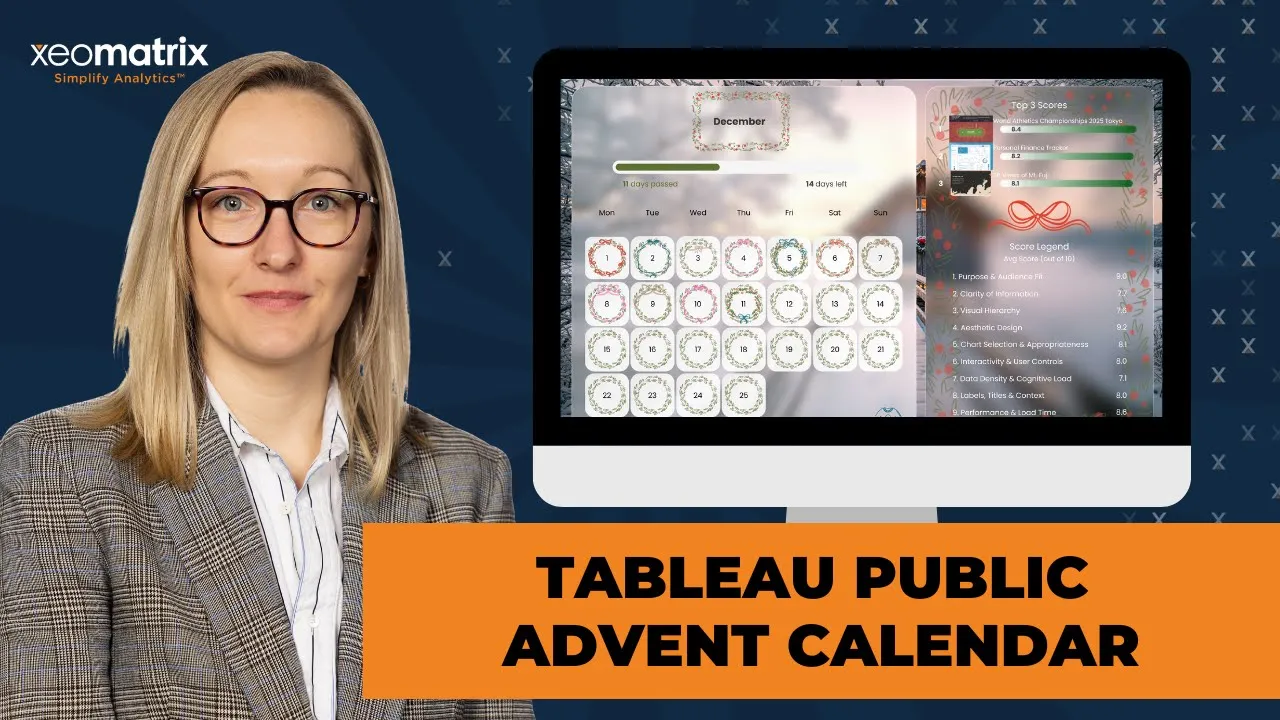
In this interactive session, we revisited our favorite Tableau Public visualizations from 2025—each “door” in our advent calendar reveals a creative and insightful dashboard worth celebrating. From innovative storytelling techniques to clever data design, this session is packed with inspiration for Tableau enthusiasts of all levels.
This article includes a recording, transcript, and written overview of the presentation on Tableau Public Advent Calendar (On-Demand Webinar).
Tableau Public Advent Calendar (On-Demand Webinar) Presentation Video
Tableau Public Advent Calendar Summarized Presentation
This session explored how to design and build a highly interactive Tableau Public Advent Calendar using advanced Tableau features and thoughtful visual design. Lauren Cristaldi walked through the creative concept behind the project and shared detailed techniques for using Map Layers, Dynamic Zone Visibility, parameter actions, and image URLs to create a scalable, performance-friendly dashboard. Along the way, she demonstrated how tools like Figma and ChatGPT supported both the visual polish and experimental scoring framework, offering attendees practical ideas they can adapt for their own Tableau projects.
Session Outline
- Concept Behind the Advent Calendar
- Building the Calendar with Map Layers
- Using Image URLs for Dynamic Thumbnails
- Interactivity with Parameter Actions and Web Objects
- Visual Design with Figma, SVGs, and Custom Shapes
- Advanced Charting with Map Layers and MAKEPOINT
- Organizing Complex Workbooks with Field Folders
- Calendar Layout Logic and Date Calculations
- Closing Discussion and Future Ideas
Concept Behind the Advent Calendar
The Advent Calendar showcases one Tableau Public visualization per day, with each date linking to a different dashboard. Many of the featured visualizations are Viz of the Day selections, while others were chosen simply because Lauren found them interesting or technically impressive. As users progress through the calendar, additional decorative elements, such as wreaths, appear, reinforcing the holiday theme and encouraging repeat engagement.
Lauren included a few of her own dashboards toward the end of the calendar to test how the scoring framework behaved across different designs. She also made her ChatGPT prompt visible within the dashboard so others could reuse or adapt it, acknowledging that prompt specificity is critical when attempting to replicate AI-assisted workflows.
Building the Calendar with Map Layers
One of the most impressive aspects of the project is that the entire calendar, including the day tiles and progress bar, is built using a single worksheet. Lauren accomplished this by leveraging Map Layers, which allowed her to layer visual elements efficiently without creating dozens of individual sheets. This approach significantly improved dashboard performance and reduced maintenance complexity.
The calendar is fully scalable. By adjusting parameters, the same structure can dynamically update for different months or years. Lauren noted that she reused a calendar template she had previously built and simply adjusted the maximum number of days to align with the Advent format. Map Layers made it possible to position each day precisely while keeping the design responsive and fast.
Using Image URLs for Dynamic Thumbnails
To display dashboard previews for each day, Lauren used image URLs tied to Tableau Public thumbnails. These images are hosted in a cloud-based repository using Cloudinary, which she recommended because image URLs must be cloud-hosted to work correctly in Tableau. She explained that supported formats include PNG and JPEG and that images must be under 200 KB to render reliably.
Lauren walked through common challenges with image URLs, including broken images caused by oversized files. After testing multiple compression tools, she found that ChatGPT performed surprisingly well at compressing images while maintaining visual quality. She shared this insight because documentation around image URL limitations in Tableau is sparse, and many users encounter these issues without clear guidance.
Interactivity with Parameter Actions and Web Objects
Clicking on a day in the calendar triggers parameter actions that allow users to interact with the dashboard in multiple ways. Users can either open the linked Tableau Public visualization in a new tab or view it directly within the dashboard using an embedded web page object. The selected dashboard URL is passed dynamically through a parameter, ensuring the correct content loads each time.
Lauren also used Dynamic Zone Visibility to show and hide detailed scoring information. As users click different days, the dashboard reveals breakdowns of the individual scoring categories that contribute to the overall score. This approach keeps the interface clean while still providing access to deeper insights when needed.
Visual Design with Figma, SVGs, and Custom Shapes
Visual design played a central role in the Advent Calendar’s appeal. Lauren created many of the backgrounds, icons, and decorative elements in Figma. She also sourced SVG packs from Etsy, which she converted into usable formats for Tableau. SVG files were exported as PNG or JPEG images and stored in Tableau’s Shapes folder so they could be used as custom shapes across the workbook.
Lauren demonstrated how custom shapes can enhance charts, such as replacing standard numeric indicators with curved or arc-based visuals. She also showed how to use custom images for show/hide buttons, resulting in a cleaner and more modern user experience compared to Tableau’s default icons. These techniques helped elevate the dashboard from functional to highly polished.
Advanced Charting with Map Layers and MAKEPOINT
A deep technical segment of the session focused on creating auto-sizing donut charts and sunburst-style visuals using Map Layers. MAKEPOINT calculations are used to place marks at the same coordinates and then layered to build complex visuals. By carefully ordering layers and removing latitude and longitude fields, she demonstrated how to create charts that automatically resize within dashboards.
This approach resolved earlier challenges she had encountered when trying to build responsive donut charts. She also showed how additional layers could be added to create more complex structures, such as sunbursts with subcategories nested within primary segments.
Organizing Complex Workbooks with Field Folders
Lauren emphasized the importance of organization when working with advanced techniques like Map Layers and Dynamic Zone Visibility. She demonstrated Tableau’s field foldering feature, showing how calculations can be grouped into folders for easier navigation and reuse. This makes it simpler to copy entire sets of calculations into new workbooks without rebuilding them from scratch.
This approach is especially helpful when calculations reference positional points on the canvas rather than underlying data fields, making them highly portable across projects. Foldering also helps prevent confusion as workbooks grow more complex.
Calendar Layout Logic and Date Calculations
Lauren explained how the calendar layout itself was constructed. Using MAKEPOINT calculations combined with weekday offsets, she positioned each day based on its day of the week and its placement within the month. She adjusted Tableau’s date properties so that weeks start on Monday instead of Sunday, which aligned better with her design and prevented layout issues.
Similar logic was used to build the progress bar at the top of the calendar, where minimum and maximum values determine how many days are visually filled as users move through the month.
Closing Discussion and Future Ideas
The session concluded with a Q&A and discussion about future possibilities. Ideas included aligning the ChatGPT scoring framework with Iron Viz judging criteria and using the scoring system as a self-evaluation tool for people preparing competition entries. Lauren also shared plans to publish reusable Figma icon libraries for the community in the future.
Overall, the presentation offered a thoughtful blend of creativity, technical depth, and practical Tableau workflows, giving attendees both inspiration and concrete techniques they could immediately apply in their own projects.
Transcript
>> CELIA FRYAR: Okay, yes. Now, all good. Thank you, guys, for joining us. I’m seeing folks start to trickle in here. Really welcome, welcome. I want to just go ahead and get started and introduce you to our data-driven community. I’m very glad that you are spending your lunch hour or something close into your time zone to lunch hour with us. I want to introduce my colleague, Lauren Cristaldi.
She is one of our absolute lead and senior, we should have more words on that, by the way, Lauren, consultants on the analytics side of the house. In addition to having just a really deep background with Tableau, she’s also one of the new Tableau User Group leaders for Charleston, right? You guys are kicking off soon?
>> LAUREN CRISTALDI: Yes, and my co-leader, Jim Cote, is on too, I see.
>> CELIA: Oh, very good. Nice. Well, that’s awesome. Good, good. Today, we’re going to talk about methods to build an Advent Calendar inside of Tableau. She’s got that already posted up on her Tableau Public. Actually, I should just pass the baton to you for you to introduce yourself, to be fair. I’ve really enjoyed– I’m new to the Xeo team. I’ve been here about six months now, maybe seven. I’m also a Tableau investor and have been in and out around the Tableau ecosystem since about 2011/12 timeframe.
I am on the education side of the house. Without further ado, let me pass the baton to you, Lauren. Before I do, let me just also quickly say that we love it that this is a smaller meeting format. We definitely would love for you to keep the mics off while she’s presenting, but we’re going to encourage you to come on mic to ask questions and/or put some comments or questions in the chat.
I will be watching the chat during the full meeting, and we’d love for you guys to ask questions or clarification if there’s something you wanted to repeat or some idea you have about how you might implement it. We’d love for you to just chime in and chat because we’ll keep that going. Then, also, she will have a little bit of a Q&A at the end of the presentation. This meeting will be recorded and shared out on the XeoMatrix YouTube channel afterwards.
If you missed part of it or want to re-roll how something was done, that will be available. All right, with this slide up, let me pass the baton to you for you to introduce yourself formally, and then we’ll kick off the session. All right, Lauren.
>> LAUREN: Yes, sounds good. Thank you. Yes, I’m Lauren Cristaldi. I am a lead with XeoMatrix or lead consultant. I’m really bad at intros, even though I’ve done them like a million times now. I’ve been working with Xeo for about three and a half years. That’s a lot of intros. Then I come from a state government background. I worked for the state of South Carolina for about four and a half years. I’ve been working with Tableau for about eight years. I love using Tableau and Figma, and I like to even make dashboards in my free time, which is probably crazy.
>> CELIA: Did you make a submission to the Iron Viz Contest?
>> LAUREN: Unfortunately, this year, I was just before the deadline.
>> CELIA: Oh, okay.
>> LAUREN: I couldn’t. Something happened with the data, and I just got too into it. I missed the deadline. It’s too busy, but it’s all right. I’ll publish [crosstalk] working on that.
>> CELIA: When you do publish it, I have high expectations of the results on that when you do join into that competition.
>> LAUREN: Well, thank you.
>> CELIA: You’re very talented. She’s very gifted with this. Before we go into the session, I’m here as your emcee today. I will be watching chat. Then I have a very much an education side of the house kind of background, teaching part-time at University of San Francisco, and I’m a training and enablement lead at XeoMatrix. Part of the reason that my words are not sharp this morning is, I have been coming in and out of back-to-back trainings.
Everybody is tucking it in before Christmas. The last two months have been very full, helping people make more of it with Tableau. I love doing that. Without further ado, I’m going to pass the screen to Lauren and have her share what she’s prepared to chat with you guys about today.
>> LAUREN: Yes, thank you. I’m just going to go off video while I’m sharing, just because I need a new prescription for my glasses, I think. My forehead is just going to be in the screen. Yes, I made this Tableau Advent Calendar. I use ChatGPT to do dashboard audits of different, mostly like Viz of the Days on Tableau Public, but then some other ones that I just thought were cool, and using different types of charts and techniques.
They have different scores assigned based on design and accessibility standard, best practices. Now, with ChatGPT or any AI tool, you do have to, well, first be a good prompt engineer, and then secondly, you have to make sure to go back and look through some more of the technical and scoring measurements. Since this isn’t being used for anything other than just fun, it wasn’t too bad to just throw these scores up, but these aren’t like real scores.
I just don’t want anyone from Tableau Public to get mad at me if they think their score is too low, blame ChatGPT. Some of the features here, and feel free to go on my Tableau Public, just look up Lauren Cristaldi, and this is my featured Viz right now. You can kind of interact. This calendar is made, this Entire View right here, even the progress bar, it’s all one sheet, which I was really proud of.
This is using Map Layers for everything, which is great. It’s scalable, so if we change the month, it’ll dynamically change the dates. Right now, I just have it going through the 25th because it’s the Advent Calendar, but I actually used a template that I had made for the calendar view, like this. I just adjusted the max amount of days. When you mouse over any of these days, you’ll see that I’m using web image URLs in order to dynamically change.
On the 5th, it was this shipment dashboard. I copied the thumbnail link from Tableau Public. I put it in a tool that I use called Cloudinary because for these to work, they need to be in a central cloud-hosted repository. Cloudinary is free, so that’s the tool that I recommend to use. I think I’ve recommended that in the past. I’ve been using it now for at least a year and a half, maybe two years.
One thing to note about these images, though, it used to be you had to do PNGs, but now they also support a JPEG, and they have to be under 200 KB in size. To do that, usually you just resize the image. I had a template in Cloudinary where it was like the Tableau image URL size, and it’s like 200 by 200 pixels. Depending on the metadata, especially when you’re copying a thumbnail like here, the file size can still be too large.
I was looking for all these compression tools online, but none of them– they would say they’re lossless, but they really weren’t. I was like, “Well, let me just try in ChatGPT and see if it can do it better.” Honestly, it did. All of these are using ChatGPT to compress the image sizes where it’s necessary, so everything pulls through. Otherwise, if you’ve ever used image URLs, you might notice that it’ll have an error kind of icon when it won’t load.
That’s the trick with those. There isn’t a ton of documentation out there about that. I always like to share about the nuances of the web image URLs or image URLs. Another feature, if you click on one of the days, we can either go to a link. This, it links back to those dashboards in Tableau Public. We can also click and view it within the dashboard. That’s funny, because that’s not working, but it was earlier.
Sometimes, on the objects, I can switch over to Desktop. From Desktop, you’ll see this webpage object, and that’s what I’m using there. Yes, it was just a loading issue with Tableau Public. It’ll bring up this web object, where it’ll actually pass. I’m using a parameter. When you click, there’s a parameter action that passes the URL from that day on the calendar to this web object. That way, it’ll know which one to pull up so that you can view it within the dashboard instead of opening another tab.
I don’t use that a lot, but I was just like, “Oh, since I don’t use it a lot, why don’t we try it out?” [silence] Oh, and over on the right, as you click, I’m using Dynamic Zone Visibility to, again, with parameter actions, tell it to dynamically hide or show this detail level so that you can see into all of those different scoring categories that make up this overall average. I wanted it to look like a present.
All of the backgrounds and images or icons that you see, I made those in Figma. Some of them, though, well, actually a lot of them, over Thanksgiving, I went to my in-laws, and my mother-in-law is really into using Cricut. In case you guys don’t know what that is, it’s something to make custom labels or t-shirts or mugs or crafting stuff that you’d find on Etsy. She was asking me to help her make these SVG files, where I actually want to make this shirt for my husband with our dog on the shirt.
She was helping me do that. I made her an SVG to do that. I realized, “Oh, Etsy has a lot of these SVGs and resources. I bet I could use these in dashboards.” Like the wreaths, this bow, a lot of that is from Etsy. I think it was like, I don’t know, $5 or something for a pack of them, but definitely worth it. [silence] Then up here, I have the web image URLs again, or sorry, I keep saying web image URL, but the image URLs for those dashboard thumbnails. Yes, you can show them as a Viz in Tooltip, maybe if you don’t have a lot of space, or you can add them up here, within the sheet.
>> CELIA: Do you mind if I ask a question right there, Laura?
>> LAUREN: No.
>> LAUREN: Have you had clients that have the opportunity, like anybody with inventory or something that is product-related, use those thumbnails or web images? I saw a researcher use it one time. She was a– I forget what the full word is for bird scientists, but they had images of birds. I was curious, in your experience, have you had someone take advantage of that yet?
>> LAUREN: Yes, actually, I’m working with a client right now, a marketing client, and they represent a lot of different brands. We have all of these different images according to the brand that we are viewing in the report.
>> CELIA: Awesome. Seems like that was January ’23 or ’24 when the ability to use Role as Image came forward. It seems like, obviously, this is expecting it to take off and be a really great way to implement support for the graphic nature we all are nowadays.
>> LAUREN: Yes, agreed. I’m surprised that it hasn’t been used more. I feel like it gets overshadowed a lot, but it’s one of those hidden, really useful features for an impactful report or dashboard, for sure.
>> CELIA: Yes, you’ve used it very elegantly here.
>> LAUREN: Thank you, I appreciate that. Yes, I always like to add some extra visuals where I can. Speaking of visuals-
>> CELIA: Yes, go ahead.
>> LAUREN: -if you click this sweater, it’ll change the background. I’m using Dynamic Zone for that as well. This is actually a sheet. It just has that icon. It’ll change colors based on which one you’re selecting. Well, it’s two sheets. We have the blue one, if you want to switch, and then the green one to switch back. A lot of Dynamic Zone. That’s probably something I use the most is Dynamic Zone Visibility.
>> CELIA: Sort of a game changer, yes?
>> LAUREN: Oh, absolutely. Yes, because the old way to swap sheets was kind of tragic, I’m not going to lie, and really clunky, and hard to maintain. I was very thankful for that feature. I think that’s been around, oh, wow, for four years?
>> CELIA: I actually think, wasn’t it somewhere in the ’23 neighborhood that Dynamic Zone Visibility came in? Yes, I agree with you. It’s like more and more people are finally kind of getting it. It seems like it’s more efficient and more performant. Rather than layering up 10 worksheets, you just use your Map Layers, and you use the Zone Visibility, and way better performance out of your work, I guess, with dashboards.
>> LAUREN: Yes. Oh, absolutely, absolutely. Yes, for performance, it’s the number of sheets, yes, really, the number of sheets, and the filters that you have applied that are the biggest strains for performance, I’d say. It definitely helps with that. Especially Map Layers has also been a game changer because, otherwise, each of these would have to be a different sheet, and that could get really clunky.
>> CELIA: Really slow, right? Yes.
>> LAUREN: Exactly.
>> CELIA: Yes, and it’s not at all. It’s very responsive.
>> LAUREN: If you come back each day, another wreath will be decorated, and you can see what the next dashboard that I found interesting made the list. I’ll admit that there were a couple of my own towards the end, just because I wanted to test out the scoring.
>> CELIA: How did yoy? I guess that’s the part of your prompt engineering. You had it. Did you give it frameworks on–? Okay, I see.
>> LAUREN: No, that’s a good question, though. I wanted to make sure that I added that in there, because I’ll see things out there, especially on Reddit, where people are like, “Oh, I made this cool thing with ChatGPT, and then someone tries to go to recreate it.” If you don’t have the specific prompt, it’s really hard to do that. Yes, feel free to use that prompt down there. You just need to add the link.
>> CELIA: Oh, cool. That’s very kind of you. Thank you.
>> LAUREN: Yes. [silence] Otherwise, there wasn’t too much else to this. It’s pretty simple. I can go through how I set up the Map Layers, or if anyone has any questions, I’m happy to answer them.
>> CELIA: Have any of you guys used Map Layers yet? Do you want to come off mic or just add a reaction to your Zoom window or in chat? Anybody, any experience with Map Layers? Because I think that that’s actually a game changer, but it definitely takes a little bit of a navigation tour, like a tour from somebody at a minimum, to get started with it. Yes, Helen has not used it. I think that might be super helpful to kind of walk people through a little bit of how to get that going, Lauren, if you’re up for that. Jim’s used it just a little bit. I think the first time I used Map Layers was to do a donut chart, to be fair.
>> LAUREN: Yes, that’s a great use case for it, which, oh, by the way, remember a while ago, I was trying to figure out how I made that one donut auto-size, and then I was trying to replicate it, and I couldn’t? The other day–
>> CELIA: I would love to hear about this because I’m reluctant to teach it in class because of that, to be fair, yes. Okay.
>> LAUREN: This is still Map Layers, so I think it applies. We can do it. I was actually on a call with someone else that Celia and I work with on the Xeo side, and I was showing her my Cronut chart, where, I guess, it’s a Sunburst is the [crosstalk] I was like, “Oh, that’s how I did it.” Without further ado, I will go through that. With this field over here, the donut, all you have to do is write in MAKEPOINT and then 1, 1. The numbers don’t really matter as long as they’re the same. We’re just trying to get it positioned in the middle of the worksheet. [00:20:56]
>> CELIA: Oh, like an X and Y coordinates, right?
>> LAUREN: Yes, exactly. No, that’s a really good way to think about it. Actually, as I’ve gotten more into the Map Layers, I actually bought some graph paper, and I was trying to map out all my columns.
>> CELIA: That’s a great way to do it, yes. To sketch out and plan, that’s great.
>> LAUREN: Yes, exactly, which I guess I could do that in Figma or something, but something about the act of writing stuff out is probably why I have about 200 sticky notes on my desk right now. [laughter] I think it helps me remember, I don’t know, muscle memory. [silence] We can actually make this top one a circle, and then the donut is the pie. The order of these matters, so as you move these layers up or down, that’s how they layer in order.
The bottom-most is going to be the farthest from the top, I guess, trying to think of it in 2D instead of 3D, but it’ll make more sense as I build this out. You can adjust the size a bit so it’s easier to see. Then we’ll make the top one just white, and you kind of see it take in shape. [silence] Trying to think of what would be good to add in. Oh, I can do the score. We can add Score to Angle, and maybe the category as the color.
>> CELIA: That’s a good idea.
>> LAUREN: Yes. Now, to make it auto-size, all you have to do is remove the longitude and the latitude. Now you can’t do this with other Map Layers; you can only do it with the donut because, with the other ones, they need that Lat and Long to know how to draw everything out. Especially as you have columns or rows, like the map layer tables, I have one on Tableau Public. That’s a good example where you have different points that you’re creating.
We do Entire View, and now we can kind of resize this a little crazy. [silence] On this one, you can add a label for the average score, overall score, whatever the total is in the center, or if you only have two categories that are making up the slices of the pie, you can just call out the one that matters the most. To show how it auto-sizes, if we bring this into a new dashboard, you can see that it’s auto-sizing.
>> CELIA: Wow, that is auto-sizing. You didn’t do Entire View, did you, or did you?
>> LAUREN: Oh, I did. It’s Entire View.
>> CELIA: You did? Okay, it is Entire View. Okay. Between the fact that you did MAKEPOINT axis of 1 and 1, and then you were able to remove both the longitude and the latitude. Okay.
>> LAUREN: Yes, and that was the step that I think we were missing the last time, because I had made so many other ones recently, or when we were going through that before, and I was like, “Oh, we can’t remove the latitude and longitude.” Then I looked back at an old workbook, and I was like, “Oh, why did I do that?”
>> CELIA: Yes, that’s great. Yes, I’ll probably be checking this out later today, because I think this is a much better way. You turned it into Sunburst as well?
>> LAUREN: Yes, so the Sunburst, we could just keep layering that same point. Oh, one thing is, if you’re adding additional layers, the latitude and longitude–
>> CELIA: Oh, need to be in place to keep doing the calculations, huh?
>> LAUREN: Yes, exactly. Yes, to make that point again, yes, that needs to be in place. With traditional donuts, you don’t really need to worry, as long as you have those first two on there. Just in case anyone missed it, you can just use the same calculation over here for that same MAKEPOINT and just keep layering. You don’t need to make three different donut calculations or anything like that. [silence] Yes, now I can remove that, if I made that another pie.
[pause 00:26:19]
>> CELIA: Oh, that’s really nice. Yes, I see that. Okay.
>> LAUREN: Yes, and here, this isn’t the best data, but if I wanted additional scores, or if I had a subcategory, I could put that here. Then you can sort it to where all the subcategories will fit into these slices.
>> CELIA: That’s very nice.
>> LAUREN: Maybe that’s an idea for another DTC. We can really get into that.
>> CELIA: Yes, that’d be good. Also, I have always appreciated how you keep your folder. Your foldering system in your workbooks is top-notch. I just feel like that actually would be useful for folks to hear about a little bit. Especially as we get into Map Layers and the fact that you have a set, well, my impression anyway, I think if I heard you right, is that you have a set of points that you can move from place to place without them having to be restructured every single time to save some time on that, right? Where you have points that you have, do you mind speaking about that a little bit?
>> LAUREN: Yes. No, and that’s actually a great thing to bring up. Thank you.
>> CELIA: Yes, you’re welcome.
>> LAUREN: The foldering, I was working on a project, and it was actually a client that wanted the foldering option. I was like, “Oh, I hadn’t really even thought to use that before.” Then I realized, especially with Map Layers, it’s so much easier to look at it in the different folders because, otherwise, you just have things coming from tables, or sometimes you have a Join or a traditional Join or a View Table that has multiple things in it that might not just fit in the one category of that table name.
It’s easy to lose track of all the different calculations that you need, especially as you move them from different workbooks. If you go up here in the fields list to group by folder and then to create folders, you click on one of those fields, or you can select multiple, and you do folders. You can either add it to an existing folder or you can create a new one. I’ll call this. You can also drag and drop them into those folders.
Now I know that if I need my Dynamic Zone calcs or if I want to reuse any of these Map Layers, I can, or I can just easily select all of them and copy and paste into another workbook.
>> CELIA: Yes, I kind of think that the copy and paste various assets into another workbook, especially things that are calculation-based versus like, this is referencing specific points on the canvas, not necessarily fields, well, I don’t know if you have any fields tucked into them, but your Column 1, Column 1.5, I would imagine that if we looked at the content, it is literally about a spot on the canvas, right?
>> LAUREN: Yes, exactly.
>> CELIA: There’s no harm in moving that, and it’s not going to carry any data with it. Somehow, I miss getting the program on that: so many things being portable between workbooks, I mean. That saves loads of time if you don’t have to restructure all that again.
>> LAUREN: Yes. No, exactly. Actually, my Map Layers one, I used my adventures in Map Layers. [silence] If I download this, I had someone reach out to me on LinkedIn, and they had seen this, and they were just asking some questions about it. They were able to use all of my column calculations in their report.
>> CELIA: Well, that’s cool. Wow. How do you get the buttons?
>> LAUREN: Oh, sorry.
>> CELIA: When it’s appropriate, can you talk about that button that you created as well? It looks like it actually switches. That’s amazing.
>> LAUREN: Oh, yes, this I made in Figma. It’s one of the show/hide options.
>> CELIA: Got you, okay.
>> LAUREN: When you’re on a dashboard, you select an item, you can add a show/hide button, and it generates an X and a hamburger menu just by default, but you can choose an image. I had two different SVGs.
>> CELIA: Oh, perfect.
>> LAUREN: They render a little more cleanly when you publish. There is this toggle where it’s like toggle on, toggle off, or hide/show, so just two different SVGs and then–
>> CELIA: That’s brilliant.
>> LAUREN: Yes, I love that. I feel like it looks so clean, and everyone’s used to the Apple stuff, I feel like.
>> CELIA: You’re correct. Thank you. Sorry to rabbit trail there for a minute. I’ve been more and more encountering people wanting to hide/show things, and that’s just such a beautiful user experience right there.
>> LAUREN: Yes. No, that was a good thing to call out. It definitely gets missed. It’s one of those hidden features that I feel like don’t get used a lot.
>> CELIA: Agreed, yes.
>> LAUREN: If we go to this one, and this will have a better view of different– because I didn’t use as many Map Layers in the Advent Calendar, not compared to this one. This is where it was really important to have these set up. I’m using Superstore, but you can just add your data source and then replace references. The only things you need to change are, I think, these metrics. Yes, so you only need to change anywhere it says Metric 1, 2, 3.
This one is just using sales. Really, if you change the fields coming from Superstore here, so if you change profit quantity and sales to the relevant measures that exist in your own data, it’ll swap that within Metric 1 or 2, or 3. I also have default formatting or default properties set up for the number formats. That way, you can set those up so that it always carries over.
As you repurpose, you’re not having to then go back and format your dollars versus numbers with decimals or numbers without decimals or percentages or anything like that. Just those little time-savers really add up. Also, the colors are already set up throughout these. You won’t have to change all these colors again unless you don’t have the same color palette saved.
>> CELIA: How did you do that?
>> LAUREN: Oh, sorry, go ahead.
>> CELIA: How did you do that with the colors? Just have them set up? You have Metric 1, 2, and 3 color assignments. Is that what you have?
>> LAUREN: Yes, so that way, right here, it’ll change it. If I had multiple sheets that I would only have to change it one place instead of having to change it in, I don’t know, more than one place.
>> CELIA: Everywhere, right.
>> LAUREN: Yes, especially as you’re swapping data sources, sometimes it remembers; sometimes it doesn’t. It can be a task to go through and make sure that all of the Metric 1s being used are the same color. All I have in there for the color one is just the name, but it can say Metric 1 or something else. This one, it was especially important because I wanted to highlight that this time series is representative of this metric so that you know that this is sales. If I click on this, it’ll change to profit or quantity.
>> CELIA: Yes, that’s very nice.
>> LAUREN: Yes, I repurposed this or something similar for a client. They had an Excel, just traditional table. I was like, “Well, what if we did something a little more creative?” This is a good way to bring people into, like, it’s still tabular, but it’s a little more interesting and robust without it being too foreign to like, “All you have is a map and a couple of KPIs and a bunch of charts that can be daunting if you’re used to more traditional tabular formats.”
>> CELIA: Do you still have the link to this one? Actually, I’ll get it. Guys, if you’re interested, I’ll find the link to this in her Tableau Public, or I’ll put it into the chat.
>> SPEAKER: I am interested, yes.
>> CELIA: Okay.
[silence]
>> LAUREN: Yes, we might’ve gone over this one in another presentation.
>> CELIA: I think we did, but I think in that one, we also did a lot. Yes, this is really, really top-notch.
>> SPEAKER: Hey, Lauren, I have one quick question. Earlier, I heard that you mentioned the Figma. I didn’t know that. Tableau had that wonderful feature of Figma here. I know the other way around it, but would you be kind enough to go ahead and went over the Figma thing real quick one more time, please?
>> LAUREN: Oh, yes, with Figma?
>> SPEAKER: Thank you. Yes.
>> LAUREN: Yes, with Figma, I think we have some videos of how I use it on our YouTube channel. You go into Figma, the workspace, and then you create different images. It’s not actually native to Tableau, but you export your different images or custom icons that you create, and then you save them in your preferences folder under the shapes, if you want them to appear as custom shapes, or you can just save them somewhere on your desktop, locally, and you can bring them in as the show/hide button images or any logos or things like that.
You do have to export them and then bring them into the workbook as an object.
>> SPEAKER: Thank you.
>> LAUREN: Does that make sense?
>> CELIA: As example on the sales ranking chart that you have toward the bottom, when you have the little wedge, instead of a regular, boring number, you have this clever, little arc. Is that an image that you’re bringing in behind it, or how did you accomplish that?
>> LAUREN: Oh, yes, for that, that’s actually a custom shape. That’s where I exported from Figma, and then I saved it in my Shapes folder from the Tableau preferences or properties. Now I can’t remember what it’s called.
>> CELIA: Well, is it as simple as putting it into a folder inside the shape directory on your system, or did you have to do more to that?
>> LAUREN: No, that was it.
>> CELIA: Okay, cool. If you click into this, you have a bunch of directories that you have all kinds of shapes. Yes, I think this is really important for people to see. I’ve been starting to show this in the trainings because I think people get kind of lost in, “Well, how do I get those in there?” Well, when you’re adding a show/hide button or an image in a dashboard, it’s a little bit more directed, but this is a great option right in here.
You can see she’s added all kinds of beautiful icons. What are the rules? You mentioned it earlier. I’m just going to ask you to restate the rules about size and the file type that is allowed for this.
>> LAUREN: Oh, from earlier, that really just applies to the custom image URLs. Those are a little different because they’re actually a part of your data. You need a way to map so that you can have dynamic images show, and those need to be in a cloud-based repository, like cloud-based [unintelligible 00:40:37]
>> CELIA: Yes, I’m thinking of it like for this. I’ve had trouble with SVGs, but the JPEGs and PNGs worked really well. When I tried to use SVGs, I had to convert them.
>> LAUREN: Yes, for these, you have to make it a PNG or JPEG for it to be a custom shape within the Shapes folder. There’s not really a size limitation on those that I’ve found, at least. It kind of figures out what to do with it once you have it in there. I try to make them all similar sizes. It’s usually like 30 by 30, I think in Figma, or 48 by 48. [crosstalk]
>> CELIA: I was doing a makeover Monday thing from our Workout Wednesday last February, and I worried way too much about the size of the– I was bringing in custom shapes of states, and I didn’t know that it was going to handle it so well, and it really did remarkably well.
>> LAUREN: Oh, that’s cool. I’ll have to check out that Workout Wednesday.
>> CELIA: Jim has a question for you about, “Will you move these to the cloud if you publish it, or will these move to the cloud?” When you publish this on Tableau Public, it’s fully functional there as a packaged workbook. I’m curious, if you did a web edit on Tableau Public, it’s not making a copy of your repository of shape files, right? [crosstalk]
>> LAUREN: Because it’s packaged, it remembers those shapes, but only in this workbook. It won’t get saved in your repository of shapes, if that makes sense. There’s a way to zip a packaged workbook and then unzip, and then you can have access to any custom images that are used, and then you can move those over. It’s a little hacky.
>> CELIA: Do you see the question in chat, also from Jim? “If you use the basic desktop, can it go to the cloud?”
>> LAUREN: Yes, that can go to the cloud.
>> CELIA: Do you mean like Tableau Cloud, Jim? Feel free to come on mic and just ask out loud if you don’t mind.
[pause 00:43:09]
>> CELIA: Okay, I just changed the settings so you can unmute yourself. I’m sorry, sir. Sorry about that. Feel free to talk.
[pause 00:43:26]
>> CELIA: Essentially, Lauren, whatever we publish goes with it, but there’s not more, and you can’t reuse it in another workbook. Is that what I basically heard you saying, unless you do this technique of unzipping and doing a little bit more complexity there?
>> LAUREN: Right, yes. They’ll be native to that workbook, but you can’t use them in other workbooks unless you have them saved. I have been working on and in Figma, I have a bunch of these saved, too. There’s a lot of great resources. I’ve been trying to put together my own. I have one that’s an internal for Xeo folks with custom icons that I use a lot, or custom images or shapes.
I’ve been working on one just for the DDC group. I’m going to try to publish that in the new year, I think, so that you guys can just access the Figma directly, and then you can export all the shape files that you would want to use and reuse. [silence] Yes, if you just look up Figma, and then you can look through the different published free icon packs, they have a bunch that are out there that you can change the color palettes for or just download as is.
[pause 00:45:19]
>> LAUREN: Then, any other questions? [silence] I know [unintelligible 00:45:48]
>> CELIA: Yes, do you want to give a quick sneak peek at what you did to line those up on the calendar to make the days be in place?
>> LAUREN: Yes. With that, I actually saw Andy Kriebel had come up with a solution, so I kind of used a little bit of what he was doing, and then I made just some of my own changes, like the progress bar at the top, because the way that I used to do it was a little bit more complicated, and I felt like the way he did it was just a lot more streamlined in terms of positioning the days and everything. I always like to give props, especially to Andy, because he does so many incredible things. He’s really good at explaining stuff.
>> CELIA: He’s prolific, isn’t he?
>> LAUREN: He’s so nice, too. I met him at TC last year, or this year.
>> CELIA: Awesome.
>> LAUREN: With the calendar, let’s see. There’s a few different calculations. [silence] One of the things is that we need to group the month names so that there’s three. It’s not for this Month Level view. This would be if you wanted an expanded calendar to see all the months. If we just focused on one month, honestly, I brought this over from something else I was building to track all the TV shows that my husband and I are watching.
I had the full calendar view, so I have some stuff in there that we don’t necessarily need. For the dates, I’m trying to think of how else did I do that? Oh, not players. If we look at these days, I’m creating points for the individual days. You do MAKEPOINT, and then, by adding this variable for the day of the date, we’re basically telling it how to position based on the day of the week, or how many weeks are in that month, or how many days are in that month, so that it can move them around accordingly, depending on that individual day for the month and year. [silence]
Yes, and the label is, I think, this one. [silence] Oh, and this is more involved with how I set up this progress bar. I’m using a similar approach with that, where I’m telling it “Draw out this many days, and then here are the variables for the min and max of where to plot these points, basically.”
[pause 00:49:27]
>> LAUREN: This is how those days work into the week or the weekday. There’s a couple of calculations for that week offset in the weekday number. We’re telling it to flip, because I changed the order to be from Monday through Sunday, just because I think that makes a little more sense with how we’re starting the week really on a Monday, and then we have the weekend grouped together.
[silence]
>> CELIA: That’s very interesting. I’ve seen that more and more these days. I think that there’s a good chunk, at least Europe, that does something more along the lines of that.
>> LAUREN: Oh, cool. Yes, I hadn’t realized that. I had a client that had it set up this way, and I was like, “Oh, that makes sense.”
>> CELIA: It is against the default nature of Tableau, taking it from Sunday to Saturday, on the 1 to 7 there, like what you’ve referenced right there. That’s good.
>> LAUREN: Yes, and I should note that I had to change. Within the data, if you go to Date Properties, you do need to change the week start to be Monday, and then it knows what to do. If I change this back to Sunday, all of a sudden, we start losing from that first week, so now this whole column for Sunday gets pushed down, and it looks all funky.
>> CELIA: Oh, interesting.
[pause 00:51:28]
>> CELIA: Well, team, we have about six minutes left. Anybody have any questions for Lauren or things you’d like to see behind the curtain on, of the things she shared and showed today? I think I have my mute figured out, where you can come off mute now, if you’d like to. Otherwise, feel free to put it in chat.
[pause 00:51:58]
>> CELIA: Well, Lauren, this is really beautiful. We’ll be watching to see what hits the scoring and makes your criteria for the next few days, at least. That’s really cool.
>> LAUREN: Yes, thank you.
>> CELIA: I think it might be interesting to correlate the scoring that ChatGPT and you cooked up as compared to the Iron Viz Competition, and see how much overlap there is. There’s, literally, a spreadsheet with three main components in a lot of subdivisions on scoring that they do for that. It’d be interesting if we could get it to be aligned with each other to see how things– If you could guess who was likely to win in such, that’d be pretty interesting, huh?
>> LAUREN: Oh, that’s a really good idea. That’s really cool, yes. Then maybe it could even be something where people, if they want to enter Iron Viz, they could do a scoring for themselves and then see what they improve [crosstalk]
>> CELIA: Yes, agreed, right. Get a preview of how well do you think you’ll fare, right? Now there’s a human element on it because they have like 30 judges this year working on that, but there’s a personal interpretation, but there’s most definitely a scoring rubric, and with theoretical, it’s not boxed in, but it’s very specific. That’d be really cool. You could have the pre-qualifier qualifier to look for. It’d be really fun.
[laughter]
>> LAUREN: I like it.
>> CELIA: I love that. All right, you guys, well, thank you for spending your lunchtime with us. Really appreciate it. If you missed any part of what she’s presented and want to circle back around later, we would be glad to have you check out the video on our YouTube channel. That will be there within a couple of days. Apart from that, we just thank you, guys, for your coming, and we wish you the best.
We’d love to, if you want to reach out and connect with us on LinkedIn, happy to show and share. Please check out her Tableau Public page. It’s full of really great resources. Lauren, anything else from your side? Did I leave anything out, you think?
>> LAUREN: No, I think we’re all good. Yes, thank you, everyone, for attending, and happy holidays.
>> CELIA: Yes, happy holidays, everybody. YouTube channel and Tableau Public link. Yes, I’ll put that in the channel here before I go, one second. Do you happen to have your Tableau Public page still up, where you can put that into the chat?
>> LAUREN: Oh, yes, here I can put that in really quickly.
[silence]
>> CELIA: I think I just found the YouTube playlist. Let me put that up there as well. Thank you for asking, Mohamed. Okay, so there’s those resources. All right, team, have a good rest of your day and a good restful week, hopefully, restful holidays. It’s almost holidays. Thanks, Lauren. Good to see you.
>> LAUREN: Yes, thanks. You, too. Bye.
>> CELIA: Bye-bye, everybody.
[00:55:31] [END OF AUDIO]