
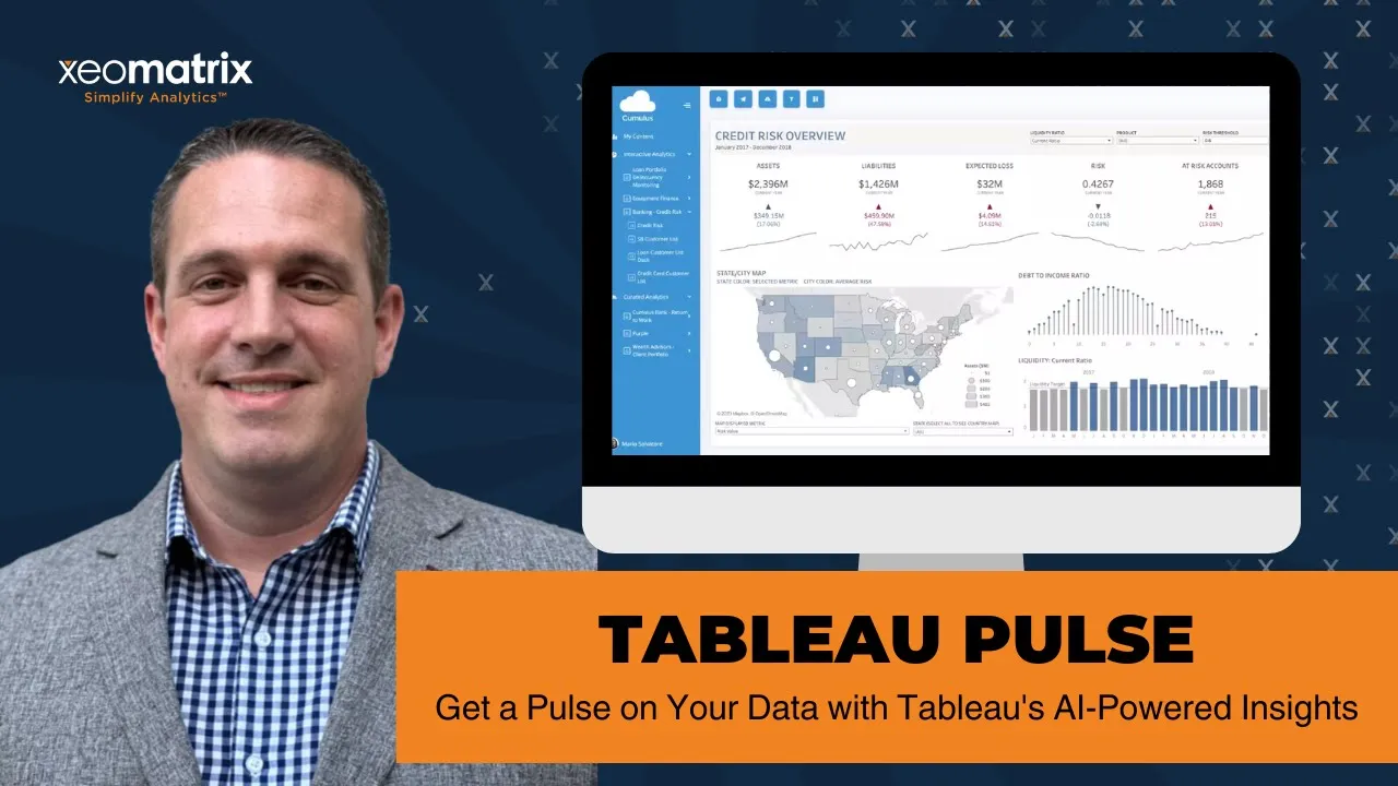
Tableau Pulse is a new feature that takes data exploration to a new level. Tableau Pulse leverages generative AI-powered insights so you can delve even deeper into your data, uncovering hidden trends and patterns that might have previously gone unnoticed.
Real-time tracking keeps you ahead of the curve with instant updates and alerts on business-critical data changes. Plus, seamless collaboration lets you share insights and work together within the familiar Tableau environment.
Learn how Tableau Pulse can create personalized and contextual insights into your workflow.
Presentation Video
Summarized Presentation
Tableau Pulse, launched on February 22nd for Tableau Cloud customers, provides a revolutionary data experience leveraging AI to make data insights accessible to users of all technical backgrounds. Exclusively available for Tableau Cloud, Tableau Pulse offers personalized, contextual, and intelligent data insights. It requires published data sources to create insights and metrics to function effectively, including a measure and a time dimension.
The demonstration began with enabling Tableau Pulse in Tableau Cloud settings, where Tim Arbuckle detailed the process of creating new metric definitions and applying filters. He also explained how to define measures and time dimensions, format data, and utilize the insights feature for trend analysis. This initial setup is crucial for users to start leveraging Tableau Pulse’s capabilities.
Tim also showcased an advanced method for building metrics using a canvas similar to Tableau Desktop, allowing for detailed customization. Once created, users can follow and view metrics from the Tableau Cloud home screen, where the metrics appear as overview tiles. The session highlighted the Ask feature, which uses natural language processing (NLP) to answer questions based on metrics, adding another layer of user-friendly functionality.
Another key aspect of the session was Embedding Tableau Pulse within other platforms, such as Salesforce. Tim demonstrated using the Lightning component to integrate Tableau Pulse, allowing users to view and interact with metrics within their Salesforce environment while maintaining full functionality. This integration exemplifies the versatility of Tableau Pulse in different operational contexts.
During the Q&A session, several important points were addressed. Only Explorers and Creators can create metrics in Tableau Pulse, while Viewers can follow but not create metrics. Tableau Pulse is designed to be mobile-friendly and can be accessed via the Tableau mobile app. It also respects row-level security set up in the published data source, ensuring that users only see data they can access. Currently, Tableau Pulse does not support visual branding customization, though this feature may be added in the future. Additionally, directly linking Pulse KPIs to Tableau dashboards is not yet available, but this functionality might be developed later.
In conclusion, Tableau Pulse simplifies and accelerates the delivery of AI-powered insights, offering versatile usage options, including mobile access and external platform embedding. Enabling Tableau Pulse in Tableau Cloud settings is essential to utilize its full potential, making it a valuable tool for organizations looking to enhance their data accessibility and analysis capabilities.
Presentation Outline
- What is Tableau Pulse?
- Enabling Tableau Pulse
- Advanced Definition and Viewing Metrics
- Embedding Tableau Pulse
- Q&A
- Conclusion
What is Tableau Pulse?
Tableau Pulse, released on February 22nd for Tableau Cloud customers, is a re-imagined data experience leveraging AI to make data more accessible to users of all technical levels. It is available exclusively for Tableau Cloud and aims to deliver personalized, contextual, and smart data insights.
Key points about Tableau Pulse:
- Available exclusively for Tableau Cloud customers.
- Requires published data sources to create insights and metrics.
- Metrics must be defined by a measure and a time dimension.
Enabling Tableau Pulse
Tim began the demo by showing how to enable Tableau Pulse in the Tableau Cloud settings. He demonstrated the process of creating a new metric definition, selecting a published data source, and defining a measure (e.g., profit) and a time dimension (e.g., order date).
Tim illustrated how to apply filters and format the data and explained the insights feature, which allows users to adjust how Tableau handles trends (neutral, favorable, or unfavorable) and customize insight types.
Advanced Definition and Viewing Metrics
Tim showed an advanced method of building metrics using a canvas similar to Tableau Desktop, allowing for more detailed customization. Once a Pulse metric is created, users can follow and view it from the Tableau Cloud home screen, where it appears as tiles providing a top-level overview.
Tim also demonstrated the Ask feature, which uses natural language processing (NLP) to answer questions based on the metrics.
Embedding Tableau Pulse
Tim explained how the Lightning component embeds Tableau Pulse within other platforms, such as Salesforce communities. This lets users view and interact with Tableau Pulse metrics directly within their Salesforce environment, maintaining full functionality.
Q&A
- Viewer vs. creator permissions: only Explorers and Creators can create metrics in Tableau Pulse. Viewers can follow but not create metrics.
- Mobile compatibility: Tableau Pulse is designed to be mobile-friendly and can be accessed via the Tableau mobile app.
- Data security: Tableau Pulse respects row-level security set up in the published data source, ensuring users only see data they can access.
- Customization and branding: currently, Tableau Pulse does not support visual branding customization, but this feature may be added in the future.
- Integration with dashboards: as of now, Pulse KPIs cannot be directly linked to preexisting Tableau dashboards, but this functionality may be developed later.
Conclusion
The simplicity and efficiency of Tableau Pulse help provide AI-powered insights quickly. It’s important to enable Pulse in Tableau Cloud settings and the various ways it can be utilized, from mobile access to embedding in external portals.
Transcript
>> STUART TINSLEY: Just a reminder, this is the DDC event, right? We do this every middle of the month. Tell your friends, tell colleagues, anyone that’s interested in data topics all around Tableau. We love to build up that community and love seeing so many people attend. I’ll go through very quickly, you know, the agenda. As you know, we’re going to talk about Tableau Pulse and our featured speakers, me, myself. If you’ve been on these data-driven events, you’ve seen me on just about every single one, but I’ve got a new face from our team, Tim Arbuckle, and I’ve got a slide that’ll go over his experience. I’m really excited that he’ll be here to do a demo for Tableau Pulse. Then at the end, of course, we will do a Q&A panel. If you have any questions, please feel free to ask those in the Q&A. You can ask those through the chat window. You can also come off of mute. Everyone has the option to come off of mute. Just a reminder, this is a webinar, so if you’re not asking a question, just please try to stay on mute. Following the presentation, you’ll get an email with the recording. That’s also posted to our XeoMatrix YouTube channel. If you ever want to go back and look at all the content that we’ve covered, you can always go back to YouTube. We’ve got an archive of all of those sessions.
We’ll also send a survey. If there are areas that you think we could improve or topic areas you want us to cover, we’re still planning out the year, so we’d love to hear from you. If you just have any additional questions about your Tableau deployment, you need some sort of help and consultation, let us know. Always open to talk and help out the deployment, all right?
I want to introduce Tim Arbuckle. Tim has been in the Tableau platform for a long time, longer than myself. I’ve been in Tableau 9, 10 years. Tim, you’ve been in Tableau, what, 14 years at this point?
>> TIM ARBUCKLE: Yes, at this point, yes.
>> STUART: That’s crazy. That’s a lot of experience. You’ve also worked at Tableau previously and you worked for a Tableau customer in the past for 10 years, is that right?
>> TIM: Yes, multiple Tableau customers [inaudible]. I’ve seen Tableau change a lot. When it first came out–
>> STUART: That’s fantastic. Really excited to have Tim talk today. He’ll be doing a live demo. We’ll get into it. All right, so today’s session, Tableau Pulse, how you can get AI powered insights with Tableau Pulse. If you’ve never heard about Tableau Pulse, this was actually released for Tableau Cloud customers on February 22nd of this year, I believe.
What is Tableau Pulse? Tableau Pulse is simply a re-imagined data experience that’s going to make data more accessible to anyone in your organization, regardless of how technically savvy they are with data visualization tools. It is leveraging AI. It’s available for cloud users and it leverages Tableau AI to deliver data in ways that are more personalized, contextual, and smart. That’s just a very quick overview of what Tableau Pulse is. I put a slide in here of just things that you need to know with Tableau Pulse, all right? Number one, it is only available for Tableau Cloud. Only available for Tableau Cloud. If you are a Tableau server customer, you won’t see the option to leverage Tableau Pulse. That’s an important detail.
The second detail I wrote down here, this is just, again, high level things to know about Pulse. Then Tim’s going to do a much more thorough demo. Number two is that to create insights with Tableau Pulse, you have to access a published data source. If that’s unfamiliar, if you’re not publishing data sources, that is something that you’re going to have to do for Tableau Pulse to create its insights and its metrics. It might be a little bit of a change process if you’re not publishing data sources today. That’s not a difficult process whatsoever. We’re happy to help if you have any questions on that. You have to do a published data source.
When you create a metric definition, and Tim will go into this in the demo, you have to be able to select, you have to select a measure, some kind of measurement. An example might be sum of sales, number of orders, number of patients. It could be any sort of metric. You have to specify a time dimension. That would be a date.
Combination, you’ll need a published data source. Well, let me start from the top. You’ll need Tableau Cloud. You’ll need– Let me go back, sorry. You’ll have Tableau Cloud site. You have to have a published data source. You need a metric that is defined by a measure and a time dimension. If you’re curious about how to set up Tableau Pulse, you just have to go to your settings tab within your Cloud site, your Tableau Cloud site, and you can activate Pulse. Tim, can we show that in the beginning of the demo? Is that cool?
>> TIM: Yep. [crosstalk]
>> STUART: Okay, awesome. I will turn it to you, Tim. We will get into the live demo here. Again, if you have any questions, you guys can use the chat window. If you’re just joining, we’re doing a live demo of Tableau Pulse.
>> TIM: Thanks, Stuart. First things first, can everybody see my screen?
>> STUART: We can, Tim, I can see it.
>> TIM: Very cool. All right, so you guys are familiar with this page. It’s obviously Tableau Cloud that we’re looking at here. As Stuart mentioned, the first thing you want to make sure is that you’ve got Tableau Pulse enabled. To do that, you’d go down to settings, and it’s in the general tab. If you scroll down a little bit here, you’ll see here the Tableau Pulse deployment options. You’re going to need to turn this on here. Check this little check box.
Then you can also, if you want to, we’re obviously for all users, this is a demo site, but you could do it for specific groups as well, if you only wanted to enable it for certain people, for certain users, certain groups. That’s that for these.
>> STUART: Tim, just to clarify, it will not show up in your cloud deployment. If you have not checked this box, you’re not going to see Pulse, right? Just to clarify, you hit a very basic point.
>> TIM: Thanks, Stuart. Once you’ve got that enabled and Tableau Pulse is working for your site, you should see this extra option come down here. Let me go to the home screen. Tableau Pulse. Then you just go ahead and click on Tableau Pulse. It’s going to bring up this new, actually– let me open that, a new tab. There we go. This is going to be the first screen you see when you open up Tableau Pulse. You’ve got two tabs here. You’ve got follow-in. I’ll show you how to do that. You can actually, once you’ve created your metrics, you can follow them. Then you can browse your metrics that you’ve currently created. You can do that down here as well.
The first thing you’re going to want to do is create a metric or a Pulse. Let’s do that. I’m going to click on New Metric Definition. Now here, going back to what Stuart mentioned before, they need to be published data sources that you connect to. This is a list of all our data sources on our site. For today’s demo, I’m going to select, where are we? Superstore Executive Data. This is a data source that you’re going to select that your Pulse is going to be connected to.
Hit Connect, and it’s going to bring up essentially the page where you build out your Pulse. On the left-hand side, you’ve got the definition. This is where you define what is included in Pulse, and we’ll go through all of that. Then you’ve got this Insights tab here, which we’ll get into as well. Then you’ve got your Canvas, a bit like Tableau Desktop when you’re building out or when you’re editing online your sheet or your dashboard.
The first thing that we’re going to do is name it. I’m going to use Profit. We’ll just call this Profits Demo. You can put in a little description here if you want. Then if we scroll down a little bit, you’re going to see Value here. This is the measure that you select that you actually want to visualize. I’m going to come down here to Profit and click on Profit. You can choose whether you want a sum, average, min, max, medium, running total, or non-cumulative. I’m going to put non-cumulative for that.
This Add Definition filter allows you to apply filters to the metric itself. If I just wanted to look at a subset of categories or city or manufacturer, I would do that here. For today’s demo, I’m going to leave that on blank. This is where you put in your time dimension. I’m going to choose Order Date. Then Tableau should start to visualize this for me here. There you go. On the fly, your post gets built out on the right-hand side. I’ll take you through all this stuff in a second once we finish up.
The next thing is comparing to what you want to compare it to, whether you want to do prior period or prior year. Essentially, if you keep your eye on this here, right now it’s saying 13.9% up from the prior period, 43 from the prior year. I can change that. If I want to get rid of year, it’s only going to show me prior period, and then I can add year back. That’s where you can configure all of this.
Then if we go down a little bit further, you’ve got the actual filters that you can filter on. I click on this, and I hit Category, for example. It’s going to bring in a filter up here, which when you’re viewing the Pulse, you’ll be able to filter this on Category. Then I’m going to add another filter option. I’m going to call it State. I’m going to choose State. You can see it adds State up here. Then you can choose your number format down here, a percentage currency or a number. We’ll keep it at number for now. Actually, no, let’s change it to currency since we’re looking at profit. There we go. That’s it. That’s my Pulse built out, or the main part of it.
The next part is if I wanted to go to Insights here, you can essentially change the way Tableau handles trends. Here’s a little dropdown of if the metric’s going up, whether you want it to be neutral, unfavorable, or favorable. Right now, it’s neutral. It does this by colors. If I click Favorable, now green’s going to be good. If it goes up, red’s going to be bad, or orange is bad, I guess, and blue is neutral.
Just to give you an example, if I choose Unfavorable, it’ll switch it around. You can change how Tableau handles the values based on neutral, favorable, and unfavorable. I’m going to choose Favorable.
Then down here, you can choose your Insight types, and it gives you a brief description of how Tableau interprets these Insight types. You can remove them. I’m going to keep them all for now, but you can come here and turn them off if you want to, and only include certain ones. Then that’s it. Then you hit Save Definition, and you’ve created your first post.
There is another way of building this out. It’s a more advanced way that I want to show you real quick before we jump out of here. If I come back down to here and click on Create Advanced Definition, this essentially opens up a canvas where you can do a little bit more. This obviously looks a lot like Tableau Desktop. You can build out your posts in the same way using this screen here. If you wanted to, I can just drag in Order Date here. Can bring in Profit as a measure. Then my filters were Category and State.
What this screen allows you to do is just to go into a little bit more detail. You can go to your Analytics pane here, and you can add trend lines, constant lines, average lines, and reference lines to your visual as well. For now, I think I’m done. You could click apply, and then you can build it out that way. It’s just an extra level of detail where you can get a bit more advanced with what you’re trying to build out.
Once I’ve got my post created, I’m just going to hit Save Definition, and Tableau’s going to save this post for me. This is the first splash screen you’ll see once you dive into the post. If I go back here, let’s go back to Home. Now, if I go to, right now, I’m not following any metrics, any pulses. If I go to Browse Metrics here, my pulse, where is it? Here we go. This is the new one that I just created. This will be my metric. I can click Follow here. I can edit my definition, first of all, if I wanted to. Tells me what data source I’m connected to. Then I can just hit Follow.
If I go back now to my home screen, that’s going to appear here. The idea is, essentially, you’re going to have a splash screen. Hopefully, you’d have more than one metric. Maybe you’ve got 12. You’d see them here, just as little tiles. Gives me top-level overview of what’s happening with Profit, whether it’s up or down. If I want to drill in, I can just go ahead and click. It’ll take me to the overview, and it’ll show me it trended. It’ll give me some insight here. Then it’ll break it down a little bit further here.
Also, it will suggest questions you can ask. This new feature that they just added is this Ask feature here. if I click on Ask, I can actually use NLP to ask a question. If I type in, what’s the state as the highest profit? Hit Enter. It’s going to suggest which questions I can ask, which built-in questions. Which state, province had the highest profit? I click on that, and it can show me there. It’ll drill further down.
As well as the overview section, you’ve got a breakdown section. This drills down into the metric a little bit further. Pulse is going to suggest to you, or going to show you essentially the top performers, and break it down a little bit further that way. Then you can filter as well. You can look at it by whatever filter you chose when you built your Pulse out. In this case, it’d be category and state, province.
Then up here, you’ve got this little Adjust button. You can click on that, you can actually adjust your filters on the fly as well. I can change it from month to date, and change my date options here. Category, and then state, province. Whatever filters you selected when you were building out the Pulse is going to appear up here. That’s essentially how you build a Pulse.
How can you view them? One way to do that is to just come into your Tableau Cloud environment, click on Tableau Pulse, and it’ll take you to this page. Another way is through Preferences. If you click the little icon here, I’ll just click my profile and pick some preferences. Here, you can choose whether to receive them by email or via Slack as well, which is really cool. You can choose a cadence as well, so that’s daily, weekly, or monthly. Right now, I get a digest daily in my inbox of all my Tableau Pulses. It’s a really cool way of being able to share and receive Pulses quickly and on the fly as well.
Then the very last thing I wanted to show you was you can embed Tableau Pulse as well. This, what you see here, is a Salesforce community that I’ve set up. I use it as a demo for embedded dashboards and Pulse as well. Actually, let me go to the home screen real quick. Just to give you an idea, like I said, this is a Salesforce community. Set up for a customer I did a demo for. These are embedded Tableau visuals using the Lightning component.
If I click on Tableau Pulse here, this is done using the Lightning component through Salesforce, and you can see this is the whole Tableau page embedded within a Salesforce community. I can just come, it’s the same functionality. Everything works the same. I can browse our metrics. I can dig into them, look at the data, and go to the breakdown and all that good stuff. I can also create them as well, all embedded within Salesforce. Again, this is done using the Lightning component. It’s all drag and drop functionality. Essentially, all I do is grab this URL here and paste it into the Lightning component. That’s how you embed it within Salesforce.
>> STUART: Tim, that’s really cool. Would that be the same process if you–? That’s for like that example of Salesforce communities, would you still just copy the URL and go through that same motion if you were embedding into, let’s say, an external portal that you have built? [crosstalk]
>> TIM: That’s a good question. You can if you want to. You could use an iframe, because that’s essentially what the Lightning component is, just an iframe bringing in the URL. Same with dashboards as well. If you wanted to embed it using JavaScript or the way we use connected apps in JWTs, or there’s documentation, but essentially you can bring in certain pulses based on ID using code, essentially, like your typical–
>> STUART: You could do it. If we have any customers on the call that have Tableau embedded, go into maybe your customers or partners or vendors. It sounds like, Tim, you can embed Tableau Pulse just as you would a Tableau dashboard in an external portal. Okay, that’s awesome.
>> TIM: Which is really useful. Good use cases for that if you’ve got like customers logging in and you want a splash screen. You can just have all their high-level metrics right there on the page for them. They can customize that as well, almost like a favorite. It’s a bit like favorites when you’ve got Tableau Cloud.
>> STUART: I’m amazed by how fast it is. Like, from when you got to a metric definition and picture measures and date time frame and just how instantaneous it spits this out. That’s really cool.
>> TIM: That’s the beauty of it. Tableau’s always got the emphasis of taking the heavy lifting out of analysis and getting the answers to the questions as quickly as possible. Pulse, I mean, you saw there, obviously, I set these metrics up beforehand, but I just followed three more and all of a sudden, I got four KPIs on my screen and I’ve got instant access to all of it. It’s pretty simple and really quick to set up.
>> STUART: That’s fantastic. Tim, did you have anything else that you wanted to share? We’ve definitely got some questions that are pouring in that we can try to address.
>> TIM: No, I think I covered everything. Just to do a quick recap, you’ve got to have Pulse enabled in your cloud environment. I took you through how to build out a Pulse, which is fairly simple. You can track them through Slack and email as well, if you want, and the embedded piece. That’s all of it.
>> STUART: And activate. Got to activate Pulse from your settings. That’s what I missed when Pulse was released. I was like, “Where is it?” We’re all fine. Pulse. You got to activate it. Tim, does that need to be an admin who activates it, I would assume?
>> TIM: Yes, so you’d have to be a site admin to be able to access any of the settings there.
>> STUART: Gotcha. Okay, so that’s an important detail for folks in my call, like the admin technically, is going to need to activate Pulse. If you’re a creator or you don’t have admin privileges, then you won’t see the settings tab, and by default, you won’t be able to activate Pulse. That’s really good.
We have a lot of questions coming in. I’m going to go through, in no particular order here, some of the questions, because we’ve got some good ones. Kevin, you had a good question around, “Do users need a certain license type to be able to build the Pulse metrics?” Tim, do we know the answer to that question? Can a viewer, for example, build out a metric? Or does that need to be an Explorer creator?
>> TIM: I don’t know the answer to that, and I should. I would think viewers can do it. I don’t know. Do you know the answer?
>> STUART: I don’t. Do we have anyone on the Tableau side on the call? Richard, are you still on, do you know?
>> RICHARD: I’m here.
>> STUART: Hey, man. Do you know the answer to that? Can a viewer create a metric? Are there any limitations to the license type in building out a Pulse metric?
>> RICHARD: I’m not sure. I’m new, coming back from paternity leave, so I don’t know.
>> STUART: We will find out. We will–
>> TIM: Do you want to say it, Lon? There’s a help article here.
>> STUART: Okay, Kevin, you stumped us with a good question. We’ll find out. We’ll find out what license.
>> TIM: It’s probably one we should know. It’s a good question.
>> STUART: Let me throw to that. Okay, Kevin, we’ll get back to you on that, and folks in the community on that question. We’ll look at that help article tells us.
>> RICHARD: It’s there. If you have a viewer, you can follow metrics and discover insights through those metrics, but you can’t create.
>> STUART: Got it. Okay, we have an answer. I would assume the Explorer can create a metric.
>> RICHARD: Exactly, yep. Explorer creator.
>> STUART: Kevin, there’s your answer. A viewer cannot create a metric, but they can follow. Explorers, admins, creators, can create metrics. That is a really good question. We always learn something on these data-driven events. Thank you, Richard. Welcome back, by the way, congrats. Hillary had a great question. “Does Pulse focus on past patterns or patterns going forward?” Do we know the answer to that question?
>> TIM: I would ask for a little bit, Mondeo, around the patterns moving forward. Because essentially, I think the answer is that it’s based on previous patterns. Because if you’re looking at year and year and month and month, essentially. It’s based on previous patterns of your data. I will say, though, Pulse has just been released. Like I said, this ask functionality has just been added. I’m pretty sure that in terms of interpolation and how it interprets the data, the features or functionality for that is going to be built out a lot over the next year or so. The functionality on how you tell Tableau to handle the data will become more robust, for sure.
>> STUART: Austin had a good question on that topic, which was, “Does the ask feature work based on filtered fields?” I think the example you showed, then you were asking across the broad metric. If you were to filter, I guess, Austin, you mean like if you were to filter down to something, would ask work at this moment? It looks like it does. It does pull all of the fields that you’re filtering on.
>> TIM: It includes your filters, but I would imagine as well that it doesn’t, it’s not specific filters you choose either. That’s how it works. It seems to be like you do have to define the filtered fields for it to search for what you’re looking.
>> STUART: Oh, on those two ads, for sure. Austin, that’s maybe a bit of clarity. Like Tim said, like the ask feature is so new, like I would imagine they’re going to continue to enhance and develop that. I think for right now, you could assume like, if you want to be able to search and type in on add those filter criteria so that the search prompts what you’re looking to do, if that makes sense.
Oh, another good question here from Emily. “Can Pulse KPIs be linked to preexisting Tableau dashboards?”
>> TIM: I think the answer to that is no as of now, but Stuart and I were talking about this yesterday, actually, like it would be awesome if you could do something like that, or even create a Pulse and bring it into a dashboard. I’d be very surprised if that didn’t happen within the next year or so, but currently, I don’t think you can. It’s purely based off of a published data source and that raw data at the moment.
>> STUART: I can see that certainly being applicable, Emily, down the road. That’s what we would hope for on our side too. That could be really neat. You have Tableau dashboard built out, Pulse Insights embedded into that dashboard and that view and published out.
>> TIM: Right now for me– sorry, I mean to interrupt, Stuart, but when you build a dashboard, you get your top level KPI at the top usually. This, I feel like it looks nicer.
>> STUART: It’s a lot quicker to set up. If I could save myself a bunch of time by creating some pulses and using those as my KPIs.
>> TIM: I’d be all for it. That would be great if they could do that.
>> STUART: Kevin had another good question that Richard had answered here, but maybe we should cover it. That is just, “How would they ensure that users only see data within the data source that they should have access to? Would this be done by using row-level security within the published data source?” I’m assuming, that would just be– you would have to implement row-level security to that published data source so that Tableau Pulse respects the security that’s been set up there.
>> TIM: Pulse would inherit whatever security you’ve got set up on the data source.
>> STUART: Cool. All right. Let’s see, these are great questions. I hope I’m getting to all of these. Let’s see. Ed, does anyone else have any other questions? It looks like, Brendan, you’ve had a few questions in here about setting up a metric. It looks like you might’ve gotten that sorted out. Does anyone else have any questions? Let’s see. If anyone wants to come up from you, is there any other questions that someone has? Happy to jump in.
>> RICH: This is Rich. I was going to ask, and I’m new to this. Is it redundant, like building out metrics in Pulse when, say, like you build out metrics for a dashboard or something? It looked like it was the same, but yet you’re doing that here in the Pulse page, in the Pulse site, for the Pulse insights that you do. Is that like how it is?
>> TIM: I wouldn’t say it’s redundant because there’s a use case for both. I feel like this is more geared to people that want to jump in really quick, quickly take a look at the data and drill down into a KPI. Whereas like a dashboard, a viewer would log in and then spend more time looking at that data and analyzing the data. Having said that, though, I can definitely– I would say there’s a little bit of cannibalization. For me, a hybrid would be awesome. A hybrid of Pulse and a dashboard would give you everything you need because then you can dig into your top-level KPIs quickly and follow them and get emails about them. Then if you want to go into the detail, you’ve got your dashboard underneath where you can go into a little bit more analysis.
>> STUART: Awesome. This seems great for like the AI aspect, to forecast, help predict, and ping you on things. The business team, the sales team can look at this stuff quick. Like I said, if you’re digging in as an analyst, then you can do other things on the dashboard. That’s great. Thank you. Thanks so much, Tim.
>> TIM: Oh, you’re good. Great question.
>> STUART: All right. Does anyone have– I know we’re a little short. The Pulse demo is quick. It’s really not a lot of setup. You activate, you have a published data source, you hit a metric, you define it, you build it. There’s obviously some tooling that can be done. Probably some scenarios where you have to troubleshoot a little bit to get what you want. Then obviously you have your preferences where you have Slack and email integration setup. This is probably a shorter than normal event because it’s really that simple. Are there any other questions that anyone else has? Otherwise, we’ll give people back almost 25 minutes here for their day.
>> EMILY: I did have a quick question about the, I know with Tableau dashboards, it can be a pain in the butt to create more dashboards for phone or tablet use. How does Pulse handle that?
>> TIM: I believe right now it’s what I would call it as pixel perfect. You can open this up on your mobile device and it should shrink to fit the screen. That should be how it works right now. Because you’re right.
>> STUART: A mobile app for Tableau and then you pulse through there, Emily.
>> EMILY: Okay, awesome. Thank you so much.
>> STUART: Good question. Good question. Anyone else? Well, we’ll have to do another poll session, like maybe three, six months from now. I have a strong feeling that so much is going to be added to it and we can reconvene on this topic. Oh, this is a good question, John, that you just had. This is really good. I don’t know if I know the answer to this, but Tim, you might. “Does Pulse have options for customizing visual branding? For example, designating brand custom colors. Is there any customization we can do to the-
>> TIM: No, not yet. Purely just the sentiment colors based on the data. That would be really cool if we could do that.
>> STUART: I was wondering that same question, John. That seems to be like that question is going to come up a lot. Especially if it’s embedded or different scenarios. That is TBD, but not that we’ve seen at the moment. It does. You are looking at the quality warning. I did notice, we have data management set up. We’re able to set up quality warning. I set up a dummy quality warning. The metric you built here, Tim, actually the data is not bad, but I did it for demo purposes. It does inherit any sort of quality warnings that you have on that published data source. You could see if someone flagged it, that there’s potentially an issue.
>> TIM: I love that. That’s really cool that they incorporated data management into this as well. You should be able to see this, but it’s awesome that you can.
>> STUART: I wrote a fake note, but it just shows you if you have data management, what that could carry in the polls and give more visibility to your data pipelines and validation there. All right, do we have any other questions? I think that’s all we had to share. These are really good questions. I hope this was helpful for everyone on the call. If you have no more questions, we’ll give you guys back 20 minutes here.