The Data-Driven Community Meetup holds monthly webinars on business analytics and big data. Webinars are held on the second Wednesday of the month at noon (12:00 PM) central time via Zoom Webinars and will cover topics related to enterprise data management. Our goal with each webinar is to provide meaningful insights and actionable takeaways to simplify analytics so you can make better decisions.
The topics we cover include data strategy, data management, data warehousing, BI modernization, embedded analytics, and cloud migration and strategy. Learn how to build reporting solutions that drive your business demand based on your needs.
About the Topic
Stuart Tinsley, Client Success Manager, and Jared Schulman, Lead Consultant at XeoMatrix, recently held a meetup titled “Top Tableau Tips and Tricks,” where they explained the most important Tableau shortcuts to help you build dashboards faster.
This article includes a recording, transcript, and written overview of the Top Tableau Tips and Tricks presentation.
Presentation Video
Summarized Presentation
In a comprehensive session titled “Top Tableau Tips and Tricks,” led by Stuart and supported by Jared, participants were guided through a series of strategic insights aimed at enhancing their proficiency with Tableau. The presentation meticulously covered a range of topics designed to streamline Tableau workflows, elevate data analysis techniques, foster the creation of dynamic and interactive dashboards, and improve overall data presentation.
Key highlights included practical tips on optimizing the Tableau interface for more efficient navigation and analysis, such as the innovative use of right-click and drag for accessing additional options, setting default properties for measures to ensure consistency, and employing drag-and-drop functionalities to validate calculations swiftly. The session also introduced methods to enhance visualizations through the dynamic adjustment of visual marks, a detailed examination of underlying data for accuracy, and the creation of a level of detail expressions to delve deeper into the data layers.
The presentation touched on advanced techniques for creating more user-friendly and interactive dashboards. This included starting grid reports with ease, implementing zoom functionalities for detailed data examination, and utilizing tooltips to provide contextual information, thereby making dashboards not only more informative but also intuitive to navigate.
Stuart shared insights on workbook-wide formatting options, precise color selection to align with branding guidelines, and dynamic field renaming directly in the view to convey information more succinctly, enhancing the aesthetic appeal of data presentations.
The session underscored Tableau’s transformative power when users armed with these expert tips and tricks turn complex data sets into compelling narratives that drive insightful decision-making and storytelling. This holistic approach to mastering Tableau provided attendees with the tools necessary to unlock new levels of efficiency, clarity, and impact in their data visualization endeavors.
Session Outline
- Streamlining Tableau Workflows
- Enhancing Data Analysis
- Creating Dynamic and Interactive Dashboards
- Enhancing Data Presentation
- Conclusion
Streamlining Tableau Workflows
Right-click and Drag for More Options
A technique for accessing additional options for dimensions and measures directly in the Tableau interface. For instance, right-clicking and dragging an order ID or sales figure can quickly bring up calculation options, such as counting distinct or average sales, without navigating through menus.
Default Properties for Measures
Stuart showcased how to set default properties for measures, like profit, across an entire workbook. By defining a measure as currency, all instances automatically inherit this formatting, streamlining consistency and reducing manual adjustments.
Calculation Editor Drag-and-Drop
This is a method for validating calculations directly within the visualization pane. By dragging a formula from the calculation editor to the view, users can instantly verify the accuracy of their computed fields against existing data.
Measure Values Trick for Headers
When working with a single measure, dragging the “measure values” to the “show me” area can reveal the measure’s header. This provides clarity in presentations where headers might not automatically display.
Typing in the Row and Column Shelf
Stuart emphasized the efficiency of typing directly into the row and column shelves to add data fields to the canvas, bypassing the traditional drag-and-drop method. This approach is particularly beneficial in complex datasets with numerous fields, where searching or scrolling for a specific field can be cumbersome.
Pill Replacement and Duplication
One of the simplest yet most effective tricks is dragging and dropping pills on top of each other for quick replacement. Additionally, holding the command (Mac) or control (PC) key allows for the easy duplication of fields across different areas of the visualization, such as color and filters, streamlining the creation and adjustment of complex dashboards.
Efficient Pill Management
Managing a dashboard with numerous measures and dimensions can quickly become overwhelming. Stuart demonstrated a time-saving method: by holding the shift key, users can select multiple pills and easily remove them from the view, decluttering the workspace and focusing on the most relevant data.
Enhancing Data Analysis
Filtering Data Pane for Efficient Navigation
A useful feature for working with extensive datasets is the ability to filter the data pane. This function allows users to quickly access calculations, dimensions, and measures, streamlining the process of finding and utilizing specific data points.
Viewing Underlying Data for Validation
Stuart highlighted the importance of accessing underlying data for thorough data validation. This feature provides a detailed view of the data behind the visualizations, which is essential for verifying accuracy and troubleshooting discrepancies.
Drag and Drop to Create Level of Detail (LOD) Expressions
A newer feature allows users to easily create LOD expressions by dragging a measure to the desired level of detail. This simplifies the process of generating complex calculations without manually entering formulas.
Shared Axis and Dual Axis Visualizations
Stuart demonstrated how to combine measures on a shared axis for a unified view and enhance visualizations by adding a dual axis. This technique allows for more dynamic and informative charts and offers a deeper comparative analysis of the data.
Creating Spacing and Percent of Total Calculations
To emphasize specific data points, such as profitability, Stuart suggests adding calculated fields that create visual spacing in grid reports. Additionally, he showed how to easily create and save a percent of total calculation for repeated use, a technique that can simplify complex analysis.
Index Function for Unique Layouts
Stuart recommends using the index function for a cleaner presentation of data, especially when suppressing repeating values is not desired. This trick can enhance the readability of tables by ensuring each row displays unique information.
Improving Table Aesthetics
To eliminate the default “ABC” placeholders in Tableau and achieve a cleaner look for tables without measures, changing the mark type to polygon effectively removes these placeholders, offering a more streamlined appearance.
Creating Dynamic and Interactive Dashboards
Grid Reports Initialization
Drag measures directly onto the view to initiate a grid report, which starts a tabular display that can be further customized.
Zoom Functionality for Detailed Examination
Stuart outlined a technique for enabling a zoom feature on visualizations, allowing users to examine data points closely. This involves creating a parameter and a calculated field to adjust the view based on user selection, providing a more flexible analysis experience.
Customizing Visual Marks
The ability to dynamically change the properties of visual marks (e.g., color, size, labels) directly in the view offers flexibility in highlighting key aspects of the data.
Describing Data Fields for Clarity
Using the describe option on data fields, users can gain insights into the underlying logic or data source details, aiding in data validation and understanding.
Tooltip Utilization for Contextual Information
Stuart showcased a creative way to use tooltips for providing contextual information about the dashboard, enhancing user comprehension.
Performance Recording for Optimization
The performance recorder feature in Tableau Desktop helps identify performance issues in dashboards, guiding users to make necessary optimizations for smoother experiences.
Enhancing Data Presentation
Workbook-wide Formatting
Stuart shared how to remove grid lines across an entire workbook, a tip that can help maintain a clean visual style for all visualizations.
Precise Color Selection
For aligning dashboard colors with branding or specific design guidelines, Tableau’s color picker and the ability to enter hex codes provide a method for selecting precise colors.
Dynamic Field Renaming
A simple syntax allows for the in-view renaming of fields, offering a way to succinctly convey information without altering the original data source.
Conclusion
The session on “Top Tableau Tips and Tricks” provided a wealth of knowledge aimed at enhancing the Tableau user experience. From optimizing workflows to creating more dynamic and visually appealing dashboards, the tips shared by Stuart and Jared are invaluable for users at all levels. By implementing these strategies, Tableau practitioners can unlock the full potential of this powerful tool, turning complex data into compelling stories that drive decision-making and insight.
Transcript
>> STUART TINLEY: Just a reminder, this is obviously our DATA DRIVEN COMMUNITY. Tell your friends, tell co-workers. We want to grow this community even more than we already have. And we appreciate the support and the attendance we’re getting from everyone here. Any feedback that you have on how we can make our sessions better is always welcome.
We’ve had really good attendance, which tells me that people are liking the content, and I’m very, very pleased with that. So tell more people, and we’re going to continue doing this.
We go to the next slide here. Today’s agenda. So I’ll first cover the meeting format very quickly and upcoming events that we have. The featured speakers today are myself and Jared Schulman. I’m director of Client Success and Sales for XeoMatrix. I used to work at Tableau; had been in the product about nine years now.
Jared is our Lead Consultant. He has led a number of our sessions in the past.
On Tableau Prep, Jared, you did parameters. I believe you did calculation. Today, you’re kind of taking a back seat, but I believe you’ll have quite a bit of input that’ll be helpful for the conversation.
>> STUART: The presentation today is on Tableau Tips and Tricks. So what I’m going to do is roll through probably around 35 Tableau tips. It’s all in the theme of teaching you stuff that will make you faster in Tableau, make you better at the product. And hopefully, you’ll see some tips and tricks that you’ve never seen before. So that will be a goal.
Give a thumbs up if it’s something you’ve never seen or didn’t know how to do. It’s going to be a good session. And we’ll always end with a Q&A panel. I don’t know how many questions we might have on tips and tricks, but we will leave some time, if there are questions about the tips and tricks, or just general questions that people have.
So just keep in mind this is a virtual webinar format. We have in recent sessions allowed people to come off of mute. So when we get to Q&A, if you have a question, you can most certainly come off of mute, but just stay muted if you’re not talking. And you could also interject and ask a question as we’re going. We want to make these sessions more interactive over time. So you can certainly do that.
We will hold a Q&A at the end, of course, if you want to reserve questions. And you can use the chat window as well.
Jared, do you mind looking over the chat window today for me?
>> JARED SCHULMAN: Yes, it’s covered.
>> STUART: Cool. OK. And then as always, we send out the recordings. If you miss a link with the recording, we post them on YouTube. It’s a XeoMatrix channel.
We also send out surveys to understand how we’re doing, you know, any feedback that you have on these sessions. So we’d love to hear from you there. But yes, YouTube is where we’re storing all of these videos; all of the past sessions, all the future sessions that we’ll have.
So our March event that will be held on the 13th is TBD. We’re currently looking at a couple of different topic areas. So we will get out the topic area as soon as we can, probably early next week. We’re kind of picking between a few that we think make the most sense for March.
That is TBD. Sorry to leave anyone hanging, if you’re wondering what the next session is. We’ll have that as soon as we can. It’ll be a good one.
Feature speakers, myself and Jared Schulman. I just went through our background. Jared’s led a number of our sessions. He’s a Lead Consultant with us, so it’s always great to have him here.
I’ll be running today. I’ll be running through the tips and tricks. I still get in Tableau here and there, so I’m happy to roll through these examples with you.
Let’s get right to it. Let’s get right into the presentation: Tips and Tricks.
I had a slide here. There are too many to list. In previous slides, we’ve had what we’ll cover for today. We actually have so many that I couldn’t really put them all down, so that’s why you’re seeing nothing here.
Let me stop sharing. I’m going to re-share in one second. OK.
All right, Jared, Chris, quick screen share check. Can you see Tableau here?
>> JARED: Yes.
>> CHRIS MONAHON: Yes. It’s good.
>> STUART: All right. And, Jared, if you could monitor the chat window as well, that’d be awesome.
>> JARED: Yes, definitely.
>> STUART: If we have any questions, just pause me.
OK, so I’m going to roll through a number of tips today. Again, I’m curious. Give a thumbs up if you haven’t heard or didn’t know about these tips.
The first one I want to show is what I would call a right-click and drag. Or if you’re on a Mac, you can hold the “option” key. And this is what will happen.
So if I have, on my “view,” let’s just say “subcategory,” and I want to bring out order ID, I’m going to right-click and drag on a mouse. Or on a Mac, I’m going to hold the “option” key. And when I do that, I get this window that might look unfamiliar to people. And what that does is it gives me more options. So number one, I can just bring out the order ID, as it is dimensionally. Or I could, very quickly, if I wanted to do account distinct of the orders.
All right, so let me show that again. So it’s a right-click on order ID, I bring that over, and I get this window, right?
Now, that also works on any measures that you have. So if I right-click or hold “option,” and drag out “sales,” I get that I could just do a sum, but I could also just do average sales. So I can save you some time in your process.
You could also do different date options too. So if I bring out this order date, I’m going to right-click and drag it to rows. And this could be really helpful, because I could pick the date part right off the bat.
As you probably know, when you bring out a date field in Tableau, it rolls it up to the year. So that right-click and drag or hold “option” gives us more options. So if I wanted an exact date, for example, I could pick “order date: discrete.” Now I’ve got every date in my data set.
So it’s quicker than if we went about it this way. If I drag out “order date,” and I wanted that exact date, I have to go down here and say “exact date,” and then I have to make it “discrete.” So you can see the time saving right there. It’s just a right-click and drag, and we have “discrete order date,” right? That is tip number one.
Now, if you’re on a PC, what did we decide that shortcut key was, Jared? Was it hold “alt,” I believe?
>> JARED: I think “alt” works. Yes, I believe it’s “alt” on a PC.
>> STUART: “Alt” on a PC will do the same thing as holding “option” on a Mac. Someone check us on that, though, as we go through it.
All right, cool. The next tip I had, which is maybe more of a basic one, is how you can set a default number across an entire Tableau workbook.
In this example, I’ve brought out “profit.” You’ll notice that “profit” is something that we would want to define as currency, right? So if I wanted every time that I use “profit,” to be a currency, you have default properties that you can apply at a dimensional level or really at a measure level.
So if I right-click on “profit,” I can go to “default properties,” and I can change and hard-code that number format. So I’d come here and do “currency custom,” and make that zero decibels. And now every time I use that “profit” measure or any measure that needs to be currency, it’ll have that dollar sign, right? So that’s just a helpful tip that you can actually hard-code in currencies or different number format.
All right. Cool. That’s tip number two.
OK, so let’s talk what I call the calculation editor, the option to drag and drop when you’re in a calculated field. So let’s pull up in a calculation real quick.
So I built a formula in Tableau that is just going to compute sales for the central region. So I have “region” on the “view,” and that’s it. And this formula is just a very straightforward IF statement. The “region” equals central, then return sales.
So this trick is cool. So if I wanted just to test my formula, test the calculation that I have, in Tableau, you can actually highlight the entire expression that I have here, and you can drag and drop that into the “view.” So I could see that these numbers are correct. Now, if I bring out “sales” next to it, I know that my formula is returning the right value. So you can drag and drop this entire expression into the “view.”
All right, give me some thumbs up if these are unfamiliar and you haven’t heard about these, OK? All right, so that’s the drag and drop calculation editor.
This one is what I would call a measure values trick. Let’s say that in your “view,” you have a “dimension” and you only have one measure. So in this case, I have “sales.” Notice how “sales” does not have a header. So really, unless I hover to get the tool tip, I wouldn’t actually know that I’m looking at sales. But if you have one measure, a trick that you can do is to drag “measure values” onto “show me” right here, and that will actually display the “sales” header, all right?
Now, if you had another measure, that’s when Tableau populates a header. So that’s a nice trick. If you only have one measure, you simply drag and drop “measure values” right there and you can see the header.
OK. This is one of my favorites. This is what I would call the ability to type into the row and column shelf – and there’s one other place I’ll show – to actually return data in the “view.”
Most people, when they start Tableau, they’re dragging and dropping the data into the canvas, right? Well, one trick that you could do is you can actually double-click into the column and row shelf, and you can type the data from your datapane. So if I just did “sales,” that would return sale. And if I wanted to look at that by category, I could look at that by category.
So you can actually double-click into the row shelf. You could also double-click here. And let’s just say, sum of profit is greater than 20,000, or 2000, maybe. Or you could actually do formula fields right there, all right? So those are all true. So you can return the data in your view, and you could also do formulas in this window right here.
I love this option.
Now, this could be extrapolated into, if you remember, the right-click and drag, where we got that exact date. If you double-click and type in a date range that you have, which in this case, I have ship date and order date… If I type in the order date, that will automatically return an exact date that is also discrete.
So if you’re doing data validation, maybe one of the record or two doesn’t look correct, and you need to look at each individual day, it’s a really helpful tip. You just type it into the “view,” and you’ll have an exact date, save you some time.
[crosstalk ]
Yes, go ahead. Do you have a use case for it?
>> JARED: I was just going to say, being able to type in fields like that instead of hunting for them in the pane on the left, it doesn’t sound as cool when you have about 20 or 30 fields on the left like this. But, man, when you have five to 10 tables coming out of Salesforce and there’s, like, 300 fields down that left pane, it can be so much easier if you know what you need to just type it in, rather than scrolling for it or even searching for it.
>> STUART: Yes, I agree.
>> JARED: There was a question in the chat as well about whether you can only do logic equation? It’s like Booleans, or if you can do anything else as well. And you can type anything you want there. You could write out, like, a full level of detailed calculation. It’s a really tiny window to do that in, but there’s not really a limitation on what you can put in there.
>> STUART: Yes, good. Yes, that’s the limitation, right? That’s a crazy viz. You just don’t have that same calculation window, the amount of real estate that you would normally have, so that could be a little bit trickier. But you can. There’s no limitation.
Good question. Cool. All right.
OK, this is a good one. I have a dashboard that I built that has some KPIs. It has a map view of sales, sales by date, sales by subcategory. Very straightforward dashboard. I wanted to share to the group that I found out about this probably only a couple of years ago. But if you’re building a dashboard, this becomes relevant if you’re floating any object.
So in this case, I do have a logo that we floated in. And if I want to have more precision on where I drop that logo, if I go to the dashboard tab, I can show a grid. And that grid would make it a little bit easier to line up that logo to make sure it fits with the entire dashboard. That grid is simply helpful for more precise formatting right there. You just uncheck it when you’re not wanting to show it.
The other tip that I find very helpful is, you can hide all of the sheets in a dashboard. So obviously, all the worksheets that go into a Tableau dashboards, they would be shown right here. And if you have multiple dashboards, lots of sheets, that can get fairly unruly in the Tableau workbook. So to make it a bit cleaner, you can hide all of these sheets, and unhide them when you want them. So it can be really helpful.
Just cleaning up a workbook makes a handoff easier. If you’re passing on a workbook to someone, potentially, just a cleaner output within a Tableau dashboards.
>> JARED: So if you have all your sheets hidden and you just want to unhide one, you can just unhide a single sheet from here on the dashboard, right?
>> STUART: How would we do that? Yes, that’s a good question.
>> JARED: So if you click on one of those sheets in the dashboard, and then click through that dropdown at the bottom, you can unhide… Where is it? Oh, is it not on here?
>> STUART: Would it be at the sheet level?
>> JARED: So at least if you go into it here, then yes, unhide sheets in that second grouping there.
>> STUART: I see it. I see you have to go to the sheet and then you can unhide that sheet.
>> JARED: Go back to the dashboard. And if you scroll down on the left and find one of the other sheets in this dashboard over on the left-hand sheets menu?
>> STUART: Yes.
>> JARED: Can you find one of the other ones that’s in the dashboard?
>> STUART: Oh, yes. Let me see here.
>> JARED: There we go.
>> STUART: OK, these right here.
>> JARED: Yes. If you right-click on that, can we… OK, so we can unhide it from here as well?
>> STUART: Yes, cool.
>> JARED: Perfect.
>> STUART: I just learned that. Two more tips. You can unhide single sheets, and you can do it right from this window over here. That’s awesome.
>> JARED: I knew there was two or three ways to do it. It’s just a matter of finding them.
>> STUART: That’s cool. I’ve learnt something every time I had you on a call, Jared.
OK. This is a good tip. I also learnt about this way too long into Tableau. Now, imagine you’re working in a workbook, and you have large data sets; lots of tables, maybe lots of formulas that you’ve built, this cylinder, funnel-looking icon actually allows you to filter data on your datapane based on either a calc, a dimension, a measure, or any comments that have been made.
So in this workbook, I probably have about two, maybe three calculations. So when I hit the “calculation” option, it automatically takes me to any formula field. And I can always identify that by the “equal” sign in front of the number that indicates there’s a formula that was created. So that I find really helpful.
You could also do the same for a dimensional field. Just highlights only dimensions, only measures. I find that to be really helpful, especially with larger data sets that you might have.
Cool. All right, I wanted to show this one. And many people might know about this, but it’s always good to recover. And that is Tableau allowing you to look at underlying data.
So if I was very curious, for example, of our profitability based on subcategory, and I wanted to really go into the underlying data behind tables, if you hover over a specific mark or many marks, this grid option that pops out allows you to view the data. So it gives you the summary first that’s in the “view,” and then it gives you the full data right here. And you can see all of those kind of records right there. So that could be really helpful.
Jared, you probably have a good example. But I just think of data validation, first of all, as being really helpful. Like, you’re going in and sort of looking at it. And you can download this into Excel or CSV. But what first jumps out to me – and, Jared, tell me if I’m directionally correct – is just for data validation, looking at that underlying data.
>> JARED: Yes. A lot of times, what we’ll see is you pull together a view and you’re looking at sales or registrations or count of individuals, and you go, “Oh, that number’s way wrong. That’s 10 times higher than it should be.” And a really quick way to see what’s going on there is to look at this underlying data. And if you’re expecting to see 250 and you see 2,500, what you might find is that when you pull up the underlying data, you have 10 rows of 250, and that’s why we’ve got 2,500. And then you know, “OK, there’s a level of detail issue here that I have to either go in with the calculation or fix in the underlying data from the source.” Maybe there’s, like, joint logic that needs to be adjusted in the data source itself.
So this just lets you get a really quick peek into the row-level data behind the visualizations that you have, or the marks that you selected.
>> STUART: Yes. Yes, you can also find this “grid” option. So again, we just hovered and we see the “grid” that pops out over here. We also have it up here, right next to where we filtered by calc or a measure. So if I click that “grid” here, we’re actually given the underlying data across the entire dataset.
If you have multiple tables that have been joined or you use relationships in Tableau, you’d see that orders table and you’d see that other tables that you have, and you can comb through those records right here. And you can make this window bigger.
Again, you could download the data if you needed to, and you could sample the rows too. So if I only wanted 100 rows, or 10 rows, I could do that, right? And then you can also sort on specific fields. Or you should be able to sort on discount, if you wanted to, right? So that can be really helpful.
Again, data validation. Just getting a better sense of your data behind the scene before you start reporting off of it, or as you’re reporting off of it. The underlying data, really helpful.
Jared, did I miss anything on that one? Anything in this window that is useful? It’s like this shows all fields too. Yes.
>> JARED: Yes. So you can pick and choose what you want to show. You can download the export from there, if you want to take it into Microsoft Excel and mess around with it a bit there. So this is going to be a really easy way to get a quick export for data validation. Or if somebody’s looking at the dashboard and they say, “Well, who are the 15 people in this bar?” You can grab those 15 people, export a CSV, and email it over to them real quick.
>> STUART: I’m just realizing how helpful this is, showing the fields. Because you might have a very wide dataset, that you’re only focused on certain elements, and you can uncheck, and that only returns those fields. That is really helpful. I’m glad we covered that.
>> JARED: Yes.
>> STUART: Cool. OK.
>> JARED: Stuart, there’s a question from Frank in the chat, and this is going back to when we were talking briefly about connecting to Salesforce tables. And this may be a question that we take offline and talk with Frank directly, but he’s trying to connect to Marketing Cloud Personalization data, and they’re looking for an alternative to data cloud. Do we have anything off the cuff that we’d be able to say, “Yes, here’s a better way to connect to Marketing Cloud Personalization data?” Or do you think we might just follow up after the call?
>> STUART: Yes, Frank, that’s a really good question. Frank, if it’s all right, let’s take it off the line, because of the limited time we have here, and I’m happy to discuss different approaches you could take.
>> FRANK: Yes.
>> STUART: We got a few more. I want to make sure we have enough time to get through them all. But yes, good question.
Jared, if you can make a note that we’ll follow through.
>> JARED: Yes, definitely.
>> STUART: Cool. OK.
All right. We just talked about underlying data. So we’re going to move into the option in Tableau to actually do a drag and drop to create a level of detail.
All right. So in my “view” right here, I’ve got “category” and I’ve got “subcategory,” so it’s breaking down the next level of detail, and I’ve got “sales,” right? So naturally, Tableau is taking sales, and it’s first looking at furniture, and then breaking that down by bookcases, chairs furnishings, tables, et cetera, right?
On this total number, if I just wanted to have another column that rolled up this number across the category level, right? So this should equal $754,748. I could write a calculated field for that and write a fixed level of detail. Or in a little bit easier format, I could take “sales,” I could hold “command,” I believe. Make sure this is the right option. I’m going to drag it up to “category.” So I held “command” on a Mac, and that actually creates a level of detail for sales at the category level.
I’m going to show it again. So it automatically does the right formula at the level of detail I wanted.
Let me show that again. All right, so I took “sales,” I held “command,” and I drag it up to the level of detail that I want, right on top of “category.”
Now I know it’s a formula field. If I bring that into the “view,” there’s our $754,000 that rolls up sales at the furniture level. So a really simple way to create a level of detail without actually having to go into the calculation editor and write that out, right in that fixed formula.
Jared, any comments on that? That’s one that they added not long ago in the product, which is pretty cool.
>> JARED: Yes, yes, it’s just a nice little hack.
>> STUART: Yes. All right, let’s keep moving. Unless there are any questions, Jared?
>> JARED: Nothing new currently.
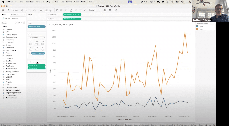
>> STUART: OK. All right. This is a great tip and trick for a shared axis. So right now I’ve got my order date, looking at the monthly level on my “view,” and I’ve got a measure for sales, right? So I was just looking at my different months and years, and showing a nice trend for sale.
Now, let’s say that I also wanted to add a measure that I have in my datapane. So let’s just take “profit,” right? So I’m going to add “profit” into the “view.” And I also wanted to share the same axis that sales does. So that was the scenario. So I can take “profit,” and if we drop it right here on this axis, it brings in “profit,” highlighted here in blue. And we can see here we also kicked off “measure values.” And so it’s really nice we can see both profit and sales sharing the same axis.
[crosstalk ]
>> JARED: That probably saved you like five, 10 clicks from doing it as a dual axis. And you don’t have to deal with having two different axis and then hiding one, and it’s just so much faster. And if you do that 100 times over the course of the year, you’re going to save yourself a couple of hours.
>> STUART: Yes. Yes. It’s also helpful if I bring in a different view here, right? If I had “sales” and “subcategory,” just looking under the bar chart. So if I wanted “profit” in there as well, we can bring the same type of thing. Now I’ve got a shared axis that looks at it this way, sharing the same axis. [inaudible]. And that’s an interesting way to look at [inaudible] tables are not profitable by high sales.
So to take this even further, you could do a shared axis and combine that with a dual axis. So let’s drag “quantity” up on my row shelf. What we’re going to do here is we are going to take “quantity,” we’re going to right-click on the pill, and we’re going to do a dual axis.
Now, the benefit of that is that I still have that shared axis for profit and sales, but I’m now given its own marks card for “quantity.” So if you wanted to have a view where maybe we have two lines and then a bar, we could come into sum of quantity and actually change the mark type. So I could make that a bar.
Now, what I’d probably do is move this pill in front of it. So now I’ve got a view of quantity, and then I’ve got that profit and sales kind of pushed out in front. And we could change the color of this if we wanted to. I believe we’d take off that and we could make this something wild, right? But there’s really cool stuff you could do with that, where you have a shared axis and you have really a dual axis right there. This is the quantity axis. You got sales and profit axis right here.
Jared, is that something you come across, like, that type of analysis where this is helpful? How common is that?
>> JARED: Yes, there’s a couple other reporting platforms that have support for, like, triple axes. And a triple axis isn’t really visual best practices because you don’t really have a good way to display all three. But this lets us do something similar where we can have a shared axis for measures that have similar values, and then include a third measure as well. So it gives you a lot of flexibility in that sense.
>> STUART: Yes. That’s cool. All right, let’s jump to our next tip, unless we have any questions, Jared?
>> JARED: Nothing in the chat.
>> STUART: OK. I wanted to be sure we didn’t have any questions on that. Happy to go through that one again.
OK, this is what I would call having some spacing between if you’re ever building like a grid report, for example. So in this “view,” I’ve got “subcategory,” and I’m breaking that up by discount, quantity, sales, and profit.
Now let’s say the most important measurement here is profitability. It’s what we care about. That’s what we’re focused on in this analysis. If I just wanted to make “profit” stand out a bit more, this is one tip that you could use. So what we’re going to do is create a calculated field, and we’ll just call this, for lack of a better naming convention, spacing. And all I’m going to do is type in “int” and then “null,” right? That’s actually going to create a blank space.
That becomes a calculated field. We’re going to drop it in between sale and profit. We’re going to come up here to the spacing header because we don’t want that header on here, and we could simply edit the alias. When we edit the alias, we can literally just have one space mark, and then that would create some natural spacing between sales and profit in this case.
You could duplicate this, have more, if you wanted to, in theory, right? And we can do the same thing. That would be a little technique you could use to make things stand out a bit more.
All right, let’s keep rolling. We’re going to do a percent of total in this view, and I’m going to show you how you could create a calculated field in your datapane from that.
So sometimes it’s a little bit trickier to write out a percent of total in a calculation window. I struggle with that in some cases. But it’s much easier to do that in a table calc.
So if I wanted to do a percent of total based off of sales and sub category, I would come over to sales, and I would create table calc, and that would do a percent of total, right? So that does a percent of total. I can see chairs represent the most of our sales, followed by phone.
Now, if I wanted to preserve that formula, because Tableau is baking in that logic and it’s all right there, what I can do is drag it over to the datapane, and now I have a formula that I can use over and over again. It’s already writing that out for me. So you can use a table calc, and then drag and drop it to your datapane, and you’ll have that percent of total saved.
Do the same for if we did a running total. So if I brought this back out and I did sales, and instead of percent of total, I did a running total, right? Same thing. I can drag and drop it over here, call this running total. And that, do the same thing.
So maybe you just didn’t know that function and how to write it out, and that’s a really easy hack on how to save it to your datapane.
>> JARED: Stuart, is the same true if you are testing calculations by typing them directly into the rows shelf or the marks card?
>> STUART: Yes.
>> JARED: Do you have the option to just drag them over? So if you were to just type that fixed category sum of sales into rows, does it let you just drag that over as well?
>> STUART: Let’s see. I think it does. From sales. OK, so I got a valid formula. We’re going to drag and drop this into the datapane. It does, yes.
>> JARED: Cool.
>> STEVE: See? Yes. Let’s do fixed LOD. Test calc. Let me double-check. Yes, it did.
>> JARED: And you’ve got fixed LOD up top now.
>> STEVE: Oh, it’s right here. Yes, it’s the wrong one. I don’t know. Let’s see.
>> JARED: Just in case you need it twice.
>> STEVE: Yes. Yes, good call. So yes, it does. So if you’re in that same trick from earlier, you highlight this and drag it to your database, you can save it there too. Yes, good call.
All right. OK, this is a fun tip right here, which has to do with adding total. So in Tableau, there are a number of ways you can add total in a product.
Right now, on the “view,” I have “category” and “subcategory,” and that is breaking down the data based off of profit and sales; two measures I picked, right?
Now, a lot of people in Tableau, they go to “analysis” and they go to “totals” right here, right? And that is if they want to add a grand total or a column total or a subtotal.
I’m going to show you an easier way to do that in Tableau. So you can go to the “analytics” tab, and you can drag and drop in your “totals,” right? And that’s not the tip either. If you didn’t know that, that could be helpful, too, and you can add in your subtotals, right?
The tip would be instead of dragging “totals” onto the “view,” if you wanted to add both columns and subtotals, you can drag it right into the “view” here, and that’ll apply both. That’ll apply your subtotals, as well as your grand total.
If you wanted to push these to the top, you can right-click on the grand total, and you can say, “column totals to the top,” and you’ll have them at the top.
>> JARED: If you have, like, a long scrolling table in a dashboard, and you don’t want people to have to scroll all the way to the bottom to get the totals, that’s really helpful.
>> STUART: Right, right. If we had something like product name in here, like, make it bigger?
>> JARED: Yes.
>> STUART: Yes, that can be really helpful. Yes, they’re just kind of sticking out here, yes? It’s a tip within itself. Cool.
So again, just drag and drop “totals” out, and you can pop it right into the “view.” That’s how you do that one, all right?
OK, so in this view, I’m breaking down region, subcategory, category manufacturer. And if I just wanted a different layout for this, kind of one record for each… Jared, you might better explain this, but I want to have just one line for each manufacturer. In the row shelf – and you’ll probably be able to explain this better – you can type “index,” and that index is a really helpful function. And if you make it discrete, we can put it in front of our region. And we can simply hide, if I do, over here.
Oops, that didn’t do it. I’m going to do it right here. We’re going to go to index, and I’m going to uncheck “show header.” It produces a better-looking grid in this example.
Then let’s just say that you have a view that doesn’t have a measure. So Tableau has these ABCs that are out here, inherently. And it’s waiting for you to put in a measure. Let’s say you didn’t have that. That’s clients that have maybe survey data, or some type of data that there’s actually no measurement. And if you just want to hide that, the ABCs, one of many ways to hide that is that you can go to the marks card, and change that to a polygon, and that’ll remove the ABC’s. If you’ve ever wondered how to get rid of those, that is how you do it.
>> JARED: And then you can remove the column dividers in formatting so that you don’t have vertical lines going through it. There’s a handful of ways to address that. But yes, just cleaner, more easy-to-read tables, between not having those ABC’s and then the index function.
What Tableau does automatically is it suppresses repeating values. So it’s going to take all those centrals and all those accessories and just list it once, and then have that one big cell. Some people really like that; some people don’t. If you’re working with people that don’t want to see that, and they want to see one value per row on every row of the table, then you can throw that index in front, uncheck “show header,” and now you’ve got a table that does not suppress repeating values.
>> STUART: Yes. That’s a really helpful one.
All right. Jared, any questions coming through we get on chat windows?
>> JARED: We’re good.
>> STUART: OK. All right. I see it’s almost 01:42 Eastern. OK. We got a few more to go through here. Actually, we got a lot. OK, I got to get cranking here. [chuckles]
All right. This one is really helpful. I’ll go through it kind of fast. It is replacing pills and using the “command” option on a Mac to copy fields.
Let me show you what I mean by replacing a field. Let’s say in my “view,” instead of sales, I changed my mind and I wanted to look at profit now, most people might bring “profit” out here and they’d take off “sales,” right? In Tableau, you can actually drag and drop pills on top of themselves. So if I take “profit” and drag it on top of “sales,” it’ll just replace it with “profit.” That’s one helpful tip. You can drag and drop pills on top of themselves.
Also, on a Mac, you can hold the “command” option. So if I hold down “command,” and let’s just say I wanted to bring “profit” to color, it keeps “profit” on the row shelf. It also duplicates it, and you can have it somewhere different entirely, right? And we could copy it again and bring it to filters. So that’s just a quick shortcut key to copy pills, OK?
>> JARED: Yes, so it’s “command” on Macs, and what is it, Stuart, “control” for PCs?
>> STUART: Yes. Someone check us on the call if you’re trying these, if that’s the right shortcut key. We can post about the shortcut. I use a Mac, so it’s harder for me to know what it is on a PC, but there are shortcut keys, the equivalent.
>> JARED: Yes. Blake [phonetic] in the chat confirmed it is “control” for PC. Thank you, Blake.
>> STUART: “Control” to copy. Thank you, Blake. Awesome.
All right, this is another tip. So this is a trick. If you had a “view” that had lots and lots of measures on there, and you want to drag everything off, or a certain amount of pills… Normally, I would start dragging these off, but I’ll show you a quicker way to do that. You can hold the “shift” button, and you can grab the pills you want, and you can take them off like that. And you could do that if it was on the row shelf, on the column shelf. It works nicely in “measure values.” But I can, again, hold “shift,” and I could take out, drag them off the “view,” and they’re gone. So holding “shift” will do that. That might save you some time. You’ve got lots of measures on there.
>> JARED: Yes. We’ve had clients with tables that literally have upwards of 50 measures in them. So if you have data like that, that’s a real timesaver.
>> STUART: Yes, it can be.
I want to show this one. I call this, “How to start a grid report.” That can sort of be a little bit confusing in Tableau, I think. And an easy trick to start a grid report in Tableau – so not something visual, but something more like crosstab, tabular – is you can drag and drop the pills, which you’ve probably seen me do this throughout today. You can take a measure and just place it right where you see the ABCs and where you see “show me” pop out, and that’ll actually fire off a grid. And then we can do the same thing for profit. And now we start to kick off “measure values,” and we can start to add different elements there. It’s a really easy way to start off a grid.
You could also double-click from the datapane, and that will also fire off a grid in this example, OK?
So I find that helpful in Tableau. If I want a grid report, I usually start it that way. And if you want to make it visual, you’d go to “show me” and pick a visualization, all right?
Jared, I probably need some help with this one. This one is really interesting.
By the way, all of these tips are not my own tips. These have come from the Tableau community. There’s some really good videos on YouTube, like “Speed Tipping” from Tableau Visionaries. So I want to be clear that I can in no way take credit for these tips. These are all out there on YouTube, and many, many more.
This is one that I saw yesterday from a few years ago. And this is an option to give users where they can zoom in to a visualization, all right? So we’ll kind of see this come to fruition as we get going here, all right? And, Jared, keep me in line with doing this correctly, because this is a bit more technical for me.
So here’s what we’re going to do. I’ve got in the “view” month of order date. I’ve got an average quantity. So in order to get a zoom effect, we’re going to build a parameter, we’re going to build a calculated field. But the first steps we’re going to do is we’re going to right-click on this axis, and we’re going to edit the axis, and we’re going to not include zero, OK? That’ll be very important. We’re not going to include zero.
Next, we’re going to create a parameter up here. There are a couple ways to get to a parameter. Let’s go to create a parameter. I’m going to call this “zoom?”. The data type is going to be a string. We’re going to list this out. It’s going to be “no” and “yes.” Very simple parameter. Name of it, “zoom?” Data type string, “no” or “yes” as a value, all right?
I’m going to go ahead and show the parameter control. Now I’m going to create a calculated field, and I’ll call this “zoom” also, all right? The formula I’m going to use is, if zoom, which is referencing the parameter right here, equals “no,” then “zero” end. All right? That’s going to be it. That’s the formula. We’re going to take that calculated field and drop it on the detail.
We’re going to now go to “analytics.” We’re going to go to “tabs” here. If you didn’t know, this is where you can add average lines and trend lines and constant lines and all kinds of additional functions in Tableau. We’re going to bring out a reference line, and we’re going to make sure to drop it on the average quantity, OK? Now it’s referencing. Because we have that calculated field on “detail,” Tableau can reference it. There’s that formula we made. Wecalled it zoom.
We’re going to go to “zoom” on the value. We’re going to do “no label,” and then we’re going to uncheck “show recalculated line,” all right? I should be good to go. So now, in my parameter, I am not zooming in this view. If I hit “yes,” it’s going to take that into a zoom. So that is an option you can have.
Maybe you have a crazy trend and you want users to look at it a bit more. It’s the same “view,” just zooming into it a bit more so people have easier finding numbers or content.
Jared, did I do that one correct? It looks like it worked.
>> JARED: Yes. Yes, you nailed it. And like you were saying, this is just a way to give your end users a couple of different views of the same data you know.
If we present it with this zoomed-in view, ignoring the zeros, then we get a much clearer view of where those peaks and values are in the data. But it might also look a little bit scarier because, like, oh, man, well, some of those low points, that’s like almost nothing. But I mean, really, it’s, like, 3.4. It’s not like it’s zero.
So you can zoom in to get a better idea of where those high points and low points are, and what the trends are relative to each other. But then if you zoom back out, it kind of flattens that line again. And you can see, “OK, average quantity has been pretty steady.”
So both views are valid. It just depends on what works best for your data. And this is a way to give your end users a couple of options.
>> STUART: Yes, cool. All right. We have 10 minutes. I’m going to sort of cruise through them. We got a few more.
This next one is what I would call, like, you have a specific measure dimension on the marks card. So right now I’m looking at sales by subcategory, and profit is on color. So I just took profit, and that’s on color. Maybe that’s how I set up the view.
I learnt this way too late in my Tableau journey, but you can actually change what mark it is in the view by clicking right here. So if I wanted to change that to the size, where profit is dictated by the size of the bar, you could do that. If I just wanted it to label, I could do that. So that could be a timesaver. You just kind of switch these around.
All right. This one is quick. So there’s an option in Tableau, where maybe you have a workbook that a data source has been published, and there’s a formula field that you can only edit a copy, or just generally, you want to understand where the field came from, the formula that was derived at Tableau or where it came from in a database table, you can right-click on any dimension or measure in Tableau, and you can hit the “describe” button.
So that actually, in this case, in a formula field, it shows the underlying logic, right? It shows that it’s the aggregation, the type, the calculated field, continuous measure, et cetera. You can right-click and you can describe your dimensions and measures in Tableau.
Let’s see what happens if we do a region. So it’ll give us some more, even, like, the domain numbers here, or all the numbers in that field. They’re really helpful from a summary standpoint. Get an idea of your data behind the scenes by right-click and “describe.”
>> JARED: Yes. If you’re doing some validation and you pull a field into your “view” that just returns all null values, that’s a good way to check and see, “All right, am I filtering out everything but null? Is there something wrong with calculation? Or is there just no values in this field?” Especially if it’s a new data set, you could right-click and go, “Oh, there’s nothing in the ‘region’ field, so I probably need to use a different field for this view.”
>> STUART: Yes. That’s a good one. Cool.
This one is using the tool tip to provide context in a dashboard. So let me show you what I mean. So if I go to a calculated field, I’ll call this “?” right? If I just do a quote and then put a question mark and I wrap another quote, this would be a valid formula. This could be any text. I just did a question mark. Because what I’ll do is drag that on the text. And if I go up here, I can make the size of this much bigger. Maybe it’s 24, hit “apply,” highlight the whole thing. Twenty-four, maybe it’s bold, right?
Now I’ve got this question mark icon. You might be wondering why we have a question mark. Well, if people come in and look at a dashboard that you’ve built and they have any questions, that might be useful if you, in the tool tip, take out the question mark and you provide context here about the report. So when they hover, you might have some really helpful guidance form.
So I could go back to the dashboard that we built earlier, and I could go to a floating object, and let’s find that tool. That’s going to be hard.
What did I call that, Jared? Question mark? There it is. If I could drag out that sheet, hide the title, we could fit the entire view. And now I’ve got this nice question mark. That can be right here. And now we provide context.
That’s one trick. You could obviously do hidden text tables or text option from objects. But that’s one way, if people have questions, they could get them in a dashboard.
All right. Let’s see, Jared, how many more we have.
OK. The Performance Recorder. I’m curious if anyone on this call has heard about the Performance Recorder. Let’s say you have a dashboard that is pulling from a gigantic data source, or even so that you’re concerned about the performance for Tableau on your end user, Tableau in the desktop tool has a “performance recording” option. So you go to “help,” and you go to “settings,” to “performance,” and you can start a performance recorder. What that does is it starts to record the actions that are happening. So you would actually go through the dashboard and start to click on your filters and engage with the report as an end user would. And then Tableau will take a log of that. And it’ll tell you precisely where you’re having performance degradation, where there are issues that you could fix.
So if you’ve got any workbooks, dashboards that are not up to the speed that you want, this could be really helpful tip using the performance recorder.
Jared, if I’m not mistaken, it also spits out, like, another copy in Tableau Desktop that does the analysis, right? Automatically based on the analysis, is that right?
>> JARED: Yes, it opens up like a Tableau dashboards of the performance recording, and you can click through and see which processes are taking the longest. Is it the queries? Is it the actual vis generation? And it’ll let you know where things are getting bogged down so that you can make adjustments.
>> STUART: All right, that’s cool.
>> JARED: Pamela asks: “Can that be logged when the users are in the published database in the browser?”
>> STUART: [inaudible] performance recording on the web?
>> JARED: I think you can.
>> STUART: Pamela, we will double-check.
>> JARED: Pamela, does that get to what your question is asking, if you can kind of use the Performance Recorder in the web? OK, perfect.
Yes, let me check on that.
>> STUART: Jared, do a quick search. We have a few minutes. I’ll keep going, and we’ll get you an answer, Pamela. Good question.
OK, this next step is, removing grid lines across the entire workbook.
In this example, I’ve got a dimension and a measure, and Tableau has grid lines right here, right? Sometimes you might not want those on. Well, you could go to “format,” and you could go to “grid lines,” and you could take that off, and they’re gone, right? But what if in your dashboard, you wanted them gone across the whole workbook? What you can do is go to “format,” that tab, hit “workbook,” and then down here, there are “grid lines” right here.
So what I can do is instead of “automatic,” I can say “off.” Now, every time I build a view it will take the grid lines off, right? That can save you time, if you’re building a view and you don’t want any grid lines. So that’s a good one.
This one is using the thermometer in Tableau for picking a precise color.
So Tableau defaults to this nice blue, but what if I wanted to pick a color precisely for a dashboard? If I go into “more colors,” there’s a “thermometer” option, and that lets me go to a completely different window, if I wanted to, and select a color. So I just went to a different monitor and picked a color.
Now, in this option up here, if you had the exact hex color, you could also do that right here. So I could type that in. That’s white, right? And make it… Yes. So you could type in the hex color. You could use the thermometer to get a precise color. There you go. All right. Cool.
I have one last tip, then I’ll leave probably about a minute or two for questions. Let’s do this one. This is a better tip. This is how you can rename a field dynamically in Tableau from the row or column shelf.
So let’s say “category,” I wanted to change the name, I can double-click in the “category,” I can do a double slash, and I can type “new category.” [crosstalk ] Jared what am I missing here? New category.
>> JARED: So you want to go in between “category” in “category” there.
>> STUART: Yes. Let me do it again. I’ve forgotten my own tip. Yes. Double click. Forward slash, forward slash.
>> JARED: Then just type out “new category,” and then “shift-enter,” and you’re good to go.
>> STUART: OK.
>> JARED: I think we’ve got a…
>> STUART: [crosstalk ] will you guys hold on. Let me see if I can mute [inaudible]. Hold on. Oh, OK.
>> STUART: Yes.
>> JARED: All right. See you.
>> STUART: All right. So let’s do that again. So renaming the field doesn’t change the name of the datapane. We double-click into the dimension in this case, double forward slash. We type in what we want this to be now. We hit “shift” and return, and that renames it in our “view” right here.
>> JARED: So this is a nice way, where if you have really long field names, if you are the sort of person who names your calculated field “average of sales across category” for the past three years, you can change the header in the chart by just writing in a comment, and then dropping the field to the second line.
This is also a really nice way, where if you have a table that has sales, average sales, profit, average profit, quantity, average quantity, and you’re running out of space on that header, you can alias all of those averages to just say “average.” And if you try to do that by right-clicking and editing the alias on the measure, it’s going to tell you that there’s already a measure with the alias average. But if you do it this way, you can name as many as you want the same exact thing, and it won’t give you an error.
>> STUART: Yes, that’s a good call.
Guys, we’re right up on time. We had a lot of tips. There were a few I couldn’t get to. Hopefully, this was helpful. We’ll have the recording.
We had the rename. I learnt that one yesterday from my team. So hopefully, this was helpful. And reach out if you have any questions. And again, hopefully this makes things in Tableau a bit faster.