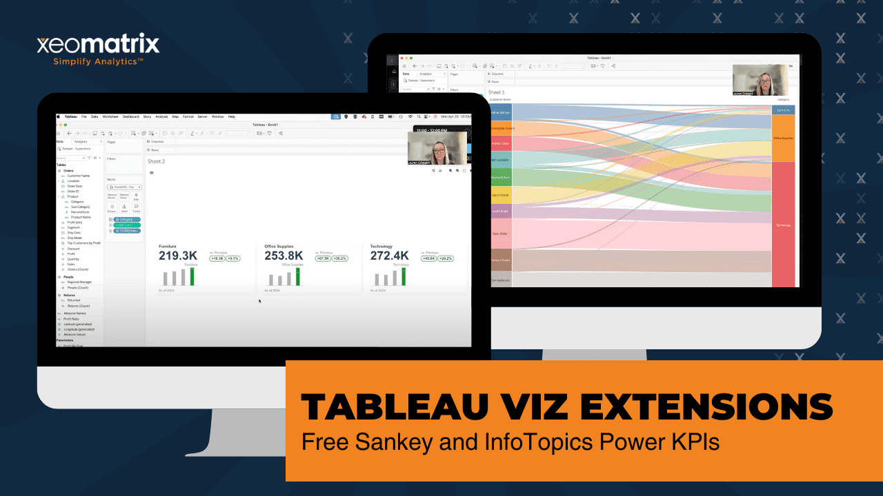
In this quick Tableau tutorial, Lauren Cristaldi from XeoMatrix shares valuable tips and tricks for using Viz Extensions in Tableau Desktop. Starting with the Sankey Diagram extension, she demonstrates how to build dynamic visual flows using simple drag-and-drop actions with sample Superstore data. Learn how to filter by top-performing customers and adjust the flow direction with ease—no complex calculations required.
Lauren also highlights InfoTopics extensions, including their Power KPI Cards, which enable users to build fast, visually compelling dashboards without needing multiple sheets or complex setups. She explains how to customize layouts, colors, and fonts, and discusses the benefits of their free and paid tiers.
Whether you’re new to Tableau extensions or looking to speed up your dashboard builds, this video gives a hands-on overview of tools that can elevate your visual analytics game.
Show/Hide Transcript
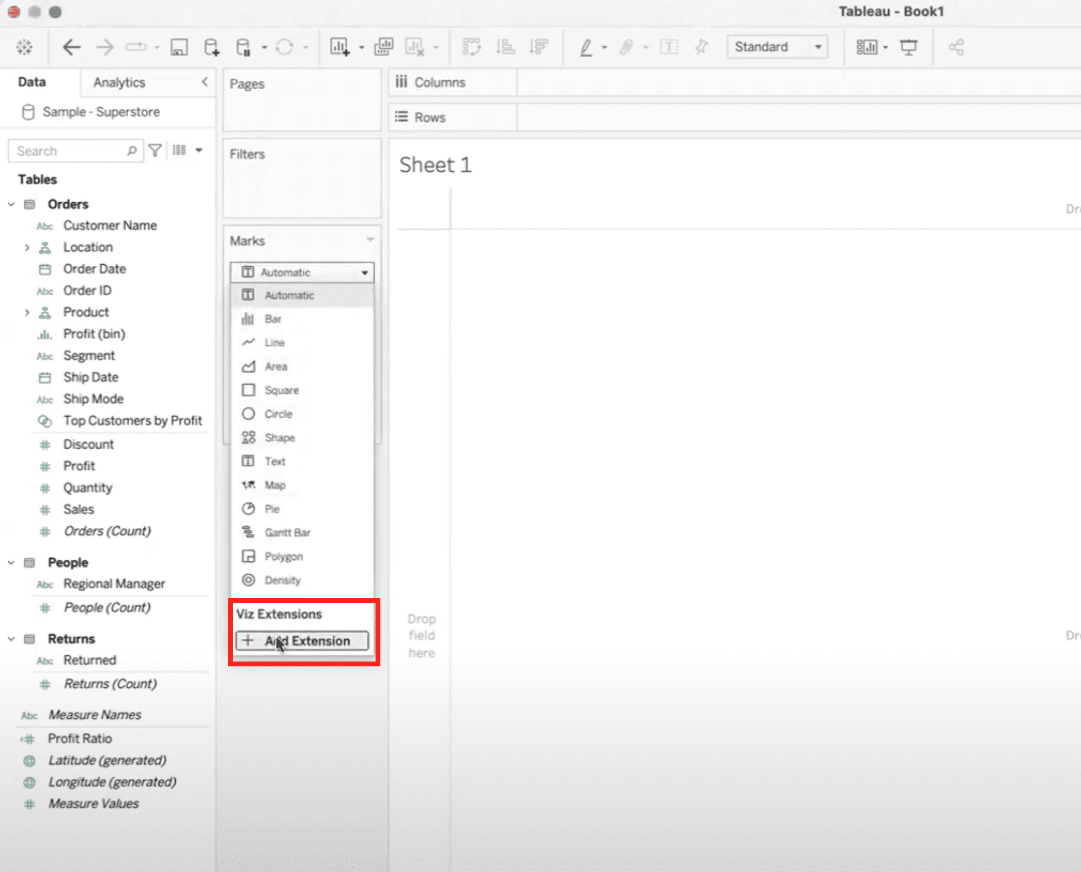
[00:00:00] Hi everyone. This is Lauren Cristaldi with XeoMatrix, and today I’m back with another tips and tricks about Viz extensions. So here you see we’re in Tableau desktop. I’m just connected to some sample superstore. If we go to our Marks card, we go to Viz Extensions, we’ll add that extension. We can start here with some of the Tableau extensions that are free.
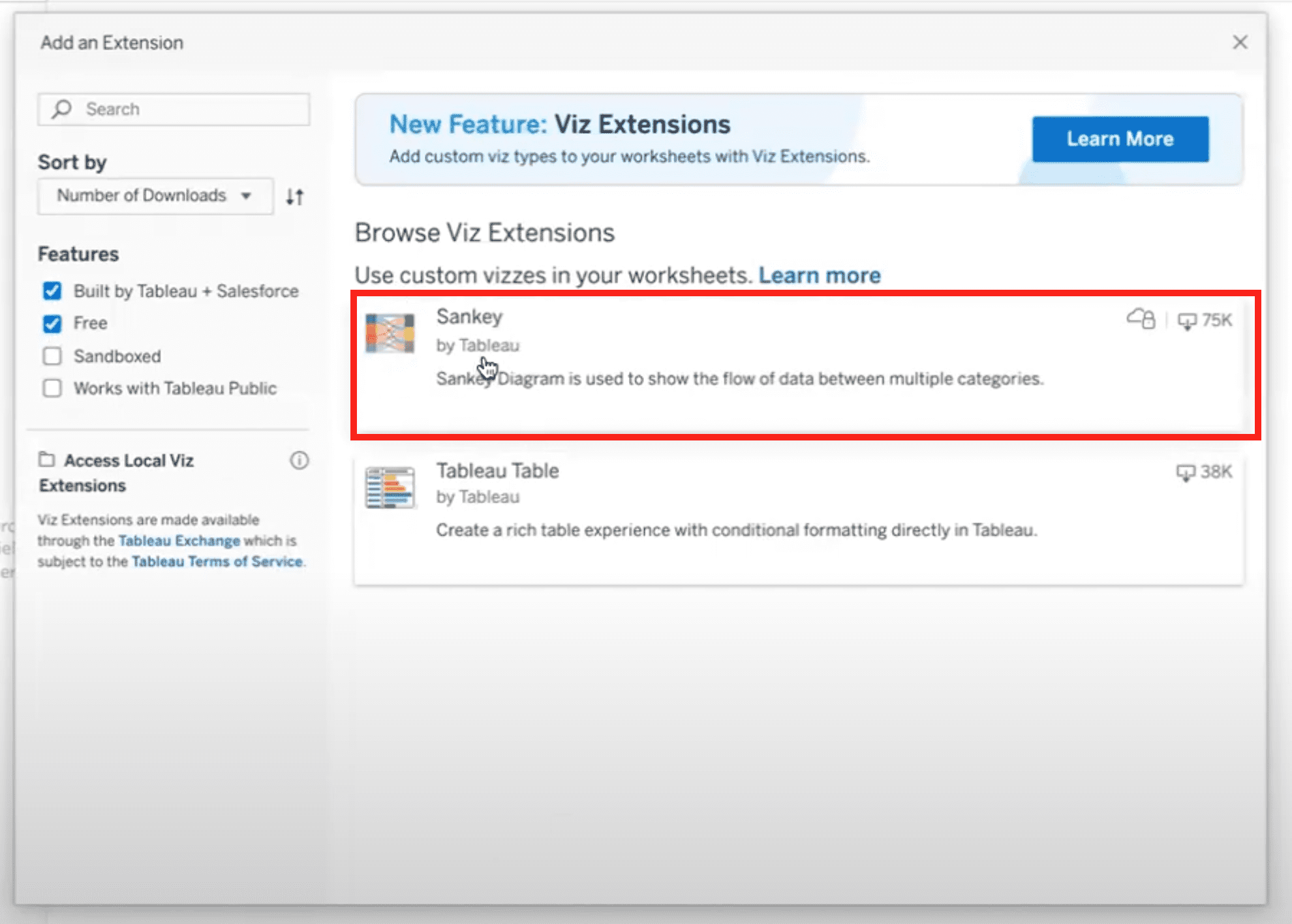
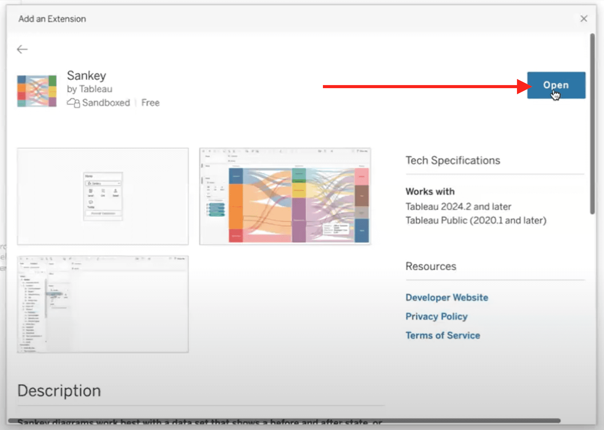
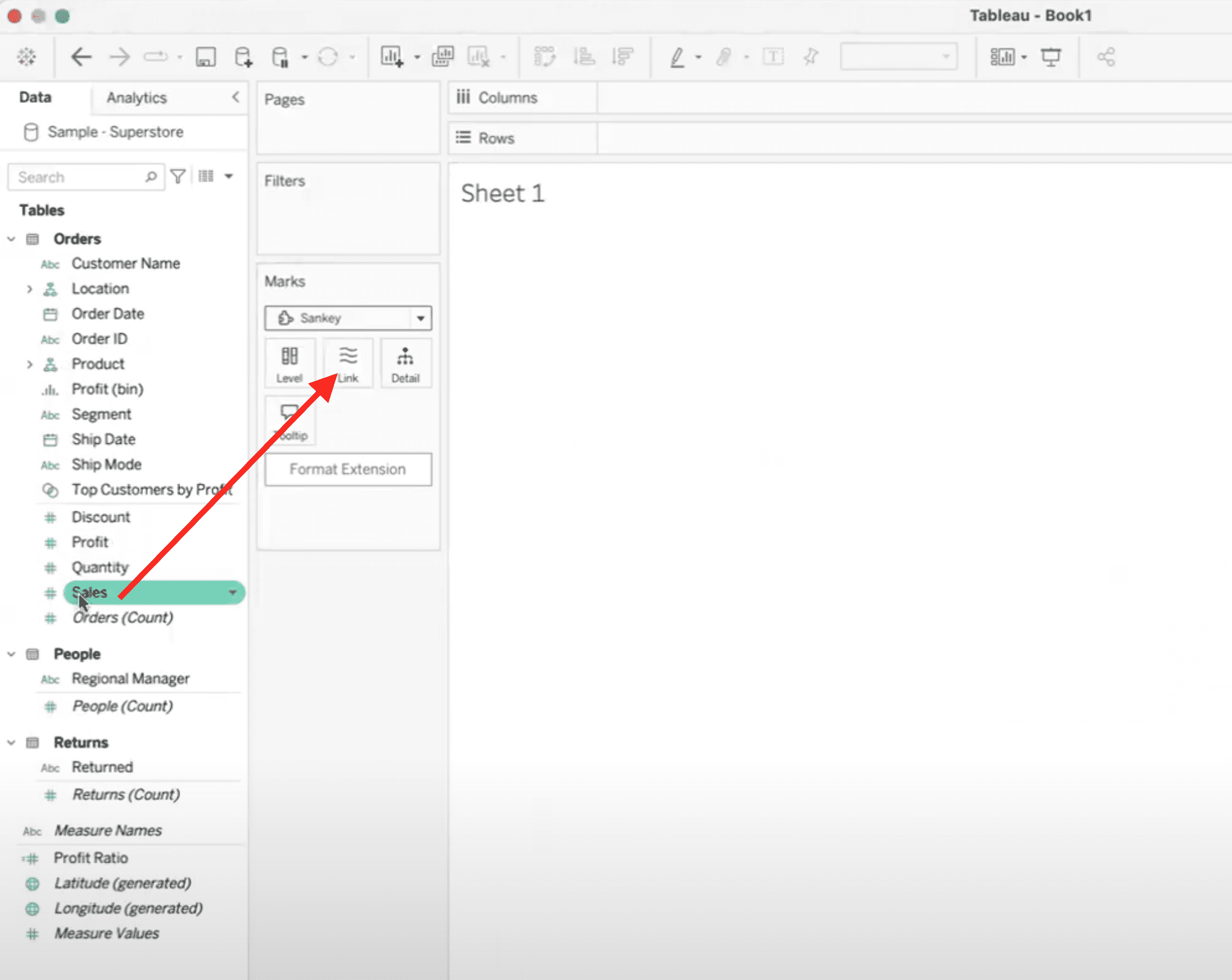
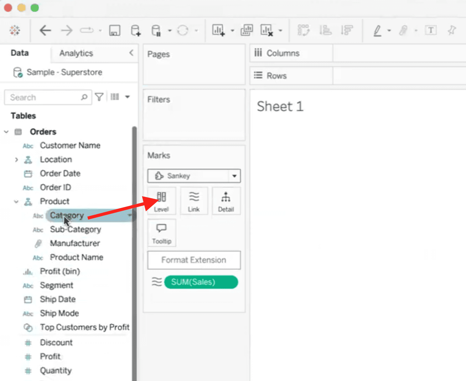
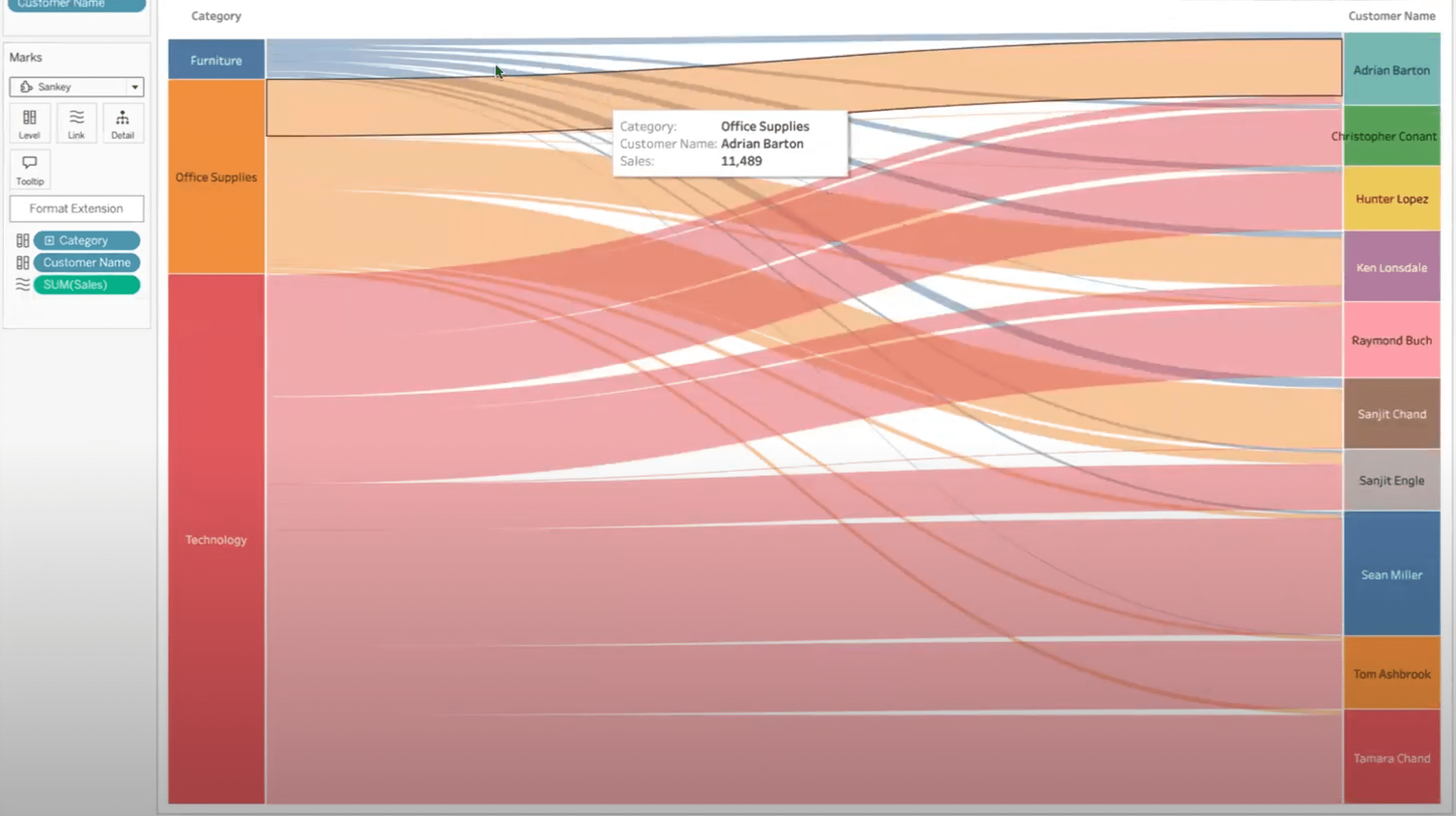
The most popular one would be the Sankey. I’ve seen that used a lot. So we select that and then open. Now all you have to do is bring in a couple dimensions for our levels and then a measure for our link. So if we link based on sales, let’s say, and then let’s do the category, the first level, and let’s try customer name for the second.
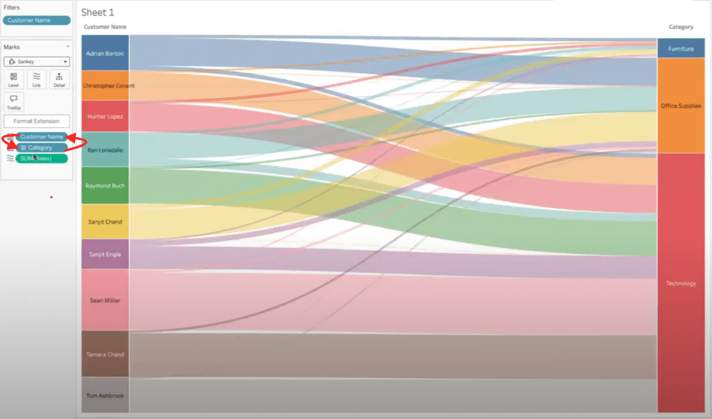
Now here we see there’s a lot of customers. So another cool thing we can do, [00:01:00] let’s go to that customer name. If we just filter by, let’s say, just the top 10 by the sales that we’re looking at, say, okay, now we can see those sankey lines going to certain customers based on the category. If we wanna see customer to category, instead, we can move that pill down and it’ll adjust the order of the levels.
And there are further formatting capabilities here. We can change the different colors or if you wanna change the, the font size or anything, then you can do that here as well. Or the padding, how the senkey is laid out. So definitely a lot easier than, you know, making this from scratch and having to do all kinds of crazy math.
Another vis extension, I wanted to highlight here would be InfoTopics. Now they are free to start, [00:02:00] but for full data capability or full capability, you would need to subscribe. And really it’s a very reasonably priced service. So highly recommend, uh, go to their website and you can view all the, details with that.
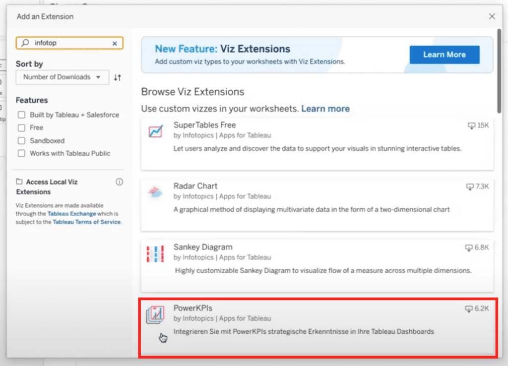
So if we go, you can see all the different ones they offer. I think the most popular right now would be like the right back extreme, which you can see more about on their website. As well as these power KPIs. So if we try out the power KPIs — we can open, and then, okay, and here you can see. Drag in, let’s do category again.
And then for measure values, if we use sales again and we just need a date, and there you go. We have these beautiful KPI cards all in one sheet, so they’re more performant [00:03:00] than usual. You know, usually we’d have to make several sheets potentially, or other calculations, and it can just take more time. But this
only took a few seconds. So it’s pretty cool. And again, we can go up here, you can format them different colors and layouts and they give you different options. It’s very powerful. So anyway, thank you. I hope you enjoy your viz extensions.
How to Add and Style Sankey Diagram Viz Extension in Tableau
The Sankey Viz Extension by Tableau is a powerful tool that allows users to visualize flow relationships between categories with minimal setup. Traditionally complex to build, Sankey diagrams illustrate how values move from one set of dimensions to another, such as from product categories to customer segments, using proportional flows.
This extension simplifies the process by letting users drag and drop dimensions and a measure, instantly generating a dynamic, interactive visualization that would otherwise require advanced calculations and custom charting.
1. Connect to Data
Open Tableau Desktop and connect to your dataset.
2. Add the Sankey Extension
The Sankey Viz extension is a free extension from Tableau.
- Navigate to a worksheet.
- From the Marks card, click the “+ Add Extension” under the Viz Extensions heading.
- Select Sankey Diagram from the list of available extensions (you may need to download it from the Tableau Extension Gallery if it is not installed).

- In the details view for the Sankey extension, click the Open button.
3. Build the Sankey Diagram
- Drag a measure to the link value (e.g., Sales).
- Drag two dimensions in from the data menu on the left to define the flow levels:
- Level 1: Category
- Level 2: Customer Name
- Level 1: Category
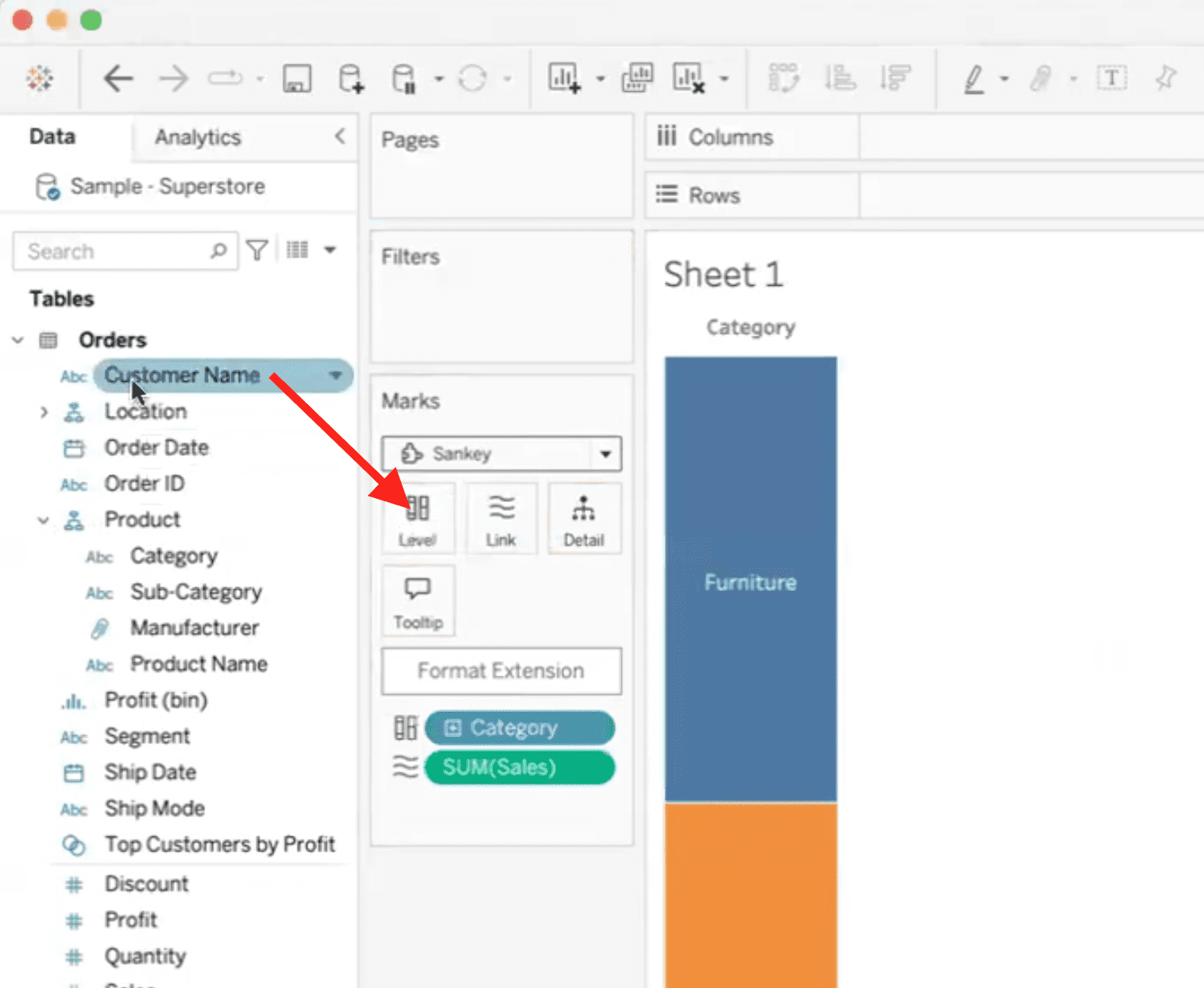
This results in a lot of customers and a data viz that is not very readable or helpful, so it makes sense to filter the Sankey viz extension to only show the top customers rather than all customers.
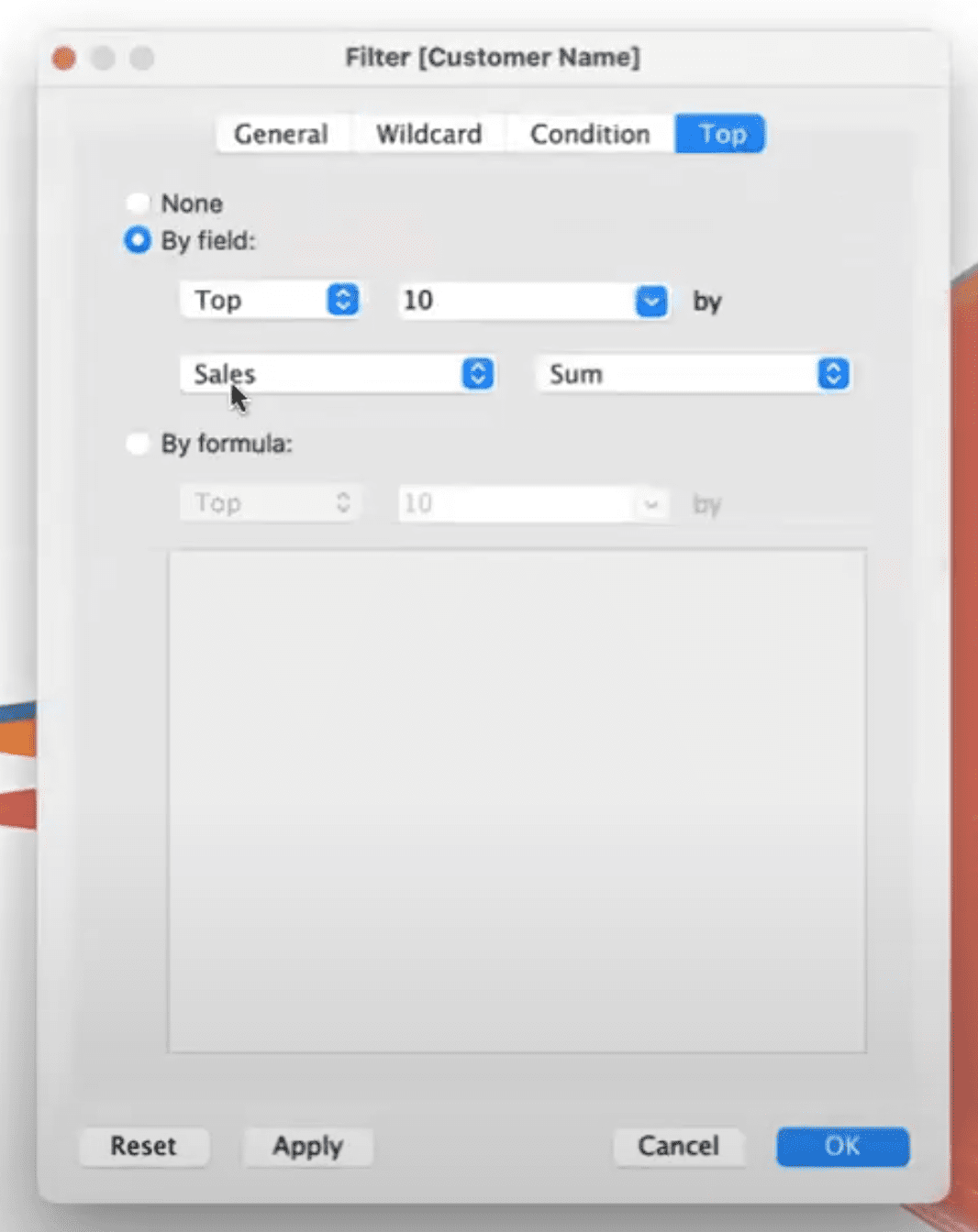
4. Filter to Top Customers
To simplify the view, filter Customer Name to only show the Top 10 by Sales.
- Right-click on Customer Name and select Filter.
- In the Filter modal, go to the Top tab.
- Select the By field option.
- Adjust additional settings as desired.
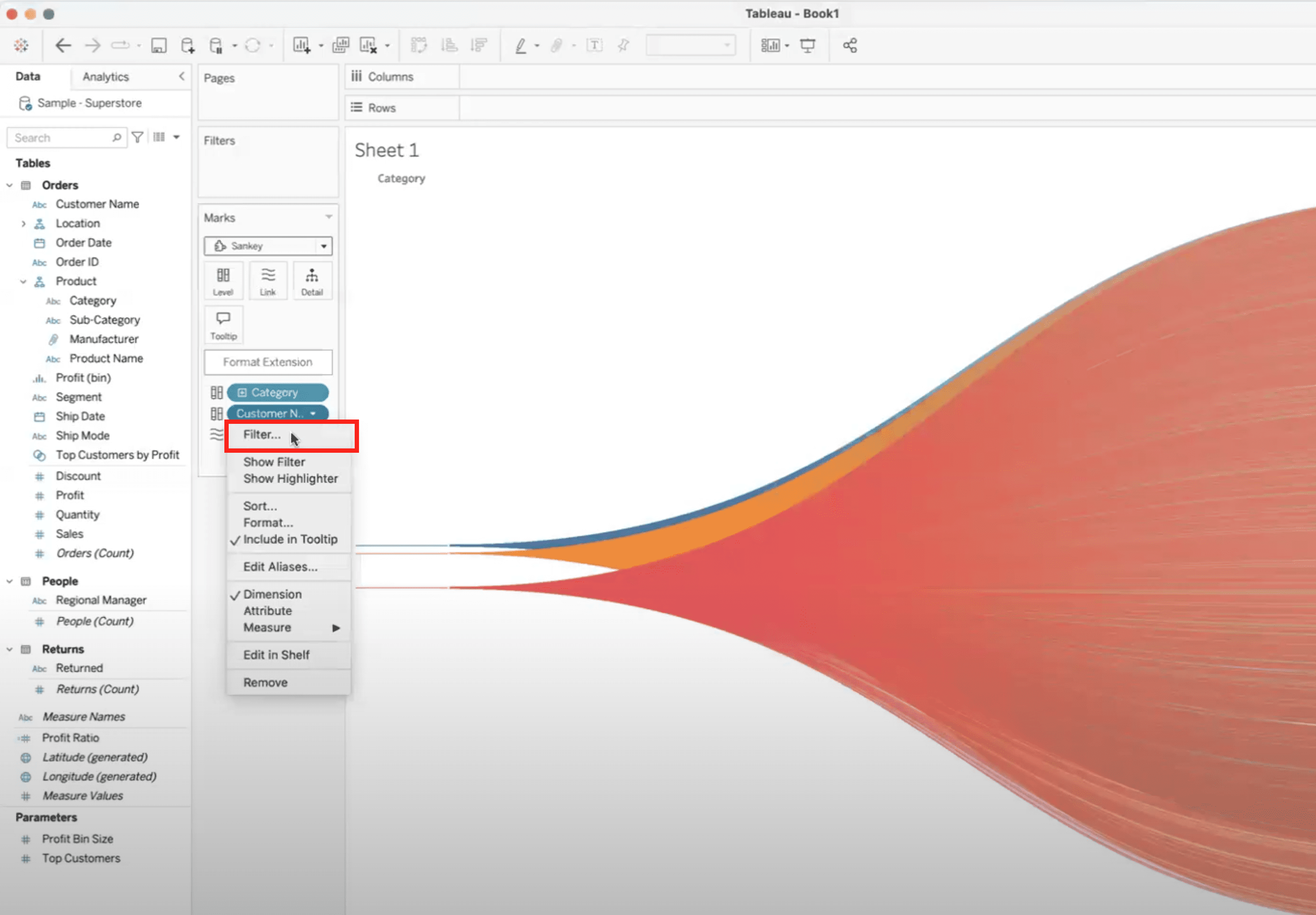
This will give you a chart that shows product categories purchased by your top 10 customers.
5. Adjust Flow Direction (Optional)
Swap levels if you want to show Customer to Category instead of Category to Customer by reordering the fields.
6. Style the Diagram as needed
Use the extension’s formatting panel to:
- Change line colors
- Adjust font size
- Tweak padding or spacing
How to Add and Style Power KPI Cards from InfoTopics
InfoTopics is a leading provider of advanced Tableau Viz Extensions designed to enhance dashboard functionality and user interactivity. Their extensions make it easy to add powerful features, like write-back capabilities, dynamic KPI cards, filter actions, and visual enhancements, without complex coding or multiple worksheets.
Many of their tools, such as WriteBackExtreme and Power KPI Cards, are free to try and offer professional-grade features through affordable subscriptions. InfoTopics extensions are built to streamline workflows and improve the performance and usability of Tableau dashboards.
Here are instructions for adding the Power KPI Viz Extension in Tableau Desktop.
1. Open Power KPI Extension
- In a new worksheet, go to Viz Extensions again.
- In the Add Extension modal, type “infotopics” in the search field to find all Viz Extensions by InfoTopics.
- Select InfoTopics Power KPI Cards, then click Open.
2. Add Data to the KPI Cards
- Drag a dimension (e.g., Category) into the Measure Names field.
- Drag a measure (e.g., Sales) into the Measure Value field.
- Add a date (e.g., Order Date) to the Date field.
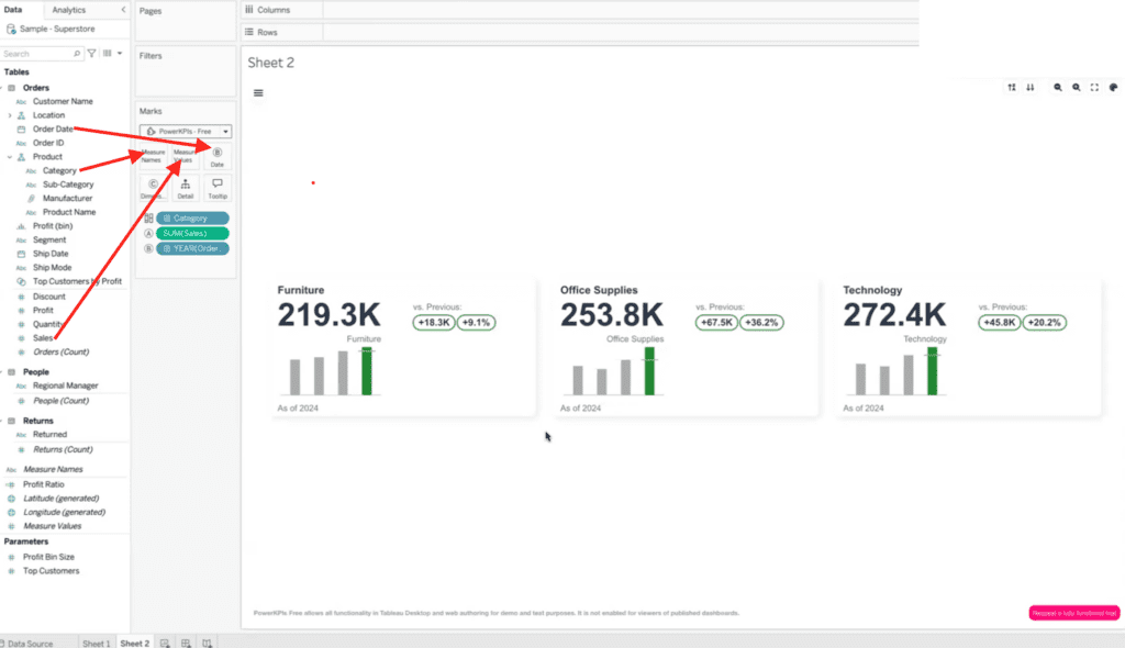
This automatically generates cards in your worksheet that show the number of sales by product category. A bar chart shows sales over time and callouts for count and percentage increase or decrease compared to the previous period are on each card.
3. Customize KPI Styling
As with the Sankey viz, you can use formatting options to:
- Change card colors
- Select layout types
- Adjust font and spacing
Have questions or need help?
Need help taking your Tableau dashboards to the next level? XeoMatrix is a Gold Tableau Partner and an InfoTopics Technology Partner with deep expertise in data visualization, dashboard design, and advanced Tableau extensions.
Whether you’re looking to streamline your reporting, implement powerful viz tools like Sankey diagrams or Power KPI cards, or build a scalable BI strategy, we’re here to help. Get in touch today and let’s elevate your data analytics together!