
Tableau and trusted Gold Partner XeoMatrix had a hybrid event on June 22nd, 2022 where they talked about how peers are using Tableau to improve business outcomes, and the latest updates from the Tableau Conference 2022, focusing on Workbook Optimization & Data Narratives. XeoMatrix also demoed how they are helping a local government facility become more data-driven as they undergo digital transformation projects.
If you missed the live webinar, read the transcript below. If you have questions about what was covered in this event or would like your organization to jumpstart a more data-driven system, please contact us here.
Read the Transcript
Tony Novak 00:12
Good morning everyone. My name is Tony Novak with Tableau. Thank you for joining us today we’ll have some late comers. Thank you, everybody that’s on virtually we’re gonna get things started on time. Because I have a feeling with the content that we have for you today, we’re probably gonna go a little bit over. With that, our agenda. We have Harris Health joining us today. I’ll let them introduce themselves when they come up. Along with principal engineer for Tableau to talk about some of the latest and greatest comings with Tableau, along with a partner to talk about what Tableau does, or Tableau blueprint and how we help organizations kind of see the art of the possible as it relates to their data.
Tony Novak 01:04
The meeting format, please disable your audio, and video, right. Make comments in chat, use that for the questions. We’ll be doing a q&a at the end. And yeah, please post your questions in the chat. I’m getting ahead of myself. With that. And I’m only 30 seconds in. I feel like I should have more to talk about. All that being said, folks, thank you for being here with us today. I’m going to pass the baton to Harris Health and let them introduce themselves and their journey.
Aruna Bandaru 01:46
Good morning. My name is Aruna Bandaru. I am the IT Director for Reporting and Analytics at Harris Health. Thank you, Tony for giving us this opportunity to present today. We’re going to talk about how we have implemented Tableau in our organization, the challenges we faced, and some of the success stories we went through during COVID pandemic implementation. All right.
Aruna Bandaru 02:22
Let me go ahead and introduce my team. I know my boss just joined us in the conference room here. Mr. LaJuan is waving his hand. You guys cannot see him, but he’s here on the screen. Today we are we have four presenters. Glenn King, who is our Epic Analytics Lead Developer. LaJuan Moore, who is our BI Business Analyst, Data Architect. Alex Chen, who’s our Epic Analytics Developer II and myself Aruna Bandaru, IT Director.
Aruna Bandaru 03:01
Today’s agenda, introductions, who we are. Then we’ll walk through the service lines and how we rolled that across various service lines along with the challenges we faced, our success story, and then how we conduct our monthly user group calls. Alright. So jumping to page three here, which talks about who we are.
Aruna Bandaru 03:30
We are a healthcare organization located in Houston. We support Harris County patient population. We are also affiliated, a teaching system affiliated with Baylor College of Medicine and UT Science at Houston, UT Health. W have two big hospitals that we support, one is Ben Taub, and the other one is LBJ. Ben Taub Hospital is located in Houston, Texas Medical Center, it’s level one Trauma Center, it has about 402 acute care beds. Then LBJ is level three Trauma Center, it’s about 215 licensed acute care beds. Well if you ever get shot in Houston, the first place you they will drive you is to Ben Taub Hospital. Right.
Aruna Bandaru 04:32
We also have about a 50 plus outpatient clinics. So on the right hand side, as you see they’re split into community health centers, same day clinics, multi specialty clinics, 2 school based clinics. We have several dental and dialysis centers, mobile health unit, ambulatory surgical centers as well.
Aruna Bandaru 04:58
We also have several affiliates. We support jail systems and it’s not presented but we support jail systems, Harris County Jail systems, we support Harris County Public Health. We also support Harris County, Hadley center systems as well. So we are like a hub for these affliate centers, where we, we provide the EMR services as well as our data services. The majority of population, we serve our uninsured population. So we are a nonprofit organization. We are funded by Harris county tax dollars paycheck is coming from tax. All right. Moving on to the second page. Here, I would like to share some of the challenges, you know, that rephase as a public sector and a nonprofit organization, where we have limited resources, limited funding, demanding stakeholders, and a good amount of patient population where we want to bring value to. So when we implemented Tableau two years ago, we had a proof of concept model. We did not have enough budget. We started off with like two resources. We could not effort server base or call base licensing. So we went on with user base model. So we had to buy individual licenses, individual creators, viewers and explore licenses to keep our budget to minimum and custom minimum.
LaJuan Moore 06:50
And then we started off, you know, at one time, we had like 21 service line reaching out to us, Hey, how can we have Tableau services implemented? And the projects that dashboards that came into our roadmap development roadmap were like about 99 projects? I’m not kidding. And everybody wanted to deliver all the projects at the same time. So I had literally two resources to go go along to deliver this. Okay, so how did we go about facing these challenges? Next slide. So we had to do implement several things, from processes, people and tools standpoint. First thing, first is establishing a Data Governance Committee, I would say data governance, establishing the data governance was key for us to seam line our request and have a prioritization processes in place. You know, my boss is in the room, he was the main champion for this. He was going out there identifying the operational champions in all the 21 service lines, identifying who we can work with and who can be part of the data governance committee that can establish this prioritization process. So we found a model called hub and spoke model, where it is the hub, and the service lines that we serve, where we are getting these development requests are the spokes.
Aruna Bandaru 08:31
The model that we have developed is we the goal is to enable our service line smees subject matter experts to become self sufficient in Tableau creation of dashboards, so we enable them to become creators. Instead of the two team members, the two resources during the entire dashboard development, we tried to enable our service line, SMEs to become their own developers and their own champions. So the second piece is from people standpoint, we have engaged professional services initially to do Tableau server implementation, for a very minimum budget. And from user adoption perspective, we’ve trained creatives in each service line to handle their expected dashboard development.
Aruna Bandaru 09:28
We also conduct monthly user group calls where we do ongoing training, and we create a platform to educate and share our knowledge across all service lines as well. Some of the tools that we implemented way in the initial rollout of Tableau itself is we, we stood up Tableau enablement website, where we’re going to go through in details and how we stood up that site. We posted the frequent FAQs, like what is the cost of creators versus what’s the cost of if you was licensing, not only that we also published development standards, architecture, standard security standards, we also publish, post How to videos, you know, any videos that we thought would be good for creators, viewers, and explore us on YouTube, we will post those links as well, that will enable our customers to go through and do a self service training as well. So the goal of the entire process is for us to stand by hold their hands in this journey, and grow them organically, and not to do the development for them. So develop having those development standards, publishing them on our Tableau enablement website tremendously helped as well. So these are some of the approach that we took. The next slide, I’m gonna have Lavon go through our project implementation that we adopted. Go ahead, LaJuan.
LaJuan Moore 11:15
Well, good morning, everyone. So one of the things that we did as we were began, our implementation was to develop a standard rollout plan. And so what you see on the screen right now index is an example of that plan, where we reached out to each one of the operational area champions and stakeholders. With each service line, we had an estimated timeline of three weeks, where we met each week and gave status updates of where we are with each one of the tasks that you see listed here. Some areas took a little longer than three weeks, some were a little shorter.
LaJuan Moore 11:52
But what we done what we did through those meetings, where we reviewed questionnaires that were distributed out to the Operational Area champions. And so using this questionnaire, we were able to identify their needs, their users how many licenses they may need, or they think they would need, we were able to identify what current data sources they were using and how they were currently developing their reports and things of that nature and how we could transition those reports and that content to Tableau. Also during this process, we were able to create active we Active Directory groups, I’m sorry, create groups in Active Directory. By working with our IT operations and identity access management teams, we curated project folders within our test and production environments. We met allocated licenses to users who were identified during this process, we ensured that software was installed manually for those users who need it creator licenses.
LaJuan Moore 12:59
We wanted to make sure that as they start to begin their development, they have the necessary equipment to do that. So we wanted to make sure that they had all the necessary equipment installed on their PCs. Also, on our Tableau enablement site, we provided access to tableaus training materials so any user could go out. So this enabled me to SharePoint site and access this training where before explore to ater, or viewers. Again, as I previously mentioned, we identified their data sources and dashboards, we walked through each service line once they got to that point of how to upload their content or publish that content to the service through our testing environment. In our testing environment. There are four stages if you will project folders, you have the development, you at certified production and ad hoc. So once our users got to the point where they want to publish their content to our production environment, we made sure that they migrate their content through our approval process on within test environment. And once they got to their certified production forwarder. That let us know they were ready to move their content over to production. And we work with them to migrate that content over.
LaJuan Moore 14:26
Next, as Aruna previously mentioned, we have a total of 21 service lines that we currently have implemented. And those service lines are listed here, one of our top users or some of our top users as quality programs, human resources, our finance department. We also have compensation, ERP systems, identity access management, organizational services, utilization management, ambulatory care service and population health, financial services, health science and data services. effects and prevention, Information Technology Laboratory, a pharmacy services, project management, business development, transitions and post acute care, decision support services, finance reporting, and analysis, disrupt, and risk management.
LaJuan Moore 15:23
All right, I’ll turn it back over to Arun at this point to speak on our success stories during our COVID journey.
LaJuan Moore 15:35
I want to really quickly touch base. You know, when we implement these level of service lines, we started off with 25 users and then we organically grew to 366 users today in production environment. You know, one of the challenges was to maintaining the security of these users as they come in. It was getting a full time FTE resource to add these users delete these users when they quit the organization.
Aruna Bandaru 16:08
A lot of the information in hospitals is PII information. So we had to set up security architecture in a wave, the roles belonging to PHR, again, only cphi information in order to align with HIPAA compliance. So, the way we we went about doing it is we integrated with a system called IAM, which is identity management system that allowed us to, to streamline our approval process, capture audit logs as well as access management as well. So with that implementation, our resources from full time when to 01 to zero, so literally, everything is automated, based on ad groups and approval process through Iam integration. Okay, so the next slide is talks about our success story COVID journey, during pandemic, so, right about in March of 2020, when, when we were told that, hey, guys work from home from tomorrow onwards don’t cannot come to work. And everybody was like running especially we were hit hard from a hospital standpoint. You know, we got report requests from ref and light to provide COVID population data set across hospitals. So I don’t know if you guys knew TMC CEOs meet up every witness day. And they talk about that a need for Texas Medical Center. And they have reached out to my leadership and asked how do we how do we collect the COVID data population in TMC area so we can plan and manage our bed ventilators labor and medical capacity. So if that way the patient population can be managed. And these supply chains can be managed as well. So when they came, when they reached out to us, it was a a project.
Aruna Bandaru 18:19
We haven’t done a bigger project at this level of bandwidth in the past. And, you know, we reached out to about six hospitals in DMC area, Houston, Methodist, Texas Children, Baylor and UT Health, and St. Luke’s. So we collected the information. And also MD Anderson was part of this data collection information. So believe it or not, my boss was running around identifying the contacts, the data guys in these hospitals that can provide us the data. So we are the data warehousing team. So we were trying to reach out the other data warehousing teams in these hospitals that can provide these data feeds, which has patient pH, patient information, vaccination information, patient testing, status, COVID. And then age and all kinds of information PHR information as well. So so we we engage these hospitals, not only from a data, data teams perspective, but also we had to reach out to the corporate compliance of all these hospitals, and have you a contract signed. So everything happened within three weeks. That compliance was involved, the data teams were involved so that data sheets can flow from these hospitals to Harris County. They were trying to do an SFTP transfers first day by 8am in the morning, so we get like see exe files from each of these hospitals that has COVID population and vaccination information.
Aruna Bandaru 20:09
In our data warehouse, we try to create a consolidated data, data, the tables for COVID data sets that included COVID information from across all hospitals. Once we had that data collected streamlined, and we had to do lot of normalization as well, we established or created Tableau visualizations on top of the data. So we we could create the story that we could tell for our represent that story to our CEOs. And then that information was again, trickled down to their hospitals in order to manage their beds, ventilators, labor and medical supplies. Well, that data was also sent back to Harris County, as well, as well as CMS through our federal portal as well. So that’s kind of a success story, we’re gonna walk through some of the dashboards that we created. And believe it or not, we did the entire project development within a matter of three weeks from end to end. And we still send these reports out today to TMC. And as we receive feedback, when we started back in March, we had to go through several iterations based on the feedback from each of the CEOs on what information they needed. So it was several iterations it was it was done in very agile fashion. And it’s still being used today. Hey, Glenn, can you hear? Us is he able to present today?
Glenn King 21:59
I can hear you. I don’t know if everybody can hear me. Hear me?
Benjamin Goodman 22:12
We can hear you. We’re getting set. All right. We’re all set. Go ahead.
Glenn King 22:30
So do we have volume now?
LaJuan Moore 22:33
Yes, we can hear you Glenn.
Alex Chen 22:38
The first project that we undertook with Tableau was to do the CMC partners COVID-19 dashboard. And what started out as a limited proof of concept when COVID quickly became a full enterprise implementation and aromas and talking about here and within. Within three months of starting the POC, we started rolling out Tableau to the various service on adding, adding disk space and memory as we went. We did the rollout by service line department and functional groups. We still have a few groups of users that may not identify as a service line, but are still looking to come on to our Tableau platform.
Glenn King 23:35
When we did the TMC partners dashboard, we met with the Texas Medical Center partners, which we had six of the eight partners participating. We identified the data that we needed to capture, or we shared data through SFTP, extract CSV files, both into our system and out to our partners. obvious that there were benefits of sharing data with our partners. They were very collaborative in back and forth with us through our CEO, Dr. corsia and provided a lot of great input as far as what they would like to see formats and that sort of thing. And we also were able to share our data with Harris County, the mayor’s office, judge had downloads office, and we use that information to also manage the COVID spread and demographics. Went through database design.
Glenn King 24:57
Some of the more important data points were are obviously zip code. So we could do geocoding, the zip code maps, patient and age, we did a mash up of patient race and ethnicity into a race and ethnicity group. Because, as you all probably aware, race and ethnicity are not necessarily the same across your population. We also included facility, the labs that were doing the tasks, the lab result, and both collected data resulted. From that process, we also went through data transformations where we transform some of the the data type names, different groupings, as I mentioned, the race and ethnicity group, we actually perform ETL to do a crosswalk between race and ethnicity.
Glenn King 26:10
We came up with a standard Group of Seven or eight that our management wanted to see. We also did geocoding. And you’ll see in a minute when I get to the actual visualizations, but we brought in the US Postal Service, zip code data, use the zip five and we also brought in the US Census, the current population data by zip code. And you may or may not be aware of the census areas do not necessarily conform to specific zip code. So we needed to work out what zip codes were in a particular census, population polygon. We looked at Community spread for Harris County, the greater Houston metro area, and even had some visualizations for the entirety of the US.
Glenn King 27:21
We did also a density calculation where we took the percentage of the population or by zip code in those regions that are mentioned above. While so we’re able to look at employee vaccinations in the process that was done there for determining first no second dose third dose whether or not our employees were complying with the necessary mandates. As I mentioned earlier, there are multiple extracts both daily and weekly. We export data to our TNC partners, we export our vaccination data, also information that goes to CMS, some or Excel extracts.
Glenn King 28:19
And then there are weekly Medical Center extracts that also with visualizations, we then zip code, heat maps, to trending charts, bubble charts, stacked bars, just about any visualization you could think of we use at some point. The initial block of 29 visualizations, we chose a subset of A Perona. Can you go to the next slide, please? And then I also created a video showing the weekly spreads. So we took a snapshot, a weekly snapshot of the zip code map and created a video where week by week if you watch the video week by week, you could see how the density of the positive test progress. We did we partnered as we mentioned with the other Texas Medical Center organizations, we collected our lab testing data, the basis for our fact table or the the center of our distribution was really around the patient lab tasks on for COVID.
Glenn King 29:53
There’s also LS and for some reason that seems to have been chopped off but our project sustaining partners, as a runner head mentioned earlier for Houston, not the best Memorial Hermann Baylor St. Luke’s. Yeah, so skewed a little bit. But what you see now is the initial book of reports was 29 visualizations. And as I mentioned, eight of those were chosen by Dr. Parsa, and the other executive partners as to what ones they would want to see on a daily basis. Next slide, please. Those eight dashboards, go out to our executive partners through a subscription service every weekday morning. It started two years ago and continues on to this day to be a daily report. There’s a cover sheet that you see here, where we talked about data latency for each of the organizations, Harris health being essentially one day behind. And then because of the slpp process, and the timing with the partners, most of the other partners were, the reporting was two days.
Glenn King 31:32
At the bottom there, you see our data load doses to do a full load daily, and we capture the previous day’s total. So that when we get today is total pass, we then look at the Delta to determine Okay, well, how many tests did we get from parents health. So in this case, at the time this snapshot was taken, Ferris health was 303. Memorial Hermann was 1300 80, and so on. So we know at a glance on the cover sheet, how much data new data we got from each organization, when this report goes out, they can see you know what their contribution was two days.
Glenn King 32:27
Next slide, please. So this is the first of the zip code maps are actually within this total dashboard, that goes out are actually three heat maps, all using the same color scheme. The higher the the counts are the percentages, the more red or the hotter. The view, rents will obviously, the lower the counts are percentages from the cooler the others. This particular view is showing TAs and this is total tabs by postal code. Each of these maps or views also had filters that would allow you to select the source. So if you were St. Luke’s for instance, you could, you could select just the St. Louis source, and then the other filters would cascade accordingly.
Glenn King 33:42
So if you looked at laboratory, and you were only in St. Luke’s you would only see the St. Luke’s laboratory locations under laboratory. If you wanted to slice by laboratories, then you can see what a specific laboratory within the same room was contributed the ethnicity, again that that goes to the patient ethnicity that’s listed at the time of the task. Race group is where we combined the patient’s race with the ethnicity to come up with a set of eight standard values. And one of the views will show how that breaks down in. We also looked at test status where we had test status that we transformed. Everybody kind of reported differently detected not detected, positive number of different values. We were able to transform those into either not detected before. Are there. But you could also slice this particular view by while status status, excuse me is either completed or not completed. So, Tesla’s was resulted, then it was completed, successfully resolve was either detected, not effective. So we transform those into either positive or not. patient age. In in filter, we’ve got specific drop downs, if you want to look at age by group, we have some standard grouping that we did, and I’ll show you in a minute. And we also did some custom groups that Harris County and that divorce had asked to have for age groups. So we could see the the spread by the different age groups. And as I’ve mentioned a little bit earlier, we also have a collected data for the for the lab specimen, and then the result, the date of the test around
Glenn King 36:13
Next slide, please. So this is this is kind of a control panel for tests. Can you make that a little bit bigger? Alright, here we go. So the very top panel shows a percent of positive test daily over the cumulative percent of positive tests. So you could see that that what the percentage of positive tests were over time, and this, this is for every one of these views in the last 60 days, but over time, and you could see whether the the cumulative percent is going up, which it normally is. And if the daily percentage of positive, also increasing or decreasing, then depending on the point in time that we were at, you could see where surges in positive tests occurred. And that sort of this particular screenshot was from the 15th was about a week ago, as you can see, we’re, we’re climbing back up, we had steadily been decreasing the feathers in the second, the red panel shows positive tests over cumulative positive test, which is test count versus that percent, which is above. And then the bottom panel just shows total tasks over cumulative. So you can see my day for the last 60 days. Next slide, please.
Glenn King 38:10
So this is just a stacked bar that shows by partner what their tasks total, fast versus positive, or are not detected versus positive. So you can see the numbers for each source or each participating partner in this list. And annual pie chart tops tend to look at the top tower that shows the percentage of total positives versus so not the next slide. So this is where we got into talking about or showing the race groups you can see on the right hand side, these were the groups that were chosen by our management. And then we were transforming the data that comes in from all of our partners to fit into one of these groups, anything that that didn’t fit into one of those groups fell into the Some Other Race bucket. So this is actually race and ethnicity. And you can see on the left hand side, we initially were looking at patients over 65 patients under 65 and then total unique patients. And that’s the beginning of the pandemic.
Glenn King 39:55
The thought was that patients over 65 was the most at risk group. It was determined after looking at this for a little while that what they really wanted to see was more of a, an age range breakout. So on the right hand side, we did age ranges, far zero to 1920, to 3940, to 5960, to 79, and then over 80, and you can see how they perform, as well as, you know, the race for those age groups. Now, next slide, please. So some other development, that’s that’s our main COVID Medical Center partners. workbook. Some other development that was that was done in I believe, one had alluded to this a little bit earlier, was employee vaccinations. So we look at how employees were faring as far as adhering to the mandate. So have you had your first cells have you had your something knows who’s the manufacturer, and those sorts of things as well as regular heat now in zip code, heat maps for that data.
Glenn King 41:31
And then the next slide, we have a group in our finance department wants to look at it in patient data for COVID patients. On the left, we have the average length of stay by race for and on the right, we have the fatality rate with a number of different top 10 zip codes for fatality rates, fatality rates by age fatality rates by race, gender, type of employment, and then within it is by failure.
Glenn King 42:19
That is the development effort that we put for for COVID ad is ongoing. As we speak, nothing has been stopped. At this point, everything is still continuing. And I think given the recent rise again, in positive cases, we’ll probably a good thing that we’re still. And that’s all I have as far as the Texas Medical Center COVID-19 project that we did, and I think Elon was going to turn it over to Alex. Now let’s talk a little bit about our user community.
LaJuan Moore 43:08
Thank you, Glen. Alex, do you want to speak up?
Alex Chen 43:12
Yes. Hi, guys. This is Alex. As for the user engagement, can you guys hear me? Yes. Okay, that’s for the user engagement, we have about four main points that governments are a tableau user group call that we host every month. These four points are goals for a monthly user group. And that entails mainly our goal for the causes to provide a platform for users to share, and transfer knowledge for productivity and internal growth. Another point is, we are engaging customers to present their success stories, so we encourage them to volunteer every month to share the developmental build, that we can help others in similar workflow practices to provide tips and tricks and PowerPoint topics we have covered.
Alex Chen 44:05
We can tell meetings, presentations and other content in our Tableau enablement SharePoint. in data science, what loop repositories some of the topics we covered already are quality, quality analytics, pharmacy, and data finance, have successfully adapted and using Tableau and showcase their success stories and these use recalls. And lastly, we have breaking changes and feature updates by providing training education for current version changes, as well as review feature updates that we’ve we’ve encountered with our community can be aware. And the next slide here, just two screenshots on the left, we have the current version change for Our desktop and account list are the future updates, we will go over with our community.
Alex Chen 45:06
On the right hand side, we kind of talked about the table Tableau in a moment. That’s the first screenshot provides FAQs, onboarding process, and anything, any information that any new users are deciding to join Tableau, we kind of dive into that. Tableau enablement site. And then the other part is our Tableau SharePoint. Every user call we have we record this session, so that anyone later on onboarding would choose to go back to review in a because they have that access and resource. kind of went through that fast. But that’s pretty much all that we do for user engagement. I guess we can open the floor for some questioning.
LaJuan Moore 45:55
Thank you, Alex. That concludes Harris Health System presentation. Tony, do you want to take question answers now or towards the end? Okay.
Tony Novak 46:10
Okay. So before we move to the next spot, folks, if there’s any questions and answers, if you’ll put them in the in the queue, we’ll respond or have Harris health respond accordingly? If not, we’ll give it a couple of seconds here a few seconds here, see if anything shows up. Thank you herself. That was beautiful. I love your journey. Okay.
Tony Novak 47:12
Yeah, I think the question was tips regarding establishing governance. So, you know, we really leveraged heavily, a very formal charter, that all the groups developed together, we lead the initiative, and came to agreement on the purpose of governance, the activities of governance, really the whole structure of the committee, and then commit to it, you know, commit to that meeting monthly every two weeks. And, you know, just practice good meeting, management skills, have your topics, have your presentations ready. And then I think that you’ve got to decide, when it comes to data governance, all agree that it’s about data, and tools, there’s a tendency and a temptation to move into a lot of minor reporting initiatives. That’s not necessarily the purpose of an executive Data Governance Committee, like we have. So it’s really strategic type planning, and discussions. So yeah, I really think it looking back on our journey, that charter, we leveraged and we reviewed, every single meeting, not the entire charter, but our our whole purpose in our articles said help.
LaJuan Moore 48:57
And now, so, as part of training process, the first thing we did was we established training pages on our Tableau enablement website. So, the first thing we do as part of onboarding process, we meet with the stakeholders, we identify the subject matter experts in that group, who are a little bit tech savvy and has the business knowledge to create dashboards and then guide them to our onboarding Tableau enablement website where we have documents on how to create basic dashboards how what are the development standards, how to migrate data from test to production? How do we go about architecting these dashboards so we have created several guidelines we did that initially itself during our implementation process. That way, all the service lines across the organization followed the same development standard.
Aruna Bandaru 50:00
So we also publish a template that they can leverage and start developing from so all our dashboards look alike and across the organization as well. So, we do also do like one on one sessions with them. Initially, we guide them to lot of YouTube videos, when they’re getting started. We also, you know, when, when it gets to a point where they want more advanced skill set, we we guide them to Tableau self service learning tool that’s available out there, it’s not that expensive. It’s about $10 per month prescription and, and we encourage our partners to our customers to enroll into the self service learning tools that are available on Tableau website, to prescribe for those learning tools. And for at least a couple of months, three months and get certified in developer as a creator or advanced analytics as well. Did that help the crusher? Okay? Right. All right, do you want to take that he’s more expert on that.
Glenn King 51:37
So one of the first things that we do when we are beginning to develop a report, we have to meet with our end users to get their specific needs, their requirements, and we kind of jot all that down. And then we’ll go back and start working on our development part, we may need to connect to other data sources, or maybe just work with them on getting those files that are needed, if we can’t connect to a system that can provide us with those extracts. And we just basically go back and we just start our development work. When we do that whole process, you have to keep close communication with the customers so that we can develop the product that they need, and it’ll be beneficial for them. So did that answer?
Aruna Bandaru 52:38
So next step is Mr. Ben good. Oh, there are questions on the chin. My Ben. airstones
Glenn King 52:54
A questionnaire about him go on can probably speak to that. What about HIPAA, and data security? Can you discuss? Hold on, hold on?
Aruna Bandaru 53:10
We’re going we’re going through them right now. We’ve got them up now. Or? And if that’s another question, please put it in the chat. And we’ll respond to it’s really hard with, with this being both hybrid and virtual from from a demo standpoint. But yeah, Ben Goodman is going to Ben Goodman is going to go through the questions herself will respond. And if there’s other questions, please put them in the chat. If you don’t mind folks.
Benjamin Goodman 53:41
Come up here in front of the mic so everyone can can hear the question was to herself, how much compute resources do you have dedicated to your tableau environment? And are there any initiatives to move to Tableau cloud?
Glenn King 54:01
Let me address that. Aruna. Yeah.
LaJuan Moore 54:04
Go ahead, Glenn. Yeah, essentially,
Glenn King 54:06
right now we have a test server and a production server is budgeted for a sandbox. Now server as well. Each of those servers have a VM where server and have they each have eight cores and 32 gig of RAM. There have been some discussions about cloud movement, but primarily at that time, it was moving about moving to AWS. My feeling right now is no there’s not an initiative to move to the federal cloud.
LaJuan Moore 54:59
Right So I believe in both our test and production environments, it’s it’s a two node environment, correct Glen.
Glenn King 55:11
That’s correct, we have, we have our primary node, which is where our all of our Tableau Server runs. And then our secondary nodes on each server is for PrEP conductor Minerva.
LaJuan Moore 55:36
And we also like here live, we conduct a health check, we engage Tableau folks to do our health check to ensure the organic growth and, and the workload that we are putting on servers is well balanced. And if we need to adjust more cores or CPUs, we try to budget for that coming year as well.
Benjamin Goodman 55:58
All right. Oh, yeah. Yeah, the the other question we’ve got right now is around HIPAA data. So, from from Nancy, law, all the information what about HIPAA data security? Can you discuss that?
LaJuan Moore 56:15
Sure. So, as I said before, most of our dashboards are at a higher level summary level, but some of the dashboards also have a detail level embedded within the dashboard and that has patient HIPAA data, patient date, MRN date of birth, their address, their SSN, sometimes very rare, but also their address, the gender, the race and ethnicity. So those are the majority of HIPAA data that fields that are that we need to protect from a compliance perspective.
Aruna Bandaru 56:59
So, how we went about creating security architecture in preventing and aligning with our corporate compliance is we created roles security roles in Tableau at a main folder level, and the security roles are split into HIPAA and non HIPAA or PHSI and non psi security roles. So, as I said earlier, we integrated with a system called identity access management system. So, these roles are created in such a way, then a person is aligned. So as soon as a person who joins our organization in a specific role, whether they are a nurse, a physician, or a security guard are so each person is assigned a job role and a job code in our PeopleSoft ERP application. So we connect to those databases. A
Aruna Bandaru 57:59
nd based on the employee ID we identify what job role they are in, right. So we created role security roles within Tableau based on the job roles of the employee. So as soon as an employee joins the organization, identity access management shoots out an interface to Tableau saying, hey, this person joined the organization. So we go in check the job roles, their department codes, and their cost centers and bought based on these three variables, we align, letting them know okay, this person can access HIPAA data, this person cannot access HIPAA data rules. So we automated the security roles within Tableau by integrating with Iam system, did that answer your question? Okay.
Benjamin Goodman 59:04
Thank you to Harris, help. That was awesome. Round of applause was great. We’ll move on to the next part of our presentation here. I’m going to be talking about your Tableau data journey. And also, if you’ve heard me do demos before, you know, I like to throw out our mission statement at Tableau we help people see and understand data. We’re going to add to that because we’re helping you manage data as well with some of the things that I’m going to be talking about. So I am Benjamin Goodman. I am a lead Solutions Engineer. You’ve probably talked to me before and if you haven’t, then talk to Tony and tell him you will want to talk to me about demos or capabilities, or whatever you want to see in Tableau. I’m really technical resource.
Benjamin Goodman 59:55
As I mentioned, I do demos. I’ll talk about technical capabilities. Hybrid your server setup, things like those health check reviews that we do, I haven’t typically the one running those. So any kind of questions like that that you guys have, I am happy to answer. I spent about the last 20 or so years of my career and the data and analytics space. And about half of that working with Tableau. I’ve worked as a developer, as an admin, I’ve run groups of people, running servers and platforms, for databases. And of course, for Visual Analytics for Tableau. I’m gonna start off just by telling you a story. And the great thing we just heard from herself, I think you’ll see a lot of parallels here, talked a little bit about enablement, about having stakeholders with needs.
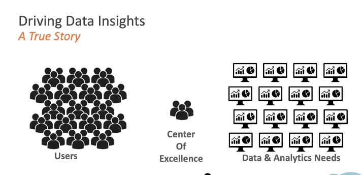
Benjamin Goodman 1:00:50
And this is, this is a true story about me. And this was my time at Motorola. When I joined Motorola, I came in as the tableau experts, I was there to help drive data insights and fulfill data needs that my users had. I became the center of excellence. So I had a small group, and we were responsible for Tableau. This started out pretty good. We were all experts in this space. But you might notice just from the visualization I have up here of how this looks, there was a problem with this setup. We came in and we started taking requests from our users for their data and analytics needs. And what we did is, instead of being perceived as a center of excellence, we were perceived as a bottleneck, because we simply did not have enough resources to fulfill all the needs that our users had.
Benjamin Goodman 1:01:51
As a result, we weren’t able to produce all the data flows and reports that they wanted, which made our users very unhappy. And it left us frustrated, because we were doing our best to help them right. So to address this, we really had to change our way of thinking about how we were going to deliver on all these needs. And we needed to get rid of this bottleneck. So we changed the structure. We took ourselves out of the middle of this equation changed from a center of excellence into a center of enablement. And what this meant was, we provided our users the tools that they needed to generate a lot of these data insights themselves to build these reports. And really, we became the ones that were there to guide them, provide them with tools, and make sure that they had the right resources to get the data insights that they needed. And this is kind of going to be the theme of what I’m talking about today is how do we drive those data insights? How do we make our users capable and get to those answers faster. So I’m going to be covering data management and server management, which are add ons to the Tableau server. And they both have some very specific things that they’re going to do. In addition to that, we’ll talk about some new resources we have out there to help you get started or at fancy further on your data journey. And then I’ll be covering what’s new and upcoming and Tableau 2022.2.
Benjamin Goodman 1:03:25
So first, let’s talk a little bit about data management. There’s three main components I want you to think of when you think of data management, the first is going to be prep conductor. Now, if you’ve got to create your license in Tableau, you already have prep builder, and you’re building those flows. Prep conductor is going to allow you to take those and publish them up to your server so that you can run those in an automated fashion and not have to manually go in and remove those. It’s gonna give you some oversight in that and allow you to schedule those things, set alerts for him and that kind of thing. The second thing we’re going to touch on data lineage and data catalog. And this is really important, because it lets us know where our data came from, and where it’s going to. It’s essentially building a metadata layer around the data that we have in Tableau. So that when we want to go see who was impacted by a change, or what happened, we can quickly go in and do that.
Benjamin Goodman 1:04:19
And then lastly, we’re going to cover the newest addition for data management, which is virtual connections. This is a really powerful tool that I think we’ll be hearing more and more about a virtual connections allows us to separate the authentication layer from our connection to data so we can manage that just like we would anything else in Tableau through permissions, without having to hand out credentials to anybody who wants to connect to data. So prep conductor, we’ll get into the weeds a little bit more on these. One of the first thing that prep conductor is going to allow us to do is centralized management. So we want to monitor automatic cleaning processes for your organization’s data as well as build permissions around that data.
Benjamin Goodman 1:05:05
I mentioned, we can control who can access this stuff who can run these flows. And you’ll notice this up on the screen looks a lot like builder. When you publish these to your server, you’re going to get this view so you can see exactly what’s happening in your prep flows. And you can even go in and use web edit. So you get a similar experience, what you would have in the builder client on your desktop, it’s going to allow us to go in and schedule and share these flows. So I can run these just like I would a data extract, a refresh or, or a subscription in Tableau. Now on the back end, there’s a whole new set of components that are added with this add on the front end, though, we’ve kept it as simple as possible. So you get the same experience you would get if you were doing something like refreshing a workbook in Tableau.
Benjamin Goodman 1:05:57
And then governance and visibility, if you’ve got folks that are running these prep flows from their desktops, you don’t have a ton of visibility into what’s happening. By allowing them to publish them up to your server, you can monitor them, you can see how they’re performing. And you have visibility into failures or successes. You can even set alerts for these so that you know your data is up to date. Next, I’ll hop over to the data catalog and lineage. And as I mentioned, this provides a metadata layer around your data. What does that mean? You’re getting a more complete view of your data.
Benjamin Goodman 1:06:32
Now on the back end, we’re pulling a lot more information about all of your data sources. And what’s happening, we add this add on. And we’re exposing that to you, to help you in your efforts to understand where your data came from, and where it’s going to. As part of that metadata layer, we can understand the relationships between data sources, and things that are either upstream or downstream from them. So if I want to see what tables a data source came from, or what databases before it was pulled into Tableau, I can see that upstream from my data source. And I can also see downstream workbooks views, other data sources that are impacted by this data. So if I have something happen, maybe a an ETL process doesn’t complete on time, or somebody’s put bad data into one of my databases, I can quickly go in and see who was impacted by any of these changes. And this is also going to give us our metadata and context. So we can ensure that users who are viewing a dashboard can trust the data, they know where it’s coming from, there’s not questions around the quality of the data itself.
Benjamin Goodman 1:07:45
And this is the big one, the most recent one, the virtual connections, as I mentioned, this is going to allow us to simplify a lot of this process by removing the authentication piece from our data sources. So instead of having to hand out credentials, we’re setting these up at the server layer, and then sharing them to our users, just like we would set permissions for anything else. So we have centralized permissions and data policies, which means instead of having to go hand out, read only accounts or set up accounts for every single user, I can set my set up my account once I can manage it, so that I don’t have to share those credentials. And I can just allow access through Tableau the same way you would grant access to a workbook or data source. Now data policies are things that you can apply to the data.
Benjamin Goodman 1:08:41
So if you want to implement something like Row Level Security, maybe I have a group that only should see the data for that group, I can do that through a data policy. So I can share one virtual connection and have multiple use cases downstream for it. And then if I need to update something, I have one place to go. So when we go in, and we update something, maybe we have a read only account and I have to change the password every 30 days, instead of having to go out and update passwords for every single use case that uses this data source, or this database. Now I have one place to go. And everything using that virtual connection is going to continue to use it. So when I update it, I just do it once. And I know that everything works. So this is saving me a lot of administrative headache anytime I have those kinds of changes. And next we’ll hop into server management, data management, we kind of covered how this is enabling your users, removing roadblocks for them and removing manual work for your folks that are running the server server management. It’s a little more focus towards our server admins. But I think you’ll see that there are components of this that are going to really touch everybody.
Benjamin Goodman 1:09:53
The three things we’re going to talk about resource monitoring tool, content migration tool, and then Some of the virtual connections and stuff that we can set up at the server layer. As I mentioned, this might at face value seem like very much just a server admin thing, right? Why do I need this, and this is why I like to bring this this slide up, I’m not going to talk through each one of these cases. But really, I wanted to show that server management is going to impact your users from server admins, DevOps teams, creator sponsors, site admins, and then your infrastructure team. So everybody is going to get something out of this at the end of the day, and it’s going to make their jobs easier. One of the first things we’ll jump into is performance monitoring. What we’re looking at here is the resource monitoring tool. So if you have multiple deployments of Tableau, maybe you’ve got a dev server and a prod server, you can monitor all of those in one place. So I have one place to go instead of having to go log in to each server to see what’s happening.
Benjamin Goodman 1:11:05
We can look at the performance of each environment. Now this is really powerful. What we’re seeing here is a live representation of what’s happening on those servers. So there’s agents that are running on servers, what we get in the admin views for Tableau typically, is a backwards looking view, it’s analytical, it’s pulling from that metadata we’ve collected over time, this has given us a real time view so that when we have problems, we can go into server management and see what’s actually happening at that point in time, instead of having to go back and use other tools to get that information. As I mentioned, a live view of what’s going on. So we’ve got server performance monitoring, if we want to see things like CPU or memory, things, you would typically bring a completely different tool into monitor.
Benjamin Goodman 1:11:52
Now we’ve got it all in one space. So you can see what’s happening both at your application level and at the server level. And that’s going to give us the ability to go in and troubleshoot things quickly. So when we see things happen, like in this illustration, where we have a spike, we can click on that, drill down into it. See, in this case, which visit QL sessions are related to it, and even go down to set the session level. So we have one specific case that tn tends to be blowing up our server. This is something that in the past will take a lot of analysis, usually we’d have to go in and look at logs.
Benjamin Goodman 1:12:33
Now we can quickly drill down and find exactly what’s causing our problem so that we can go in and address it. And beyond that, we can go down to the actual query level for any of these data issues that we’re having. So if we have a data source that’s not performing well, we can go see what’s the actual query getting generated and executed against this data source. So if we have something like bad SQL, this is going to expose that to us if we have something like a Cartesian product, right? Because we’ve got somebody writing custom SQL, who knows, maybe novice at it, and they aren’t aware of those kinds of things, we can find those things here. So this is really just exposing that stuff. So that you can quickly go in and determine what’s causing you performance issues.
Benjamin Goodman 1:13:30
The other thing it’s going to do, it’s going to give us just like anything else in Tableau. We’re all about the visualizations. So that’s going to visualize some of these biggest hits, I guess I’ll call them. So we want to see like, what are my slowest views, right? We can see that in a visual manner, we can go and see what the performance looks like. And we can even go out to those views directly on our Tableau server from here. And of course, I’m not going to be logged into this thing all day. It’s not realistic, right? So we can configure incidents and alerts. So when something happens, you don’t have to constantly be sitting there watching the resource management tool. Instead, you can get those notifications in your email or on Slack.
Benjamin Goodman 1:14:20
You can see, here’s where we’re going in and we’re really defining like, what we’re going to what we’re going to get in this case, we’re seeing a warning from her Postgres data source. And then this last feature of the resource management tool, it says a chargeback report. Now, if you’ve got multiple departments that maybe have their own budgets, and they’re all contributing to Tableau, you can use this tool for that. But beyond that, what I really love to use this tool for is to see who’s you utilizing my server, I can see which sites which projects are consuming the most resources where my biggest extract slave, and then what kind of processor power is getting leveraged against those and the load view time and the extract refresh time, you can also adjust the weighting here. So if you want to use it as a chargeback report, truly, you can adjust that to your own needs. But this is just giving you additional insights into what’s actually happening in your server.
Benjamin Goodman 1:15:24
We also have some prepackaged data sources, I mentioned that we’re unlocking another layer of metadata with this stuff. So with that, we provide prepackaged data sources that you can use to go out and build your own administrative reports if you choose to. There’s just adding a whole new layer of detail that you didn’t have before. Next, I’ll jump into the content migration tool. Why this is important. So as the name implies, this is for moving content around, we can move it between sites, projects, even different servers. What can we move? Well, you can move data source is you can change user permissions.
Benjamin Goodman 1:16:11
You can move workbooks, projects, wholesale at a time of pretty much anything you want. And what this allows us to do is automate that movement. So if you have things like the development lifecycle that we talked about a little bit, and maybe that’s been a manual process, what I can do in this content migration tool tool is build a plan that will automatically update content that I’ve put in, say, a specific project. And it will move it automatically. So I don’t have to go through that manual process every time. This is going to allow us to do things like touchless deployment. So if I want to copy a project to a new project, maybe I want to change the connections as I do it, or update the names of workbooks, I can automate all of that through the content migration tool. We can also do transformations. So if we want to do things like replace a table name, or schema name and a data source, we can do that maybe you’ve got a staging schema that you use to test all your data out, and you got to production schema, well, instead of having to go in and update all of those data sources, we can just have the content migration tool, do that for us.
Benjamin Goodman 1:17:22
Now, we can also do bulk updates in place. So if you have things like images that you want to replace in your reports, maybe you’ve got like URL actions in there, you can do all of these in an automated fashion. So this is really just automating anything you want to do around moving content around. And then lastly, we’ll talk briefly about our enterprise management capabilities that come with server management. The first one we’ll touch on is just workload management. So when we get into a multi node environment, that means that you know, we’ve got more than one server in our node. And we do this for things like load balancing, server management allows us to specialize those nodes so that we’re getting the best performance out of them. Well, we can see here, we’ve got a node specifically set up for extract and subscription. And then we’ve got another one set up for extract only, and a last one for subscription only. So we’ve specialized, those just do specific tasks.
Benjamin Goodman 1:18:20
If subscriptions are really important to us, we want to make sure that they don’t get de prioritized for other things happening on our server, we can set up a specific note just to handle those to ensure that those get delivered on time. The other great thing we can do with server management is using external repository. So if you’re in Azure, or AWS, and you want to host that Postgres database on the back end of Tableau somewhere else, you can do that with server management. And the reason you might want to do something like that is maybe you’ve got your own database standards you want to apply to it. Maybe you just want to make sure that it’s not competing for resources with all the other processes happening on your Tableau server. server management, you can split that off into either an EC two instance, or an Azure Database, Postgres database in Azure.
Benjamin Goodman 1:19:14
You can also take advantage of San and NAS hosted external file stores. So you have you know, particularly large files, maybe you got big extracts, that you’re right now managing on server, you can move those over to like Sam, where it’s going to be a lot more performant for you and flexible. And then lastly, if you’re concerned with security, you can also use key management services in both AWS and Azure to ensure that your data is secure. So we covered the resource management tool. We cover the content migration tool, and then Cloud Service and external server enhancements. Those are the three big things that you get with server management resource This is to get you started or advancing on your data journey. This is just one that I wanted to call out. If you look at accelerators for Tableau, the name is accelerators. What these are, is they’re basically pre canned dashboards. So if you’ve opened Tableau and you know, I don’t know where to start, I know I’ve got some data. You know, based on web traffic or something, right, you can go out to the accelerators. And you can find, in this case, we’ve got web traffic over here on the right, you can find these pre canned reports.
Benjamin Goodman 1:20:36
Now, when you open these up, they’re going to ask you, you know, connected data. And that kind of gives you some guidelines and how to get started. But these are going to implement best practices from the get go. So you kind of have reports that were built by experts. And you can hook those up to your data, and you’ve got a head start, because you’re not building them from scratch anymore. Now, you’ve kind of got a jumpstart on what you’re doing with your reports. And of course, you can take these you can customize them and make them your own. And lastly, I’m gonna jump into what’s coming in 22.2. For Tableau, there’s some pretty exciting stuff here, we’ll touch on data stories, on auto save our editing, support, asked data, and a little more on virtual connections, and then dive a little bit into prep. Data story, this one’s particularly exciting to me. Narrative sciences was acquired by Salesforce. Within the last year, I happen to know these guys, because they’re based in Chicago, and not too far from me. So when this happened, I was already aware what they were doing. They were taking all this data that we were turning into visualizations, and then building the story around them. So finally, we’re seeing kind of the fruit of this acquisition with data story. What this allows us to do is plug in data stories to any of our dashboards.
Benjamin Goodman 1:22:02
Now, I’ve built visualizations. I’ve gotten insights into my data. But what if I have someone who just wants an executive summary level of what’s going on with their data? They don’t want to see all the visualizations. They don’t want to drill down, right? This is somebody who’s probably not, you know, in the weeds, they’re not your analyst. What if I just want to know like, what’s this? Tell me, right? That’s what we always want to know, what’s this telling what’s important, in my data, at the end of the day, Data Store is going to do that, it pulls out the interesting points in your data, and writes a story for you. So you can take this and you can share it, you can set it up as a subscription and email it out. And that way, if I see something show up on here that I know is something I need to dive into, I can click through and I can go back out to the report and see what visualizations are associated with it and explore there. T
Benjamin Goodman 1:22:56
he other really cool thing with data stories is as it brings up each of these points, you’re gonna see that a lot of them are going to be clickable. So just like you would with your visualizations in Tableau, I can click on any of those points and filter my dashboard down to the specific thing that that story is talking about. So it’s a really powerful way to take what we’re looking at visually and turn it into a narrative. And these other ones aren’t going to be as long for me to talk about but pretty cool features that we’ve got coming out shortly here. autosave. So if you’ve ever been using web edit, your computer crashes, oh, no, I just lost everything. With autosave. Now it’s going to save automatically. If you exit, if something happens, maybe your browser, you close the browser without thinking, when you go back in, they’ll see that you’ve got your draft that you were working on. So you can continue to work on it, just open it back up and you continue right where you left off. Editing support for metrics, if you’re using metrics, these are really powerful ways to just get like one single metric that maybe you want to watch to let you know when you need to go and explore an issue.
Benjamin Goodman 1:24:11
When you set these up, before you had to set them up, if you didn’t like it, you delete that metric, you’d set up a new one. So we’ve added editing support for those instead of having to go set up new metrics, you can just update the ones that you’ve already got. And then virtual connections, I mentioned the virtual connections being kind of a big thing. And you can see the development continuing here. We’ve added revision history to these virtual connections. So just like you would for your workbook history, if you go make changes to these and you go, Oh, I did something wrong. Now you can easily go back and just restore a previous version. You can see what changes happen who changed a virtual connection. So maybe you have multiple people with access. But you’ve got your whole history here now. And then we’re adding in and out visualizations to your virtual connections.
Benjamin Goodman 1:25:06
So you can see how they’re being leveraged how many people are using them, and get a sense for how, how many times they’ve been used. In prep, we’ve added a wildcard union. So if you’ve worked in prep, and you go, I just want to add two things. Why is this so hard to Union these, now you can use a wildcard. So if you have partial strings or column names that kind of match, not completely, you can use the wildcard to perform those unions. And just like we’ve added in web edits, in on Tableau server, on Tableau Desktop, it’s been around for a while. Now, it’s in prep as well, if you want to reorder your columns, you can simply do that by clicking on them and dragging them around to change the order of them. I don’t know why it took us so long to do that feature. But this is a really nice one, if we want to make sure our orders and our data’s in a specific order. And then we’ve got a onboard asked data Lintz for our catalog.
Benjamin Goodman 1:26:18
I mentioned catalog in the data management tools. If we want to jump to any point in this catalog and ask questions of that data. Now we can do it. So we’re bringing that natural query language to the lineage. So if you are troubleshooting an issue, and you want to go in and see like what’s happening here, we can simply ask data, and we can ask a question of it, and quickly filter down to an answer without having to do something like open a sequel studio or build a whole new visualization on it.
Benjamin Goodman 1:26:51
That’s all for the updates. You can see there’s quite a few on here that I did not cover. So feel free to reach out to me, we’ve got all this published online as well. But a lot of exciting stuff coming in 2022.2. Now I talked about my data journey, talked about driving insights, we looked at tools and ways we can change that Center of Excellence into a center of enablement, and get our users to the data they need. But if you’re still going, Okay, this sounds great. I see. I’ve got tools out here. We heard a great story from Harris Health, about what they were doing. How do I do that? Next up, we’ve got Chris and he’s going to talk to us about something called the tableau blueprint.
Chris Monahon 1:27:40
All right, thank you, Ben. Hi, everybody. My name is Chris, Monahon. I’m president of XeoMatrix. We’re a tableau Gold Partner based out of Austin. I’ve been doing data analytics for about 20 years. So dating myself a little bit, but as Ben mentioned, yeah, today I’m going to tell you a little bit how to build a data driven culture using Tableau blueprint. It’s a framework that Tableau has put together to assist organizations on best practices on how to implement their data strategy and Tableau. Again, I’d like to thank Harris Health, they sort of helped me with my presentation. So as we go through this, you’ll see all the great examples that they pointed out, Aruna’s team did a great job, you can tell that they have a very strong data culture there. And you’ll see a lot of those best practices that they’ve implemented highlighted here in my presentation. So a little bit about our firm.
Chris Monahon 1:28:36
We’re a full service data analytics shop. And we’re a tableau Gold partner. We’re very active in the Tableau community, we sponsor a lot of the TUGs, especially the one here in Austin, that we hold monthly, which is tomorrow, if you want to tune in. And, and yeah, we help organizations with their deployment, training and adoption at Tableau. So we work with a lot of state local, higher ed, education’s across Texas as well as the country and help them with their Tableau implementations.
Chris Monahon 1:29:05
Specifically, like I mentioned, it’s around deployment, training and adoption. So that’s anything from you know, building your visualizations, your data preparation, preparation, data warehousing, maybe assisting with training and enablement and, and then also taking it a step further with strategy and how to build that Center of Excellence or enablement has been referred to. So all these points are going to be brought up during during our presentation, as we talked about Tableau blueprint. So our agenda will talk about what is data culture, what makes a data culture and why is having a data culture important. And as we alluded to, how do we get there? How does Tableau blueprint help us? So again, Culture refers to a company’s ability to use data to make decisions, right? We’re all in the data business.
Chris Monahon 1:29:54
But are we actually using data to make these decisions? Companies with a strong data culture consistently rely on data to inform their strategy. They’re the ones that are more proactive, have predictive analytics. And that’s where you’re really trying to achieve. What makes up a data culture, there’s really five common elements. One is trust. One is that trust is in your data in your organization. And that you’ve, you’ve enabled your team to, to be able to implement accordingly. The other is commitment. And that’s coming from top down, right? Do you have executive buy in? Are you in support? Do you have the right project teams in place? And are your users all in as well into the vision? The next is talent? Talent? Are you training your team accordingly? And do you have the right skill sets in place in order to implement the strategy? code sharing or collaboration you need to foster a culture of of sharing sharing data and best practices? And then the mindset right? In order, it sort of goes with the division, you need to all be aligned and have the same mindset and being data driven? So why is the data culture important?
Chris Monahon 1:31:08
I sort of put a little calculation up here, but I think Aruna’s slide also put it there, it’s people process and tools, right. So in a sense, it’s sort of the same thing, you have data culture, but you also need that the tools or the technology, in order to become a data driven organization, you need to everyone united in a shared mission, right to understand the power of the data, and making sure that you’re making decisions based on data and not intuition. And overall, this is just going to lead to overall business value, and you also serving your customers better. So now we’re going to talk about Tableau blueprint. And for those that aren’t familiar with Tableau blueprint, as I mentioned a little bit earlier, it’s a step by step guide, to becoming a data driven organization. What Tableau did a couple of years ago, they gathered all the data from talking to 1000s of customers that they have, and they look for common traits and processes and what made them successful in implementing their data strategy. And, and having strong data cultures. And they put together this framework. And it’s a set of concrete plans and recommendations or guidelines and sort of how how to implement repeatable processes in building your data culture. When you break it down, it’s basically talking about the fundamentals I was talking about earlier. It’s around deployment, training, and adoption.
Chris Monahon 1:32:31
What I’m showing here is a high level diagram of the tableau blueprint process. And this is a, they sometimes refer to it as a subway stop map. It’s got your little stations along the way. So if you start left or right, it starts with an analytic strategy, right? And then, then you must have some sort of executive advocacy team or project teams that are leading that strategy. And then there’s three areas of focus, one being agility, agility, proficiency, and community which sort of tie back to that deployment, trading adoption.
Chris Monahon 1:33:03
And all of this, if implemented, right creates a creates a foundation for trust and govern govern data, right? So it gives you that in that flexibility of having trusted data, but also the agility of self self service. So that’s, that’s the all end goal of Tableau blueprint. So let’s start with strategy and executive leadership. That’s our first sort of two stops on the map here. So one, you need to have a vision, right? What what is your organization trying to do? What are your goals. And so with that, you need to have, as I mentioned, an executive team, you need to identify for start by identifying your executive sponsors, and what project teams are going to support this vision and help implement this strategy.
Chris Monahon 1:33:52
These are usually cross functional teams, it’s not just not just business, not just it, it’s a mix of business it, you know, lead team leads, and, and they’re going to be the ones that give input and set the guidelines here as far as implementing this blueprint framework. And then you need to discover and prioritize sort of your, your use cases in order to implement this, this strategy. So let’s take the sort of first area of focus and that’s going to be agility which ties back to the development and deployment. So this typically refers to a lot of the function around it, right? So so in order to be agile, it means you need to have the proper systems and tools in place in order to scale and perform and have enough capacity in the future for what what type of goals you’re trying to implement.
Chris Monahon 1:34:47
With Tableau that might be understanding your your server capacities, your performance, how you’re SLAs and you need to focus on are these processes repeatable scalable and how are we maintaining those? Right? So as as your maybe Tableau server environment progresses? are we investing in the hardware infrastructure? Are we doing, you know, regular scheduled upgrades? So those are the things you want to think about. When we chat with organizations, these are some of the recommendations we we provide. One is focused on your deployment strategy, right? If it’s upfront, or you’re, you’re revisiting it, because maybe you’re having challenges with your deployment, you need to understand sort of where, where first, do you want to start? Is this going to be a Tableau Server on prem installation? Maybe it’s Tableau server, public cloud, right? A lot, everybody’s moving to the cloud. No. Gov cloud. Or maybe it’s Tableau cloud, maybe Tableau cloud works for you. But regardless of what it is, you need to sort of lay out a deployment strategy and understand either your hardware requirements or what are your future. And in order to, to estimate that you need to understand your licensing for future growth.
Chris Monahon 1:36:04
I can’t stress more enough, you need to outline and understand your security, security around your your data, how you’re going to have to authenticate users, how you going to onboard users. I like what Aruna said how it’s fully automated for them. That’s amazing. That’s a lot of folks aren’t there yet. So they’re very far in their data journey, for sure. Secondly, I would say craft data strategy, what data sources are currently used, or will be used in the future? And then, and what what data is, is is governed or secured. Right. So, you know, Haertel talked about their governance, is it set? You know, is it centralized, delegated or self govern? And I would say, you know, in a lot of the examples we’ve seen, you know, most folks are moving toward that self governed model, right, that’s the one that’s most efficient, and scales the best. So there’s a lot of ways to do that. And we can touch on that later.
Chris Monahon 1:37:02
The other recommendation we made is configure proactive hardware and application monitoring. So Ben touched on this, you have server management, right? Add on, and there’s a lot of resource monitoring tools, if you don’t have the luxury of having the server management add on, at least you have the administrative views. So put in either any sort of Windows monitoring, or Linux, whatever, whatever platform you’re on, put some of those monitorings in. And then if you have, you know, if you have the availability, you know, get the server management add on, I highly recommend it. And then lastly, perform frequent maintenance, right? So apply upgrades and configure backup jobs, do your capacity planning, check in every evaluate, or assess your hardware, frequently to understand sort of, are you going to be able to fulfill capacity in the future, and perform load tests to understand if that’s going to work?
Chris Monahon 1:37:57
The next area I want to talk about is proficiency. And that’s, that’s, again, around sort of your training and enablement. So that’s when we talk about proficiency we talk about education, how are you training your users? How what type of programs have you put in place to train your creators, your your explorers and viewers. And then once you train them, you know what you need to measure that to see how effective that training is, and then put in some best practices. The recommendations we, we provide around this, with the organizations we talked to, is a first round training, the train the trainer workshops. That’s, that’s really the best way to roll this stuff out.
Chris Monahon 1:38:39
Focus on your creators, and we recommend doing it on your data. I know there’s a lot of good programs out there for learning Tableau desktop, I recommend highly starting on your data that reinforces a lot of the concepts a little bit easier. And the investment you make in your your subject matter experts in your tableau creators will pay dividends and they’ll go back to their departments or groups. And they will help train other users. So this, this is a great model to use. One, one thing that I do want to touch on is you know, a lot of folks do do focus heavily on the crater trading, but not as much on the Explorer viewer. And I think that’s something that sometimes overlooked and and should be invested more because those obviously are your end users and you want to put a lot more training into that.
Chris Monahon 1:39:25
Tableau is super easy to use. But I like Harris Health how they were showing examples have they have a lot of e-learning online and a lot of they do a lot of demonstrations with a team especially at the user groups and that type of training with your your user community is only going to foster more adoption and, and self service. Another area or recommendation we see is augment with departmental trainings and lunch and learns this is something we see it’s not a big investment. Everybody nowadays, a lot work remote to it, and everybody has to eat lunch so it’s a good time for everybody to get together and it do a little training.
Chris Monahon 1:40:01
We see these these highly successful. Elearning is something that Tableau provides it’s a very cost effective way for people to get started with Tableau, I highly recommend that. But there’s also some free options that Tableau has well, Role Based Learning Paths, if you haven’t seen that, you can be an analyst and administrator, check into those. And you can earn these skill badges and you can put those on your LinkedIn as well. So it’s, it’s pretty cool. So check that out. There’s a lot of great thing about Tableau, there’s a lot of free education out there. And, and it’s good to take advantage of that.
Chris Monahon 1:40:35
The other point I want to make is, you know, when you’re enabling your users, you need to explain and train how dashboard should be used for guided analysis. I know, you know, it seems pretty obvious, especially as a developer, you might think, like, hey, well, this, this dashboard is super easy to use. But there needs to be a little bit of training on it. And I did, like, you know, one talked about the rollout strategy that they have. And I think that will, again, pay dividends, just investing a little bit up front with training on how to use the dashboards.
Chris Monahon 1:41:07
How to improve the data that that’s within your organization. And this is something that is challenging understanding the data. I mean, it does take a level of maybe, or someone to sometimes understand the data, but with a little bit of assistance and training and, and also leveraging maybe Tableau tableaus data catalog, you can see the data lineage, like Ben pointed out, and that’ll really help people understand the data. What what do these measures mean? How do they tie back to the source data? So I would highly recommend if you haven’t checked out Tableau, Tableau is data catalog, give it a try. And that’s something that I think a lot of organizations could leverage.
Chris Monahon 1:41:49
And the last point I want to make is focus on change management and new ways and processes for analyzing data. I think when we do training, sometimes we forget that people are or they have their own processes currently in place, and, and it It is human nature to resist change. So go out there and show people that there’s a better easier way to do their analytics, how to pull their reports. And especially using Tableau, they can really leverage a lot of the features and capabilities and the powerful functions in Tableau to do that. All right, and the last area we’re going to talk about is around community.
Chris Monahon 1:42:25
And that’s, tied to enablement and adoption. So a lot of this is how do you build a tableau community, internally within your organization, and this is sort of the pinnacle of becoming a data driven organization. And part of it, you know, is going to be communication? How are you communicating to your end users? And your customers? And how are they communicating back with you? Is that a shared portal? Or some sort of Slack channel or something like that? And then how are you engaging with them? What are the processes to kick off development? Or what are the process processes to teach them more about the new functionalities in Tableau? And then lastly, how are you supporting your community? What what are the what are the processes that you have in place to help them learn, learn more about Tableau and best practices?
Chris Monahon 1:43:20
Here’s some of the things we’ve seen with organizations we’ve worked with. First of all, in order to have high adoption, keep focusing on trade. That’s the number one thing I mean, sort of ties back to the last section. The more you train, the more adoption, it’s easier use, you’re gonna see a higher adoption. Second point, create a centralized location for all things Tableau, like what Harris Health says they have a SharePoint, we see that that’s very popular, some sort of Reporting Portal, or someplace where they can collaborate, either it’s an internal team wiki, or, again, like I mentioned, that we’ve seen some teams or Slack channels, someplace where users can go to consume information, but also ask questions, right.
Chris Monahon 1:43:59
And that builds, especially nowadays, in our virtual worlds, that builds a sense of community where people feel a part of part of Tableau and part of learning and part of your data culture. One point that I will also want to mention is, I think, you know, especially with it or a business analytics group, we need to promote and advertise sort of what we’re doing. You know, we don’t want to work in a silo or a vacuum. You know, we’ve, you’ve done a lot of great work, you’ve done a lot of great things. There’s a lot of powerful features in Tableau, go out there and promote that, right. And there’s a lot of ways to do that. You could do that using internal user groups, which which Harris Health has done excellent. I was happy to see that they meet monthly, which is amazing. I would say start off quarterly. If you can, that’s a that’s a goal that’s easy to accomplish. And then and then as you see the momentum pick up, do it monthly when we start when we help organizations start user groups and usually you want to target If you’re passionate users, you’ll know who they are right off the bat. And they’re the ones you work with every day that ask you all the tableau questions. They’re usually your smase, get them together. And you can just start small giving a presentation, either on maybe how a business group or department is using Tableau and, and they can share that with the other organizations to understand how it’s being used. And then maybe follow up with a technical presentation of a new feature or something similar to what Ben did. And that just drives drives attendance, and people get interested and passionate about Tableau. Another a couple of other ways, we’ve also seen to build some of that sense of community is using Office Hours. So sort of like, maybe when you were back in college, and you had folks like a TA that helped you out, you can hold office hours where people can come and ask questions, right, and get that one on one support that they need that they might not get be able to get elsewhere. And then lastly, we’ve seen this done. And this is really cool. It’s Tableau days. So we, that’s where you have hold a couple of days, similar to this for a couple hours. And it can be virtual as well. And you just spend time talking about the best practices of Tableau, except it’s more around your whole organization. So I would encourage, if you’re doing a tableau day, invite two or three departments to share their experience with Tableau, how they’re using it. And then I’m sure I’m sure you can talk to Tony, and he’ll get Ben in the door to come give a presentation as well, about the technical aspects of Tableau. And then the last point, which Ben teed up perfectly was, you know, you know, you want to create a center of excellence, and that that really is going to be a group, a cross functional group team, that sets the standards, right, and best practices that that you want to achieve within your organization, you definitely, definitely want don’t want to be a bottleneck. So if done correctly, which we’ve seen a lot, you know, it really is imperative to driving that, that adoption and achieving that end goal of being a data culture. So.
Chris Monahon 1:47:02
So in the end, as I mentioned, if we put all of this into motion, right and done successfully, it creates this trusted and governed culture process in place to for a data driven culture. And so you’ll get that balance, right? That foundational balance of having a trusted govern data, but also the agility of doing self service analytics. So it’s a process, it’s not going to happen overnight. But there are tools to do that. And that is Tableau, Tableau blueprint. So that’s, that’s sort of the end of the presentation. I know, a lot of folks want to know how you get started with this. There’s several different ways there’s one online and there’s, here’s the URL, we’ll send it out with the recording of the presentation. One, there’s a questionnaire Tableau has online, it’s very short, you can fill it out. And immediately, you’ll get some results back, and which will sort of score or grade you on at least your input on what you know whether or not your organization where they are sort of compared to other organizations as a data driven culture, it’s really cool. only takes a few minutes to fill out. So if you’re interested, check out this link. Secondly, one would be to get started just taking a look at Tableau blueprint planner. So it’s a tableau blueprint cramp planner is a sort of a workbook that has a lot of different questions. It’s a questionnaire system that you can do internally. And it’s an exercise that probably only takes maybe for four or five sessions with the different executives, it groups, business leaders, team leads. And with that, you can fill out your own information and make your own internal assessment of where you guys are as a as an organization. or And then lastly, of course, we offer services around doing a blueprint assessment engagement. It’s a third party, you know, assessment that we do, we we will interview your groups and talk with them and then gather the information and provide our recommendations as well. So if you’re interested that please feel free to reach out. So we’ll send out all this information with the presentation. So everybody has it. With that, I’ll close
Aruna Bandaru 1:49:19
Tony if anybody has questions, throw them in there, Ben. Oh, get it.
Aruna Bandaru 1:49:32
Give it a second. I want to thank Harris Health for coming out and showing us their journey. Their data journey. Certainly good. My name is Tony Novak. We’ll be sharing the presentation with everybody you can kind of fast forward through it. We did we are going to end on time which but we might not but we got we did. Any questions? All right. Well, hey, thank you, everyone. And we hoped to do this again in another quarter and another part of the Tola region, Texas, Oklahoma, Arkansas, Louisiana if you don’t know where I’m going with it