Maps have always been a practical way to explain “where,” but something important has changed over the last decade. The best Tableau map visualizations are no longer static visuals that sit on a dashboard. They are interactive, analytical tools designed for exploration.
A good map is not decoration. It is often the fastest way to answer a spatial question.
That shift matters even more in 2026 because modern Tableau mapping workflows feel much more natural to users. Spatial parameters and newer viewport-based workflows allow analysis to respond to movement. When someone pans or zooms a map, the data updates with them. That mirrors how people already expect maps to behave.
In this post, we will walk through nine Tableau Public dashboards and the design lessons behind each one. Together, they show where Tableau mapping is heading right now: layered geometry, proximity-driven analysis, and storytelling that treats the map as the foundation instead of an afterthought.
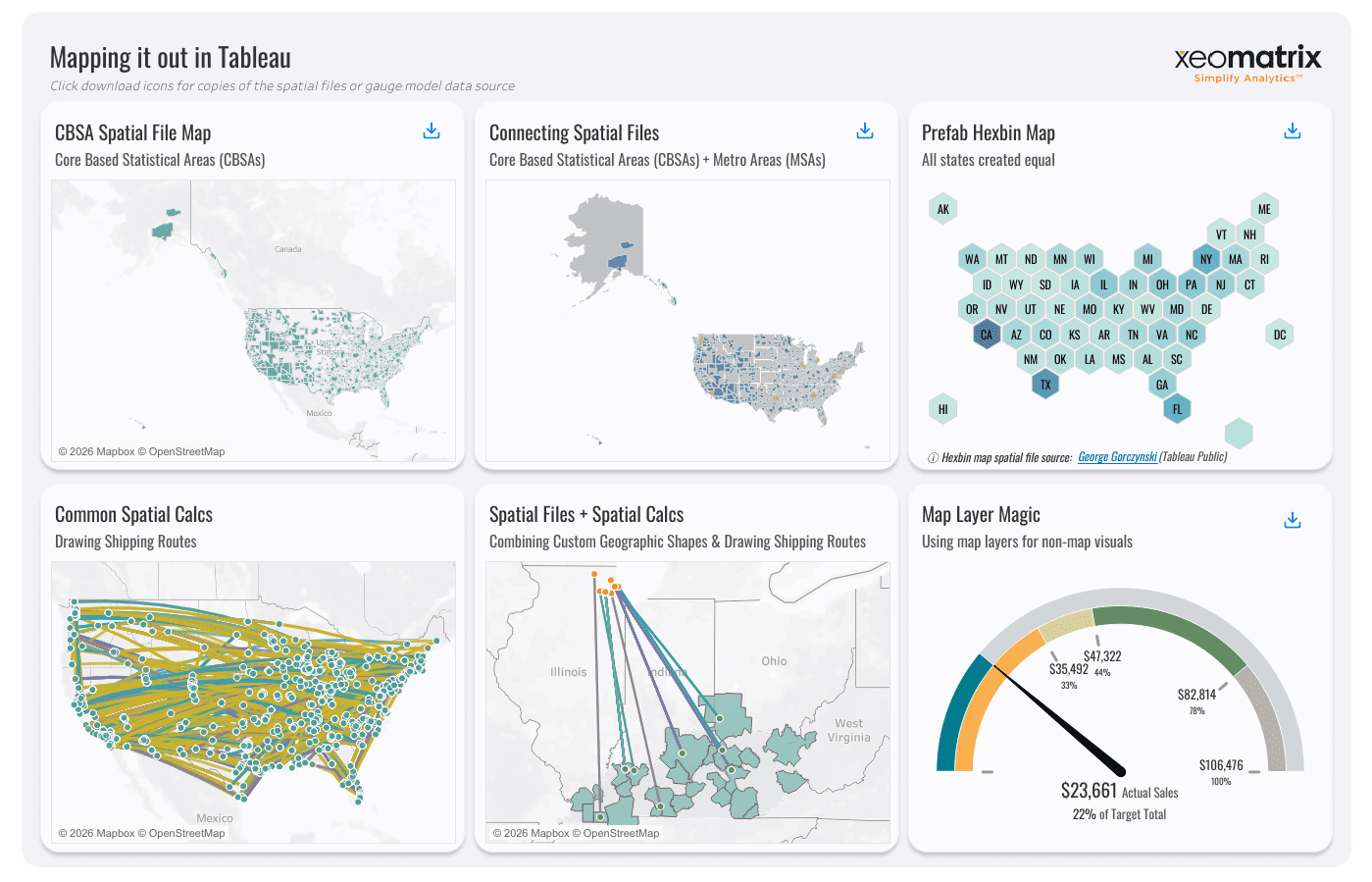
Tableau Map Visualization 1: DDC Advanced Tableau Mapping by XeoMatrix

This dashboard works like a hands-on mapping lab. Instead of telling one story, it walks through six different spatial techniques that analysts can reuse in real projects. Each panel highlights a specific pattern you are likely to encounter when building advanced Tableau maps, from working with custom geographies to using map layers for completely non-map visuals.
CBSA Spatial File Map
This first map introduces Core Based Statistical Areas using a spatial file rather than Tableau’s default geographic roles. You can see how the shapes go beyond standard state or county boundaries, which immediately expands what you can analyze geographically.
What makes this effective is that it solves a common real-world problem. Many business regions do not align with built-in geographies. By bringing in a spatial file, the map reflects how organizations actually define markets, service areas, or territories. It shows that advanced mapping often starts with the right geometry, not just the right chart type.
Connecting Spatial Files (CBSAs + MSAs)
The second map demonstrates how multiple geographic layers can be connected and visualized together. Here, CBSAs and Metro Areas appear side by side, showing how different regional definitions overlap across the United States.
This is effective because it highlights a workflow that analysts frequently struggle with: combining custom spatial datasets. Instead of treating each geography as a separate map, this panel shows how relationships between layers can add context. It reinforces the idea that spatial analysis is not only about location but also about how geographic definitions relate to each other.
Hexbin Map
The hexbin map transforms U.S. states into hexagons of equal size, removing the distortion caused by geographic area. Smaller states no longer disappear visually, and comparisons become much easier to read.
This works well because it reframes geography as a comparison tool rather than a literal map. When the analytical question is about distribution or ranking, equalized shapes often communicate more honestly than traditional geographic outlines.
Common Spatial Calcs: Drawing Shipping Routes
This panel focuses on movement. Lines connect points across the United States, simulating shipping routes or transportation flows. Each connection represents an origin and destination relationship drawn directly on the map.
It is effective because it demonstrates a practical application of spatial calculations like MAKEPOINT and MAKELINE. Instead of overwhelming viewers with tables of coordinates, the map immediately reveals patterns of movement and density. For analysts working with logistics, mobility data, or customer journeys, this pattern turns complex data into something intuitive.
Spatial Files + Spatial Calculations
This map combines custom geographic shapes with route lines, showing how spatial files and calculated geometry can coexist. The result feels layered, with regions providing context while lines show activity or relationships.
The strength of this design is that it mirrors real analytics workflows. Rarely does a map exist in isolation. Analysts often need to show both “where things are” and “how things move.” By layering routes over custom regions, this panel demonstrates how spatial logic can evolve from static boundaries into interactive storytelling.
Map Layer Magic (Gauge Built with Map Layers)
The final panel pushes mapping beyond traditional geography. Instead of showing a physical map, it uses map-layer techniques to build a radial gauge visualization. The result looks like a KPI dial, even though it is constructed using layered marks.
This is effective because it challenges assumptions about what a “map” needs to be. Tableau’s layering capabilities allow analysts to align shapes, arcs, and marks within a spatial frame. The takeaway is not just how to build a gauge. It is understood that map layers can serve as a design framework for entirely different kinds of visuals.
Why This Dashboard Works as a Whole
What ties these six panels together is that they teach patterns rather than one-off tricks. Each example introduces a reusable idea:
- Use spatial files when your geography is not standard
- Layer multiple geographies to provide context
- Equalize shapes when comparison matters more than physical size
- Draw lines to explain movement
- Combine geometry with calculations for richer storytelling
- Treat map layers as a flexible canvas, not just a map feature
That approach makes this dashboard feel less like a showcase and more like a toolkit. It reflects how XeoMatrix, as experienced Tableau developers, actually think about mapping in 2026: we can start with the spatial question, choose the simplest geometry that answers it, and build interactivity around how people naturally explore space.
Interact and download the DDC Advanced Tableau Mapping dashboard in Tableau Public.
Tableau Map Visualization 2: Historical Atlantic Hurricane Paths (Spatial Parameters) | Next-Level Tableau by Andy Kriebel
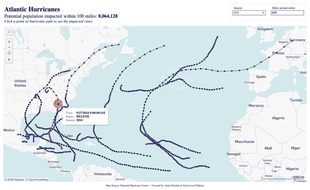
This dashboard visualizes storm tracks across the Atlantic basin and pairs them with a proximity-based impact metric that updates as you explore the map. At the top of the view, a headline displays the potential population impacted within the selected miles radius, which immediately recalculates when you adjust the distance parameter or select a different storm.
When you click on an individual point along a hurricane path, a tooltip appears showing specific details about that moment in the storm’s lifecycle, including the timestamp, storm name, and season. For example, selecting a dot along Hurricane Helene reveals the exact date and time associated with that track position. That interaction does more than provide context. It drives the analysis. The selected geometry serves as the center for a proximity calculation, and the population impact metric is updated to reflect cities within the chosen distance band.
What makes this design effective is how naturally it mirrors real-world spatial reasoning. Instead of scanning historical tables, you click a storm, adjust the miles-around-storm control, and instantly see how the estimated impacted population changes. The interaction feels intuitive because the analysis responds directly to where you click on the map.
Takeaway: This is a strong example of spatial functions working alongside spatial parameters. Proximity zones can be created with BUFFER and evaluated using INTERSECTS, while the tooltip interaction acts as the trigger that drives the recalculation of the impacted population metric. The result is a workflow where the map is not just displaying history, it is actively powering the analysis.
Interact and download the Historical Atlantic Hurricane Paths dashboard in Tableau Public.
Tableau Map Visualization 3: London Stadium Crime by Celia Fryar

This dashboard centers on a very practical spatial question: what does crime look like within a selected radius of London Stadium? The default view highlights anti-social behaviour incidents, displaying a headline summary that updates dynamically, such as the total number of crimes within a six-kilometer radius. Instead of forcing you to interpret raw geographic data, the design immediately communicates scale and proximity in plain language.
On the right side of the dashboard, viewers can adjust several controls that directly shape the analysis. The Crime Type dropdown lets you switch between categories such as burglary, vehicle crime, robbery, shoplifting, and more. Selecting a different crime type instantly updates both the map and the summary metric at the top, reinforcing how spatial filters drive the story. Additional controls, including radius selection and ring shading bin size, allow viewers to refine how distance is calculated and visually represented.
What makes this dashboard effective is its ability to mirror how people naturally explore geographic questions. Instead of navigating administrative boundaries, users start with a specific place and ask, “What is happening nearby?” The adjustable radius parameter positions the stadium as an anchor point, while color bins help communicate how crime density changes with distance.
Takeaway: This design is a strong example of proximity-based analysis using spatial calculations. BUFFER logic can create the selectable radius around the stadium, while DISTANCE calculations support color binning and ring shading. Pairing those calculations with parameter controls and filters, like the Crime Type selector, transforms the map from a static display into an interactive spatial investigation tool.
Interact and download the London Stadium Crime dashboard in Tableau Public.
Tableau Map Visualization 4: Racial Diversity in America | Next-Level Tableau by Andy Kriebel

This dashboard takes a different approach to mapping by removing traditional geography altogether and replacing it with a structured grid of state tiles. Each square represents a U.S. state and contains a stacked composition view showing the distribution of race and ethnicity categories, including White, Hispanic, Black, Asian, American Indian or Alaska Native, Native Hawaiian or Pacific Islander, and Multiple Races. Instead of focusing on physical boundaries, the design focuses on comparison.
At first glance, the layout looks simple, but the details become clearer as you interact with it. Hovering over any state reveals a tooltip that highlights the selected category and percentage, such as “Iowa — White: 81%.” That small interaction helps reinforce the exact values behind the visual proportions without cluttering the dashboard with labels. It keeps the view clean while still allowing deeper exploration.
What makes this dashboard effective is how it removes the visual bias of geographic size. Traditional choropleth maps can unintentionally emphasize large states simply because they occupy more space. By equalizing each state into the same-sized tile, the viewer can scan patterns much more easily and compare distributions without distraction. States like California, Texas, and New York no longer dominate the visual conversation purely because of land area.
Takeaway: This is a strong example of treating geography as custom geometry rather than a basemap. Tableau ultimately plots marks on coordinates, which means geographic analysis does not have to rely on traditional maps. By combining custom shapes, layered marks, and hover-driven detail, this dashboard turns a spatial dataset into a compact comparison tool that clearly and efficiently communicates composition.
Interact and download the Racial Diversity in America dashboard in Tableau Public.
Tableau Map Visualization 5: Melbourne on the Move | Next-Level Tableau by Andy Kriebel
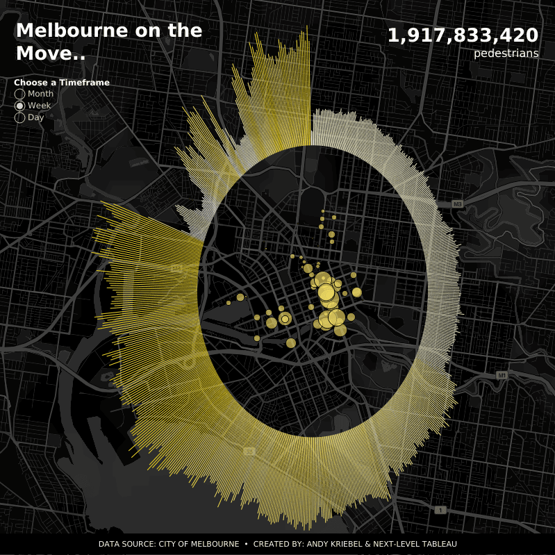
This dashboard blends spatial context with temporal storytelling by turning pedestrian activity into a circular radial visualization layered over a dark basemap of Melbourne. At first glance, the design feels striking, but the interaction reveals how thoughtfully the pieces work together. A large headline KPI displays the total number of pedestrians, while a timeframe selector lets viewers switch between month, week, and day views to explore the data.
The outer circular structure represents pedestrian activity over time. When you hover over a radial bar, a tooltip appears showing the specific timeframe and total pedestrian count, such as a monthly value for October 2021. This interaction transforms what could have been a static design element into an exploratory timeline. Instead of reading a traditional chart, viewers move around the circle and discover peaks and dips through interaction.
Inside the circle, the map displays individual pedestrian sensors across Melbourne. Hovering over a dot reveals additional context, including the sensor name and pedestrian counts for that location. For example, selecting a sensor highlights details like “Bourke Street Mall (North)” along with its recorded pedestrian volume. The contrast between the large radial timeline and the detailed spatial map encourages viewers to connect activity to its location.
What makes this dashboard effective is how it avoids separating maps and charts into different sections. The radial bars and sensor map share the same visual space, creating a unified experience where spatial and temporal analysis feel connected. The dark basemap reduces visual noise, allowing the gold tones of the radial bars and sensor points to become the focal point without overwhelming the viewer.
Takeaway: This is a strong example of layering geographic and non-geographic visuals within one composition. The map provides spatial grounding, while the circular radial bars act as a synchronized temporal layer. By combining dual-axis design techniques with map layers, the dashboard demonstrates how Tableau maps can function as a canvas for complex storytelling rather than just a background for points.
Interact and download the Melbourne on the Move dashboard in Tableau Public.
Tableau Map Visualization 6: Crimes in Athens-Clark County | Next-Level Tableau by Andy Kriebel

This dashboard works as a visual guide to four different mapping approaches applied to the same crime dataset. Instead of telling one story, it shows how changing the map encoding changes what you notice first. Each panel represents a different spatial technique, and hovering over individual marks reveals additional context that reinforces how each approach answers a slightly different question.
Dot Map – All Crimes
The dot map displays every recorded incident as an individual point across Athens-Clarke County. At a glance, you can immediately see clusters forming around the downtown area and along major corridors. When you hover over a single dot, a tooltip appears with detailed information about the specific case, including the offense type, date and time, address, and case number.
This interaction highlights the strength of dot maps: precision. They allow you to investigate individual records and understand exactly where and when something happened. The trade-off is density. With thousands of points layered together, patterns can become visually overwhelming, which is exactly why the other panels in the dashboard exist.
Why it works: It anchors the viewer in the raw data before introducing aggregation. You start with the most literal view of the dataset, which builds trust before moving into more abstract visual encodings.
Density Map – Crime Downtown
The density map shifts the focus from individual incidents to overall intensity. Instead of plotting discrete dots, it uses a heatmap-style rendering to highlight areas with higher concentrations of crime. When you hover over a location, a tooltip surfaces the underlying offense details, showing that the density layer still connects back to real records.
This approach works well because it reduces visual noise. Rather than trying to interpret thousands of overlapping points, the viewer can immediately identify hot spots based on color intensity. The downtown area becomes the clear focal point without requiring zooming or filtering.
Why it works: Density maps translate large volumes of point data into an intuitive gradient, making them ideal for answering questions like “where is activity concentrated?” rather than “what happened at this exact address?”
Hexbin Map – All Crimes
The hexbin panel aggregates incidents into evenly sized hexagons across the county. Each hex represents a summarized count rather than individual events. Hovering over a hex reveals the total offense count for that area and exposes quick actions such as Keep Only or Exclude, showing how spatial aggregation can also drive filtering workflows.
Hexbins strike a balance between precision and clarity. Unlike density maps, which smooth the data into gradients, hexagons maintain discrete boundaries. That makes it easier to compare one area against another without losing the sense of geographic structure.
Why it works: Hexagons normalize the map into consistent units, which helps viewers compare relative activity across space. It is a strong example of how aggregation can simplify analysis while still supporting interaction.
Map Layers – Thefts vs. All Other Crimes
The final panel moves away from traditional mapping entirely and demonstrates how map layers can support comparative analysis. Instead of geographic shapes, the view uses donut-style marks to contrast theft-related offenses against all other crimes. Hovering over each donut reveals whether theft occurred and the total number of offenses, with separate tooltips highlighting values such as “Theft: Yes” or “Theft: No.”
What makes this panel particularly effective is its reframing of geographic data as a compositional problem. The layered donuts allow viewers to quickly compare proportions without a basemap. The interaction reinforces this by emphasizing category breakdowns rather than spatial location.
Why it works: It shows that map layers are not limited to geographic storytelling. They can also act as a flexible design framework for building non-map visuals that still originate from spatial data.
Why this Dashboard Works as a Whole
Taken together, the four panels illustrate a progression in spatial thinking:
- The dot map answers “what happened exactly where?”
- The density map answers “where are the hot spots?”
- The hexbin map answers “how does activity compare across space?”
- The layered donuts answer “what is the composition of the data?”
Seeing all four side by side makes the design lesson clear. There is no single “best” map type. The right choice depends on the question you are trying to answer.
Interact and download the Crimes in Athens-Clark County dashboard in Tableau Public.
Tableau Map Visualization 7: NYC Taxi Trips | Next-Level Tableau by
Andy Kriebel

This dashboard explores a classic mobility question: where do New York’s taxis actually go once a trip begins? The map visualizes origin-destination routes as connected lines, with pickup and drop-off locations forming a network across the city. In the default view, Brooklyn is selected as the pickup borough, revealing clusters of short-distance trips around Lower Manhattan and nearby neighborhoods.
On the right side of the dashboard, viewers can refine the analysis using interactive controls. A Pickup Borough dropdown allows switching between areas such as Brooklyn, Manhattan, Queens, Bronx, Staten Island, and airport zones like EWR. Beneath that, a second dropdown displays a detailed list of neighborhoods within the selected borough, allowing users to granularly control which pickup areas appear on the map. These filters demonstrate how geographic hierarchy can guide exploration, starting broad with boroughs and then narrowing into specific locations.
Another key interaction is the distance parameter labeled “How far should the taxi go?” Adjusting this value changes which routes are displayed, allowing viewers to focus on shorter local trips or expand the network to include longer journeys. As the distance increases, the map transforms from a tight cluster of connections into a broader web of movement across New York City.
What makes this dashboard effective is how quickly it communicates flow. Instead of listing pickup and drop-off coordinates in a table, the network of lines reveals patterns immediately. Dense clusters highlight popular routes, while isolated lines hint at less common travel paths. The interaction model keeps the experience intuitive. You select a borough, refine the area, adjust the distance, and watch the spatial story evolve.
Takeaway: This is a strong example of origin-destination mapping built with spatial calculations. Functions like MAKEPOINT and MAKELINE transform latitude and longitude fields into connected routes, while parameter controls introduce a dynamic layer that lets users explore distance-based patterns. The result is a map that turns raw trip data into a clear visual representation of movement through space.
Interact and download the NYC Taxi Trips dashboard in Tableau Public.
Tableau Map Visualization 8: I Want Candy by Lisa Trescott

This dashboard takes a playful approach to mapping, transforming a Valentine’s Day candy story into a visual experience centered on a heart-shaped layout. Instead of using a traditional basemap, each U.S. state appears as a custom shape within a large heart, turning the map into an illustration that matches the data’s theme. At first glance, the design feels whimsical, but the interaction reveals the analytical structure that underlies it.
Hovering over a state brings up a detailed tooltip that shows that state’s favorite Valentine’s candy along with supporting rankings. For example, selecting Tennessee reveals that Conversation Hearts take the top spot, followed by Heart-Shaped Box of Chocolates and Wild Berry Skittles. The tooltip includes imagery, reinforcing the storytelling aspect while still communicating clear ranking information. This interaction helps viewers explore regional differences without cluttering the map with labels.
The lower portion of the dashboard complements the map with a ranked list of the most popular Valentine candies overall. When you hover over a candy in the list, additional visual context appears. Selecting Conversation Hearts highlights the category, while hovering over Heart-Shaped Box of Chocolates displays a larger image tooltip and summary text explaining which states prefer that option. These layered interactions connect the map and the bar chart, encouraging viewers to move between geographic and categorical perspectives.
What makes this dashboard effective is its balance of creativity and clarity. The heart-shaped layout immediately establishes the theme, but the custom coordinates and structured interactions keep the analysis grounded. Instead of overwhelming viewers with technical details, the design invites exploration through familiar visual metaphors.
Takeaway: This is a strong example of using custom coordinates and shapes to turn geographic data into a storytelling canvas. Tableau ultimately plots marks on an X and Y axis, which means maps do not need to look like traditional maps. By combining custom geometry, image-rich tooltips, and coordinated highlighting between views, this dashboard shows how spatial design can support both analysis and narrative.
Interact and download the I Want Candy dashboard in Tableau Public.
Tableau Map Visualization 9: Playing with Tableau’s New Spatial Parameter by Dennis Kao

This dashboard demonstrates how spatial parameters can reshape the way users interact with geographic data. In the default view, a dark basemap of Ottawa building footprints fills the screen, with most structures shown in muted gray while a selected cluster of buildings is highlighted in bright cyan. The contrast immediately communicates that geography itself is driving the interaction rather than traditional filters or dropdown controls.
Instead of overwhelming viewers with multiple charts, the design keeps the focus on one core idea: using geometry to define selection. The highlighted area represents the output of a spatial parameter workflow, in which a user-defined shape determines which buildings are displayed on the map. This makes the experience feel more exploratory, as though the viewer is drawing a question directly onto the geography rather than clicking through standard UI elements.
The minimal design plays an important role in how clearly the concept comes across. The dark background reduces visual noise, allowing the highlighted structures to stand out and making it easy to understand how spatial selection changes what is emphasized on the map. Even without additional annotations, the interaction tells the story.
This dashboard turns a technical feature into something visual and intuitive. Spatial parameters introduce a new level of flexibility by allowing shapes, buffers, or spatial logic to drive analysis. This example shows how a simple highlight can demonstrate advanced geographic capabilities, offering a glimpse into how newer spatial workflows in Tableau can support more dynamic, map-driven exploration.
Takeaway: This dashboard highlights how spatial parameters transform passive visuals into interactive analytical tools. Rather than relying on traditional filters, the geographic shape itself drives what is selected and emphasized, creating a more intuitive way to explore location-based data. It’s a strong example of how newer spatial features in Tableau can simplify complex workflows while encouraging users to think spatially first.
Interact and download the Playing with Tableau’s New Spatial Parameter dashboard in Tableau Public.
The Tableau map-building toolkit behind these dashboards
Across all nine examples, one pattern shows up again and again. The creators treat maps like a composable canvas made from geometry, layers, and interactivity.
Tableau supports this approach in a few key ways.
Marks layers allow you to stack multiple geographic layers on a single map. Each layer can use its own mark type, styling, and logic. This allows combining points, density surfaces, hexbins, routes, outlines, and even decorative shapes within a single spatial frame.
Spatial functions expand what you can calculate and draw. You can create points, connect them into lines, buffer an area, measure distance, or test whether shapes intersect. These functions are the backbone of origin-destination routes, proximity zones, and interactive filtering.
Spatial parameters shift mapping from “show where” to “let the user choose where.” A spatial parameter can store a point, line, or polygon and drive calculations or actions. As of Tableau 2025.2, map viewport parameters take this idea further by allowing the map viewport’s visible area to drive filtering and synchronization across views.
Bring These Mapping Ideas to Life with Tableau and XeoMatrix
The dashboards featured here show how powerful geospatial analysis can be when creativity meets the right tools. Tableau gives teams the flexibility to move beyond standard maps, blending spatial data, design, and interactivity to tell clearer stories and uncover deeper insights. From advanced parameters to layered visual techniques, these examples demonstrate what’s possible when mapping becomes part of the analytical workflow instead of just a background visual.
At XeoMatrix, we work with organizations to turn ideas like these into production-ready analytics experiences. Whether the goal is modernizing legacy reporting, designing intuitive Tableau dashboards, or building scalable data foundations that support advanced geospatial analysis, our team helps bridge the gap between inspiration and execution.
About XeoMatrix
XeoMatrix is a data and analytics consulting firm focused on helping teams get more value from their data through thoughtful design and strong technical strategy. By combining Tableau expertise with practical data engineering and visualization best practices, we help organizations simplify complex information and create analytics that people actually use. If you’re exploring new ways to elevate your Tableau environment or bring advanced mapping concepts into your workflows, our team is here to help.