
Survey data is everywhere. It informs decisions across marketing, HR, customer experience, and product strategy. Providing these insights is not about building charts, it’s about translating sentiment and preserving meaning.
But what happens when:
- Your data is filled with messy, non-tabular data structures,
- Inconsistent scales and response orders bring ambiguity instead of clarity,
- Survey design introduces complexities with multi-select and complex conditional logic?
Lauren Cristaldi, XeoMatrix’s Manager of Data Analytics, walked through how to rethink survey data in this Data-Driven Community session. The focus was not just on visualization, but on building dashboards that are more performant, easier to maintain, and more effective at telling a story.
See how combining thoughtful data modeling and design techniques can unlock new possibilities:
- Structure wide and long datasets for more flexible analysis,
- Use dynamic zone visibility to simplify layouts, and
- Improve performance by consolidating views and leveraging map layers.
This is not just about making survey dashboards look better. It is about reducing complexity and turning messy feedback into clear, actionable insights.
Dive into the recap for a practical look at the examples and techniques used to bring survey data to life.
Ready to rethink how you work with survey data?
Watch Visualizing Survey Data & Using AI for Analysis in Tableau
>> CELIA FRYAR: Welcome to our March edition of the XeoMatrix Data-Driven Community. We are grateful that you guys carved out time to spend with us today. Hopefully you’ve got your lunch, and you’re comfortable and ready to jump in with us to how to make the survey data visualizations be more enjoyable and less painful. I’m pleased to be your host today. We do this monthly, and we have topics that we select around either requests from various customers or fresh pickings from the grapevine of development that’s recently been done. That is how today’s topic came about. We’ve got a little bit of announcements and meeting normals we’ll talk about.
Lauren is our featured speaker today. She is our manager of data analytics at XeoMatrix and is absolutely an expert when it comes to UI/UX design. It’s my pleasure to get to work alongside of her. We’ll have a presentation, and then we’ll have a time for Q&A at the end. Also, very much like for this to be more of a conversation and less of just a one-way delivery. She and I both love that, and so if you have questions that you want to ask during it, we have chat enabled for our webinar. Feel free to put comments, questions, and such in there as we go along. Chat will be available. Q&A at the end.
By Friday, there will be an email in your inbox that will be a linking to some of the resources that we reference today. I’m going to keep an eye on the way you learned to help people make their way in. Truly, if you have an idea for a topic you’d like to see us cover, we are all ears, and we really welcome your feedback and your input. I’m Celia Fryar. I’m the training and enablement lead at XeoMatrix. I’ve been here for about a year. I’ve been part of the Tableau and data analytics environment for the last two decades. Very much been involved in Tableau the last 15 years and been teaching it for 10.
I also am a university professor at University of San Francisco, and enjoy participating in things that happen with the data fam. I’ll let Lauren introduce herself, and then we’ll jump into our presentation for the day.
>> LAUREN CRISTALDI: Thank you. I’m Lauren Cristaldi, for those of you that don’t know me. I’m the manager of our data analytics team. I come from a state government background. I have about eight years. I think it’s nine years now, but it’s always changing. I don’t want to do the math anymore.
>> CELIA: This is probably out of date, to be fair.
>> LAUREN: No, you’re good.
>> CELIA: I’ll fix it.
>> LAUREN: No, I think I did the math recently, and I was like, “No, that can’t be right,” and I was like, “Oh, I guess that is right.”
>> CELIA: It is right.
>> LAUREN: I’m excited to show you guys some different ways to visualize survey data today.
>> CELIA: Thank you very much, Lauren.
>> LAUREN: With that, this topic was fresh peekings from the grapevine of development done in-house recently. I was telling our marketing team this morning, as an educator, when it came to survey data that they wanted to use for their capstone, I always tried to steer people away from it because it can be more complex, more frustrating. It’s just difficult to do well with. I was really delighted when I heard that Lauren was willing to do this today. Hopefully, it will be that intersection of where feedback meets foresight. A lot of decisions get made around survey data, so it is actually very important. With that, Lauren, if you’re ready, I will stop sharing my screen and hand the baton over to you.
Please, folks, just know I am watching the chat channel, and we really welcome you to jump in and ask questions as we go through.
>> LAUREN: Thank you. I’m just going to turn my video off because I get too close to the camera, and I don’t want to do that to anyone.
[aughter]
>> CELIA: That sounds good.
>> LAUREN: I’ll start with how I get all the data ready. I use this data mock star by the visionary Adam Miko, which Celia introduced me to. This thing has been awesome just for wanting to put together quick demos or anything like that, or maybe you want to test out a new style, but you don’t have the data ready yet. This can be really useful. If we start from the top, I know it seems like a lot of prompts. It kind of is. I asked this model to produce this team survey. We want to, like, look at sentiment among the team. This is more like, I guess, an HR use case, but it can be adjusted if you had something more industry-specific.
I know survey data is used a lot in marketing, especially, but it can be good to know just your own employees, how they’re feeling. I guess now that I’m a manager, I’m thinking about that more. I produced this, and then it prompts you any edits you’d want to make, or like here, I just asked to make it more personal. We get a better range of answer styles. Now we have more categorical and scale, but the really fun ones in survey data are more of the short answer or a more long form response. Let’s see, as we go through. I may have asked that later on.
I’m still growing and learning as a prompt engineer. [chuckles]
>> CELIA: I just want to point out that this is a great example, Lauren, of how it’s a iteration of asking questions and refining the prompt. Don’t you think?
>> LAUREN: Yes, absolutely.
>> CELIA: [crosstalk] It’s a process to get really good data, especially when we’re asking it to be generated.
>> LAUREN: Yes, exactly. It’s better also if you are super clear, as clear as possible, and we don’t need to add the niceties. I say that, but maybe AI is going to come after me one day because I never say please and thank you.
[laughter]
>> CELIA: I heard a debate recently about the extra tokens that get spent on please and thank you, so I don’t know. Just asking.
>> LAUREN: I read something about that, too. The power that it takes for it to process a please and thank you. That point with opening that conversation and having these iterations to make it exactly what you want. Here you can see it’s expanded. We have these two more like long-form responses. I use the exact verbiage that it gave me, more like the sentiment-friendly. It’s nice because it explains the work. You’re not just getting sentiment is positive. You understand this response falls into positive. That’s always nice if you need to add a guide to your dashboard and say positive equates to this response.
>> CELIA: Those definitions are essential, aren’t they?
>> LAUREN: Yes. It’s especially nice if ChatGPT can write it for you, and you don’t have to write out for every single one. Then here I’m asking it to calculate the overall sentiment based on everything above across all of the questions. That’s also nice because then you don’t have to do that work yourself. of course, always go back and check through because this isn’t perfect, but it definitely alleviates a lot of that burden and workload. Then it suggested a couple of other columns that might be useful. I just copied and pasted and added those in. Now this is really growing from the top when we only had 10 columns. We’re getting a lot more out of this.
Then I asked it to produce the survey responses in Excel, and then supporting tabs for the question and answer guides and the logic. Where it was listing above its logic for each scoring category, and all of that. The pivot summary wasn’t actually that useful, but it was just something to try out. It’s also able to give us each the survey responses in a normal form and a long form, which is better for Tableau in certain cases, which is also nice because then you don’t have to pivot everything. I usually use prep to do that, but this was even faster than prep, and I love Tableau prep. Any excuse to use that, usually.
Then, with those guides, I asked it to provide this model so that when we’re building out that data source in Tableau will have those foreign keys and other objects mapped to one another across the tabs. They added a little summary. Let’s look at that data.
>> CELIA: Lauren, you might want to restate what you were just doing, because a bunch of people have joined us after we started the conversation. I’m not sure it’s clear that you were creating the– if you want to just summarize what you were doing there, because I think that was incredibly important, by the way.
>> LAUREN: Yes, no worries. I was using ChatGPT, this data mock star, like mock data generator. Basically it’s just going through the iterations of responses to customize your data set that you’re using. If you already have survey questions and answers, and really any form, you could put that in here as well, and then it could do the same thing in the later steps, when I’m asking it to kind of expand or change some columns or categorize for different things, like sentiment overall. Then, adding in those tabs for support, so that you have more descriptions for the questions and answers. This logical model so that you can bring all of those support tabs together in Tableau with actual responses.
>> CELIA: This is great. This is really good. If you’re trying to illustrate something, also if you’re trying to communicate a problem you’re having with your own internal proprietary or data that’s protected by PII or PHII, this is an engine you can use to approximate it, so then you can get support or help. For today’s session, we clearly needed to do something that was a little bit more abstracted from actual direct responses. Lauren, having had to work with this both recently and over time, this was a good way for us to get good survey data for us to demonstrate today. Thank you for that reroll there, Lauren.
>> LAUREN: Yes, absolutely, and thank you for that note, too. That was a good thing to note. Let’s look at our output. Here are different tabs. This would be the most, I say, like, normal view of it, where we have it more of in a wider format, but we’re getting a response. It’s one survey per line. We have that employee. Then those different questions and the answers per row. Then, the next two tabs, we had released a tips and tricks video recently about using image URL field types. I just built these out because I had the saved in Cloudinary. I’ll go through that in another step, though. Those are those two keys for the images.
Here’s that pivot summary. This was an example of where ChatGPT suggested it, and I was like, “Oh, why not?” I just wanted to see what that would look like, but I don’t think it’s too useful, but it’s always good to have options. Here’s one of our sample guides, or lookup tables, where we have the different questions, the description of the question. This column name is the foreign key where we’re going to be connecting. You’ll see that pop up again on the answers. Then sentiment logic is just for– it doesn’t really connect cleanly to the other ones. That’s a case where I would go back normally and ask ChatGPT to make it so that we could connect to these more easily.
This is also just good to have if you wanted to have another data source where you just bring in this table just for a description.
>> CELIA: Lauren, a couple of questions about how much interaction with the LMS as a general class that we would have when we’re working with client data. I answered it with which we don’t use ChatGPT in particular data at all, but I want you to have a shot at that question as well.
>> LAUREN: No, we don’t use the LMS for client data. Not that it’s not safe, but I just don’t think that’s– that’s part of one of our policies is that we don’t do that just because we’re worried about if anything were to happen. I’d say I mostly use ChatGPT to model things first, and then it helps me go through some questions. With this mock data, if I told it, “Oh, make some marketing data for me based on certain questions. Then that would help me, and I wouldn’t actually be using any proprietary information or data. I’d say that’s mostly what we use it for.
>> CELIA: Really good. Recently, Lauren and I were working on an account together. Somebody had asked for a certain type of visualization, but the data hadn’t even been shared with us yet because they weren’t sure that it was possible what they were asking for. Lauren created some data using the same engine along the lines of what we’ve been told that the topics and categories would be. She referenced it to didn’t use the CDC site. You reference real data out of it, but it wasn’t the client data. Right?
>> LAUREN: Oh, yes, I did pull the publicly available CDC.
>> CELIA: Right, exactly. We were able to inform it with things that would be domain-specific and relevant, but not have anybody’s privacy or purpose amongst mentioned here. All of those rules apply to what we do. You have to navigate carefully so that you are modeling and helping to increase the speed of delivery for your own work, but also keeping it really buttoned up on anybody’s actual data. Anyway, thank you for that, Lauren. I just wanted to make sure we circle through that in case anybody’s thinking about that, because we’ve got three or four comments in chat about that.
>> LAUREN: No, that’s a good thing to call out. It’s a good public service announcement. We’re not using your data in ChatGPT.
>> CELIA: Correct.
>> LAUREN: Oh, here’s our survey model. I wish that this just existed everywhere, because this will be so useful in real databases where you don’t always have the right documentation. I’d say more often than not, you don’t have the right documentation, so you don’t know what that foreign key is. This is really nice. We won’t actually bring this into Tableau, but it’s great for a reference as you’re building your data source in Tableau. This is that long form. This would be our taller version, because back here in the wide version. It’s great that we have all that information per row per employee.
When we go to bring in these other keys, like the question guide, we can’t tell Tableau to create a relationship on column H based on row two or something like that. That’s where this long form comes in handy. Really, you do need both, and I’ll show you how I put them together. I’ve done a few survey dashboards now for clients, and that was a big part of it was where we had to make sure that we had a long format, and a wide format, just for ease of filtering or swapping views out for other views where you want to look at one employee in particular across or all the employees across the different questions and question types. That’s the long format comes in handy.
Now that we’ve looked at the data, before we start building out, I’ll show you the data source. This is something I made for our team, Secret Santa. I just reused that and generated some dummy names based on our own team’s responses, and then adjusted things accordingly. Honestly, I really just wanted to show this off because I was super proud of it. [chuckles] I had a lot of fun building this, maybe too much fun.
>> CELIA: It was beautiful.
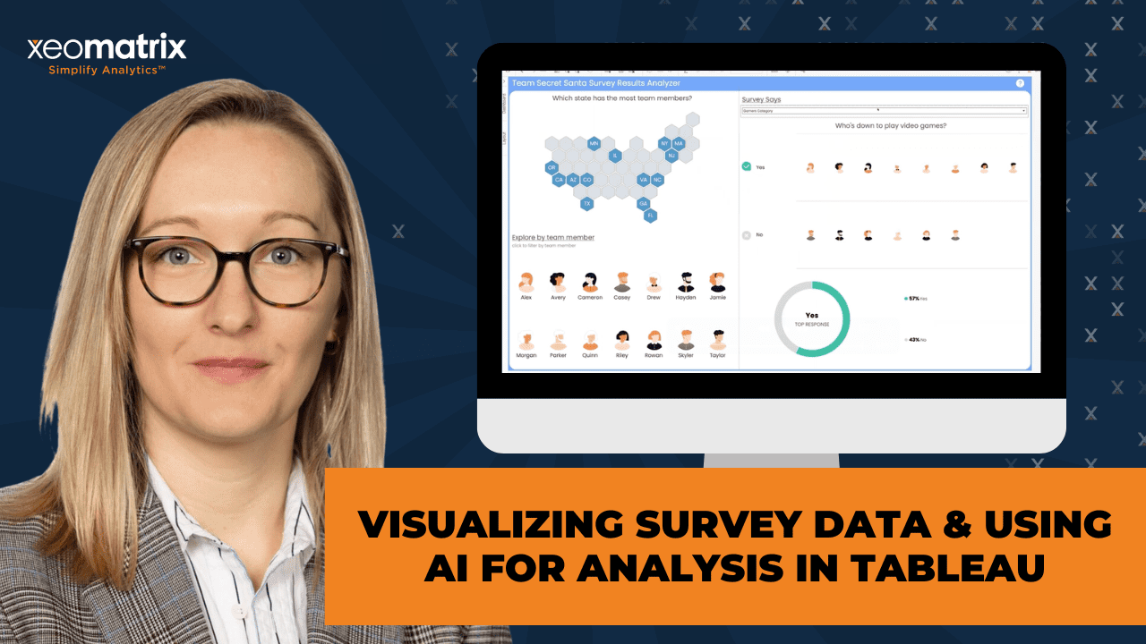
>> LAUREN: Thank you. Here I have these profile pictures. This is one sheet, which I don’t even know how I figured this out, but I did. [chuckles] I’m using index and then a set. You can actually create these different rows for the profiles or team members and then have them all in one sheet. Then I’m using this sheet as a filter for the rest of you. If I select Alex, now, it brings up her profile just like a random address. This is laid out similar to the one I had walked through with the mock data. We just have more fun categories to go through.
I’m using dynamic shapes, so I’m assigning actual shape files or images to the different subcategories. Then each person or team member, they have their own little profile user icon that I just got from Figma, but it’s kind of a fun way to show who has similar fandom. Then you can see these icons for different people. Sometimes I feel like, especially with survey data, where people go wrong is they try to put too many words, but it’s also really hard to visualize outside of having a lot of words. I thought this was a creative way to show, “Oh, look at all the people up here.” Versus gaming versus sports or music. You’re seeing the number of team members that answered within those categories.
You’re seeing the forest and the trees at the same time. Then we have this overall down here with the top response called out, which is my favorite use case for a donut. That way we’re calling attention to the [crosstalk]
>> CELIA: It’s a great idea. The top response being in the center into the KPI replacement. That’s actually a great idea, especially for this sort of use case. Right?
>> LAUREN: Yes, thank you.
>> CELIA: Super nice.
>> LAUREN: Then having a better version of the legend over here because a lot of times with pies or donuts, we start getting– especially if this was an even smaller percentage, then that label would get cut off or it would overlap another label, or as we’re adjusting size, not all the labels would fit. This way, you get a legend telling you what each color is, and also that percentage. Then most of the questions are just in the same format, but since in this case, I’m using that long form version just with a different set of mock data, I’m able to have this drop-down where we have the different categories of questions and answers. Then it’s really easy just to switch, and it’s fast because we’re not using as many sheets.
>> CELIA: Can you describe those performances, you said a little bit more? There’s a couple of notes about that, and I have observed that you have some really nice efficiencies you’ve got in here.
>> LAUREN: In terms of performance, I’d say what I try to focus on the most is the number of views or worksheets in a dashboard. If you’re applying a filter and you have, let’s say, a sheet for each of these, instead of just one sheet where you’re applying this, and then it changes the categories, it’s going to be a lot more performant if it only has to load one sheet and then filter. As opposed to load 10 different sheets.
Even if you’re using dynamic zone, it’s still in the background, and it’s still trying to load in the background. This is just taking a lot of that load time off of Tableau. I guess, does that make sense? [chuckles]
>> CELIA: Yes, absolutely. Aren’t you using map layers for some of your layout selections as well?
>> LAUREN: Yes. Oh, actually, I don’t know if I am in this one. I figured out that index– oh, here we go. Yes, I’m using it here. For those custom legends, the map layers can be really handy. Here I’m just making– recently I’m all about– I’ve always been all about donuts and pie charts. Kind of a hot take, I guess, but map layers are my new favorite feature in Tableau. They’ve been around for a little while. I’ve been trying to use them just everywhere I can because there are a lot more performant. It goes back to now, you only have to have one sheet instead of having 10 sheets.
Especially when you’re building out KPIs, like, let’s say, you want to show the time series as well as the total. Maybe you want to call out some growth metrics at the same time; you can do that all in one sheet with map layers instead of having that be three or four sheets. The map layers are pretty easy. I do make point. Then these numbers don’t matter. It just depends on what you’re building out. We have the columns and the rows. We always get those mixed up. Longitude and latitude. It’s backwards from what you think X and Y, and how this usually would be, just because it’s a map if we go to make point.
Also, I feel like I don’t call this out enough, but the fact that Tableau has this guide over here where you can look up what the different functions are is so nice because even in all my years I’ve been using Tableau, I still forget exactly what– especially for things that I don’t use all the time.
>> CELIA: It’s great for confirmation to be sure because there’s so many choices, and then there’s undocumented ones beyond that. There’s a lot of options here, especially since it’s borrowing a lot from the SQL engine underneath it. Right?
>> LAUREN: Yes, exactly. I’m trying to think of other tools. I don’t know, I’m still traumatized from using Power BI and DAX. With the make point, it’s the latitude and longitude how we have it here. That’s where it’s going to fall, either horizontally or vertically. This one, for example, I’m just using that 0.11. It’s the same because if I had multiple columns, that’s when I would care or sub rows within one dimension row, because all it’s doing is recalculating that. Not recalculating, but it’s laying it out per row. Where we have this subcategory, yes or no, it’s laying it out again, depending on the row value of that dimension.
Then you can also show the header, which isn’t that wild that you can show the header. It still gets me sometimes because I’m like, “This is a map. That’s weird to have longitude and latitude like this.” Yet in this case, I just adjusted it, really just for looks. You don’t necessarily have to adjust it, but I adjusted it here for the 0.5, and then the end is just for– I think it’s because I wanted to– here, let me hide these again. We go back to our dashboard. I wanted it to be closer to the donut. Otherwise, it would just default to be in the middle because we only have technically one point map layer that’s being used.
If I could just talk all day about map layers, I would. From this example, I know we’re about halfway, so I’ll get into what we started with, where we’re generating new mock data. I’ll show you how I set up that data model based on the Excel sheet. We have our wide-format survey responses from the start. I’m bringing in that department and overall sentiment key for those image URLs. We’re just using that relationship to connect on department. Then the same for the sentiment. Here we’re going to connect the wide format to the long format.
We’re just going to use employee name because there really isn’t any other rows that we could connect here since the wide format has all of those questions and answers pivoted differently. Here’s our long format. We’ll attach that answer guide where we have the question column, the column name, and those response values to the answer value so that we can pick up those descriptions of the different answers, and same for question. We’ll have descriptions of the different questions and also the type. Which is nice if you want to swap between looking at more categorical responses or the scaled responses.
One thing to know is in this long format, we don’t have that overall score. Again, that’s something I can go back to ChatGPT and say, “Hey, can you add in the overall in the long format? “We can pick that up from the wider view, and everything will still flow.
>> CELIA: This question is in chat. Do you use the wide-format data in Tableau, given that you already have a long form? I’m not sure that I understand. Are you connecting on what question is asking, or Helen, do you want to elaborate? The question is, why do you need both the wide and the long?
>> LAUREN: No, that’s a good question. With the wide, sometimes it’s just easier when you are just looking at an employee view, and you want to show a scorecard, almost or assessment for one employee, whereas the long format gives you more flexibility to look across employees. It’s just giving you options for those views and also the department, these dimensions that we have that aren’t a part of the long format, they need to connect to the rows in the wide format. When we’re adding extra detail, so adding in these image URLs to have dynamic images attached to these different departments or that sentiment, that’s where we bring those in to that wide format.
In the long format, it would be a lot more complicated to bring those in, even if it did exist, since all of the rows are repeating in the longer format. I think it will make more sense once I– I’ll show you a couple of the tabs as we’re closing out.
>> CELIA: I think that’s something that Bill is asking now is probably congruent with something you said earlier about how you would bring this data together often inside of prep, into a long format. Is that that you commonly use prep for–
>> LAUREN: Yes, no, absolutely. I actually did that with the team one. That first example I was showing in the original version with our actual [unintelligible 00:36:29] team responses. It created an answer key, and then it pivoted all the questions and answers for the team so that we’d have that longer view versus the wider view.
>> CELIA: Helen, thank you for your follow-up there. She thanks you for answering the question. She understands what you meant by that.
>> LAUREN: Oh, awesome. Cool. I’m trying to think if there’s an even more succinct way to put it. I think this is more the wider version matters more for your dimensions, not necessarily the question and answer. It’s like the plate for the sandwich that you’re making from the actual meat of the survey. I don’t know if that made sense, but I’m going to go with it. [chuckles]
>> CELIA: It is lunchtime, so there you go.
>> LAUREN: Exactly. I might be hungry. I think that’s what it is.
[laughter]
>> LAUREN: As I start building out really anything, I like to bring everything into more of a tabular view so that I can get a sense of where everything falls, brainstorm different visuals that would make sense, especially as we’re going from the categorical to the scale. With the scale, we have the number values available, but with the categorical, it’s all string values. My first stab at it, I was thinking it would be interesting to see a dynamically sized bubble and then have it colored based on the answer description. That way, when you hover over it, saying, “The question is, I have the autonomy. I need to do my best work.”
This is on the scale. It’s three, which is neutral, and there were 3 employees that had responded with three and that response value. Whereas we had 11 employees agree to the autonomy and 6 that strongly agreed. Now this way you’re getting all of that. That’s a lot of information all at once. Then it’s good to have the tool tips because it adds all that detail and context for you without taking up too much space. If we go to all, we can see how all of the questions and answers scale beside each other. Another thing you could do, which I feel like doesn’t get used enough– let me look for my question column.
If we throw a question column onto pages and press play, now it’ll show you a visual of how those are changing. That animation doesn’t get used a lot, but I think, especially for high-level presentations, it can be nice to have that visual animation style where you can see trends and you can adjust how fast it is as well.
>> CELIA: I’ve looked away for just a second. Did you show how that was back over your dashboard? I love pages, shelves. Things in motion. I feel like that’s certainly underused. It’s a great way to draw attention.
>> LAUREN: Sorry, how I added it to the dashboard?
>> CELIA: Yes.
>> LAUREN: Let me remove that. If we go over here to that question column, I just had– oh, there it is. You just drop it on pages. If you have it in the filters, just set it to all, then you can press play, and then you’re good to go. I think when you do it this way, if you’re just selecting one, you’re filtering it, and the pages happen after all your filters. Just make sure that it’s cleared or set to all. If we remove the question column now, we can watch it change. It’ll show you what that question is at the top. Any other questions around that, or maybe ideas for a different way to visualize?
>> [PAUSE 00:42:53]
>> LAUREN: Awesome. Our next one, be these categorical type views. Here is where we would have basically the same thing as the scale type, but since it’s– I should change it to categorical. Since these are strings, it’s better to use– we’d use the total employees, and we would show back here with the other survey. We could build where we have the different team members associated with that, or an overall total of the team members. Oh, I think someone put an annotation. Was there a question?
>> CELIA: I don’t think so.
>> LAUREN: Oh, it might have been by accident, that’s okay. For the sake of time, since we more or less have this already built out in the first example, I really want to show you guys how we’re using the image URLs. A few notes about image URLs. They support JPEG, GIF, and PNG. Then the only criteria really is for it to be under 200 KB. It needs to exist or be referencing a cloud-based repository, so that’s publicly accessible. I use Cloudinary. It’s a free tool. Let’s see. Here, I just have a folder. Here are my different assets. You can just search for images that get uploaded. You can upload images that you have locally, or you can put in certain web addresses for those images.
Here are my different images. Then I just copied the URL and created those supporting tabs to map the URL to that certain dimension. We go back here. These are technically GIFs. I will say in Tableau desktop, they don’t always load, but once you publish them, they do load. Here I’m showing the overall sentiment, or just to go back one step. In order to establish that a certain field is that image URL type field, if you see this little picture icon from the data pane or the fields list, you go down, it should be a string, and then image role and URL. To see this in action, go over to our cloud site. Of course, you don’t have to use these.
I pulled some sample ones, but this is another good way to add more animation and make it more visually creative and interesting, because now I’m associating the neutral, and that’s 45% of the total respondents had a neutral overall sentiment. Then, 55 had a positive overall sentiment. I just think it’s fun that we can use GIFs. Any questions on that?
>> CELIA: See any questions in chat? Has anyone used the image URLs before? I’m just curious. If you have, you want to add a reaction to your screen. That’d be awesome. It’s not brand new, but it is relatively new. I feel like that’s a low-hanging fruit for really bringing in some additional interesting creativity into what we do. Lauren recorded a little short tips and tricks video on how to get that done. I’ve just put the link to it into chat. If you want to grab that link and look it up afterwards. She’ll step you through how to get that done.
>> LAUREN: Thank you.
>> CELIA: Awesome, Lauren. Thank you. I guess with all those options. I’d be interested to know if anyone– is anyone using survey data currently or planning to? I guess what struggles are common that you found?
>> LAUREN: Amy Moss says she’s planning to. Amy, do you want to come off mute and describe a little bit about what you’re doing?
>> AMY MOSS: I have a survey for about 25 aging agency. For each agency, I pull sample, but the sample size is different for each agency. Totally, of all the agency, I have like 300 people. Then do survey to those 300 people. Each people may answer about 150 questions. I’m working on how to present the huge amount of content.
>> LAUREN: That can always be the hardest hurdle, I feel like, when you have that kind of data, and you want it to be useful, and nothing gets left out, but you don’t want to overwhelm. I think in that case, using a visual similar to this one, maybe not necessarily using the pages, but counting the number of employees, and how– kind of like putting things in [unintelligible 00:51:20] almost where you’re saying, “This is how that was distributed across the number of employees.” Especially if you have– that’s a lot of responses.
I think that’s the number one biggest hurdle and then second would be if you have the long form answers and trying to put those into categories, which is where ChatGPT was useful because it was able to evaluate different long form answers, and then say, “This is how we categorize these,” or using natural language to assess like overall sentiment based on keywords. I’d say, as much as you can categorize things and group them together [crosstalk] the story that you’re telling.
>> AMY: I want to show a bigger scale, a category or group question, but I also want to show, for example, if one agent fail on something, I wanted to show what kind of question that the agent fail. Those are just detailed question.
>> LAUREN: Oh, yes, kind of like showing–
>> AMY: First thing I see the high-level category, how many fail how many not fail, and then if fail, I want to show what kind of question fail. That’s a detailed information, and I know I’m working on that, how to show all the question, because that will be large for them.
>> LAUREN: That’s a good flow to establish where you’re showing the highest level to more of a medium detail view with the different categories, and then the greatest level of detail at the end. That’s a really good plan of attack for surveys.
>> AMY: I don’t want to take more time, but I can always find you if I need your help.
>> LAUREN: Okay. Yes, no problem.
>> CELIA: Anybody else have any questions or comments working on survey data, considering survey data? If not, I just want to tell Lauren, thank you so much for sharing with us today, and all the fact that you were able to use what we use for the– was it Secret Santa?
>> LAUREN: Yes.
>> CELIA: That is impressive. If you guys would just kindly– there are several links in the chat that are– feel free to grab the link to the YouTube, and then if you need to generate sample data to do a proof of concept or to share and show something that is not going to be– the real data needs to be more held by privacy for sure like most every data set we work with. Anyway, Adam Miko has the tools that I linked earlier about eight minutes after the hour. Feel free to grab those as well. We’re good. We’ll give you guys a couple minutes back. Lauren, thank you so much, and I appreciate you guys joining in today. We’ll be sending the recording out in a day or so. Am I missing anything, Lauren, do you think?
>> LAUREN: No, I think that’s good. Thank you.
>> CELIA: All right, you guys have a good rest of your week, and hopefully we’ll see you in a month. Okay? Thank you very much, everybody.
>> LAUREN: Thank you. Bye.
>> [00:55:52] [END OF AUDIO]
Links Mentioned
Presentation Summary
Survey data can be one of the most frustrating data types to work with. It is often text-heavy, difficult to structure, and easy to overcrowd with too much information.
The focus of this session was how to simplify that complexity by combining better data modeling, thoughtful design, and AI-assisted workflows. The goal was not just to visualize survey data, but to gain broad engagement and offer techniques empower business intelligence analysts.
Session Outline
- Generating Realistic Survey Data with AI
- Structuring Survey Data for Flexibility
- Improving Dashboard Design with Images and Layout Choices
- Using Dynamic Zone Visibility to Reduce Clutter
- Improving Performance with Map Layers for KPIs
- Balancing High-Level Insights with Detailed Responses
- Final Thoughts
Generating Realistic Survey Data with AI
One of the first challenges with survey analysis is simply having usable data. Using Adam Mico’s Data MockStar GPT LLM, we demonstrated how to use AI to generate sample datasets that closely resemble real-world data.
By iterating on prompts, she was able to create a mix of categorical, scaled, and long-form responses, along with additional fields like sentiment and scoring logic. AI can also generate supporting tables, such as question guides and answer definitions, which help structure the data before it ever reaches Tableau.
This approach is especially useful for prototyping or building proof-of-concept applications without relying on sensitive or proprietary data.
Structuring Survey Data for Flexibility
Survey data does not fit neatly into a single format. Lauren showed that using clean, normalized, and enriched data structures increases flexibility when building dashboards.
The wide format works well for maintaining dimensions like employee details or overall sentiment, while the long format makes it easier to analyze responses across questions and categories. Together, they allow you to switch between detailed views and aggregated insights without rebuilding your data source.
Establishing relationships between these tables also makes it easier to bring in supporting data, like descriptions and logic, which adds context to the analysis.
Improving Dashboard Design with Images and Layout Choices
Survey dashboards often rely too heavily on text, making them difficult to read. Lauren demonstrated how to improve visual appeal by incorporating images directly into Tableau using image URL fields.
By mapping icons and GIFs to categories like sentiment or response types, the dashboard becomes more engaging and easier to interpret at a glance. This technique also helps reduce the need for excessive labels or long text explanations.
She paired this with thoughtful layout decisions, including the use of icons and grouped visuals to show both high-level trends and detailed breakdowns in the same space.
Using Dynamic Zone Visibility to Reduce Clutter
A common issue with survey dashboards is trying to show too much at once. Lauren used dynamic zone visibility to control what appears on the screen based on user interaction.
Instead of stacking multiple charts on top of each other, this approach allows the dashboard to update dynamically as users select different views. It creates a cleaner experience and helps guide users through the data without overwhelming them.
Improving Performance with Fewer Sheets and Map Layers
Performance becomes a concern quickly when working with large survey datasets. Lauren emphasized reducing the number of worksheets as one of the most effective ways to improve load times.
Instead of building separate sheets for each element, she showed how to consolidate multiple elements into a single worksheet. Map layers played a key role in this approach, allowing her to layer different components, such as KPIs and supporting details, without adding extra sheets.
This not only improves performance but also simplifies dashboard maintenance and layout management.
Balancing High-Level Insights with Detailed Responses
Survey data often includes a mix of structured responses and open-ended feedback. The challenge is presenting both without overwhelming the user.
Lauren recommended starting with high-level summaries, then allowing users to drill down into categories, and finally into detailed responses. This layered approach helps maintain clarity while still preserving the depth of the data.
AI can also support this process by grouping long-form responses and identifying patterns, making it easier to turn raw feedback into meaningful insights.
Final Thoughts
The biggest takeaway from this session was not just how to visualize survey data, but how to approach it more strategically.
By combining AI-generated data, flexible data structures, and thoughtful design techniques, you can turn complex survey responses into dashboards that are both easier to use and more visually engaging.
With the right approach, survey data becomes less about managing complexity and more about uncovering insights that represent participants voices and drive better decisions.