
As organizations continue looking for ways to make data more accessible and actionable, Tableau Pulse has emerged as an important addition to the Tableau ecosystem. Tableau Pulse metrics surface important business metrics in a more personalized, contextual way, helping users stay informed about changes and trends in their data without having to navigate dashboards to find key metrics.
Creating effective Pulse metrics, however, involves more than simply selecting a measure and clicking save. The way a metric is configured determines the insights available to end users, the questions they can explore, and how well it aligns with the business context of the data. Thoughtful configuration can help teams deliver more relevant information while maintaining consistency across their analytics environment.
In this step-by-step guide, we’ll walk through the process of creating a new Tableau Pulse metric and adding it directly to a dashboard. You’ll learn how to define metric settings, configure filters and time periods, customize comparisons, and embed Pulse metrics into existing dashboard experiences. We’ll also look at how Pulse metrics can be connected to dashboard filters so they synchronize with dashboard content when users make selections.
Tutorial Video
Show/Hide Transcript
Celia Fryar: [00:00:00] I’m going to add a new Customer Segment Pulse Metric to my Dataset and to the Active Dashboard I have going. I wanted it to be focused on the segments, so I’ve given it some new definitions. I’m using my Measure Sales, Aggregate Average just to have a different perspective. My Non-cumulative was my selective selection for my sparkline. You can do any of that, that is a, odds of running total. Then I’ve given it an Assortment of things to do some Filtering on the basis of so that we can have some insights. I’ve given that.
Got a couple series of questions here to answer. My Dataset doesn’t come all the way to today, so then I’ve given it the Dynamic Selection here so that I can have it reflect the data that is… the Time Period that’s in the Data Tables.
Then you have some choices regarding comparisons for Prior Periods [00:01:00] and set up a Custom Calendar down here. You can see the Preview of what’s happening on the right-hand side. I have a chance, if I had a data s- if I had a Threshold or a Source Goal, I would be able to select those with specific Measures or to create an Advanced Goal.
Straight away it’s giving me several examples of insights that it’s seeing and these previews give you some feedback straight away on the kind of things it’s gonna be telling my user if they use my newly created banner.
I’m gonna Save this and I’m setting some Permissions here. And I can choose to select it as a Certified Definition. I’m gonna leave it for now. So [00:02:00] this is what my Metric will look like and the initial questions that it’s got here. It’s also using the type of things I had supplied for Filtering for Prompts. So knowing that it’s looking at Subcategories, Segments, and then Customer Names. So I have an Assortment of Perspectives that it’s instantly gonna have providing.
Now, to go back to my Tableau Workbook and to take a look at how to I’m implement this, I notice that we do have this menu top left to go between Pulse and to go back to Tableau Cloud.
And I wanna be able to put my Pulse metric in here. So I’m gonna configure my Pulse Metric in my Dashboard that I was working on. And here’s my Customer Segments Pulse Metric I just selected or just created. I can choose full or compact. Let’s just see what that looks like for now. That would be without the Sparkline.[00:03:00]
Let’s go ahead and look at the Sparkline. I have a couple different ways. We’ll just take a look at what these different impact of the different settings are. Respond to Filter Selection. So I do have that Segment set up as a Filter on this Dashboard, so that would be great for it to respond to that. And I’m gonna add this to the Dashboard now.
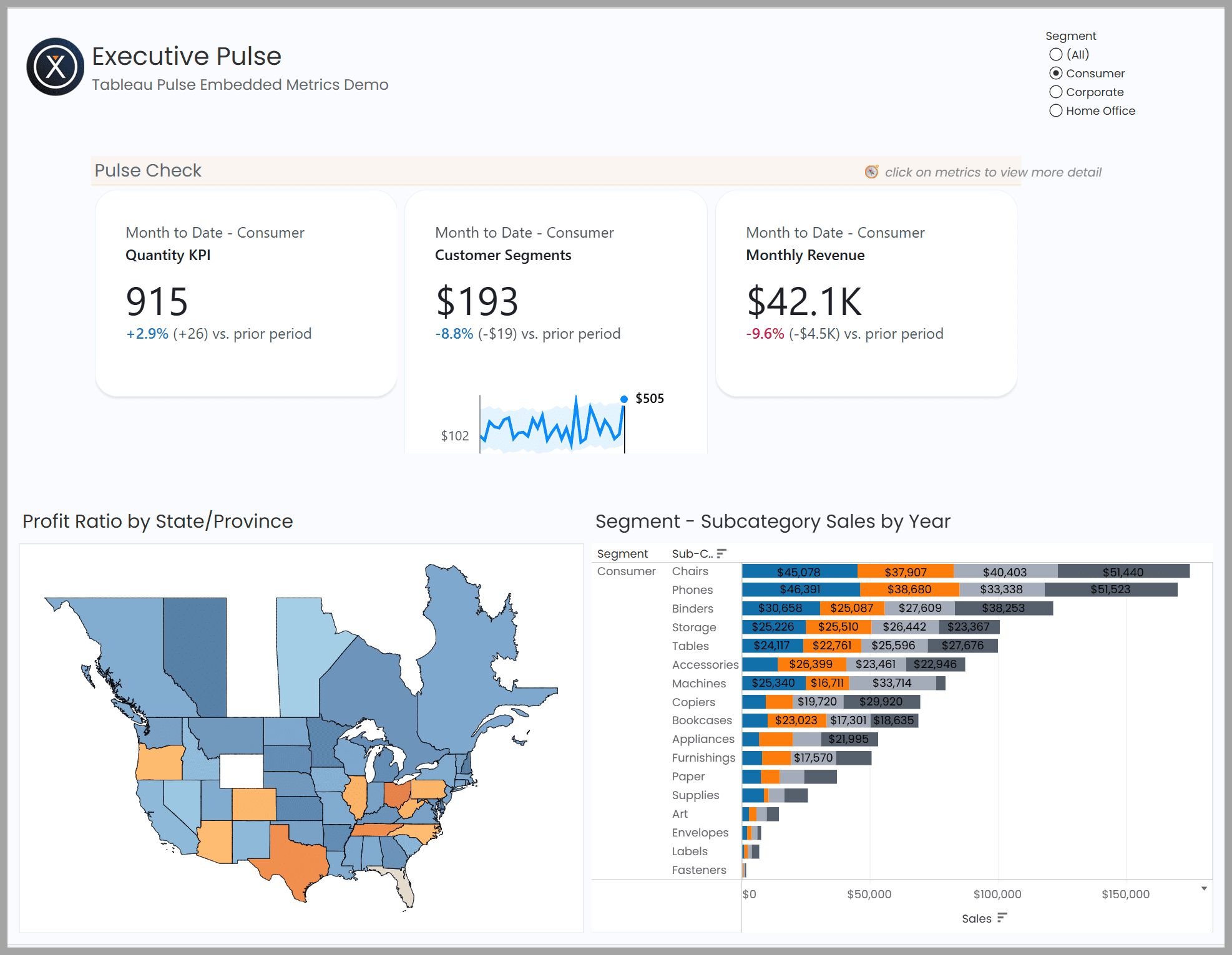
Now I’ve got my Pulse Metric embedded in this Dashboard with two others alongside of it. I’ve added the ability to do Filtering with Segment to the other two. So all three now will be responding when the user makes a selection on our Segment Filter.
Free Download: Tableau Pulse Implementation Guide
Successful Pulse adoption begins with a solid foundation, including the right data source structure, permissions, governance practices, and performance considerations.
Download our free Tableau Pulse Implementation Guide for Tableau Cloud administrators. This reference resource covers setup requirements, data source recommendations, permission settings, authentication considerations, and best practices for creating scalable Pulse metrics. Use this guide as a roadmap for implementing Tableau Pulse and establishing a strong foundation for long-term adoption.
Fill out the form below to download the Tableau Pulse implementation quick reference guide.
Create a Tableau Pulse Metric and Add It to a Dashboard
1. Create the Pulse Metric
Start by creating a new Tableau Pulse metric from your dataset. For this example, we’ll create a Customer Segment Pulse Metric focused on Sales Performance across Customer Segments.
Begin by selecting the Measure you want to track and the Aggregation you want to use. In this case, we’ll use Sales with an Average Aggregation to provide a different perspective than a traditional total sales metric.
Next, choose how the trend should be displayed in the Sparkline. We will use a Non-cumulative view, though Tableau Pulse also supports other options, such as running totals, depending on your reporting needs.
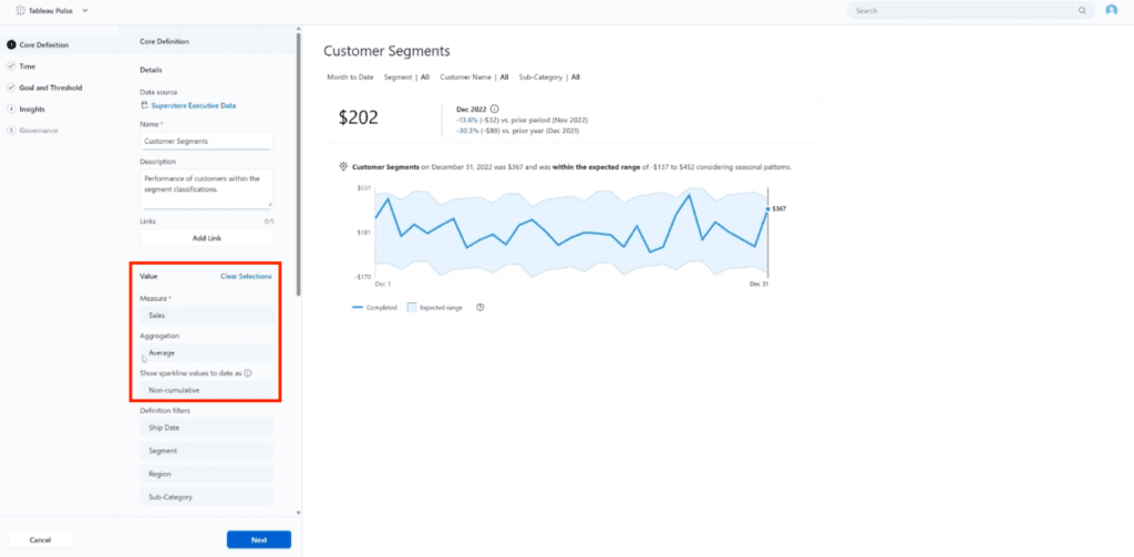
At this stage, the goal is to establish the core business metric that Pulse will monitor and analyze.
2. Configure Filters and Prompt Dimensions
Next, select the dimensions Tableau Pulse can use for filtering and prompt generation. In this example, we’ll include the fields Ship Date, Segment, Region, and Sub-Category. Then, click Next.

These dimensions help define the ways users can explore the metric after it is published. They also influence the prompts and questions recommended within the Pulse experience. Selecting meaningful business dimensions can make the metric more flexible and useful for different audiences. For example, you may want to analyze sales by customer segment, drill into a specific subcategory, or focus on individual customers. Adding these dimensions during setup makes those perspectives available later.
3. Set the Time Period and Comparisons
Once the metric structure is in place, configure the Time Settings. In this example, the dataset does not extend all the way to the current day, so we’ll use a Dynamic time selection for the Date offset field. This will automatically reflect the latest period available in the data.
Tableau Pulse also allows you to define Time comparisons, and in this example, we are choosing a Prior Period comparison. There is also the option to use a Custom Calendar. After your Time settings are complete, click Next.
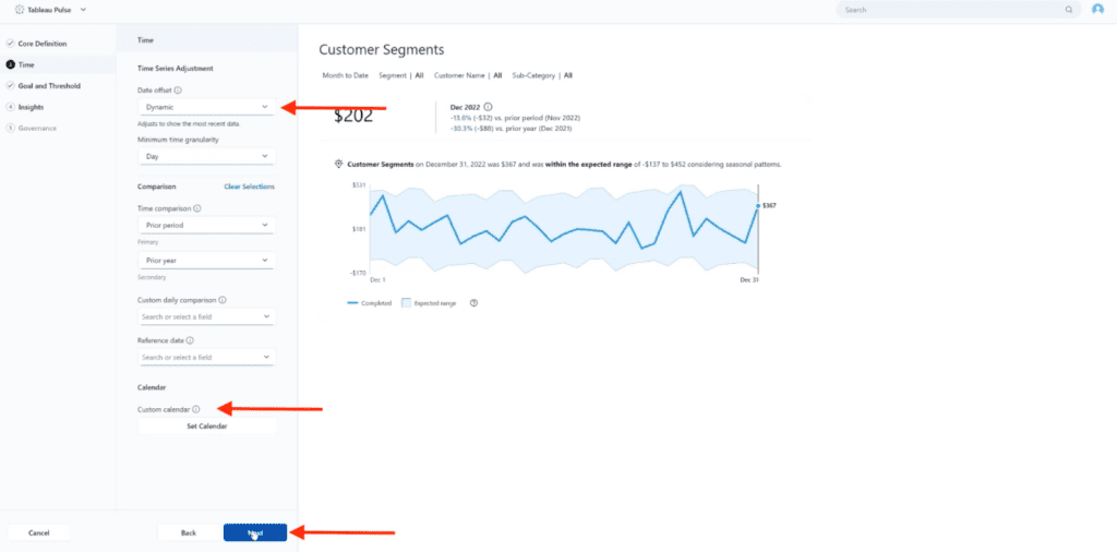
These options establish the context for illustrating changes in performance over time. Choosing the appropriate time configuration is important because it affects the trends, comparisons, and insights displayed to users.
4. Configure Goals or Threshold and Review the Metric Preview
For your Goal and Threshold, you are able to choose the Type between a Goal or Threshold, depending is available in your source data. You can select an existing Measure as a goal or Create an Advanced Goal. While this step is optional, adding goals can provide additional context by allowing users to compare current performance against expected outcomes. (If your data source does not include a goal target, budget constraint or other type of threshold, you can set a manual value from the dashboard menu at a later point.)
As the metric is configured, Tableau Pulse will display a preview on the right-hand side of how the metric will appear to end users. The preview also includes examples of the types of insights that may be generated based on the selected measure, dimensions, and time settings. This step provides an opportunity to validate the metric before publishing it. Once you are done with this step, click Next.
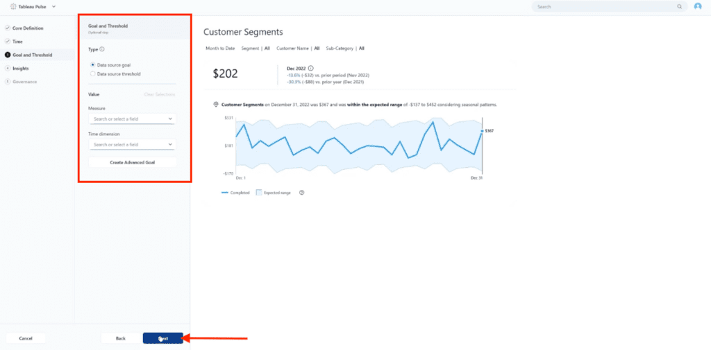
Review the displayed trends, prompts, and example insights to confirm they align with the business question the metric is intended to answer.
5. Configure Insights
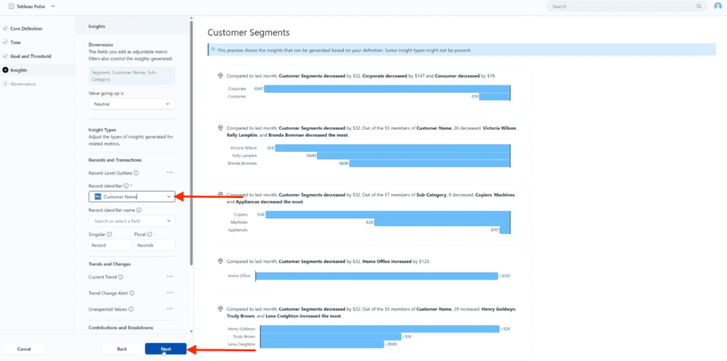
The Insights tab provides the opportunity to add dimensions to drive insights Tableau Pulse can generate for the metric. The dimensions selected during this step will appear at the top of the page and can be used to create many types of insights. In this example, Segment, Customer Name, and Sub-Category are available for analysis.
Another important settings on this page is the Record Identifier field. This field determines the grain of your data by giving the opportunity to identify an unique identifier for Tableau Pulse to use when generating insights. For this example, we’ll use Customer Name as a Record Identifier. (In most use cases, this will be an identifier like a Customer ID or transaction ID.)
You can also configure additional insight settings, including whether increases should be considered positive, the types of insights that can be generated, trend alerts, unexpected value detection, and contribution analysis. These options help shape the insights available to end users once the metric is published.
On the right-hand side, you can see a preview of the insights that can be generated based on the current configuration. In this example, the preview shows several Customer Segment insights, including changes by segment, customer-level contributors, and Sub-Category performance. Reviewing these examples before publishing helps confirm that the metric definition and selected dimensions are producing meaningful results. Once you are satisfied with the available insights, click Next to continue.
6. Review Governance Settings and Save the Metric
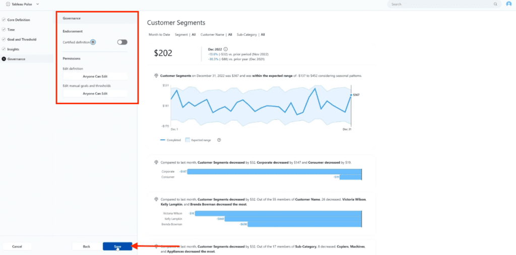
The Governance tab allows you to review Endorsement and Permissions settings before saving the metric. If desired, you can mark the metric as a Certified Definition to help identify approved metrics within your organization. In this example, we left the certification option disabled.
You can also review permissions related to editing the metric definition and managing manual goals and thresholds. The Tableau Cloud role and data permissions and governance practices take priority over assignments made inside the Pulse Metric creation process.
On the right-hand side, Tableau Pulse displays a final preview of the completed metric, including the metric value, trend visualization, and the insights generated from the configuration completed in the previous steps. This gives you an additional opportunity to verify that the metric appears as planned before publishing it.
Once you are satisfied with the configuration, click Save to create the metric.
7. Review the Finished Metric
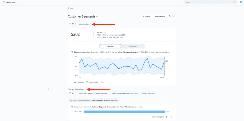
After saving, Tableau Pulse opens the completed metric and displays the full user experience. This is a good opportunity to review the metric before embedding it in a dashboard.
At the top of the page, you’ll see the current metric value, trend information, and the time period being analyzed. Below that, Tableau Pulse displays the trend visualization along with generated insights based on the dimensions and settings configured during the setup process.
One of the benefits of reviewing the completed metric is seeing the questions and prompts available to end users. Under the Discover Top Insights section, Tableau Pulse surfaces suggested questions that users can select to further explore the metric. In this example, prompts focus on Customer Segments, including questions about which sub-category increased the most, which segment decreased the most, and overall performance trends.
Take a moment to review the available insights, prompts, and visualizations to confirm they align with the business question the metric is intended to answer. If adjustments are needed, you can return to the metric definition and make changes before embedding the metric in a dashboard.
The completed Pulse Metric is now ready to be shared directly or embedded within a dashboard.
8. Return to Tableau Cloud and Open Your Dashboard
To add the metric to a dashboard, you’ll first need to return to Tableau Cloud. In the upper-left corner of the screen, click the dropdown arrow next to Tableau Pulse. A small menu will appear with options including Followed Metrics and Tableau Cloud.
Select Tableau Cloud to leave the Pulse experience and return to your Tableau Cloud environment.

9. Configure the Pulse Metric Object
After opening your Tableau Cloud dashboard, locate Pulse Metric from within the Dashboard Objects section and drag it to onto the dashboard layout. Tableau displays a frame or holder for the metric to be inserted, prompting you to “configure” the metric. The next steps include selecting the specific metric and the settings that will be provisioned for it.
With the Pulse Metric object holder selected, open the control menu from the dropdown arrow on the frame. Choose Configure Pulse Metric to continue establishing a connection to a specific Tableau Pulse metric.

This opens the Pulse Metric configuration panel, where you can select the desired metric and define how it behaves on the dashboard.
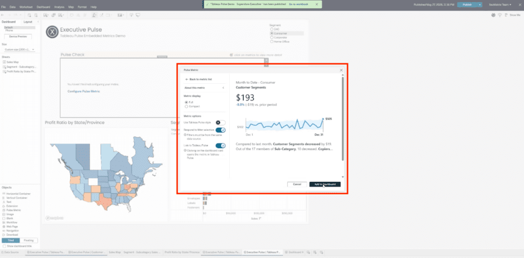
10. Select the Pulse Metric and Configure Display Settings
After clicking Configure Pulse Metric, the Pulse Metric configuration window opens.
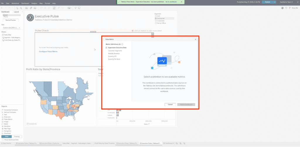
In this example, we are selecting Customer Segments from the available metrics.
Once Customer Segments is selected, Tableau displays the related metric details, including the measure, time dimension, and available metric options. In this example, the metric uses Sales as the measure and Ship Date as the time dimension. We are selecting the Month to Date metric option.

Next, decide how the metric should appear in the dashboard. For this example, we are using the Full metric display instead of Compact. Select Respond to filter selection so the metric updates based on the dashboard’s Segment filter. This setting is important because the dashboard already includes Segment as a filter, and we want the Pulse metric to also be filtered when users select a specific segment.
For this example, we are also keeping Link to Tableau Pulse enabled. This allows users to click the dashboard card and open the metric in Tableau Pulse for more detail. Once the metric definition, display settings, and interaction options are configured, finish with Add to Dashboard.
11. Test the Final Dashboard Experience
After adding the Pulse metric to the dashboard, take a moment to test the interaction between the embedded metrics and the dashboard filters.
In this example, the dashboard contains three Pulse metrics: Quantity KPI, Customer Segments, and Monthly Revenue. Because we enabled Respond to filter selection during configuration, all three metrics are connected to the Segment filter in the upper-right corner of the dashboard.
Users can switch between (All), Consumer, Corporate, and Home Office to view metrics for a specific customer segment. As different segments are selected, the embedded Pulse metrics automatically update to reflect the filtered data. The values, trend indicators, percentage changes, and sparklines all adjust based on the selected segment.

This interaction allows users to quickly compare performance across customer groups without leaving the dashboard. For example, selecting Consumer updates the metrics to display Consumer-specific results, while selecting Corporate or Home Office immediately refreshes the metrics to show performance for those segments instead.
Testing these interactions is an important final step to confirm that the Pulse metrics are responding correctly to the dashboard filters and showing that they are now synchronized with other filtered components of the dashboard.
At this point, your Tableau Pulse metric has been successfully embedded into the dashboard and is ready for users to explore.
Want Help Getting More Value from Tableau Pulse?
Tableau Pulse can make key metrics more accessible, but successful implementation requires more than simply creating a metric. From defining meaningful KPIs and configuring insights to embedding metrics into dashboards and aligning them with your governance strategy, there are several decisions that influence the end-user experience.
At XeoMatrix, we help organizations implement Tableau solutions that make data easier to access, understand, and act on. Get in touch with XeoMatrix to discuss your Tableau Pulse and analytics strategy.