Tableau allows users to create a wide variety of visualizations within a dashboard. When you want to understand the relationship between two measure values in Tableau, you can use a dual-axis or shared axis view. Both visualizations show relationships, but they do so in different ways depending on the measure values you need to understand.
This article describes the pros and cons of dual-axis vs. shared axis visualizations in Tableau to help you determine which visualization is best for your data, and includes a tutorial on how to create these visualizations for your organization.
What Is a Dual-Axis Visualization?
A dual-axis data visualization shows the relationship between multiple measure values. This can be especially helpful when the values cannot be shown on the same scale or have different units of measurement.
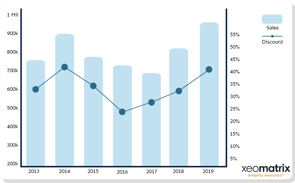
For example, dual-axis visualizations can be used to show the relationship between the sum of sales over time and the average discount value over that same period.
Each visualization has its own axis with the appropriate scale or unit, and the visualizations are overlaid on top of one another in one Tableau visualization.
What Is a Shared Axis Visualization?
A shared axis data visualization shows the relationship between multiple measure values where every mark is shown on a single axis, all within the same visualization. For example, shared axis visualizations can be used to show the relationship between the sum of sales and the sum of profit.
Dual-Axis vs. Shared Axis in Tableau
Many people use Tableau to answer one question per dashboard. They may add two data visualizations into their dashboard side by side, which may not truly help users understand the relationship between the two values.
What many Tableau users don’t realize – or may not feel comfortable trying when they first start building dashboards – is that it is possible to show relationships and answer more than one question within a single visualization on their dashboard.
Dual-axis and shared axis visualizations can help you understand the relationship between data sets values, and easily compare those multiple measures in a single view.
How to Create a Dual-Axis Chart In Tableau
In this example, we will be creating a dual-axis visualization that shows the relationship between the sum of sales over time, and the average discount over the same time period.
1. Add First Value
The first step is to add the SUM(Sales) data field to the rows bar at the top of your Tableau worksheet. You can do so by dragging the field from the data pane on the left side of the worksheet, up to the rows bar.
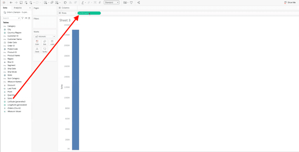
You will also want to add the Order Date field to the columns bar. You can add this field by dragging it from the data pane into the columns shelf.
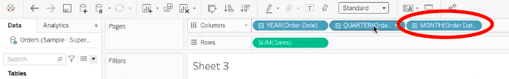
Once you have the order date data field in the rows shelf, select the small plus (+) icon in the YEAR(Order Date) field.
Another data field, QUARTER(Order Date), will appear. Repeat this process and select the small plus (+) icon in the QUARTER(Order Date) field.
A data field titled MONTH(Order Date) will appear.
We only want to see the sales values over monthly order dates, so we can remove the QUARTER(Order Date) field. To do so, drag the quarter data field out of the columns shelf and into the gray area of your Tableau worksheet.
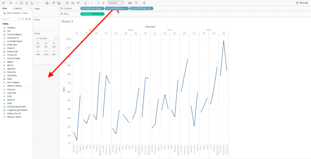
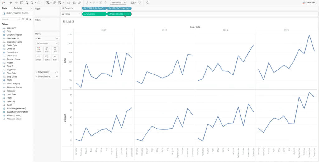
Now we can see our sum of sales data month by month, from 2017 to 2020.
2. Add Second Data Value
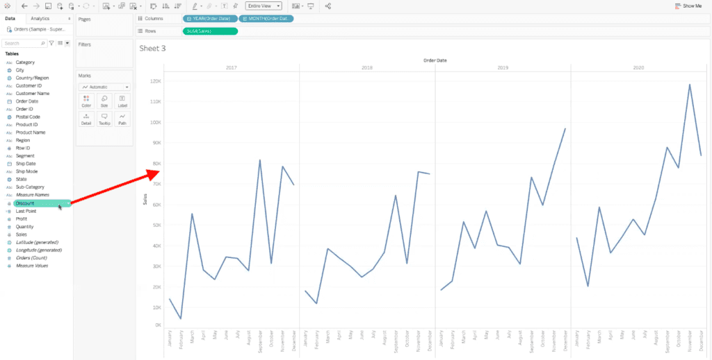
The next step is to add the second measure value. In our dual-axis example, we will be adding the discount field to see how our sum of sales compares against the discounts being applied.
To add this field to your worksheet, drag Discount from the data pane onto the right side of the existing axis, dropping the pill once you see a black dashed line appear.
After you have dragged the discount field to the left of the existing axis, before you let go of your click, your cursor will show two small columns of a bar graph.
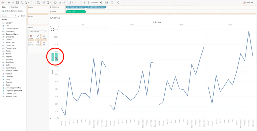
This cursor change is letting you know that once your release your click, there will be multiple measure values on the same axis.
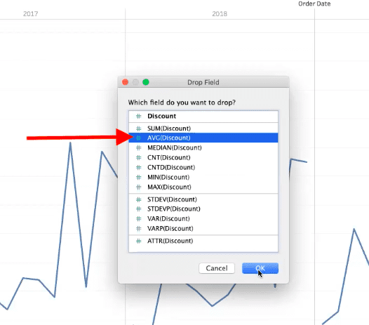
After you release your click, a dialogue box will appear, asking you which field you want to add to your axis. We will select AVG(discount), and then select “OK” in the bottom right of the dialogue box.
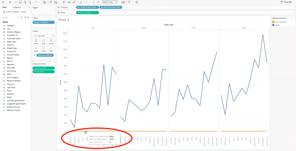
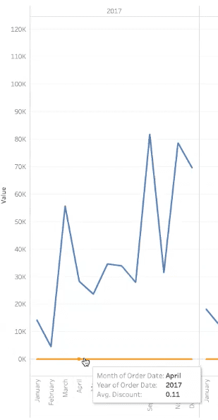
Now we can see an orange line underneath the sum of sales data in our Tableau dashboard. This may just appear as bad data, but if we hover over the line with our cursor, we can see that the average discount value is zero, which isn’t really true.
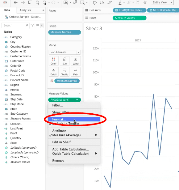
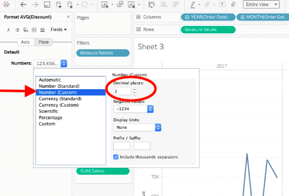
To fix our data, we need to tell Tableau to show our average discount data in two decimal points. To do so, select the AVG(discount) field in the measure values card to the left of the dashboard.
In the pop-up menu, select “format”.
In the new section that appears to the left, select the “numbers” drop-down menu. Next, select “number (custom)” in the drop-down options. Make sure that the decimal places field has the number 2 in it.
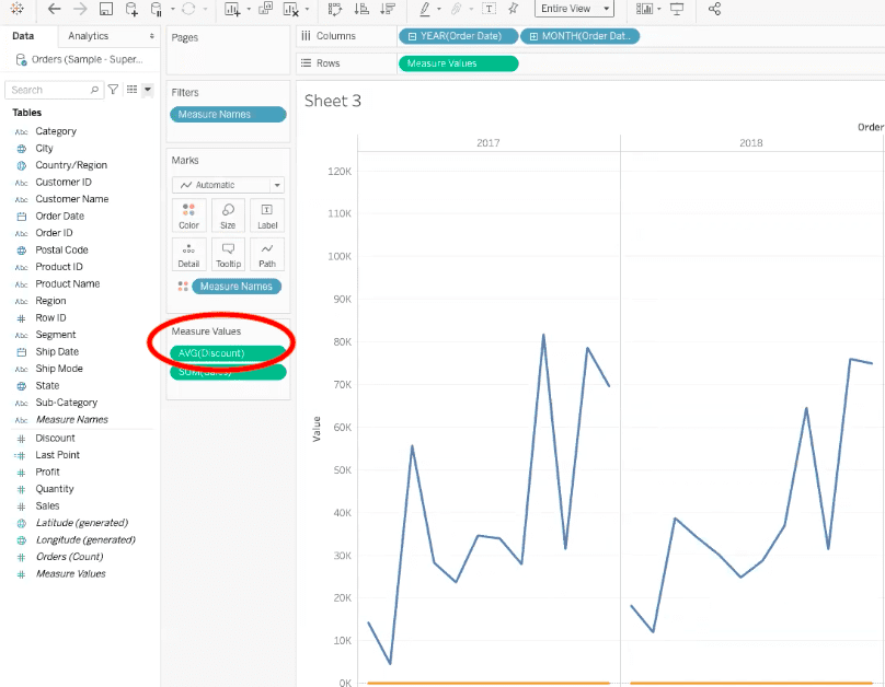
Now if we hover over the orange line in the dashboard, we can see our average discount value data.
However, this still isn’t showing us the data the way we want. This is because these two data fields do not work on the same axis. So, we need to create a dual-axis visualization for this data.
3. Change the Settings to Display in a Dual-Axis View
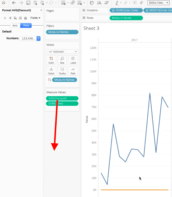
To create a dual-axis view, we need to drag the AVG(discount) data field out of our measure values card into the gray area of the dashboard to remove it.
Another way to achieve a dual axis is to start by adding both measures side-by-side on the rows shelf.
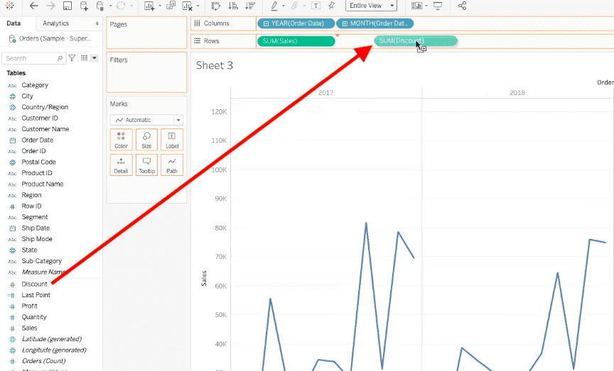
Now we can see two different data sets, one with sales month over month, and one with the discount month over month.
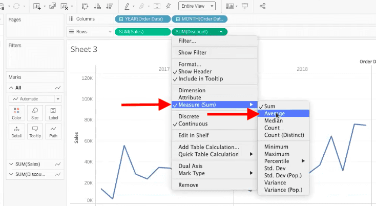
We can again select the drop-down option on SUM(Discount) and change the aggregation to an average.
Once we have the average discount view, we can overlay these two datasets to get a better visualization of the relationship between them. To overlay them, right-click in the AVG(Discount) data field, and select “dual axis” in the pop-up menu.
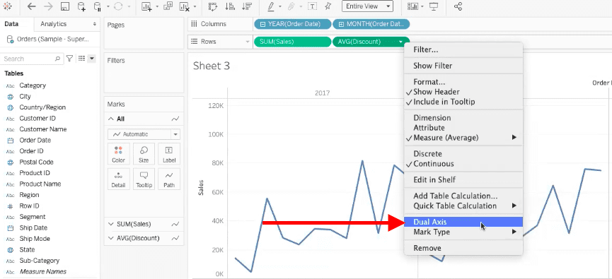
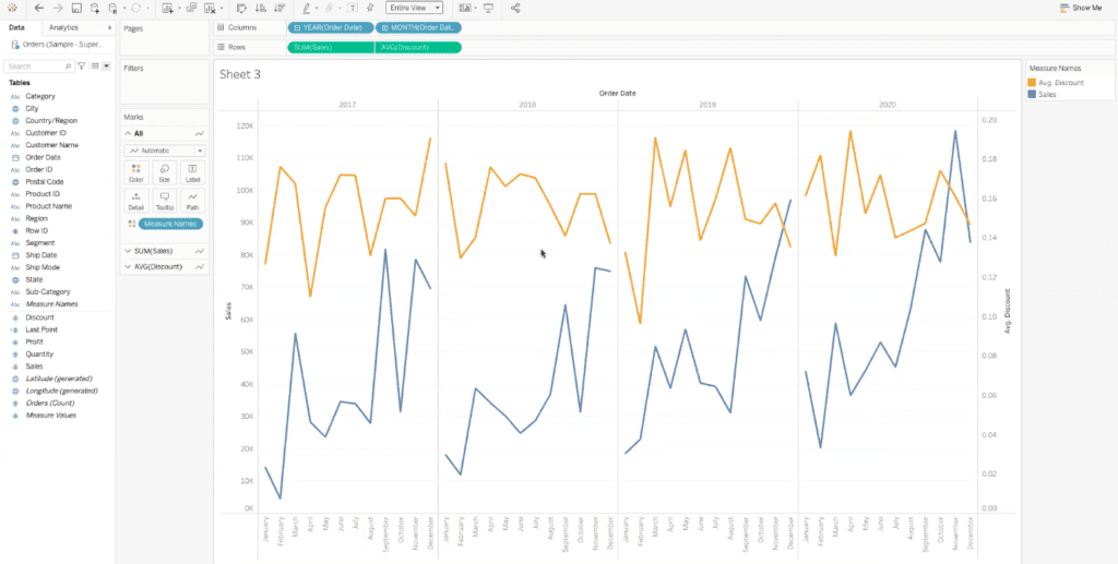
When we select “dual axis”, we’ve told Tableau that we want to see these two values overlaid, but we still want them to maintain their separate axes. Tableau will then place one axis on each side of the dashboard, maintaining the individual data scales while layering the data visualizations on top of each other.
How to Create a Shared Axis In Tableau
In this example, we will be creating a shared axis visualization that shows the relationship between the sum of our sales and the sum of our profit.
1. Add First Field
The first step is to add the SUM(sales) field to the columns shelf at the top of your Tableau worksheet. You can do so by dragging the field from the data pane on the left side of the worksheet, up to the columns shelf.
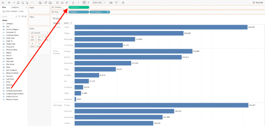
You will also want to add the category and sub-category data fields to the rows shelf. You can add these fields by dragging them from the data pane into the rows shelf.
2. Add Second Field
Once you have added the SUM(Sales), Category, and Sub-Category fields to the appropriate shelves, you can add the second data field. In this example, you can to add the SUM(Profit) data field. Instead of dragging the SUM(profit) field to the columns shelf, we need to drag it to the bottom of the existing axis.
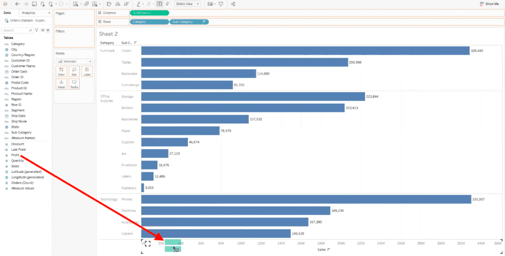
After you have dragged the SUM(Profit) field to the bottom of the existing axis, before you let go of your click, your cursor will show two small rows of a bar graph.
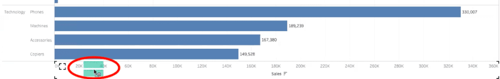
This cursor change is letting you know that once your release your click, there will be multiple measure values on the same axis.
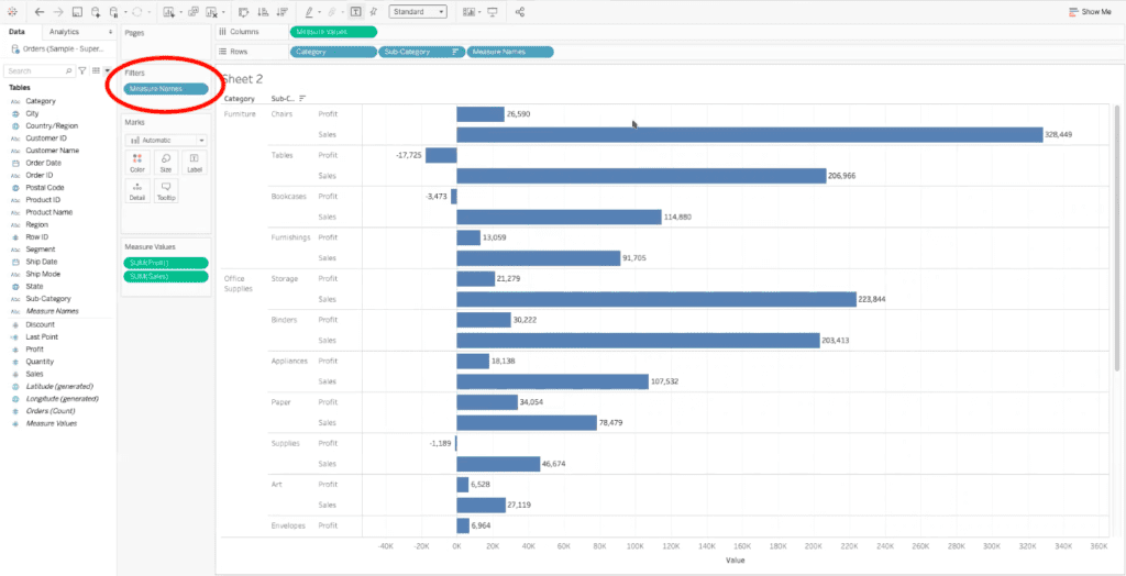
3. Confirming that the Shared Axis View is Working
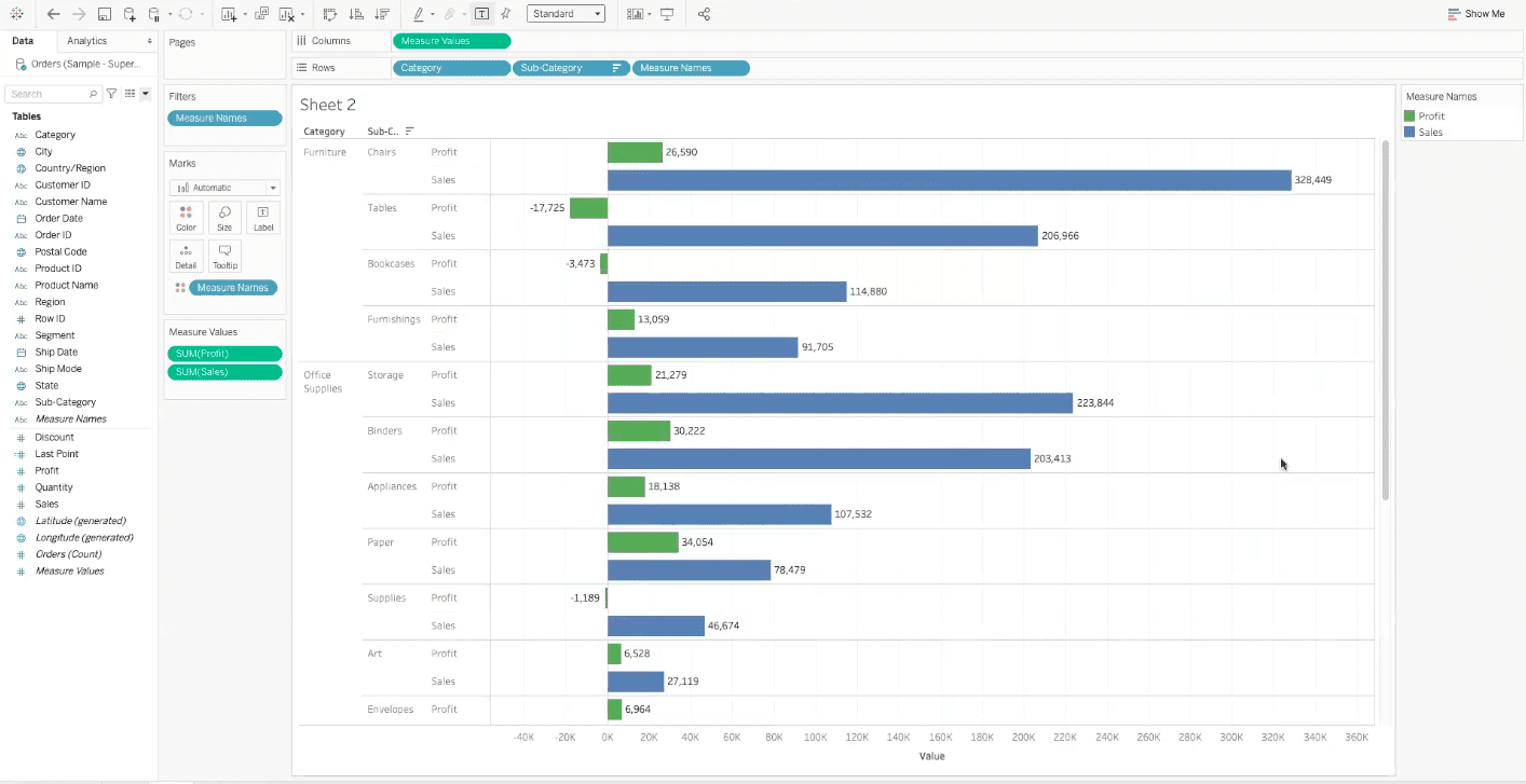
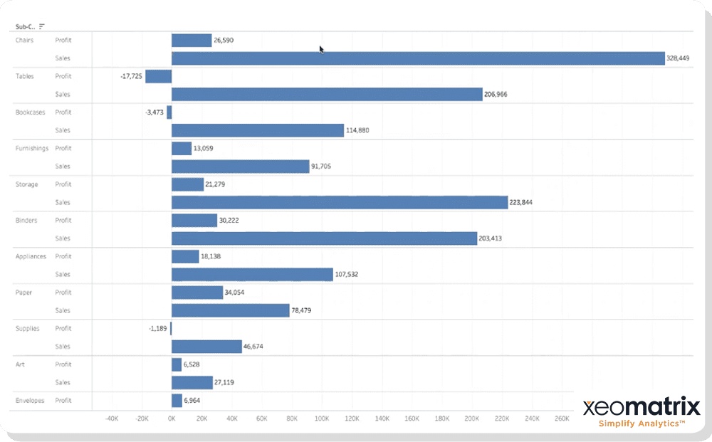
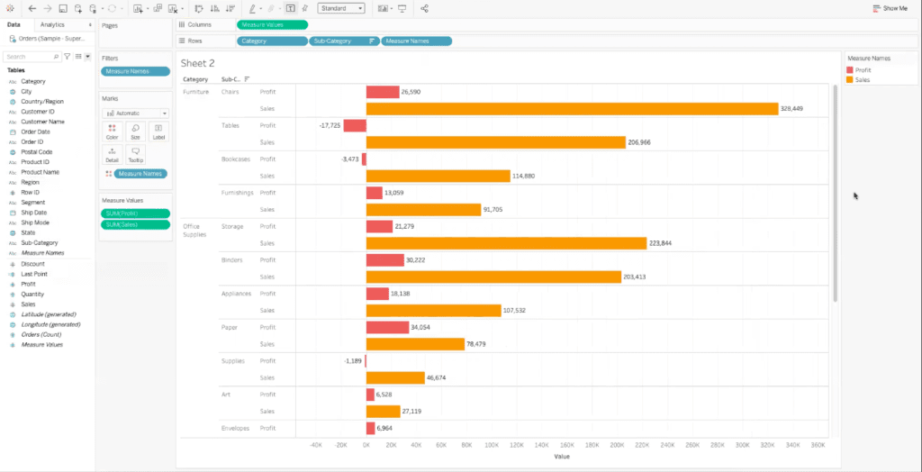
Now each sub-category is broken down into two rows- one for SUM(Sales), and one for SUM(Profit).
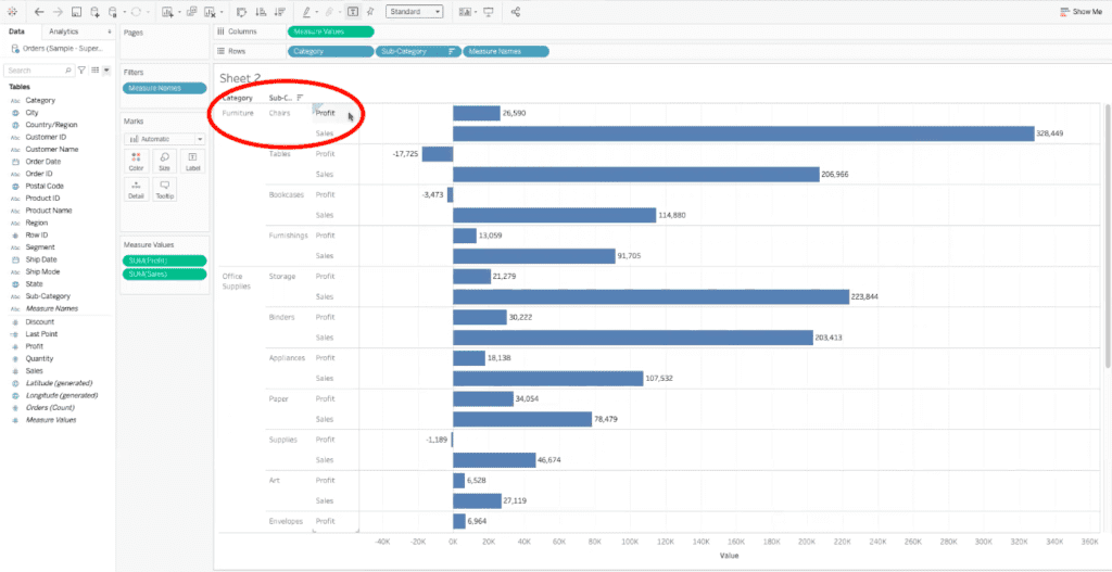
Adding these two fields on the same axis also adds some extra fields into the view automatically, the Measure Names field into the rows bar, and the Measure Values field into the columns bar.
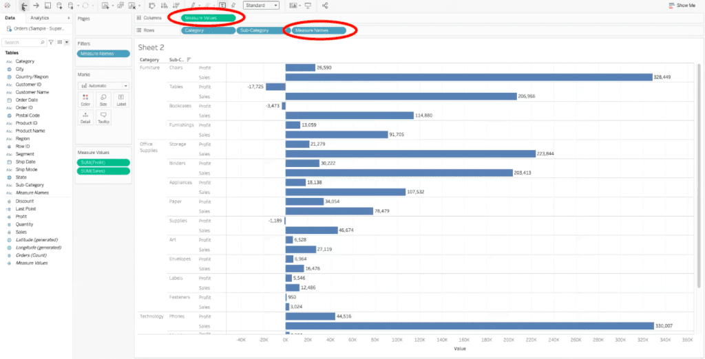
Tableau has also added the measure names field into the filters card to the left of the worksheet.
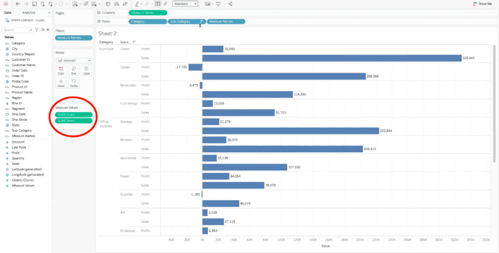
Lastly, we now have a Measure Values box, which is storing the two values that are currently being using in the visualization.
All of these data fields and filters allow us to compare the sum of sales to the sum of profit for each category and sub-category of our products. In this example, we can see that the sum of profit for our chairs sub-category is being dwarfed by the sales of the chairs, meaning that we don’t have a high profit ratio between the profitability of the chairs and the actual sales dollars of the chairs.
4. Add Color to Differentiate Between Data Sets
Now that we have all of our data fields in the appropriate places, we can customize this shared axis visualization a bit more. In our example, we will add color to differentiate between the SUM(Sales) and SUM(Profit) fields on the shared axis.
To add color, all you need to do is drag the Measure Names field from the rows shelf into the color element in the marks card.
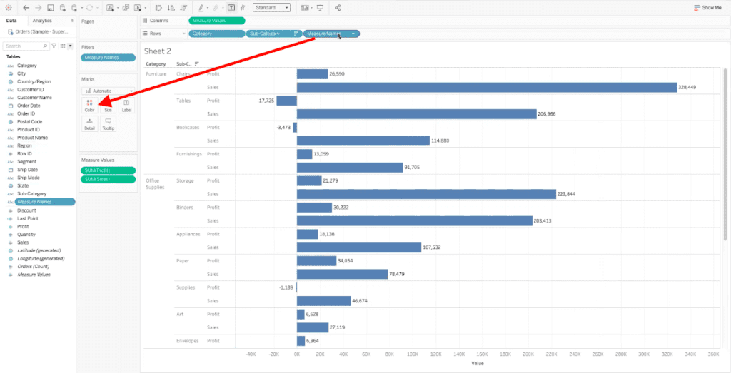
Tableau will then automatically change the color of the bars depending on the data field that are being represented. In our example, Tableau has made the profit data red, and the sales data orange.
If you want to change the colors, open the color legend on the right side of the worksheet.
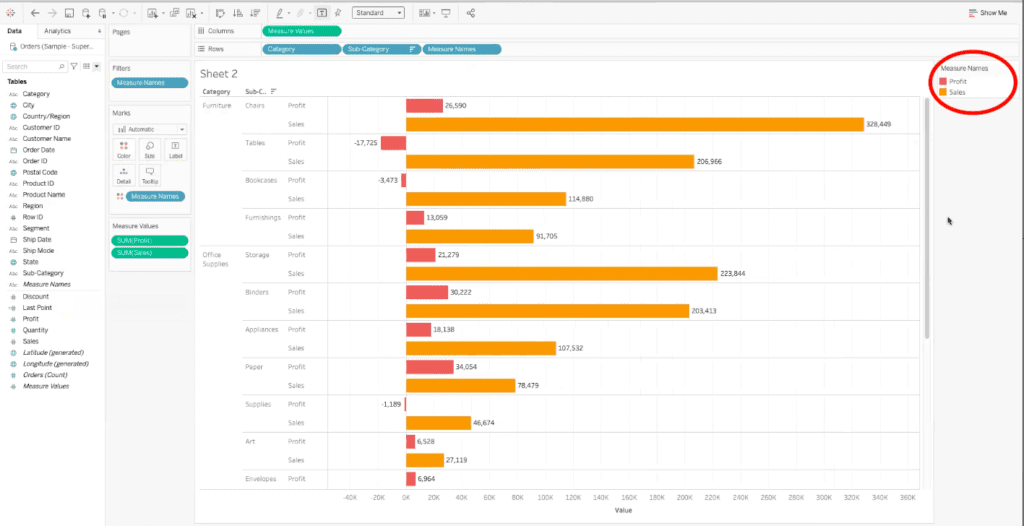
In the dialogue box that opens, you can select the color that you would like to represent your data fields. Once you have chosen the colors that you want, select “OK” in the bottom right corner of the dialogue box.
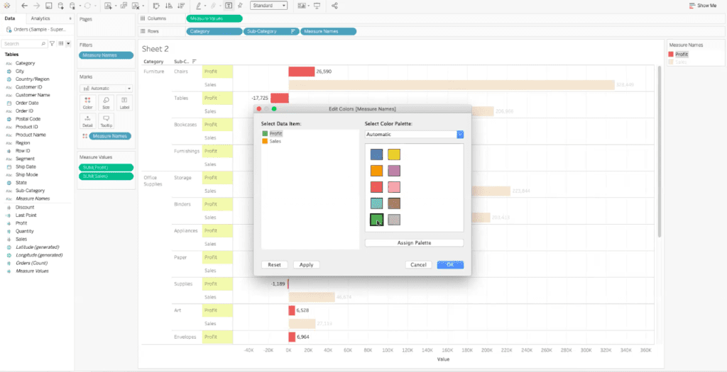
For our example, we have chosen green to represent the profit data field, and blue to represent the sales data field.
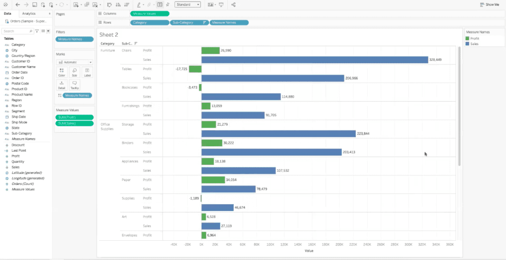
Now we can quickly and easily understand the differences in the relationship between our sum of sales data and our sum of profit data.
XeoMatrix Can Help
If you need assistance creating dual-axis or shared axis dashboards in Tableau, XeoMatrix can help. We offer a variety of Tableau services, including Tableau training and dashboard development. Contact us today to get started on your data visualization project.