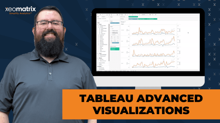
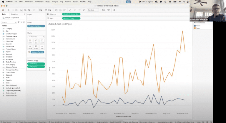
Tableau Advanced Visualizations
Explore advanced Tableau techniques in this session, including sparklines, dual axis charts, donut charts, and upcoming Viz Extensions for enhanced data visualization and interactivity.

Explore advanced Tableau techniques in this session, including sparklines, dual axis charts, donut charts, and upcoming Viz Extensions for enhanced data visualization and interactivity.
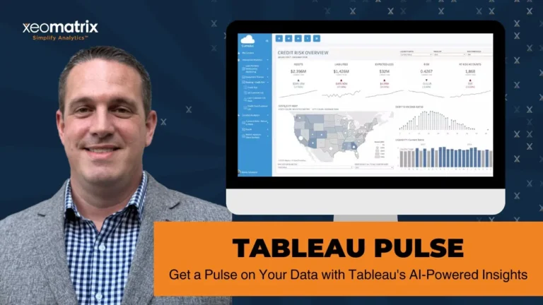
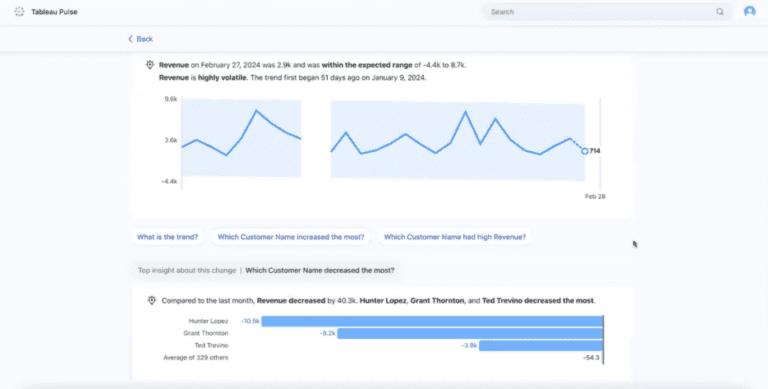
Tableau Pulse leverages AI for personalized, smart insights in Tableau Cloud. It requires published data sources and offers mobile-friendly, customizable metrics for enhanced data accessibility.
Learn how to seamlessly enable Tableau Pulse on your Cloud site to enjoy effortless collaboration & insight sharing within the familiar Tableau environment.
This session covered multiple use cases for Tableau’s Dynamic Zone Visibility functionality, including sheet swapping, showing and hiding legends and filters, and drill-down data exploration.
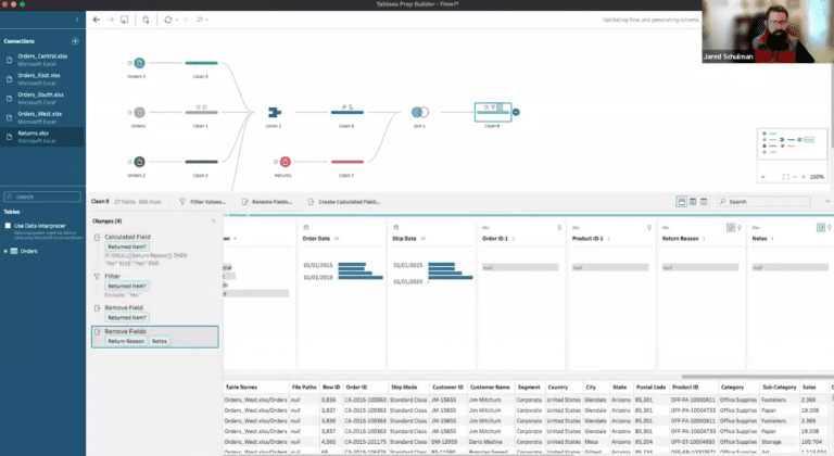
Master data prep with Tableau Prep: Simplify unions, joins, & pivots for enhanced data insights. Transform complex tasks efficiently.
Unlock the full potential of Tableau with expert tips: streamline workflows, enhance data analysis, and create dynamic dashboards for impactful storytelling.
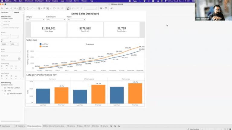
Explore advanced Tableau dashboarding techniques, including dynamic filters, containers, and interactive elements for enhanced data visualization.
Session on Mastering Tableau Parameters, where Jared showed how to harness the power of Tableau parameters to create interactive and insightful dashboards.
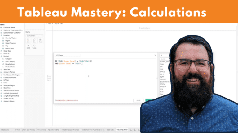
In this session, attendees delved into the intricacies of Tableau calculations, exploring topics such as formulas, table counts, IF-THEN statements, date calculations, and level of detail expressions, before wrapping up with a discussion on year-to-date, month-to-date, and quarter-to-date formulas, followed by an engaging Q&A session.

In Tableau 2023.1, a new feature allows you to have dynamic axis titles for fields that reference parameters. This means that the axis title can automatically update based on the selected parameter value, providing more flexibility in your visualizations.
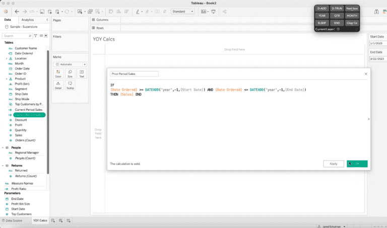
A year-over-year analysis is essential for businesses to track their performance and identify trends. Businesses can gain insights into their
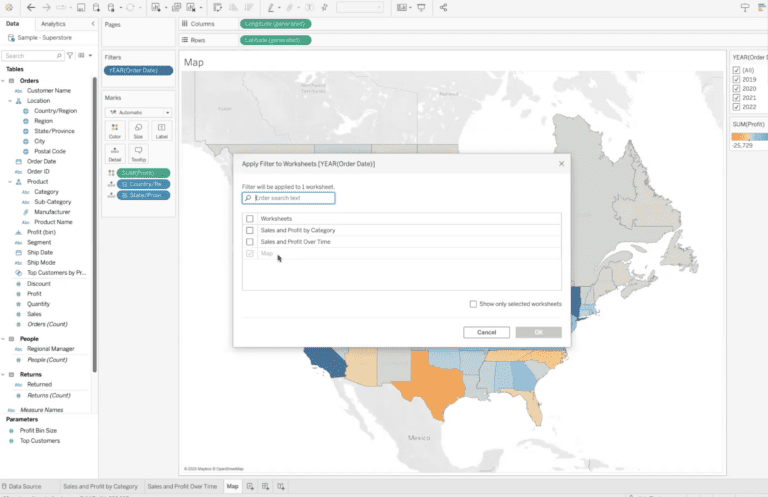
Step by step guide on how to apply a filter to multiple sheets in Tableau.

The Tableau Cloud environment will begin enforcing multi-factor authentication for all site admins. Set up an MFA authenticator app before being able to access your Tableau Cloud site.

Salesforce Security discovered that, due to a coding error, machines installed with specific versions of Tableau Bridge Client are logging database secrets.
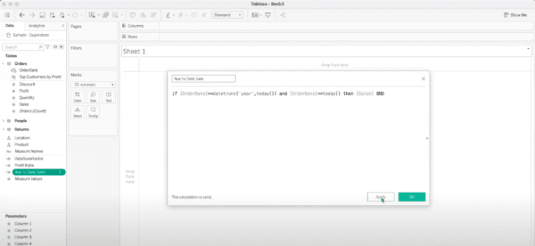
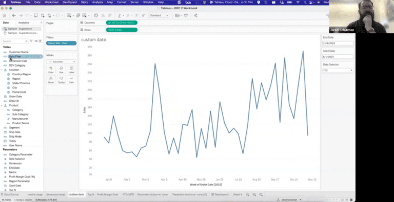
How to do year-to-date, month-to-date, or quarter-to-date calculations for any metrics on your Tableau Dashboard.