Donut charts have begun to replace Pie charts in data visualization. While they provide a similar level of detail or insight into data, the Donut chart has become best practice. To learn how to make donut charts in Tableau, follow our step-by-step tutorial below.
What Is a Donut Chart?
A donut chart is very similar to a pie chart; the only real difference is that a donut chart has a hole in the center. Donut charts add more meaning to the colors of a chart and provide more real estate on the screen for labels and other relevant information.
How to Make Donut Charts in Tableau
Unfortunately, donut charts cannot be selected and made instantly in Tableau. To make a donut chart in Tableau, you will actually have to start with a pie chart.
1. Create a Pie Chart
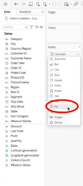
To create a pie chart in Tableau, find the “marks” menu in your Tableau worksheet, then select “pie” from the drop-down options.
Next, select the data fields that you would like to visualize from your tables menu, and drag into the different pie chart elements.
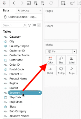
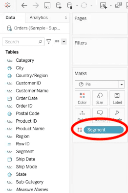
In our example, we have added the segment field into the “colors” element. The colors of our pie chart will now be relaying who is purchasing which type of product.
Once you have dragged your field over to the “marks” menu, it will appear like this:
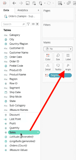
After the colors element, we are going to add the “angle” of our pie chart. This tells Tableau how to slice up the regions of the pie chart.
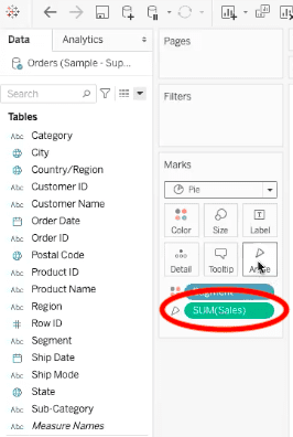
For our example, we are going to drag the sales field into the “angle” element under the “marks” menu. Now each region is representing the sum of sales for different segments.
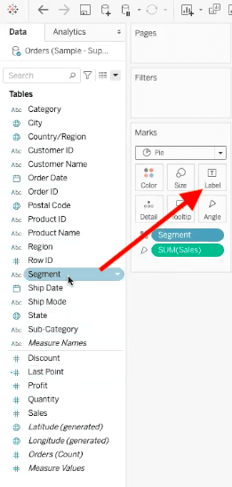
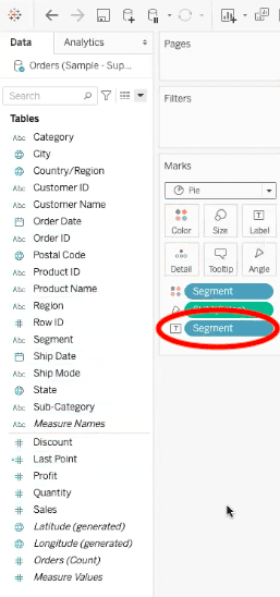
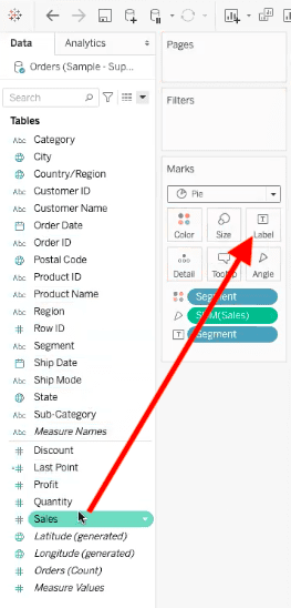
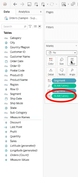
Lastly, we need to add labeling elements. For our example pie chart, we need our labels to show the segment field and the sales field, so we are going to drag both of those up to the “label” element in the “marks” menu.
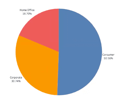
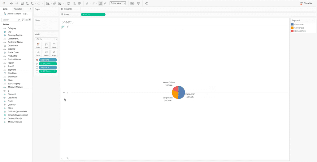
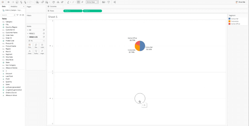
We have finally added all of the elements we need to visualize and understand our data. Our final pie chart looks like this:
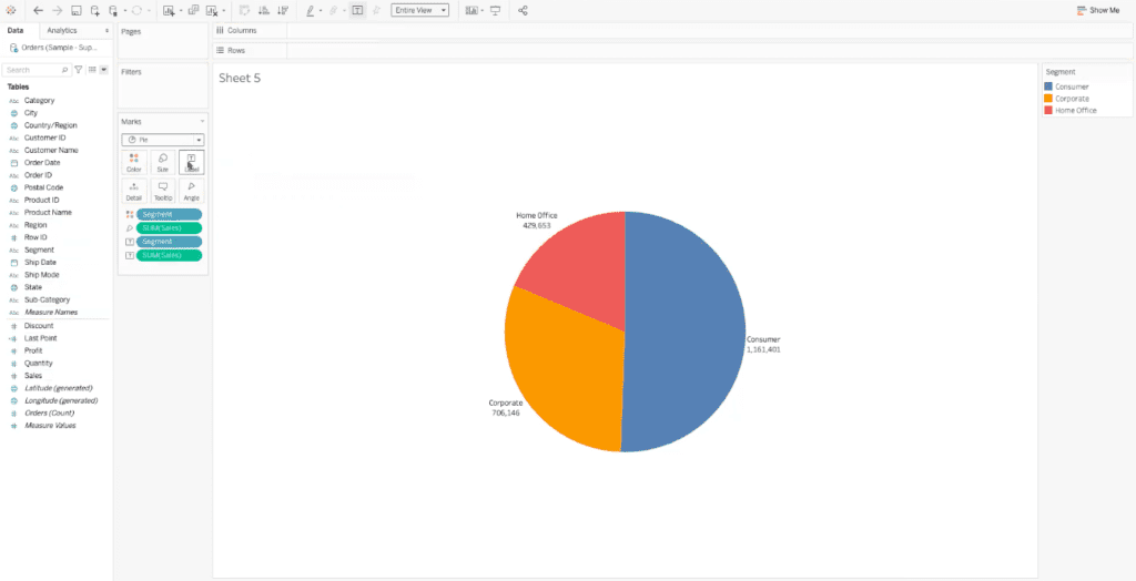
This is a simple pie chart that shows the sum of sales for three customer segments: home office purchases, corporate purchases, and consumer purchases.
Now that we have all of these elements, we can turn this pie chart into a donut chart.
2. Turn a Pie Chart into a Donut Chart In Tableau
Turning a pie chart into a donut chart allows us to add more information and visual interest to our data. We will create this donut chart by cutting a hole in the center of our existing pie chart.
The first step in creating a donut chart in Tableau is to create a calculated field. To do so, find the drop-down menu next to the search bar in your Tableau worksheet. Within the drop-down menu, select “create calculated fields”.
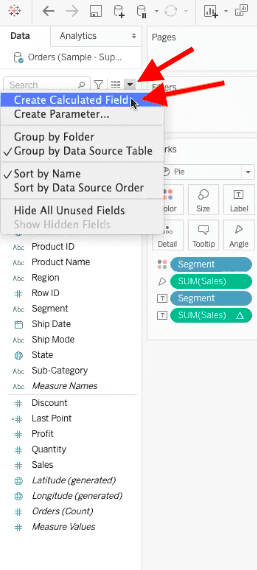
Once you have selected “create calculated fields”, a dialogue box will appear in your worksheet. In the bar in the top left of the dialogue box, you can name your field. We will be naming our example field “1”.
Next, we will start adding the calculation in the blank area of the dialogue box. For our example, we are using the calculation MIN(1). This means that we want to return the value “1”.
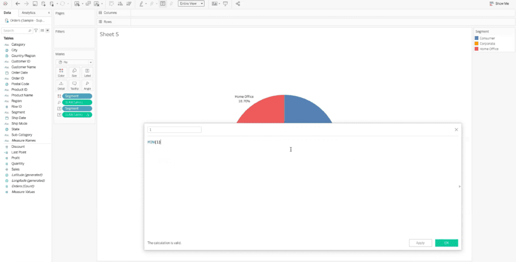
Now that you have named and written your calculation, select “OK” in the bottom right of the calculated fields dialogue box. Now the calculated field will be added to the tables menu in our Tableau worksheet.
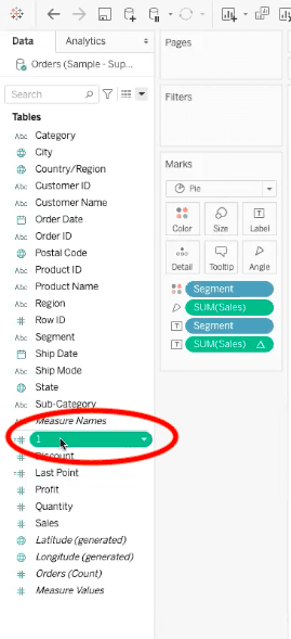
After the calculated field has been added to our menu, we want to drag it up to the “rows” bar at the top of the Tableau worksheet.
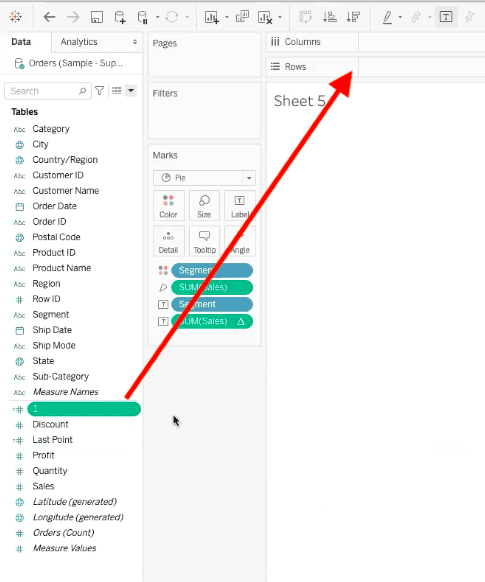
Once the calculated field “1” has been placed in the “rows” bar, Tableau will automatically re-configure the worksheet.
The pie chart has been made much smaller, and Tableau has added an axis to convey that we have created a measured value calculation. Now let’s create a second axis by dragging the calculated field “1” into the rows bar again, and placing this one next to the original. Tableau will now display two identical pie charts in the visualization, each on its own axis.
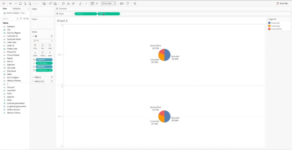
Each of these pie charts has its own marks menu, denoted as AGG(1), and AGG(1)(2).
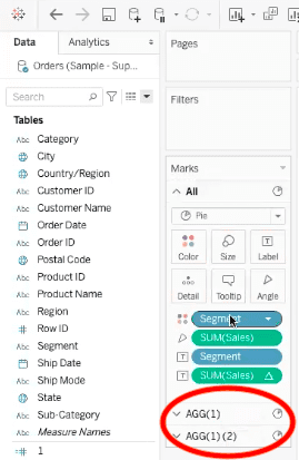
You can use these individual menus to make changes to one pie chart, or make changes to both under the marks menu titled “all”.
In the AGG(1)(2) menu, we are going to remove all of the fields that we originally added to show colors, angles, and labels. Now our bottom pie chart is blank and gray.
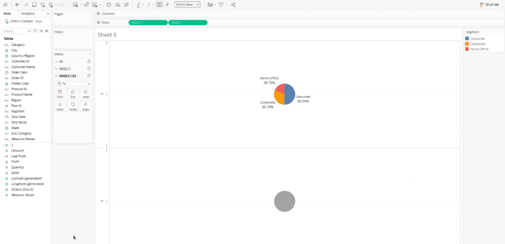
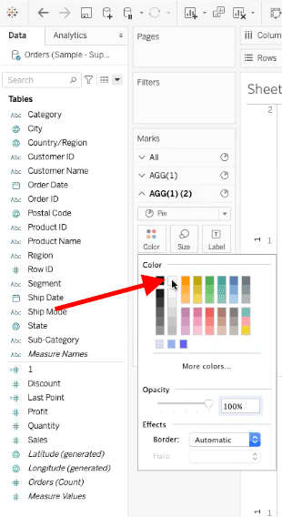
This blank gray dot is now going to become the hole that turns our original pie chart into a donut chart. To create this effect, we need to make the gray pie chart white.
In the “marks” menu, select the “color” element, and then, in the drop-down menu, select the white box.
The second pie chart will turn white, which makes it look as if it has disappeared in the visualization, but if you hover over the chart, an outline will appear around it.
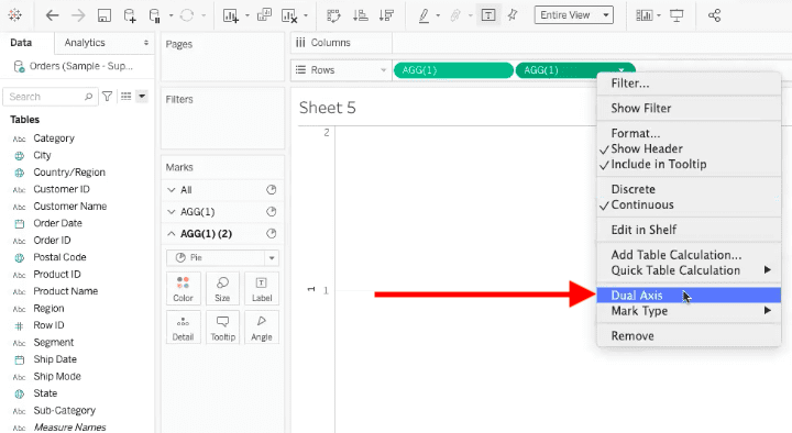
To overlay this white chart on top of the colored chart, we need to create a dual axis visualization. For this step, right-click the second calculated field value in the rows bar, and select dual axis in the pop-up menu.
You may start to panic here, because it will look like there is no pie chart on the visualization, only the labels. Don’t worry, Tableau has simply laid the white pie chart on top of the colored pie chart.
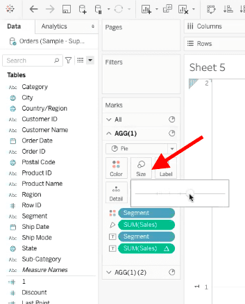
To fix the view, go to the AGG(1) “marks” menu, and select the size element. Move the slider to the right to increase the size of the original pie chart.
You can repeat this process in the AGG(1)(2) “marks” menu to make the white pie chart larger as well. Continue to resize both pie charts until they look best to you. Here is our example:
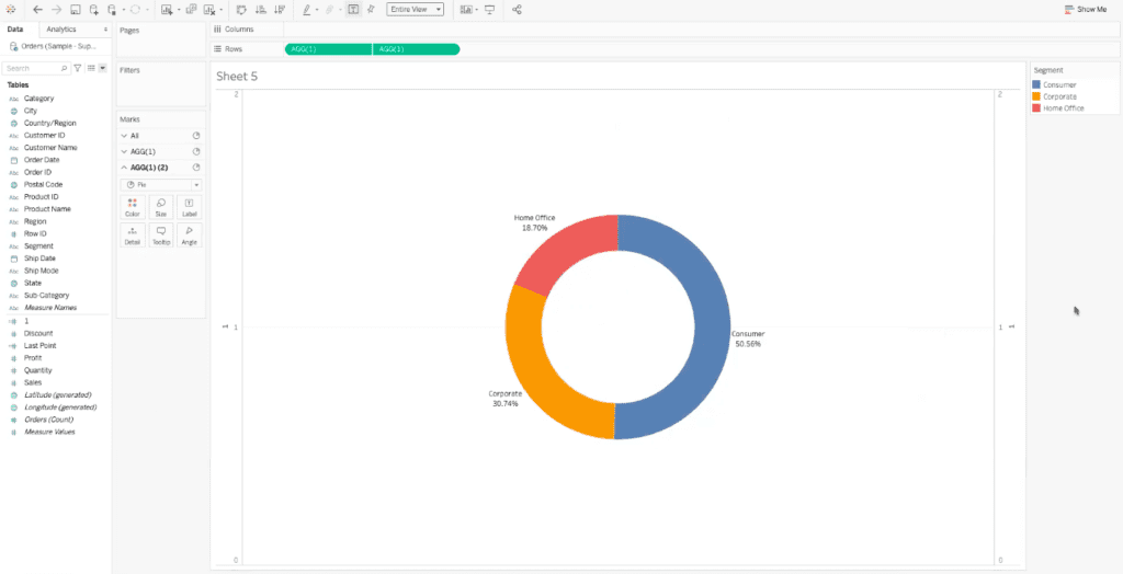
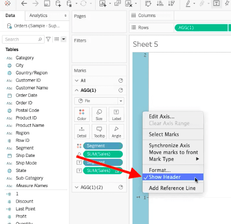
To get rid of the axis in the Tableau visualization, right click within the axis, and deselect “show header” in the pop-up menu.
This will make the visualization more clean and stylized to showcase your donut chart.
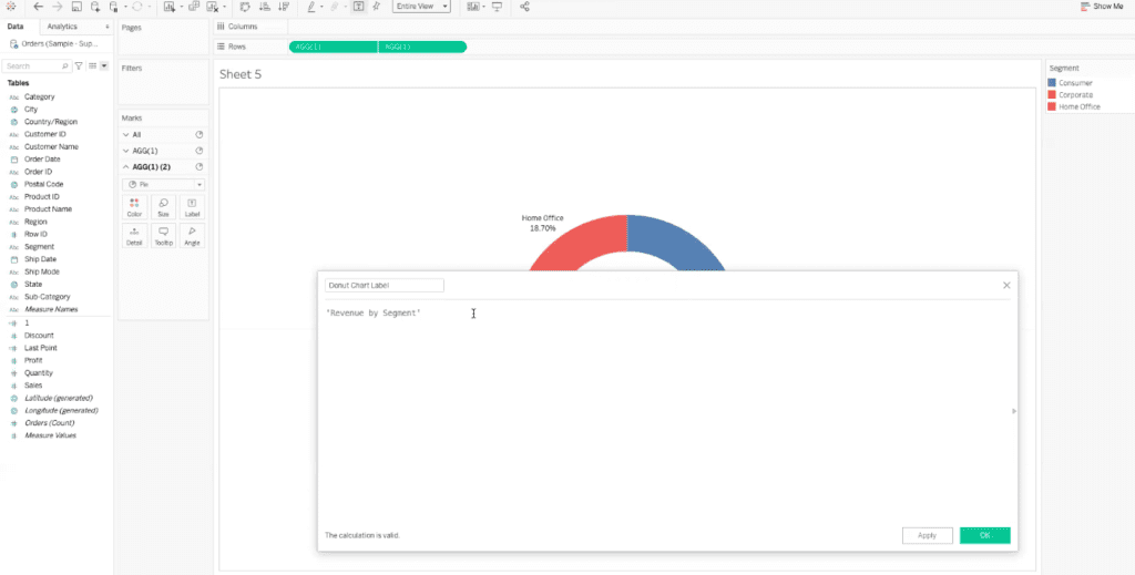
The last step is not required, but it adds more helpful information to our donut chart. We are now going to add a label into the middle of our chart that clearly states the purpose of the chart.
To create a label, we are going to create another calculated field. This calculated field is only going to serve as a label, so we have titled ours “donut chart label.” You can then write the full title of the label in the blank area of the calculated field dialogue box. Ours reads: ‘Revenue by Segment’. Make sure you have the quotations around the title so that Tableau recognizes it as the appropriate field.
Once you are done with the title, select “OK” in the bottom right of the calculated field dialogue box. Now the “donut chart label” field will appear in the tables menu of our Tableau worksheet. From here, we can drag the field into the “label” element of the AGG(1)(2) “marks” menu.
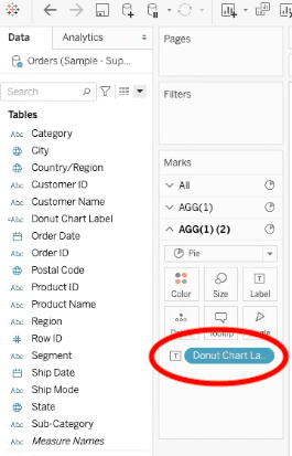
Tableau will automatically place the label, and it will most likely need adjusting. To adjust it, we can select the label element in the AGG(1)(2) “marks menu”. In the pop-up menu, select “alignment”, and then select the center alignment both vertically and horizontally.
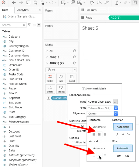
You can also change the font size and color in this pop-up menu. We have changed our font size to 16 bold.
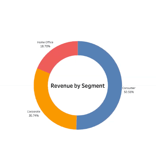
Now you have created a donut chart in Tableau!
Best Practices for Creating Charts
Now that we’ve covered the basics of how to create a donut chart in Tableau, let’s go over the best practices for chart creation.
Keep Colors Simple
Visually, as human beings, we can only perceive and remember up to 8 colors in a chart. Any more than 8 colors can begin to run together, and prevent us from drawing real insights from the visualizations.
It’s best to keep your donut chart simple, with minimal colors and data, so that it is easier to understand.
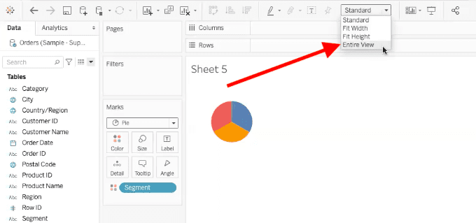
Set the Worksheet to Entire View
Tableau has a default view setting for pie and donut charts, which looks like this:
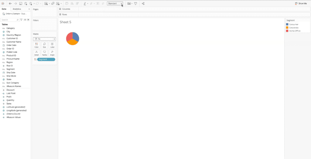
This view shows the pie chart in a very small section of the Tableau worksheet. To make the pie chart better fit the worksheet, we can change the view to “entire view”.
To change the view, find the drop-down menu at the top of the Tableau worksheet that reads “standard”.
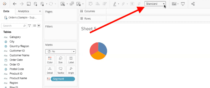
Within the drop-down menu options, select “entire view”.
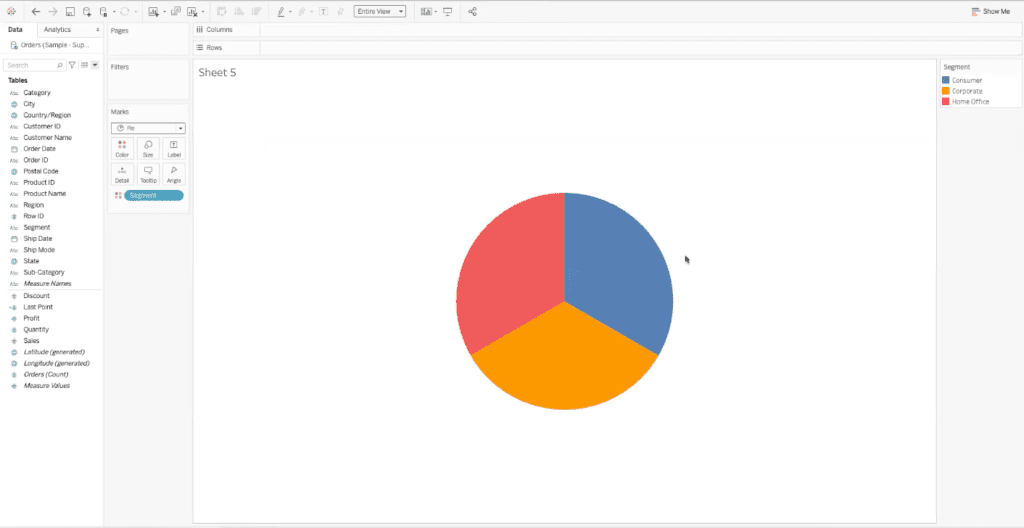
Now your chart will fill more of the Tableau worksheet, like this:
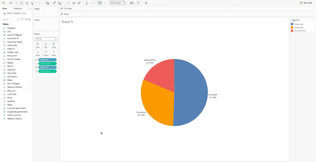
Use Percentage Labels
When we think of pie charts and donut charts, we often think of each section or slice as a part of a whole. Adding percentage labels helps visualize the part of the whole that each section makes up.
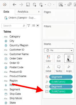
To add percentages, find the component that you have added as the “label” in the “marks” section. There may be more than one, as shown below, so be sure you are selecting the component that you want to be shown in percentages. In our example, we want to see the sum of sales as a percentage.
Once you have found the right component, right-click on it. When the pop-up menu appears, find “quick table calculation”, and select “percent of total”.
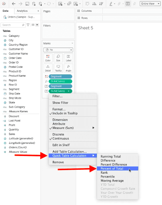
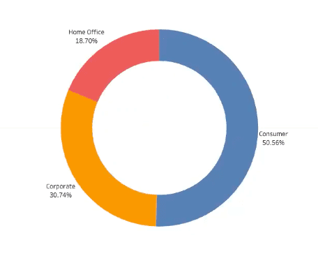
Now we are able to see a pie chart with the sum of sales in percentages.
XeoMatrix Can Help
If you’re not sure how to make donut charts in Tableau or whether they’re the right choice for visualizing your data, XeoMatrix can assist you.
Whether you need personalized Tableau training to create your own dashboards and insightful data visualizations, or if you’d like us to design a custom dashboard or embedded analytics solution for you, our Tableau service offerings will get you started on the right path. Contact us today to learn more about our business intelligence and data warehousing solutions.