The Data-Driven Community Meetup holds monthly webinars on business analytics and big data. Webinars are held on the second Wednesday of the month at noon (12:00 PM) central time via Zoom Webinars and will cover topics related to enterprise data management. Our goal with each webinar is to provide meaningful insights and actionable takeaways to simplify analytics so you can make better decisions.
The topics we cover include data strategy, data management, data warehousing, BI modernization, embedded analytics, and cloud migration and strategy. Learn how to build reporting solutions that drive your business demand based on your needs.
About the Topic
President at XeoMatrix, Chris Monahon, and Client Success Manager, Stuart Tinsley, recently held a meetup titled “Jumpstart Your Tableau Deployment” to showcase how organizations can get more out of their Tableau investment.
The event aimed to help attendees understand Tableau’s best practices for better deployment, training, and adoption, as well as to discover what’s possible with live demos of Tableau in action tailored to executive reporting, operations, and sales. The session also provided insights on how to quickly implement powerful features that can be rolled out to teams. The interactive Q&A panel session allowed participants to ask questions to the speakers and gain a greater understanding of how to deploy analytics at scale across their organization.
This article includes a recording, transcript, and written overview of the Jumpstarting your Tableau Deployment presentation.
Presentation Video
Summarized Presentation
The event focused on providing attendees with knowledge of Tableau’s best deployment, training, and adoption practices. The session included live demos of Tableau in action, tailored to executive reporting, operations, and sales, to show attendees what’s possible with the software.
Additionally, the session provided insights on how to quickly implement powerful features that can be rolled out to teams.
Presentation Outline
The two-part session follows this outline.
Driving Business Insights with Tableau
- Custom Views
- Subscriptions
- Alerts & Metrics
- Data Stores
- Ask Data for Self-Service
- Collaborations & Web Editing
- Embedded Analytics (External Reporting)
Building a Data Culture
- What is a data culture?
- Tableau Blueprint
- Things to consider
- Stay up to date
- The Data Checklist
- Tableau Training
- Building Your Tableau Community
Part 1: Driving Business Insights with Tableau
Stuart Tinsley, Client Success Manager at XeoMatrix, shares his expertise from consulting for four years at Tableau. He presented several Tableau functionalities. For specifics, please go to minute 05 for Stuart’s demonstrations.
Part 2: Building a Data Culture
What is a Data Culture
Data culture is essential for companies to make informed decisions, and there are five key elements that companies with a strong data culture possess.
- Trust: trust in data.
- Commitment: commitment from leadership.
- Talent: having talented people on board.
- Sharing: a culture of collaboration.
- Mindset: a collective mindset towards being data-driven.
Creating a data-driven culture is important to avoid making decisions based on guesswork and intuition, leading to better business results and value.
Tableau Blueprint
The Tableau Blueprint is a framework developed by Tableau to provide best practices for successfully deploying their software. It is based on insights gleaned from hundreds of Tableau clients over the years and is presented as a subway map. The Blueprint offers guidance on various aspects of Tableau deployment, including data governance, training, and adoption. It is an essential tool for anyone seeking to improve their Tableau deployments and make the most of their investment in the software.
The first step is to establish a strategy by defining goals and objectives. The leadership team, including executive advocates and project teams, plays a crucial role in this process. The leadership at the top must make data the organization’s center and prioritize its use in decision-making. Then, we have three workflows.
- Agility: deployment, monitoring, and maintenance.
- Proficiency: education, measurement, and analytics best practices.
- Community: communications, engagement, and support.
Things to Consider
The takeaways presented to serve as a starting point for individuals to consider implementing or incorporating within their organization.
- Are you fully leveraging the latest Tableau features?
- Is your data accessible and ready for analysis?
- Have you provided training to your SMEs & end-users?
- Do you have internal communications for Tableau?
Stay up to Date
Keep your Tableau environment up to date and take advantage of the latest Tableau features. Tableau Servers, product releases every six months, and Tableau Cloud is always up to date. Also, you may want to consider migrating from Tableau Server to Tableau Cloud.
The Data Checklist
Accessible and Centralized Data: having easily accessible and available data for end users is crucial. Nowadays, there are numerous data sources, including internal ones, cloud-based ones, and data warehouses in the cloud. Commonly, companies are consolidating their data into a data lake or data lake house to obtain a holistic view of their customer hierarchy and organizational hierarchy across all their systems. Therefore, centralizing data is essential and should be a consideration for those who haven’t yet standardized their data.
Excel & CSV Dependency: We have encountered many organizations that still rely heavily on using Excel and CSV files. These are especially popular in finance-driven organizations where end users are comfortable using these file formats. However, with the use of Tableau, there are a lot of best practices that can be utilized to bring users into the platform for their analytics needs. Stuart has demonstrated some of these practices, which enable end users to benefit from the powerful features of Tableau, including visualizations, instead of having to work with raw numbers on their own.
Fresh, Automated, and Clean Data: data should always be kept up to date. This can be achieved through ETL processes for data warehouses or data lakes. Another way to keep the data up to date is to use Tableau Prep Conductor, which is part of the data management add-on for Tableau. Tableau Prep is a tool that allows users to build steps into a workflow to clean and process data. It is available for free with a creator license, just like Tableau desktop. Using Tableau Prep, users can source raw data from spreadsheets, databases, or other sources, pivot and join it with other data sets, and produce an output file that is easy to consume into a dashboard.
The power of Tableau Prep combined with the Prep Conductor is a great feature for organizations to make their data available to end-users.
Tableau Training
Available resources:
Building your Tableau Community
Encourage communication and increase adoption:
- Slack and Microsoft Teams
- Internal Wikis
- Lunch & Learns
- Tableau Days
Transcript
>> CHRIS: All right, well, I see everybody’s logged in, so let’s go ahead and get the show on the road. So welcome, everybody, to our data-driven community, where we discuss all things data every month. Here at the DDC, we like to bring exciting and informative topics to you that will help your organization become more data-driven. My name is Chris Monahan, and I’ll be your MC today. We have a great event planned for you.
Today we’re going to be discussing how to jumpstart your tableau deployment. So if you’re new to Tableau or maybe you’ve had it for a little while and maybe just haven’t gotten any traction or adoption, this is the presentation for you. Here’s today’s agenda. I’m going to start with a few community announcements, and then we’ll jump into our presentations.
Stuart Tinsley, who’s our client success manager here at XeoMatrix, will be giving a presentation and demo around how to jump-start your Tableau deployment. And then I’ll be giving a presentation around building a data culture using Tableau’s Blueprint. And then after that, we’ll open up for a Q and A for our panel.
So, just as a friendly reminder, this is a webinar meeting. It’s virtual, so please observe customary webinar etiquette. If you’d like to participate, please post your questions or comments in the chat window. If you have any questions for our panel, we’re going to save those till the end. So please just put that in the chat as well, or in the Q and A, and we’ll go ahead and collect those.
All these recordings will be collected. Any content that’s presented will also be sent out after our event. So you’ll have that. In addition, we’ll also provide a short survey. If you could just take a second to fill that out, that’ll definitely help us improve our events for the future.
So here are some of the events we have coming up for the DDC. In May, our topic is going to be around Legacy migrations over to Tableau. So it’ll be modernizing your analytics, migrating legacy platforms over to Tableau, and what are some of the best practices around that.
So we’ll discuss that and show you some of the strategies around that. I’ll be giving a presentation for that and then we’re going to be doing our DDC events throughout the summer here. So here are the dates for June through August. So please keep those posted on your calendars and we’ll be sending out reminders for that.
And I definitely would be remiss if I did not mention that we have Tableau conference right around the corner. That’s going to be from May 9 to 11th. It’s three days in Vegas. It’s also virtual if you can’t attend. If you’d still like to attend in person, definitely go ahead and register. I’ve provided the link here. We’d love to see you there. Let us know if you’re going. We’d love to meet up with you there in Vegas.
So with that, I’d like to introduce our featured speaker, Stuart Tinsley. He’s going to be doing a presentation on how to jumpstart your Tableau deployment. This is very interactive. You’ll see a lot of demos around this as well. And again, it’s for those of you that may be new to Tableau or have had Tableau for a little while, and maybe haven’t got a little bit of traction with it or would like to just turbocharge your existing deployment. This is the presentation for you.
So with that, I will turn it over to you, Stuart.
>> STUART TINSLEY: Cool. Thank you, Chris. Appreciate it. Everyone on the call, nice to meet and see everyone. I see some familiar faces on the webinar. I’m Stuart, I lead client success for XeoMatrix.
I’ve been in the Tableau platform now for almost a decade. So really passionate about the product, the platform, and today really cool agenda just to show you a lot of features and functionality in Tableau that you might not know are there. And hopefully, that’ll help you jumpstart the deployment that you have. So, Chris, you can slide over.
The topics we’re going to cover today, we’re going to jump right into some demos here. We’re going to talk about custom views, setting up these customized filtered view options in your deployment for your team members. We’ll talk about subscriptions alerts and metrics, how to use those options.
We’ll talk about a newer feature in Tableau called Data Stories. Some people on the call might not have heard about this new feature. We’ll go into Ask Data, and talk about how you would enable Ask Data and how that can help for self-service across your tableau deployment. We’ll talk about collaboration and web editing, and some things we can do there. And then we’ll wrap up with a quick example of embedded analytics. So actual external reporting for your clients, if that might be a use case. Chris, you can go to the next slide. OK, that’s me to turn over to share my screen.
All right, 1 second here. All right, Chris, let me do a quick screen check. Can you see what’s on my window here?
>> CHRIS: Yes.
>> STUART: Cool. OK, so I’m in Tableau Cloud today. What I thought I would do is start off with an example dashboard. This is a really good dashboard that a lot of our clients will build when they start their journey or even kind of midway through their Tableau journey. And that is an executive type of report.
Now, this could be any data. It doesn’t have to be sales information. But I’ve got this dashboard built off of really fictional sales data if people on the call are familiar with superstore. That ships with your Tableau product. So a couple of things about this dashboard just to call out in case folks in the call didn’t know that this functionality existed.
Number one, this might seem sort of rudimentary, but for any filters that I have on my dashboard, tableau has the ability to, of course, control and filter other sheets or all of my sheets. So if I click central I can see my sales and profit and quantity and so on, filtering, as well as my states and my top customers. So the entire dashboard will filter. Same with my order dates if I wanted to look at the last four months.
This is a nice date range to use in Tableau. It’s called a relative date filter. It gives you the most comprehensive options to look at dates. You can look at each individual date part years, quarters, months, weeks, and days, right? Now we also in the right corner here have what’s called a parameter.
And a parameter is really helpful for dynamically changing our data. In this case, we have a profit margin goal. So it lets the user simply type in a profit margin percentage. Right now everything that’s highlighting in orange indicates that I’ve got customers and products that have a profit margin at 25% or higher. So if I were to go and type in 40%, we’ll see the data change and update automatically. So we can see Amy Cox is one of our customers who has a high-profit margin.
Now, what we’ve also done in this example is woven in a vis and tooltip. So a tooltip as many people might know just displays the information behind a worksheet. In this case, I’ve got the client, I’ve got sales. But what you can do is take other sheets in Tableau and you can incorporate that into your tooltips. That’s called a vis and tooltip. Very easy to set up.
What that let’s see is, I’ve narrowed down from another sheet the top products that Amy has been selling. So it shows me which products are probably doing the best for her. And it filters based on any selection that we make.
Now additionally, what I’ve done here under top customers is said click to filter.
This is a great technique to give users an indication that you can filter based off of a worksheet. Otherwise, they might not know that they can filter. So what this is designed to do is if I go to Amy and if I want to look at her details, I can click on her name and that’ll jump me over to another dashboard entirely.
This is great because this view tells me more information about the manufacturer, the order IDs, city postal codes, et cetera. It’s also filtered down to the time frame that we selected previously. It’s also great because we didn’t take up that extra real estate in our main dashboard.
So jumping people over to another dashboard can be a really nice technique in Tableau to reroute and put different direction and save real estate on your dashboard too. The other thing I’ll call out too is that you can have every sheet in your dashboard can act as a filter. So if a user was curious about, let’s say, text, that can dynamically change across your whole dashboard. That is called a dashboard action in Tableau.
So a couple of basics. Just wanted to show this dashboard, the functionality. Now we’re going to dive into what if somebody wanted to create a customized view. That is an option in Tableau where we will see this option that says view original. So what that allows someone to do is they could create their own view and that would archive and save their filter selection (unintelligible 09:44) Stuart’s view.
Now what I can do is make it my default. So every time I log in, it’s got my filter selection saved. You can also make that visible to others. So that’s a great technique. If you want users to save them time along the way, they pre-make these filter selections, save it, make it their default.
And they could always go back and view the original right here.
So I’ll make it my default and I’ll show you what that looks like when it reloads. So I can come back up to view, and I can see the original right here. Right back to where we started. So, a great way to archive and save your filter selections.
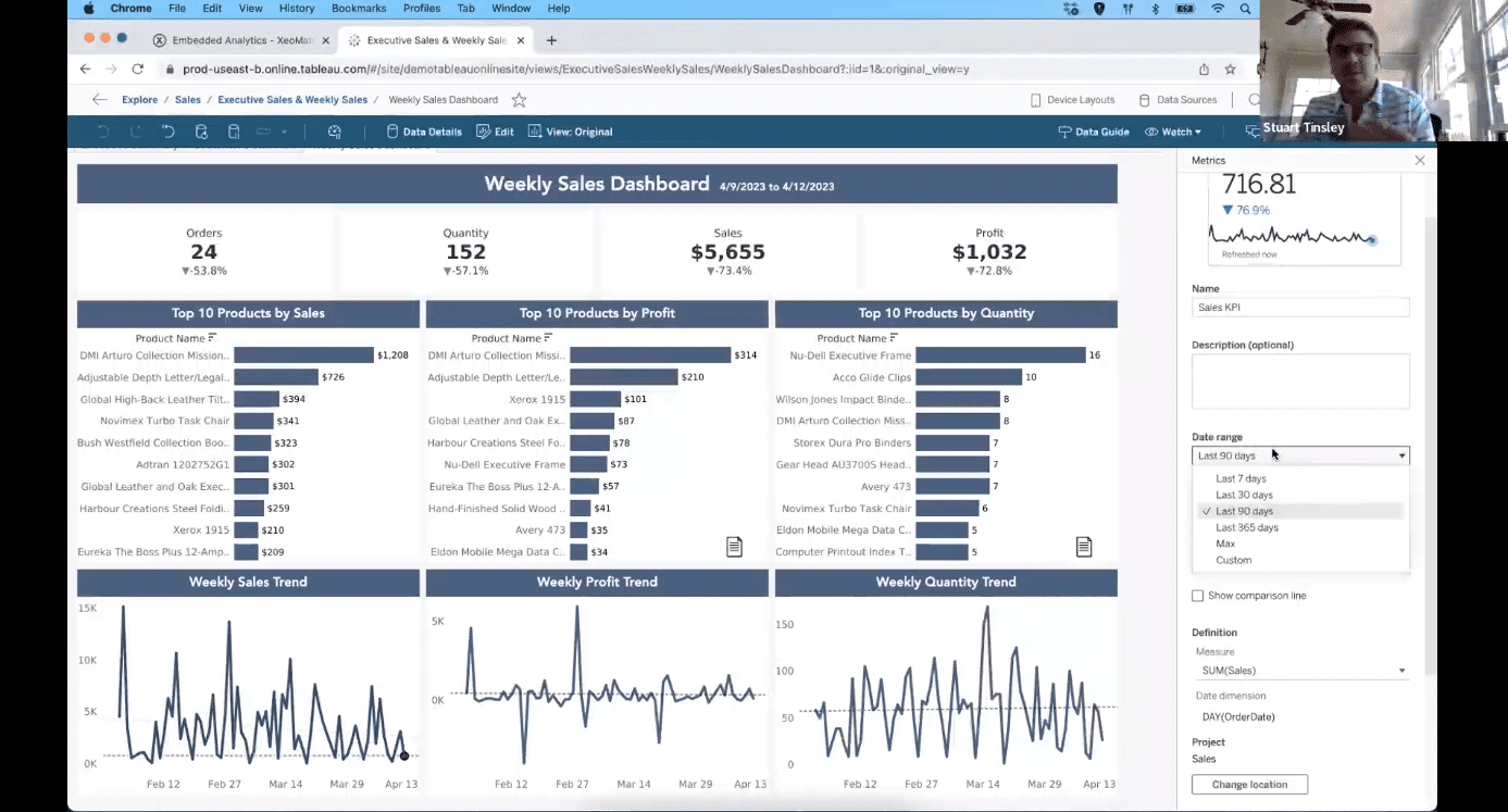
Now, a lot of customers ask us along their Tableau journey, how would I set up a subscription? So I get a snapshot via email of a report that might be important. So I’m going to jump over to my weekly sales dashboard. This might be a great example of a report that someone across your organization wants on a daily or weekly or monthly basis.
So to set up a subscription, what you want to do is go over to watch and we’ll see three options that we’re going to talk about today, subscriptions, metrics, and alerts.
So subscriptions allow users to get a snapshot of this view or they can select the entire workbook. So anything that’s in that workbook, they’ll get an email for. And you’re simply “@” mentioning people across your Tableau deployment that want to subscribe. Now, users can also subscribe themselves. It doesn’t have to be just your admin.
Now, the other thing that’s important is the format. You can pick between two formats. You can do an image that’s hyperlinked, or you can do a PDF in Tableau. Or you could simply do both. So Tableau is sending a hyperlinked image and the PDF. You can include an optional message.
And this is very important, the frequency.
So how often does it send out that subscription via email? Most of our clients will pick on a selected schedule because you might have your data refreshing fairly constantly and I would be sending a lot of emails.
So on a selected schedule, what you want to do is come down to the schedule. And this window is actually very similar to how you would refresh and extract in Tableau. You’re simply picking the time frame when this gets sent out. Is it hourly, daily, weekly, or monthly? You’ve got selections for each depending on your cadence you want to set.
And then you want to make sure that you check the days of the week that you want this to be sent out. You just check off a box right here and you’re sending that out. Here’s an example. Once that’s all setup, let me bring over an example of that. One second.
Yes, this is an example of the email that Tableau will kick out when you’ve set up that subscription. It’ll come from no reply. And you’ll see here that it’s just a hyperlinked image. So I didn’t do a PDF in this example, but we’ll notice I just click there and a user will be taken right back to that report. That is a subscription in Tableau, extremely easy to set up.
Again, users can subscribe themselves to reports. Let’s jump back to here.
Let’s talk about metrics. So metrics in Tableau allow you to track key numbers from your dashboards and reports. So a good example might be from my weekly sales dashboard. I might want to track my sales. Let’s take that sheet. All we have to do is select a mark on our view to create that metric.
So I’m going to go right over here to our weekly sales trend. And we’ll notice it’s gone ahead and created that metric for April 12, 2023, which shows up right here. We can then obviously add a name to it. I’ll call it sales KPI. We go to our description, we can pick our date range. I’m going to have it set to 90 days. But you can customize and pick the time frame in which you want to track this metric. So I’ll go last 90 days.
You can also show comparison lines if you want to. And then right here, you’re simply picking the measure that we want to base that KPI on, that metric. So I’ll do sales right here. Once we’ve done that, we could say create. And we’re going to go to the metric.
Now, before we talk about the metric itself, and what this entails, I just want to show you that it will fall into the project folder where that report lives. So it’s going to live right here. And we saw that executive sales dashboard. It’s going to live right here, that metric that you have.
Now, what’s cool about this metric is that it’ll tell you where it’s connected. You can always tell what report this metric was built off of. It’ll also give you an automatic range and comparison by percentage and indicator arrows of the previous, in this case, day. So I can see in this on [Unintelligible 15:27] we were up by 223%, we were down 74%, and so on. So it automatically creates this nice overtime line chart with comparison and indicator arrows.
And of course, we could share that metric with other people. We can make it visible to other users, but we do this for our business. I have a couple of metrics that we track, that I just look at on a weekly basis how we’re tracking. As a company, I don’t necessarily have to jump into a report to see that. So really nice feature in Tableau.
Let’s jump back and talk about alerts. So from the weekly sales dashboard, another request that we get from customers a lot is “How would I set up an alert to go off if a certain threshold has been met?” So that would be an alert in Tableau. So we’re going to go back to watch and go to alert. So as the text says here, Tableau is going to notify you when your data reaches that set threshold. Let’s click alerts.
You’ll notice with an alert, what’s important here is that we have to select a numeric axis on the view. You’ve got to have a numeric axis exposed for Tableau to generate that alert. That’s the information it needs to create the alert. So I’m going to go back to my weekly sales trend.
I’m going to select that numeric axis. I’m going to say create. Now I got this window that pops up where we can set the condition. This can be a range of options above or equal to, below, below equal to, equal to above. So if I said above or equal to and I’m going to set my threshold, that is an entry that we can make on the fly. We can have a subject that goes out that’ll come over in the email.
And then, like our subscriptions, we could set when this happens. So we could say once, if it’s true, as frequently as possible, maybe you have an alert that you need to be notified every time. So that would be a good option there. You can do hourly, daily, and weekly as well. And you can, of course, make this visible to other people. So you would just simply create the alert.
Once you’ve done that, this is what that email will look like. We’ll see, data alert, weekly Sales dashboard, the sum of sales was above or equal to that threshold that was set. And again, we are hyperlinked back to Tableau if we want to go engage with that report. All right, that is an alert in Tableau.
All right, let’s move into more collaboration and web editing and talk about data stories. So in Tableau, depending on your deployment, if you have Explorers in your deployment, the Explorer has the capability to edit reports and do a save as, or they can connect to data from scratch and actually build reports. They can connect to data that you have published as a creator to do analysis. So in this report, I’ve made that web edit option available. So if I have folks in my group that are Explorers, they can go in here and web edit.
So what that’s going to do? It’s going to open up this entire workbook on the Web. And then a user would have the ability to go into a sheet and they can start to answer their own questions. So they’ve got access to the published data source. So maybe one of your users wants to go in there and take the data and answer their own questions. They certainly could with Tableau.
So they’re almost in sort of a desktop light. They’re able to edit and work with this report on the fly and answer questions. They could also publish and they could make Dashboards, and they could publish those dashboards to their own folders. So that is a really great way to encourage collaboration and self-service if you have a mix of explorers in your deployment that you have.
While I’m in Web edit, I want to talk about a newer option in Tableau called Data Stories. So you’ll notice on this top ten products by profit, I’ve got this little icon right here. If I click this right here, this is what’s called a data story in Tableau.
So in natural language, Tableau is going to transcribe the data that it sees on the view. And so that can be a great option for users, and executives, to give them more detail. So in this particular view, I can see here that my profit was driven by this product, DMI Arturo, and it gives me more details behind the scenes about that.
So how we set this up is a little bit of a trick in Tableau to make this kind of fancy. What I’m going to do is bring in a floating container, and I’m going to put this container over my top ten products by sale. So it’s just going to cover that entire window. And the next thing I’m going to do is go to layout, and what I want to do is make the background white. I’ve still got that container.
The background is white. I’m going to go back to my dashboard, I’m going to flip back to tiled, and I’m going to bring in my Data story. That’s going to just land right in that container. When we do that, we get this window that pops up and I can pick the sheets, the worksheets that I want to write about. So I’m going to take the top ten products by sales, and I’ll say next. The next option we’ll have is to pick the fields. So I want “product name” and I want the week-to-date sales. That looks correct so I’ll hit next.
Now we can pick the best option to describe the data we have. You can pick between a discrete option, a continuous option, or a percent of the whole. So I’m going to leave it discrete for now, and I’ll say, OK. And that is put in there, my data story.
Now the trick is we want to double-click this tab to highlight the sheets that are in that container. And what I can do next is add a show/hide button. That button, when we click it, will then collapse and show my top ten products by Sales and then that data story behind it. That’s a great technique in Tableau to introduce data stories and other options that you might have, other worksheets that you might want to show.
And then to get this image, all we need to do is edit the button. Anytime you work with a button in Tableau, you can choose your button style. You could do text, you could do image. And if you do an image, you can simply choose images from your folder, your network folder. So I could go in there and pick. I’ve gone ahead and saved some images that we have.
That is Data stories in Tableau. Really nice technique. Let’s move on and talk about Ask Data. I’m going to go ahead and publish this from web edit. Let’s go to my workbook. All right. I’m going to go back to my Sales folder and I’m going to talk about Ask Data.
So Ask Data is Tableau’s NLP [Natural Language Processing] option, where users can simply type a question that they have about the data and Tableau will return results in either text or charts for them. So I’ll show you what that looks like. And the first key ingredient here is that you want to make sure you have published your data source to the project folder that is not embedded in the workbook.
So I can see here I’ve got an extract that is powering a couple of different workbooks. It’s also powering the metric that we have. So because I have that isolated, I published that data source separately. I can go to the extract. And the first option I’m going to see is Ask Data.
And what I can do is create a new lens here. I’m going to say “create new lens”, that will take me to a different window here. And what I can do here is pick all of the fields across my data that I might want to keep.
So for the example today I’ll save everyone the time of me unchecking boxes. You can certainly pick what data points and dimensions of measures you want to bring in. So I’ll go ahead and say submit. And now I have a searchable or really a text box to type in questions. So if a user were to come in, I could say top customers by sales. Now you’ll see Tableau is referencing all the data that we have over here.
And we just simply say submit, that’ll jump us into a chart. Based on that data set, here are the top customers that we have driven by sales. You could add filters to this, but it’s meant to be a nice self-service option for users. You could also pick different ways to visualize that. So that is Ask Data.
All we could do is create the data lens and then, it’s all teed up from there. So if I jump back to Sales, we will see there’s the superstore executive data. Now, one thing you might want to do is give users maybe more identifiers of what this is. So let’s call this ask Tableau. You could also add a summary as well in here.
And I’ll call this out as well. With Ask Data, you can also re-alias or add synonyms here. So if you had some maybe unique database tables that people might not know how to search for that, you can add synonyms. And those synonyms will be picked up in this text right here. All right? So let’s hit save right here, and cancel right here.
We’ll jump back to sales and we’ll see Ask Tableau. And again, they click here, and they can start typing any questions that they have. So going back to that example we saw earlier with Data Stories, a nice technique that would work similarly with Data Stories is once you’ve created that Ask Data lens, you could add Ask Data to your dashboards or reports. How we would do that would be the same sort of method.
We go into web edit. I’ll flip this back to the original view. So I’m going to go into web edit. I’m going to do the same technique that we saw earlier. So I’m going to grab that horizontal container and we’re going to float that in. Oops, wrong layout.
Let’s go to floating horizontal container, and have it take up most of the space right here. We’ll make the background white, and we will then jump back to the dashboard view, refer back to tiled, and then right above our data story, we have Ask Data. So we can drag that into that container, and it references the lens that we just created. Let’s say OK on that.
It’ll take a second to generate, but we have the same view that we had. Now I can double-click that tab again. It’s in that container. I can add the show/hide button. And what I might do here is let’s first collapse it. Let’s drag and drop this up here. I’ll edit the button, make it text, and say, Ask Data.
I might make the background white, the font bold, and add a border here. And let’s see how that looks. Cool. So now that’ll live in our report, I’ll go ahead and publish this.
Let’s take a look at what this would look like when it’s all said and done. It’s publishing back in web edit. So, again, really quick for iterations of the dashboard, let’s go back to my original view.
There it is right there. I’ll just go back to the original, and there is Ask Data published. And we’ll see when I click Ask data, click it again. We’ve got ask data right here and we can come in and ask questions. So that is a really unique and sort of fresh way to add more self-service options for your users right here. And when we don’t want it, we can hide the item and we’re right back to our dashboard.
So we talked about a lot right there. Subscriptions, custom views, alerts, metrics, data stories. We talked about Ask Data, and again, that key with Ask Data, you want to make sure that you publish your data source separately into your project folder.
So the last thing I’ll talk about before I pass it over to Chris is how we would embed Tableau. Now, we have a full webinar from last month where Chris demoed many, many examples of how you can embed Tableau. But if you’re thinking about embedding Tableau and offering reports for your clients, Tableau has made that very simple to do and achieve for your organization.
The example I will show very quickly is how you could take Tableau dashboard and embed that into your website or a portal. In this case, I’ve got a few different example portals.
So what we’re going to see here is a different experience all around. We’re not in Tableau cloud or Tableau server. We’re actually first met with this custom login screen that can be made custom in any way that you want for your company.
So this is how we designed it. But what it allows a user do is simply they would sign in like they’re signing into your portal. And when I log in, this is an example where the dashboard that was built in Tableau loads right here. And we’ve got a wrapper. This is important because the wrapper is everything that we would customize with the embedded API. So we’ve taken a lot of creative liberties and done a lot of customization with this report.
So everything from the PDF download. This is the same button that you might see in Tableau server or Tableau cloud, same with the download to Excel. We’ve also added branding for the user that’s signing in and their role.
We’ve added enhanced filtering options. This is just a dimensional filter in Tableau that almost everyone in this call, I’m sure has done, but we’ve just branded it differently to have a unique look and feel. A user can click over to store 105 and the data changes. You can also see under navigation, we can click to go to different Dashboards.
So when you embed Tableau and you use the embedded API, you can really come up with a unique and fresh way to view Dashboards and make it more seamless for your end users. Because if you did it in Tableau cloud embedded, it’s certainly a good way to start. But you’d have dashboard tabs that you’d have to toggle from like we saw earlier. That’s a slick and really fresh way to do this in Tableau.
Also, I’ll just show this as well. If I log in as John Smith here, John Smith is simply a store-level manager. So a lot of clients, when they embed, they ask us, how would we pass through the right security? So if one user logs in, they don’t see data from other customers across their customer pool. And you can do that with row-level security in Tableau.
So as I logged in with John, I’m only given access to 105. It’s also very easy to set up that level of security in Tableau where it restricts a user’s access. That is certainly something Tableau can achieve.
Chris, that is all I had in terms of jump-starting the deployment. I will pass it back to you.
>> CHRIS: All right, sounds good. Can you see my screen?
>> STUART: Yes, I can see it.
>> CHRIS: Well, thank you, Stuart. I appreciate it. As you guys saw, Stuart gave you guys a lot of tips and tricks and maybe even some features that you guys have not yet implemented. And we’ll be sending out this video after our event.
Please check it out. It’s basically an online tutorial on how to quickly implement some of this stuff. And I think what you’ll see is, you’ll see a lot more engagement from your user base and you’ll be able to provide them a lot more opportunities for self-service analytics as well. So hopefully these help you guys jump-start sort of what you already have.
If you have any questions, of course, please reach out. So this next part, I’m going to give a presentation on how to build a data culture. Stuart showed you all these great features using Tableau and how powerful the Tableau platform is. But technology is just one ingredient of building a data-driven organization. You have to have a great data culture, and that is the people and processes in place in order to foster this environment, in order to be more data-driven.
So let’s go ahead and we’ll take a look. Let’s see here. So, for those of you who don’t know me, I’m Chris Monahan, president of XeoMatrix. I’ve been doing data analytics for quite a bit, about 20 years. But I love talking to organizations on their data strategy, and what they’re currently doing today, both on the data warehousing side, sourcing their data as well as the analytics.
So with that, we’re going to talk a little bit more holistically about high-level, I guess I should say about. What is a data culture and how it applies to you? So let’s start off with what is a data culture.
A data culture is a company’s ability to make decisions. And companies with a strong data culture rely on data, obviously, to make their business decisions.
We found that companies that are data-driven have five key common elements, the first being trust in their data, the quality of their data, the availability of their data, and their systems. Secondly, it’s commitment. And that’s commitment from the leadership down. And really it starts at the top, establishing the priorities of being a data-driven organization.
And of course, you need to have the people, right? We all work with great folks at our organizations and you have to have the talent and the skill set in order to be more data-focused.
And then there needs to be this collaboration or sharing culture where you are sharing your data, collaborating with each other, and making decisions together in a collaborative format. And then lastly, there needs to be that mindset just collectively, that everyone understands the importance of being data-driven and why and how we’re going to accomplish that.
So, as I mentioned, data culture; technology is just a part of it. Data culture, you need in order to become a data-driven organization. That’s why it’s important everyone is united as an organization in a mission in order to improve your organization’s ability to use your data to make business decisions. And the end goal is to not make guesses on intuition. It is to use results, numbers, and data to make sound decisions on your business. And the end result obviously, would be to increase the overall business results and values.
So Tableau, luckily for all of us, has put together this awesome framework called the Tableau Blueprint. And for some of you that are not familiar with that, it’s a framework that they’ve established. They’ve interviewed hundreds of their clients over the years and they put together these best practices of sorts and put it into a framework here. They call this the subway map, so to speak.
But if you’re looking at it left to right, it starts off with having a strategy. First and foremost, what is our goal here? What is our strategy? And then again, you’re going to have that leadership team, the executive advocates, or the project teams. As I said, the leadership at the top, it’s really top-down where they made data the center of the organization and they have made it a priority.
To the right there, we have three sort of work streams, I should say, workflows. So one is around agility. So that’s how quickly can we do our development, how quickly can we update our systems, maintain our systems, and make decisions?
The second one is around education. So proficiency, how are we training our subject matter experts? How are we training our end users and how are we measuring that? And are we applying best practices to the rest of the organization? So everybody’s on the same page of how we do things?
And then lastly, we have community. And that’s more around the adoption. So are we effectively communicating to everyone in the organization on the results of what we’re analyzing, on how we do our best practices? Are we getting engagement from our end-user community as well?
So these three work streams, agility, proficiency, and community are sort of parts of the framework that Tableau has laid out. If you want to simplify it further, it’s simply deployment, training, and adoption. That’s really what it breaks down to, and that’s the core fundamentals that you need to focus on when you’re trying to become more of a data-driven culture.
So I’ve taken a couple of these bullet points that I want to focus on today. It’s not the full blueprint framework, but these are some things to take away that might help you just get your mind started on thinking these are some things we might want to implement or put in place within our organization.
So, first and foremost, you want to make sure you’re on the latest and greatest version of Tableau. You guys have made an investment in Tableau. You want to make sure you’re on the latest features so you can take advantage of those.
Tableau is an advanced platform that has a lot of great capabilities and every version has brand-new, powerful features. The ask data, explain data, all the new stuff coming out, you want to take advantage of that. So you want to make sure you’re on the latest and greatest features.
Part of that also, you want to make sure that your data that you are analyzing is accessible and ready. So we all have different data sources that we’re working with across our organization. How available is that to our end users in order to get their job done?
Fourth, have you provided the proper training to people? Tableau is very intuitive, but it always helps people if you get them a little bit of training to get them started. So that’s also important as an organization to invest in your teams. And then lastly, how are you communicating internally when it comes to Tableau or just your organization in general? How are you effectively building that user community internally and really trying to get some of that adoption in order to foster that data-driven culture?
So let’s talk about these. First, staying up to date. As I mentioned, you want to leverage the latest features of Tableau. For those of you that are on Tableau Server, Tableau does release a version product release of Tableau Server every six months. Not all organizations move every six months, but at least once a year you should try to stay on the latest feature or near latest feature. I know some of you have different policies as far as not being on the latest, latest feature, but of course, something near current would be great.
For those of you that have made the shift over to Tableau Cloud or are on Tableau Cloud, just started there, Tableau Cloud always has the latest version of Tableau, and that’s a great part of Tableau Cloud. For those of you that aren’t on it, it’s hosted by Tableau. They maintain, in a sense, virtual servers for you. And that environment is maintained and updated and upgraded all the time and you don’t have to worry about that. So you always get access to the latest and greatest features.
So for those that are maybe still on Tableau Server and are interested in moving over to Tableau Cloud, let us know. We’ve assisted with some of these migrations, but that is something we’ve seen a lot of organizations now that are on Tableau Server moving to Tableau Cloud in order to get the benefits and in order to be more agile in nature when it comes to using Tableau.
I mentioned about having your data readily accessible and available to your end users. In today’s world, there are all these different disparate data sources. We have internal ones, we have some in the cloud, data warehouses in the cloud. We have all these different data cloud sources that we use, such as Shopify or Google Analytics, or whatever.
We’re seeing a common trend where everybody’s centralizing that data in a data lake, data lake house, or whatever you want to call it today. But they are centralizing that data and you want to make sure that’s important so that you can have a holistic view of your customer hierarchy, your organizational hierarchy across all your systems.
So if you haven’t gone down the path of maybe centralizing your data or standardizing, that’s something you might want to look into.
We’ve talked to a lot of folks that are still really dependent on Excel and CSV. That stuff just won’t go away for sure, especially with organizations that are very finance driven. We know those end users like to use Excel and CSV a lot, but using Tableau, there are a lot of best practices, some of what Stuart showed you today, where we can go ahead and bring users into Tableau, bring them into the platform to do their analytics there, to look at the visualizations, and really benefit from the powerful features in Tableau, versus having to go through all the raw numbers themselves.
The other two points I want to call out here are you want to make sure that your data is up to date. And there are two ways of doing that. Obviously, if you have more of a data warehouse or a data lake or something like that, you have ETL processes that keep that up to date.
Another easy way, especially more at the departmental level, you can use Tableau Prep Conductor. Tableau Prep Conductor is part of the data management add-on for Tableau. And that goes ahead and automates your Tableau Prep flows. And Tableau Prep, for those that don’t know, is it’s available for free with your creator license, just like Tableau desktop. And that allows you to build steps into a workflow to clean and process your data, to wrangle your data.
And so you can take spreadsheets, just raw data from a database wherever, and source that data. And you can pivot it, you can join it with other data sets, and produce an output file that’s easy for you to consume into a dashboard. So the power of Tableau prep combined with the prep conductor is a great feature for you guys to really make your data available to your end users. So I highly recommend you check that out.
When it comes to training, part of being a data-driven organization is making sure that everyone’s trained and enabled on Tableau. And so here are a couple of resources that I’ll list here. We won’t go into all of them, but there’s a lot of free training out on the web for Tableau. That’s the great thing about Tableau. They have a vast community, everybody’s eager to help out, and the community message boards as well also give a lot of answers, tips and tricks, and things like that. So there are a lot of ways to learn online with Tableau.
There are also some other options like role-based learning that they’re like skill awards that you can earn depending on whether you’re a business analyst or an admin, so you can check those out as well. And then another option that’s also pretty affordable is E-learning. I think it’s $10 a month per user. It’s pretty affordable, and it’s an online, self-paced tutorial on how to use Tableau. And this is a great way to get started.
For those that want to sort of take it up another notch, you can also do Tableau custom training. It’s something that we offer as well, where you get trained on your data. It really helps reinforce the concepts because the data is more familiar with your end users.
Our particular training is only 10 hours of instructor-led training, so it’s five two-hour sessions, and it really goes end to end, teaching you the basic fundamentals of Tableau all the way up to the advanced calculations and best practices around dashboard. So that’s something really cool. If you’re interested in that, please let us know. But those are some of the ways we’ve seen where organizations train their subject matter experts and end users.
And then on the last slide here that I want to close with is sort of how do you go about building your Tableau community? How do you build that internal community and really get that adoption? So we’ve seen a lot of different ways of doing this. First and foremost is how you communicate internally. Some organizations are Slack, some are Teams. Whatever you’re using, set up some channels that people can post to.
Here at XeoMatrix we actually have a couple of channels where people that need assistance or have questions can go ahead and get answers. So we have a blockers channel if someone’s stuck. We have a general help question channel for help and then just Tableau interesting tips and tricks and news. So that really starts to build a sense of community there where people are just interested in the topics that are being posted.
You probably all have some sort of internal wiki like SharePoint or something where you’re posting information so that any important information is just centralized. Make sure you have those established and people know where to find the information. You can store your webinars there for videos, PowerPoint presentations, and things like that.
The other ways we’ve seen organizations increase their adoption and sort of foster this internal community is with Lunch and Learns. We’ve seen folks do Lunch and Learns once a month. Those are really popular. Also, internal Tableau user groups, that has also become really popular here. We talked to a couple of organizations recently that have done that and that’s just setting up similar… If you’ve ever attended a public Tableau user group, it’s really just having a department maybe sponsor or present how they’re using Tableau within their group, and some of the best practices and tips they do.
And then you go ahead and maybe have another guest speaker that maybe shows a cool feature about Tableau. So it can be as short as just one hour during a lunch. But those are really great. We’ve seen a lot of organizations do those internal tugs once a month and you’ll find that once you do that, that really starts bringing out all the subject matter experts and even end users that are interested in your data. And that starts building that data-driven mindset and culture within your organization.
And then lastly, if you want to get five stars and get an A, you could try to do a Tableau day that is taking it up to the next notch, where we’ve seen some organizations that block off half a day and it’s sort of like a Tableau user group, but on a bigger scale. And we’ve seen it where they do iron visits internally, where they do dashboard contests, they do presentations, best practices, and it’s really just a way to get all the departments together to collaborate and talk data and really in a shared mission, sort of try to drive more of a data approach to how you guys do your business.
So that’s some of the things we’ve seen. I guess I’ll close. If you have any questions about anything that Stuart showed today or anything that I’ve shared, please let us know. With that, I’ll open up the floor to some Q and A.
So let me take a look here. Stuart, I think we had one or two questions.
>> STUART: Yes.
>> CHRIS: I saw one… I think it’s for you, Stuart. “Of the features you showed, which ones get the users most excited?”
>> STUART: Of the features I showed, which gets users most excited? That is a good question. It sort of depends. I think if we break it down maybe by different users. Like executives get very excited by subscriptions and alerts, that is for sure.
They’re just often moving quicker at a different pace and need those updates. So they get very excited about that. I think the general user population gets excited by Ask Data. Just a simpler option. Maybe they don’t have the skills to go in and web edit and do ad hoc analysis, but they want to get quick answers.
We’ve seen a lot of great feedback for Ask Data in that setting. So those would probably be my top two… Certainly custom views. I mean, they all really have a place here. People move so quickly nowadays that a custom view can really save a lot of time from them having to filter and they can go on about their day.
So they’re sort of weighted equally, I think. I don’t know if it’s a copped-out answer.
>> CHRIS: That’s fair. I see one here, I can take this one. “Does embedding have to be in a custom portal or can it be inside our application?” So we won’t go too far into embedded. I know Stuart showed an example. We did a whole webinar last time so you can check out our Meetup group. It’s posted there. The video is posted there. But yes, the short answer is yes. You can definitely embed into your existing portal.
Tableau has a very rich embedded API that allows you to create sessions and embed the dashboards within your portal. So you can definitely embed and do it inside your own application. It’s a very common request.
>> STUART: Chris, there’s a question right here. “Is there an easy fix for a data sync failure with a dashboard?” That’s a good question. My first gut reaction there to an easy fix for a data sync failure is what is the data source itself, is it an extract of data, How many times has it failed, if that’s the case. What you can track Chris, you could track extract, refreshes, and tasks. Correct. Or the failures. Where would that be visible?
>> CHRIS: Yes, I don’t know if it’s an easy fix, but there is. [Crosstalk 53:51] Probably the short answer is not there’s an easy fix, but I think there’s an automated way where you could check to see when extracts were last refreshed, and you could refresh them again if they failed. Or you all, of course, get those alerts, too. So there are a couple of options there, depending on what your internal process is, if we want to be doing that.
>> STUART: And one thing too, this might just be an easy option. If your data source is an extract-only data source, like a salesforce, you would need to set up that on a refresh schedule. That’d be the first thing I would check. Did you even set it up on a refresh schedule? Because if you hadn’t, then you wouldn’t get a sync of data coming in.
>> CHRIS: OK, well, Brendan’s getting very specific.
>> STUART: Yes.
>> CHRIS: Full refresh required.
>> STUART: That looks like a salesforce message.
>> CHRIS: Yes.
>> STUART: Brendan, is the data source salesforce?
>> CHRIS: Brendan, if you want to reach out to us, we can [Crosstalk 54:59]
>> STUART: We’ll take it offline. Yes, let’s take a look. It looks like that’s a salesforce. And different data systems and databases will have different errors. So yes, like Chris said, Brendan, not always an easy approach, but that gives us the detail we can explore with you.
>> CHRIS: And one thing just to mention while we’re talking about extracts, and maybe this applies to you, Brendan, some people do incremental refreshes, and sometimes those fail. And maybe that’s what you experienced here, Brendan. But incremental refreshes, of course, are where you have a historical data set and you’re adding or appending changed records. Please note that with Tableau, that’s going to be an append, but it does not update historical records.
So we do find some clients that do incrementals, and then during the weekend, they do a full refresh to make sure that catches up everything. So if that’s what you’re doing, we can talk to you about some options on how to set that up. So please reach out.
Let’s see, I think the last one was Stuart. I talked about the Tableau training, maybe you could go into a little about how that works. Someone is asking, what exactly do you get with the custom desktop training?
>> STUART: Yes, so the way we’ve designed the custom training is to, first off, be respectful of our clients’ time and not have too much time where users and people are in the training. So we’ve designed it to be a total of 10 hours of training. There might be some folks on the call that have taken that training, but it’s five, two-hour sessions broken up. The idea of the training is that it scales from… we cover the fundamental concepts in Tableau.
We cover dimensions and measures and filtering and groups and data types. And then we scale that very quickly into different visualizations that Tableau can produce out of the box and even more custom visualization. Then for a two-hour block, we talk about calculated deals, all the different formulas that you can write, and different functions. And then we close and wrap our training with producing a dashboard that can be that is set up to interact and engage, like the example I showed earlier. And we walk through the publishing process from there of how to get this to your tablet, cloud, or server site.
So we’ve mapped this to a T in terms of how many hours make sense, where it’s not too much but it’s not too little. We cover the basics all the way to fundamentals. Hopefully, that’s helpful.
>> CHRIS: Yes. Thanks, Stewart. Thanks for that overview. Well, we’re up on time here guys, so thank you for tuning in. Check us out next month on May 17. We’re going to be doing a presentation around legacy migrations to Tableau. So if that’s something that applies to you, please check us out.
In the future, just a heads up, we will have a couple of our data-driven community events where it’ll be more meeting formats, so we’ll be able to engage a little bit more and have a little bit more discussion as well. So be on the lookout for those. Those will be this summer. So everybody, thank you very much for tuning in and we will talk to you next time.
>> STUART: Bye everyone.