
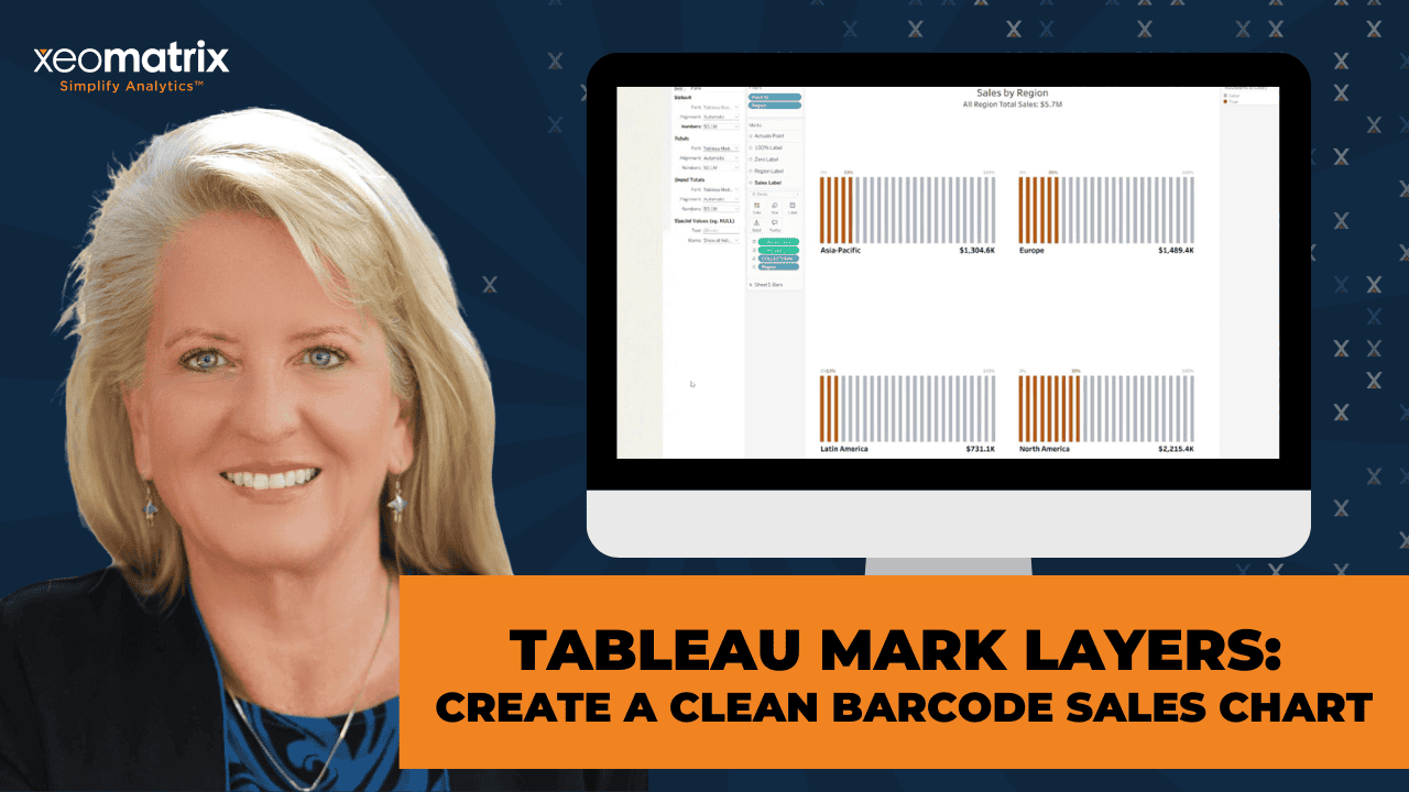
For years, Tableau developers have become experts at solving visualization challenges by combining multiple worksheets into a single dashboard.
Need a custom label? Add another worksheet.
Need a target indicator? Layer another worksheet.
Need annotations, reference markers, or additional formatting? Create another worksheet and carefully position it in the dashboard.
This approach has served the Tableau community well. It has enabled countless creative dashboards and even entire visualization libraries. As dashboards have become more sophisticated, however, they have also become more complex. A single KPI card might require four or five worksheets. A custom chart could require ten or more. Every additional worksheet introduces another object to maintain, another layout to manage, and another opportunity for formatting inconsistencies.
Mark Layers offer a different approach.
Instead of composing dashboards from multiple worksheets, Mark Layers allow developers to compose sophisticated visualizations within a single worksheet. It is a subtle shift in thinking, but one that has significant implications for dashboard design.
A Shift in Design Philosophy
One of the most interesting aspects of Mark Layers is that they encourage developers to think differently about how visualizations are built. Traditionally, Tableau authors have approached dashboard development by asking, “How many worksheets do I need?”
Mark Layers encourage a different question:
“What layers does this visualization need?”
Rather than treating labels, markers, annotations, and supporting graphics as independent worksheets, they become individual layers that work together within a single visualization.
This approach keeps every component aligned because each layer shares the same coordinate system and resizes together as one object.
The result is a visualization that is often easier to build, easier to maintain, and easier to adapt over time.
What Are Mark Layers?
At their core, Mark Layers allow multiple independent marks to coexist within a single worksheet. Each layer can have its own mark type, formatting, labels, calculations, and even data source. Developers gain precise control over positioning while combining points, lines, polygons, text, Gantt bars, and custom visuals into one coordinated view.
While the feature evolved from Tableau’s mapping capabilities, its value extends far beyond maps. By using spatial calculations such as MAKEPOINT(), developers can create a flexible canvas where visual elements are positioned with remarkable precision.
Once you begin thinking of a worksheet as a design surface rather than simply a chart, entirely new visualization possibilities emerge.
Why Fewer Worksheets Matter
Reducing worksheet count is not simply about creating cleaner workbooks.
It also simplifies the overall dashboard architecture and improves performance.
Every worksheet has formatting, layout behavior, filters, and rendering considerations. When several worksheets are layered together to create a single visual, maintaining consistency becomes increasingly difficult. Small formatting changes may require updates across multiple worksheets, and resizing dashboards for different devices often requires additional adjustments.
Mark Layers consolidate many of those responsibilities into a single worksheet. Instead of managing multiple dashboard objects, developers manage multiple mark layers.
This simplification often produces dashboards that are:
- Easier to maintain and troubleshoot.
- Improved autofit for multiple devices.
- More resilient when requirements change.
It also improves collaboration. When another developer opens the workbook months later, they are less likely to spend time tracing interactions between numerous supporting worksheets.
Building for Responsive Dashboards
As organizations increasingly consume analytics on laptops, tablets, and mobile devices, responsive design has become more important than ever.
Traditional worksheet layering can introduce challenges when dashboards are resized. Floating objects often require additional adjustments, and carefully aligned worksheet combinations can become time consuming to maintain across multiple layouts.
Because Mark Layers exist inside a single worksheet, the visualization scales as a unified object.
Labels, reference markers, indicators, and primary marks remain synchronized as the worksheet resizes. Rather than maintaining several independent dashboard elements, Tableau maintains a single visualization with multiple coordinated layers.
For organizations supporting multiple device layouts, this can significantly simplify dashboard design and maintenance.
A Barcode KPI Chart
One example of this design philosophy is a barcode-style KPI chart, originally authored by Andy Kriebel of Next Level Tableau.
At first glance, the finished visualization appears to combine several independent components:
- A barcode made from evenly spaced vertical tick marks
- KPI progress coloring
- Percentage labels
- Region names
- Sales values
- Reference labels for 0% and 100%
Traditionally, many developers would approach this by creating several worksheets and carefully arranging them within a dashboard.
Using Mark Layers, the entire visualization can be constructed within a single worksheet.
The foundation begins with a simple spatial scaffold that creates evenly spaced positions for 25 Gantt marks. Additional MAKEPOINT() calculations create independent layers for labels, reference positions, and KPI indicators. Logical calculations determine which barcode segments are highlighted, while separate text layers position labels exactly where they belong.
Although the finished visualization appears sophisticated, its underlying architecture is surprisingly clean.
The barcode chart is not the goal.
It is simply an excellent example of what becomes possible when developers begin thinking in layers instead of worksheets.
Looking Ahead
Mark Layers represent more than another Tableau feature. They encourage a different approach to visualization design.
Experienced Tableau developers have already embraced relationships, Level of Detail expressions, table calculations, and dynamic zone visibility as techniques that simplify complex problems. Mark Layers belong in that same conversation. They provide another tool that allows developers to build sophisticated visualizations while reducing workbook complexity.
As more developers adopt this approach, we are likely to see dashboards that contain fewer supporting worksheets, cleaner workbook structures, and visualizations that are easier to maintain over time.
The walkthrough accompanying this article intentionally focuses on a simple barcode KPI chart. The objective is not to master one visualization. It is to introduce the principles behind Mark Layers and demonstrate how a single worksheet can replace what previously required several.
Once you begin building with layers instead of worksheets, you may find yourself revisiting many of your existing dashboards and discovering opportunities to simplify them.
That may be the greatest advantage of Mark Layers. They do not simply help us build new charts. They help us build Tableau workbooks that are cleaner, more resilient, and better prepared for the next generation of analytics.
Watch the Tableau Mark Layers Walkthrough
In the video below, Celia Fryar walks through how to recreate the barcode-style KPI chart step by step using Tableau Mark Layers. The walkthrough shows how a visualization that might normally require several worksheets can instead be built from a single worksheet by layering Gantt bars, labels, percentage markers, tooltips, and formatting controls into one coordinated view.
Read the Video Transcript
[00:00:00] Celia Fryar: Welcome. Today we’ll recreate this clean Barcode style Sales Chart using Mark Layers.
It looks like a complex Dashboard, but as I unhide the objects, you’ll see it’s powered by just a single Worksheet. Now that you’ve seen the finished results, let’s recreate this chart together.
Let’s bring Point: ID on here. We only want to use the first 25.
You want to see the impact of that. You can see that we indeed got that.
I’m also gonna just focus on the first Region to get this started. We can add the others after we get finished and get the one instance of it stood up.
We’re gonna begin by collecting Bars, so our Bars. Make point. When I press Marks card, we’ll have it change the Mark Type to Gantt bar. You can see one tiny bar right there right now.
I’m gonna bring the Points onto here. We’ll get the 25. We’ll have the Marks to Color on our Color Marks Card. You can see a few that are red now.
I’ll bring Region onto the Mouse Card in the Detail as well and then we’re gonna use AVG(1). That will help us with the structure here in a moment.
We’re gonna bring in the Size.
Next, we’ll bring on the Sales Label.
Change the Mark Type to a Circle.
We’re gonna bring on Detail on here for us to have a good Label.
We are keeping the Region on the Detail, and then we’ll put the Sales Values onto Label, and I’m gonna use All Sales onto the Tooltip.
And you can see that I have the Number down there.
I need to change the format for this. So I’m gonna, rather than changing it through here… You can change it through here. Alternatively, I’m, like, going to go here and make my choices here. Boldface. I’ll go ahead and make this Medium, and that looks be great.
I need to affect the alignment to go under and to the left. There we go.
I will leave that for now, but I also want to get… That’s good for the Formatting, I want to change the way this Number is being presented. So Currency (Custom), one Decimal Place, Thousands, and then we’ll have it more like a KPI.
All right. So we’re ready to move on.
The next one is gonna be our Region Label. Here’s the Calculation for the Region. Bring it to the Marks Layer. We’re gonna layer it up with the correct things for it to be showing. There, Region on its Detail. Move it around a little bit and format it, and also change it into being a Circle.
Now we can work on the Label Format.
And that’s gonna be our Pattern each time when we have a Label.
Next, we’ll put the Zero Label that’ll be at the top of the Box, the Bar. And at this point, I could go ahead and release the Map Background. So you do have two Marks Cards, and then you can release it, and that way we can go ahead and see our Marks.
And this is great. We’re off to a good start here.
All right. So bring on the Zero Label on the Marks Layer. We’re gonna make it into a dot, so we can work our Layer, give it the Label and work around it.
So we’re gonna make Region sit on the Detail shelf, and then I’m gonna type into this a literal value of 0%. Put that onto the Label. And then go ahead and work on the Label.
I like this size is fine. The alignment is not my ideal. I want it to be above and to the right, so right there. Let’s match the Mark Color. I think Gray is good. Maybe that just to help it stand out. Okay, great. Gonna close that up.
Make the Opacity go to zero. Now I’ve just got my zero up there for 0%.
Next, we’re gonna bring on 100%. Much the same. We’ll change the Mark to a Circle, bring Region onto Detail, type 100% into the open space and make a literal Value here. Put that on the Label. Work on the presentation of the Label. Mark Color 100%. Come out to Alignment, it’s going to be to the left and above the dot.
And going to Color, reducing Opacity to None. And then I have my Bounding Boxes. So I have a 0% and 100%. Now I need to put the Actuals On.
So my Actual Point is tucked away in this particular Calculation, and you can see it’s using Percent of Total Sales to determine the length of, or the Placement of that Number.
We bring that onto the Mark Layers. Change it to being a Dot or a Circle that we can work with. Then I’m gonna put the corresponding Values on it to give us our Titles. So Percent of Total Sales. Make sure Region is sitting on the Detail.
Work on the Formatting.
Actually, this one should be bright red. And alignment, we need it to sit above it, and to the left over the Filled Bars. Okay? And then we’ll take the dot to transparent. There we go.
Now, we got some cleanup to do before we move on to the next piece, and one of the things we’re gonna do is to increase the size of the axis so we have just a little bit more breathing room around everything.
So Edit the Axis, and we’ll say that we’re gonna have a Custom Size, and we’ll go ahead and go from -1 to +2. And that’ll give us just a little bit more framing around each of the Bars, and you’ll see how that’s responded in the Background. That’ll be good. That’ll help our… help make room for all four when we get them on together.
Before we start doing cleanup, we have a specialty Calculation to help us with the Alignment and Indexing on the page. It is a Table Calculation. I’ll show you the Calculation here. We got one in Rows and one in Columns, and that would require a deeper dive for another day, so we’re gonna just use it, and we’re gonna tell it to Compute Using Region, and same thing for Columns. Compute Using Region.
All right, now as we hover over the Bars, you can see that we have a few extra things in our Tooltips, so we’ll clean that up quickly. And the things we don’t wanna have added in to Tooltip, we’ll just go through and make sure that is not involved. So Include in Tooltip, turn that on. Make sure that’s not gonna be Included in Tooltip. That’s okay, we’ve already got that in lots of places.
With Zero Label, I don’t need a Tooltip. I need to not turn that off because if I turned it off one place, it’s being turned off other places. So let me go back to this now. Region, what else do we have here? The Point ID and the Average. So let’s do Point ID here, Not Include in Tooltip. Take the Average off, and see if this one is being fed into that.
Sure. Let’s do that. Let’s tell ’em to please not include these.
Okay. Now our Tooltip makes sense.
Okay.
Probably need to see if our Sales Labels could be Included. Included until there, and this could be Included until there.
Great. Okay.
I’m first gonna turn on the other Regions before I finish my cleanup duties.
Four. Okay, now I have some Axises to dismiss. So I can uncheck Show Header here and here, here, and then I have Lines that need to be removed. So from this, I would say no Grid Lines, no Zero Lines. And then from this window, I don’t want any Row Dividers or Column Dividers. That cleans it up nicely.
Good.
I think that one boils down to a T.