When Tableau Pulse was first introduced, many people saw it as a convenient way to deliver KPI cards and executive summaries. After spending considerably more time with the product, I think that view undersells what Pulse has become.
Pulse represents an important shift in how organizations deliver analytics. Traditional dashboards depend on users knowing where to look and remembering to check them. Pulse turns that model around by bringing trusted business metrics directly to people through dashboards, mobile devices, email, Slack, Microsoft Teams, and other places where they already work.
That shift only works when the metrics behind the experience are thoughtfully designed. Definitions, optional dimensions, goals, thresholds, dashboard filters, permissions, action links, and governance all influence whether a metric becomes something people trust and act on, or simply another number they ignore.
During our June Data Driven Community session, I approached Tableau Pulse from an implementation perspective rather than a feature tour. The question wasn’t “What can Pulse do?” It was “What does it take to build Pulse Metrics that people actually use?”
Where Pulse Fits in Tableau’s Analytics Evolution
Tableau Pulse reflects a meaningful shift in how organizations deliver analytics.
For years, dashboards have been the primary way people consumed analytics. They remain incredibly powerful, but they depend on users knowing where to go, opening the right dashboard, and deciding which questions to ask. Instead of relying solely on users to open dashboards and search for answers, Pulse helps bring trusted business metrics directly to the people who need them.
This shift toward push analytics makes important business metrics more accessible through dashboards, mobile devices, email, Slack, Microsoft Teams, and other places where people already work. Rather than replacing dashboards, Pulse complements them by helping organizations surface trusted metrics before users even think to go looking.
Tableau’s broader analytics platform continues to build on this evolution. Data Guide added more contextual exploration. Tableau Agent and Tableau Next are extending analytics into conversational experiences grounded in trusted business context. Pulse fits naturally into that progression by making important metrics easier to access, understand, and act on.
The remainder of this article focuses on the implementation decisions that make push analytics successful. If you’d like to see those concepts demonstrated live, you can watch the full June Data Driven Community session below.
Watch Pulse Check: Making Metrics Accessible
>> CELIA FRYAR: We are going to jump in then. All right, so welcome. We’re going to talk about Pulse Metrics, and before we get started on the topic of today, though, I have a few announcements to make. First of all, thanks for joining us for the DDC. We love doing this. It’s a monthly event for us. It’s kind of a try to listen to what people are saying that they are needing to do and provide some support for that.
Along the lines of additional support, just want to mention a couple of other things that are happening in our space, and that is Lauren and I are both involved in a couple of different Tableau user groups, and I should have asked you for the [unintelligible 00:00:42], what you guys are doing next. Maybe you can, in a minute, jump in and just tell, but we’ve got a couple of really cool things happening for the Austin and San Francisco ones coming up. Tomorrow, actually, a former Iron Viz winner, Lisa Trescott, who’s visionary, done a lot of publications online, she literally will help just to– she’s very generous in the way she helps others. She’s going to talk about, at the speed of Iron Viz, in the midst of–
She does a lot about design and elements that are efficient, and so this is one of the things that she’s– from that perspective of the pressure cooker of the Iron Viz challenge, she’s going to talk about that a little bit. Matt Huff is coming in from H-E-B. He’s one of the co-leads from Makeover Monday, and then Jane Kamata was a former Iron Viz winner as a student, and she’s going to be our technical interview tip provider tomorrow. We try to do those three segments every time with Austin TUG. You can see we have a couple of other really good topics happening in the days that will follow in terms of data literacy and then Claude.
Alongside of MCP and Tableau, Louis Yu is a visionary. He also runs another Tableau user group and works in analytics full-time, so he’s incredible but a little bit different time zone on some of that because he’s in Singapore. We’ve talked about doing Tableau Next in July, and as I was preparing for this session, I also wanted to just take a quick pulse of the folks who came to this one to see would you guys rather us do that, or would you rather us look at creating visualizations using mark layers. They’ve officially changed the labels no. It’s not map layers but mark layers. It’s essentially where we’re using the flat earth coordinates to be able to assemble high-performing visuals and have good connections on it. I’m seeing it in the chat.
If you have an opinion on that, if you could please put the notes into chat, that would be fantastic because, either way, we will circle back around on Tableau Next. Part of my reason for even mentioning that was I’m pretty sure we’ve got another release or two happening in the summer with Tableau Next that’s going to change the game a bit. MCP is coming to Tableau Next, and that may be just a real breakthrough, so mark layers. I’m seeing that. Good. We may re-swizzle a little bit. I also have just recently been teaching it a whole bunch, and so we’ve got some great examples to show. We might make it like a little baby walkthrough for you guys.
All right. Good, good. Thank you for that. I think that’s pretty unison there, don’t you think, Lauren?
>> LAUREN CRISTALDI: Yes, I love it. I love [Inaudible 00:03:37]
>> CELIA: You were the one that introduced me to it last summer. This is really remarkable what you can do there. Your TUG, the Charleston one, do you want to– what are you guys doing this summer?
>> LAUREN: We’re planning our first in-person event right now. It’s going to be next month.
>> CELIA: Awesome.
>> LAUREN: Trying to figure all that out. It’s a lot of work event planning, especially when it’s in person, and there’s a venue.
>> CELIA: Yes, that’s so true.
>> LAUREN: I’m planning my wedding again.
>> CELIA: I feel you on that. We usually do an August one for Austin because of an availability of– the space is always such a thing here in Austin. One of our council members has space for July 28th, and so we’re doing our in-person one then. Anybody who’s in the Austin area, I’ll give you some more details about that when we get together at the beginning of July. It is a lot: travel, parking, all the things. All right. As you all know, this is a Zoom meeting. Shocker, right? This is such old news these days, right? We have made it so that you can come off mute and chat. Nobody’s locked down. You’re welcome to be on camera, off camera. That’s entirely up to you.
We are recording it, and we do make this recording available for others later. If you ever know that we’re doing a topic you’re interested in, but you can’t make it, know that that’s going to be available after a while. All right? It’s really good to see you guys, so thanks for coming.
As you know, this is mine and Lauren’s project. Lauren has this year been promoted to run our data analytics department. Is doing a fabulous job. Anything else you want to say about your background, my friend? We were going to change the slide, weren’t we?
>> LAUREN: Oh, sorry, we can leave it at eight years, because honestly, I’d rather be younger.
>> CELIA: Okay. That’s so true.
>> LAUREN: I’ll take it.
>> CELIA: There we go.
>> LAUREN: I have a state government background. I love building dashboards. I even do it on the weekends, and my husband makes fun of me. I just made a TV guide tracker because we have too many subscriptions. I need to publish that. Maybe I can do that on a DDC, one of these months.
>> CELIA: That’d be fun. That’d be great.
>> LAUREN: We have too many subscriptions, and it’s always like, “What’s on tonight?” It’s like, “Oh, was it on Amazon?” I’m like, “Such a waste of time,” so now we’re saving all this time with this dashboard.
>> CELIA: There you go. [crosstalk]
>> LAUREN: All right. I’m very excited about it, clearly.
>> CELIA: Awesome. You manage your life on that. I love that. That’s so good. All right, cool. As you guys may know, I recognize much your names. I do training enablement here and in the rest of my life as well. I have been teaching Tableau specifically for 10 years now. I’ve been teaching a little bit of Power BI this week. I’m re-remembering all the reasons.
>> LAUREN: That you hate Power BI? Oh, it’s a recording call.
>> CELIA: Oh, did I say that out loud? Oof. Especially if you want to do anything with mapping, just want to put that out there.
>> LAUREN: Yes.
>> CELIA: Where there’s a will, there’s a way, I guess, with most any tool, right? In any case, love Tableau very much. I’m very much amazed at the DataFam. That by itself would be a selling point to me. The community around it is extraordinary. In this day and age, there’s a community of people who are literally giving of their time and resources to help everybody improve and do more and do better. When folks are out of work and such, help each other out. It’s amazing, so I’m really impressed with that. All right. Without further ado–
This is my first time to try to piece together all these collected resources I’ve put together. I do have built a fairly extensive implementation guide because I’ve been in my folks I’ve been working with. Several of them are doing implementation of Pulse at the moment, so it may seem like an overwhelming amount of material. I’m going to point to some of the things I built along the path here. I have two decks, because also, I’m trying to figure out how I can share some of this with the rest of the DataFam. I’m going not be able to see chat for a minute. Lauren, please flag me down if I need to stop or change gears or something, okay?
>> LAUREN: Yes, no worries.
>> CELIA: Okay. I do have a demo ready to go, and I have things logged in. Hopefully, they’ll stay logged in in the background. Teach your heart in me. I want to kind of use the old school method of I’m going to tell you what I’m going to show you in a way where it’s static, we’ll go look at it, and then we’ll kind of wrap it up. I’ll be sure and show you the resources I’ve built that we’ll be sending out on email. They have a pattern where they email to anybody who registered for DDCL. I think it’s on Friday that it’ll go out. Anyway, with that, let’s dive in. Lauren, feel free to jump in at any point because I know that you have so much hands-on experience here. Whatever you want to pitch in.
As I spent a load of time with Pulse Metrics in particular, really started seeing how Tableau has intentionally built a– actually, I don’t know if it’s intentional, but they have a strategy now where they’ve got these pieces that are increasingly sophisticated. What we probably would have called more along the lines of data science, algorithmic tooling in the beginning, has now evolved with the times. This very much starts with Data Guide.
If you’ve not played around with Data Guide yet, it for sure is great with outliers and finding those contributing factors, depending on the complexity of the dashboard that you have it pointing to or looking at the worksheet. Whatever you have on screen, you select something, and then you ask it to do a deeper dive on it. It can be very good at helping define those contributing factors.
In desktop, it will do a pop-up. In both platforms, cloud and desktop, it’ll give you a chance to have a pop-up of another chart that’s just the focus on the thing it’s telling you is a contributing factor. However, in desktop, you can tell it to put it in another worksheet. On cloud, it shows it to you and then goes away. The fact that it would generate– well, especially I was teaching people who were new to Tableau. That was just like magic to have a chart generated for you on the fly.
I would qualify that that is so much better than what we had in that time, because keep in mind, this came out in about 2018, right? It’s great for outliers and those sort of edge cases and contributing factors or oddities that may not be abundantly obvious on the surface, but then again, depending on your data. I may say that about a thousand times a day.
The next thing in the progression of tooling is going to be Pulse Metrics, and that’s intended to be more of that push analytics coming to you. Ask Data. There you go. Ask Data was– You remember Einstein was also introduced right along in there, and then it got swept away into being a different license, more on the Salesforce side. I think that the underpinnings of Einstein now shows up in so many places. Probably the algorithmic side of it has fed back into a lot of what we see here. We don’t have like a product per se, except for in a few places in Next, where we say something about Einstein.
Make no mistake, that’s a powerful engine that’s underneath a lot of this. Pulse Metrics, I think, initially was designed to be KPIs that would go to execs. Then it would take them to a place, if they clicked on it and moved into it, via that ability to do that natural language question-answer kind of thing. That’s what we’re going to spend all our time on today. I think that that is the right positioning for it. The way it’s implemented now, we have the ability to bring more context around it because we can embed it in dashboards and even have filters that it responds to as well.
Tableau+ is going to be our next step in that evolution. I do have that on another cloud site that I can show you today. I know it’s just gone to GA last night. All the cloud sites that I’m involved in upgraded overnight, of course, because I had the presentation today. That’s usually how that goes. The fact that it can do Tableau+ on worksheets was what it was able to give us some support on up till now, where it would either give you the calculations for a formula, if you described what you were trying to do, build a basic viz, or then give some insights on it. Those are the three things it could do.
The strength of it rose or fall on the data that it had access to. If you were using Salesforce data, you could actually train an agent on the back side. You had the option of doing agent grounding training, however you want to phrase that, but you didn’t have to. It was obviously going to be better informed if there was more context that was provided with the agent that was giving you those insights and recommendations. The fact that it could do something without any of that context was remarkable.
Now, the thing that’s been added just right now, as we’re speaking, is that we have the ability for it to also operate on a dashboard to give insights and then descriptions. Then it’ll give you generalized insights and descriptions if you don’t have anything selected. If you select something, it will give you something that is more of a kind of a drill into that area. I thought it was very nice.
Tableau Next is a whole other thing, right? It’s a fresh version of Tableau, and semantic layer is where I have spent a lot of this last year. It is remarkable. It does require an amount of data governance to do great things. Of course it does, right? Because you have to inform the agent.
Some of the things that have been around forever about semantic words, semantic layers, and data governance are now gone from nice-to-haves or just okay to exist in someone’s mind to where it really needs to be brought into the system. In the end of things, it will be really great for us to move toward that consolidated, agree on the business rules, agree on the logic we’re using, agree on the definitions and words we’re using. There’s been no systematic reason for us to have to have to do that, up until this point, unless there was an organizational requirement to do so. That’s like the progression of what we’re looking at here in terms of products.
I think it’s important to recognize that because Pulse occupies this space before we get into the agentic era. That’s part of the reason I spent the time on pointing that out, because it’s very clever and very effective for what it is. Now being on this side of my process this spring, I think that, unfortunately, it gets implemented very shallow, then it doesn’t bring as much value as people were expecting. I think that that’s there may be some things I want to point out to you today where it’s almost a missed opportunity to do something better with it. That’s my goal. Hopefully, you’ll find something in this collection, things I’m going to offer you that will be new ground.
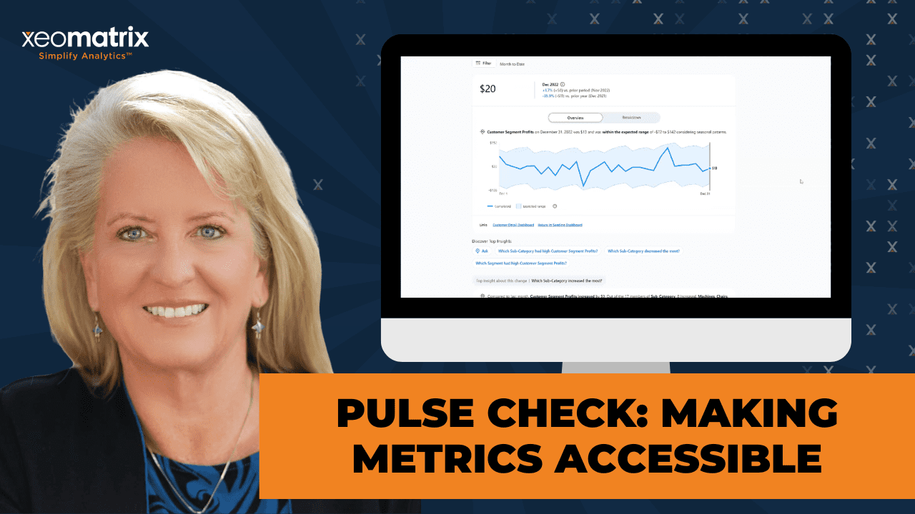
As you may or may not know, I’m just going to start from the beginning in case it’s new territory. Tableau Pulse is this idea of getting one of these cards, a KPI card. Lauren builds these from scratch that are remarkable. This KPI card inside of an application that is not totally separate, but it is almost going to adjacent from Tableau Cloud or Tableau Desktop because it does have its own standalone app that you can interact with. We’ll look at that in a moment. It also can live inside of your dashboards. This is a picture from one of our cloud sites where we have a demo of it that’s in the background here in a minute we’ll get to.
It can either be the standalone app or it can be embedded. Those two work hand in hand very well with each other. You also can do one or the other. In addition to this potential setup, you also can have your KPIs from this app. Just go directly to your execs on whatever platform of choice, so email, Teams, slack. It doesn’t even have to be a part or a member of a dashboard per se. You could just create them and have them being shipped to whoever is responsible for those KPIs, whoever is measuring that, or is aware of them, or needs those. Those are kind of the components of this in terms of where things live.
Pulse on a dashboard, this would be what it would look like. You can turn it on to have this– they call it Pulse Formatting. That is the beautiful tile or not. You have a couple of different ways you can configure it as compact or the full thing. Now, to edit it inside of edit mode right on cloud, just like all other dashboard objects, there’s a frame, and there’s a control panel that’s tucked away underneath that little carrot or upside-down triangle, however you want to phrase that. That’s where your configuration pieces are for Tableau Pulse objects that would sit on a dashboard.
The first screen here is going to ask you if you want to configure it or if you’re just adjusting the formatting for how it sits on the dashboard. Let’s say that we are going to select it and we are going to do something else with it. Maybe we decided there’s not room for the full display of the little chart that comes below or the descriptive insights. That would be the decision of full versus compact. Now, these metrics right here, the metric options below here have changed and are important. The use, the styling is about the rounded corners box.
The next one down is respond to filter selection. That’s new this spring. It is fantastic. Now, it also is dependent on, though, in the configuration for the metric, that that dimension that you might do the filtering on be referenced. It doesn’t necessarily inherit that. With a filter on a dashboard, you can say, “Apply cross worksheets,” or “Apply all on dashboard.” That similar kind of characteristic, it doesn’t just command it to exist. You have to go back to the Pulse definition and add that dimension in as an option for it to be sliced and diced based on. But then, it’s very nice because it can stay in sync with the rest of the items on your dashboard.
You also can make a choice on whether or not you’re going to have it linked to the other app. I was on a call a few weeks ago, and the people were very bothered by it leaving and going to the other app. You can literally turn that off if that’s a problem for anybody that’s in– if that’s unsettling for your user base, then turn it off. Make it stay there. If I execute on this option right here back to metric list, the next thing that’s going to happen is it’s going to give me a list of metrics that I have defined that I have access to. There’s a couple of levels of access and permissions that I also want to point out as we go along.
Now, if you’re over in the cloud and you have Data Guide and you’ve opened it up to do something, even if you have Tableau+ but you’ve not activated metrics for some reason or another, the first thing Data Guide is it’s going to recommend something for metrics. If you have something that you’re drilling down into and you’ve asked it to evaluate, the first spot on that window is this recommendation regarding Pulse and what that might look like. If you just click on this space right here, it would take you over there and have it started, pre-populate a little bit that you would continue to make the definitions for. Then, below, you can see that this is where the Data Guide traditional things are starting to populate below that if you’ve used Data Guide.
Another important concept about Pulse Metrics is that there’s the definition of it, and then there’s the presentation of it. They really make a delineation between the definition and the metric that appears before you’re on your screen. You can have one set of definitions that drive several metrics, and people subscribe or follow, or have edit permissions to the metrics. Is not necessarily the definition. Those things are separated, and it’s good to know that because as you define a Pulse metric, there’s two places where you set up some options related to filtering.
The way you may be wondering, “Why would I have one that has more?” Let’s say you had a regional team and you wanted to have just their one metric that is their region, maybe that’s the way that you would have multiple regions of multiple metrics. Then you would have the one going to the person that that was responsible for their territory as just a small example. You’ll see across the top here, whatever that filtering, that can’t be edited by the user at that point. The metric is just going to have that as part of its default.
There will be other ways for the person to slice and dice. There’s two different places where we input dimensions that either are fixed in place or they’re optional slicers for us. That’s the zone. In the documentation and in the referencing throughout Tableau, you’ll see a real distinction between the definition and the instances of the metrics. As you would probably expect, these are the things that we often might be using to define a metric. This is about where people stop. We usually get a few things in there, we get it looking kind of nice, and then we’re off to the races with it.
There are opportunities here for engagement. That’s usually been my jam of engagement. Even with training, if people don’t use what I’ve taught them, it’s usually lost, right? One of the things here I want to point out is, there’s an opportunity to have up to five links in this core definition. As I was asking colleagues and friends, literally, there was only one person, she’s on the call with me today, who actually had ever used a link, and it was to help the team that she had implemented the post-metric for move on to an action that would be a follow-on based on good news or bad news.
With there being five opportunities there, and you get to create the labeling for it, and I have a couple set up, I’ll show you in a sec, you can have them return back to the dashboard that they came from. You could have them go to a Confluence page with definitions or something like that. Maybe what they see here needs to trigger a JIRA ticket, or maybe it needs to trigger some sort of campaign, or intervention if numbers are bad, or look at the product levels if it’s about what’s on hand, or is available, not available. There’s just a lot you could do with this, and the fact that you get to define not only where it’s going, but also what it’s called. You have a lot of control over making it approachable and increasing engagement right there.
This is right in the midst of this core definition, which is the first of five spaces we go through to make those definitions. The action links, there was actually a presentation at TC this year. One of the main focuses of his talk was about action links. It’s a way to really make more of it, and I’ll show you how that shows up in a few minutes. In here, we have definitions that we’re going to put in place that are not– they’re immutable for the user, and then we have ones that are options. These options are important because that’s where the Q&A part of the natural language processing, as well as anything that’s embedded in a dashboard that you want to have sliced and diced, those features or facts, dimensions, however you want to refer to them, they need to be included here.
If you have a new filter on a dashboard, you might need to go back into your definitions and add that dimension so that it can be responsive to the filtering that’s happening on the dashboard. We also have good control over how numbers are being seen, and then, as you would expect, there’s also control over– that’s the main page. This is the core definitions. That’s it. Then we move on to time, and time, there’s a lot of varieties, a lot of options here.
The thing that I haven’t specifically been able to sit down and implement yet, but is on my to-do list, is I have two or three people that I’ve worked with in training recently that have a– not a retail calendar, but an academic calendar. For various reasons, their business is seasonal around the trimesters that represent the school years. One of them is an educator, one of them is– their business just rises, and they serve those markets, and so they have that focus. You can see the peaks and valleys and seasonality of their business activity, very much in that way.
The default settings here, you have a chance to do a date offset, time comparisons for what do you want to use this period or that period. What is the choice of what you’re comparing for this section of the dialog that it’s going to provide for you, this is where you set it up.
Now, the custom comparisons and the calendar of a custom calendar, this device is having the expectation that it exists in your table. If it’s something extra, something you might need to join it in, you might need to do something like that, because, at least at this time, it is expecting to have a data column out of, say, your published data source that it can point to there. I understand that may represent a little bit of an issue.
Lauren, have you been able to implement a specialty calendar in this environment yet?
>> LAUREN: I haven’t. I’ve had to go in and create that custom definition, but I haven’t used the set calendar yet.
>> CELIA: Okay. Did it work out well?
>> LAUREN: Yes. It was a lot of work.
>> CELIA: That’s fair. All right. There’s two things I might mention about that. The Pulse team this year really took up the banner and has gone to market faster. With some changes in their delivery, every two weeks, they’ve been on a bi-monthly– bi-weekly, sorry, not bi-monthly, but every two weeks delivery pattern. Every two weeks, there’s something coming out from that team. I think that if you jumped into Pulse a while back, maybe were disappointed. I think giving it a fresh look, you might be well-served because it has gotten a lot of attention and development time the last year or two, especially the last year.
The next thing is ability to set goals and thresholds, and/or do it manually. If it’s in your table, something you could relate, like budget, or target, or actual, some of those fields, if you capture those, if your work is project-oriented or if there’s commission goals, something like that, that could really help make it more meaningful to help people track where we are, how the actual is comparing to that. Then I also just wanted to include what this would look when you set the manual goal, because it’s not right here in this dialog box with the threshold or goal set up. It’s a little bit later.
I think that may be one of those things that people miss as well, because when you have it defined and you have it saved, then you can come back in and you can edit the definition. The first thing on that list is to set a goal or threshold. That’s your chance to set a manual one. That’s another little thing that I feel like I maybe missed because of just where it is.
Now we get to the insights. This is what I think is where people are sold on Pulse Metrics, and actually is very cool, but is also really dependent on how things are set up and the data being in place for it to be supported. In these core definitions, we had those optional dimensions. That’s the fuel for what you’re going to see on the insights. This section of the configuration path is literally meant to help you see what it is that it will be potentially offering to your stakeholders, so comparisons, top performers, low performers, whatever it finds that are key contributors, that sort of dialogue is what it is programmed to provide, and can be very helpful.
Just know that the dimensions that we gave it are going to matter a lot. You have the opportunity to also define what good news is, what bad news is, with some constraints here. It’s not an open field. Whether or not the values are up or down, it’s going to be helpful. Define granularity here. It’s not necessarily something you have to turn on, but it can help control how it sees units. I can’t imagine it not being important, but it’s an option.
Let me get that saved. We separately get to manage who are editors, and we have managing of followers as well. We can view, add, and remove. Just keeping in mind that the metric and people following the metrics is not the same thing as them being connected to the definition. That’s separate.
This is going to be what a person would receive if they either were requesting something they didn’t have access to, which is the reason I included it. I wanted y’all to see that because whatever happens with Pulse does not override the cloud site roles or the data source permissions, or even the project permissions. Keep it in mind that cloud, in and of itself, has this really pretty robust down-to-real-level security. Stratified permission system, and Pulse Metrics being kind of a separate entity does a check on that before it provides that back to your user. That has to line up.
They, in their documentation, talk about how they intentionally made it more open for people to define, but then, when data is involved, it validates against the cloud rules. If I was responsible for that and I recommended this to a team I was working with last week, I would always want to check that, validate it, run a safety run on that. That is what this is supposed to do.
A couple of the fun things to talk about here is Tableau Mobile. One of the new things this spring is they have a widget that is going to give you this kind of cute app update when you have push notifications coming to you. Then we also have the new filters I mentioned that I’ll show you in a second. This widget, I tried to download it on my phone. It does require a newer version of the Apple OS, if you’re an Apple iPhone user, but it’s all possible. I also put a link. I’m going to share this deck with you guys on the email that will follow up. I’ve included the site where you can get to see what their bi-weekly release notes are. When I started this deck, that was the most current. They had an update this week as well.
Another cool thing is that we have a separate Tableau apps for Microsoft Teams. You’ll notice that that is actually a Teams window of a conference call happening. We have a little Tableau icon up here being embedded in the tools that are available inside of the Teams conversation. I don’t have this set up on my system, so I didn’t test this personally, but for those of you that are Teams and Microsoft houses, I would really encourage you to try it out and see just how much more integration you can get.
Part of the reason I enjoy teaching Tableau Cloud is not necessarily because of cloud, except for that cloud has subscriptions and alerts and anything you can do to make it easy for people to see what is key for them to be– what they’re being measured on. That to my mind is a win. This is just one more way to bring data to them and put it in their normal path instead of having to be another place they go to check.
Finally, on this part, Tableau Pulse is well represented on Trailhead. If you guys haven’t seen Trailhead lately, it got a massive facelift the last two years. I observed that they’re prioritizing having things come out in it right away alongside of new products coming to market. Having been involved in Tableau Next a lot this year, it is also there in abundance. It’s fascinating how that is really– it’s a good place to get started and have some good quick looks and demos on it.
Let me switch gears for just a moment. A couple of resources I’m going to point out before we dive over into next part. I have a little app Claude and I built. We’ve been doing a lot of that in the house these days. This is a basically– and this will be shared so that you can access it. When you’re defining things, this will go field by field and give you a little bit more insights on it. For each grouping, there’s something that needs a little bit more context or a little bit more definition.
For this one to know that there’s five links that you can use and give you some ideas and recommendations on what it was that you would do. This is something you could use to kind of double-check or provide support as you’re going through your process of getting things defined and moving through. Each one of these correlates to a component on the Tableau metrics, the configuration page, and even a little bit about permissions as well.
This is a page that I should put in– it’s going to make me re-log back in. Let’s just make sure it’s going to play ball. Okay, great. Notice, I’m in edit mode at the moment, but this is a dashboard I put together that has a couple of different styles of Pulse Metrics in here. I added one in the middle that is a intentionally different type. If you haven’t had a chance to work with it yet, I just want to draw your attention to a few things, and that is that these guys are sitting in a container together. That way, we can distribute them evenly.
Then, to get into my configuration, here’s where I go. It’s going to reflect what is on screen at the moment, give me a chance to do compact mode or full mode. Then here is the button for the styling of this with the little shadow in the rounded corners. This is the one that is new, the spring of respond to filter selection. That is awesome. Then the linking to Tableau Pulse itself. This dialogue here would take me back over to– maybe I don’t like this one here, and I want to switch it out for something else. I can see what else I have access to that are defined and standing on deck to get to.
Even though I’m in edit mode, this should work fine. If it doesn’t all go into publish mode. I have my segment. I also have a subcategory filter here. Just to test it, you can see my two visualizations changing. You can also see these two changing and this not changing. I intentionally left it where this one did not have the update of that factor of segment, but being able to have them be in agreement around the clock here, I think is really good. Then also provides some insights without it having to be disjointed or static, unless there was a specific reason for it.
Let’s see. What if I’m looking at technology here? Let’s just do copiers, phones, and machines, and then apply. This one, I updated with subcategory. I did not update this one with subcategory. You can just see, depending on what you’re doing and the necessary interactivity. Also, this one didn’t have subcategories connected to it. You can drive things to be in unison with each other and synchronize, or you can have them be this is a specialty filter aimed at that one thing. You have a lot of choices you can make there, just so you can see where that sort of configuration setting is decided. It’s going to launch me back to the main page whenever I double-click on a Pulse Metric tile. Then you see that set threshold or goal right there. Get into the definition.
We have a couple of things that I want to point out here, and I should have gone back to that first. I’ll go back. See, here’s my links. I have a link going to a customer detail, like a breakout. I have a return to the sending dashboard. I literally was on a call not too long ago where the executives were frustrated with the fact that they had to get back to it. They had to go back to Tableau Cloud through here. It took them back to the main page. I don’t blame them. That’s not necessarily a very smooth UI for sure.
Then we have a couple of different places where we have the ability to slice and dice. The way that this is going to show up, keep in mind, when I have it out of edit mode, we’ll get to in a second. Here’s my links. We have two sections where I’m adding dimensions to this, right? These dimensions right here are set up inside this environment where I’ve chosen them here. I get to see straight away what that’s going to look like.
Anything I change there overwrites whatever is in this. In fact, you’ll see these are not clickable because it’s done inside of that spreadsheet. Then we have optional ones. This is where we need to add something if I was going to include it in a filter that’s on my dashboard. These optional metrics are dimensions that we need to use for slicing and dicing. We talked about the year, the time, the threshold coming out of a table if it was there. By the way, creating an advanced goal, if the goal was something that was a metric like a multiplier, then you could most certainly add it in here.
This is where we’re going to get to see these various insights that it will do. You can comparisons and the type of trends, top contributors, bottom contributors. That is the language that is done here. Those sort of questions are driven largely from the dimensions that you make available in these definitions. That’s why it’s important to preview also what’s going to happen. You can certify, and then you can also define who can edit the definition. Beyond the followers, we get to define it here. I’m going to save this and back into it.
As I save it, this is the page that someone landing here would see. Here’s my return to my customer detail and go back to the sending dashboard. This should take me right back where I was. It is going to open a new tab. It’s not the return loop that is taking you someplace orthogonal. As an example of adding them, as you guys are, I’m sure aware, it is a dashboard object. To pull one on, I’ve got a container there. Needs to reconnect. Then I can do this. Let me just add my container back on, then I’m going to bring my Pulse metric in. It’s going to ask me to choose which one. Let’s see. How about I do customer profits? It’s going to show me. I need to select it.
It has you select in case there’s more than one. You can see what it’s going to look, full or compact. Let’s do that compact full this time. I like the style, and I do want it to respond to things on the dashboard, but that also is going to mean I need to double-check and see if this one has category involved in it. I’m going to add it to the dashboard. If it’s my one and only, I probably want to put a blank over to the side to get it to be a little bit more in the center, because they like to be a little bit cranky about how you format them. There we go.
If find out that my viz is not connected, this would be my instant feedback that I don’t have this one set up for category. Just to follow that loop of what I would do, I need to add category to it. I’ll need to do more with it and do my edit here. Then down here in my optionals, I’ll need to add category. This right here. I need to add category to it. Now, you are boxed into whatever it sees as a dimension in your table, but I have a category there. That’s not a problem. Next, next, and save.
All right. The back over here, probably I’ll need to reload that. Then with my new edit system, as long as it picked it up, I should be able to get it to then slice and dice it. It does. That’s the full loop on that. It actually should work out really well. Just want to note that these things can be pushed out to Teams, Slack, you name it.
The other thing I’m going to share with you guys is an implementation guide. I did put together a little bit more detail on the definition section with more context there, a little bit of some best practices at the end of what works and what doesn’t work well, and more on that linking pulse to specific actions. These things came out of those TC presentations as well as I have a document that’s a little bit more detailed.
Let me just pause there for a moment. How are we doing on any questions or thoughts? Anybody try with Pulse Metrics that they’ve had some concerns or maybe some good experiences with as well.
>> LAURA: Yes.
>> ABDUL KARRIEM KHAN: Do you have an agentic or voice or prompt-based built out of these, or a way people can use skills or plugins from Google to be able to let someone design an actual dashboard in here with voice or with prompts?
>> CELIA: You definitely could do that with Plus and with Tableau Next. I don’t know about Pulse. I’d have to ask, but I’d be happy to follow up with that. I’m just making a note. I think you’d probably need to have an MCP approach to it, an API for that, right?
>> ABDUL: Yes, that’s cool.
>> CELIA: Anybody else? David, have you guys used Pulse?
>> DAVID: No, we haven’t. I just posted a question about it because most of our data, we have calendar dates in a field, but then we resolve in SQL those calendar dates to a fiscal year value and then a fiscal month value in two separate columns, sometimes in one column as a string or an integer. Is there any way to build Pulse Metrics around those date frames?
>> CELIA: Lauren, is this similar to what you did?
>> LAUREN: I created a date field with other strings and integers before. It’s possible. It’s a lot to set up, I guess, would be.
>> CELIA: You’re resolving it in SQL, so it’s already in your table before it comes in?
>> DAVID: Yes, the three fields, the actual calendar date field, which is a date value in SQL, and then usually a four-digit– an integer for the fiscal year that that date falls into, and then the month value, the fiscal month that that date falls into. Would I have to change? I don’t know. I can think of maybe a way to do it, but would it recognize something like that as the time basis for Pulse Metrics?
>> CELIA: It feels like it should.
>> LAUREN: No, it should. Sorry, my internet keeps cutting in and out. If you set the calendar– doesn’t it show that?
>> CELIA: Yes, I pulled it up on screen.
>> LAUREN: As long as you have that reference date. You said you tried it, and it wasn’t working, David?
>> DAVID: I didn’t try it yet. We don’t have it use Pulse Metrics much, although I’ve been watching the technology evolve for a long time. They just don’t use them where I’m at right now, and there’d be some great opportunities to use them. Before I commit to doing something, I want to know is it going to be flexible enough to basically do the Pulse metric, but instead of, I guess, calendar dates on the bottom, it needs to reflect fiscal year, fiscal month type, day within the month, maybe, if it’s daily.
>> CELIA: I think that’s what this is specifically designed to do. I don’t have a data set to try that out on, but maybe that’s something we need to do next, is do a proof of concept with a fiscal calendar. My customer needs to do a trimester kind of thing.
>> DAVID: For instance, our fiscal year started June 1, and then you’ve got even some idiosyncrasies in there. Some of our customers use a fiscal calendar that starts like April 30th. It’s unusual.
>> CELIA: I would feel fairly confident that it is queued up to use a fiscal calendar. For example, parent company, Salesforce, they don’t run on a regular annual calendar. They supposedly are using this internally. There’s is a skew by– one full quarter is off. We’ll have to look into that and find out. Maybe I can find a demo data set to do that with. That would be good, probably. If you try it before we talk again, I’d love it if you’d shoot me an email on how it goes.
>> DAVID: I have to see if I even have access to Pulse Metrics.
>> CELIA: Oh, there you go.
>> DAVID: Okay. Thank you.
>> CELIA: You bet. To set that up on your cloud site, if you are a creator license– let’s see. Are we on my end as one of these– I’m signed in as the team account, maybe not. There we go. On the site settings, Pulse is going to be right in here. It’s there. Without a Salesforce login, you have access to these top two. Past that, you need to have a Salesforce login. The top two is summarize key metric insights and get better semantic matches on insights in any language when using questions. The rest of these down here, you need to have AI in Tableau turned on. That’s for Plus, right? It’s my understanding. I am not involved in the invoicing and all that. I don’t know exactly how things are bundled, but my understanding is you can have Pulse turned on without it being all the rest.
It’s just right there. It literally is this simple. For everybody on the site or for selected users in a group, maybe you need to make a group for it. Yes, Jim, I see that. I’m hearing that story. I literally haven’t been involved in Pulse until– I was aware that it was over there, but I felt Data Guide was the underappreciated member of the team, to be fair. I teach a lot of folks that have access to that, but then this year I’ve been watching– Pulse Metrics, the volume of updates has been– they’ve been prolific with it and really making concerted effort to take it to the next level. This spring has become more of a topic with everybody that I’m working with, and rightly so, they’ve really done a lot to make it more robust and to give it more appeal in the market.
This document that I created for implementation, this has become my thesis statement recently, I guess. I don’t know. Anyway, it is literally with screens and highlights or heights and everything, so getting through it and consideration. The things that are in highlight are the things that I feel are underused items, like a planning page. Some of these things, like here on the bottom left, Section 9, come from– there was a presentation at TC done by three product managers about Pulse Metrics. The whole session was about Pulse Metrics. That was some of the things that they were talking about, what’s on deck and what’s coming soon. Those are the things that’ll be coming.
I think that we’re just right up on time, y’all, and just want to thank you for being here. Lauren, anything else I’m missing in those?
>> LAUREN: No, thank you for doing all this and for [Inaudible 00:55:44]. Your documentation is a lot, but it really matters.
>> ABDUL: We’ll get an email with the video for this, right? Because this was an excellent presentation.
>> CELIA: Thank you so much.
>> ABDUL: I just would ask where you look for the prompts. Do you have a prompt approach where you can go in and search for stuff under your– that’d be something really useful, like a floating window where you just go and say, “Looking for this,” and they can show you where in the actual Tableau the controls are, because it’s a really powerful platform. I think it’s built because it’s got data and search built into it for stuff for information for that type of UI, even with voice out of that, I think you just use your phone or whatever device. I really appreciate your presentation. Excellent.
Make sure you send us the presentation. We’ll definitely promote it out. Where do people follow up and send you stuff? LinkedIn, what?
>> CELIA: LinkedIn is great. Whatever address you registered with today, they’ll send you a follow-up email with all the links to everything today.
>> ABDUL: Thank you.
>> CELIA: You’re welcome. Good. Thank you for being here, David. Nice to see you, man. It was good to meet you in the real this year. I appreciate it. Good to see you. Thanks.
>> DAVID: That was great. Thank you very much. If you’re diving into Pulse, I need to do more with it. It’s underutilized, but they’ve been doing it for a long time, so evolving.
>> CELIA: I definitely feel this year it’s stepped up.
>> LAUREN: Absolutely. Yes.
>> DAVID: Thank you for being timely with it. Take care.
>> CELIA: You’re welcome. Appreciate it. See you later. Thanks.
>> LAUREN: Bye.
>> CELIA: Thank you for being here, Lauren. Bye y’all.
>> [00:57:21] [END OF AUDIO]
Presentation Summary
This session explores Tableau Pulse from an implementation perspective. Rather than serving solely as a feature tour, it focuses on the design decisions that determine whether Pulse Metrics becomes a trusted business asset or simply another set of KPI cards.
Throughout the session, I demonstrate how metric definitions, optional dimensions, filters, goals, thresholds, permissions, action links, and delivery options work together to create a successful push analytics experience. We also examine where Pulse fits within Tableau’s broader analytics evolution, including Data Guide, Tableau+, Tableau Next, and AI-enabled analytics, while highlighting practical implementation lessons you can apply in your own environment.
Session Outline
- Designing Trusted Pulse Metrics
- One Definition, Many Pulse Metrics
- Making Metrics More Actionable
- Optional Dimensions, Filters, and Slicing the Data
- Time Comparisons, Custom Calendars, Goals, and Thresholds
- Insights Depend on the Setup
- Permissions and Governance Still Apply
- Bringing Metrics Into the Flow of Work
- Final Takeaways
Designing Trusted Pulse Metrics
The primary goal of designing Pulse Metrics is to deliver trusted business metrics that are timely, accessible, and actionable. Whether delivered as standalone experiences or embedded within dashboards, Pulse helps people receive the right metrics at the right time so they can make informed decisions.
One implementation decision is where those metrics should live. Standalone Pulse Metrics are ideal for proactive monitoring through Tableau Cloud, mobile devices, email, Slack, or Microsoft Teams. Embedded Pulse Metrics, on the other hand, provide valuable context by allowing users to see key performance indicators alongside the visualizations that explain them. Tableau supports both full and compact layouts, making it easier to integrate Pulse into existing dashboard designs.
Another important consideration is how the metric should respond to user interaction. One of the newer Pulse capabilities allows embedded metrics to respond to dashboard filters, creating a more connected analytics experience. However, this behavior requires planning. The dimensions used as dashboard filters must also be included in the Pulse definition as optional dimensions. Without that configuration, the dashboard and the Pulse Metric can become misaligned, creating a confusing experience for users.
One Definition, Many Pulse Metrics
One of the smartest design decisions in Tableau Pulse is the separation between a Metric Definition and the Pulse Metric that people follow. The definition contains the business logic behind the metric, while the Pulse Metric is the user-facing card that delivers that information to a specific audience.
This design allows a single Metric Definition to support many Pulse Metrics. For example, an organization might create one Sales Definition that establishes the approved calculation, dimensions, formatting, and insight configuration. That same definition can then generate separate Pulse Metrics for each region, product line, or business unit without duplicating the underlying business logic.
From an implementation perspective, this improves both scalability and governance. Analysts maintain one trusted definition, while business users subscribe to the Pulse Metrics that are most relevant to them. Changes to the business logic happen once, making it easier to deliver consistent metrics across the organization.
Making Metrics More Actionable
One of the most overlooked implementation decisions in Tableau Pulse is what happens after someone sees a metric.
Metrics answer “What happened?” Action Links answer “What’s next?”
A well-designed Pulse Metric doesn’t stop at reporting performance. It guides people toward the next decision, the next conversation, or the next action. That’s where Action Links become especially valuable.
Action Links are configured as part of the Metric Definition and allow up to five destinations to be associated with a Pulse Metric. Those links can point users to a supporting dashboard, a customer detail page, business documentation, a Confluence article, a JIRA workflow, or another operational system. The destination matters less than the purpose: reducing the friction between recognizing an issue and taking action.
Common Action Links include:
- Returning to the source dashboard for deeper analysis.
- Opening documentation that explains the metric and its business logic
- Launching operational workflows such as customer records, support tickets, or follow-up processes.
During the demonstration, I configured Action Links to return users to the originating dashboard and to open a customer detail page. These small design decisions help Pulse become more than a notification system. They connect trusted business metrics to the workflows where decisions are made.
Optional Dimensions, Filters, and Slicing the Data
The flexibility of a Pulse Metric is largely determined before anyone ever uses it.
The optional dimensions included in a Metric Definition determine how people can explore a metric, how embedded Pulse Metrics respond to dashboard filters, and how effectively users can ask business questions.
This isn’t simply a configuration step. It’s a planning exercise. The dimensions you include should reflect how people naturally think about the business. For a sales metric, users may want to explore performance by region, customer segment, product category, sales representative, or other perspectives that support their roles and responsibilities.
During the demonstration, I intentionally showed one embedded Pulse Metric responding to a dashboard filter while another did not. The difference wasn’t the dashboard—it was the Metric Definition. Once the missing dimension was added as an optional dimension, the metric immediately responded to the filter.
The implementation lesson is straightforward: if users need to filter, compare, or ask questions about a particular dimension, that dimension should be considered during the Metric Definition process. Thoughtful planning early creates a far more flexible and useful Pulse experience later.
Time Comparisons, Custom Calendars, Goals, and Thresholds
Without context, a metric is just a number.
Time comparisons, custom calendars, goals, and thresholds help people answer one of the most important business questions: “Is this performance good, bad, or simply different than expected?”
Choosing the right business calendar is the next implementation decision. Many organizations don’t operate on a traditional calendar year. Fiscal calendars, academic terms, retail calendars, trimesters, and other business-specific timeframes often provide a much more meaningful basis for comparison. Supporting those calendars requires that the appropriate date structures be in the published data source, making data preparation an important part of the planning and implementation process.
Goals and thresholds provide another layer of business context by comparing actual performance against targets, budgets, or expected outcomes. Pulse supports goals and thresholds from fields in the data or through manually defined values. One detail that is easy to overlook is that manual goals become available only after the Metric Definition has been saved and reopened for editing.
Together, these design and implementation decisions transform a Pulse Metric from a simple scorecard into a meaningful business indicator. Rather than asking only, “What is the number?” users can begin answering, “How are we performing?” and “Should we take action?”
Insights Depend on the Setup
The quality of Pulse Insights is determined long before anyone reads them.
Pulse Insights are one of the capabilities people are most excited about, but the relevance of those insights depends on the quality of the Metric Definition. Optional dimensions, time comparisons, comparison logic, and business context provide the foundation for identifying trends, top contributors, bottom contributors, and other guided insights.
This means Insights should never be treated as a finishing touch. They are an outcome of thoughtful metric design. Decisions about dimensions, time settings, business calendars, goals, thresholds, and whether increasing or decreasing values represent success all influence the guidance Pulse provides.
The implementation lesson is straightforward: Pulse cannot compensate for unclear metric design. A well-designed Metric Definition produces more meaningful insights because it gives Pulse the business context it needs to identify patterns that matter.
Permissions and Governance Still Apply
One of the strengths of Pulse is that it extends analytics without bypassing governance. Site roles, project permissions, data source permissions, and row-level security continue to determine what each user can see, ensuring that push analytics never comes at the expense of governance.
Like any enterprise analytics implementation, permissions should be validated as part of testing. This is especially important when metrics are filtered by region, department, customer group, or other sensitive business dimensions. Testing helps ensure users receive only the information they’re authorized to access.
Governance also extends to the Metric Definition itself. Because one Metric Definition can support multiple Pulse Metrics, changes to that definition can affect many users. Clear ownership, certification, naming standards, and editor permissions help maintain consistent business logic as Pulse adoption grows.
Bringing Metrics Into the Flow of Work
One of the biggest goals of push analytics is to reduce the distance between people and the information they need. Instead, trusted metrics become part of the places where work already happens.
Tableau Cloud has steadily expanded this philosophy through subscriptions, data-driven alerts, and now Pulse Metrics. Whether delivered through email, Slack, Microsoft Teams, Tableau Mobile, embedded dashboards, or mobile widgets, Pulse helps bring important business metrics into people’s daily workflows rather than requiring them to open a dashboard first.
These delivery options matter because accessibility is about more than viewing a dashboard. It is about making trusted business metrics easier to discover, easier to understand, and easier to act upon. The closer analytics lives to the conversations and decisions people are already having, the more likely it is to influence outcomes.
As Tableau continues investing in Pulse, I think it’s worth taking another look, even if an earlier version didn’t meet every expectation. Recent enhancements have made Pulse considerably more robust and capable. Learning paths, such as Trailhead and the shared links below, offer a great way for administrators and business users to continue exploring new capabilities as the platform evolves.
Final Takeaways
Tableau Pulse has evolved into much more than a way to display KPI cards. It represents a meaningful shift in how organizations deliver analytics by bringing trusted business metrics directly into the places where people work.
Successful Pulse implementations don’t begin with creating Metric Cards. They begin with thoughtful Metric Definitions, meaningful business context, and a series of implementation decisions that determine how people will consume, interpret, and act on those metrics. The design choices you make around dimensions, goals, thresholds, governance, and Action Links ultimately determine whether Pulse becomes another notification system or a trusted part of the decision-making process.
If you haven’t revisited Pulse recently, I strongly recommend taking another look. Recent enhancements have made the platform considerably more capable, especially for embedded and integrated experiences, dashboard interactivity, and delivering metrics through existing business workflows. More importantly, Pulse now fits naturally into Tableau’s broader evolution toward push analytics, AI-assisted exploration, and trusted business context.
The technology makes push analytics possible. Thoughtful metric design makes it valuable.