Going into Tableau Conference 2026, there was a lot of curiosity about how much of the conference would be shaped by Salesforce’s larger AI narrative. Would Tableau’s story be swallowed by agentic AI? Would the focus move so far toward Tableau Next that Desktop, Cloud, Prep, and the daily work of Tableau developers would feel secondary?
After attending TC26 and considering the Tableau product announcements, our takeaway was more nuanced than that. Yes, AI was a major theme. But we witnessed that innovation and fundamentals are not competing priorities.
Agentic analytics, MCP, Pulse Discover, Tableau Next and its Q&A calibration were all central parts of the conversation. But TC26 was not only about AI. It was also about better authoring, stronger connectivity, more flexible visualizations, accessibility, data preparation, interoperability, community innovation, and the continued evolution of the core Tableau experience.
In our May DDC session, Lauren Cristaldi, Manager of Data Analytics at XeoMatrix, and I walked through the announcements from a practical lens: what do these changes mean for developers, analytics leaders, and teams responsible for helping people use data well?
Here are the TC26 highlights that stood out most.
Watch Inside TC26: Highlights, Hot Takes, and Real-World Impact
>> CELIA FRYAR: Let’s jump in. We had a great week at TC and a lot of buildup going into it. We’re delighted to have a lot of things to share with you today. First, some announcements. Some upcoming information about our soon-coming DDCs. We’re going to be talking about pulse metrics. Lots of you guys have asked about them, and so we have a demo and basically some recommendations regarding how you set up your data to get that working well for your organization. As with all things AI, it’s all about the data, so we’ll talk about that a bit.
In July, we’re going to have a Next installation of our conversations around Tableau Next. I want to point out that in parallel with this, there are a lot of really amazing Tableau events happening that our CEO team is involved in. One in particular we’ll be talking about at the end of our time today, and that is the DataDevs. They have their whole ecosystem that we want to introduce you to, make sure that you’re aware of it, because with MCP and AI and headless BI being on a lot of people’s radars, that is a really great environment to jump in and participate in and learn a lot from.
Lauren and I are on the advisory council for the Austin Tableau Community Group. On June 11th, we’re going to be hosting– Lisa Trescott, who’s an Iron Viz winner from, I believe it was 2021. She’s remarkable. As a visionary, she posts and creates lots of how-tos and helpful things. She’s got that design eye that is somewhere between a developed skill and a natural gift. She’ll be our featured speaker. In our Austin talk, we always have a three-part program. We talk about interviewing. Then we have someone that we spotlight from our community, and then we have a main guest speaker. That’s typically our format.
Jane Kamata just finished her college degree at Boston University, I believe it is, and she is coming to Austin to work at Visa. She’s been in the throes of all the interview things. She’s going to be our spotlight speaker for talking about interview tips, tricks, techniques, and what she recently experienced. We’ll be interviewing her about that.
Then Matt Huff, who works at HEB, he leads a retail Tableau user group. He also is one of the team that publishes Makeover Mondays. If you’ve not experienced that yet, it’s a great way to take your skills to the next level. Every Monday, they find a dataset, and they put a challenge out on the Tableau community Slack channel. I think they also have a website. You don’t have necessarily to approach it there from the community Slack, but it is really a great way to see it. People all over the planet build example visualizations based on the prompt that is given and then give each other feedback. It’s a great way to take things to the next level outside of your workplace with a little bit of fun and some community mixed in.
As we go, we’ll be highlighting things that are happening in parallel that you may be interested in going forward. Today, our focus, of course, as you know, is about Tableau Conference. Lauren and I both were there and participated very fully, and barely saw each other all at the same time. We’ll be sharing from a collection of notes and a slide deck that Lauren has artfully created, but circling around three main themes of features that are coming and what differences it makes potentially to you as a developer or a manager of developers. Also, some community opportunities and a little bit of fun.
Did I volunteer? I’m not really sure that I ever volunteered, but I got voluntold to be part of a group of people that did a Tableau Tricks & Tips Battle. It turns out it’s an annual thing. Wish I’d known that in advance, but I didn’t, but it was a lot of fun anyhow. We all dressed in neon, and we very much competed on a stage for the too many people in front of us. I did get through the first round. I’m feeling really good about that, because I lost to the girl who eventually won, and that’s fair. She came very much buttoned up to hit that target. That was her primary target for the Tableau Conference. We had a panel of judges that were visionaries and former Iron Viz judges. It was really quite intimidating. I mean, it was really a lot of fun, so we had a great time.
In any case, I have a thing or two to share from that. I wanted to share some links to some resources of people who do that as part of their profession. There was two showcases of that at Tableau Conference anyway. When we get to the last part of it, I’m going to show you what helped me get through my first round, and then also just a couple resources, including the fact that Lauren last summer, I think it was October last year, she did an entire session in DDC on tips and tricks that are very practical. Things that are less showy and really can make a difference in how your workflow goes as a developer. If you haven’t seen that, it’s on our YouTube channel. I’ll be happy to grab a link for that as we go.
With that, let’s make sure any of the logistics, we are really more interested in all of this when you guys chat with us. I will keep the chat channel open, so if we’re midstream on something– We’re likely to be asking you questions for feedback for conversation as we go. Please feel free to be interactive with us like that. There will be a recording that’ll be published alongside a follow-up email on about Friday of this week.
Then, starting next month, we’ll be back on our regular schedule, where it’ll be the second Wednesday of every month. With Tableau Conference, we needed a little bit more space so that we could do this well. You guys, I recognize a lot of your names. We are the Xeo team that does this for you guys monthly. I’m Celia Fryar. I’m in charge of training and enablement. I’m also a part-time adjunct professor at the University of San Francisco. Let me let Lauren introduce herself as well, and then we’ll dive into the material that we’ve brought for today.
>> LAUREN CRISTALDI: I’m Lauren. I’m based out of Charleston, South Carolina. I never know if I should add that, but I’m adding it.
>> CELIA: It’s good for flavor, I think, yes.
>> LAUREN: I manage our data analytics team here at Xeo. I come from a state government background. I also lead the Charleston Tableau User Group. We just set up a session for next month, but more news on that to come. I have eight-plus years of data analytics experience. I need to do that math again, because I think it’s more–
>> CELIA: We need to change the slide, probably. Yes, absolutely.
>> LAUREN: We can leave it at eight. I can be younger.
>> CELIA: [laughs]
>> LAUREN: I’m at that age now, where I’d rather be younger.
>> CELIA: I know, right? At some point, we stop counting. We just are grateful for the time. Yes. Sounds good. I have not been in academia my whole career. I very much started off in the doing side of the house. It was 2016 when I made the jump to being a full-time academic, because I got to see how analytics made a difference in people’s careers. That was what motivated me to switch over.
With that, I’m going to invite you to share your screen, Lauren. We will dive into our TC26 topics, takeaways, and highlights, because there was a lot of that this year.
>> LAUREN: Yes, perfect. Can you see the Devs on Stage?
>> CELIA: Yes.
>> LAUREN: My worst fear is sharing the wrong screen. [silence] We put this together just to go through all the highlights from Devs on Stage, because that’s always my favorite presentation.
>> CELIA: Just for curiosity, anybody here in the room, if you got to see the Devs on Stage, if you would just make a note or something in chat, or add a reaction to your screen, that’d be amazing. Yes, Vivian, thank you for that. David, yes, I thought you might be there. Cool, all right.
>> LAUREN: Here are just different sections, because it was kind of long, so it was a lot to take in, so it’s nice to have it in this format. When we get into connectivity and data access, and maybe people can react or chat, which of these features are your favorite? I was pretty excited about the REST API connector. I feel like that’s a long time coming, and one less driver to install?
Yes, please. Then, the Bring Your Own Connector to Cloud, it’s nice that it will be easier to connect to OneDrive, especially. For those who use Tableau Public, I’m pretty excited about this, because I love Tableau Public, you’ll be able to actually publish those data sources now and share them.
[silence]
I think everyone’s excited about the add-in with Excel and PowerPoint, because as much as we want everyone to stay in Tableau, sometimes it’s not possible, so it’s nice to have it, to be able to be on different platforms.
[silence]
I guess, Celia, do you have anything you wanted to add here?
>> CELIA: You know, I was just wondering, and this is a question rather than a comment on what was presented. How does this impact the connections to SharePoint that have been ongoing? Do you think any of this will make any of that smoother?
>> LAUREN: Yes, I have a feeling it’ll make it smoother, especially with the Bring Your Own Connector because there’s always issues with trying to connect to SharePoint, even more than Google Drive or OneDrive.
>> CELIA: Yes, agree. David in the chat is talking about REST APIs and helping connectors– oh, at Azure DevOps. Hey, David, do you want to just say more words out loud about that, please?
>> DAVID: Sure, can I talk?
>> CELIA: Yes, there you go. We can hear you.
>> DAVID: I’ve gone through two different companies now, my former employer and my current employer, which is Deloitte, and developed a pretty robust work management, deliverable tracking tool using Azure DevOps for Tableau workbook development or Tableau data source development, whatever is your Tableau deliverable to lead to a server production environment. It’s backed up by a lifecycle. There’s custom fields, restrictions, and validations for how stuff moves through the QA levels and the lifecycle and everything. I’ve got all this great stuff in Azure DevOps, but getting to the Azure DevOps to do the analytics I want to do, versus what the Azure DevOps gives you in their platform for analyzing their data, would be wonderful.
I’ve just struggled with easily getting Tableau connected to my Azure DevOps data. You have to jump through all kinds of hoops, pulling it down through their API and figuring it all out, and then trying to pipeline that so it happens, regular refresh, and so forth and so on. I’m wondering if this might be a nice solution to that.
>> CELIA: We’ll find out, right?
>> DAVID: Yes.
>> LAUREN: Yes, hopefully. Keep us posted if it does work.
[silence]
I might go to the next section. I think for me, the Mark Layers are my favorite new feature because I’ve been using Map Layers for a while now, and I’m really excited for them to be more normalized. I feel like it’s less, I don’t know, intimidating when it’s just like the Mark Layers, so it’s already set up for you to do that. You can build some really cool charts with the layers. Has anyone used Map Layers?
>> CELIA: If you’ve used Map Layers, if you’d add a reaction in Zoom on your screen. Yes, good, a few. It seems like it’s also been intimidating to get into, and tricky because we’re clearly adapting a Flat Earth map, right? Where, if it’s just some sort of grid in the first place, it’d be easier for everyone to jump into, but they’re more performant, so the view has been worth the climb, I guess, is what I keep saying to people because it’s a little bit more cryptic, but it’s everything in one sheet. There’s no argument about the performance on the other side of things.
>> LAUREN: Yes, exactly. It’s easier to maintain, too, because you just have to go to one sheet. Then, if you set it up just right, you can make changes really easily instead of having a bunch of different sheets that you’re putting in a container. I love containers, but I totally get wanting to avoid that.
>> CELIA: Yes. I’ve kind of given you credit in some of the classes I’ve taught for moving a core of calculations between workbooks before you bring in the data. Is that still part of the game plan of what you do?
>> LAUREN: Yes, because a lot of times I’ll have templates set up. I’ll move those same calculations just because it saves me a lot of time, especially for calculations that you’re using over and over again, or like with Map Layers, like bringing in all of those make points. You’d have to recreate all of them.
>> CELIA: I think that’s very smart. I’m not sure that’s well-known, by the way, that you can do that.
>> LAUREN: Oh, really? Because I’m doing it so much, I feel like I forget sometimes.
>> CELIA: I think the only tricky part about it, honestly, is that you just need to do that first. You need to pull it out of a workbook that doesn’t have data in it so that you don’t have a clipboard of stuff that was not intended there. Although you can get rid of it, it’s just like something just cleaner.
>> LAUREN: Yes, one more thing.
>> CELIA: Right, exactly. Yes, something you don’t have to clean up.
>> LAUREN: I think you were excited about Dark Mode.
>> CELIA: I am. Everything on my screen is Dark Mode. For better or for worse, my entire life, my creativity kicks in about 9:30 at night. Even if I try really hard to not have that be the truth, it is the truth for me. Man, during the night, trying to squint at my big screens–
>> LAUREN: I totally get it. I’ve seen you on Slack at 2:00 AM, and I’m right there with you.
>> CELIA: I know, right? It’s just like, it’s quiet.
>> LAUREN: Yes, no distractions. It’s nice.
>> CELIA: Correct. No distractions, creative thought. Yes. Then this really, really bright screen.
>> LAUREN: The Dark Mode is cool. It’s kind of crazy that it took so long to get that. I’m really glad that we’re adding more features for developers that go around.
>> CELIA: Yes. For that to be something that can be toggled on or off, I’m assuming that, hopefully, fingers crossed, that’s how it’s going to be, because that means that, as a developer, you kind of can give that choice to the user. Are they seeing it in a place where Dark Mode is appropriate, or do they need the white background? It’s being displayed in it. Then we don’t have to do quite as much with putting darkness behind dashboards that are going to be portrayed in a conference room. You don’t have to have as much understanding about where this is going to be presented and whether or not it’s going to– What that environment– Anyway, it just seems like it’s a flexibility that– Like you said, I’m surprised it’s just now, but I’m grateful it’s happening at all.
>> LAUREN: Absolutely. It’s good that it will be on the user to be able to toggle that, and so it saves us development time. The Drive Time Selection is pretty cool with the drivable routes.
>> CELIA: Yes. Instead of it just being as the bird flies. Yes. Been doing a lot of this with one of our clients right now, the radio buffers, and trying to do that. I can think of a half dozen others where the city drive time and pathways matter, and that needs to be part of the planning that they have to do. It should be great.
>> LAUREN: Yes, absolutely. Cool, okay.
>> CELIA: Tableau Agent on Dashboards is so interesting because I’ve spent most of my Plus, versus Next time in Next, as opposed to, in Plus, and now I’m like spending more time coming back to Plus. I was so surprised when I first started working with the beta of Next last summer, and it could not see the dashboards. Kind of like, “Wait a minute. What do you mean you can’t see it?” It very much was just working with semantic model and any calculations or logic fields you set up.
Progressively this year, I’m alongside a solutions engineer on the Salesforce side. He does Plus, then I’ll do Next. There’s so much more now that’s available in GA with the Tableau Agent on Dashboards and their ability to create a dashboard, answer questions, do a calculation, and actually can build some charts that you might like. It’s like a starter, if you will. It’s not going to be all the finishing touches, but it would be a starter. Depending on the cleanliness of your data, right?
When I was most recently with this same solutions engineer that I’ve been chatting with a lot about this, he was talking about how that if your data is coming from the Salesforce side, you can do more of that when you train a specific agent to have a verified knowledge base, like questions that you pre-queued and pre-answered so that you know that these are going to be high frequency questions coming in from your users, and so you’re going to make sure that those are understood and answered correctly. It’s starting to evolve into a larger ecosystem of not just a quick and easy Q&A, like what we said of Explain Data, Data Guide, or Einstein, this is going to be next level.
Right now, it’s three things. In fact, there’s a quick video of that, actually, that Stuart just recorded that our marketing team put out. I’m pretty sure it’s out already. I’ll have to double-check that. In any case, showing that Plus functionality as it’s sitting there, able to answer and build a few things. It’s going to be good.
>> LAUREN: Yes, that’s really exciting. It’s all about the context. The fact that it has that context now is going to be really powerful, especially to get started.
>> CELIA: I’m sorry, I’m taking so long to get to this, but the dashboard usually expresses our intent, because we have a bunch of data, but the dashboard is where that from a human development point of view comes into, “What is this purpose we need this thing to serve?” as opposed to anything and all things that could be possible with the data, right? In the same way that you would have one dashboard go to marketing, one dashboard go to sales, and one dashboard go to some other division in a company. I feel like being able to see the dashboards is essential.
>> LAUREN: Absolutely. Accessibility is always good. That’s another one where I’m surprised that that’s just now coming out, but I’m glad it’s coming out.
>> [PAUSE 00:22:17]
>> LAUREN: Oh, the Dynamic Field Formatting on this slide is my favorite. We were talking about that like a couple of weeks ago, I think.
>> CELIA: That’s right.
>> LAUREN: Where you have to make the three different calculated fields. It’s kind of hacky, but not super hacky, to get that to work. Now it’s just going to do it, which is awesome.
>> CELIA: Right, and it makes it cleaner, to be fair.
>> LAUREN: Oh, absolutely. Yes.
>> CELIA: She’s being mild about this. About a month ago, she basically taught me all that she has to do for this and to make a production dashboard. I was actually wrapping it up to maybe use it in the Tip Battle, because a lot of people don’t get all the fit and finish to happen in the dashboards, because think about a donut chart, if you put a KPI in the middle and you round that thing up to the display level of a million, but you want to have a different level of aggregation out on the edges, I don’t even know that people necessarily know. I always teach it so you’re using a percent on the edges, and then you have a KPI that’s the actual number in the middle, but if you wanted to have that number present somewhere else, it has not had the ability to have a different level of aggregation unless you go and make a bunch of other fields.
Lauren has some really nice techniques for not only building the– building the fields, the part that’s really seamless is how she applies them so that you only get the one that is relevant to show up. I’ll leave that as your secret sauce. In any case, that’s been really elegant how she’s done it. Not very many people are aware of that. They choose to go with one or the other and leave it because it’s not necessarily understood how to get around that.
>> LAUREN: Well, thank you. I appreciate that.
>> CELIA: It’s beautiful.
>> LAUREN: Now, it’s irrelevant, I guess.
>> CELIA: Well, not yet. We haven’t seen it or tested it. If anything, what you did was kind of a proof of concept. It was required.
>> LAUREN: Yes, that’s true.
>> CELIA: I would figure that. Yes.
>> LAUREN: With the SVGs, the SVGs tend to render a lot better when you’re sharing, and the file sizes are smaller. That’s exciting that we can start using SVGs or exporting them.
>> CELIA: Yes. The very first custom-shape project I tried to do, the files were SVGs, and I had no idea what I was setting myself up for, trying to convert them into PNGs or JPEGs.
>> LAUREN: And they look all wonky,-
>> CELIA: They did.
>> LAUREN: -and they’re kind of gritty. Like, “What happened?”
>> CELIA: Yes, it was very disappointing. Had no idea until that moment.
>> LAUREN: The Data-Driven Dashboard Styling, that’s cool, too, because anyone that’s had to try to format across the workbook, it gives you the option to format the font everywhere, but it doesn’t always apply it exactly how you were expecting. That should help, I guess, save some time in that respect. [silence]
Platform & Admin Tools. [silence] An update to Tableau Prep is exciting because I feel like we haven’t had that in a while, and to have an agent in Prep to help through some of the more complicated flows, I think, will be really valuable. Maybe more people will use Tableau Prep. How many people here use Tableau Prep? [silence]
>> CELIA: David and Jim, Vivian, yes.
>> LAUREN: Awesome.
>> CELIA: Good.
>> LAUREN: I love Tableau Prep.
>> CELIA: I feel like it’s an underappreciated resource to help take the load off of what really shouldn’t have to happen in a workbook. From an organizational perspective, gives you a chance to standardize and get things cleaner or fulfilled, even calculated fields. If you can do it at that level, then they’re ready in the extract as opposed to having someone have to define something that someone’s doing locally on a regular basis. If you can push it upstream, that just makes it more consistent and available for everyone.
>> LAUREN: It’s especially great for the calculated fields, because I had a project where I moved a bunch of calculations to Tableau Prep. The performance, it was staggering the difference that it made, in a positive way.
[silence]
>> CELIA: Do you see the chat, Lauren?
[silence]
>> LAUREN: Oh, yes, [unintelligible 00:27:50] [crosstalk]
>> CELIA: I heard you talking about that at conference, about the ability to combine two or more published data sources.
>> LAUREN: That’s another feature that’s coming out, which is incredible, because it’s really frustrating when you can’t combine those just in a desktop. I’ve definitely used Prep a lot for that use case. Then, Tableau Next, you’re our Next expert.
>> CELIA: [chuckles] This is such an interesting labeling, this. My point of view is that they’re progressively expanding the opportunities for connecting to different data types and data places. The thing we’ve kind of taken for granted, anyone being in the Tableau desktop environment for very long, such a lovely thing that they did very early on to have native connectors, a giant page of them. It’s 130 now? Yes, not all of them download, nor should they, but they’re available. The fact that they were so cognizant of that need and had an entire team, I remember way back in 2015 and ’16, there was actually a department that would work on native connectors all the time.
Tableau Next, I keep saying, is a baby product, and it’s got a ton of potential. This is just one more step in an expanding repertoire of things it can connect to with proper connectors. Make no mistake, they’re trying their best to help it accelerate very quickly.
>> [PAUSE 00:29:31]
>> LAUREN: Then, more Tableau Next.
>> CELIA: Data interpreter, I actually was reviewing this just a couple of days ago. You know when you have an Excel sheet and you pull it into Tableau Desktop, how, if you have a named range or you have extra titling around the edges, Tableau Next being new, it needed you basically to take your Excel worksheets and put them out to a CSV just to make sure that you didn’t have any of those labeling, framing, other things get in the way of Tableau Next reading the file correctly. They’ve added Data Interpreter now, like what we have in Desktop, to have it sort through and be able to take it straight as an XLSX. This is super good.
Dashboard Extensions, we’ve had a steady stream of those. I mentioned a couple of them at conference when I was talking about this, but a couple more coming. The hackathon that happened this spring, it was so interesting how the top five, all of them were about things that were more like using MCP to extend it, to provide accessibility. There’s a lot that’s going to happen in short order here with new extensions. There’s some specific release regarding MCP and Tableau Next coming up this summer that I don’t really understand the boundaries of, so I’m not going to try to comment on that. There should be more and more. It’ll be very interesting in the summer for Next.
>> LAUREN: It’s exciting how much they’re investing in Next, as well as in Desktop and Cloud. It was a good balance this year.
>> CELIA: Yes, it wasn’t only Next, which I was so relieved to see, because Desktop is on base for a lot of folks. I feel like Next is actually going to be a welcome breath of fresh air for folks who are in Salesforce, but it’s a young product compared to what we have had. You may get tired of me saying this, Lauren, but we all disliked Cloud when it first came out in 2017, ’18. We have that version again, except, for this time, with a different structure underneath it. There’s a lot that will happen very quickly here. At conference, it was a really nice diversity of conversations around each of the platforms, and interoperability was a priority that was also expressed [unintelligible 00:32:22].
[silence]
>> LAUREN: Now we can get into the Labs.
>> CELIA: That was really fun, right? The Lab conversations. Yes.
>> LAUREN: Yes, it’s just amazing, the art of the possible really comes to life, and the things that the community members come up with is kind of amazing. These are better if you go back and watch the recording. This just summarizes what the tool that they came up with does and what the impact is. Actually seeing it live, I think, has the biggest impact.
>> CELIA: Yes. If you’ve ever tried to do any of the radial anything, from mapping to graphing to charting, there used to be even more so than at this moment, but there’s still a fair amount of complexity and math involved. What they were showing us was graphically very pleasing, very flexible. The claim was no trigonometry recalled and no cosines, that sort of thing. With it being a selectable, this type, so to speak, is kind of the way they were positioning it. We’ll see, but it was in prototype when they were demoing it. It was very fun.
>> LAUREN: I have one on my Tableau Public, I think, that used the radial bars, and there was a lot of math. I was like, “Oh my God, I don’t remember all this math.” This was before AI, so it was like looking up math. Relearning trigonometry.
>> CELIA: Right. I almost said, “And now we can just use one of these engines to look it up,” but my ChatGPT still tries to give me solid SQL answers that I still have to go verify because about 75% of the time it didn’t work. The more complex, the less likely it is to hit it. It may get me close, but I still have to bring it home. [silence] This was super cool, right?
>> LAUREN: Yes, this was the biggest. Wasn’t this the winner?
>> CELIA: It was, yes. Yes, it’s been funded. [silence] Yes. What about this struck you, Lauren?
>> LAUREN: I was trying to think the best part of it.
>> CELIA: For me, it was the ability to have an incomplete month and have your ability to drag that. Like, if you did get it in a bar chart, just keep it simple. The last month is incomplete because, of course, it’s six days into the month, and you could drag it to the Expected or the Target or Goal, as opposed to it just being something you had to either exclude or just look pathetic.
>> LAUREN: Yes, being able to fill in is nice. You have to bring in a calendar table and do some data densification and all that. The forecasting is nice, too, because usually that is more complicated.
>> CELIA: I don’t know if it was just in the way that they were showing it or if it’s in the way it’s implemented. Those things, when you did that of dragging an estimate into a series that was actuals, it automatically changed the Viz type to be shaded or something, where it was clear. You know how, when you add forecasting onto Viz right now, it doesn’t use the same Viz characteristics, so it’s clear that it’s an added-on segment that is not core data performance. That was really clear here as well, both in the table and in the Viz that they showed, where they were doing either the directive forecast or something that was out of step with the rest of the data. It wasn’t like you’re going to miss it and think, “Oh gosh, that’s part of the core performance sales data,” or whatever you’ve got there.
>> LAUREN: Yes, and to be able to do what-if analysis is huge. Before, the forecast would kind of work, I guess, but you’d have to have your data formatted for the what-if. Anything to deter people from exporting to Excel to do additional analysis is always good. [silence]
This is another one. Apparently, they named this after their dog, which I love. [chuckles]
>> [PAUSE 00:37:40]
>> CELIA: To be fair, I barely remember this one because I was so smitten with [unintelligible 00:37:53].
>> LAUREN: I just remember it being named after the dog, if I’m being–
>> CELIA: [laughs] Okay.
>> LAUREN: I feel bad about that. It’s a tough act to follow, the Tableau [unintelligible 00:38:06].
>> CELIA: Yes, it really was. They really put a lot of creativity into the way they expressed these three. If you’re at all interested in this, all these are things that are available in recording on Salesforce+ at the moment.
[silence]
>> LAUREN: Just for the sake of time, we’ll keep going. Tristan won the hackathon with Tableau MCP + Accessibility. Now that accessibility will be easier to set up. I feel like that’s the main takeaway.
>> CELIA: Yes.
[silence]
>> LAUREN: MCP is all the rage,
>> CELIA: So true. [silence]
>> LAUREN: Now, a lot of Tableau Next.
>> CELIA: Yes, a lot of Tableau Next. The newest features that were in beta most recently and then in a continued beta that’s about to begin this summer. Q&A calibration was something that was added and then started being tested, probably in January. Now that I have seen more about the Salesforce side of the house, I’ve got to tell you, part of the reason they brought it in so quickly is because there’s things there that exist that are very similar. For the Tableau people, it’s a way to basically trial run questions that you anticipate your users are going to ask and see what the agent will do in terms of the answer, and then verify it or tell it it’s incorrect. You verify, or you invalidate. Depending on what you do in that moment, it will also then suggest other calculations, especially other calculations that you could add to help it understand better.
If it’s jargon, logo, acronyms, it’s probably a business preference addition that’s needing to be said. There’s business preferences, there’s descriptions and fields, and then there’s calculations that the agent element has quick reference on, and that’s the first thing that it’s going to for answering questions.
This is similar but different, okay? In the same way that I might have a conversation going where I’ve told my ChatGPT a number of things about a circumstance that I’m workshopping and problem-solving on and whatever, imagine that chat log being a folder that’s a predicate that would be probably a reasonable corollary to what business preferences are. Meaning that when we ask a question in Tableau Next, there is a prologue or predicate that it’s going to pick up, read, and digest before it answers my question. Until we’re at the point where we have a dedicated agent that’s trained, and even then– it’s a folder of things that–
I’m telling you that partly because there are size limits and character limits on what they recommend that you do, and they’re also wanting you to be careful not to replace algorithmic logic with business preferences. If it’s a word, a connection, net sales, the definition of an acronym, the jargon that’s used by executives on the regular, rather than having them change their ways, you just document it there, but then if it’s a way to derive an outcome, that needs to be put into a calculated field or a metric because those are the two devices that the agent has quick access to, and then also, it’s more efficient to not have it be loading up a big, bulky bunch of stuff that it actually is a calculation. They need to really reserve that for its intended purpose. Then the Q&A gives you a chance to verify that the questions that you anticipate they’re going to ask will be answered correctly. Then it creates a set of verified questions and answers that are ready to go. It can be really useful.
Conversational Analytics is, of course, the end game and the payoff for any of the work that’s done. I have heard, seen, and experienced a lot of conversations about how can we bring things like, for example, from DBT, a project that Lauren was involved in, where there’s the source label, the label that you want to have, and then a metadata tag that is a descriptor, now do we get those things to come straight into Next, without having to put those in separately? I think that in just a blink of an eye, that will happen. Some of these things about how much time it takes to set Next up should diminish, but some of the principles about how we use calibration, validated questions, training the agent, or conditioning it or grounding it is the words that are preferred. All that still is going to have to happen because it’s all about the data and the quality of the data and the clarity of it.
[silence]
MCP is coming soon. The thing that I actually have seen of all these widgets and stuff, mobile parts, I don’t know that was on the last slide, but I got to see last week Slack in the Tableau feeding out charts and graphs, them interactively still appearing and interactable inside of Slack. My understanding that beta is happening now. That’s going to be tremendously helpful for people to stay in their workflow and not have to go– The governing thought here of it, wherever your workflow is, “Let the analytics come to you and be there with you,” and so a lot of us live, for better or for worse, in Slack and in Teams, but having that interactive chart or graph be right there with you in that space instead of it being someplace else, you have to go find it and log into to get the data from is big right now as well.
>> LAUREN: That’s really exciting. I agree, it’s good to have it in one place, especially since there’s so many different places that everyone goes now.
>> CELIA: Yes.
[silence]
>> LAUREN: Here we just have a summary, the key takeaways. [silence] Cloud being the new default. I feel like it’s been the default for a little while, but they’ve definitely made more of an effort to invest in features in cloud. There’s less of a difference between cloud and desktop. I mean, there’s still a difference in what you can do.
>> CELIA: Yes. Particularly for authoring, there is, but once you get past that, the usability on cloud is really greatly improved.
>> LAUREN: Yes, absolutely.
>> CELIA: The thing about governance that I just want to comment on is that semantics like this are being tossed around as this new hot word. It’s so funny because that’s a word that is about as old as saying the words “IBM PC.” It’s just that semantics are so necessary. It’s the agentic evolution that is causing semantics to rise to the front to being the thing that we all need to pay attention to. Regardless of it being a newer old thing, it’s an essential thing with AI. It’s like a limiter on whether or not AI is going to be able to serve you well or not.
[silence]
>> LAUREN: The VizQL evolving is also exciting because there won’t be as many workarounds as there were before.
>> [PAUSE 00:46:56]
>> CELIA: This is just a slide that I slipped in here. Lauren, surprise, surprise.
>> LAUREN: I didn’t know about this slide. I’m really glad that you put this in.
>> CELIA: This is a summary of where there was discussions around each topic and which platforms they would apply to. If you are curious and just know that there is depth on each one, this. Then, if you’re pressing issue that may not have made the cut—this is one of the slides from the keynote presentation—this QR code, I tested it yesterday, takes you to the IdeaExchange where you could submit your request or a recommendation for an improvement. They are, most certainly, very data-driven in that they have the IdeaExchange, and then they have people that campaign and vote for things to be noted and raised to the top. I have now seen and observed that process, and just want to invite you to jump in if you’ve got something that has been an issue that is a rub on how things work for you. They, as I say, do listen.
I think the next part, Lauren, if you want to click into that, we had a lot of emphasis in the Tableau Conference on community. This has got to be one of my favorite parts about going. Any of you that went, if you would just give me a reaction on screen of if you went to any of the above that are on the screen, because we had several pre-gaming events the day before, Data+Tacos and Data+Women were two of a few that I was aware of. Luckily for me and my daughter, who went with me, who’s an adult, the Data+Tacos happened on the day of May 4th, so we felt obliged to go in costume, of course, and that made it even crazier. In any case, there are these meetups and socials that happen around the edges of the conference as well.
The meetups proper during the conference, I think there was about a dozen of them. The one that I helped co-lead was education. It was for professional trainers, and then, also, people who were institutional analysts across the globe. Even though our time was a little bit less than ideal, it would have been 8:00 AM on the morning following, there’s a big party called Data Night Out on the next to last day of the conference with music, dancing, and sorts of places to have conversations. We still had almost 250 people show up. It was incredible. These networking events were well populated, and people really seemed to enjoy them.
Iron Viz was stunning this year. I guess it is every year, but I’ve only been a couple of times. I just am always interested and amazed at the way that people are participating. Unfortunately, my browser got closed this morning, but I had the three Iron Viz’s sit open for– let me see if I have them really close here at hand. Yes, I do actually. I’m going to just put into chat the type of public links to the three finishers.
There was really a strong theme about data storytelling and the way that they did it, also, each of them created their own data set off of a derivative of a larger data set that was done. Ann Pregler, who won, she hand-drew a lot of her art, or all of her art, I’m not really sure. In any case, I’m going to encourage you to take those links out of the chat I just shared and take a look. She won, but all of them could have won. They were so intensely amazing. The challenge of Iron Viz, folks, for anybody that’s not aware, they have some time to create this, but then they have to build it in front of this live audience in a matter of 20 minutes, and then present it and tell whatever their data story, what it is. That’s just a remarkable talent all by itself.
The Vizzies are something that I would encourage you to watch for. First of all, Iron Viz, there’s a data set that’ll be suggested, or more like a theme that’s suggested, and it’ll come out in October. Then they take submissions through middle of November. Then there’s a multi-step process for evaluating and getting it to the final 10 and then the final 3. It’s folks from all over the Earth. I would encourage you. Anybody who’s doing this day to day has enough skill to do this. I just want to invite you to jump in because it’s a great refining process. You’ll get feedback, if nothing else, on what you’ve done. It’s a great way to just to take your skills to the next level, and just experience that whole thing is remarkable.
The Vizzies is another community-based activity where I don’t remember exactly when they started the request, but they sent around a Google Form to folks that were in the Tableau community Slack channels, asking us to vote for people who had shown the most leadership, the most support, or the most creative ideas. They have an assortment of sections, of ways they recognize people around the Earth. It’s all community support, nominated and such.
I have two really close friends from Australia who actually ran and administered that this year. They did a really good job of going through the submissions and making sure some of the rules were followed. They found a place or two where there were some not rules followed, and they took care of that. It’s for the people who are not being recognized necessarily by Tableau. Not visionaries, not ambassadors, but other people in the community who are leading and setting the pace high for a variety of measures. The Vizzies were an unexpected delight for me to see, observe, and be a part of this year. I would encourage you to jump into, as you’re all obviously connected to this environment.
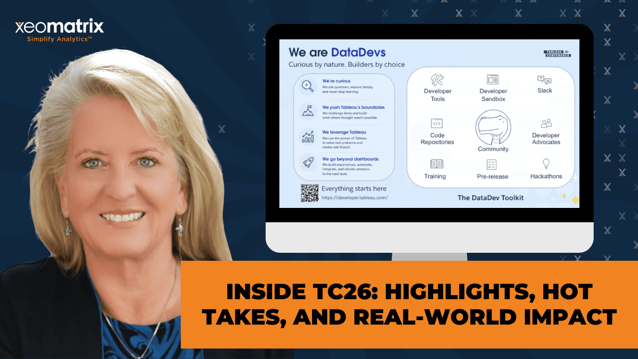
Then we can go into the next slide. There’s the slide about the Iron Viz finishes. Like I said, the Slack channel has their link. If you want to move forward. The last thing on this deck was to just kind of get you introduced to the DataDevs. DataDevs have kind of their own ecosystem, but it’s folks who would rather go ahead and code a little bit of things as opposed to draw a little bit of things. If you’re more on the logic side of the house, I’d invite you to get involved in this. It doesn’t cost anything. There’s a community of people that will quickly embrace you and support your endeavor. Especially as MCP comes into the realm, it becomes less of a difficult coding environment and more of an approachable querying and structured coding environment.
With LLM supporting us, none of us needs to memorize syntax anymore. I would just encourage you to join them. They have their own Slack channel. They do a lot of coordinating there. It’s their own Slack org, not just the channel. This gives you kind of a quick preview of the scope of what they do. They just encourage curiosity. You can get a free sandbox to use to participate. It is all wrapped into their DataDevs toolkit.
When you request this developer site from Tableau, they will give it to you. It’s full administrative privileges: one creator, one explorer, one viewer. It gets you set up so that you can do the exercises. Now, Cristian Saavedra is on our team. He’s very active in the DataDev community. He’s also a DataDev ambassador and has been a visionary, I think, for a couple of years now. He writes a lot of the challenges that are on their sites. They have a site called datadevquest.com. We encourage you to check that out regardless of if you’re going to join them or not. They have beginning, intermediate, and advanced challenges that they publish. Then they request you to submit. Then you can get feedback from them. It’s just a great way to get started.
If it’s been a while since you did any coding, this is a great place to jump in in a supportive environment. They have a DataDev Tableau User Group that meets at regular frequency. It’s published on the regular Tableau groups website. I think it’s monthly, but I could be wrong about that. They go after real-world cases. They talk about APIs a lot. This number is most definitely wrong. There’s way more than 500 people involved in this. Tristan, the one who won the Tableau Next Hackathon, is one of the most notable Tableau figures for adding new Viz types. He’s also very involved in this.
I have a co-lead for San Francisco Tableau User Group who’s a DataDev Ambassador. He is an analyst at Stanford doing analytics. That’s the flavor of folks that you would interact with in this group. It’s really worth the investment of time and energy, I promise.
I will save the Tips & Tricks thing for another time because we are almost at time. Does anybody have any questions before we wrap up today’s session? [silence] If not, we just encourage you to find the Salesforce links for the sessions that are of interest to you guys. There’s a lot available. Salesforce tries its best to make it accessible after conference has come and gone because there’s a lot to be learned from that. Thank you, guys, for being here. Lauren, thank you for leading us. Great deck. You’ll get a follow-up email on Friday with the resources that we’ve been mentioning. I’ll make sure that we’ve got these links in there as well.
With that, we’ll wish you a happy Wednesday afternoon. You’re halfway to the weekend. Thank you, Lauren. Anything else?
>> LAUREN: No, I think we’re good. Thank you.
>> CELIA: Okay. All right, y’all.
>> EDWARD MOORE: Thanks a lot, y’all.
>> CELIA: Thank you very much. Appreciate that. All right.
>> LAUREN: All right.
>> CELIA: See you back at the ranch, so to speak.
[laughter]
>> CELIA: Bye.
>> LAUREN: [unintelligible 00:58:41] good. Bye.
>> [00:58:44] [END OF AUDIO]
Presentation Summary
In this Data Driven Community session, we shared our biggest takeaways from Tableau Conference 2026. Drawing from product demonstrations, technical sessions, and community discussions, we explored what the latest announcements mean for developers, analytics leaders, and business users. Rather than simply reviewing new features, we focused on the practical implications of these changes and how they may influence the way organizations build, govern, and deliver analytics.
The discussion covered enhancements across Tableau Cloud, Tableau Prep, dashboard development, Tableau Next, and emerging MCP integrations. Along the way, we highlighted the growing importance of semantic models, business context, and data quality in an AI-enabled analytics environment. We also explored how community-driven innovation continues to influence the platform’s direction, from hackathons and Labs projects to developer-focused initiatives, from communities such as the DataDevs.
Session Outline
- Connectivity Is Still Foundational
- Visual Authoring Had Real Momentum
- AI Is Becoming More Context-Aware
- Pulse Discover Moves from Monitoring to Investigation
- Tableau Prep and Tableau Next Are Evolving
- MCP and Headless Analytics Expand the Conversation
- Tableau Labs Showed the Art of the Possible
- DataDevs Opens Doors to Technical Tableau Skills
- The Bigger Takeaway
Connectivity Is Still Foundational
It is easy for AI announcements to get the spotlight, but analytics still begins with a more basic question: can we reliably get to the data?
Several TC26 announcements focused on making data access more flexible. The REST API Connector was one of the most practical updates discussed. For teams trying to connect Tableau to systems like Workday, Stripe, Jira, Azure DevOps, or other operational tools, API-based access can reduce the need for custom workarounds and driver-heavy setups.
Bring Your Own Connector for Tableau Cloud was another meaningful shift. Historically, some custom connector scenarios felt more aligned to Tableau Server or required additional infrastructure decisions. Expanding connector options directly in Tableau Cloud supports the direction many organizations are already moving: cloud-first analytics with fewer barriers between business systems and reporting workflows.
Tableau Public data sources also received attention. The ability to publish and collaborate on updatable data sources in Tableau Public opens new possibilities for community projects, shared datasets, and collaborative learning.
Together, these updates are practical. For most analysts, the bottleneck is not imagination. It is data access, refresh reliability, and the time required to connect systems that were never designed with the same analytics workflow in mind.
Visual Authoring Had Real Momentum
One of the strongest non-AI themes from TC26 was the continued investment in visual authoring, specifically for Tableau Desktop and Tableau Cloud.
For Tableau creators, the expansion of Chart Layers (also known as Mark Layers) was one of the most exciting. The idea builds on what many advanced authors have already been doing with Map Layers, but moves that concept into a broader authoring experience and significantly increases the performance of dashboards or visualizations. Instead of relying on multiple worksheets, overlaid images, containers, or complicated workarounds, authors will have more ways to layer marks, annotations, shapes, and comparisons within a single view.
That is a big deal. It makes sophisticated visual design more approachable and easier to maintain. For teams seeking gains in performance, reusability, and dashboard intricacies, this could change how many visuals are architected.
Dark Mode was another welcome addition. Visual analytics are often shown on large screens in conference rooms, executive meetings, operations centers, classrooms, and late-night working sessions. A true Dark Mode can soften the visual impact during presentation and reduce eye strain for users and developers.
A number of other visual authoring updates also generated excitement, including:
- Dynamic Field Formatting which addresses a common fit-and-finish challenge: numbers often need to display differently depending on scale, and authors have historically used calculated-field workarounds to handle that elegantly.
- SVG exports which improve the quality and file size for sharing, reporting, and presentation use cases.
- Data-driven dashboard styling opens the door to more flexible formatting and branded experiences.
These updates reinforce an important point: Tableau is still investing in the craft of visual analytics. The future may be more conversational and AI-enabled, but visual communication still matters.
AI Is Becoming More Context-Aware
The AI story at TC26 was not just “ask a question, get an answer.” The more important story was context.
Tableau Agent on Dashboards is a meaningful example. Earlier AI experiences provided Agentic support from the worksheet level, assisting with calculation creation, or identifying trends and contributing factors from individual visualizations. Dashboard context adds something different. Dashboards are not just collections of charts. They reflect human intent: business priorities, design decisions, metric definitions, and an understanding of what a specific audience needs to see.
If Tableau Agent can summarize dashboards and generate dashboard insights, as well as generate starter views, or support follow-up exploration, that increases value and reduces time to insight. The experience still depends on the quality of the dashboard, the clarity of the data, and the governance behind the metrics.
That is where semantic models and Q&A calibration are stepping in, with Tableau Next. TC26 reinforced the need for a strong trust layer. Business terms, definitions, acronyms, metric logic, and preferred interpretations cannot be left to chance. In Tableau Next, Q&A calibration gives teams a way to test expected questions, verify responses, and correct misunderstandings before broader adoption.
This is one of the places where organizations will need to slow down enough to move forward well. AI can accelerate access to answers, but only when the underlying data and business context are ready.
Pulse Discover Moves from Monitoring to Investigation
Pulse Discover is also an example of AI supporting analytics judgment rather than replacing it.
Pulse already helps users monitor metrics and understand changes. Pulse Discover points toward something more conversational: asking questions across related metrics, identifying trends, surfacing drivers or detractors, and packaging findings visually.
Monitoring tells someone what changed. Discovery helps them investigate why it may have changed and what deserves attention next.
For business users, this could reduce the gap between seeing a KPI and understanding the surrounding story. For developers and analytics teams, it also raises important readiness questions. Pulse Discover will be most useful when metrics are thoughtfully defined, dimensions are clean, time fields are consistent, and the organization has clarity around which KPIs matter.
In other words, Pulse Discover is not just an AI feature. It is another reason to invest in better metric design and stronger data foundations.
Tableau Prep and Tableau Next Are Evolving
The conference also showed continued investment across the broader Tableau platform.
For Tableau Prep, the message was encouraging. Prep remains an underappreciated way to move repeatable data shaping, standardization, and calculated logic upstream of the workbook. When teams push the right work into Prep, they can reduce workbook complexity, improve consistency, and improve performance.
Quick Actions in Tableau Prep and the introduction of agent-assisted support inside flows suggest that Tableau is continuing to make Prep more approachable, especially for larger or more complex workflows.
Tableau Next is a different story. It is newer, evolving quickly, and clearly central to Salesforce’s agentic analytics direction. Features like self-service connectivity, Data Interpreter, dashboard extensions, conversational analytics, semantic model creation, and Q&A calibration all point toward an agent-first analytics environment.
The key is to view Tableau Next with both optimism and realism. It has tremendous potential, especially for organizations already working deeply in Salesforce. At the same time, Desktop, Cloud, Server, and Prep still matter deeply to many teams. One of the more reassuring parts of TC26 was the commitment to broader platform integration and interoperability.
MCP and Headless Analytics Expand the Conversation
Model Context Protocol, or MCP, was one of the most important architectural themes at TC26.
At a high level, MCP creates a way for AI clients and external tools to access Tableau context and data through a standard protocol. The demos involving Slack and other AI clients made the direction clear: analytics is moving closer to where people already work.
This is sometimes described as headless BI, but the practical idea is simple. Not every insight needs to begin with someone opening a dashboard. Increasingly, analytics may appear inside Slack, Teams, mobile widgets, embedded applications, workflow tools, or custom copilots.
For developers, this is a major extensibility story. For business users, it could reduce the distance between a question and a trusted answer. For organizations, it introduces new governance and implementation considerations. If analytics can show up anywhere, then trust, permissions, definitions, and source quality matter even more.
It also raises a practical question for analytics teams: when is headless BI a cost-effective and viable alternative to traditional reporting investments? That answer will vary by organization, but TC26 made it clear that Tableau developers and analytics leaders should start building literacy in this area.
Tableau Labs Showed the Art of the Possible
Some of the most fun and thought-provoking moments came from Tableau Labs and the TC26 Hackathon.
The Radial Layout prototype showed a future where circular visualizations may no longer require trigonometry-heavy workarounds or custom extensions. For anyone who has built radial charts by hand, the idea of choosing a radial layout more directly is exciting.
Tableau Solve was another standout and was upvoted as the audience favorite. The prototype explored what-if analysis, editable cells, drag-to-forecast behavior, optimization, and clearer ways to distinguish actuals from projected or adjusted values. This is exactly the kind of workflow that often pushes people out of Tableau and back into spreadsheets. Seeing that type of analysis explored inside Tableau was compelling.
Project Bongo pointed toward autonomous analysis: give the system data and a question, and receive an analytic baseline with findings, supporting logic, SQL transparency, and opportunities to challenge or refine conclusions. Even as a prototype, it showed where Tableau is experimenting: faster exploration, more explainability, and more interactive validation.
The Hackathon winner focused on Tableau MCP and accessibility. Accessibility was not just treated as a compliance checkbox. It appeared as an area where community innovation, AI, and Tableau extensibility can come together to make data experiences more inclusive.
DataDevs Opens Doors to Technical Tableau Skills
The community engaged with these products remains one of Tableau’s defining strengths.
From pre-conference events like Data + Tacos and Data + Women, to Meetups, Iron Viz, The Vizzies, and hallway conversations, TC26 was full of reminders that a significant part of Tableau’s momentum is propelled by people who teach, share, experiment, and push the platform forward.
DataDevs is especially relevant right now. It is an open community for anyone who wants to learn the more technical or code-facing side of the Tableau platform, including APIs, automation, extensions, embedded analytics, MCP, and development-oriented workflows.
This matters because the skill expectations around analytics are expanding. Not every Tableau developer needs to become a software engineer, but more analysts and developers are being asked to understand integrations, automation, embedded use cases, and headless analytics options. The DataDevs community offers a supportive way to build those skills through sandboxes, challenges, examples, community support, and real-world practice.
For anyone curious about the technical side of Tableau, joining DataDevs is a practical next step.
The Bigger Takeaway
TC26 made one thing clear: innovation and fundamentals are not competing priorities.
AI was the headline, but the core message was more complete than that. Tableau is moving toward a future that is more agentic, connected, and embedded in the flow of work. At the same time, they continue to invest in and feature visual insights, accessibility, connectivity, data preparation, governance, and community-led innovation.
For organizations, the opportunity is exciting, but readiness matters. The teams that will get the most value from these new capabilities are the ones already investing in clean data, well-defined metrics, thoughtful governance, strong enablement, and practical adoption planning.
That is the work we care deeply about at XeoMatrix: helping teams not only understand what is new, but prepare to use it well.
To hear more detail, including our discussion of specific TC26 demos, developer implications, Labs prototypes, and community resources, watch the full Data Driven Community recording. And join us for future DDC sessions as we continue exploring Pulse Metrics, Mark Layered Charts, Tableau Next, MCP, and the evolving Tableau ecosystem.