
New Year New Set
About the Event Kick off the new year by leveling up your Tableau dashboards with smarter interactivity. In this webinar,

About the Event Kick off the new year by leveling up your Tableau dashboards with smarter interactivity. In this webinar,
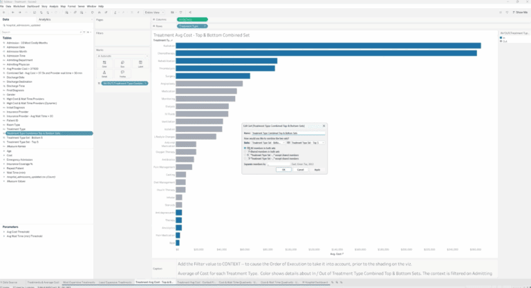
Discover how to create and combine Tableau sets to highlight key data, compare top and bottom performers, and build dynamic, interactive dashboards with parameters.

Celebrate the season with data! Join us Wednesday, December 10th at 12 PM Central to explore our favorite Tableau Public dashboards in a fun, interactive advent calendar.

Discover highlights from TableauNext and see a live demo of Tableau’s Semantic Layer and Salesforce integration. Join us Wednesday, November 12th at 12 PM Central.
Discover practical Tableau tips & tricks to save time, boost performance, and create polished dashboards with clever formatting, sets, and creative visuals.

Discover how to transform Tableau map layers into tables, donuts, KPIs & more in this hands-on webinar with XeoMatrix Lead Consultant Lauren Cristaldi.
Learn how to clean, combine, and transform messy data with Tableau Prep—from naming steps clearly to publishing flows and handling Google Sheets, joins, pivots, and on-prem SQL challenges.
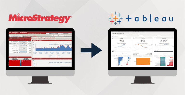
Learn why enterprises are replacing MicroStrategy with Tableau and how XeoMatrix delivers faster, smarter migrations—no lift-and-shift, just optimized dashboards, streamlined logic, and higher user adoption.
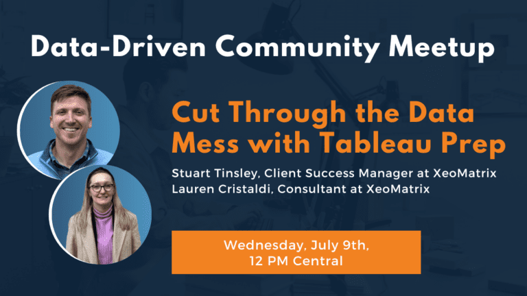
Learn how to clean and organize messy data using Tableau Prep. This webinar covers tips for combining Excel files, fixing inconsistencies, and preparing your data for analysis—fast and without code.
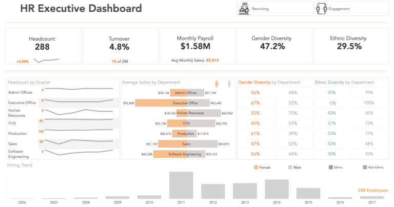
Discover five powerful HR analytics dashboard examples that streamline human resources reporting, track key metrics, and provide actionable insights to improve workforce planning, diversity, and performance management.

Join us on Wednesday, June 11th at 12 PM CT to explore powerful Tableau dashboard extensions! Learn how to boost interactivity and see our favorite InfoTopics tools in action—perfect for taking your dashboards to the next level.
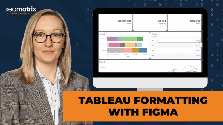
In this session, we explore advanced formatting in Tableau using Figma for layout prototyping. While Figma is typically a graphic design tool, it provides templates, UI kits, and wireframes that are highly useful for Tableau users to build polished dashboards.
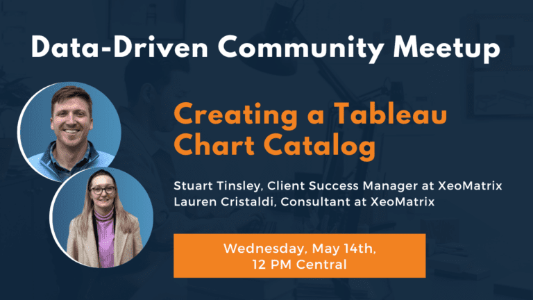
About the Event Speed up your dashboard development process with a custom chart catalog! In this webinar, we’ll show you
Discover five powerful Tableau sales dashboards that provide real-time insights, optimize sales strategies, and enhance decision-making. Get inspired to transform your sales analytics in 2025!
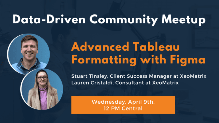
Learn Tableau Formatting with Figma to create polished dashboards with custom backgrounds and layout best practices.
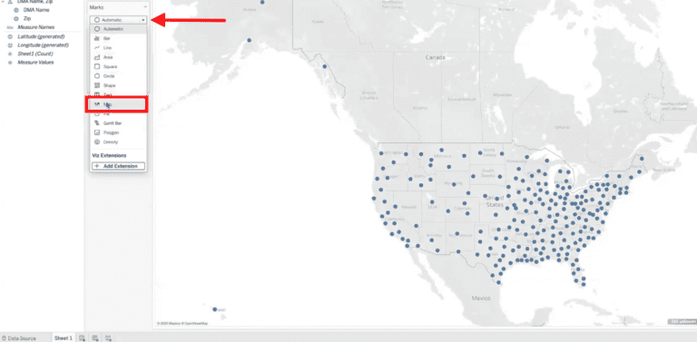
Learn how to create custom geographic regions in Tableau using zip codes. This step-by-step guide will help you map non-standard areas like DMAs for better data visualization and insights.
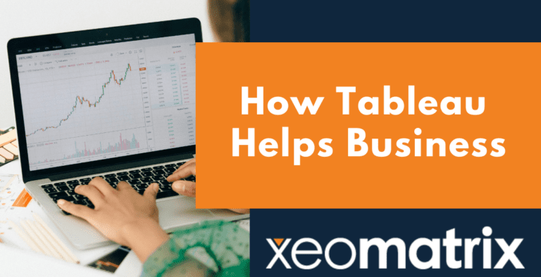
Learn How Tableau Helps Business unlock data-driven success by transforming raw data into actionable insights, improving decision-making, and enhancing efficiency with powerful BI tools.
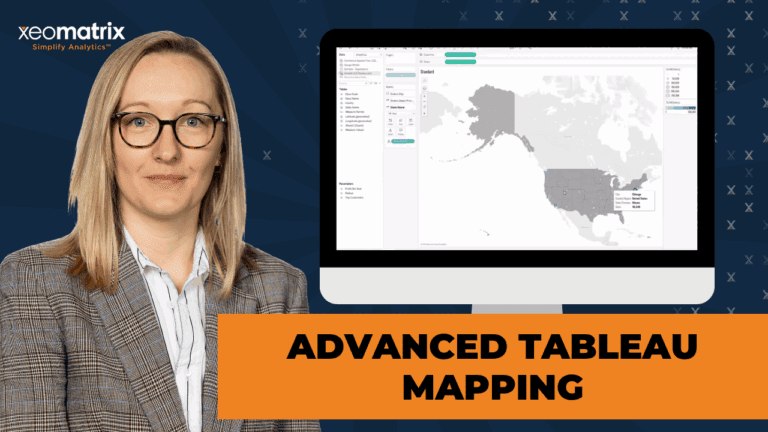
Discover advanced Tableau mapping techniques with Lauren Cristaldi from XeoMatrix. Learn how to leverage spatial files, create custom map layers, perform spatial calculations, and build unique visualizations like hexbin maps and dynamic data-driven gauges.