Tableau’s default mapping offering is a solid tool for most dashboard designs. With the six integrated background layers, element selection and data layers, it is a generous package.
But what happens when:
- Your sales territories don’t follow state lines,
- Your target geography does not exist in Tableau’s default,
- Your corporate branding doesn’t match the standard options?
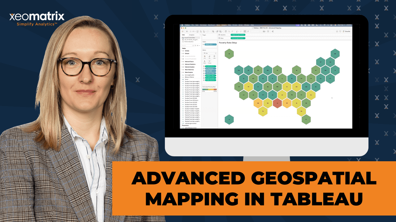
Lauren Cristaldi, Xeomatrix’s Lead UX/UI designer and Manager of Data Analytics shows how to venture beyond standard basemaps in February’s Data Driven Community webinar. Building maps that peak interest, increase engagement, and more accurately portray your business reality.
Experience how custom geospatial and shape files unlock new possibilities:
- Create personalized map shapes,
- Implement elegant design components,
- Use Map Layers within a worksheet to boost performance, and
- Design backgrounds to align with your corporate style guide.
This is not just about map aesthetics. It is about understanding the spatial data beneath the surface and using it to create precision.
Dive into the recap and find the webinar recording, transcript, plus a practical breakdown of the DDC session featuring Advanced Geospatial Mapping in Tableau.
Ready to resync what your maps can do?
Watch Advanced Geospatial Mapping in Tableau
[00:00:00] Celia: Welcome everybody to our February edition of our Data-Driven Community. I’m Celia Fryar. I’m your host today, and I’m very glad that you decided to join us and spend your maybe your lunch break with us, right?
[00:00:13] So we are the XeoMatrix team we’re committed to bringing things that either have been requested or things that are our current interest of our clients. And what we’re observing in the data FAM is a larger community.
[00:00:26] And so today we’re going to be focusing on, advanced geospatial mapping. And Tableau, as Tableau is very much a leader in the space of mapping early on. And then has just really taken it to the next level in the last few years. And so, Lauren Cristaldi, who is our manager of the data analytics team at XeoMatrix, is gonna be presenting today from her experience and her work and everything from low hanging fruit to some advanced techniques that you will be able to pick up from her. So, just as a quick reminder, zoom meeting etiquette policeman. You guys are pros at this, I’m sure by now, but let’s leave mics on mute. But I, but definitely we want this to be interactive.
[00:01:10] We’ll keep the chat window open and be watching for communications there. In fact, let’s just kick that party off and if you would kindly just pull up chat and tell us where you’re dialing in from today, what, where are you at, and good to see folks. So, we’ll have a q and a opportunity at the end time allowing, and if for any reason you missed some or you need to come and go there, there will be a recording, they’ll be sent out on the email to the email address that you registered with.
[00:01:40] So that’s great. So we have folks from all over. That’s awesome. Good. Good. So. On the email, there’ll be a chance for you to make a suggestion. So very much would like to hear what would be top of mind for you. All right. And so I’m, I and the two of us do usually run this together. So we’re very glad to spend the time and I am a Tableau academic ambassador.
[00:02:05] I’ve been in data my career and the last 10 years have very much been focused on helping people get to market. Table has figured largely into that, along with SQL and some sort of spreadsheeting and python along the way. So, I’m also an adjunct professor at University of San Francisco and I’ll lead the team for training and engagement at XeoMatrix
[00:02:27] And Lauren, do you wanna take a minute and introduce yourself please?
[00:02:31] Lauren: Yes, so I’m Lauren Cristaldi. I’m based in Charleston, South Carolina. I am the recent manager of data analytics, but I’ve been a lead, or I was formerly a lead with XeoMatrix for about three and a half years. I’ve been working with Tableau for over eight years and I love maps, so I’m really excited to show you guys today what I have built out.
[00:02:56] Celia: Awesome. All right. And along with the fact that we are gonna be sending you an email where you can make suggestions, we just wanna say thank you to Jeff Johnson and the team there for making this recommendation, because they are, it was their recommendation that kind of spurred the thought there.
[00:03:13] And we will have a q and A that follows after Lauren and Lauren, are you ready to share your screen?
[00:03:20] Lauren: Yeah.
[00:03:22] Celia: All right. Very good.
[00:03:23] all right. That looks good.
[00:03:25] Lauren: Awesome. Thank you. So today I wanna think outside the Mapbox. So as many of you may know, the default map in Tableau uses Mapbox. It is limited to a certain default that the Tableau has baked into the application, so you’re limited. If we go and look at this, you are able to
[00:04:02] make some like minor style edits to the background and then you can add different layers like the terrain or coastline and different labels. But if you wanna do like additional customizations, you’re not really able to do that. It’s more limited. So let’s say I wanted the font to be Poppins for the labels.
[00:04:24] So like where it says United States it can’t do that unless we go actually into Mapbox and make a custom map. But there are some options and I think it works for the most part, pretty well.
[00:04:44] But if you’re working with a brand design guide and you want to keep things consistent, it’s more limited if you’re just using the default. So we can go through, we’re gonna go through how to add the Mapbox maps, and then I also wanna show like some of the Arc GIS and OGC maps. Those are a little bit more tricky, but as long as you have the right links to them, it’s not too bad.
[00:05:18] And finally, towards the end, we’ll get into some different kinds of mappings with spatial files. So like hex bends and maybe even like map layers, which I love map layers. I feel like I’ve presented on them a lot lately, but they, you can really make. Non maps out of map layers, which is cool.
[00:05:41] So let’s get into these custom maps, and I did a tips and tricks video, but just as a refresher, in case you missed it, here’s the Mapbox website with the gallery. So you can use any of these that they already have built out and then you can further customize them. And I think I, I like the community templates, so like this blueprint one, for example, if we just add to your studio and you can create a free account with Mapbox,
[00:06:22] and it’s nice because it automatically logs you in so you don’t have to remember your password.
[00:06:29] Over on the side here, we can change the different labels and it might be overwhelming ’cause there might be too many options, but always good to have options. But yeah, we can go in, change the font or the size depending on those different layers that we’ve added in. You can have the different water, like bodies of water, labels, waterways roads.
[00:07:03] So a lot of options in order to bring this into Tableau. If we were to make any edits, you go up to share
[00:07:15] then third party.
[00:07:20] You’d copy this style URL, so we’ve copied that. Now if we go back to Tableau,
[00:07:35] we can see I’m using that template here. We go up to map background maps, and then I have that blueprint loaded. But we can add a Mapbox map
[00:07:56] and this is where you’d enter that URL
[00:08:06] and it loaded that new one. It’s the same, but if we were to change it to one of the other ones that I previously loaded. The bubble map,
[00:08:20] which isn’t very impressive when you’re zoomed in. Maybe the, yeah, the navigation streets are better.
[00:08:33] So any questions around the Mapbox maps?
[00:08:41] Cool. So next let’s get into the more complicated
[00:08:50] maps. So the arc GIS is great because especially when, if you have a. A license so you can actually get in there and make more customizations. There are a few like free ones that I found and honestly, they’re hard to find. I found, I don’t know about everyone else if you’ve tried to look for these before, but I used like the USGS website and like this is the trail map, so I have a few of these.
[00:09:24] I can add the links in the Tableau workbook so that when we publish it on our Tableau public site, you’ll have access to those.
[00:09:35] We took this trail. One,
[00:09:39] we copied the URL.
[00:09:49] Let’s add a new sheet. We’ll go into our background maps from map. And we’ll add a WMS map.
[00:10:02] I’ll just paste that URL in.
[00:10:10] Now, if I bring in, let’s see, maybe country and region.
[00:10:22] In this case, it’s limited to the US
[00:10:29] so let’s filter for that.
[00:10:39] And this is the case where, yeah, some of these can be really slow to load. They’re not super performant because it is calling that URL and trying to basically load it like you’re loading something on the web
[00:10:59] and your data really matters here as well. So if I had US trail data that I wanted to incorporate, like maybe I hiked the Appalachian Trail. I wanted to track like how many steps I took on the trail. That would be good data to plug in.
[00:11:28] And this is another thing that you may run into
[00:11:33] and I’d run into this before. So yeah, you have to be careful where you’re pulling it from because the WMS. Maps are using like p and gs, basically like custom p and Gs, and then mapping them according to where the coordinates are. So it’s trying to render a lot of images all at once.
[00:12:08] But if we go to one of our other ones like this one isn’t quite as complicated as those like the US trails. So there’s a lot of trails and like I would imagine more image files that it’s trying to render. Whereas this is just a. Standard background,
[00:12:40] but I would say like for when I used to work for the State of South Carolina and I’d have to make custom maps for like our, like I was, I worked for the Department of Employment and Workforce and we had different. Like local workforce regions. So it was a collection of counties or cities. And so I’d have to make custom maps out of those regions.
[00:13:05] And since, the default map didn’t have those regions, it just had the different counties available, it was harder to like. Bring those together. At first I just grouped all of the counties that were in the regions. Of course that took a long time ’cause there are a lot of counties in South Carolina.
[00:13:23] So, but then I realized like that I could use Arc GIS and create custom shapes and I was able to bring that together. And I don’t have that here, but I imagine if. If you’re working, with the government or for the government, you may have that be an option if you’re wanting to make custom maps.
[00:13:51] Celia: A question in from Austin in chat about once the WMS map is loaded from the URL do you need to reload it again or is it now tucked into a packaged workbook in some way? Can you talk a little bit about that, please?
[00:14:07] Lauren: Yeah, no, that’s a great question. So once you have it loaded it will be packaged with the workbook as long as you’re saving it, as the tw bx.
[00:14:19] But if you create a new workbook, it’s not gonna remember any of these maps. So I would recommend making like a template or like a map. A map focused workbook that already has these loaded, and then just bringing in, so like at the start of a new project or new dashboard bring in your relevant data sources to something like this where it already has those maps loaded just so you don’t have to, copy and paste the URLs again and again,
[00:14:56] if you go to manage maps, it’ll show you all of the URLs. You can export or copy and paste somewhere else if you want them for reference for other workbooks.
[00:15:13] Celia: And you were describing the load that the other one was creating, that load doesn’t occur until you actually load it into a worksheet.
[00:15:20] And then Jeff has got a question for you. Will both the WMS and Mapbox works once published to Tableau Cloud server? Are there complexities, I don’t want you to read it, but some complexities with the local shape files and if, it would be great if there was, if the cloud was leveraging published sources.
[00:15:41] Like maybe making, are you thinking, Jeff, are you thinking, like making do you wanna come off Mike and just elaborate a little bit about what you’re thinking there? It sounds like you’re trying to create a resource online that would be shareable, right?
[00:15:52] Attendee (Jeff): Yeah. We have a private Tableau Cloud instance.
[00:15:54] So I’m not talking about public, although that could be a factor too.
[00:15:58] Celia: No. Within your organization, right? That’s exactly,
[00:16:01] Attendee (Jeff): Yeah. Yeah. That’s clear. So, so shape files, right? As we know, they have to be zipped up. And sent to the server. And anytime there’s an update, you gotta rezip them and send them. So if I could use a WMS layer and that was just always up to date and I could leverage the underlying data, it would make the process of publishing those reports a lot easier.
[00:16:23] Lauren: Yes. So I haven’t done that with the WMS, but I know you can do that with other spatial files. So I would imagine. It would be faster too, and you could keep it consistent. So if you had a lot of different people building and using that same map you’d have that one point of governance basically, so that you could keep all of the maps consistent so you wouldn’t have some that were outdated or using the wrong URL or something like that.
[00:16:59] But the, this method with the URLs works when you publish to cloud or server, as long as your firewall, like if you have any firewalls for your server, are all clear for that URL.
[00:17:15] Attendee (Jeff): And do we have access to the underlying attributes, this map layer?
[00:17:22] Lauren: So with this one. Lemme go back to this one.
[00:17:29] It really depends on the URL. Like this one you do, there’s only one option, but if this was combined with like water labels or other background layers, then it would come up a on the side over here,
[00:17:50] or is that what you meant?
[00:17:57] Attendee (Jeff): Yeah, I think it’s just gonna depend on the data source, what they’ve published to make available to you.
[00:18:02] Lauren: Yeah, exactly.
[00:18:03] Attendee (Jeff): Basically I’m just, I’m looking to filter on certain attributes or features. That’s the end goal.
[00:18:12] Lauren: Oh, gotcha. Yeah. For filtering, you have to make sure that the underlying, like the map and the map layers.
[00:18:19] The data that you’re using to add points to the view all mesh well together, and then you can use the map layer. Usually it comes up over here to where you can hide, especially when you have different Marks cards. So if I only wanted to see like certain features depending on the data I’m presenting.
[00:18:46] It would allow you to remove certain layers.
[00:18:59] Celia: Yeah. Thank you for the question and thank you for Lauren. He’s, there’s a thanks for you also in the channel, my friend.
[00:19:07] Lauren: Yeah, thank you. Yeah. I know it’s complicated, but it really does depend on. Your data, like with anything and where you’re getting the the web map service from.
[00:19:37] So outside of WMS and Mapbox. We also have, I’ll show this example where I’m using a spatial file. So we have this geometry, I got this from Tableau public a long time ago. There are a few different ways to make like hex spin maps, but I just found using this file to be the easiest. If you wanna see an example of how I incorporate it with other data.
[00:20:14] So I had built I was trying to do iron vis last year, but I ran outta time. But I built out this data source where I’m using food waste statistics and I wanted to make a map of the us some, the traditional map, you have some states that are really small, especially in the Northeast, and it doesn’t like.
[00:20:38] Lay it all out, especially when you’re looking at more which state has the most food waste or the least. So to make it easier to read, I like to use the hex bin. For the US I put the spatial extract here, and then I just have the flow with those relationships connecting to the relevant data that I wanna bring in.
[00:21:11] These are all geo fields. This polygon is basically drawing that hexagon and then the line just provides an outline of the hexagon.
[00:21:29] And when we bring it all together, we end up. Something like this.
[00:21:53] Celia: Yeah. That’s beautiful, Lauren. That’s beautiful.
[00:21:56] Lauren: Oh yeah. Thank you.
[00:21:56] Celia: Yeah. Mm-hmm.
[00:21:59] Lauren: Yeah, I really it’s the hex bins. Don’t, they’re not. Like perfect for every use case. But I think when you’re, you really just wanna, a flattened view of all of these different states or regions. It’s nice to see everything and your labels don’t get cut off.
[00:22:19] Like usually it would be hard to see New Jersey or Vermont or New Hampshire.
[00:22:24] Celia: That’s a really good point. And Austin’s asking if HX Hexagon is the default shape for Polygon.
[00:22:33] Lauren: So, good question. No, it’s not the default. It depends on how you create that spatial file. I haven’t made my own spatial file, but this one that I had found, it does the way that it lays out the points.
[00:22:53] It basically draws a hexagon for that polygon
[00:23:07] and to demonstrate
[00:23:11] this so much easier than having to do the different like special calculated fields where you’re using like HX spin Y or HX Spin X. We just bring in the like geometry column and now we have all of these hex spins and if I added state to detail separates those a bit, I can go to the map options. I don’t need any of those.
[00:23:45] You can also take away those background layers.
[00:23:52] We can go up to map background maps and select none. Oh no, sorry. I was thinking of something else.
[00:24:04] We can just uncheck everything in the background since we don’t need that.
[00:24:17] Only a few steps, and then you have everything.
[00:24:27] And I usually like to add a border too, to separate those a bit.
[00:24:45] So, yeah, it’s really nice when you can just add it to the data source and then it does all the heavy lifting for you.
[00:25:02] Celia: Do you use this file or another one to get them on? The one you showed with the waste, the food waste.
[00:25:11] Lauren: Oh, so I used, yeah,
[00:25:12] Celia: I used this file. How did you control the amount of space that’s between them? I, that’s probably a fine point, but. I like the amount of space you’ve given it here. A lot of breathing room.
[00:25:24] A little bit of breathing room.
[00:25:27] Lauren: Yeah. I think, oh, what did I do?
[00:25:37] I think I used the outline.
[00:25:48] Let’s see if we
[00:25:48] Celia: Can, did you change the size of it by chance?
[00:25:55] No.
[00:26:01] Lauren: Now I’m wondering, okay. I have it set to map.
[00:26:15] I have a feeling it has to do with the outline,
[00:26:20] Celia: Uhhuh.
[00:26:22] Lauren: Oh
[00:26:27] Celia: yeah.
[00:26:27] Lauren: Oh. Yep.
[00:26:28] Celia: Got it. Mm-hmm. That’s good. That creates some nice like almost like a honeycomb.
[00:26:35] Lauren: Yeah, exactly.
[00:26:37] Celia: Mm-hmm.
[00:26:41] Lauren: And it’s always funny when because I made that, I don’t know, in October,
[00:26:47] so trying to remember. It’s a good refresher though. It’s.
[00:26:53] Celia: Yeah, this is really cool. You’re, there’s been some applause and some shout outs in chat, by the way.
[00:27:00] Lauren: You see it? Oh, thank you. Yeah, I definitely, I need to publish this.
[00:27:05] I can’t I can’t even tell you the number of dashboards that, it’ll be like a random Sunday and my husband makes fun of me. Because I’ll just start. Thinking about something, I’ll find some data, try to like start building out a dashboard for fun. And then I don’t actually finish it or do anything with it, but it’s always nice when like your hobby and things you enjoy align with
[00:27:30] Celia: Yeah.
[00:27:30] Lauren: What you do for work, not everyone, right? True. Does that look you? But.
[00:27:36] Celia: Austin’s asking where you found the spatial file. Are you thinking about for this particular one, Austin, or you wanna come off mute and tell us what you’re thinking there?
[00:27:47] Attendee (Austin): Yeah. I really like this particular one with the hex guns, but if there’s like a repositories that where you can find a variety of spatial files and that’s where you found it, that would be good to know.
[00:27:59] Lauren: Yeah, and I’ll add. I’ll add that when I publish, but let me go to, I think I can find it pretty quickly. I know that on my
[00:28:19] Tableau public page, I had it somewhere.
[00:28:37] Or maybe not.
[00:28:42] It might be on the Z Matrixx one. Oops.
[00:28:52] Oh, there we go.
[00:29:03] So I had done a similar presentation in the past, and this is on Tableau public, but I’ll make it available in this new one as well ’cause it is nice to have a single source ’cause it can be a lot to Google and try to find the right website for different ones.
[00:29:26] It looks like the one I used before is no longer available. But yeah, George from Tablo Public, he had created and made available, made that spatial file available originally, but I think I still have the files where you can download them. They’re still available so you can download that spatial file.
[00:29:55] I already have it set up like in a data source to make it a little bit easier, but you can go in and edit that. And we recently moved to Google Drive, so I’ll research the best way to make those available in our new environment.
[00:30:14] Attendee (Austin): It sounds like you just founded exploring Tableau Public.
[00:30:19] Lauren: Yeah, exactly.
[00:30:20] Attendee (Austin): Okay, cool.
[00:30:22] Lauren: I think that’s like most of the things I find are just scrolling through Tableau Public, like it’s Reddit or something.
[00:30:32] Attendee (Austin): All right. That’s great. Thank you.
[00:30:34] Lauren: Yeah, no problem.
[00:30:41] Yeah, shout out to the Tableau community because it’s like Power BI and Looker. You don’t have as many as much community engagement, I feel like, where you can go in and download and then reverse engineer or repurpose someone else’s solutions. It’s very collaborative.
[00:31:18] Then another way that I use maps
[00:31:27] like this and I actually help someone on our team. Make a version of this recently. So this is a sunburst using map layers. So who thought, you could use maps to build a donut on top of another donut. And
[00:31:51] for this, it’s pretty simple. So if I go into my donut. And you don’t have to call it donut, you can call it anything.
[00:32:05] And the one, one, does it matter? It could be zero zero, as long as they’re the same, it’s gonna find that middle point and then create, or plot it based on that point that you’re creating.
[00:32:22] So if I go over here. We can even use world indicators,
[00:32:35] so we’ll make a calculated field. I’ll do make 0.00.
[00:32:47] I’ll bring that in. Then I just bring it in again and it layers on top of itself. So we’ll add that Marx layer. Now I can change these both to be pies and you can add as many layers as you want. Like I’ve had some, especially when I do custom tables. I’ve had 20 marks cards, which is crazy.
[00:33:20] That’s why I also appreciate that you can rename them to keep track,
[00:33:28] and I can actually remove latitude and longitude. As long as you’re just layering the same point on top of each other, you can remove those and then it’ll auto size to an entire view.
[00:33:45] Let’s see, what would be a fun one to use? Let’s do internet usage on the angle. One, one thing to point out is depending on the order of your Marx cards, so like the top most layer is gonna be on the top. The topmost card is gonna be the topmost layer, and then the bottom will be on the bottom. So if I change the colors here for this bottom one, let’s do it by the region and you’re not able to see anything because they’re the same size and this one is on the bottom.
[00:34:29] So if I change the size to be a little bit bigger.
[00:34:41] Now we have a donut.
[00:34:43] Celia: And Lauren, I think that I recently was told that you have to have two points on before you can remove the longitude latitude without there being some issues with that, right?
[00:34:55] Lauren: Yes. And that’s really good to note because, oh actually sometimes it’s fine. Oh, no, it’s not fine.
[00:35:04] So yeah it freaks out if you remove that and then try to add another layer on there. So you have to make sure that all of your layers are added before before you take those latitude and longitude points away.
[00:35:19] Celia: But you could probably set your background map to none to keep it from distracting from your build process,
[00:35:25] earlier.
[00:35:26] Yeah.
[00:35:29] Lauren: Actually, I wonder if it will still throw that error.
[00:35:35] Oh no. So actually, so yeah, if you, that’s a good point. If you do background maps and then none, and then try to add in another layer, it won’t break it, which is nice.
[00:35:53] So that way if you wanted to add more to it, after you’ve already built it out, you can still have that flexibility without having to start over again.
[00:36:10] Celia: And this method of building donuts, y’all is way more conducive to auto fitting into evenly distributed containers and things like that. That’s one of the biggest wins on this, as opposed to the way we used to build donuts in tableau.
[00:36:27] Lauren: Oh yeah, that’s a good point too. ’cause and when you’re you’re building, let’s say you have 10 donuts, but you’re trying to get that sizing, like the middle to the outer ring.
[00:36:41] Ratio, correct. Like it, it can be really tedious and a lot of trial and error, whereas this one will just resize by itself.
[00:36:54] Celia: So helpful.
[00:37:00] Lauren: Yeah. That’s why I’m like so passionate about map layers now.
[00:37:05] Celia: Aren’t they? I think I’ve learned from you and like a host of other voices about them being more performant than us taking 10 worksheets and overlaying them in the ultimate production of it all, right?
[00:37:16] Lauren: Oh yes, absolutely. Yeah. I like to use them.
[00:37:21] I’ve been using ’em a lot for like custom KPIs as well. So if you have, let’s say you wanna show like an area chart for a time series under. A big like indicator of a total, but traditionally that would take, anywhere from two to three sheets, depending. But now you can do it all in one sheet. So Tableau’s only having to load one sheet instead of three.
[00:37:54] And the more you can consolidate things to be on one sheet or like fewer sheets, the more performant. Your dashboards will be.
[00:38:06] Celia: David, do you wanna go on and ask about your, the labeling question, please, sir?
[00:38:12] Attendee (David): Yeah, sure. Hi Lauren. With traditional donuts or pie charts like you were talking about a little bit ago regarding the sizing, labeling is just very rigid and unflexible in terms of how to control where the labels. Fall and what happens when things get, on top of each other or losing labels.
[00:38:33] Have you done much labeling using donuts or pies with this construction method? And is it more flexible in terms of getting it to look the way you want and still being dynamic?
[00:38:46] Lauren: Yeah, that’s a really good question. So I have, it does, it’s a little bit more flexible, but it’s still not. Like perfect because you can like with the, let’s add a label.
[00:39:03] So this will adjust, but things are overlapping depending on how much room it has. And then of course you can move a label and you can do that in the traditional. Donut or pie, but as soon as you filter it, it will revert back to the automated labeling positioning. So that’s not a great solution.
[00:39:35] Attendee (David): How about like just horizontal leader lines or something like that between the labels?
[00:39:42] I’ve tried to create that using the old methodologies with a whole bunch of calculations to create, every label is. Vertically stacked and horizontally noted with a leader line to its appropriate pie section. But something like that is, has been a labeling challenge with donuts and pies for a long time.
[00:40:04] Celia: You tried doing the match the mark color to help it be connected without having to have a leader line.
[00:40:13] Yeah, that’s a, that’s what I actually recommend.
[00:40:18] Attendee (David): Yeah, the map colors work well until there’s overlap, like you see Africa’s disappearing within its own color and stuff like that.
[00:40:28] Lauren: Oh, true. Do you
[00:40:29] Celia: have your overlap allowed checked on yours, Lauren? I’m surprised it’s, I’m surprised it’s doing that.
[00:40:38] Lauren: So I think it’s looking, it’s making sure that it’s not overlapping. Like the next mark.
[00:40:42] Celia: Oh, the next one in. Got it.
[00:40:49] Attendee (David): It actually looks to see if the labels themselves overlap. The labels themselves wouldn’t overlap, then it doesn’t delete hide them,
[00:40:59] Lauren: right? Yeah. With this, if we, yeah, if we address the size a little bit, it’ll give it more room, but it’s still not.
[00:41:11] Perfect. I think a lot of times what I’ll do or what I’ve started doing more recently, if I have a donut like this, I’ll actually create a like smart legend. So if we,
[00:41:34] and you can use.
[00:41:37] Map layers for this as well. So let me go into the point. I’ll bring that in like before. Gonna make it a circle. Bring in another point. This will be our label.
[00:41:55] We can also just only use this one, but we do none.
[00:42:12] Now we have that. I’ll put region on the rows
[00:42:23] and the label and the color.
[00:42:33] Really, we don’t need that one.
[00:42:39] We can hide that header
[00:42:45] and I’ll tell this to be off to the side.
[00:42:59] And I can do the internet usage underneath.
[00:43:16] So now if I go back to the dashboard.
[00:43:32] And this can be a better like labeling solution, especially if you have more than I would say, three categories or slices within that donut or pie. And you could even add. Like more relevant information to that label. ’cause you have a lot more space and consistency to do that. And control in general.
[00:43:57] So I could add a percentage as well as the amount of internet usage.
[00:44:07] Plus you get a legend that is a circle instead of the square. So I.
[00:44:20] And I found that this is a lot easier to read that way when you’re up here, we remove those labels.
[00:44:37] You can focus on the different slices. Then look over for exact values or hover over them.
[00:44:55] I do wish we had like more customization though in terms of like those leader lines. I know I’ve done that with several calculations. For the gauges like here, and this gauge chart is using map layers as well. It’s like with the donut, except for you have to do some data densification so it can draw lines. ’cause it needs to fill in the points between the zero and the 23,000. But like all of these are dynamic, so it knows how to plot.
[00:45:37] So if the, any of these values changed within that first ring, then those lines would change according to where this starts or ends.
[00:45:54] That is more involved though with setting it up. But once you set it up. It’s pretty easy. I haven’t tried it with a pie or a donut, but now I want to. So be on the lookout.
[00:46:33] Any other questions? I know we only have about 10 minutes left.
[00:46:48] Attendee (David): Sorry, Lauren, you could have done that with map layers, right? You could have done that Smart legend inside the center circle, couldn’t you have and kept it all in one sheet?
[00:47:00] Lauren: Yeah, that’s a good point. Yeah. As long as you have enough room, you can add that legend into the center.
[00:47:08] You would, oh, sorry. Go ahead.
[00:47:10] Attendee (David): That would’ve been beautiful.
[00:47:13] Lauren: I will say you couldn’t have, you’d have to make individual calcs though for the different regions because within the, within this part, it wouldn’t we’d have to
[00:47:30] see when we add region, it does this. So to get them to be like individual rows, we would have to add in calculations for that.
[00:47:51] Celia: Are you seeing a trend that is moving away from one donut into more separate donuts that show. The highlight of just the proportion that is represented by the item that’s on that row?
[00:48:06] Lauren: Oh yeah, I’ve done that a few with a few things. And honestly I feel like that can be a lot easier to read and you get more insights faster from doing that.
[00:48:20] I think donuts and pies in general get a really hard time because. People have 20 different categories and then it’s I can’t even read this. So
[00:48:31] There’s too much going on.
[00:48:36] But yeah, if we had like a total, maybe I can make that.
[00:48:46] So we have the sum of the internet usage. I.
[00:49:05] Actually, let me just do a fixed calc.
[00:49:28] And then we would need that difference from the total.
[00:49:51] Now if I switch that out with the measure values, I’ll edit the filter. None.
[00:50:02] We want the internet
[00:50:07] usage and that difference,
[00:50:16] and if we filter on one region
[00:50:26] and then we make the measure names. Color,
[00:50:38] that difference would be the gray, and we can leave that as orange
[00:50:46] and then we can re-sort it
[00:50:51] Celia: like that.
[00:50:54] So that would be in line with a label that was for that one item and maybe some other details.
[00:51:00] That’s really good.
[00:51:01] Lauren: And
[00:51:01] Celia: we could even, that’s easier to get data from. Yeah. Now there you go. That’s great.
[00:51:06] Lauren: Yeah. And then that way, you just have it all in one sheet. We’re seeing how those differences stack up against each other.
[00:51:14] Celia: Mm-hmm.
[00:51:16] Lauren: With the total.
[00:51:17] Celia: That’s really good. Yeah. Lots of applause by the way. I hope you’re seeing it.
[00:51:22] Lauren: Yeah, thank you. I see a couple of them.
[00:51:29] Celia: Yeah. This is great. That’s a fresh perspective on an old familiar friend, right?
[00:51:35] Team. Any other questions for Lauren? And let me the, in case you missed it, the I’m gonna put it into chat. She did record a walkthrough on a how to configure that map. The Mapbox custom Mapbox that she’s demonstrated right at the beginning, the one with the blueprint, that’s an example that is she’s shared with every made, ready to go for everybody.
[00:52:03] So if you wanna give that a shot this afternoon, you’re already equipped to do so. So, and any questions or comments we’d love to hear from you guys.
[00:52:19] All right, Lauren, thank you so much for preparing all this and having it ready for us to share and show today. I really appreciate you. And let’s see. We have, we’ll be sending you the team will be sending a follow up. Just please any, and like I said, Jeff was the one that suggested this, so we’d be happy to do the, do what you guys are interested in to what will support what you’re doing with your work. And that quick tip video that I’m mentioning here is in chat and will be sent out again on the email. That’s a follow up and if you wish to get in touch with us, we have these emails here for our president and our director of client success Stuart Tinsley.
[00:53:03] And otherwise, just thanks so much for joining us and love to. Be in touch with you and see what is up next month. Lauren. I know we’ve got it planned out.
[00:53:15] Lauren: Oh, next month. I think we’re gonna get into using custom image URLs, maybe some survey data.
[00:53:23] Celia: Oh, that’s great. Fun stuff. Awesome. Sounds good. Okay, thank you guys for coming and we will hope to see you again if not before then We’ll see you next month hopefully.
[00:53:36] Thank you, Lauren.
[00:53:37] Lauren: Yeah, thank you, Celia. Thank you everyone.
[00:53:39] Celia: Thanks everybody.
Links Mentioned
- Templated Workbook: “Thinking Outside the Mapbox” Templated Workbook (Tableau Public)
- Tutorial: How to Use Custom Mapbox Maps in Tableau (Advanced Map Formatting)
- YouTube: Implement Custom Mapbox Studio Maps in Tableau Quick Tip
Presentation Summary
In this Data-Driven Community session, Lauren Cristaldi explored practical ways to move beyond Tableau’s default mapping experience and build more flexible, customized geospatial visuals. This presentation showcased real workflows analysts can apply right away, from creating branded Mapbox styles and working with ArcGIS and WMS layers to using spatial files for hexbin maps and rethinking map layers as a broader design tool.
Rather than treating maps as fixed geographic visuals, Lauren demonstrated how they can become a foundation for more creative and performant dashboard design. Throughout the session, Lauren shared approachable techniques for elevating map design, integrating new geographic sources, and creating more streamlined dashboard experiences.
Session Outline
- Moving Beyond Tableau’s Default Maps
- Working with ArcGIS and WMS Background Layers
- Using Spatial Files to Create Hexbin Maps
- Rethinking Map Layers as a Design Tool
- Final Thoughts
Moving Beyond Tableau’s Default Maps
There are clear limits to Tableau’s built-in Mapbox styles. While default maps are easy to use, they can feel restrictive when you are working with brand guidelines or trying to match a specific visual direction.
Lauren demonstrated how to customize maps directly in Mapbox Studio and then bring those designs into Tableau using a style URL. Using this approach allows teams to change fonts, labels, and overall styling while preserving Tableau map functionality. You can also create template workbooks with preloaded custom maps so teams can start new projects without repeating the same setup steps.
Working with ArcGIS and WMS Background Layers
Going into more advanced territory with ArcGIS and WMS map services, these tools allow analysts to bring in geographic layers that are not available by default, such as trail maps or custom regional boundaries.
These layers can open up new possibilities, especially for teams working with government or industry-specific geography. You also have to consider performance considerations. Some WMS maps can be slower because they rely on loading images from external sources. Publishing workflows may require extra attention to firewall rules and URL access.
It’s recommended to build reusable templates and manage map URLs carefully so teams can maintain consistency across dashboards.
Using Spatial Files to Create Hexbin Maps
You can also build a hexbin map from a spatial file. Traditional geographic maps can make it hard to compare smaller regions, especially in areas with many small states.
By using hexagons instead of geographic boundaries, Lauren created a cleaner layout that made comparisons easier to read. The example used food waste data and showed how spatial files can simplify complex design challenges by handling geometry directly within the data source.
You should explore Tableau Public for shared spatial resources. The Tableau community contributes a lot to advancing mapping techniques.
Rethinking Map Layers as a Design Tool
Map layers can be used for much more than geography. Using layered marks, Laurent built donut charts, gauges, and other custom visuals inside a single worksheet.
This approach improves performance because Tableau only needs to load one sheet rather than several. It also makes dashboard layouts easier to manage since visuals resize automatically.
Lauren shared practical tips on layering marks, adjusting sizing, and managing labels, including when it might be better to rely on a custom legend instead of crowded chart labels.
Final Thoughts
The biggest takeaway from this session was not just how to build advanced maps, but how to think differently about what maps can do in Tableau. You should treat maps as flexible design tools rather than fixed geographic visuals.
By combining custom Mapbox styles, external map services, spatial files, and creative layering techniques, analysts can build dashboards that are both more engaging and more performant.