The Data-Driven Community Meetup holds monthly webinars on business analytics and big data. Webinars are held on the second Wednesday of the month at noon (12:00 PM) central time via Zoom Webinars and will cover topics related to enterprise data management. Our goal with each webinar is to provide meaningful insights and actionable takeaways to simplify analytics so you can make better decisions.
The topics we cover include data strategy, data management, data warehousing, BI modernization, embedded analytics, and cloud migration and strategy. Learn how to build reporting solutions that drive your business demand based on your needs.
About the Topic
Stuart Tinsley, Client Success Manager, and Jared Schulman, Lead Consultant at XeoMatrix, recently held a meetup titled “Mastering Tableau Calculations,” where Jared showed the secrets of creating efficient, insightful formulas that can elevate your data visualizations to the next level.
This article includes a recording, transcript, and written overview of the Mastering Tableau Calculations presentation.
Presentation Video
Summarized Presentation
The session covered various aspects of Tableau calculations, including formulas, table counts, IF-THEN statements, date calculations, and level of detail expressions. The discussion also covered common year-to-date, month-to-date, and quarter-to-date formulas in Tableau. The session concluded with a Q&A session.
Presentation Outline
The session follows this outline.
Mastering Calculations in Tableau
- Calculation Editor Overview
- Tableau Calculations
- IF/THEN Logic
- Date Calculations
- Level of Detail Expressions
- YTD/QTD/MTD Calculations
Calculation Editor Overview in Tableau
Tableau is a powerful tool that allows users to perform calculations and analyze data. The calculation editor, located in the main canvas, provides various functions for writing calculations, including year, regular expressions, ranking functions, percentiles, and model extensions. The help window on the right side of the screen helps users find the right format for their calculations, such as year, month, and day.
The calculation editor also offers tools for sorting data, such as date functions, string calculations, numerical calculations, and search functions. The “sort” and “search” functions are particularly useful for numerical calculations.
IF-THEN Function in Tableau
One common basic calculation is the IF-THEN function, which helps users quickly identify high-selling and low-selling subcategories. For example, if the sum of sales in a subcategory is greater than 200,000, it is considered a high-selling subcategory. If the sum is above 100,000, it is a mid-selling subcategory, and if it is not above 200,000 and not above 100,000, it is a low-selling subcategory.
The IF-THEN calculation categorizes data by sales, allowing users to identify the top-selling subcategories quickly. This is particularly useful when comparing data from different views. For example, if a company has chairs and phones as its top two categories, users can create a calculation for both categories and see their sales compared to overall sales. This allows them to see both subcategories side by side, providing context for understanding the percentage of sales made up by each.
Level of Detail Expressions
Tableau is a powerful tool for data analysis, but it can sometimes cause errors when trying to combine aggregate and non-aggregate comparisons. One common error is when trying to sum sales for subcategories like chairs and phones, which can lead to a red pill when using aggregate fields. To avoid this, one can move the sum outside of the calculation, avoiding the need to aggregate a dimension field with a single value.
Another workaround is to use level of detail expressions to turn an aggregate into a non-aggregate field, but this can be dangerous. This error is particularly common in thick-enough reports where you have an aggregate field that you need to compare to something that’s not aggregated.
Date Calculations
For date calculations, one can use the “ship time” function to calculate the number of days between the order date and the ship date. The formula requires specifying the start date, end date, and optionally, the start of a week. For example, in a business setting, the start of the week can be specified as Sunday or Thursday to Wednesday.
Jared discusses the use of date diff formulas in data analysis to determine the shipping time of individual orders. A minimum, max, or average of the date diff can be used to determine the ship time for each product name. Jared also discusses the use of the today function to compare the last order date per customer with today’s date.
Today Function
Jared highlights the importance of using the today function to identify the latest order for each customer and calculate the fixed level of detail (LOD) for each order. Fixed LODs are typically used in 20%-30% of dashboards, and the function is set to “fixed” for better accuracy.
Jared uses the today function to calculate the date difference in days between the last order date per customer. The function defaults to today, so there is no need to change anything. The last order date for each customer is then assigned to every row per customer, ensuring accurate calculations.
Jared also mentions the use of the today function to check the last time a customer has purchased, which can be useful for understanding the shipping process. For example, if a customer lasted 11 months ago, the last order date could be in the future. The summary concludes by highlighting the importance of using the today function to analyze shipping times and identify areas for improvement.
Date Diff Function
Jared discusses the use of date diffs for last order, last login, and last activation in cloud software monitoring. It is particularly useful for monitoring activity and checking back in on customers who haven’t been engaged in a while. The analysis can be expanded to include repeat customers, churns, and all different types of customers.
Fixed Level of Details
Jared suggests bucketing customers based on their order history, such as not ordering in the past year or month, to ensure customer follow-up and retention. Jared also discusses the importance of fixing the formula on last order for customer at the customer name level to ensure the visualization is at the level of detail needed. This is because, without a fixed level of detail, the visualization may not provide the desired information.
Jared also discusses the use of fixed calculations when the level of detail in the view is different from the desired level of detail. For example, if sales-by-state is used, it is possible to see sales per state, regions, and even a percent of the total for each state. However, if the region is not included in the view, the pane is just every single state, so the percentage of sales within the region can still be seen with a fixed level of detail calculation.
Subcategory Filters
Jared discusses the use of level of detail expressions in Tableau to calculate or view data at different levels of detail from the view. Jared explains that level of detail calculations can be tricky, but they become more intuitive as one becomes more familiar with the data.
One example of using level of detail is to see customers’ sales by subcategories and how many of them have purchased all of a certain number of subcategories. Jared uses a subcategory filter to see who’s purchased accessories and appliances. The calculation is to determine if the overall distinct count of subcategories in the data is equal to what each customer has for their count of distinct subcategories.
Jared suggests that if the filter is selected, it will only show “false” because of something happening in the background of Tableau’s logic. Instead, Jared can choose to exclude “false” to get the same result.
Level of detail expressions can be used to calculate or view data at different levels of detail from the view. This approach allows for more accurate and detailed data analysis in Tableau.
Tableau calculates fixed level detail calculations before calculating dimension filters, which count all subcategories before considering the customer name. To move the filter before the fixed level of detail calculation, add it to context, and it turns gray. A tech note with a flow chart can be found on Google for Tableau’s order of operations.
The subcategory filter is now working, and the calculation matches the distinct counter subcategories overall. This can be helpful for targeting customers who cross-shop different products or categories, such as those enrolled in multiple educational programs or online training programs. For example, 64 people might be interested in cross-shopping art and machines.
This is an advanced Tableau calculation that can be put on a dashboard and tested by end users. The data is fictional, but it can be useful for understanding customer behavior and targeting marketing campaigns.
Quick Table Calculations
To analyze the data, use quick table calculations like running totals for time series data, difference, percent difference, and percent difference. For example, chairs and phones make up 28% of the sales, which is about a quarter of the total sales. By order date, we can see how this trends over time, with chair sales starting at 16.2% in 2020 and dropping to 13.15 in 2023.
Heat Map
A heat map shows the growth in colors in chairs, phones, and accessories over time. Machines dropped from 12 to five and back up to nine, while binder sales were consistent.
To see the percent difference, change the quick table calc to a percent difference and do the same for colors. Fasteners show significant growth, and supplies dropped 86% less in 2021 but rebounded in 2022.
The percent difference can be useful for understanding changes over time. By converting the percent of the total view into an area chart, viewers can visually see the layers of growth and change over time.
Transcript
>> STUART TINSLEY: Welcome, everyone, to another awesome session with our Data Driven Community. As you all know, every month, we do a specific topic where we’ll talk for about 45 minutes here.
Today’s session is great. We’ve got a featured guest, Jared Shulman, who’s going to be talking about Tableau calculations.
With these data-driven communities, we’re always trying to get better. We’d love to hear feedback from you, and please tell your network that we do these. It’s totally free, as you know, and anyone can join, so we’re really excited.
Today’s agenda, like I mentioned a minute ago, we’ve got Jared Shulman. He’s our lead consultant as the XeoMatrix. He’s going to be giving our tech talk today on Mastering Tableau Calculations.
I’ll do a few community announcements here in a minute, and like we do every session, we’ll have time for Q&A at the very end here. OK.
Just a couple of housekeeping items. Just remember, please observe customary Zoom webinar etiquette. We definitely want you to participate, so if you have questions, comments, please make those comments in the chat window. I’ll be taking a look at those and monitoring. We’ll certainly have a Q&A session at the end of our presentation, and as always, a link to the recording will go out following the session. Every recording, by the way, is on YouTube as well.
Couple of upcoming events. On November 8th, we’ll have our next Data Driven Community session. I just came up with this title yesterday. Let me know what you think. It’s going to be called “Harmonize and Parameterize.” And as you can probably guess, we’re going to be spending the entire session talking about parameters. Specifically how you can create dynamic parameters in Tableau, how they can be more useful, and harmonize your Tableau dashboard. It was off the cuff. I looked at words that ended I-Z-E, and that’s how we came up with “harmonize” and “parameterize.” But that’ll be a really good session.
Jared, I presume you might lead that one as well.
>> JARED SHULMAN: That’ll be fun.
>> STUART: Yes. We’ll finish out the year in December. It’s kind of hard to believe we’re already almost in December, so on the 13th at noon Central, we’ll have our last session for the year. We’re obviously going to continue doing them into next year, so two more following today’s session.
Today, our topic is going to be “Mastering Tableau Calculations.” All right. Our feature speaker is Jared Shulman. It’s a pleasure to introduce him. I’ve worked with Jared for a number of years now. He’s got over eight years in the analytics space. He loves Tableau calculations. He’s absolutely my go-to person on my team for any Tableau calculations, and we’ve got some very talented folks that know formulas, but Jared is the best I’ve ever seen, so I’m really thrilled that he’ll be going through the presentation today.
Most of you have met me. I’m Stuart Tinsley, director of Sales and Client Success at Xeo. Used to work at Tableau. I’ve been in the space 10 years working with Tableau.
We’re really excited today. We’re going to cover a couple different areas with Tableau calculations. The first thing we’re going to do is give a general overview of, what is a formula in Tableau, and specifically, how can the calculation editor be helpful? How you can extract some help from the hundreds of formulas that you could actually do within Tableau.
Jared will spend some time talking about table counts. He’ll spend some time on IF-THEN statement. He’ll spend time on date calculations. Level of detail expressions will be talked about today pretty extensively, actually.
If we have time, I’ve got a timer to go off at [inaudible], but we’re going to hope to get to very common year-to-date, month-to-date, and quarter-to-date formulas in Tableau. All right. At the end, we’ll have Q&A.
By the way, please feel free to make comments in the chat window for any questions that you have throughout. If we can’t get to them right there, we’ll get to them in the end, and anything that we can’t get to today, please feel free to reach out to us. We’re happy to help in any way we can.
With that, Jared, I’m going to pass it over to you. I’ll stop sharing and we can get into Mastering Tableau calcs.
>> JARED: Right. Thanks, Stuart. Yes, I appreciate the intro. It’s funny. Stuart and I were talking before we got on this call, and he had that bullet point about me loving Tableau calculations, and I kind of do. He said we can put anything in there, and I said, “No, you can leave that. That’s OK.” Because I like solving problems and I like solving puzzles, and I feel like Tableau calculations have a lot in common with that.
So let’s pop open the calculation editor, and I want to start by showing you all a few things that Tableau gives us to kind of help with that problem solving, and kind of untangling what we have with calculations.
If you’ve been in Tableau for very long and all, you’re probably familiar with the screen. You’re probably familiar with this little pop out to the right. This main canvas in the middle is where we’re going to actually type all of our calculations. We’ll name them up here, but this, like, help window that pops out on the right hand side is where I actually spend a lot of my time when I’m working on tougher calculations. This shows us all of the different functions that are available to us in Tableau for writing calculations. Everything from simple year, where we can just take the year of a date to, like, regular expressions are available in here. There’s ranking functions, there’s percentiles. You can put in some model extensions, which I haven’t done and I don’t know anyone who has, but if there’s enough interest in it, hey, maybe we’ll cover that someday, but there’s just a ton available in here.
One of my favorite things about this is that if you click on any one of these, it’s going to give you an example of how to write that calculation, so if we’re looking for something like the length function, it’s going to tell us that this is going to return the number of characters in a string, so we can use the length function with a string and it’s going to tell us the number of characters in it.
It’s really helpful if you ever want to take like just a particular number of characters out of a string, but it’s dependent on the length of the string, so things like that, it’s really helpful to be able to see what kind of format we need. If we want to make a date, we need to put in that year, month, and day in this format, so the calculation editor does a lot to give us hints and tools at what we need to build the calculations that we’re going to build. That’s where I go anytime I get stuck. If I’m curious, “Hey, can I do X, Y, or Z with a date?” You can pull this dropdown down and look at all the different date functions.
You might say, “Oh, yes, I wanted the actual month name of a particular date,” and there’s a date name function for that, so there’s a ton in here, and you can look at all the different string calculations. Anything that’s just numerical calcs. The “sort” and the “search” are really helpful for things like that as well. All the different table calcs that are available to you. We’ll touch on a couple of these later, and how to build some of those pretty quick and easy, so hopefully that covers a tough of the calculation window. You can easily get lost in here, but they give you the tools that you need to find your way back too.
If we want to start talking through just some real, common basic calcs, the sort of bread and butter that you’re going to use all the time, IF-THEN is probably if not at the top of the list, then towards the top of the list, and what this would look like is, if we wanted to take a look at all of our product subcategories and how many sales we had in each of them, this visualization technically tells us that this is OK, but it doesn’t really help us pick out the most important information super quickly, and it might help if we sorted it, so we can sort it down here on the axis, and now we’ve got it sorted, and so we can see what our top categories are, but we kind of have to bounce back and forth between this axis and the bars to figure out where exactly are some of the cutoffs between the different types of subcategories, and how we might treat them.
So if we wanted to see some of our high-selling subcategories and our low-selling subcategories and everything in the middle, we can write an IF-THEN calculation for that, and so we’ll come over here into the calculation editor, we’ll just call this IF-THEN for the example, and we’ll say, if the sum of sales in a subcategory is greater than 200,000, then we’re going to call that a high-selling subcategory. Otherwise, if the sum of sales is above 100,000, we’re going to call that a mid-selling subcategory, and if it’s not above 200,000, and it’s not above 100,000, then we’re just going to say that’s a low-selling subcategory.
Once we have that calculation built, it’s going to tell us the calc is valid. We can hit “OK” on that, and if we drag this pill out, now we can see that it’s going to categorize those for us, and we’ll probably want to bring lowdown here to the bottom, and that’s kind of helpful too, but if we drag this over onto color, now all of a sudden, with that one calc, we can easily get an idea of where our subcategories go from high selling to mid selling to our low-selling subcategories. Just very quickly, visually.
If we go back a few steps and compare that to this view, the difference in how quickly you can pick up on the top-selling subcategories is pretty drastic, so those IF-THENs are some of the most common calcs that we’ll use.
Another way that we might see those is, we see that we have chairs and phones as our top two categories here, and if we ever wanted to just keep an eye on those two subcategories and see how the sales were going for those two subcategories compared to our overall sales, we might pull out our total sales up to point three million, and then if we wanted to, we could filter that by subcategory and look at just chairs and phones, and we can see that’s about 667,000, but then we lose the context of what our overall sales number is, so instead of filtering, one of the things we can do is we can create a calc just for chairs and phones.
So we can say, “If the subcategory equals chairs, or the subcategory equals phones, then give me the sales for that.” And once we have that, if we drag that out and just drop it right on top, now we can see our overall sales, and our chairs and phones right next to each other, so if we filtered to chairs and phones, we’d lose that context, but by using an IF-THEN calc, all of a sudden we can see both side by side and get an idea of how much of that sales is made up by chairs and phones.
While we’re here on this calc, I want to point out a couple of things in this calculation editor, so on the IF-THEN calc, we had used sum of sales for those subcategories, and if we wanted to do the same thing on chairs and phones and we wanted to sum the sales, we’re going to run into a super common error, and Tableau is going to tell us that we can’t mix aggregate and non-aggregate comparisons for “if” expressions, and the same thing is going to happen for any calculation that you’re mixing an aggregate, like a sum, min, max, or average with non-aggregated fields, like subcategory.
There’s a couple of ways that we can get around this, one of which is to move the sum to the outside of the calculation, so now we’re not saying, “If the subcategory equals chairs or phones, then sum the sales.” We’re saying, we’re going to take a sum if the subcategory equals chairs or phones, and the way that Tableau reads it, it’s now looking at all of these three fields in a disaggregated fashion, and then aggregating it versus what we had before, where we were asking Tableau to look at a disaggregated subcategory and then give us an aggregate number on top of it, and Tableau just doesn’t like mixing those aggregate and non-aggregate fields.
The other option that will work sometimes is, the attribute function will aggregate a dimension field if the level of detail for it only returns a single value, so if I do this here, it’s going to give me a red pill because it is now trying to sum an aggregate field, but if I drop the aggregate there, it’s giving me a blank, and what that tells me is that I have that attribute function on something that’s returning more than one value. If we bring that subcategory out, now we can see it’s actually giving me a value for chairs and phones, but if we take subcategory out of the view, it’s trying to aggregate something that’s returning multiple values, and Tableau is not going to play nice with that.
So in that situation, we would want to stick to just moving that sum to the outside if we needed this to be an aggregate expression, and if we do that, again, we can’t sum a sum, but if we bring that back out, that “sum” changes to “ag” because it’s already aggregated, and we still get our 667th.
>> STUART: I just learned something, Jared. [inaudible] raise your hand, like, virtually, if you’ve come across that error in Tableau mixing aggregate. I feel like it’s super common in the product.
>> JARED: Yes. If you’re building out a thick-enough report, you’re going to get to the point where you have an aggregate field that you’re trying to compare to something that’s not aggregated, and you’re going to have to find a way around it. There’s a couple other wonky workarounds that are like edge cases, where you could even use level of detail expressions to turn an aggregate into a non-aggregate field, but you can get into some dangerous waters with changing your level of detail in that instance, so we’ll save that for the mastering “mastering” session, so hopefully that helps to shed some light on IF-THENs, some of the different intricacies of calcs and aggregations.
Let’s switch gears for a sec and let’s talk about date calcs, so we can see our sales here. If we’re curious about how long different things are taking to ship, we can look at our customers and their orders, and then if we wanted to see their ship dates, I’m going to just type it up here, and we get ship date, and we can compare that to our order date, but then, we’re, like, “We’re doing math.” We’re starting to say, “OK, well, what’s the ship date minus the order date?” “How many days is that?” We can just write a calc for that instead.
So this is going to be ship time, and we’re going to take a date diff, and as soon as I hit that “enter” key on that autocomplete, it does two things. It’s giving me the format that I need to put this in, so it’s telling me that I need to specify the date part, the start date and the end date, and optionally, I can specify the start of a week.
So if you’re in a business or an industry where your week starts on a Tuesday instead of a Sunday. Or I know in a lot of the entertainment business, their week goes Friday to Thursday or Thursday to Wednesday, you can specify a different start of week there, and that gives an example down here where it’s specifying Sunday, but you could put any day of the week in there that you want.
For our purposes, we want to know the number of days, and we’re going to put that in single quotes because that’s what it shows in the example. We want to know the number of days between the order date and the ship date. We’re not going to specify a start of week because it’s not relevant to this calculation. Once we do that, then we can bring this out here, and we’re starting to see, from the 18th to the 24th is about six days. Now this one’s interesting because we see from the seventh to the eighth is three days, and the reason that’s happening is because we are summing the ship time.
If you think about this from a business standpoint, there may be multiple rows of data per order, but they’re all going to ship together, and if we want to check for that, we can pull out this product name, and we can see, yes, OK, there are actually three different products in this order, and the date diff that we created is giving us one. From the seventh to the eighth is one day, but it’s actually summing it, one for each product name, so probably what we want to do there is, we just want to take a min, a max, or an average of that date diff, because the number of days is going to be the same for the whole order, and we don’t care how many items are in that order for this purpose. We just want to know how long it took the ship, and if we check a few others, we’re seeing, yes, it’s four days from the 27th to the 31th. From the 18th to the 22nd, that’s four days, and we’re in pretty good place there. That’s going to tell us how long each individual order took to ship.
Now, if we want to know how long the orders take to ship across each region, for example, then we can do that as well, so we can take our region field, and we can take that ship time calculation, and it’s going to default to a sum. I’m guessing it’s not taking 9,400 days to ship products in the Central region. If we change that to an average, now with that date diff, we can see it takes a little bit longer in the Central region to ship products out than it does in the East or West, which may be relevant or interesting for your business.
You can also do the same thing if we expand this hierarchy out on region and look at it by state or province. If we do that, and let’s say we want to sort this by the average ship time, then we can start to pick out where things are taking the longest to ship, and by far, Newfoundland and Labrador takes the longest to ship. That kind of makes sense. If you’re familiar with Canada, Newfoundland and Labrador are out there. District of Columbia, that’s right in the middle of everything, but maybe it just takes them a little longer to get things together because there’s so much going on over there, but that’ll give us an idea there of where some of our pain points are.
Some places, it takes practically no time at all to get stuff shipped out, but we can see at that top end of the range where it’s taking a little bit longer.
>> STUART: Jared, in that date diff formula, it’s probably also worth mentioning that you could use the today function, right? In this data set, we have order date and ship date, but you could subtract a date range against “today,” and you would just use the “today” function, right?
>> JARED: Yes, so that “today” function, let’s use that over in the next step here, so if we wanted to look at dates for the last time that a customer purchased, and we wanted to compare that to today and say, “How long is it been since the last order that they made?” That’s a perfect use case for that today function.
So if we bring out our customer name and our order date, we can kind of take a look and see, OK, so Aaron Bergman purchased last on November 10th, 2022, which is somewhere just under 11 months ago. Aaron Hawkins, his last order date is actually in the future, which may be some weird data. This is a dummy data set, so I don’t know what going to happen. Aaron Smaley last purchased about eight days ago, but it’s going to take us a really long time to go through 5,066 rows of data and try to pick out how long it’s been since everyone has last ordered, so instead, we’re going to go ahead and create a calculation for that, and part of this calculation is going to be identifying the latest order for each customer, and that’s going to get into fixed level of detail calculations. We’re going to call this last order for customer, and we’re going to use a fixed level of detail calc for this.
“Fixed” is one of the options that we have for LODs. There are also “includes” and “excludes” that we can maybe hit on if we have time. They’re a little less common. I’ve probably used an “include” or an “exclude” five or 10 times over the years, but “fixed” is probably in 20%, 30% of the dashboards that we build, at least.
The way that fixed detail calculations work is we’re going to specify the dimensions for the level of detail that we want to see, and then what the aggregated expression is, so in this case, we’ve got it all up in the title here. We want to see, per customer, what is the last order, and the last order is going to be the maximum order date, so this expression here is exactly what we have up here. We’re just looking for the max last order per customer, and that’s how every fixed calc you ever write is going to be. It’s going to be per blank colon. This is what we want to see, so per customer, we want to see the last order date, and if we bring that out under the rose shelf, now we can see, OK, Aaron Bergman’s last order was November 10th. Aaron Hawkins’ was December 18th. Aaron Smaley’s was October 3rd, and it’s going to assign that to every row per customer, because that’s the level of detail that we set in the calculation.
From there, we can use that “today” function that you’re talking about. We can say, “What is the date diff in days between the last order date per customer.” And today is its own function. This will update every day that you open this dashboard. It’s just going to default to today, so you don’t have to change anything. There’s no filter or parameter setting that you have to do. Today is just today, and if we bring that out, then we can start to see it’s been exactly 335 days since November 10th, 2022, and if we skip over some of the bad data, Aaron Smaley’s been eight days since October 3rd. Alex Russell last purchased on September 10th. It’s been 31 days since then, and it makes it really easy to check and see, when’s the last time we engaged with this customer?
This is another really popular one for things like login dates. If you’re monitoring cloud software, and someone’s saying, “Ah, you know, this software is just terrible. I really don’t like it. It never works for me.” And then you see that they last logged in, like, a year and a half ago? Like, “I think you’re just not using it.” So date diffs for last order, last login, last activation can be really helpful for trying to monitor activity and check back in on customers or clients who maybe haven’t been engaged in a little while.
Does that help with that “today” function?
>> STUART: I think you nailed it. Yes, that’s absolutely perfect.
So I’m hearing, in this example, this is great analysis for, like, repeat customers. We’re looking at retail, but it expands that, like, looking at a churn, looking at all different types. It could drag some insights there.
>> JARED: We could really go as far as to, you know, go back to the IF-THEN and start bucketing… I guess we won’t go through it here, but you could say if they haven’t ordered in the past year, then put them in a special category for follow up. If they’ve ordered in the past month, put them in a category for someone to make sure they reach out and check in and say, “Hey, how was your order? Was everything what you expected? Is there anything we can help with?” It can really help like for customer follow-up and retention. Yes.
>> STUART: So this might be a question people have, because I know I had this question: Why did we need to fix that first formula on last order for customer, which was the fix formula? But maybe if you could spend, like, a minute, Jared, just for context for the folks here, like, why did we have to fix it at the customer name?
>> JARED: Yes, so if we just wanted to look at max order date… This is a little another old tip and tricks. Stuart, you actually showed me this one a while back. You can just highlight something here in the calc window, and you can just bring it out and drop it on your rose shelf without having to go and create a new calculation or bring out order date and then set it to the max, as I want to make sure that that is discreet.
The reason that we fix it at the customer name level is because if we bring out that max order date, it’s looking at it at the level of detail of the visualization, and right now, we have customer name and order date in the view, so when it looks at max order date without the fixed level of detail, we’re just seeing the max order date per row on the cross tab that we have in the view, and that doesn’t really give us what we’re looking for if we took this time since last order and put max order date in there.
Let me bring that back out. You know, all of a sudden, we’ve got a whole bunch of different numbers here.
>> STUART: Yes.
>> JARED: And we could take, you know, the minimum of this and say, “OK, well, what’s the lowest number of days between today and their previous orders?” But it’s a lot quicker to just identify that maximum order date and use that to get the date diff between there and today.
>> STUART: That’s great. That’s a really good explanation of that. Hopefully that’s helpful for folks on the call of why. I had the same question a long time ago, like, “Why do I need to fix this at customer name?” It just didn’t inherently make sense to me, so that’s a really good explanation.
>> JARED: Yes, and there will be a lot of times where you’ll want to use fixed calcs. Really, any time that the level of detail in the view is different from the level of detail that you want to see for the data… I’m trying to think, like… I’ll clear this sheet. We can do a quick example of this, actually.
If we had sales-by-state out here. This is great. We can see, per state, what our sales are, and we can see which states are in which region, and if we wanted to, we could even take like a percent of total for each state.
This is getting into table calcs that we’ll jump into in a minute. We can look at that per pane, and now all of a sudden, we’re seeing what the percent of sales for each state is within each region, but if we didn’t want region in the view, that breaks, because now the pane is just every single state, so instead, if we want to just have that sum of sales and still see what the percent of sales within the region is, we can still do that with a fixed level of detail calc.
If we want to see the sales per region, then we can, again, take a fixed calc by region and take the sum of sales, so now, even though we don’t have region in the level of detail in the view, we can see the sales per region compared to the sales per state, and with that, we can take the sum of sales, which is going to be at the state level because that’s what’s in the view, and compare that to the sum of sales per region, which is going to be at the region level because that’s where we fixed it. This is our percent of sales within region, and now, without having region in the view, if we format this to a percentage instead of a whole number, we can still see the sales by state, and how much of that state’s region those sales make up.
If we bring the region back out, we can see… Let’s take some subtotals, each of these adds up to 100, so these percentages are giving us the percent of sales by state within each region, even when we don’t have region in the view, so we can use level of detail expressions to either calculate or view data at a completely different level of detail from what’s in the view. Does that make sense?
>> STUART: That made sense to me. Yes. Thumbs up if that was helpful. Yes, that’s great.
>> JARED: I’m always trying to figure out if there’s a better way to explain level of detail calculations, because it can be tricky.
>> STUART: For sure. Yes. Yes. You’re getting some thumbs up, so I think that’s great. Yes, yes, awesome.
>> JARED: Yes. I don’t know if I’ve ever had a really, really good explanation for why level of detail, and how it works, but it’s one of those things that the more you do it in Tableau, the more it’s going to make sense to you, and the more it’s going to become second nature.
It’s like being plugged into the matrix. You just start seeing numbers coming down your eyeballs and you can see inside the fixed level of detail calcs?
>> STUART: Yes. The practice. That’s practice and data. That’s awesome. Yes, great example. I know you’ve got the next one that is probably going to involve another level of detail that’s really exciting.
>> JARED: Yes. I really like this one. This came from Kate, one of our XeoMatrix colleagues.
What we’re going to do here is we’re going to say, we want to see our customers, and we want to know which subcategories they’ve ever purchased. We want to see their sales by subcategory, but we want to know how many of them have purchased all of some number of subcategories.
So if we pull out our subcategory filter here, and we want to see who’s purchased accessories and appliances, we can kind of see who’s got numbers in both rows, but it’s tough to really just get a quick idea of who all those people are. There’s 600 rows on this sheet, but if we use a bit of a funky level of detail calculation, we can get to that answer, so let me…
>> STUART: As you write it, it’s recorded. You can come back and extract the logic too. This is a really good one.
>> JARED: This calculation is going to tell us whether or not that customer has purchased all of the sub categories that we’re filtered too. There’s going to be a few steps to this one, so we’ll build it out and then we’ll explain it, but we’re going to take just an overall fixed count distinct of subcategories.
By the way, this is another little time-saving hack. We could have also written that as “fixed” with nothing to the left of the colon, and then take the count distinct of subcategories, but if we’re not going to fix at any particular level of detail, we can actually leave out the “fixed” and the colon so that we just have that curly bracket, count distinct of subcategories.
So we want to know if that overall distinct count of subcategories in the data is equal to what each customer has for their count of distinct of subcategories, so we want to know, do all the subcategories in the view equal the total number of subcategories for that customer? And what am I missing here? I’m missing my [inaudible]. There we go, so that’s what we want to know. We want to know, does the total distinct count of subcategories equal the distinct count of subcategories for the customer? And if we hit “OK” on this, and we bring this filter out, it’s only going to show us “false,” because of something that goes on in the background of Tableau’s logic, but instead of picking “true,” we can also pick to exclude “false,” and that’s going to give us the same result. When we first do this, we’re going to see nobody. The reasoning for that is Tableau’s order of operations.
So before we get too deep into the level of detail of this, what we want to do is talk about the order of operations. The most common place to go on into this is between fixed level detail calculations and dimension filters, and what’s happening is Tableau calculates fixed level of detail calculations before it calculates dimension filters, which means when we do this calculation for customers purchasing among all subcategories, it’s counting all of these subcategories, all, like, 15 or 20 of these, before it takes into account the fact that we’ve filtered to only two, and it’s doing the same thing for the customer name.
So if we want to get out in front of that fixed level of detail calculation, we need to move this filter before the fixed level of detail calculation in Tableau’s order of operations, and we do that by adding this to context. Tableau’s context is determined before the fixed level of detail calculations are calculated, so when we move that filter to context, it turns gray, and that tells us this filter is happening before fixed level of detail calculations.
If you just search Google for Tableau order of operations, there’s a really good tech note that has a flow chart that goes through exactly what’s happening in each step, and I would just print that out and have it next to my desk, because you’re going to run into it every now and then, and it’s a really helpful visual guide.
Now that we’ve moved the subcategory filter before the fixed level of detail calculation, we’re seeing all of these customers who have purchased in these two subcategories, so now our filter is working. Our calculation is saying, the distinct counter subcategories overall, these two that we’ve selected, does that match how many subcategories these customers have purchased in? If they’ve only purchased in one, they won’t show up, but if they’ve purchased in both of them, that two subcategories is going to match the two subcategories overall, and if we add a third one, all of a sudden we have 152 rows instead of 218.
So we have 218 people who have purchased accessories and appliances, and we have 152 who have also purchased art, and we can keep on going down the list until we have practically nobody. We have 33 now that have purchased the first five subcategories, alphabetically. Chairs takes it to 21. Copiers, so only two customers have purchased all seven of the first alphabetical subcategories, but this can be really helpful if you’re looking for something exactly like this. If you’re looking for people who cross-shop different products or different categories. If you’re looking for people who are enrolled in multiple educational programs. If you do some kind of online training programs or things like that. You can build this view to get an idea of, “Hey, who’s cross-shopping art and machines?” It’s these 64 people, and these are the folks who you might target with a marketing campaign about some sort of machine that also does art. That might be something they’d be interested in.
>> STUART: Part of this is, like, it’s all fictional sales data, and we probably have people on the call that is super relevant, but I encourage you to use your imagination about the analysis over the data that you might be seeing, and how it could be used. It’s a really, really thoughtful format. It’s a great example.
Thumbs up if that one’s good. That’s one that we thought would be a good one to show.
>> JARED: Yes. This is definitely getting into advanced Tableau calcs, and ways to use Tableau, and you throw this on a dashboard and let end users kind of play around with it. They’ll have some fun.
>> STUART: Definitely.
>> JARED: So, yes, that might be one to revisit on the recording and test that one out. Throw it up the chain at your workplace and see how people get a kick out of it.
>> STUART: Yes.
>> JARED: All right, we’re doing pretty good on time here too. I think we’ve got enough time to at least get through table calcs, so let’s talk table calcs, and if we wanted to talk table calcs… I mean, even just a percent of total.., so if we go back to subcategory, and we wanted to look at subcategory sales… Again, this is great. It’s nice to see the total sales, but if we wanted to know how much of the sales these different subcategories made up, there’s a really quick and easy way to do that. There’s these quick table calculations, so we’ve got running totals for time series data, difference, percent difference. We’ll use this percent of total, and that’s going to tell us that, OK, chairs and phones seem to make up the bulk of the sales that we have. Now, it’s a good 28%, so that’s like a quarter of what we’ve got going on.
If we wanted to see this by order date, we could see how that trends over time, so now we can see per year, what are the percentages. We make sure… Did we add totals here? Yes, so 100% per year, and we can get the row grand totals as well, so we can see how that changes over time. Chairs started at 16.2% in 2020, and it’s down to 13.15 in 2023. We can take this sum of sales.
Stuart, keep me honest. If you’re on a PC, I think it’s hold “control” and click? On a Mac, it’s the command key. You hold that and you click and you can duplicate this field, or drop it on color, and then if we change this mark type from text to square, now we have a heat map, and we can see, visually, those colors lightening up in chairs and phones. We can see some different spikes. Machines dropped from 12 to five and back up to nine. That sticks out. Binders has been pretty consistent in the 7s, 8s, 9s. We can see the growth in accessories from five to eight, so that jumps out really quickly.
If we wanted to see the percent difference, so that actual growth and dropping by year, we can change this quick table calc to a percent difference, and we’ll do the same thing for the colors so that we can make sure we’re looking at the same thing, and now all of a sudden, we’re seeing, OK, so fasteners, which, before, were not sticking out, we’re seeing a lot of growth in fasteners. People are really trying to staple stuff, paperclip things together. Those are selling like hotcakes. The growth is crazy.
Even supplies dropped really hard in 2021, 86% less, but then had a really big rebound in 2022, so maybe that was just all of the hoarding during COVID in 2020. People bought enough supplies and decided that they didn’t need to buy any in 2021 before they jumped back, so that percent difference can be really useful too when you’re looking at tables to get an idea of how things have changed over time.
One of the things if we go back to the percent of total view, we can take this and we can make this into an area chart as well, and all of a sudden, we’re seeing something almost like an archaeological sample where we have all these layers, and we can visually see how those things change over time, and this is using that same table calc that took us like one click to build, but that’s kind of a neat view when you can see things growing and changing over time.
I’m trying to think. Is there anything else on table calc, Stuart? There’s a whole lot of other options for table calcs?
>> STUART: Yes. Maybe just, like, compute using. [inaudible] just touching on for a second, if that’s unfamiliar to folks.
>> JARED: Yes, let’s talk about that for a minute, so if we look at this little mini-menu inside the menu for our table calcs, there’s this “compute using” option, and we saw this a little bit earlier when we were looking at state sales by region, and we picked, like, pane down, and that was going to be to look at the state sales within each region because it was splitting the pains on the window by region, but in this, we just have the one table, and so we’re calculating things by table down right now, which means we want to know what percentage of sales were accessories within 2020, and if we switch that to table across, we’ll see our numbers all change.
I’m going to switch this one as well, and all of a sudden, now, what we’re asking is, we’re asking to compute by table across, so we’re saying, “For accessories, what percent of sales were in 2020?” As opposed to what percent of sales in 2020 were accessories, which is going to be down. We’re looking across. What percentage of accessories sales were in 2020, and there we can see that big jump that we saw in percent difference in fasteners. 72% of the fasteners that we’ve ever sold were sold in 2023. That’s pretty wild. Almost half of the copiers that we’ve ever sold were sold in 2023, so there’s a big jump in the need for copiers between 2020 and 2023, so, yes, that’s where we can start to see some of that difference between table down and table across.
If we picked “sell,” everything would be 100%. What percentage of accessories sales in 2020 were accessories? 100%. I don’t know if I’ve ever found a use case for “sell.” And, yes, if we picked just table, then all of a sudden we want to know what percent of sales were accessories in 2020 out of all of our sales in all of our subcategories, and you can see that shift in where the percentages add up to 100. Before, we were looking across, so out of the 100% of accessories sales, how many were in 2020?
Now we’re saying, OK, our total sales were 7.19% accessories, and 21% of our sales were in 2020, but what percentage of our sales were accessories in 2020? And that was 1.08%. If you add up the whole table, then it becomes 100%.
Is that helpful?
>> STUART: Yes, that’s great. I know we have time probably for one more example. You’ve got teed up year-to-date, month-to-date. Do we have time? I’ll make sure we have a little time for Q&A. Yes, why don’t we whip through that, and then we’ll get to Q &A.
>> JARED: Yes, so year-to-date, quater-to-date, month-to-date… This is a great place to leave it too, because this is going to transition really well into parameters next time, so for those of you all who are here right now, if you come back next time, we’re going to talk about year-to-date, quater-to-date, month-to-date, with parameters, to make this even more dynamic, but for now, this is going back to the date calculations that we were talking about.
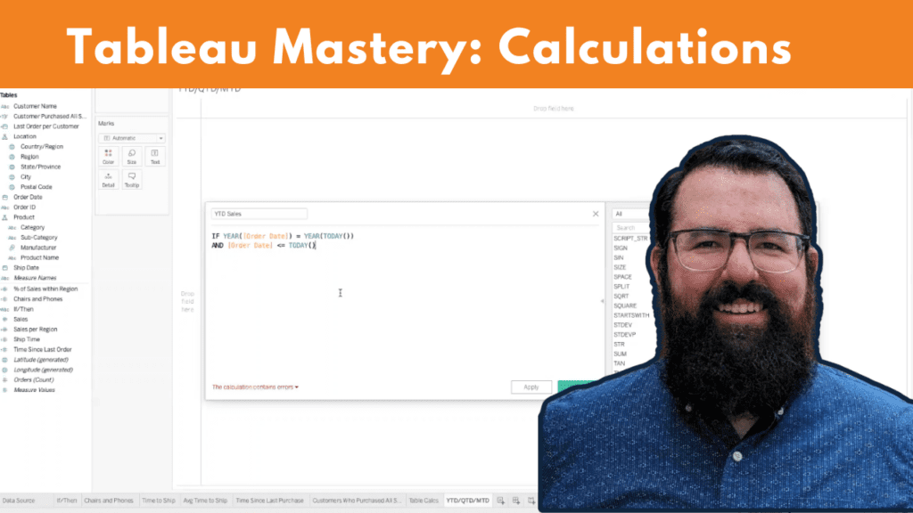
So if we have year-to-date sales, all that we want to do for this is we want to say, “If the year of the order date is equal to the year of today, we want to know…” OK, it’s in the same year, and we saw some weird data with future orders that we think is probably bad data. No one’s ordered anything two months from now yet, so we want to make sure that this is an order that’s already happened too, so the order date is less than equal to today. Then we want to see those sales.
So this is just saying the order was within the current year. The year of order date equals the year today, and the order date was not after today. It was before or on today. We want to see all of those sales for year-to-date, and we can bring that out, and we can see that’s 488,299, and we do the same thing for quarter, so for quater-to-date sales, this is going to be a little bit different, because we’re not just looking at the year. We need to split that year up, so in this case, we can say, “If…” And we’re going to truncate the date. We’re going to truncate the order date to the quarter level, which means it’s going to take all of the order dates and bump them back to the start of the quarter.
So we just want to know, if we move all of the order dates back to the start of the quarter, does that match if we bump the date of today back to the quarter level? So this is just going to tell us if this is in the current quarter, and if it is, give us the sales, and so we can drop that there, and our quater-to-date sales are 287,104.
Oh, you know what? While we’re there, we should do the same thing and make sure that we’re not getting any future orders, so we still want to make sure that the order date is less than or equal to today, and we can watch that number change. That makes a lot more sense, because if the quarter is October, November, and December, we’re only 11 days into that quarter, so it’s probably not [inaudible] dollars yet.
Now, because we’re currently in that quarter that’s going to be October, November, December, if we build out a month-to-date calculation, it’s probably going to look exactly the same. We’re going to use the month and the date trunk or order date, and we want to see if that equals the date trunk at the month level of today. If that equals the month of today and that order date is on or before today, and we want to see the sales.., and because this quarter starts in October and that’s where we are, we should see 29,836.
So that’s three calcs to real quick get year-to-date, quater-to-date, and month-to-date, and then when we circle up next time, we’re going to be talking through how we can parameterize these so that we can dynamically look at the year, quarter or month-to-date sales for past dates as well, and not just for today.
>> STUART: Yes. I think we could throw in a custom option, too, maybe, for that? So we have the option for a user to click on year-to-date, month-to-date, week-to-date, quater-to-date, then an option where it would give a range that they could pick from.
>> JARED: Yes.
>> STUART: So more customization than you can get with an out-of-the-box relative date filter is what we’re going after for that.
Jared, that was awesome. We have five minutes left. I want to give some time for any questions that come in, so if there are any questions, please use the chat window, and we are happy to answer some questions that come in.
As we’re waiting, Henry, did we answer your question about errors with level of detail? Now we can try to come back to that one.
OK, awesome. That was a thumbs up.
Actually waiting for more questions. I know one that has come up a lot that I’ve heard is, you know, Jared, best resources for getting better at calculation? Any come to mind that you’ve picked up and learned along the way?
>> JARED: Yes. Tableau’s community forums are just phenomenal. Anytime that I’ve searched anything related to Tableau, I’ve found posts from other people who had the same questions, and I say that as someone who before I started at XeoMatrix, I was almost always on a team of one.
So I was learning Tableau myself, as some of you might be, and just trying to figure it out as I went, and being able to access some of the experience of other people who had run into the same issues and figured it out was just phenomenally helpful, so the community forums and the help forums for Tableau are the first place that I would go if I didn’t have a brain trust of super-smart people working with me like I do now.
>> STUART: Yes, plus, like, troubleshooting, so you can go there for learning, but also, if you’ve got an error that’s coming up, going to the forums can be helpful too. It gives an insight. That’s great.
I always think Tableau Public too. Like, I’ve learned a lot of tricks, especially formulas and parameters, from you find a workbook on Tableau Public that the author has made downloadable, and you could sort of reverse engineer the functionality with your data. That’s been really helpful for me. Really just taking someone else’s idea when it comes to Tableau, but that’s what’s great about Tableau. It’s so open in that way.
Any other questions that are coming through? OK.
>> JARED: I think even though we already answered Henry’s question, I do want to just touch on some other common errors that you might get with fixed calcs we can kind of talk through. You know, if we ever try to take, like, just a fixed sales, we’re going to get an error because the results of the fixed calc need to be an aggregate, so particularly, when you’re five, six layers deep in calculations, that’ll be a really quick tip that a calculation you’re trying to use isn’t already an aggregate, so that’s one that might cause errors.
Then the flip side of that is if we take that fixed sum of sales, and we try to compare that to something else.., so if we said, “If subcategory equals chairs, then sales…” And let’s say we want to sum that, so we take the sum of, “If subcategory equals chairs, then sales and we want to divide that by the fixed sum of sales…” We took the fixed sum of sales, so we’d think that would work, but that fixed calculation is not an aggregate calculation. It’s just using an aggregate in the calculation, so that can be confusing, but if we wanted to do this, you know, subcategory equals chairs divided by sales, then we would actually need to sum this, because that is not itself a fixed calculation… Or not an aggregate, rather. The fixed calculation is not inherently aggregated, so that’ll be another error that you could run into using fixed calcs.
>> STUART: That’s a tip right there, I think, Jared, that you might have touched on, but worth covering. Like, you’re using a formula that you’ve created before and a new formula, and if you click where it says “fixed sales,” like, click on “sales,” like, the measure… All right, so then click on “fixed sales.”
So in that, if you leave that pop-up window open, if you’re ever nesting calculations, you’ll have the window that’ll pop out to show you what formula to use that you might have built prior, which I found very helpful, too, if you start nesting the [inaudible].
>> JARED: Yes. If we wanted to look back at what our IF-THEN calculation was to check the logic, we can just pull it up right here without even having to go out of the editor.
>> STUART: Yes.
>> JARED: I love this one.
>> STUART: Yes, you can check it right there. You can drag it, you can copy the whole string, post it in, test it. Yes, it’s helpful tips. Cool. [inaudible]. You got the other one? Yes, yes, we got one minute. Yes, go for it.
>> JARED: I was just going to say, you know, you’re talking about testing, and when you have errors in calculations, or if the math doesn’t look like it’s working out, the one thing that I’d recommend is, you can comment lines out in Tableau, so if you hit two forward slashes, that’s going to take this fixed sales out of the calculation and it’s only going to show this top part.
So particularly for percentages like this, if you’re running into issues where the percentages don’t look right, you can do that. Or like you were talking about before, you can just click and drag this side of the calculation out and see, “OK, what is that giving me versus what is this giving me?”
>> STUART: Yes.
>> JARED: And you can use that to do some validation as well.
>> STUART: That’s such a good point, and it’s been really helpful for validation. I feel like a lot of people probably spend time in validation mode. That’s a really good tip.
We’re out of time. Jared, thank you so much. That was awesome. Hope this was valuable for the folks on the call. We’ll get these recordings out, and we will see you in November for parameters. We’ll likely have Jared, and we’ll be going more in depth on how to use some of those formulas in a more dynamic way with parameters. “Harmonizing and parameterizing,” we call it. So great to see everyone again, and I will see you in November.